Looking for ways to improve yourself as a web designer? We’ve put together 13 tips to help guide your creative growth.
Whether you’re just beginning your journey as a web designer or have created countless websites, you can always improve your craft.
Here are 13 tips to help you sharpen your skills and strengthen your design work.
1. Avoid hectic color schemes
With so many wonderful shades and hues out there, it’s easy to go overboard with color. Though bright and bold color schemes are at the cornerstone of many designers’ aesthetics, when you put too many colors too close together, the visual noise that is created overpowers the rest of the web design.
Stick with a simple color palette and neutral background colors. A toned-down background makes instances of color — such as colors on call-to-action buttons, menu items, or other design elements — stand out and get the attention they deserve. Sometimes all you need is a simple white, black, or neutral background.
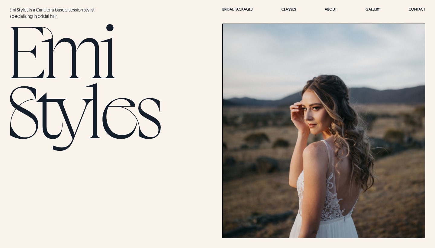
Made in Webflow, this website for the hairstylist Emi Styles is a great example of how a simple color scheme can project a sense of calm and order. To better understand how to best use color in your own web design, read up on color theory to help you make better decisions about your own color schemes.
2. Put some thought into the images you include

The photos that are integrated into a web design layout have a huge impact on the overall look and feel of a website. Poorly shot images with fuzzy focus and questionable composition can diminish even the most brilliant of designs. Generic stock photos can drain the life from a design, leaving it bland and uninspiring.
Using high-quality photos is a simple way to improve your designs.
There are plenty of great options out there if you want to use stock photos. But don’t just plop them down into your designs as they are. Make sure you crop and edit them. Use filters, adjust the saturation, change the warmth, bump up the contrast, and use other photo editing techniques to make the images better fit in with the harmony of a web design.
Additionally, make sure that whatever images you choose fit within the context of the content they’re appearing with. If a photo doesn’t relate at all to the section it’s being placed into, you may need to find one that fits the content better.
Lastly, pay attention to the file types you’re using. Know the difference between a JPG and a PNG. Implementing the correct file types can make a huge difference in how fast your pages load.
3. Learn about SEO
We know you didn’t devote yourself to the art of web design to be bothered by search engine optimization. But how you put together a web design can have a great impact on SEO.
As a web designer, a few things you should know about search engine optimization include:
- How to properly use header tags like <h1>, <h2>, and <h3>
- How the part of a link that identifies a specific page — aka a slug — can influence organic search rankings
- How to optimize images to speed up loading times and decrease the bounce rate — which is the percentage of visitors who only view one page on your site and then navigate away without taking any actions
Of course, we can’t distill the complexities of SEO into three bullet points. If you’d like a helpful introduction to search engine optimization, please check out our blog post “9 SEO best practices for your Webflow website.”
4. Use responsive design

There are many devices out there with varying screen sizes. No matter how someone is accessing your web design, it should offer a similar experience no matter what it’s being viewed on. Instead of putting a huge amount of effort into overly complex animations and hover effects that may not work on every device, it’s better to spend that time improving UI and UX for everyone.
Following the tenets of responsive design means your website will be user-friendly and offer an optimized experience across desktop and mobile devices.
To learn more, check out our course material “Intro to Responsive Design” to help you understand how to make your own designs more accessible.
5. Keep typography consistent
When we sit down to read a book, we expect that every page will follow a sense of order. The text will be the same size, set with exact spacing, and follow the same repeating format. This sense of congruity keeps us engaged, offering an uninterrupted experience in reading through a book’s pages.
Similarly, the typography in a web design also needs to have a sense of order and consistency. Headers, body text, links, and other text need to follow the same styling from one page of a website to the next. Additionally, padding, line spacing, size, color, and weight should be identical for a given type of content.
We’re fans of setting up a universal style guide page for each website you create. By doing so, you can make sure typography is consistent across a web design.
For reference, Webflow’s style manager is a handy tool in managing text styles like headers and body copy — making it easy to keep track of all the text styles you have in place.
6. Keep diversity and inclusion in mind
People landing on a home page come from a variety of backgrounds, ethnicities, genders, abilities, and ages. Being a good web designer means creating a welcoming user experience for everyone. When choosing photography and character illustrations, make sure they represent people from different walks of life.
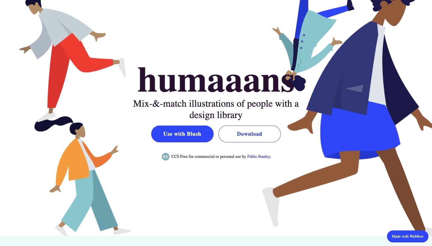
We’ve sung the praises for Pablo Stanley’s free character illustration generator Humaaans in the past. It’s a simple way to fill your design with a wide range of people.
7. Define who you are as a designer
It’s not uncommon for designers to have multifaceted skill sets that include UI, UX, and other aspects of web creation. A web designer rarely has a singular focus when working on projects.
However, because there are so many different aspects to design, it’s an impossible undertaking to be adept at everything. It’s important for designers to pursue aspects of design that are personally exciting and interesting to them. Good designers know that having specialties, and becoming experts in those specialties, helps set their work apart and makes them more attractive to potential clients.
Though many designers find themselves bouncing from one type of project to another early in their careers, with progress, growth, and introspection, finding a niche becomes easier.
To start, figure out what type of businesses or clients make you the happiest to work with. If you’re into all things tech, you might want to seek out SaaS companies, startups, and others in the digital sphere. If you’re a foodie, you might find designing restaurant websites a perfect fit for your culinary appreciation.
Defining yourself as a designer also extends to your own artistic aesthetic. Whether you enjoy precision-crafted minimalist designs or like pushing the boundaries with abstract and conceptual design, make sure to have a design voice that’s uniquely your own.
Knowing who you are as a designer makes it easier to find the projects you want to work on and the people you want to work with. It also enables you to have a focused LinkedIn profile and portfolio, letting potential clients recognize your talents right away.


Get our 100 video course on web design — for free
From the fundamentals to advanced topics — learn how to build sites in Webflow and become the designer you always wanted to be.
8. Mentor a designer

Becoming a mentor isn’t only a way to give back and help out an aspiring designer — it can also make it easier to better critique your own designs.
Being a mentor is more than just giving website design tips. It means being able to analyze a problem someone may be having and explaining why it’s not working, as well as the steps they can take to improve it. Paying attention to someone else’s work and exercising the analytical part of your brain will make it easier for you to evaluate your own designs.
9. Write case studies
Case studies should be a part of any web designer’s portfolio website, but so many skip over creating them. While they do take a bit of time and effort, case studies can help you out in multiple ways.
Case studies add so much to a portfolio. Website visitors get an in-depth look at your process, see how you approach problem-solving, and develop a better understanding of who you are as a designer.
Taking a granular look at your work as a web designer also helps you better understand what you’re doing right and identify areas where you may need to improve. Case studies exist as a detailed archive of your work and are a great record of your progress.
10. Understand the principles of web design
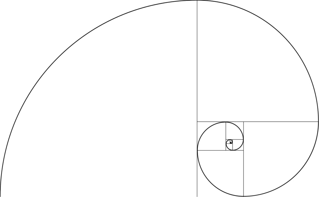
The intuition that guides the decision-making of skilled designers comes from knowing the principles of design.
Take the time to learn about the fundamentals of UI, UX, typography, composition, and color theory. Understand visual hierarchy, the rudiments of Gestalt theory, and the golden ratio. Dive into the more cerebral aspects of design so you can put these lessons into practice on your own work.
If you want a great place to begin your learning, check out this post we did about 10 effective web design principles every designer should know.
Related reads: How to design a website the modern way (in 9 steps)
11. Ask for better feedback and critique on your work
It’s satisfying to hear what you’re doing right. But to grow as a web designer, you need constructive criticism.
Getting the right feedback begins with you.
Let people know what type of feedback you’d like. Give them a bit of background information about the project as well as its goals. Prepare them with all of the details they’ll need to analyze your work.
Some questions you may ask the people critiquing your web designs include:
- Can the content be better organized to improve readability?
- Does the UI functionality make sense?
- Does the visual hierarchy work?
- What can be done to improve usability?
- Is it missing any important page elements?
- Does this website follow responsive web design guidelines?
- Will this website keep visitors’ attention?
And, of course, don’t just ask for feedback from designers. Marketers, content writers, and even your friends and family are all great people to go to for feedback.
12. Stay inspired
It’s easy to get stuck in the vacuum of one’s work and to work oneself into a design rut. To avoid creative stagnation, keep your mind abuzz with web designs that excite you.
Check out what’s going on in Awwwards, Behance, Dribbble, and the Webflow Showcase. Follow your favorite web designers on social media and take in all the great web designs you can.
13. Work on experimental web design projects
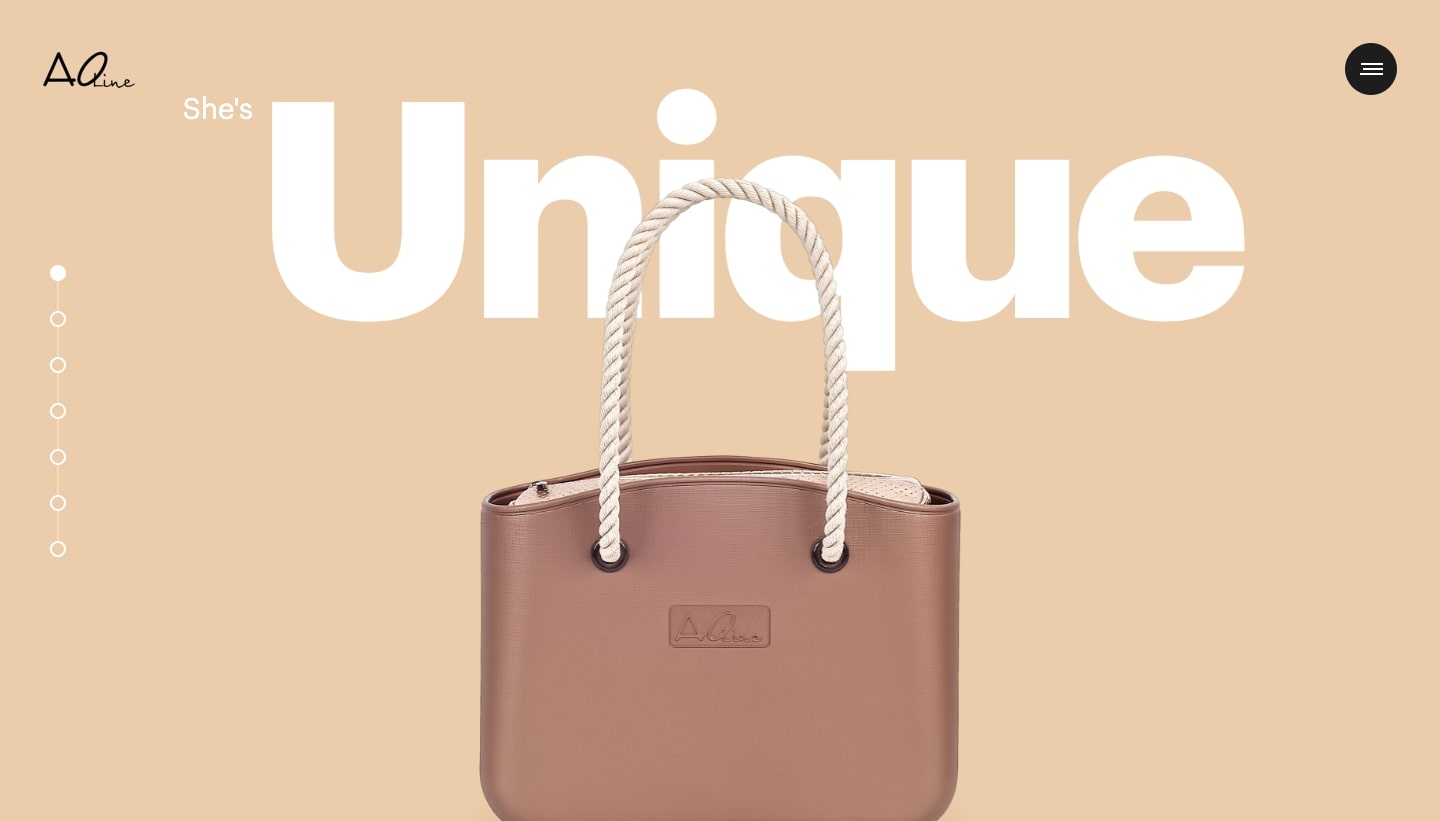
Why not create something out of the ordinary? Push yourself to make something weird or unorthodox. Take a website that’s out there and come up with your own boundary-pushing redesign. Every good designer knows going outside of your comfort zone will force you to approach your design work differently.
And don’t be afraid to fail. Entering unexplored design territories doesn’t always end in a design you will love. The great thing about these types of personal projects is that even if you fail, no one ever has to see it.
Always keep learning
Web design is constantly evolving, which makes it such a rewarding pursuit. There are always new tools and new design techniques. What do you do to stay on top of things and improve your skills? Let us know in the comments below!


