

Web textures transform a boring, flat screen into an immersive, tactile experience, but they’re so visually striking that they can be overwhelming in large doses. You need to be strategic to use them correctly.
Humans are sensory beings. We thrive on interacting with our surroundings in three dimensions, using both sight and touch. By incorporating textures into digital web design, we emulate these tangible experiences, bringing a sense of the physical world into the digital one.
But using real-world textures in design is challenging, especially in website design, where the canvas is a compact, two-dimensional space displayed directly in front of the viewer. Overloading this canvas with texture can be distracting and lead to visual discomfort, particularly when you’re trying to communicate complex information or detailed content.
Given these difficulties, it’s unsurprising that some web designers avoid textures altogether. But if you’re judicious about using them, web textures can reinforce a brand’s identity and stimulate specific emotions, memories, and tactile sensations. These subtle sensory cues can deepen user connection with a brand, enhancing user engagement and influencing behavior and decision-making.
What are web textures?
Web textures are images that capture the look and feel of three-dimensional surfaces. Unlike standard feature images, they don’t serve as focal points or narrate a story — instead, they subtly enhance the design by introducing a layer of tactile realism. By integrating textures, designers evoke the physical world, increasing user engagement by adding depth to the digital landscape.
While the concepts of web textures and background patterns overlap, leading to interchangeable usage, there’s a clear distinction. Strictly speaking, a web texture is a single image, while a web pattern is a smaller image, often a vector file, that’s tileable and repeats many times.
Web textures: Natural vs. human-made
Natural web textures
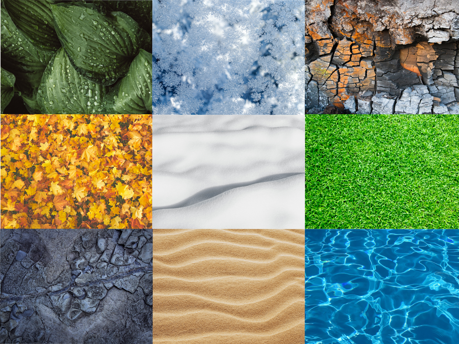
Natural textures infuse a design with the emotional resonance of the outdoors. By mimicking sensations like sand between your toes or the roughness of tree bark, these textures evoke feelings of exploration, freedom, and vitality.
Natural textures that work well on websites include:
- Water
- Sand
- Stone
- Grass
- Snow and ice
- Leaves
- Bark
- Fur or scales
Natural web textures also make designs more immersive and memorable, especially when associated with the outdoors.
Human-made web textures
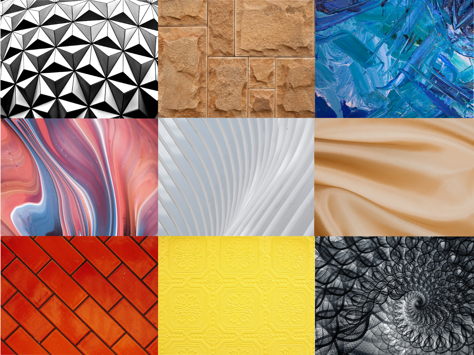
Human-made textures, like fabric, bricks, and paint, often command greater visual attention than natural textures. These textures reinforce the context of their origin — for example, a textile pattern enhancing a tailor’s website or a paint texture adding depth to an artist’s portfolio — and subtly convey specific themes or concepts. For example, a metal or geometric texture on a tech company’s site might lend tangibility to their services, while a cafe or restaurant could adopt a brick texture on their site to mimic the eatery’s physical interior.
Human-made textures that work well on websites include:
- Glass
- Metal
- Textiles
- Tiles
- Paint
- Brick
- Concrete
- Paper
- Lumber
- Carved surfaces
- Film or television grain
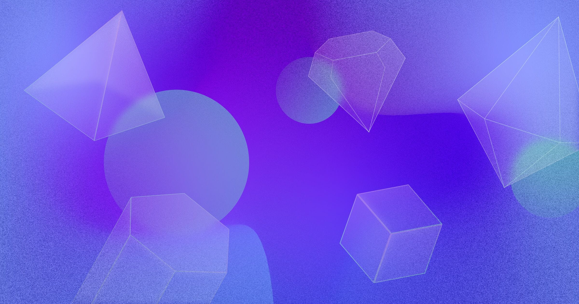
- 3D geometric shapes


Free ebook: Web design 101
Master the fundamental concepts of web design, including typography, color theory, visual design, and so much more.
How to use textures in web design
Textures are bold design elements that require thoughtful and intentional application. For example, if you’re employing a texture for an entire website background, choose one with a subtle pattern and low color contrast to maintain readability and avoid visually overwhelming visitors. However, if the texture serves as a minor design element, like a sidebar or section background, employ a stronger and more noticeable texture to draw interest and create a focal point. The key is to let texture enhance the design rather than detract from the user experience.
Textures are hard to get right, but when they work, the effect is spectacular. To give textures the best chance of success, keep these pointers in mind:
- Balance size, color, and pattern intensity. In most cases, larger areas should be more subtle in pattern and color, while smaller swaths of texture can have bolder colors and more intense patterns. This delicate balancing act helps ensure the web design doesn’t become visually overwhelming. If you plan to apply a whole-page background texture, decrease the image’s opacity or deploy a color overlay to fade part or all of it so other images or text on the page don’t get lost against the background.
- Keep purpose in mind. Every texture must evoke a specific emotion or experience consistent with the brand’s identity. This consistency enhances user engagement and strengthens brand recognition, as the textures resonate with the emotional experiences associated with the brand.
- Make sure all text is easily legible. Some textures are visually busy, so any overlaid text needs to be large and styled in a clear font and contrasting color. Conduct user testing to ensure the text is legible to users with diverse accessibility needs.
- Monitor website performance. Higher-quality images take longer to load, potentially affecting a site’s load time and increasing the bounce rate. To optimize performance, consider converting PNG and JPG images to WebP format and checking that images are set to lazy load.
- Experiment with creating textures. If a particular surface or flat object is special to a brand, take a photo and incorporate it into the site. Creating textures allows for a personalized touch that differentiates a brand and gives it a unique identity.
Designers use textures in three main ways: as an overlay for an entire site or section background, underneath a hero section, or within smaller segments or shapes. Here are some ideas for how to implement each one.
As a website or section background
Applying texture throughout a site adds a tactile quality to the user experience. But it’s also risky, as the texture will compete with the text and other design elements for attention. Unless you want the background to draw a lot of attention — if it’s intended to be cute or funny, for example — choose a subtle texture for these large areas.
Even discreet textures that don’t immediately draw the eye evoke surprisingly specific memories and feelings. For example, snow might bring back memories of the winter holidays or snowboarding, while a satin texture might make visitors think of relaxation and luxury.
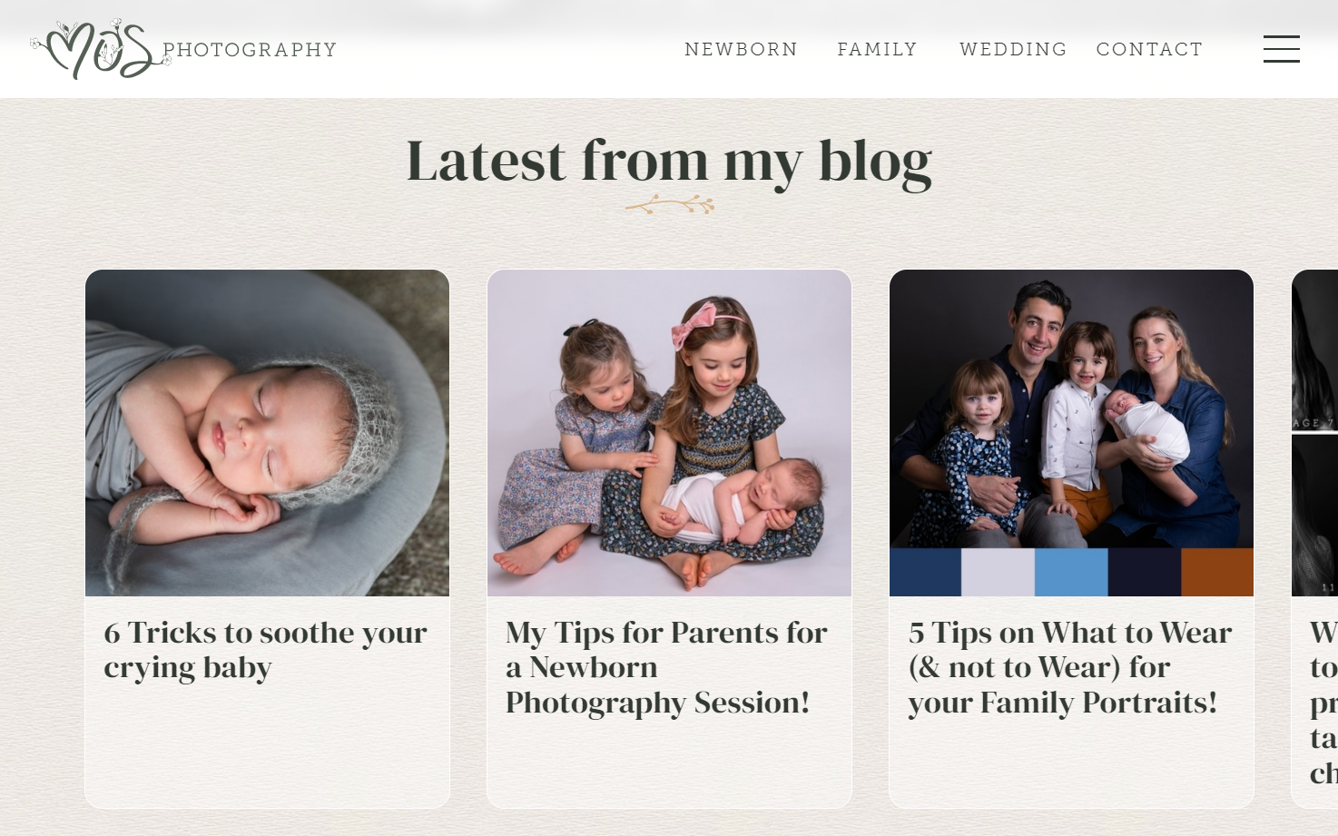
On photographer Michelle O’Sullivan’s site, DesignChief replicates the thick pages of a photo album with an off-white paper texture. It evokes nostalgia and a desire to capture new memories through photography, subtly encouraging visitors to get in touch with Michelle for a photo session. This texture covers most of the site but doesn’t negatively impact text legibility or distract from other visual elements because it’s so understated.
As a landing page background
A striking texture can transform a sparse landing page into an immersive experience. When using such bold textures, toning down color or intensity isn’t always necessary, even if it’s applied over a large area. However, designers need to style the hero text and other page elements to ensure readability, integrating them with the vibrant backdrop to create a seamless visual journey.
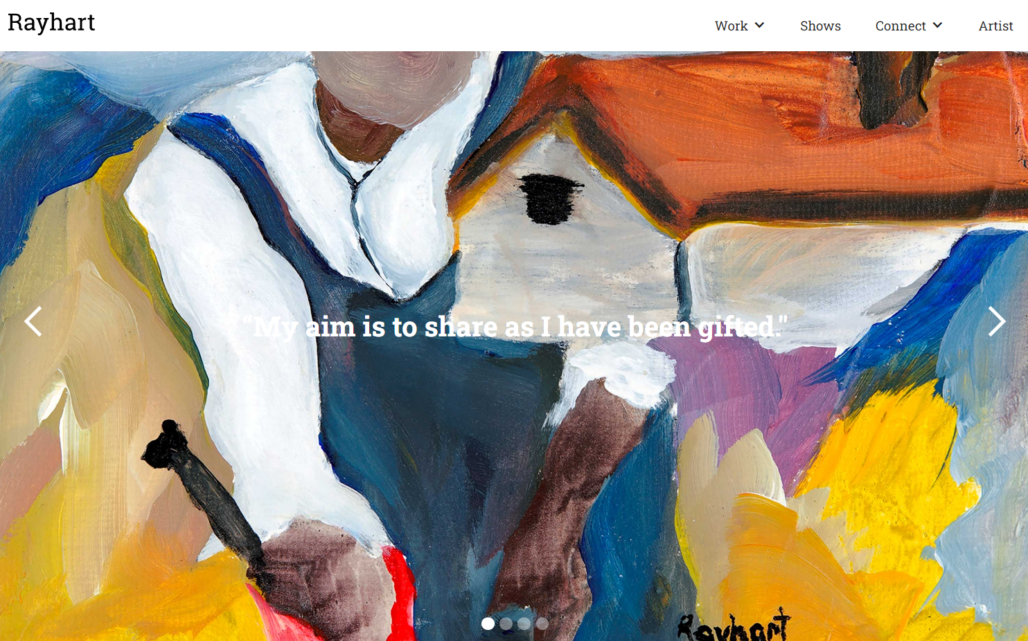
Rayhart Art’s landing page takes a unique and engaging approach by making the background texture a central design feature. A slider cycles through full-page, close-up pictures of Rayhart’s paintings, revealing the intricate brushstrokes and underlying rough canvas that form the artwork’s texture to visitors. This design choice gives a tangible feel to the digital space and encapsulates the essence of an artist website, showcasing not just the finished piece but also the creative process and artistry behind it. It’s a thoughtful, resonant touch that sets Rayhart’s website apart and creates a unique user experience.
In bands, headers, or other small shapes
In smaller fragments, web textures liven up a site, create a point of visual interest, and evoke emotions and associations without being overpowering. You can experiment with textures in headers, as independently shaped design elements, and even on buttons.
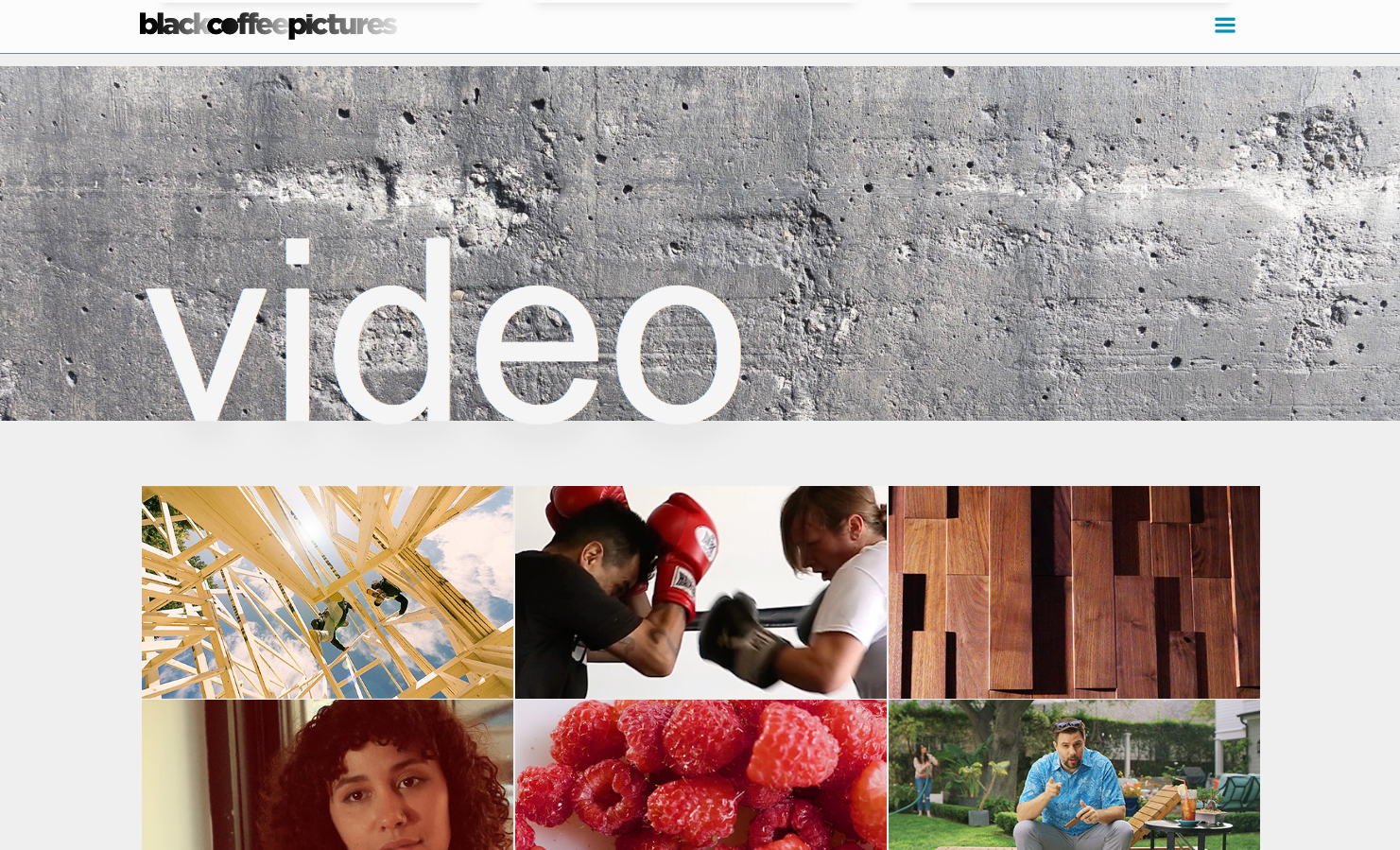
Black Coffee Pictures site designer Bill Fogarty uses a series of grunge textures underneath the section headers to give the site an urban physicality. The images are full-page size, but only a narrow band of each is visible at a time as users scroll through the site, preventing the textures from overshadowing other content.
3 websites that use web textures to support their brand
These website examples illustrate how designers leverage the power of website textures. Each translates the tactile essence of the brand into engaging web designs that don’t just appeal aesthetically but also establish a stronger bond between the user and the brand.
1. natureplus
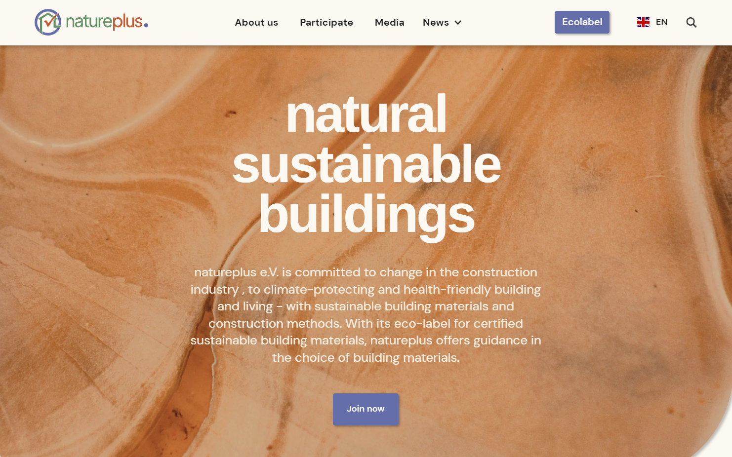
Designer Joao Prenzler de Carvalho welcomes visitors to the eco-friendly construction company natureplus site with a wood texture on its hero section. This ingenious way of expressing the connection between nature and natureplus’ building materials represents the company’s core business perfectly and helps visitors connect with the nature-centric values of the brand.
2. Saffron Table
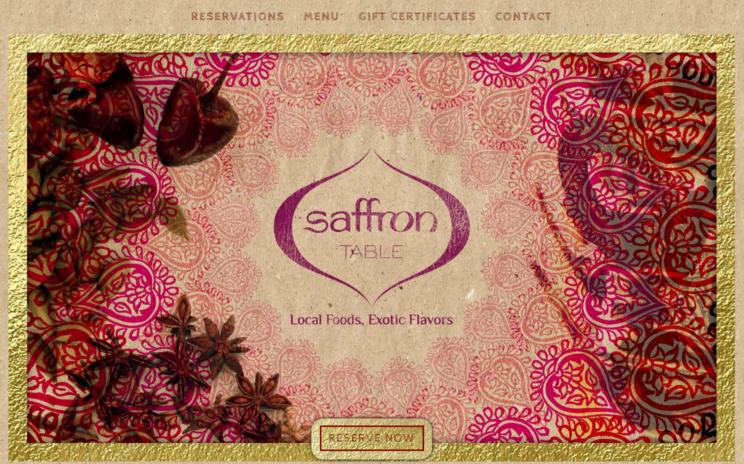
Designer Yogesh Simpson notes that Saffron Table, an Indian restaurant, requested “a one-page site with a bit of exotic bling.” As requested, Yogesh leverages a layered paper texture, placing gold paper and red paisley patterns on top of plain brown kraft paper. This final result recreates the experience of reading a lovingly crafted real-life restaurant menu.
3. Alora

On the design for the Alora site, designer Juano Lucarelli opts for a moving texture as a background video. Alora, a marine agriculture startup, is developing a farming method to genetically modify rice to make it more salt tolerant, then plant it in the ocean. The gently rippling water texture on the site is calming and hints at the potential beneath the water’s surface. Not content with just one texture, Juano also uses glassmorphism to create a frosted-glass effect on the right-hand menu bar.
Experiment with textures on your Webflow site
Textures offer designers endless possibilities for creating personalized, engaging, and visually stunning sites.
Next time your site design feels flat or dull, see if a web texture can add an interesting new dimension. Webflow allows you to test different background images, overlays, gradients, and masking effects by creating clean CSS background code automatically as you work. Get started with your next dazzling web design with textures on Webflow today!

Get started for free
Create custom, scalable websites — without writing code. Start building in Webflow.