Feature
Ecommerce
Display sale prices by setting a compare-at price
We’ve added a new “compare-at price” field to your ecommerce products so you can highlight sale prices and showcase discounts.
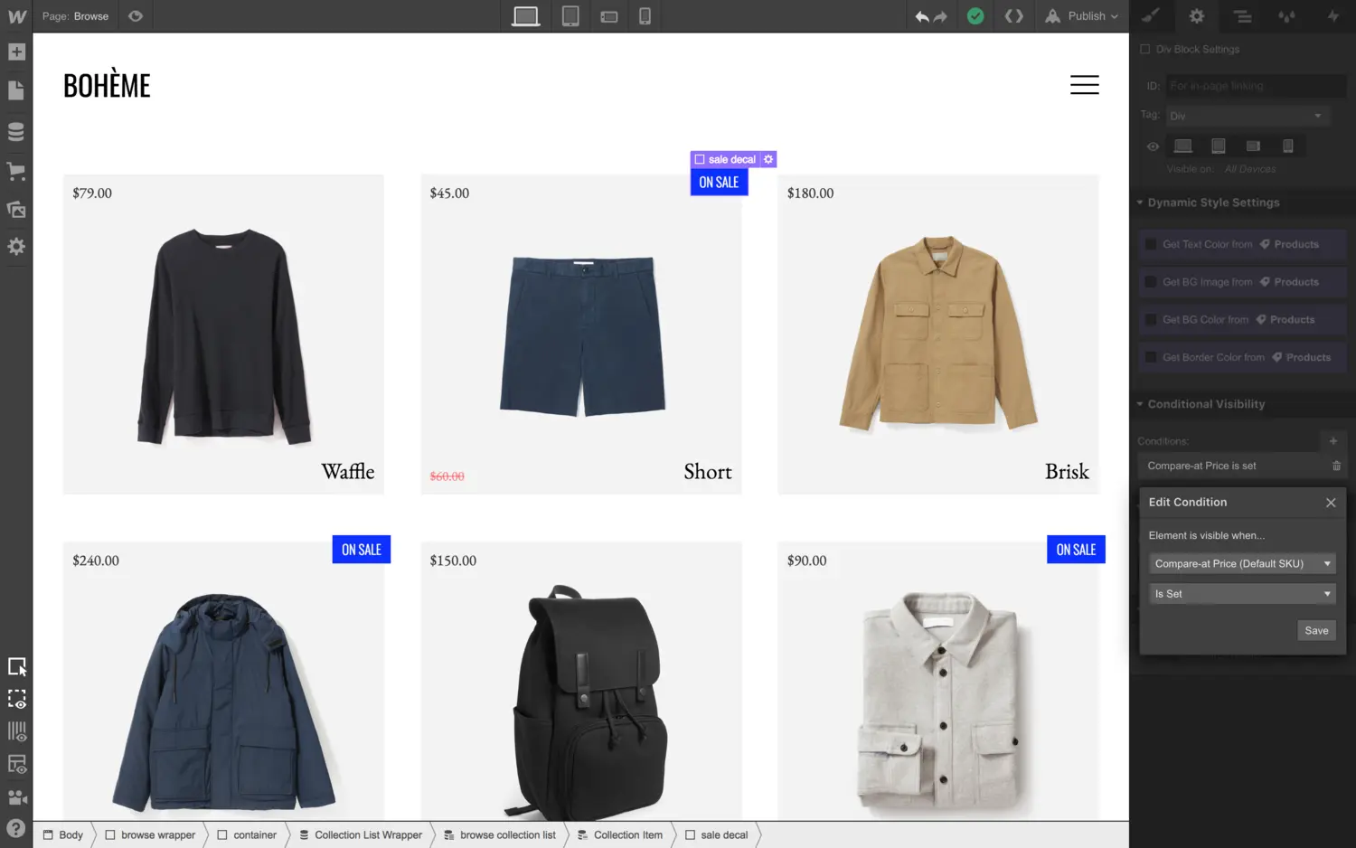
Running sales, promotions, and discounts is a huge part of running an online store. Today we’re releasing our first feature in this realm: the “compare-at price” field.
The compare-at price field lets you display an “original” price that is more expensive than the price you’re selling the product at (in effect, marking that that product is on sale).
This new field — combined with the power of conditional visibility — allows you to create inventive sales and merchandising designs on your store. Let’s take a look below at some of the core workflows for using this new compare-at price field.
Setting a compare-at price
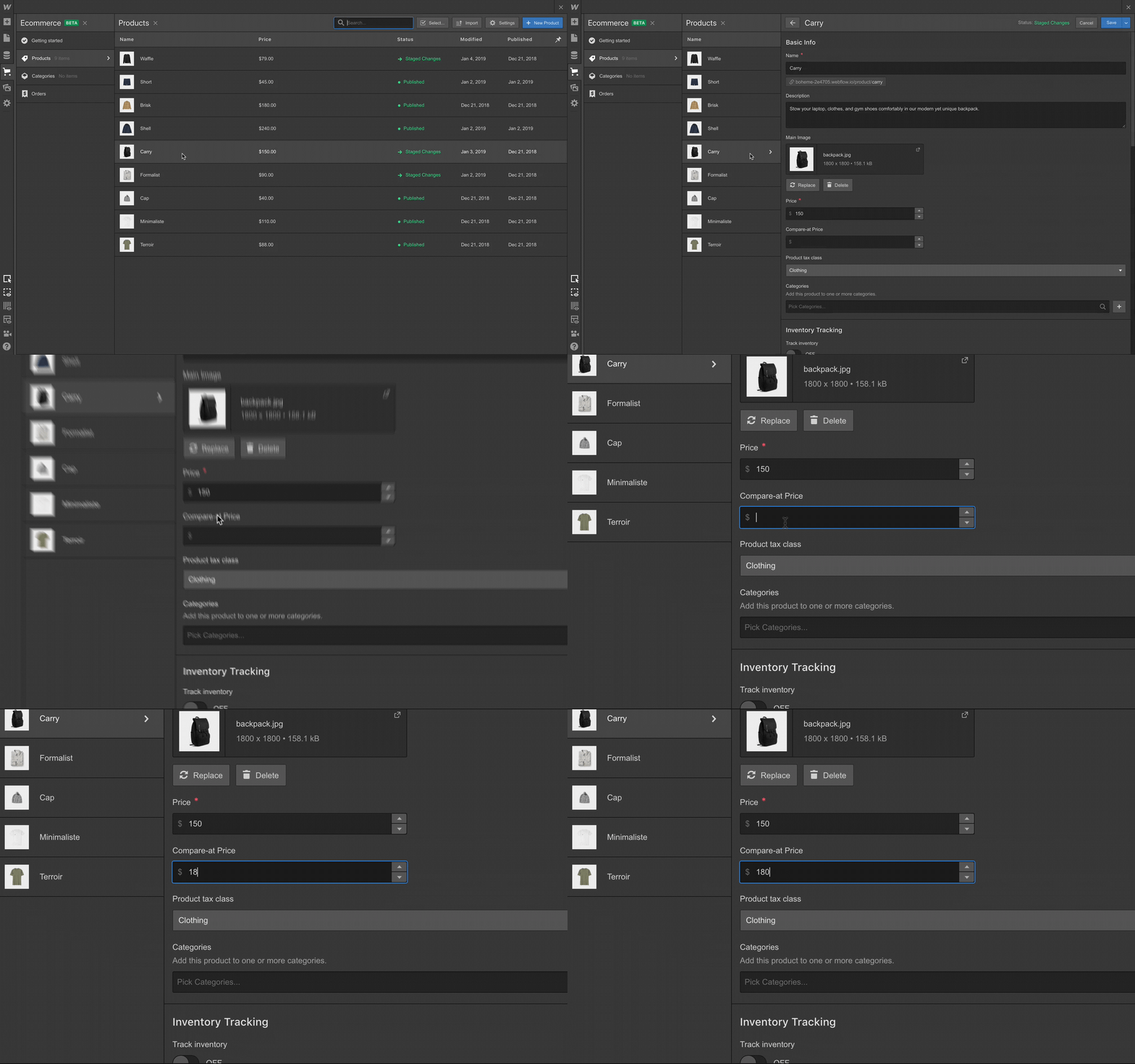
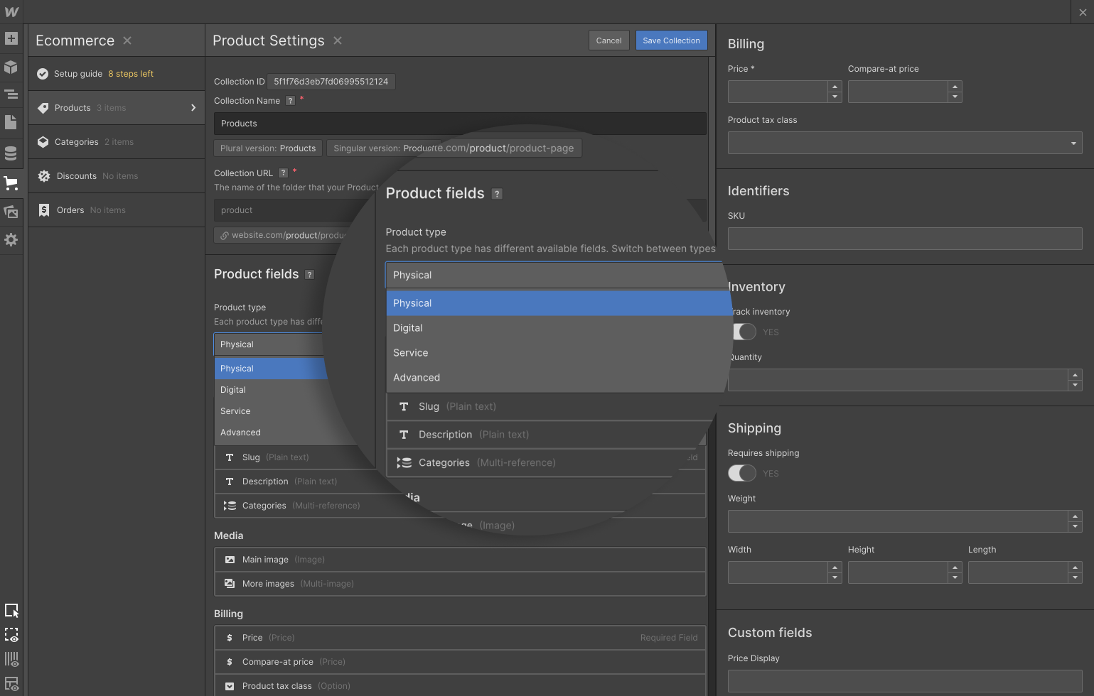
Setting a compare-at price is pretty straightforward. Just open the product details in the Designer or Editor and set a value in the compare-at price field.
Displaying the compare-at price on a product page
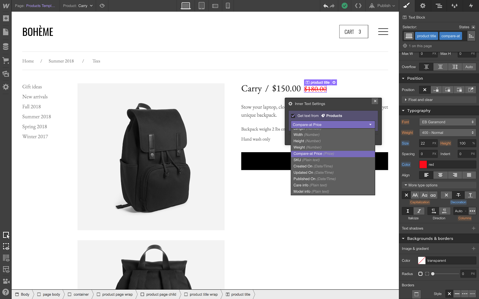
Let’s say you want to show the compare-at price on your product page, styled in a different color and struck through to indicate the price has been … how do you say, “slashed?” Again, pretty straightforward: add a new text element to the page and connect it to the compare-at price field. Then, style that element however you’d like.
Displaying sales banners
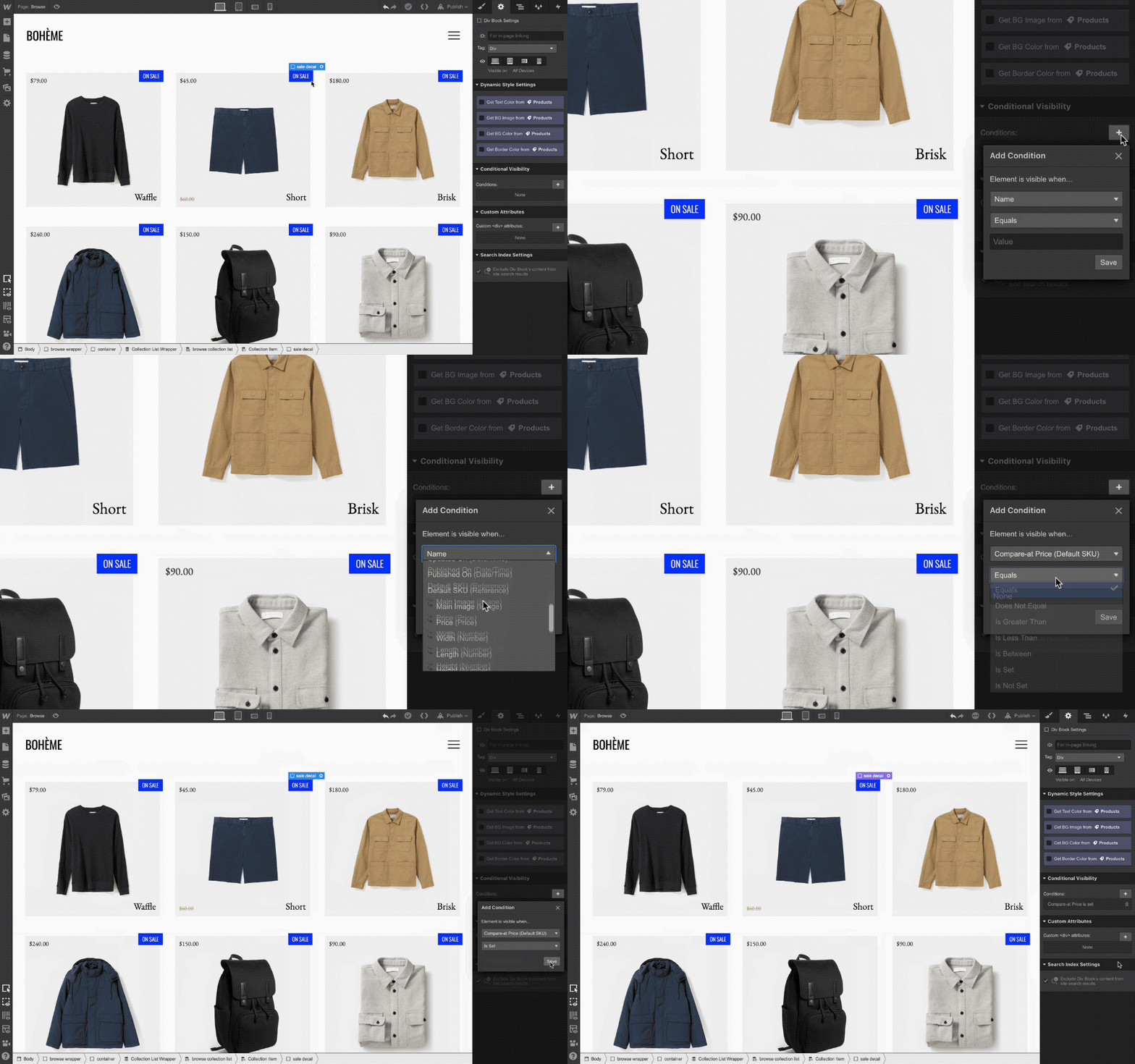
Often, you’ll want to add a small banner or callout on your browsing pages to point out products on sale. With this new compare-at price field and some help from conditional visibility, you can do this pretty easily. Simply create the callout element you have in mind, then set it to only display if the product in question has a compare-at price set.
What’s next
This new compare-at price field is only the first step toward making it easier to run sales on your Webflow Ecommerce store. We’re still planning to build out a more comprehensive system for creating and managing coupon codes, discounts, and other promotions.
If you have ideas or requests for additional features, be sure to let us know by submitting new (and voting on existing) ideas to the Webflow Wishlist.
Related updates
Get started for free
Try Webflow for as long as you like with our free Starter plan. Purchase a paid Site plan to publish, host, and unlock additional features.
Try Webflow for as long as you like with our free Starter plan. Purchase a paid Site plan to publish, host, and unlock additional features.


.jpeg)


