

Update
Test your designs on iPhone 12 device widths
Now you can test your designs on the new iPhone 12 product line in the Mobile portrait breakpoint.
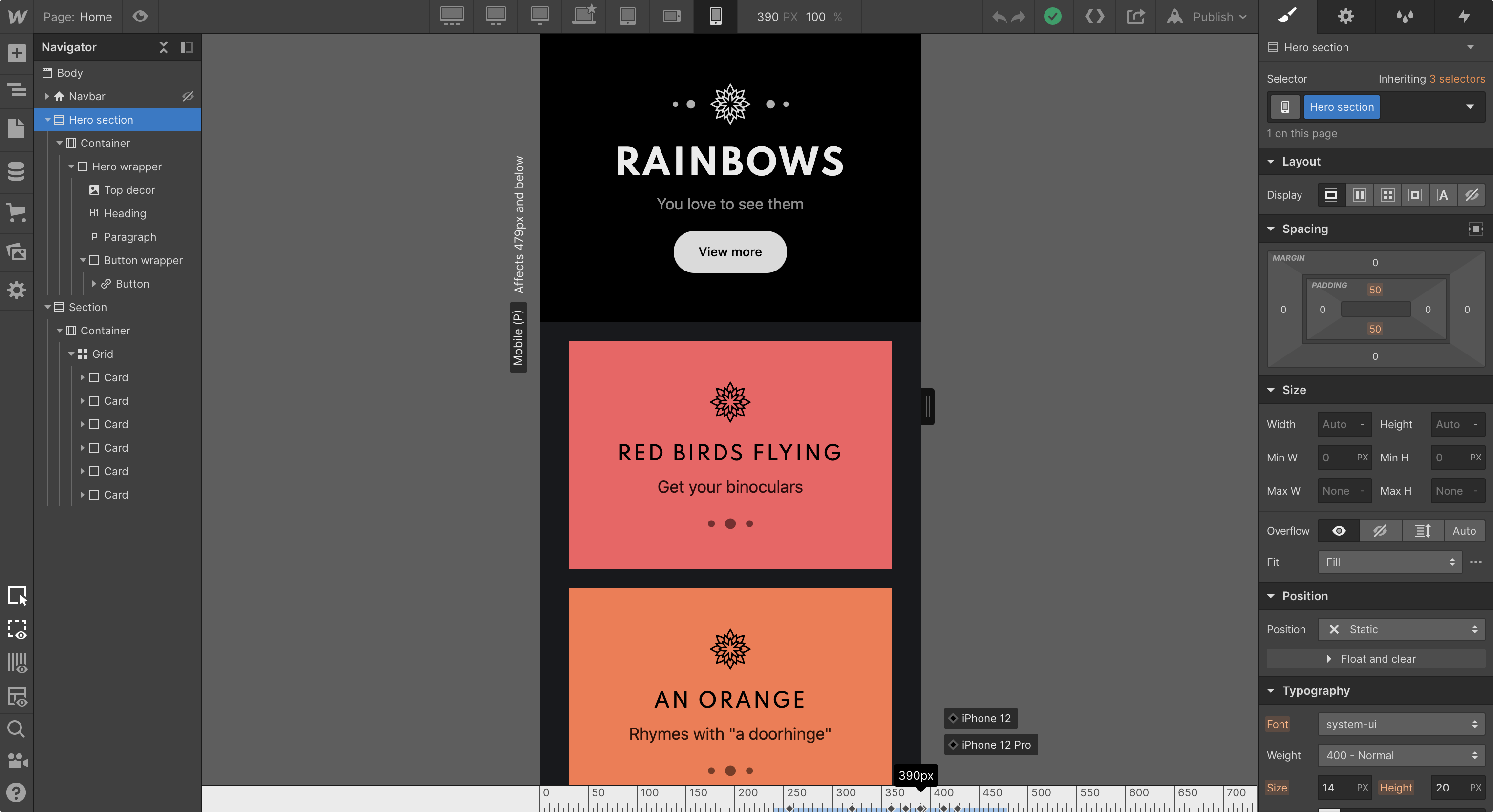
Today, Apple released the iPhone 12 product line with four new viewport sizes that vary from the existing iPhone 11 product line.
We’ve added four new device widths to bring the newest iPhones to the Webflow Designer: iPhone 12 and iPhone 12 Pro (390px), iPhone 12 Pro Max (428px), and a smaller width for the iPhone 12 mini (360px).
Launched on
October 13, 2020
Category
Related updates


Get started for free
Try Webflow for as long as you like with our free Starter plan. Purchase a paid Site plan to publish, host, and unlock additional features.
Try Webflow for as long as you like with our free Starter plan. Purchase a paid Site plan to publish, host, and unlock additional features.