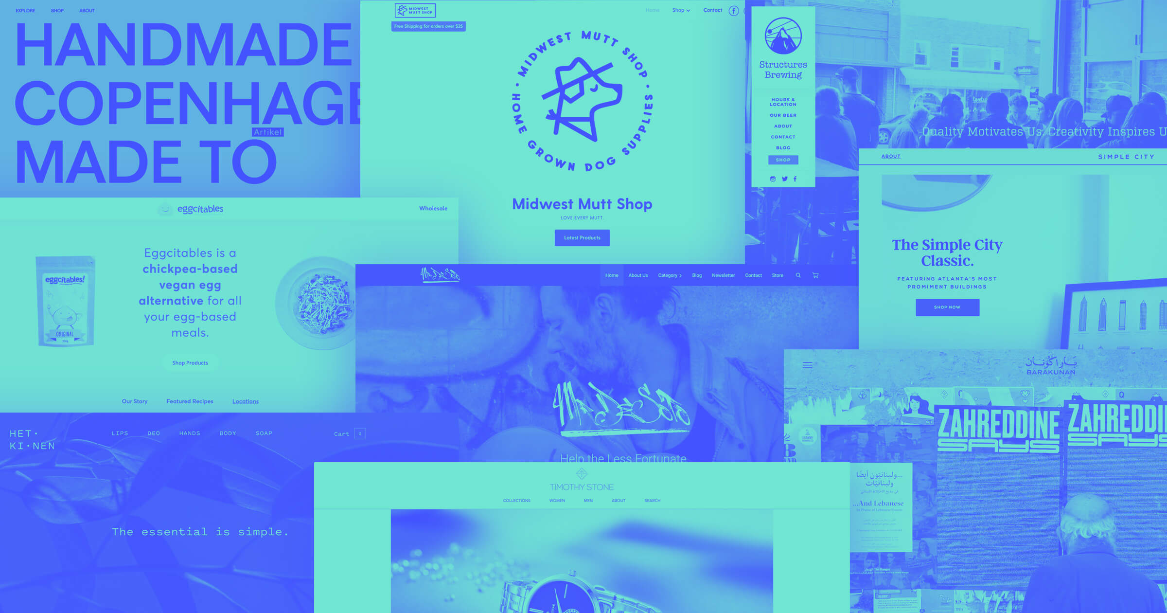
A content management system helps you turn vast web content libraries into engaging digital experiences.
Content management systems (CMSs) help you create digital content that’s categorized, optimized, and consistent. That way, your entire website is a cohesive digital experience. These platforms are essentially website builders that prioritize making, updating, and managing content at scale.
Signing up for CMS software requires an initial investment, especially at the enterprise level, but it’s worth it. With the best tools, you can generate content and fine-tune pages seamlessly. While reviewing these CMS website examples, consider how Webflow makes each layout and user experience possible.
The importance of a CMS
Content management systems offer the tools and web hosting services to publish and manage content online. They typically feature intuitive text editors, search engine optimization (SEO) tools, and collaboration features that help you quickly turn written content into engaging digital experiences. And the best CMS platforms — like Webflow, Squarespace, and Sitecore — set themselves apart by offering prebuilt templates and flexible scalability.
By choosing a comprehensive CMS, you’ll be able to create website pages more efficiently. For instance, use a CMS to launch a blog that generates leads for your brand. Or create a business directory that recommends local or online services. Whether you’re building a blog or a portfolio, a CMS is an efficient way to maximize your traffic.
9 great CMS website examples
With Webflow’s CMS, you can create impressive websites faster — with or without developers. Here are nine examples of websites that use Webflow’s CMS to develop intuitive, inviting digital experiences.
1. Bonsai

Bonsai helps digital agencies and consulting firms track their projects, clients, and finances in one convenient place. The site includes several customer stories pages and use case examples to describe their services, all created in a CMS.
To attract readers’ attention, each section includes multimedia, like static images and GIFs. With a CMS, Bonsai can store these visuals in a single library so it’s simple to reuse them across pages. Further, the content management platform makes these elements responsive, meaning they look great on any screen size.
2. Agile by Design

Agile by Design is a business consulting firm that creates custom Agile workflows to suit clients’ business needs. Diego Toda de Oliveira made the brand’s Webflow website, which includes a detailed blog page that defines essential project management terms and methods.
This resource provides value to prospective clients by sharing industry knowledge for free. And the blog gives Agile by Design a platform to share why they’re the best consulting firm for customizing these workflows. The CMS allows them to quickly turn drafts into blog articles by simply dropping all their copy into premade CMS templates that format the page accordingly.
3. AI Stash

AI Stash is a library of artificial intelligence (AI) tools for a wide range of things, including SEO and art. Designed by Thomas’s Workspace, AI Stash’s tool pages are organized into an intuitive gallery format, with each landing page describing the tool’s functions and alternatives.
Each page follows a templated layout that pulls information from the CMS to populate descriptions and suggestions based on relevant tags. For example, the Podstellar page explains that it uses AI to generate YouTube video transcripts and highlight the key takeaways. Under “Podstellar Alternatives,” you’ll find options like SumlyAI and One AI, which share the #Summarizer tag with Podstellar.
If you want to use a similar format, tag all your content in a CMS reference field and include a dynamic section in the Collection page template that references that field. That way, every time you create a new page, it will appear in those dynamic sections. You can then link these dynamic sections so any changes you make in one section are automatically applied everywhere they appear.
4. WERC

WERC is a talent mobility agency that specializes in helping businesses find and relocate employees. They used Webflow’s CMS to create their online directory, which shares resources to help this audience connect with each other.
The CMS ensures each directory page follows a consistent format with a title, a search filter, and relevant listings. Maintaining this structure lets readers quickly understand each page’s use, so they can find the connections they’re looking for.
You can use Webflow’s CMS to achieve the same effect. Start by creating a template, then simply add a new CMS item whenever you need to upload new content. Webflow will automatically populate the page with the correct information, saving you from having to design a new layout each time you update the site.


Rethink your CMS
Find out why a cutting-edge enterprise CMS is not just a nice-to-have, but a necessity for teams.
5. Three Piece Bar

Three Piece Bar is a drink catering service for upscale events like weddings and cocktail parties. On their website, designer Daniel Twine used Webflow’s CMS for two separate use cases: recipes and case studies. The recipes for their mixed drinks all appear on a landing page that presents them neatly in a long list. And the case studies all follow the same layout, with images of their previous events and testimonials from attendees.
This example showcases how Webflow can help you organize and publish multiple content types at once. By creating different layouts and CMS categories, you can use one platform to generate all kinds of pages, like product listings, blog articles, and portfolio pieces.
6. UpGuard

UpGuard is a risk assessment service that analyzes plugins and third-party software for security vulnerabilities. Their site contains blog articles, service descriptions, and reports that teach potential customers all about cybersecurity.
UpGuard uses Webflow’s CMS to categorize blog articles with tags like “Attack surface management” and “DevOps,” which helps readers find what they’re looking for. You can do the same by identifying the best categories for your content and labeling every piece this way. If you pair tags with responsive layouts, you’ll make browsing content intuitive and functional on any screen size.
7. Footer Design

Footer Design is a simple website that offers a curated list of stunning website layouts. It’s Devin Fountain’s passion project, and he believes website footers are too often overlooked. To improve navigation, he tagged each entry with useful labels like “colorful,” “fun,” or “minimal.” The top-level pages organize designs into the most popular categories, pulling in every page marked with the relevant tags.
By assigning these tags to your CMS content and site navigation, you help readers quickly search the page and discover related things they might not have found otherwise.
8. Upwork Cookbook

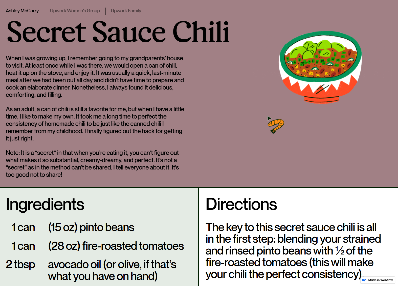
The Upwork Cookbook celebrates recipes from Upwork’s diverse team members. It’s an opportunity for everyone to share meal ideas from around the world. Juice Agency made this website cute and bold, with details like the mini shrimp cursor and the full-screen animations. These fun design choices encourage people to explore the page and add a bit of whimsy to Upwork’s brand image.
While every recipe page seems unique, they all follow the same format. The CMS puts all the relevant instructions, images, and animations in place, sparing the designers from manually laying out each page. This example shows how you can achieve a custom design even with the programmatic way the CMS makes pages.
9. Kingcanary

Kingcanary is a Dutch event coordinator that organizes concerts and presentations. Their portfolio highlights each gathering’s activities, guests, and photos. Having this information front and center on the homepage shows prospective clients how much fun they could have if they hired Kingcanary to run their event.
For each of these case studies, the CMS stores all the related text snippets and images. Then, it plugs them into the layout the same way on every page. This is a great way to create detailed portfolios, service catalogs, or product listings. Whenever you have pages requiring similar content, the CMS can transform it into something as polished as Kingcanary’s site.
Elevate your website with Webflow’s powerful CMS
The CMS software you choose affects how well your website performs. To create a memorable digital experience, your CMS must render high-quality, dynamic web content quickly.
With Webflow, you can organize your content into different CMS Collections, allowing you to create unique layouts and templates for each item. After setting up this structure, you can quickly add new content without spending time on extensive redesigns. Simply create a new CMS item, and the platform will automatically apply the correct template.
Manage your content confidently with Webflow’s visual-first CMS.

Get started for free
Create custom, scalable websites — without writing code. Start building in Webflow.


