Transcend the second dimension and turn flat designs into dynamic 3D experiences.
With 3D layouts, you can scroll through a website and watch an object rotate midair, see a product unfold in 360 degrees, or move your cursor to make a digital landscape shift in real time.
Three-dimensional design principles like these turn screens into immersive spaces where browsing feels like exploration and websites come alive.
Read on for inspiring 3D website examples and tips to create your own.
3D website design: An overview
Three-dimensional website design elements add depth, realism, and spatial movement to a webpage, transforming flat, static layouts into interactive, immersive experiences. With traditional 2D sections, visitors might quickly skim through if the components feel too static or unengaging. But 3D design elements create a tangible sense of space that draws people in and encourages exploration.
Common 3D elements include:
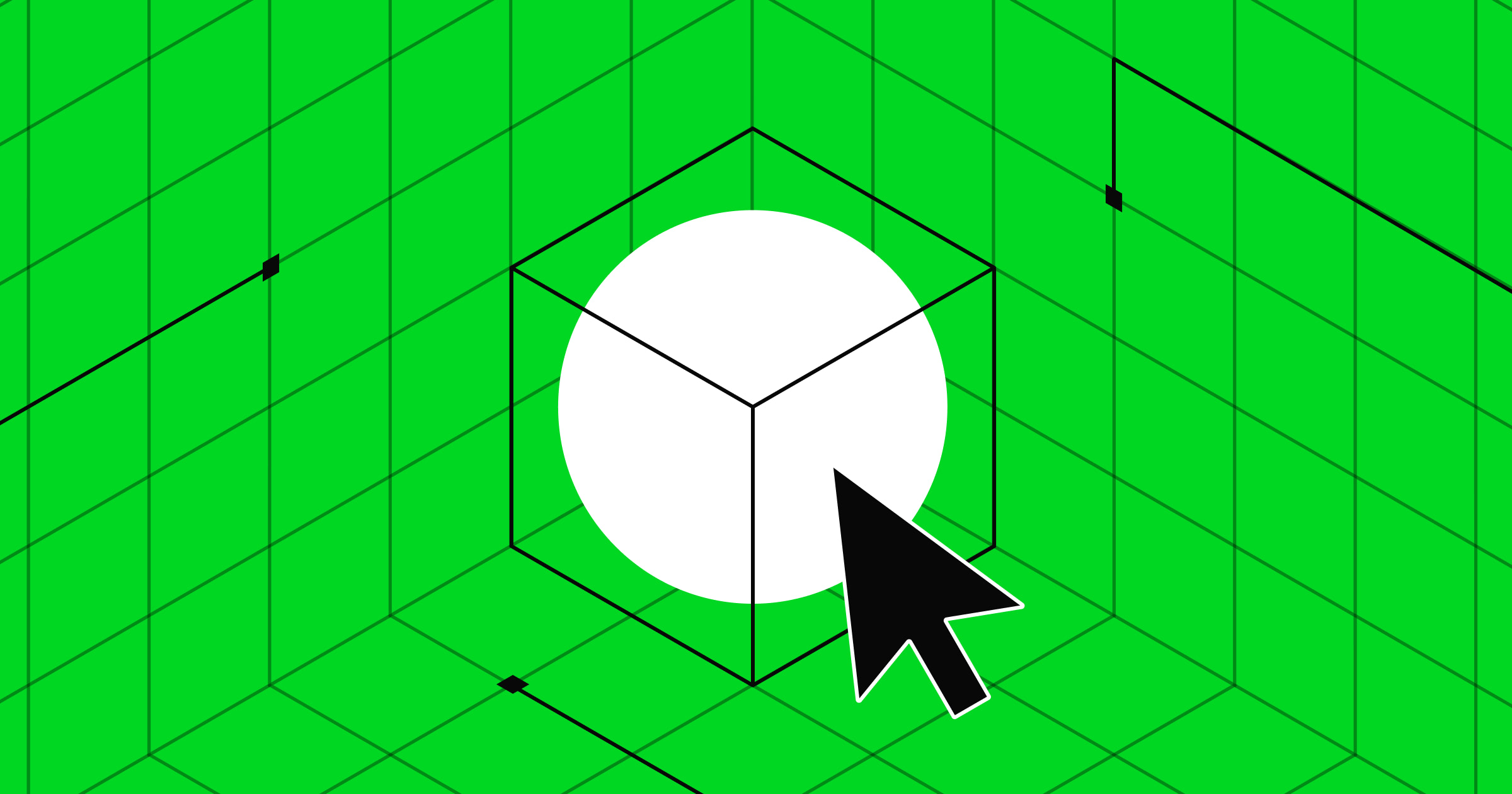
- 3D models or product viewers. These objects let users rotate, zoom in and out, and view them from different angles.
- Layered animations. When elements move at different speeds, they create an illusion of depth — similar to parallax scrolling — that responds to cursor movement or scrolling.
- Lighting and shading effects. These visual cues make buttons, user interface (UI) cards, or illustrations appear elevated, often with subtle shadows behind or between them.
- 3D typography. Similar to layered elements, 3D typography consists of text elements with shadows, bevels, or motion effects that give them weight and form, as if they’re physically raised from the page.
- Perspective transitions. Certain page interactions mimic camera movements or spatial shifts — like you’d see in a movie — to add a lifelike, cinematic feel.
Why you should consider using 3D design on your website
While 3D design elements are visually striking, they can also strategically influence how people engage with your website. Here’s why they’re worth considering.
- Quickly grab attention. Naturally, 3D visuals stand out against flat, minimalist websites. Their depth and motion add contrast that catches the eye, helping your site make a strong first impression and encouraging visitors to stay and explore.
- Boost engagement. Interactive 3D elements invite people to explore and click, turning passive visitors into active participants who often move toward conversion faster.
- Improve storytelling. Three-dimensional websites let you illustrate complex ideas, products, or services in a more immersive way. These elements simulate real-world environments, making your designs feel more natural and familiar than their 2D counterparts.
- Design without code. With tools like Webflow, you can add 3D effects without relying on third-party developers to code. Regardless of technical expertise, any designer can build high-quality sites that satisfy and convert.
- Showcase creativity. Using 3D components helps position your brand as modern and innovative. It tells people you prioritize a user experience that’s more memorable than static alternatives.
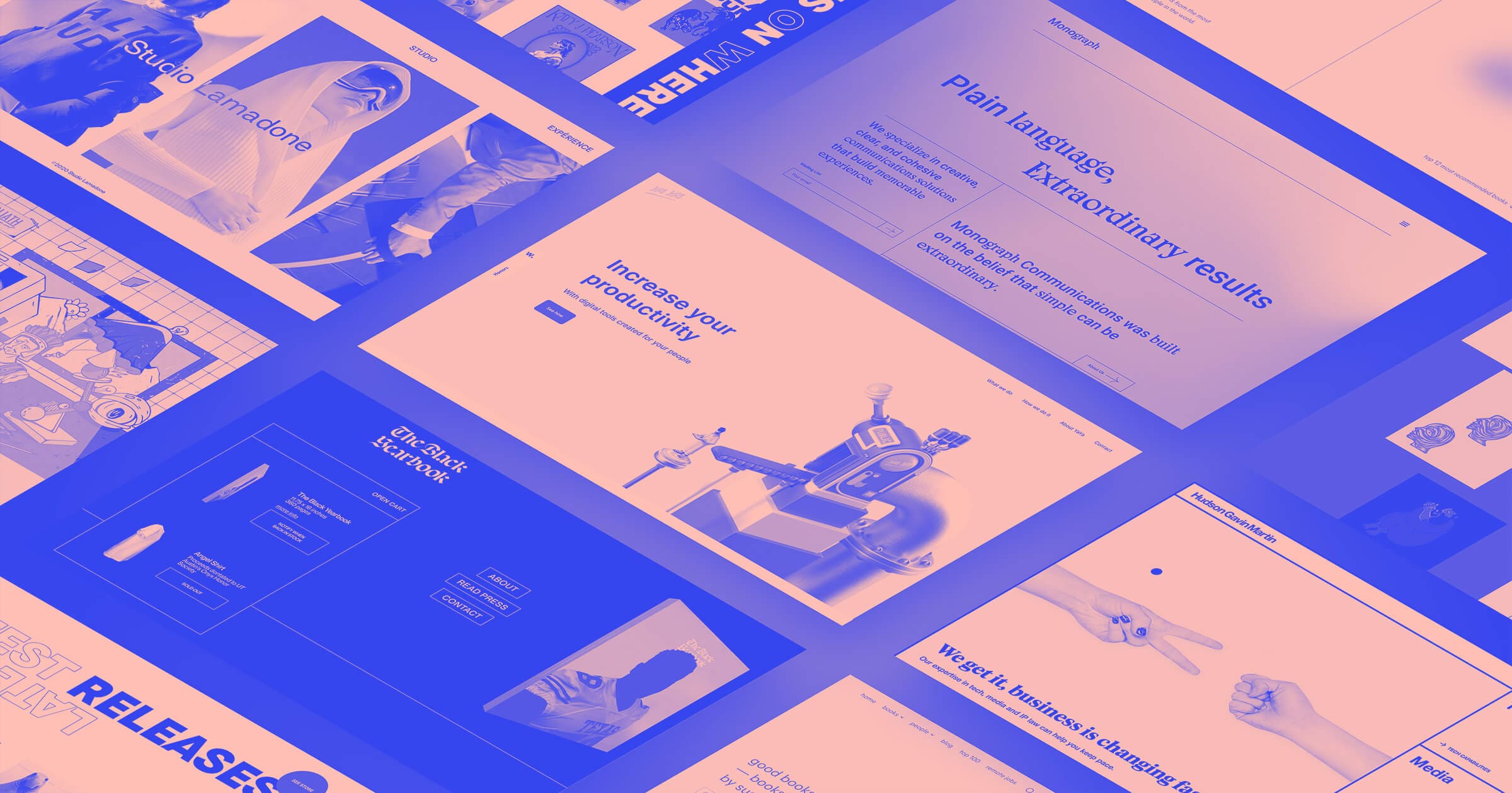
6 inspiring 3D website examples
Here are six websites that showcase the range of what 3D web design can do. Some use gentle, glass-like accents, while others lean into bold, cinematic transitions that transform the browsing experience. Together, these examples highlight how 3D elements guide visitors through a story and bring modern design principles to life.
1. Anyone Events
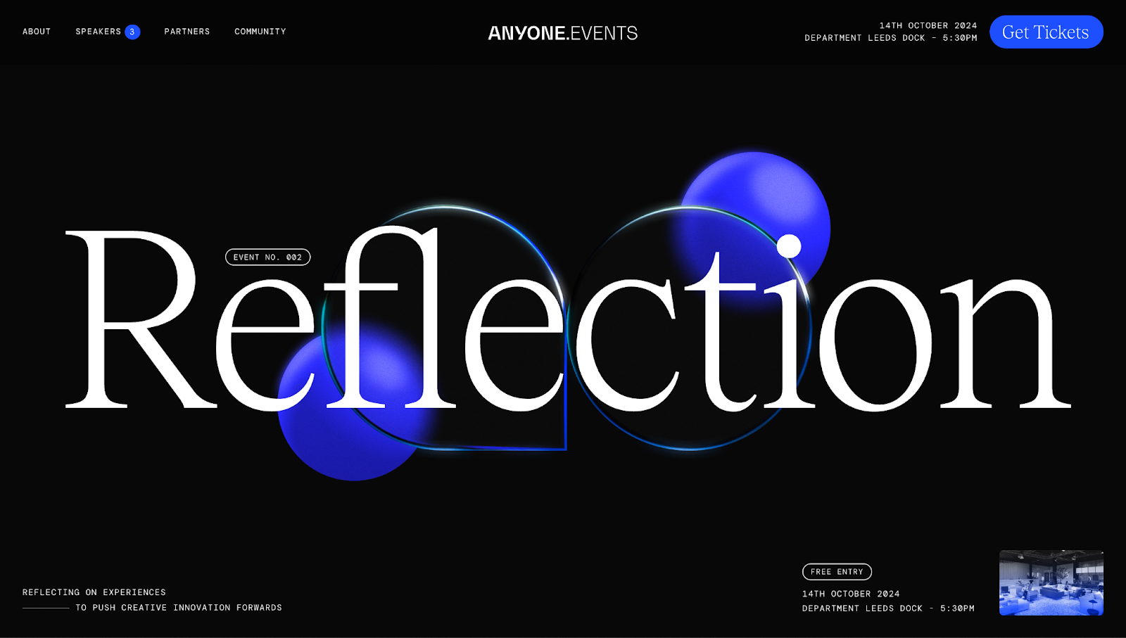
On the Anyone Events website, designer Nathan Clark uses floating, abstract 3D shapes in the header to add depth to an otherwise minimal layout. The shapes respond to scrolling behavior, creating an intentional visual rhythm that guides visitors down the page without distracting from the text.
As you move through each section, the shapes fade in and out, acting as soft transitions that frame the content in a way that’s immersive and dynamic.
2. Fintech Studio
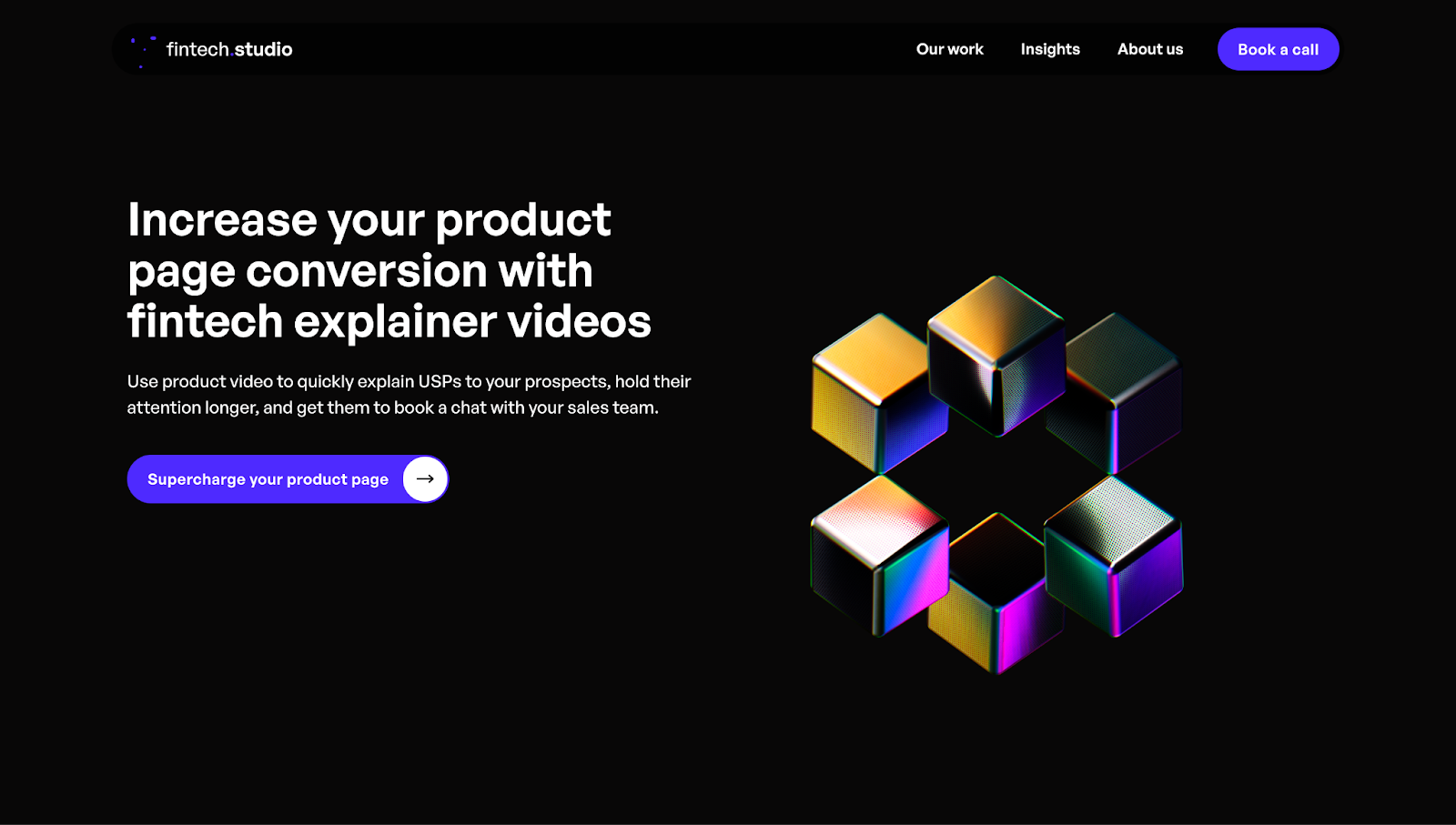
The 3D cubes in Fintech Studio’s hero section react to cursor movement, making the page feel responsive from the first interaction. It also builds curiosity, encouraging you to move about.
Midway down the page, stacked UI cards neatly organize a large amount of information, while soft shadows add depth and keep the section visually balanced. In the footer, designer Purple Banana uses another 3D touch — a flowing wave of dots — to close the experience with movement without competing with the calls to action (CTAs).
3. Surfaceflow
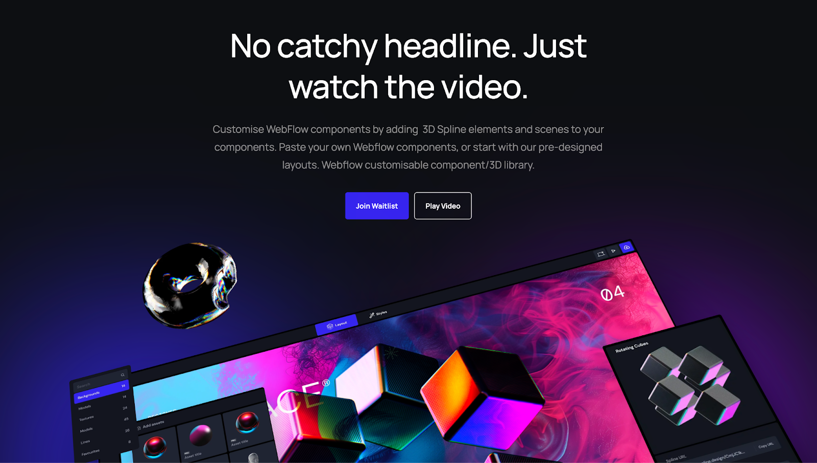
Surfaceflow cleverly blurs the line between product demo and marketing website. Instead of describing its 3D design tools, the site acts as a working preview. Rotating 3D cubes, UI cards, menu selections, and real-time 3D assets create the feeling that you’re already inside the platform.
This live-preview approach builds trust faster than text-heavy static screenshots because it gives potential customers a direct sense of the platform’s capabilities. It uses interaction — not words — to show what Surfaceflow can do.
4. Healthy Together
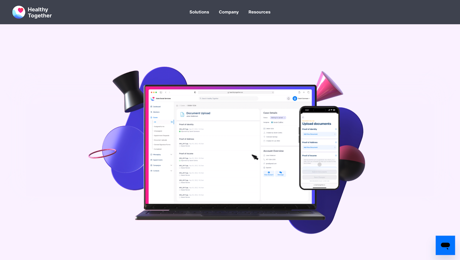
Healthy Together features 3D mockups that visually elevate what would otherwise be a conventional software-as-a-service (SaaS) layout. Instead of flat screenshots, designer Devin Fountain uses playful abstract shapes that introduce motion, depth, and contrast that make a lasting impact — without pulling attention away from the product UI.
The 3D elements show the tool in action and draw the viewer’s eye to key sections. Layered visuals break up text-heavy areas and make transitions between sections smoother. They also make traditionally monotonous sections, like footers, more dynamic and noticeable.


Build a better site experience
In our ebook, learn how to approach your next website redesign — from collaboration and trust-building to finding the right tools.
5. Arqitel
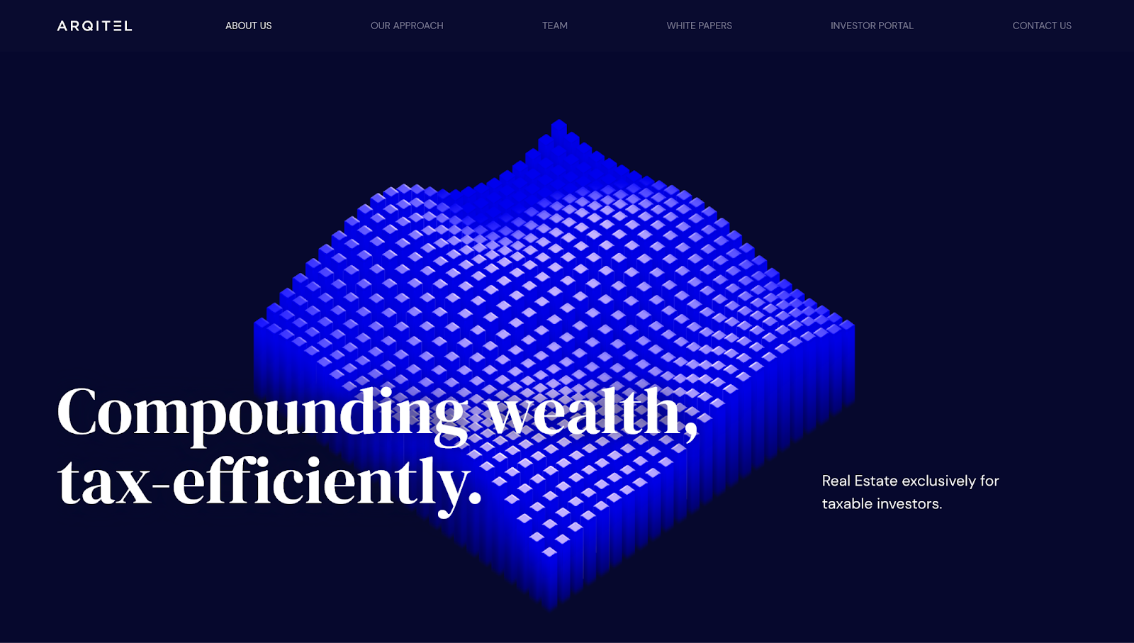
Arqitel’s site combines 3D model viewers with a strong narrative approach. Instead of switching between static charts and text, designer Refokus uses a single evolving grid that morphs in real time from a textured data landscape into a bar graph, then a map of the United States, and finally into a cityscape of buildings.
Each transition mirrors the company’s messaging about data, geography, and real estate, without breaking flow. The effect is educational and cinematic. It helps you feel the narrative rather than just read it, making complex concepts like “tax-efficient compounding” easier to understand.
6. NeoCultural Couture
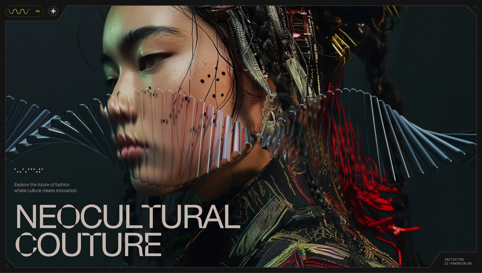
NeoCultural Couture’s site, designed by Jordan Gilroy, has two bold, interactive 3D elements: a rotating DNA-like helix and a gyroscopic star encased in concentric, luminous rings. The layered effect feels like peering through multiple screens to view the subject — a model in avant-garde, Asian-inspired attire.
These elements give the site a futuristic tone that reflects the brand’s positioning as culturally rooted yet modern and willing to push the boundaries of fashion. The encased star responds to cursor movement, turning basic scrolling and hovering into a more active, participatory experience.
4 ways to use 3D elements on your website
Three-dimensional elements can completely change how people experience your website — when used thoughtfully and with purpose. Here are four ways to bring 3D web design principles into your site effectively.
1. Show a product from a different perspective
Three-dimensional model viewers and animations add lifelike detail and interactivity that go beyond traditional static images. Because visitors can rotate, zoom, and view every angle of an item, the experience feels more tactile, almost like you’re examining it in the real world. They work well for ecommerce sites, tech products, or anything with physical design value.
Add a 3D viewer directly on your product page to highlight that value. You can create animations directly within Webflow and adjust actions depending on user interaction. But be sure to optimize your 3D assets and preload animations to minimize loading time.
2. Add dynamic images to show movement
Dynamic 3D visuals capture more attention than 2D components because they add depth and a sense of motion. Even subtle shifts — like 3D-rendered elements that react to scrolling or cursor movement — can make a page feel more interactive without overwhelming visitors.
In some cases, there’s no need to actively engage with an element. Simply scrolling up or down triggers movement, making the experience more engaging than static pictures.
For example, by replacing standard hero images with animated 3D illustrations, you can use layers, such as abstract art or UI cards, to create additional depth. With Webflow, you can animate movement so these elements react naturally to scroll or hover behavior.
But as with any dynamic 3D element, make sure the motion feels purposeful — it should enhance your storytelling, not distract from it.
3. Invent an imaginative and immersive portfolio
Portfolios are for showcasing creativity and attracting clients. With 3D elements, you can compose a narrative design that transcends traditional grid layouts and static thumbnails and text. The result feels like a guided tour of your best work.
To achieve this, frame your projects with scroll-triggered animations, layered scenes, or floating objects. You can also create a virtual gallery — a 3D space that visitors “walk” through — for a more immersive experience.
4. Incorporate parallax scrolling to create layered effects
Parallax scrolling is a visual effect where background elements on a webpage move more slowly than foreground elements as you scroll. It mimics depth perception, making a flat page feel layered and more dynamic. It ushers visitors naturally through content but doesn’t compromise navigation.
You can apply parallax effects to background images, content blocks, or illustrations. For the best results, emphasize transitions between sections to tell a story or highlight important information. However, don’t overdo it — parallax works best when it’s subtle enough to complement rather than dominate.
Create designs that move with a 3D website
Going from 2D to 3D instantly upgrades your website. Whether you’re showcasing a product, building a portfolio, or trying a different approach to minimalist-heavy design trends, 3D elements add depth to your site’s interactions.
With Webflow, you don’t need technical expertise to design in 3D. You can build, animate, and launch a fully interactive experience that feels alive from the moment visitors arrive.

Get started for free
Create custom, scalable websites — without writing code. Start building in Webflow.