


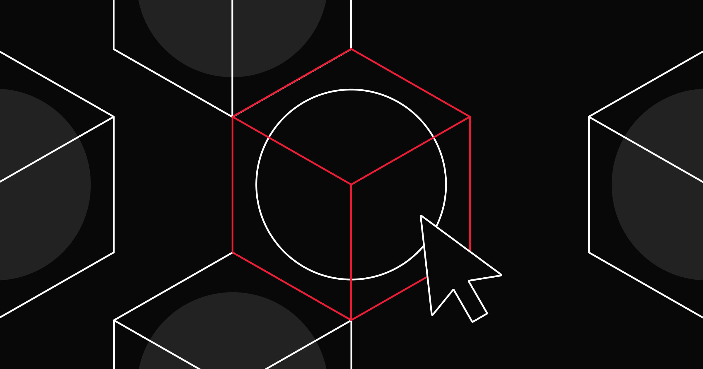
In the ever-evolving world of digital design, icons play a crucial role in enhancing user experience and visual consistency.
At Webflow, we recently embarked on a rebrand and redesign of our product, focusing on refining every detail. Understanding the significance of these tiny yet powerful elements, we took a meticulous approach to revamp our iconography.
In this blog post, I’m sharing an exclusive look behind the scenes at the design process of our new icon set. As a product designer who has meticulously designed over 800 icons, I’m going to delve into the considerations, challenges, and creative decisions that shaped our refreshed visual language. From achieving pixel perfection to ensuring usability and clarity, read on to explore the art and craft of icon design at Webflow.
The process of designing the icons and key considerations
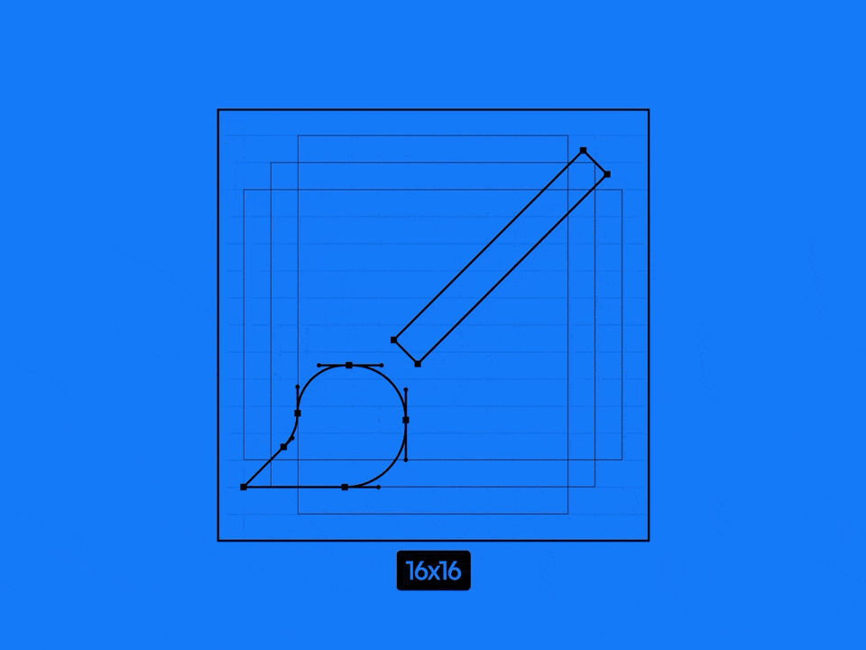
Our previous icon set spanned several sizes (12x12, 16x16, 20x20, 24x24… and so on) and these icons were mostly filled, too detailed, and sometimes featured multiple colors. With the new set, we aimed to simplify all of the icons as much as we could to improve readability and reduce the variance of sizes. We pared it down to:
- 16x16 for the majority of interface icons
- 24x24 for the icons on the left sidebar and the top bar
- 64x64 for the empty UI states
We also decided to go with the stroke approach rather than fill for a fresh new look and to present a cohesive style with our updated UI typography.
During this redesign, we had a few other considerations. One approach we explored was to use a more abstract style, making the icons less literal and more symbolic. However, this posed challenges in terms of immediate recognition and usability, especially for new users.
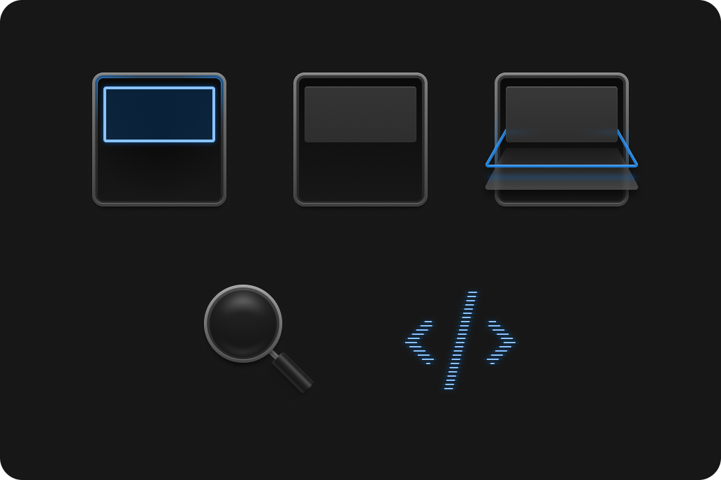
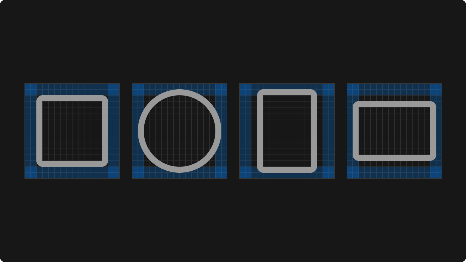
Instead, we focused on achieving pixel perfection and ensuring that each icon was sharp and clear, even in small sizes, which is critical given how our icons are used. When it comes to the cap and joints of strokes, we have followed a different approach — which would go on to become part of our signature style in our iconography. We have rounded corners on the outside while having sharp corners inside, as it’s displayed in the picture below.
The most fun icon to design
Our very well-known rocketship for the “publish” icon is really memorable. Publishing your site is one of the most exciting steps when building a website, so I wanted this icon to be really well-polished while also simple and cohesive with the rest of the icon library.
Infusing a sense of excitement and motion into a tiny icon was part of the fun. Designing it thoughtfully required bringing in symbolism that clearly captured the feeling of launching something new and exciting. The challenge lied in balancing the playful aspects of a rocketship while ensuring it remained clear and functional at small sizes.
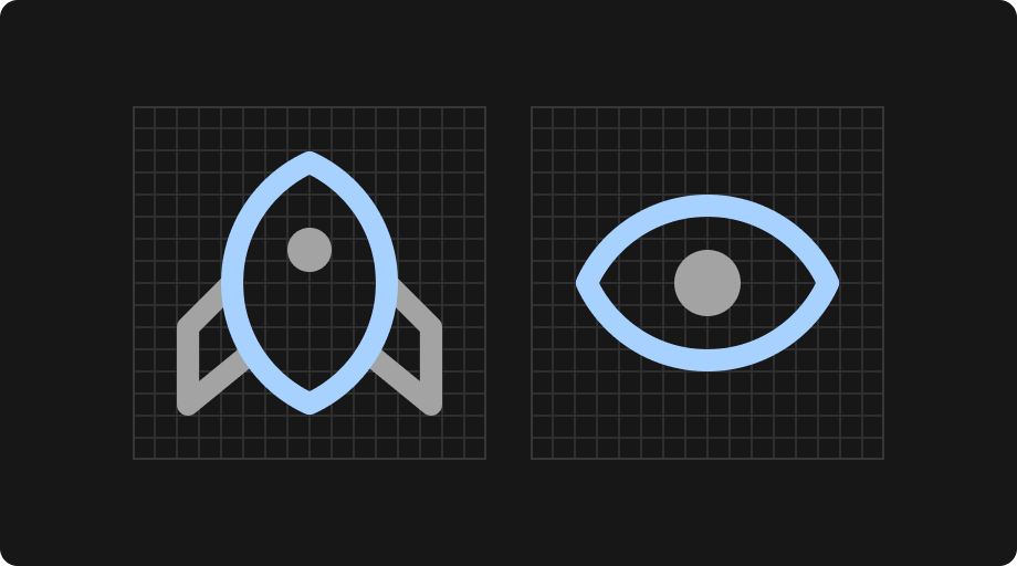
Communicating a complex concept with clarity
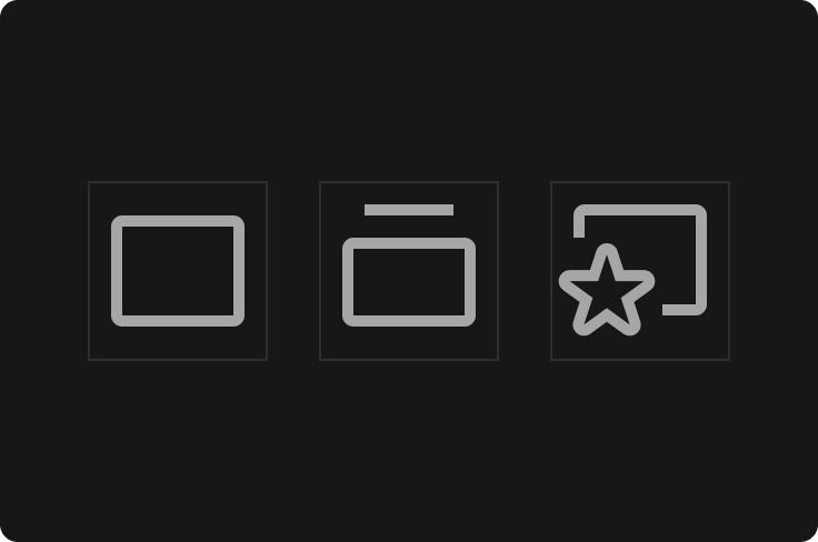
Our “site” icon is literally just a rectangle. Sometimes, the biggest challenge is resisting overcomplicating a design decision. A site can be anything, but it always starts with a blank slate, which is why we decided a simple 16x16 pixel icon would be the best decision.
The icons that required the most iterations
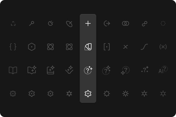
“Settings cog,” “AI help,” “data binding,” and “variable” icons are probably the ones that intimidated me the most during the design process. Our primary pain point was balancing the visual weight with other icons, making what it represented super clear, and trading off simplicity and clarity.
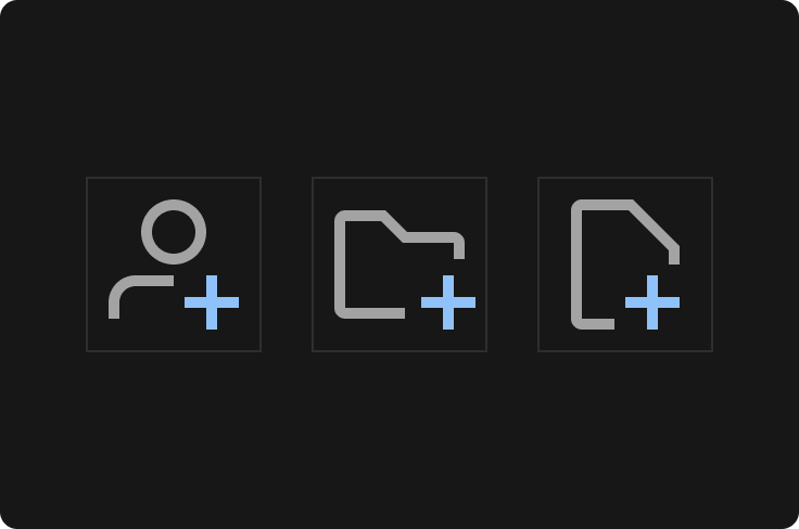
In the beginning, for example, we wanted the “data binding” icon to offer some level of differentiation from the rest of the icons. We wanted it to feel special and be more than a basic plus icon. Think Apple’s Command key symbol — how symbolic it is and how it creates its own meaning rather than depending on a real-life object.
After nearly 50 concept icons, we decided not to use any of them and kept using the plus icon. The iterations were necessary to ensure that each icon was intuitive and fit seamlessly into the overall design language of the product.


Evolving design systems
In our ebook, learn why experts are investing in scalable design systems and how they are thinking about the future of design systems.
Favorites that didn’t make it to the final version
I still like the concept of skeuomorphic “add panel” icons I designed. They matched our new components with depth and shadows, but at the end of the day, they were hard to iterate and understand at a quick glance.
These skeuomorphic designs related closely to other parts of the UI like buttons with complex shadows, aiming to create a more tactile and engaging user experience. However, the complexity often made them less clear and made it more challenging to maintain consistency across the icon set.
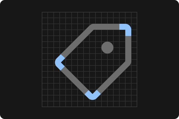
Making sure icons worked together as a set
The overall shape of an icon can vary from a circle to a square or from a tall rectangle to a wide one. Always start with the following keylines so all icons have the same visual weight. Also, reusing some of the same elements across the set — such as same arrow sizes and other common patterns like plus, cross, and edit-pen — creates consistency.
I achieved consistency by constantly visually examining the icons together and adjusting overall shape, stroke thickness, rounded corners, and hard ends. This meticulous attention to detail ensured that despite the variety of icons, they all felt like part of a cohesive set.
Technical considerations I kept in mind when designing icons
Pixel perfection
Making sure icons are readable due to their tiny 16x16px sizing.
Transparency
Some of our icons use transparency. You should only use transparency if it's necessary and shouldn’t use more than 2 shades. Transparent parts have use the same “text/active” variable color token so the icon works in our codebase.
Color
By default, icon color should be set to "text/active” variable color token. It’s a very rare case for us to have multiple colors in our icons, but don’t use it unless it’s necessary.
Naming
Make sure you name your layers as “icon” and flatten/union all the same colored paths before you publish. This process prevents any confusion when designers change the color of the icon (Figma overrides the styling only when layer names are matching).
Tips for designers who want to create a custom icon set for their product
If you’re getting ready to embark on your own exploration of icon design or prepping to create a custom icon set for a digital product UI, here are a few tips to keep in mind.
Use Figma’s “union” feature for clean code exports
When designing icons in Figma, leveraging the “Union” feature can significantly streamline your workflow. This tool helps you create clean and efficient code exports by merging multiple paths into a single, cohesive shape. This feature simplifies the design process and ensures your icons remain editable and customizable.
For instance, if you’re creating an icon set with various strokes and shapes, using “union” can help maintain consistency and reduce complexity when exporting SVG files for web use.
Develop principles to express your brand
Icons are a vital part of your brand’s visual language. Well-designed icons can communicate your brand’s personality and values more effectively. Creating a unique and cohesive icon set starts with establishing design principles that reflect your brand’s identity.
As you start designing your own cohesive icons, follow these tips:
- Define your style guide. Begin by outlining the visual characteristics that represent your brand. This includes the thickness of strokes, corner radii, color palette, and overall shapes. For example, Webflow chose a stroke-based approach with rounded corners on the outside and sharp corners inside to align with our updated UI typography.
- Create key icons first. Design the most distinctive or frequently used icons first to set a visual benchmark for the rest of the set. These could be icons that are core to your product’s functionality or those that embody your brand’s essence, such as a unique logo or a signature element. In our case, the “rocketship” icon for the publish function was designed with special attention to convey excitement and motion.
- Focus on pixel perfection. Achieve sharpness and clarity at small sizes, which is critical for interface icons. Ensure that each icon aligns perfectly with the pixel grid to avoid any blurriness or distortion.
- Engage in iterative design. Some icons may require multiple iterations to get right. Icons like the “settings cog” or “data binding” often need several rounds of adjustments to balance visual weight and clarity. It’s a process of trial and error to find the optimal design that fits seamlessly into the overall icon set.
By following these tips and principles, you can create a custom icon set that not only serves its functional purpose but also strengthens your brand identity and enhances user engagement. Whether you are a seasoned designer or just starting out, embracing these practices will help you create icons that are both visually appealing and highly functional.