Interactive websites provide an immersive, memorable user experience (UX) that keeps visitors coming back for more.
An interactive website engages your audience with animations, hover effects, and clickable visuals that encourage them to actively participate with your website design. Every scroll, click, and icon becomes part of the experience, immersing users in your content and leaving a lasting impression.
Building interactivity into your website requires a little creativity, so you’ll need a powerful platform like Webflow that supports effects such as parallax scrolling, dynamic content, and hover animations. You’ll also want some fully interactive models to draw inspiration from.
In this guide, we’ll provide 12 examples of engaging interactive websites that impress and inform.
12 engaging interactive website examples
To get visitors to interact with your website, it helps to start with eye-catching visuals and a clear user experience. The following are 12 website examples that take advantage of some of the interactive design features Webflow offers.
1. Weglot Like Magic!
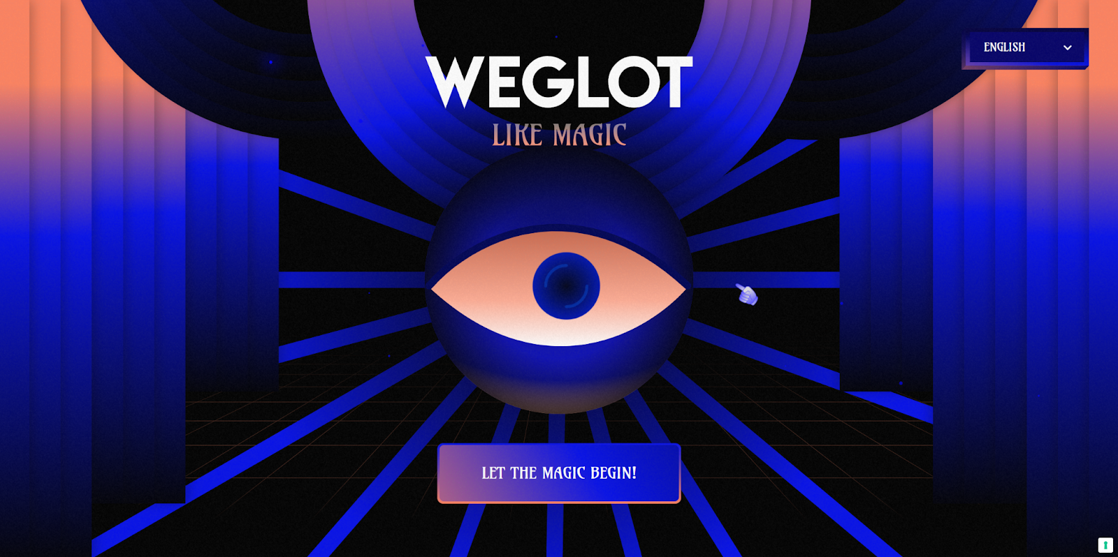
Weglot Like Magic! is an interactive website from web design studio Refokus that showcases the power of the Weglot translation platform with a quick trivia game. The colorful, eye-popping homepage is impressive enough to warrant an immediate click, which leads to an interactive page where users try to match words with their meanings. The end node directs users to the Weglot website, capitalizing on audience engagement and driving conversions.
2. AKARI
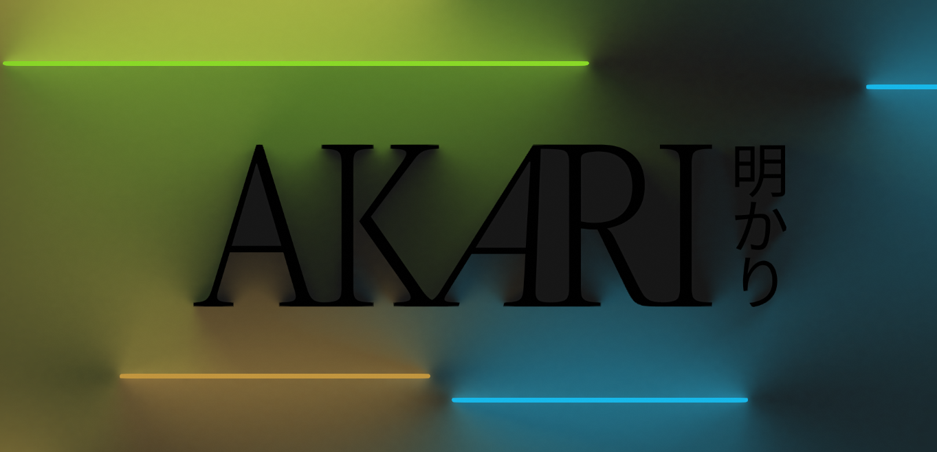
AKARI is a 2D light tracing website by Lusion that showcases experiments with light, shadow, and color blending. It uses a jump flooding algorithm to generate the distance field for 2D ray marching and responds to user inputs to shift and warp the display. The experiment includes multiple visuals and mini games for the user to play with.
It’s a great example to follow if you want a fun, user-centric interactive website that showcases advanced algorithmic technology.
3. A Tiny Adventure
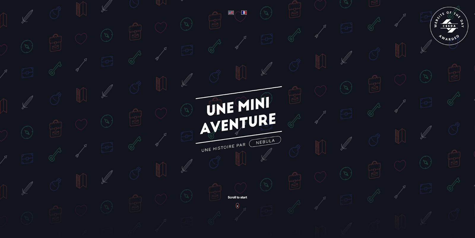
A Tiny Adventure is a storytelling website about Gus, a person who has a remarkable encounter with a mythical creature in a forest. The primary interactive element of this website is the scroll-enabled navigation, which allows users to advance Gus as he walks through the forest to reach his goals, tripping over stones and drinking potions along the way.
Designer Pierre-Louis makes other interactive websites as well, all of which feature animated interactions and scroll effects. Elements like this showcase Pierre-Louis’s web design skills in a neat, engaging experience that visitors will remember when they need a designer for their next project.
4. Super Valdis
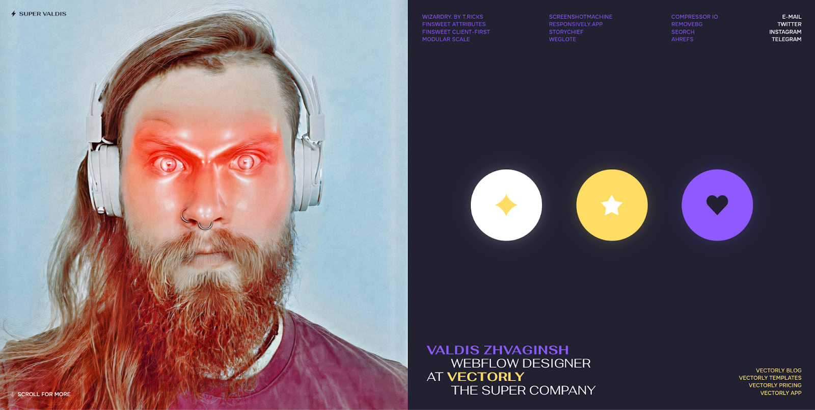
Super Valdis is Valdis Zhvaginsh’s interactive portfolio website. It’s all on a single homepage, and scrolling through it shows a few case studies of Valdis’ work. Hovering over one of the three buttons on the side changes the pictures at the top and bottom. The images and scroll effects are bold and encourage the users to navigate to each section of the page, and the consistent color scheme of the navigation menu brings everything together.
If you’re light on content or just want a small website, follow Valdis’ example by sprinkling in a few engaging animations and subtle interactions to really make your content come alive.
5. Rose Island
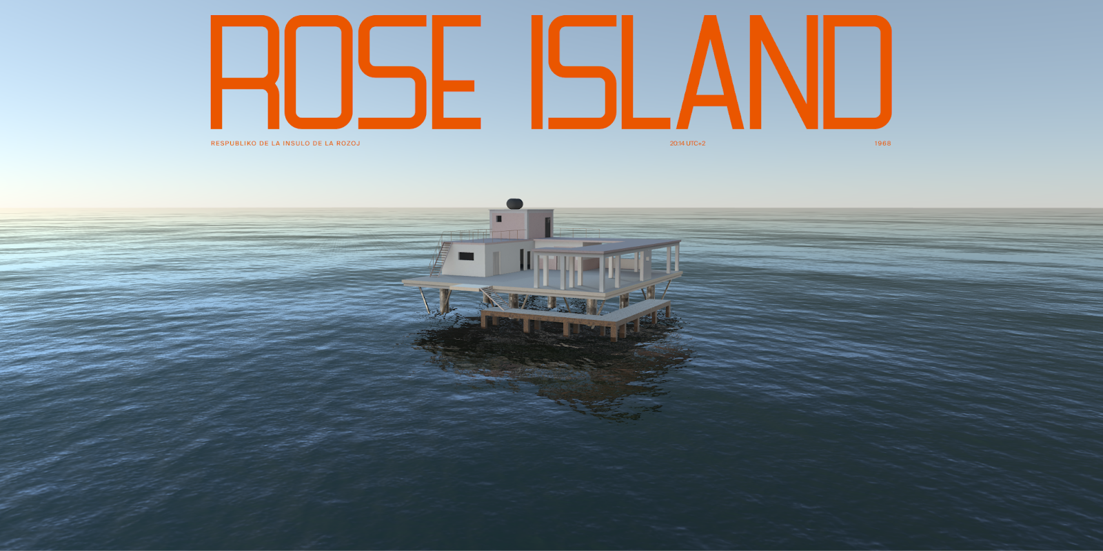
Rose Island was a short-lived micro-nation built by Giorgio Rosa in 1967. He built it just outside Italy’s international waters to create a place celebrating independence and freedom. After several rumors circulated about what went on there, the Italian navy destroyed it in 1969.
This website aims to capture the history of Rose Island and publicize the Netflix movie of the same name. It starts with a 3D animation that zooms in as you scroll, and the rest of the page uses parallax scrolling and subtle animations to tell the story. It’s a perfect example of scrollytelling, in which you tell a story over the course of one long page — a great web design method to encourage visitors to continue all the way to the bottom.
6. OFF+BRAND
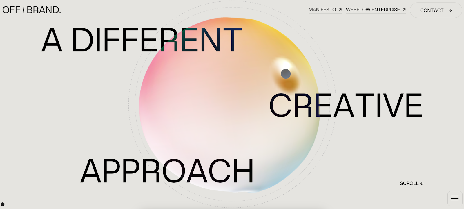
OFF+BRAND is a brand design agency specializing in avant-garde web design. Their interactive website features several hover animations and a playful, colorful orb that follows you through most of the homepage. This level of immersion gives visitors something to shake, poke, and rotate as they move through the site. If users navigate away from the tab that the OFF+BRAND site is on, a custom “We miss you 🙁” message pops up on the tab label, reminding users to not forget their new orb friend.
To get the same effect in your website design, pick a logo or avatar you can add interactivity to. Then, give it a personality; it’ll become a familiar companion as your audience navigates your website.
7. Niccolò Miranda
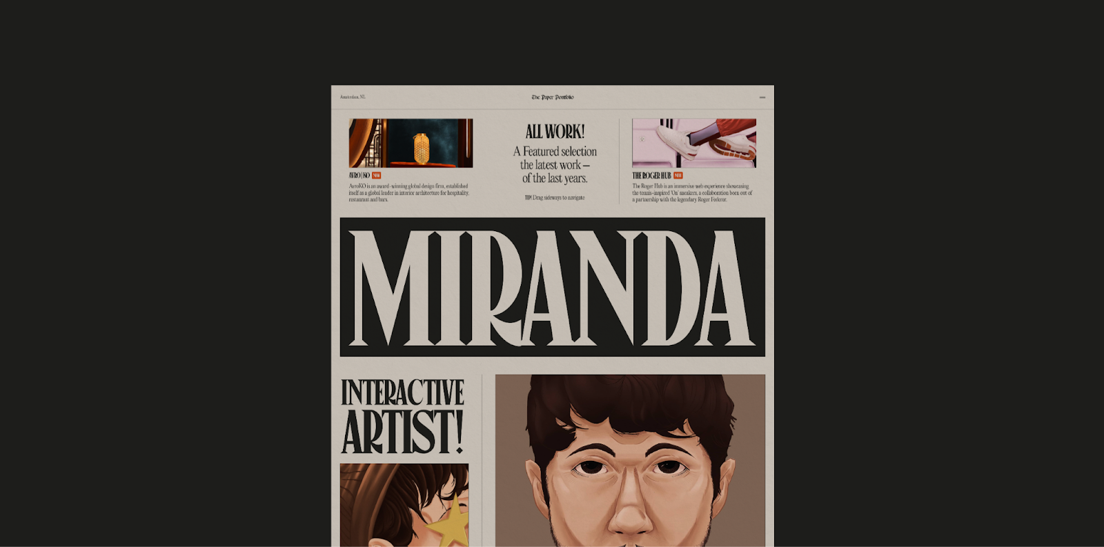
Niccolò Miranda’s portfolio mimics a newspaper layout, with big, block letters and striking images. There are a few rows you can scroll manually and interactive cards to explore, but Niccolò Miranda went light on the effects in favor of a more formal look. A few subtle hover animations break up the static layout of the paper, and that light-touch approach to interactivity makes this portfolio a great example of balancing form and function.


Build websites that get results.
Build visually, publish instantly, and scale safely and quickly — without writing a line of code. All with Webflow's website experience platform.
8. Chrono
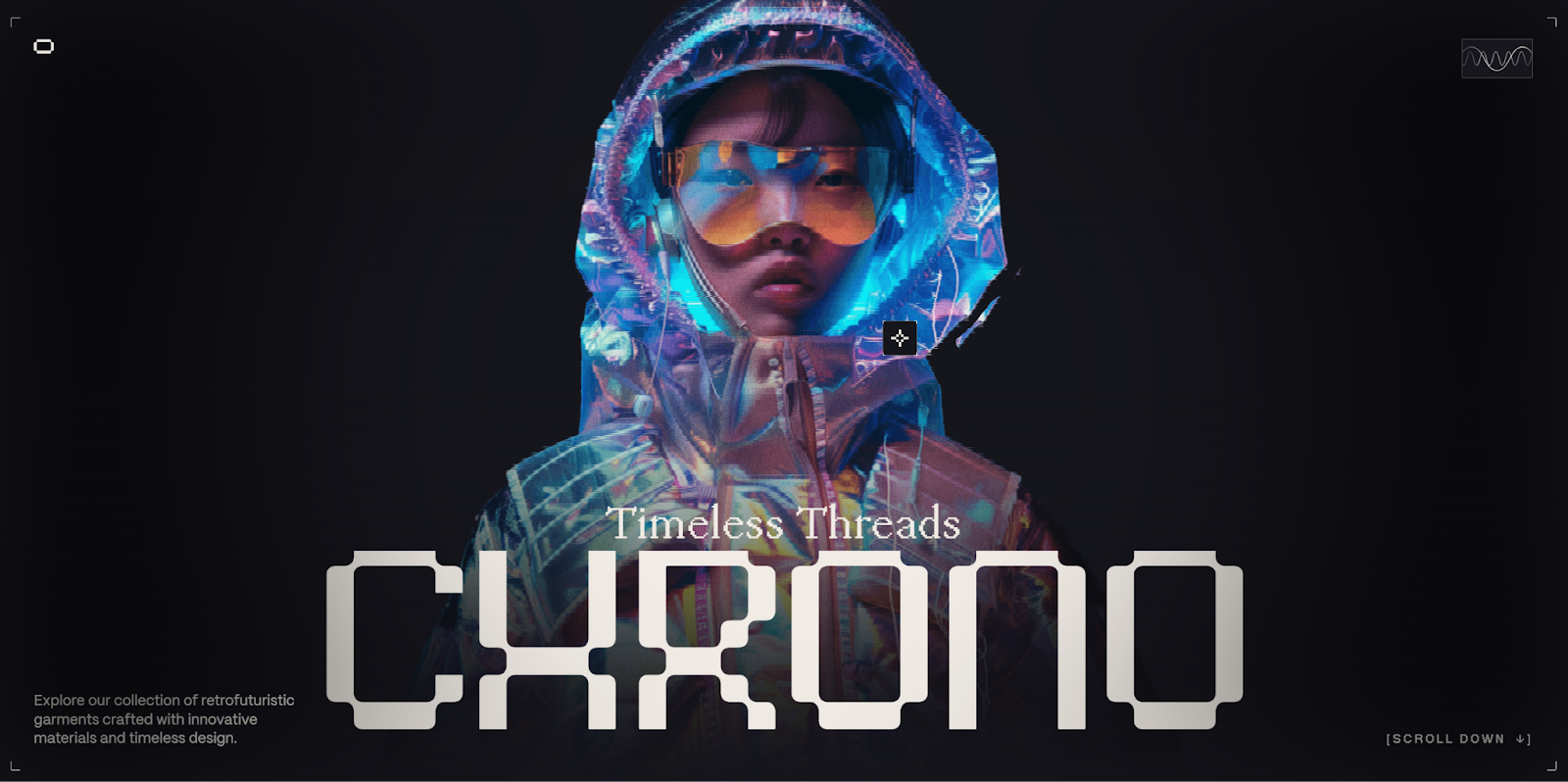
Chrono is an interactive website designed by Matteo Donini while attending Niccolò Miranda’s “Awwwards” MasterClass. It’s jam-packed with interactivity, like cursor-detecting animations, scroll effects, and clickable elements. There’s even music that makes the user experience extra immersive and engaging.
9. Three Dimensions
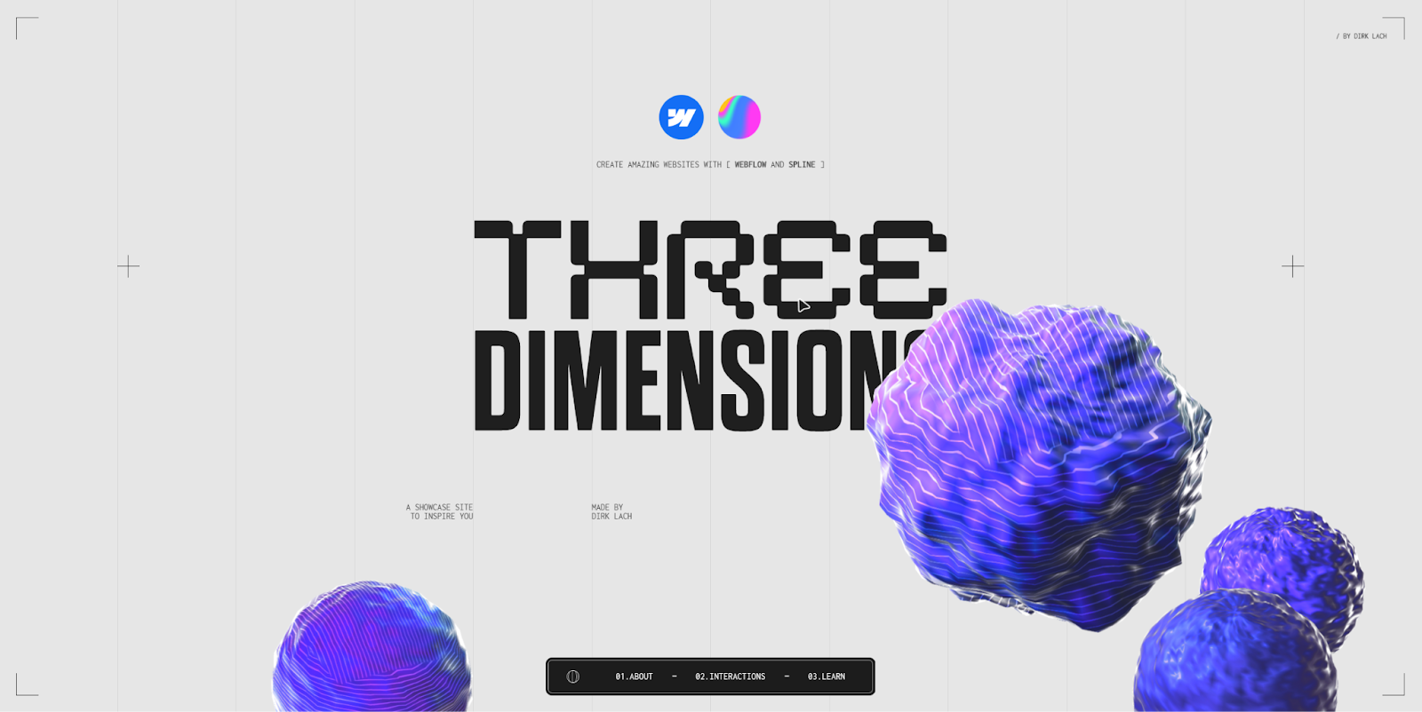
The Three Dimensions website by Dirk Lach showcases how Webflow designers can leverage Spline to create incredible 3D effects on webpages. It’s a remarkable tech demo website that keeps visitors immersed with cursor-sensitive effects, parallax scrolling, and impressive animations. If your intent is to amaze site visitors, let this website inspire you to think outside the box.
10. Kaloyan Madzhunov
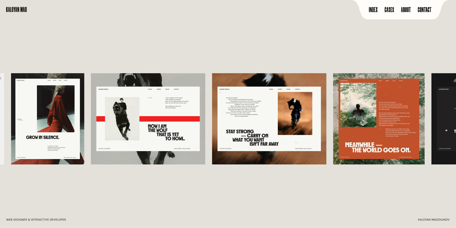
Kaloyan Madzhunov is a web designer specializing in interactive designs that keep visitors engaged. Like any good portfolio website, scrolling through it presents you with case studies, awards, and a bit about the creator. Every frame is enhanced with interactive elements like hover effects and responsive visuals. If you’re building a portfolio website, let Kaloyan’s provide some ideas about how to make it visually stunning and immersive.
11. Mama Joyce Peppa Sauce

The Mama Joyce Peppa Sauce website is full of bold flavor, just like the hot sauce it advertises. Site visitors will enjoy fun animations, cursor effects, and a very bold layout that shifts as you scroll. Much of the screen space is used to tell the story of Mama Joyce, the original creator of this bold recipe — which is a nice way to connect with your audience. And the “Buy now” call to action shows up constantly to remind you of your best next move.
12. Attentive’s holiday marketing reboot page
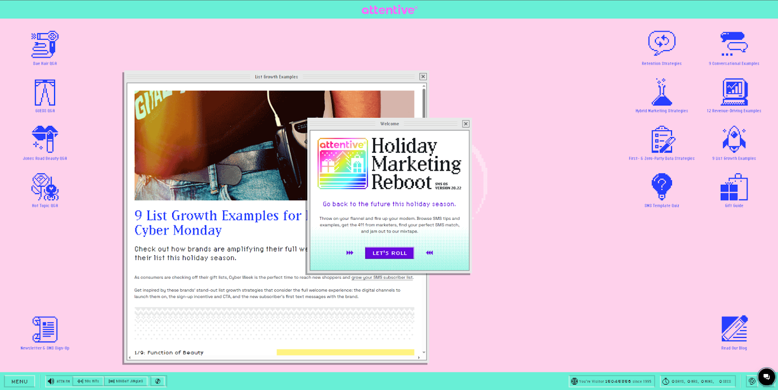
The Attentive holiday marketing reboot page begins with a loading bar that, once complete, shows a retro desktop with some windows already open. Visitors can’t just scroll through it — they must interact by clicking icons on the desktop or opening the menu at the bottom. Some windows are already open, hinting at what the visitor should do next, which is a smart way to encourage them to stay on the site to play around with various options.
Benefits of interactive web design
Interactive websites are more challenging to make than standard, predictable website layouts, but if you can manage it, they offer several unique benefits:
- More opportunities for creativity. Interactive design offers several ways to make your website stand out from the crowd, such as unique navigation menus, animations, and scroll effects.
- A memorable user experience. Potential clients will likely remember a website that gives them an immersive, engaging experience. So if they’re ever looking for a site designer or developer, it’s more likely your page and offering will come up.
- Storytelling potential. With more options for motion, animation, and scroll direction, you can tell a unique, interactive story that engages your audience. Characters can come alive with interactive elements that allow users to imagine themselves in their place.
Build interactive websites with Webflow
Creating effective interactive websites means designing experiences that feel dynamic and engaging while keeping the site intuitive to use. Whether you’re using hover states and scroll-based animations or microinteractions and parallel effects, interactivity transforms a static layout into a living, breathing experience that keeps visitors on the page.
No matter your design proficiency level, Webflow enables you to build fun user journeys and engaging interactions, now with GSAP.
Whether you’re refining motion details or mapping out complex, multistep animations, Webflow offers tools that can amplify your design instincts (rather than replacing them).

Webflow Interactions with GSAP
Unlock visual-first motion development, a new horizontal timeline interface, reusable interactions, and more.


