Inspire visitors to book a trip with your web design.
Online travel agencies (OTAs) accommodate every travel need — last-minute deals, digital nomad destinations, remote tours, and more. It’s no wonder 41% of travelers prefer booking through them. And because travel rates have almost returned to pre-pandemic levels, travel websites are enjoying visits from wanderlust-consumed viewers again.
But not all travel agency websites are made equal. The best travel websites won’t just appear on search engines like Google and booking sites like Skyscanner or Expedia — they’ll inspire travelers and give them the information needed to book their next adventure.
5 of the best travel agency websites
People land on OTA sites with a purpose — to book something — be it tours, flights, or a hotel stay. The most effective travel websites use animations, graphics, and strategically-placed buttons to help visitors achieve this goal. They also make the most important information easy to find. They might list standard tour prices on the front page, for example, or provide FAQs about popular destinations.
Here are five of the best travel sites and why they work:
1. Know to Go

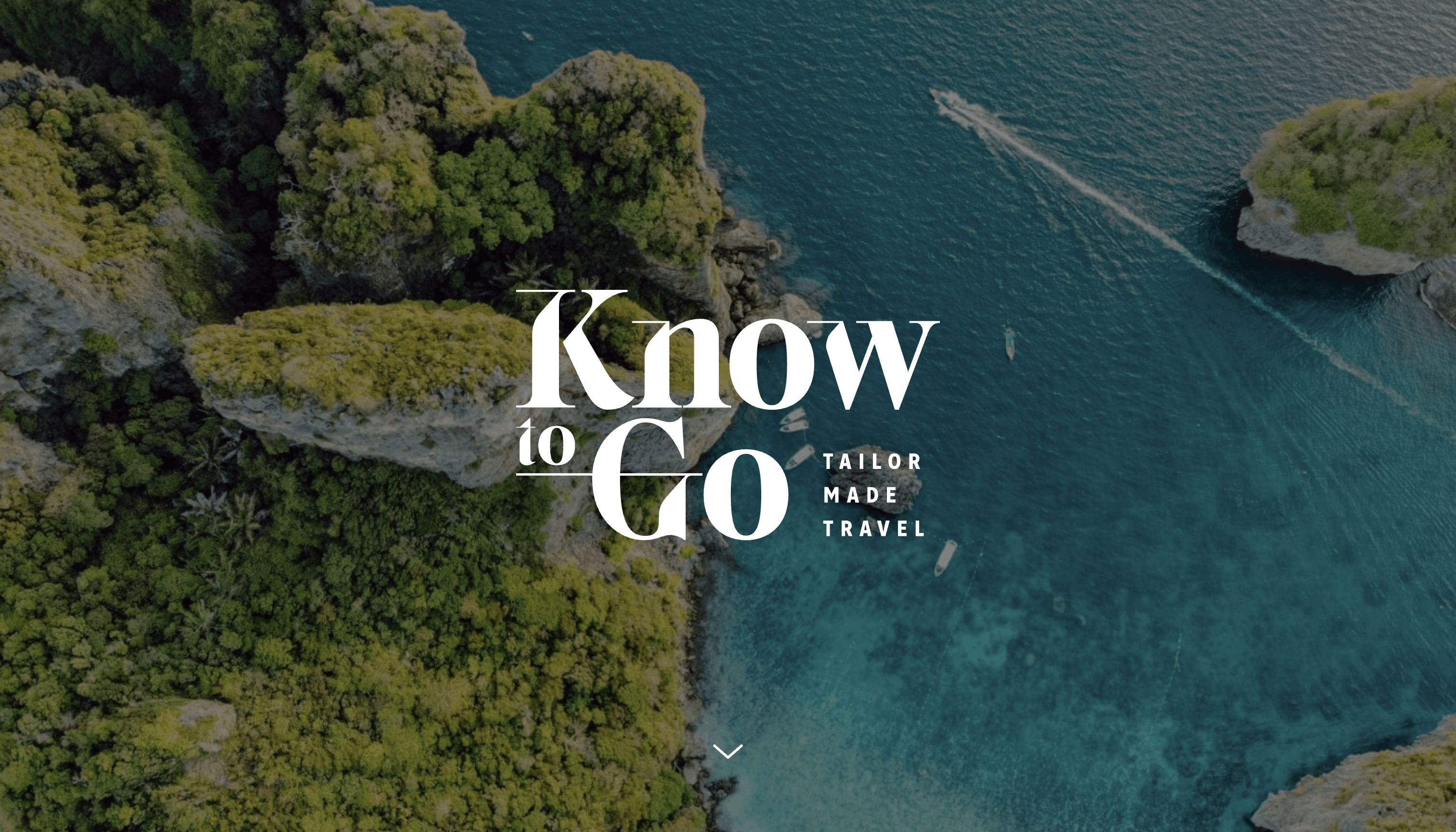
Know to Go’s site is a single landing page beginning with a full-screen top-down shot of green plants, gray rocks, and boats on bright blue water. This aerial shot resembles an airplane window view, inspiring visitors to book a trip to see similar sights and feel the excitement of arriving somewhere unfamiliar.
The company’s slogan is “Tailor Made Travel,” which expresses the agency’s philosophy: custom itineraries to meet everyone’s unique needs. No matter what your dream vacation is, Know to Go promises to make it a reality.
The agency doubles down on their philosophy when describing the Full Contact™ methodology: they do their utmost to deliver proximity (24-hour customer support), knowledge (in-depth location expertise), and competence (speedy, knowledgeable advice and responses) to ensure clients get the vacation they want.
A streamlined diagram outlines the methodology’s three pillars, making it more likely that those skimming the site notice them. The diagram grabs visitors’ attention and quickly and clearly communicates Know to Go’s expertise.
2. The Hidden Italy

The Hidden Italy offers unique tours in popular cities and hidden-gems across Italy. Their travel site web design is neat and clean, surrounding vibrant images of Italy with whitespace. Placing these images front-and-center on a white background makes colors really stand out conjuring up images of a dream vacation with all Italy has to offer. This might encourage conversions as visitors feel confident the site can deliver experiences that meet their needs.
The site’s navigation is also effective at inspiring viewers to book. The menu bar travels with the scroller so they can head to “Blog,” “Inspiration,” or “Destinations” whenever they like instead of having to search around for information. This increases the chance they’ll find details they need, or inspiring suggestions that’ll convince them to book a tour of Italy.


Get started for free
Create custom, scalable websites — without writing code. Start building in Webflow.
3. Bespoke Travel
![A screenshot of Bespoke Travel’s site showcasing an aerial shot of Las Vegas at night.]](https://cdn.prod.website-files.com/687e8d1b96312cc631cafec7/68c4895dbd697a9cb3882f5a_6421fcc7ed5d5849344944ab_641a14e5d97bd8e69ec95a72_Screenshot-of-Bespoke-Travels-site-aerial-shot-of-Las-Vegas-at-night_11zon.png)
Bespoke Travel offers luxury trips for every travel style — from leisure to corporate to honeymoons. This agency plays to travelers’ unique concerns. The term “bespoke” means “custom to the client,” and their slogan, “Made for you,” reiterates this philosophy. This instills confidence in the brand, keeping customers on the site by assuring them Bespoke Travel can plan the trip they want.
The unique CTAs across the site also stress to the reader that this OTA accommodates any travel concern. Phrases like “Start Your Adventure Today,” “We Can Get You There,” and “Give Us a Call to Realize Your Dream” accompany images of various destinations to encourage visitors to take the leap and book a trip. These fun and unique CTAs paired with their high-quality images also make luxury travel seem doable with Bespoke Travel’s help.
Bespoke Travel’s straightforward navigation and design show that excessive animations and interactions aren’t necessary to create an effective travel site. If executed correctly, good photography and creative copywriting go a long way.
4. Eratur

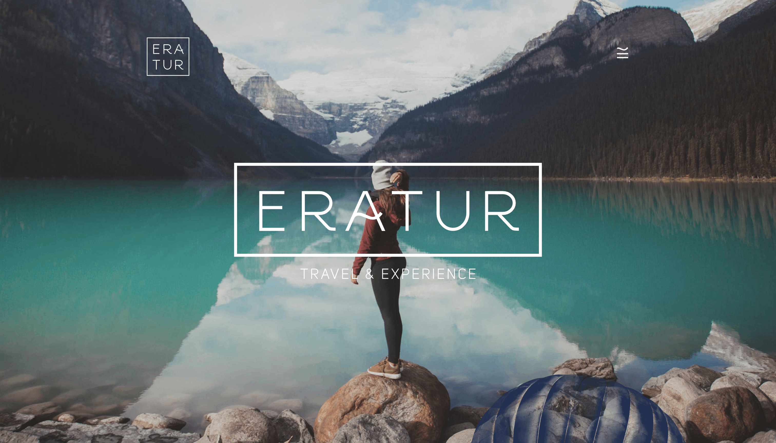
Eratur’s site combines modern design elements like clean, crisp lines and color blocking among whitespace to express their ability to meet modern-day travel needs. The emphasis on up-to-date design helps advertise a similar travel experience.
The site content appears and disappears as we scroll, and images have a parallax effect that shifts at a different speed than the background to immerse users in the site. The dynamic effect engrosses viewers in a new and beautiful scene before they even book their trip.
A vibrant color scheme including seafoam green, and mustard yellow mirror the atmosphere of certain images. Meanwhile, inspiring phrases like “When in doubt, travel” and “life is short, go explore!” stand out against white backgrounds.
Like Know to Go, Eratur stresses their customized travel packages in the website copy — but they take customization one step further by using the first copy block to express that users can choose every detail. This guaranteed freedom in choosing the details of a trip shows visitors that personalization defines this business.
5. Bosa Tours & Travel

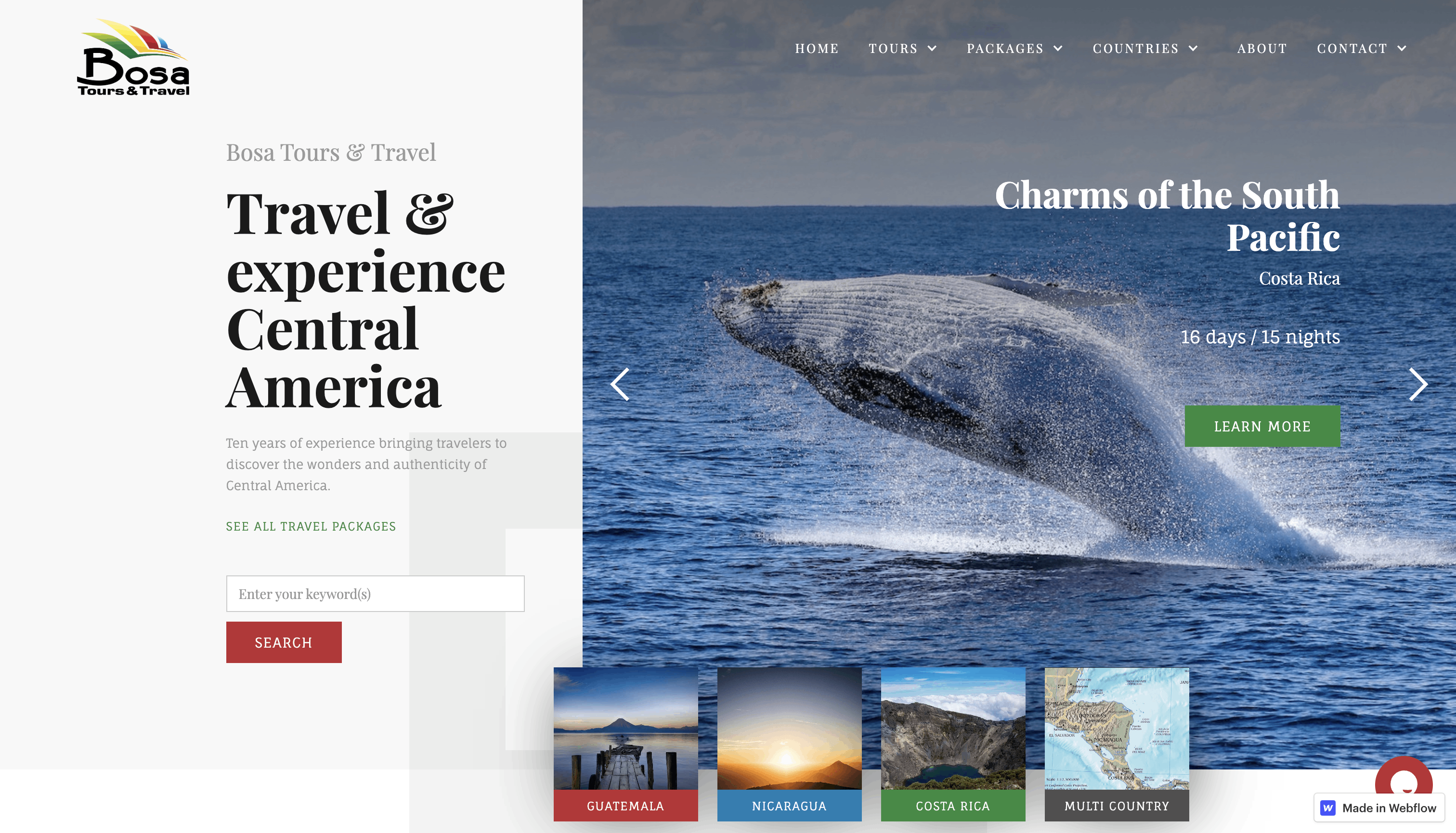
Bosa Tours & Travel offers Central American travel packages. They make this destination specialty clear early on with the header “Travel and experience Central America”This transparency instills trust in users that the company finds their time valuable and wants to ensure they get their dream trip.
This OTA uses a layered design — various elements such as text, graphics, and CTA buttons sit on top of each other. This creates a sense of depth so viewers feel immersed in the elements and are more inclined to connect this OTA’s travel options with their ideal vacation. It also means viewers see several travel-based images right away,inspiring viewers to book a trip. Plus, many things a visitor might want to click on are available immediately, increasing the chances they’ll stay on the website to explore instead of bouncing.
One of the most effective sections of Bosa’s website is their testimonials. Nearly 88% of users say reviews play a role in their purchasing decisions, making this an effective way to prove an agency’s value and increase conversions.
Like what you see? Do the same with Webflow
The travel industry is constantly evolving — websites can accommodate this by addressing user interests in their designs. The best travel planning websites inspire viewers and provide information they need to book their next trip. Check out our free resources to create an inspiring and effective travel site today.


