

Promoting a good cause begins with a stunning nonprofit website.
A website is one of the best ways to market a nonprofit, share its mission, and tell its story. A website serves as a platform to invite donors, sponsors, and volunteers to become involved with an organization bringing about positive change.
Through a charitable website, a nonprofit can reach beyond local advocates and connect with a larger audience. The more people who know about a nonprofit, the more potential donors it has. Plus, a sleek and professional website builds legitimacy and promotes trust in the brand.
The best nonprofit website designs provide visitors with simple instructions that point them toward contributing to the nonprofit's objectives, whether that’s through joining a program, volunteering, or making a donation. They also provide insight into the organization’s core values, past work, and current objectives.
No matter what the cause, a nonprofit can benefit from an excellent website. Whether you’re a professional designer or a complete beginner, we’ve compiled a list of five stunning nonprofit websites as inspiration for your next design. Let’s dive in.
5 nonprofit website designs to help better your cause
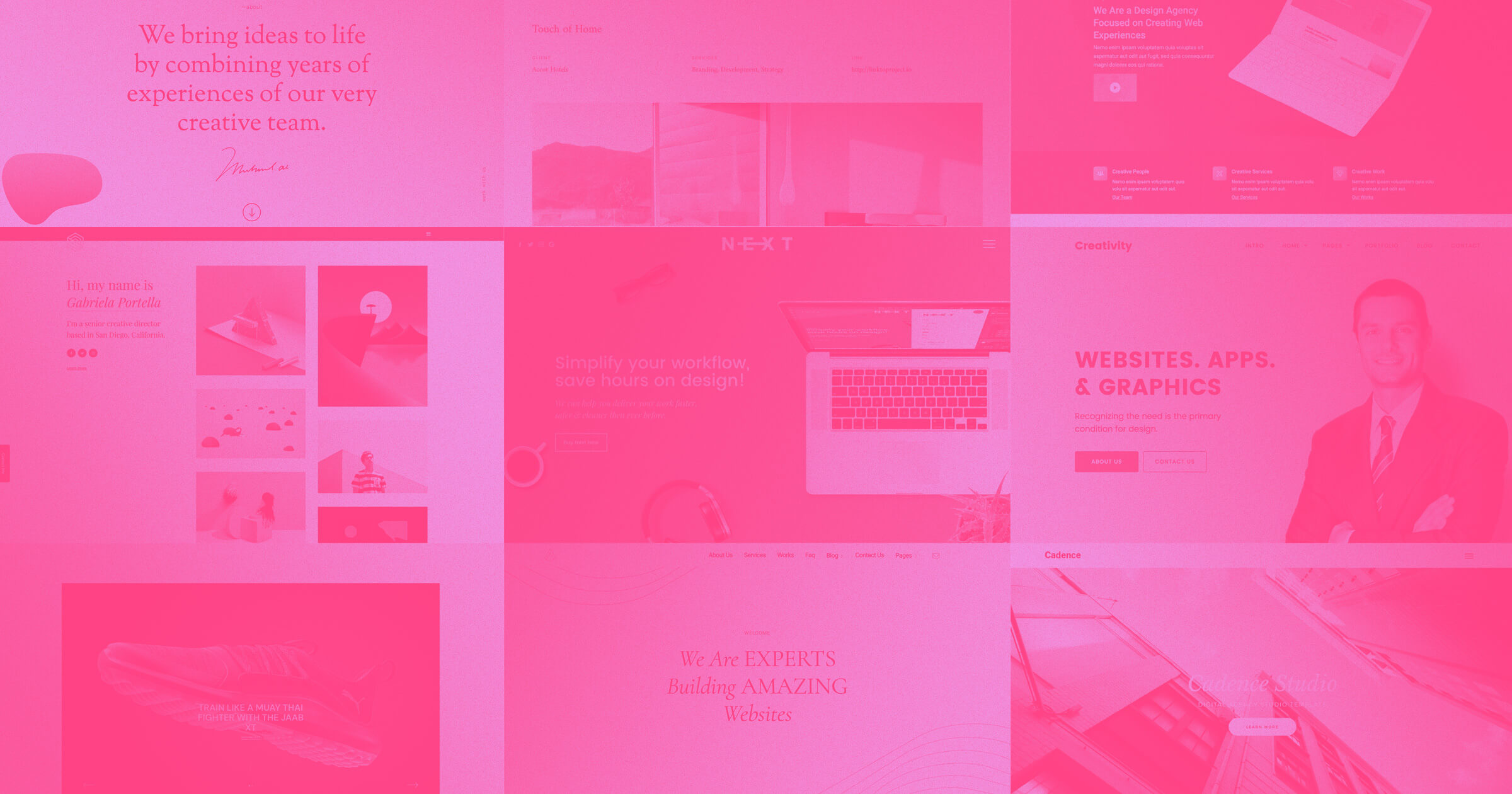
Every website on this list adheres to essential design elements — they're user-friendly, have aesthetic branding, and feature eye-catching graphic designs and typography. Most importantly, they're nonprofits with excellent causes. As you scroll, take note of the elements and design choices you wish to emulate in your own work.
1. Age of Union
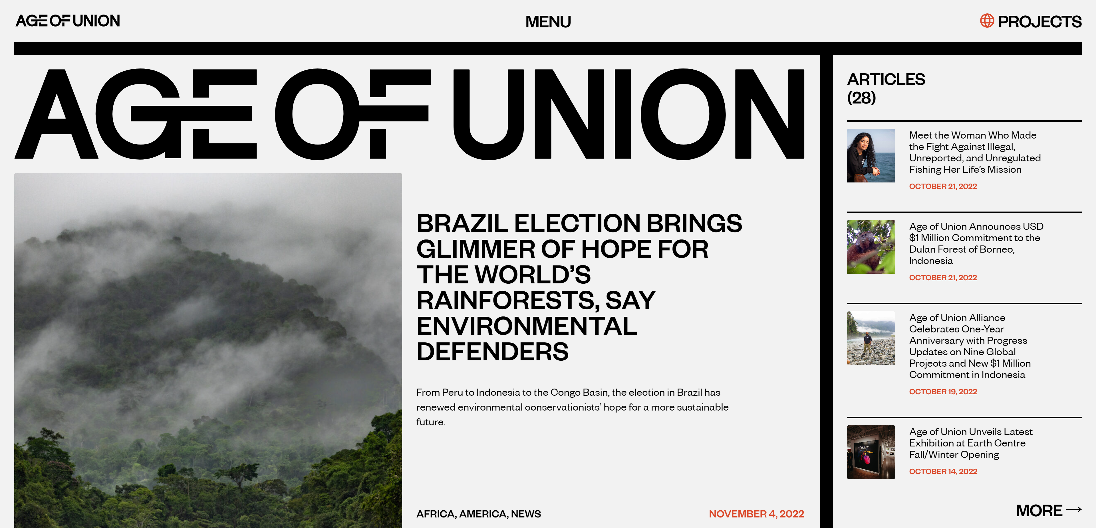
Age of Union is a nonprofit environmental alliance that promotes an international network of leaders working to safeguard the Earth's biodiversity.
The website follows a minimalist theme with sans serif fonts, clean lines, and lots of whitespace. It uses a consistent color palette of light gray, orange, and green and includes subtle animations throughout the design.
Why the design works
Big, bold headings and dynamic text draw the visitors’ attention without overwhelming them. We love that Age of Union sticks to a simple color palette — mostly black and white — because it helps the high-quality photography stand out on every page. For a nonprofit organization focused on environmental initiatives, the focus on quality imagery makes sense.
Unlike other pages on the site, the “about” page uses a green background — a clever nod to the organization’s conservation work and a fitting color choice that signifies growth and balance.
Age of Union’s website design mimics a magazine, which makes it stand out from the more formal, business-like designs often preferred by nonprofit organizations.
2. Girls Who Code

Girls Who Code is a nonprofit aiming to close the gender gap in technology and alter the public perception of programmers. They provide summer coding courses for high school students and clubs for students in grades 3 to 6 and 6 to 12. They also offer programs for college-aged women to prepare them to thrive in the workforce and connect them with an international community of women in tech.
Their website offers details about the organization’s work and success, including an informative “About us” page, a map illustrating their global presence, and CTAs promoting donations, subscriptions, and a weekly newsletter. Headings appear in bold fonts underlined by an animated squiggly line, making the site’s organization easy to follow.
Why the design works
The sticky navigation menu stays pinned at the top of the page, so you don’t have to scroll back to the top of a page to navigate to a new section. Girls Who Code also uses a familiar teal color for buttons and calls to action (CTAs), which creates a strong visual brand and intuitive user experience.
Statistics, testimonials, and exciting Girls Who Code news are sprinkled throughout the website, repeatedly reminding site visitors what the organization is all about. Pairing CTAs like “Donate now” with metrics illustrating Girls Who Code’s efficacy is an excellent strategy to increase conversions, as visitors are more likely to invest in the initiative if they feel confident their money is going to make a difference.
Including a “questions'' box with accordion-style answers on the “Donate” page is a nice touch as well. This thoughtful design element gives anyone with last minute concerns about donating to the program a chance to get answers right when they want them.
3. Design+Peace
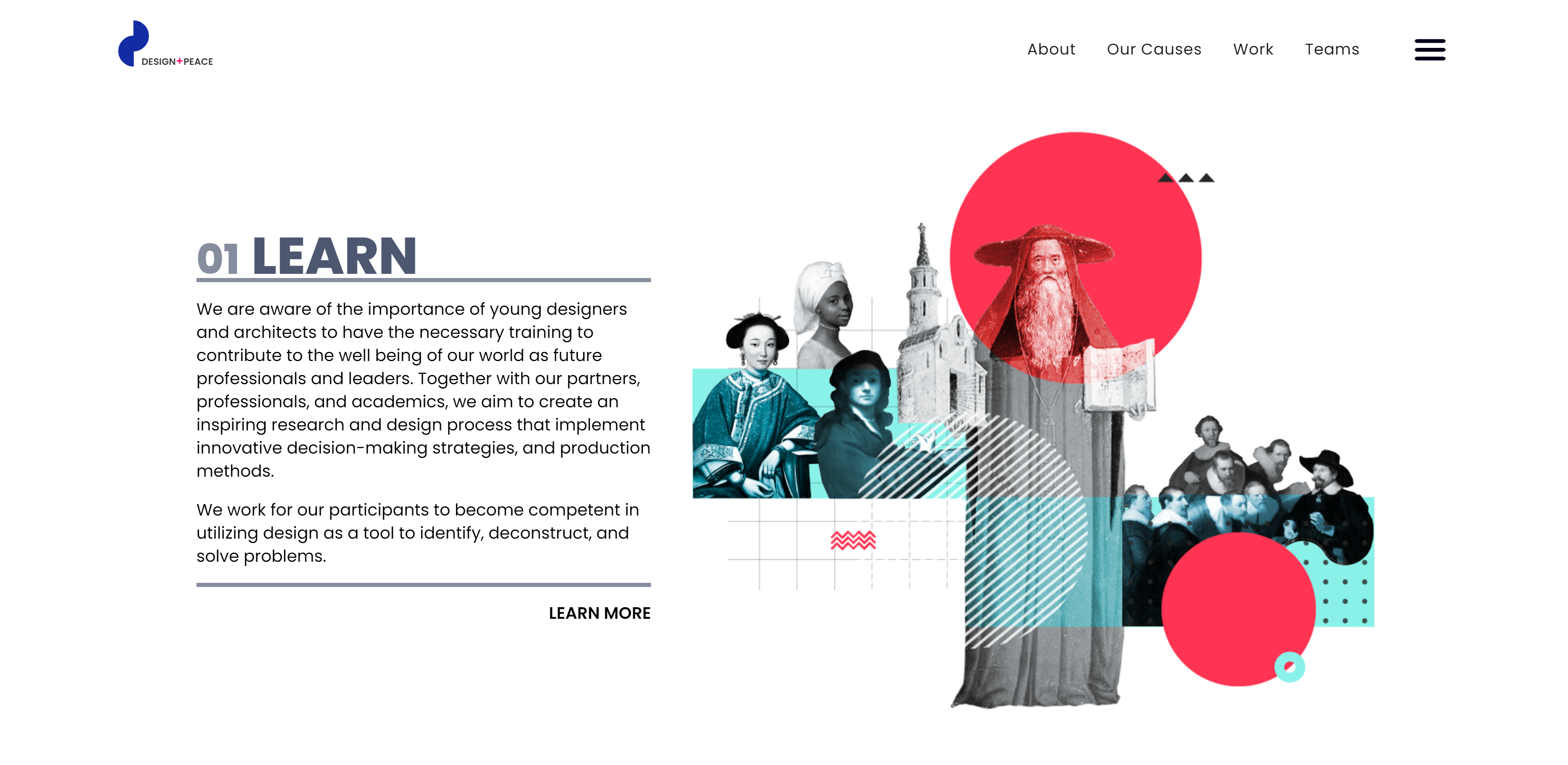
Design+Peace uses design and interdisciplinary work to address societal and environmental issues, emphasizing research, education, collaboration, and innovation. They bring together activists, students, and communities from all over the world to promote positive change through collective design work.
The website’s animations, transitions, and illustrations reflect the organization’s love for design. Bold and artistic graphics complement the content of each page and prove the group’s creative talent. An abundance of whitespace encourages visitors to admire each deliberate and curated element.
Why the design works
Most information about Design+Peace’s work and values is divided into short paragraphs, each with an accompanying illustration. This pairing establishes how the organization can communicate complex ideas through both written and visual mediums — the perfect vote of confidence for a design-based initiative.
The hamburger menu icon in the top right corner of the screen expands to include all the website’s pages in one place. This keeps content uncluttered and organized.


Get started for free
Create custom, scalable websites — without writing code. Start building in Webflow.
4. ColorStack
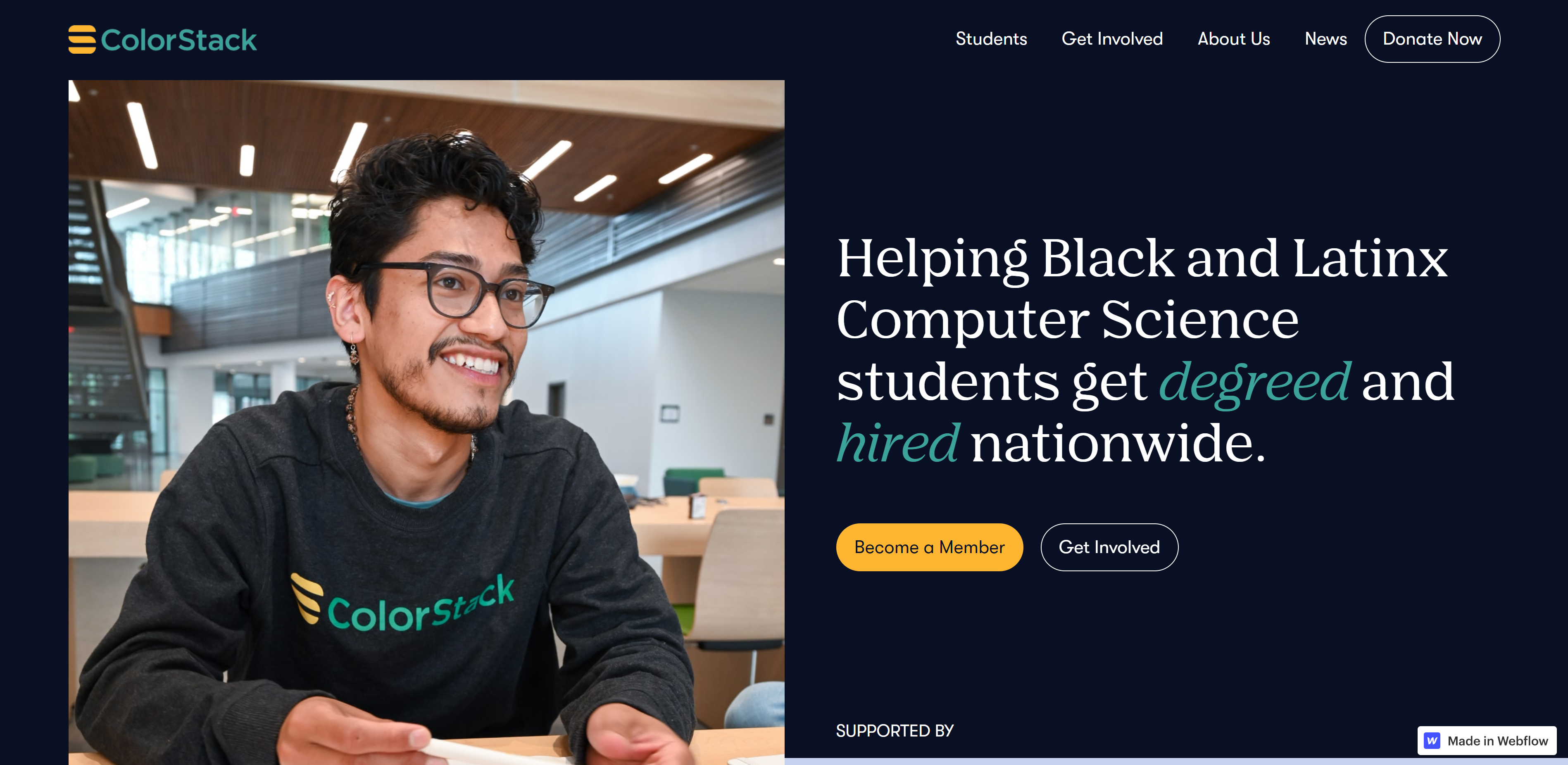
ColorStack is a nonprofit aiming to increase the number of Black and Latinx computer science graduates internationally.
Their mission is to establish cross-campus networks to provide opportunities for career growth, community development, and academic support. Each ColorStack member has access to various tools and resources to help them finish their degrees and find full-time employment in a technical field.
ColorStack’s website has a minimalist aesthetic with a consistent color palette of navy blue, off-white, yellow, and teal. The typography is casual yet eye-catching — the font for headings is a serif that pairs well with the sans serif font used for body text. The site’s animations, which reveal themselves as you scroll, use subtle movement to grab attention.
Why the design works
Teal is used to emphasize words ColorStack wants to highlight — the logo, the icons, CTAs, blog titles, and statistics. In the image above, the use of color highlights the words “degree” and “hired,” drawing the visitor’s eye to these attractive terms key to the organization’s mission.
The “Donate Now” button in the header bar is accentuated with a round border that becomes yellow when the mouse hovers over it. This contrast pulls visitors’ attention to the CTA, even if their cursor unintentionally passes over it.
The site’s “Get Involved” page uses large text and simple, easy-to-understand statistics to highlight ColorStack’s achievements and incentivize potential partners to become involved with an initiative they know to be successful.
5. Skate Nepal
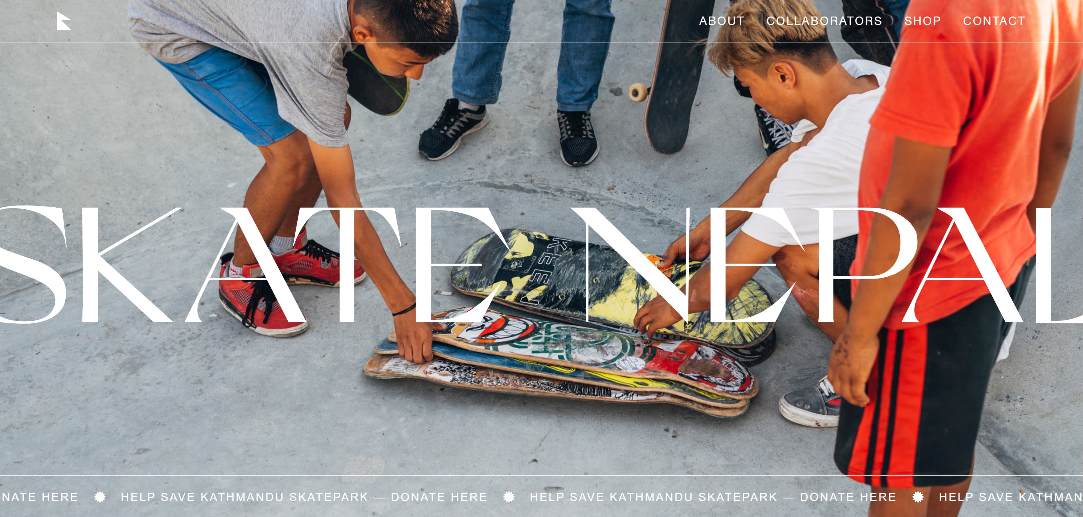
Skate Nepal was born six months after the tragic Gorkha earthquake that struck the country in 2015. Following thousands of casualties and injuries, many were left without homes and families.
At the time of the earthquake, skateboarding was a new activity in Nepal, but this nonprofit saw its potential to grow into a means of enrichment for the Nepali people. Skate Nepal's mission is to “spread the love of skateboarding” among the people of Nepal as a positive social, cultural, and creative activity.
Why the design works
The edge-to-edge header on the home page flips between high-quality action shots of Nepal’s skate parks. This element immediately tells visitors what Skate Nepal is all about: developing the country’s budding skating culture.
The site’s minimal aesthetic creates a straightforward and pleasant user experience. Only the most important information is given space: the “About” section, the group’s collaborators, contact information, and a link to their shop where 100% of profits go towards funding current projects.
The video in the center of the home page adds life to the website and creates a tangible opportunity for visitors to see the impact of Skate Nepal’s work, encouraging them to support its mission.
The scrolling ticker at the bottom of the screen reading “HELP SAVE KATHMANDU SKATE PARK — DONATE HERE” acts as a CTA urging visitors to donate. The dynamic nature of the elements draws visitors’ attention and creates a sense of urgency similar to a “Breaking News” banner.
Create a platform for change
Building a website for a nonprofit organization is an important step toward making an impact. A powerful site can take your initiative to the next level, connecting your mission with as many people as possible.
At Webflow, we provide all the tools you need to build impactful websites — whether you’re a design beginner or an expert. Our visual web development platform allows you to build without code, and Webflow University has loads of tutorials, and guides to help you create a stunning nonprofit platform that inspires real change.