Build your client's construction website from the ground up.
Without a digital storefront attached to your client’s construction company, people passing by the building might admire the work but have no way to reach out for more information on the company who built it.
Whether your client is a small construction firm or an experienced high-rise builder, their website must showcase their projects, encourage trust, and convert visitors into customers. Read on to find inspiring examples of well-designed construction websites and establish your client's brand as the go-to contractor in their area.
What makes a good construction website?
An effective construction company website uses the following design elements to showcase their offering and convince potential customers to get in touch:
- Professional site design — Emphasize your client’s craftsmanship and attention to detail, reflecting their professionalism through an approachable, aesthetically pleasing, and user-friendly interface.
- Navigational elements — The website should be simple to navigate, with a logical structure that guides visitors to key sections like services and contact information. A responsive layout ensures the site functions consistently on all devices, regardless of operating system or screen size.
- Service descriptions — Detailing the business’s offerings on a service page helps potential customers understand what the company specializes in, whether residential, commercial, or industrial construction. Include specific skills and certifications that set your client apart.
- Testimonials and case studies — Reviews from real customers demonstrate a construction company’s reliability, quality of work, and client satisfaction levels.
- Portfolio section — A dedicated portfolio section highlights successful projects with descriptions, images, and client praise. These highlights build credibility and invite website visitors to reach out.
- Calls to action (CTAs) — Strategically placed CTAs encourage visitors to take action, such as scheduling a consultation, requesting a quote, or contacting the company directly. CTAs should be straightforward so people stay on your client's website and follow through on next steps toward working together.
- Contact information — Like CTAs, contact details should be visible and accessible. Make sure important details like phone numbers, email addresses, physical addresses, and “contact us” forms are highly visible and accessible. You can also integrate social media links to help prospective customers reach your client.
- Search engine optimization (SEO) — SEO techniques help a website rank higher in search engine results, increasing its discoverability so customers can find the company online. This process involves optimizing content, metadata, and relevant keywords.
- Trust indicators — Trust badges, certifications, awards, and affiliations with well-known, verified organizations add credibility to your client's website. They reassure visitors that the company is reputable and adheres to industry standards.
8 construction website examples for inspiration
Here are eight of the best construction website designs. Each combines strategic aesthetic choices and functionality to create a compelling pitch for potential customers.
1. Gibbons Marine Construction
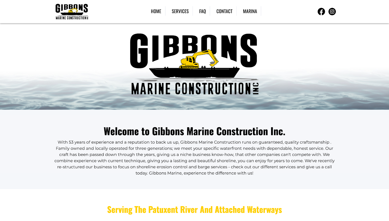
The Gibbons Marine Construction website, designed by Homebase Media, has a large banner with a ship icon and a short description, immediately explaining the company's unique selling proposition (USP). The section below highlights their specialized services, allowing visitors to quickly find what they need, be it stone revetment or excavation.
Each service has a bold heading and a CTA button, leading you to explore a specific offering. A dedicated FAQ section verifies that Gibbons is licensed and insured for construction jobs in the area.
The contact page has a form and a reCAPTCHA to prevent spam on Gibbons' end. Homebase Media also included the company's phone number, email, and physical address to convince visitors to reach out.
2. Revolution Contractors
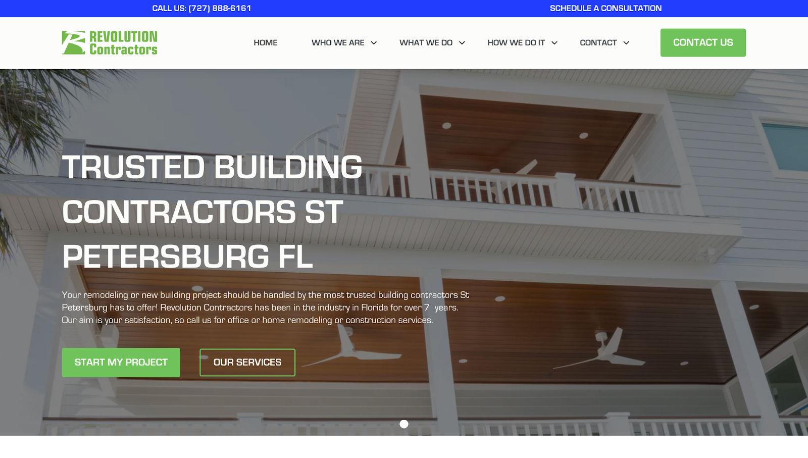
Revolution Contractors' website uses large headlines and high-quality imagery of completed projects to demonstrate their credibility and industry expertise. Maverix Design created this layout and included CTA buttons like "Start My Project" and "Our Services" at the top of the site, encouraging visitors to take immediate action.
The website breaks the company’s services into clearly defined sections, each with relevant imagery and concise descriptions so visitors can grasp the general contractor’s range of offerings. Testimonials and client-centric messaging reinforce the company's commitment to quality and customer satisfaction.
The portfolio section invites you to explore past projects for inspiration, while the "Check Now" CTA button invites you to dive deeper into the company's work. At the bottom, a contact form ensures quick communication, while a footer provides other contact information and social media links.
3. Edifis
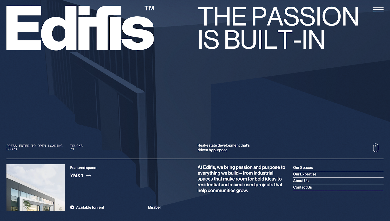
The Edifis’ website features an interactive 3D model that reacts to your cursor movement, drawing you into the company's innovative style. Moving skies over Edifis-made buildings leverages a parallax effect, which adds depth and visual interest to the otherwise minimalist layout. Video backgrounds also break the monotony of static elements, showing the company's expertise in action while emphasizing their focus on cutting-edge construction.
Further down the homepage, the portfolio section sits in a neatly tucked-away list. Thumbnails expand upon scrolling, subtly guiding navigation while drawing attention to content. Below this list, dedicated sections highlight testimonials and clients before transitioning to the footer, which has contact information and social media links. The website overall prioritizes functionality while consistently reinforcing the company’s visual branding.


Work with a Certified Partner
Webflow-certified partners have verified experience and a proven track record with client satisfaction.
4. Residential & Bespoke Projects
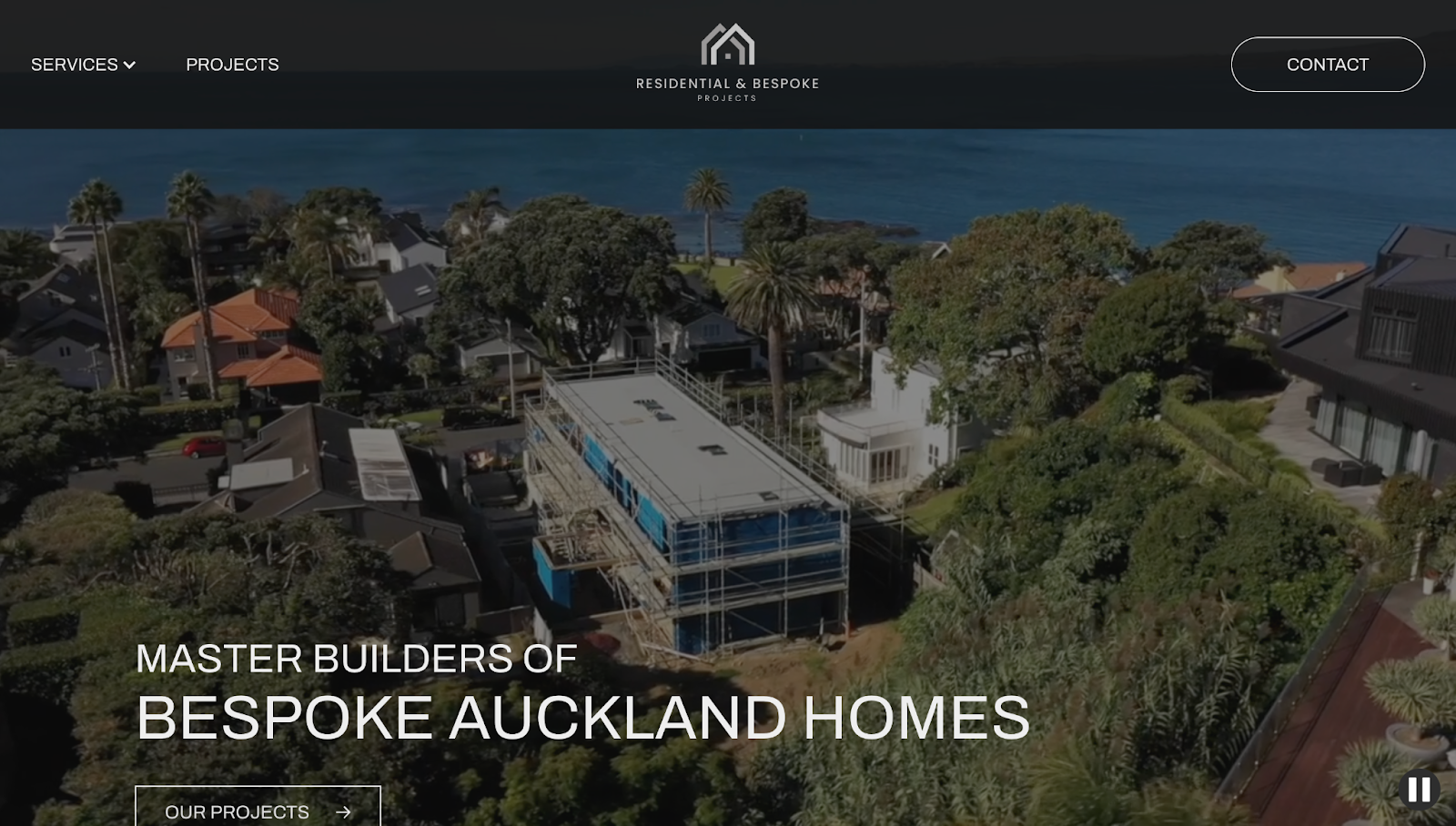
The Residential & Bespoke Projects website, created by Julia Piper, reinforces the company's identity as an expert in luxury home building. The site shows the home builder’s expertise in luxury construction for houses in Auckland, New Zealand. A looping video banner at the top immediately captures attention, which is great since it’s showcasing ongoing and completed projects.
The site's black-and-white color palette emphasizes premium quality with its timeless appeal. Grid-style sections present information clearly, guiding visitors through the company's offerings in a logical visual hierarchy.
A parallax effect in the footer image adds depth to the otherwise static layout while showing the company's affiliations and partner brands. The website’s design balances visual intrigue and appeal with a user-friendly experience.
5. Space Care
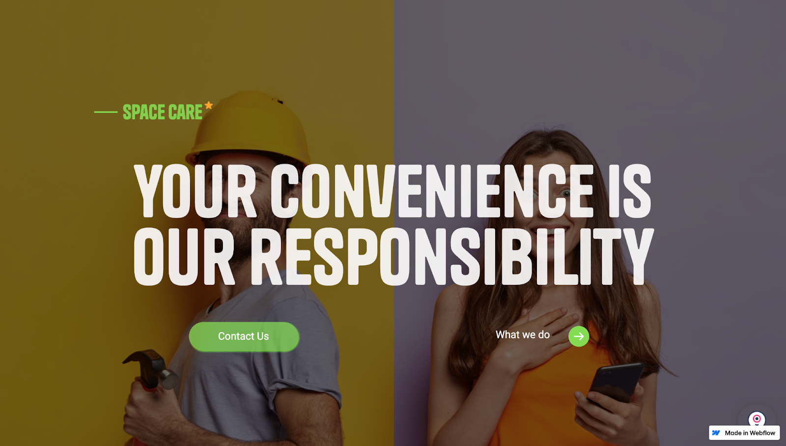
Space Care's website, created by Pedro Schreck, has a vibrant, visually-compelling split-screen design and a bold headline, “Your convenience is our responsibility.” This message instantly communicates the company's commitment to customer convenience.
The interactive content cards below the hero image show Space Care's services. Hovering over a card makes the others fade into the background, bringing the specific service into focus.
Testimonials build trust and credibility by showing satisfied clients. Team member profiles sit in moving carousels, their smiling portraits adding a human touch so visitors get a sense of the people behind the company.
A minimalist one-page design and ample whitespace ensure your attention remains on essential information. Strategic CTA buttons stand out and prompt you to take action, such as contacting Space Care directly or subscribing to the blog.
6. Gerding Builders
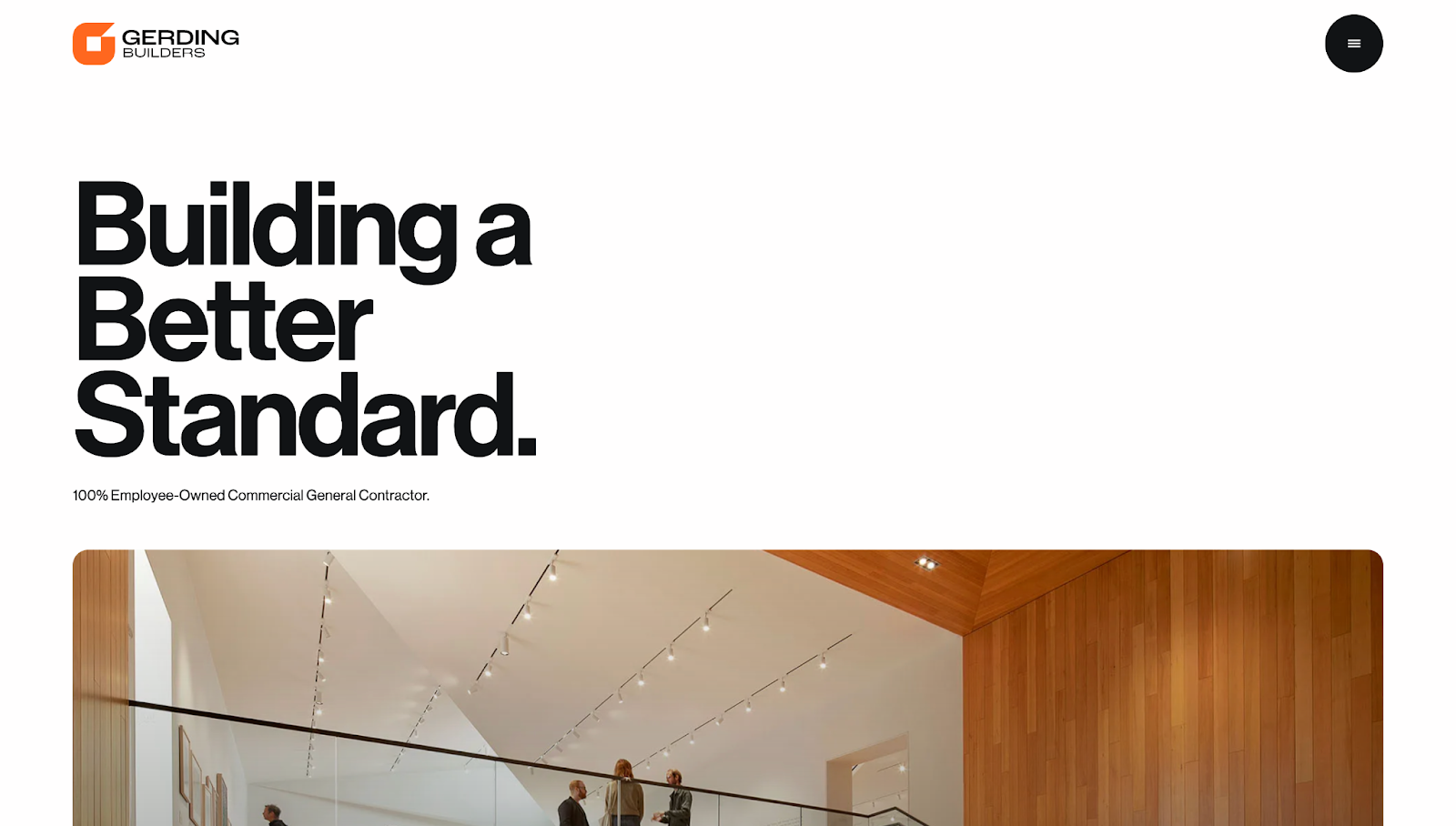
The Gerding Builders website has a modern layout that mimics the buildings they create, featuring high-quality images and a contemporary color scheme. The large header typography immediately communicates the company's commitment to quality with the phrase "Building a Better Standard." Gerding reinforces their brand identity throughout their website with a consistent orange, black, and white color scheme.
The designer, Joseph Graham, used hover effects to reveal images behind key statistics, encouraging exploration while underlining the company's expertise. High-quality pictures of completed projects throughout the site appeal to prospective clients.
A "Recent News" section shows Gerder's exposure in the media with updates on their latest achievements and milestones. Below, testimonials express a good company reputation, and a contact form prompts you to reach out.
7. Woodhull
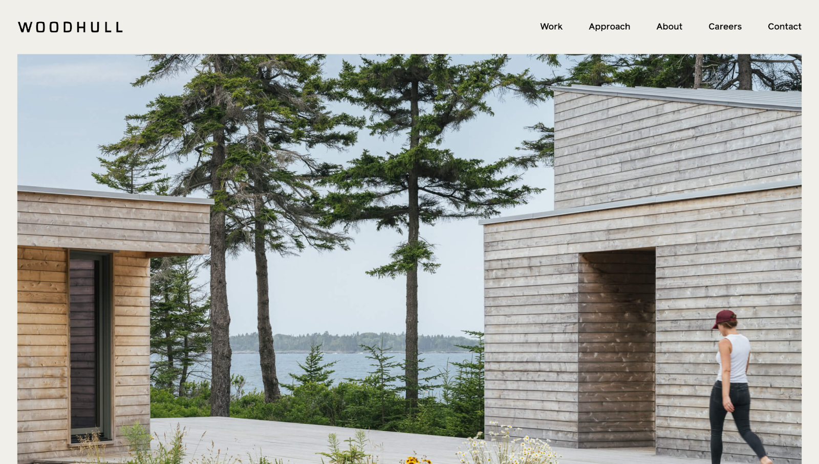
Woodhull's website has ample spacing between elements, a neutral color palette, and high-quality imagery that focuses on the company's work, all underscoring their dedication to design-driven projects.
On the homepage, a toggle feature between "Services" and "Process" lets you explore Woodhull's offerings at a glance. Below, a "Press & Awards" section highlights multiple brands and clients who successfully worked with the company.
The "Our Team" section on the About page has high-resolution, monochromatic portraits of every team member, humanizing the team and adding a personal touch.
Every page includes the same footer, with contact information, social media links, and navigational elements that allow visitors to quickly jump to any section and explore more of Woodhull's offerings.
8. Crosby Construction
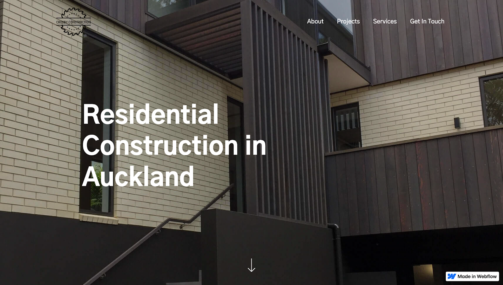
Crosby Construction's website, designed by The No Code Shop, has a stripped-down appearance, focusing on the company’s brand message: integrity and honesty as builders.
The homepage immediately conveys the company's USP with bold white text, “Residential Construction in Auckland,” against a fullscreen background image of a successful build project. A limited color palette maintains a clean and professional appearance without distracting from the primary elements, like important pages and sections within the site.
Scrolling reveals an "About Crosby Construction" section that communicates the company's values and commitment to quality. Each point has a bold heading with a concise description to improve readability, making text scannable so you can glance through the site and quickly see what makes the company a good choice.
Build beautiful websites with Webflow
While your clients construct buildings, you can give their business a virtual home by creating visually stunning, functional websites — without relying on developers.
With Webflow, you can build and launch immersive website experiences — no matter what type of client. And if you don’t want to start from scratch, you can find inspiration from community essentials or use ready-made templates.
Construct your client's online presence with Webflow today.

Get started for free
Create custom, scalable websites — without writing code. Start building in Webflow.


