Connect with your target audience through impactful service pages.
Whether you’re a marketing agency or a large service business, an effective service page outlines the types of projects you’re qualified to take on. These pages typically showcase work samples and testimonies to demonstrate your expertise. Presenting your offering this way allows potential clients to identify whether you’re the right person for the job.
In this article, we’ll break down the fundamentals of a strong service page and explore a few examples to inspire your designs.
Service pages: An overview
A service page represents a critical point in the conversion funnel — when potential clients click a call to action (CTA) on your homepage or web ads, they should land on a service page. From there, people can learn about your unique strengths and previous successes to decide whether your skills suit their needs.
For example, a service page for a design studio would describe their website design capabilities and encourage readers to click a CTA that leads them further into the conversion funnel, like “Schedule a consultation” or “Tell us what you’re looking for.”
How to create an effective service page: 8 essentials
The following eight elements create impressive, memorable service page designs that attract potential clients.
1. Write compelling headlines
The headline at the top of your service page should drive readers toward the CTAs that follow. Headers set the tone for the rest of the page’s information, so write engaging, action-oriented phrases that attract attention and build anticipation. On web design sites, for instance, a header could read, “Turn visions into visuals: Unlock your website’s potential.”
2. Organize your layout
Break down your service page’s layout into three or four sections covering a specific benefit, like productivity, efficiency, or cost savings. Then, highlight the use cases that best suit those benefits in each section. Listing clear value props in your headers helps target audiences quickly find the benefits related to their needs, which can convince them to sign up for your services.
3. Add engaging visuals
Include interactive visuals like hover animations or explorable demos that showcase your skills in action. If your animations are informative enough, potential clients will clearly understand how your service benefits them and may feel more inclined to take the next step.
You could also place CTA buttons near every visual and monitor the click-through rate of each button. This metric can highlight which visuals seem to encourage the viewer to interact and take the next step.
4. Provide clear service descriptions
In your service descriptions, reference your target audience’s pain points and clearly describe how your service addresses them. For example, a UI designer might call out how they can navigate the challenge of finding the best UI design through user testing and iteration. Pair these descriptions with the visuals from the last step to create an engaging reader experience.
Descriptions are also a great place to incorporate SEO tactics like long-tail keywords and natural language search phrases. These strategies increase the likelihood that your page will appear at the top of relevant searches.
5. Craft persuasive calls to action
People encounter CTAs constantly, so get creative with your CTA buttons whenever possible to get their attention. Phrases like “Get started” and “Sign up” are too common. Instead, take every opportunity to make eye-catching CTAs that are unique and resonate with a specific benefit. For example, a section about your artistic philosophy could have a CTA that reads, “Refresh your aesthetic.” Pair CTA phrases with different design styles, like ghost buttons or floating action buttons, to keep designs fresh and interesting.
6. Highlight social proof
Social proof refers to testimonials from real clients who’ve used your service or from trusted institutions that have reviewed it. Endorsements are essential on your service pages — testimonials that align with your visitors' viewpoints provide proof that your skillset suits their project. This is especially important for small business service pages, as client reviews add credibility to the brand.
7. Ensure easy navigation
Avoid overcomplicating your service page with navigation techniques like expandables and scroll animations. Instead, opt for a simple web design where it’s easy to scroll from top to bottom and quickly scan through all the sections. Minimizing the effort it takes to read your service page means visitors will find the specific information they’re searching for — which could reduce bounce rates.
8. Offer a process overview
Provide a step-by-step overview of what makes your process unique. Focus on the potential client’s involvement as much as possible, describing how often you’ll meet and how important it will be to understand and find ways to meet their expectations. The more you bring the client into the process, the more they feel their project needs are top priority.


Ultimate web design
From 101 to advanced, learn how to build sites in Webflow with over 100 lessons — including the basics of HTML and CSS.
4 inspiring service page examples
The following four examples use all the essentials in the previous section to create bold, memorable service pages.
1. Dynamic Maids

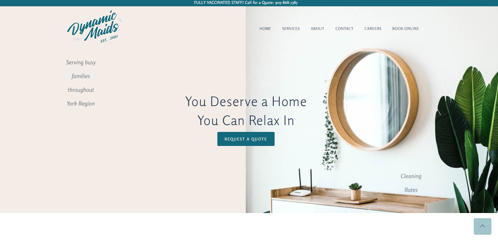
Dynamic Maids is a housekeeping company that offers everything from top-to-bottom deep cleans to regular spot checks, and Lea Gucciardi designed their website.
To impress potential clients with their meticulousness, Dynamic Maids’ services page outlines their cleaning process, available packages, and pricing plans in great detail. Each image shows off a spotless space they’ve cleaned, and they pair those visuals with inviting copy.
For instance, the headline “You Deserve a Home You Can Relax In” overlays a photo of a tranquil, spa-like bathroom. These visuals and descriptions make maintaining a clean home seem effortless, attracting busy individuals who want a pristine space without the time commitment.
2. TeamUp

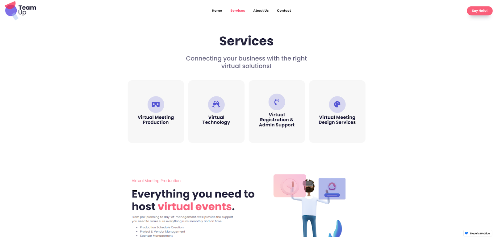
TeamUp is an online event coordinator that helps businesses create and run virtual events for webinars, digital marketing, and business proposals. Taylor Bartlett designed their site, and he uses a bold color palette to clearly separate the services page into four sections describing features and use cases. Each section includes visuals with subtle hover animations that add engaging flair.
To ensure search engines show the page to the right audience, headlines use keywords like “smart technology,” “attendee support,” and “virtual events.” That’ll get visitors to the site, where they’ll see short, scannable descriptions that quickly showcase the brand’s value.
3. Solis

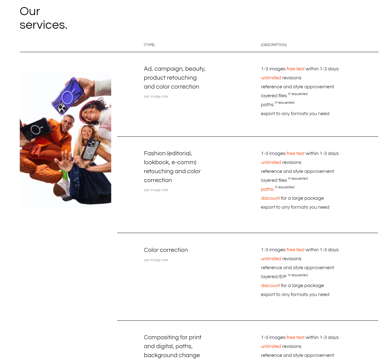
Solis is a photo and video editing studio specializing in high art, fashion, and beauty. Scrolling down the homepage reveals a sleek table describing their services. This modern, informative layout resonates with audiences looking for a similar design aesthetic.
Rather than having a separate URL, the services section appears on the same page as the company’s portfolio and process description. And as you hover over each type, related images appear, showcasing the brand’s expertise. These subtle design choices guarantee that site visitors will experience Solis’ work, increasing the likelihood that potential clients will see a photo that resonates with them.
4. metriq

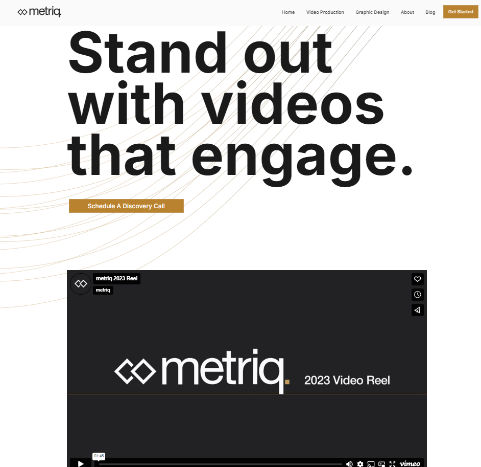
metriq is a video production and graphic design studio that creates marketing materials for brands looking for modern, high-production visuals. The clip at the top of their video services page provides a montage of some of their best work. Testimonials, descriptions, and a brief FAQ follow to add credibility to what potential clients see in the reel.
metriq’s design choices on this page, like subtle color palettes and minimalist layouts, mirror the rest of their website design. This modest aesthetic keeps people’s focus on the work itself rather than the page layout. And using this style across the whole site lets visitors see metriq’s design philosophy firsthand.
Elevate your service page design with Webflow
As a web designer, your site is the top way to display your skills. Pairing smart designs with a detailed service page converts casual site visitors into clients. Strong visuals, clear descriptions, and consistent messaging will project confidence to anyone who visits your site.
When you’re ready to build your service page that stands out and converts, you’ll need a flexible website platform. With Webflow’s visual-first design platform, you can bring your vision to life with the power of code — without writing any. Whether you're showcasing your own services or building sites for clients, Webflow empowers you to create stunning, responsive service pages that capture attention and drive results.

Get started for free
Create custom, scalable websites — without writing code. Start building in Webflow.


