


A call to action is the bridge between interest and action.
Your call-to-action (CTA) text guides visitors toward the next step of their online journey, like signing up for a newsletter, downloading a free resource, buying a product, or subscribing to a recurring service.
Without persuasive CTAs, even the most beautifully designed websites can struggle to convert. But when done right, CTAs nudge people down engaging pathways — the exact paths you want them to take.
Read on to find inspiring CTA examples and see how judicious wording can drive conversions.
What’s a call to action?
Calls to action, which most marketers and UX designers refer to as CTAs, prompt website visitors to take a specific action. CTAs can appear as buttons, links, or lines of text.
Strategically placing CTAs throughout your website helps turn passive interest into meaningful action, aligning people with your goals. But a CTA's role goes beyond simple direction — it can provide clarity, highlight value, or introduce time-sensitive incentives that create a sense of urgency, motivating people to act. For example, a CTA promoting a limited-time summer sale could use a sense of urgency to inspire visitors to buy before the deal expires.
Main types of CTAs
CTAs come in various forms, each designed to suit specific goals and user behaviors. Here are the most common CTA types.
CTA buttons
Buttons are the most common CTAs on websites. The button itself is the delivery method, while the copy on the button serves as the real call to action — short, action-oriented phrases like "Sign Up," "Learn More," or "Buy Now." CTA buttons are visually distinct and easy to find on a site's layout, making them ideal for quick, high-intent actions.
CTA forms
Embedded CTAs within contact forms encourage people to submit helpful information like email addresses or survey responses. You can pair forms with incentives, like access to a free guide or a discount, to motivate visitors to complete the action.
CTA banners
Banners usually sit at the top or bottom of a web page, grabbing attention without disrupting the user experience. Because of their high visibility, they're effective for sharing special offers, announcements, or time-sensitive deals.
Contextual links
Contextual links are embedded within a page's text, seamlessly integrating with the content without affecting the user experience. These CTAs guide visitors to explore related materials like blog posts, case studies, or product pages, but the links aren’t intrusive in any way.
Pop-up CTAs
Pop-ups, on the other hand, are intrusive by design, which makes them both polarizing and highly effective. Pop-up CTAs appear in the center of the screen and command immediate attention. For example, just before a user exits your site, they might see a pop-up asking if they're sure while offering a compelling reason to stay. Pop-ups are most successful when they provide clear value, like a discount or exclusive content.
Slide-in CTAs
Slide-ins are less intrusive than pop-ups, appearing subtly from the side or rising from the bottom of the screen. They capture attention without disrupting the browsing experience, making them ideal for offers like newsletter subscriptions or links to related resources.
Navigation CTAs
Navigation CTAs appear in menus or sticky headers. Since they're always available at the top of the screen, they ensure easy access to key actions like "Add to Cart" or "Start Free Trial." These CTAs offer constant visibility and gentle reminders throughout the user journey, no matter where a visitor is on your site.
Social proof CTAs
These CTAs include testimonials, reviews, or user-generated content (UGC) to encourage trust-based actions like signing up or purchasing. For example, "Join 10,000+ happy customers" tells potential customers that your offering is tried and tested, signaling credibility and community and increasing the likelihood that visitors will follow through.
28 CTA examples to get visitors clicking
A good CTA grabs attention, keeps visitors engaged, and convinces potential buyers to convert. Here are 28 CTA examples to inspire your next design.
1. Pocus
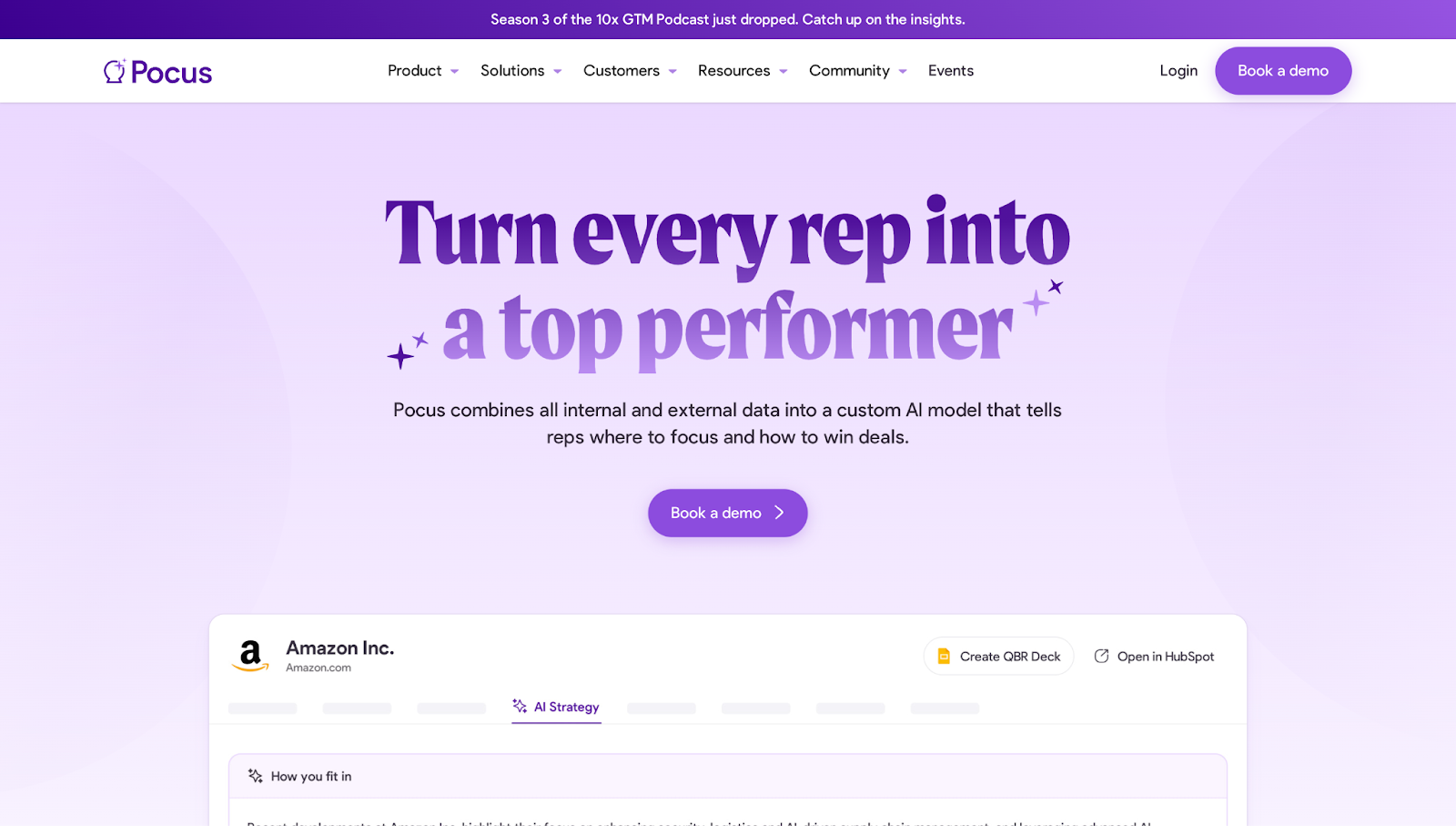
"Turn every rep into a top performer." This headline doubles as a CTA, immediately communicating Pocus’ value to sales groups. If improving team performance is one of your audience's main goals, this type of CTA is an effective way to make the message both motivational and actionable.
"Book a demo." Straightforward and action-driven, this CTA button pairs perfectly with the headline’s promise to turn every rep into a top performer, nudging users toward the next step in the buyer journey.
"See the magic for yourself." At the end of the page, a playful, curiosity-piquing line acts as a CTA, culminating in another button inviting visitors to book a demo now that they’ve seen the product's many benefits.
2. RemotePass
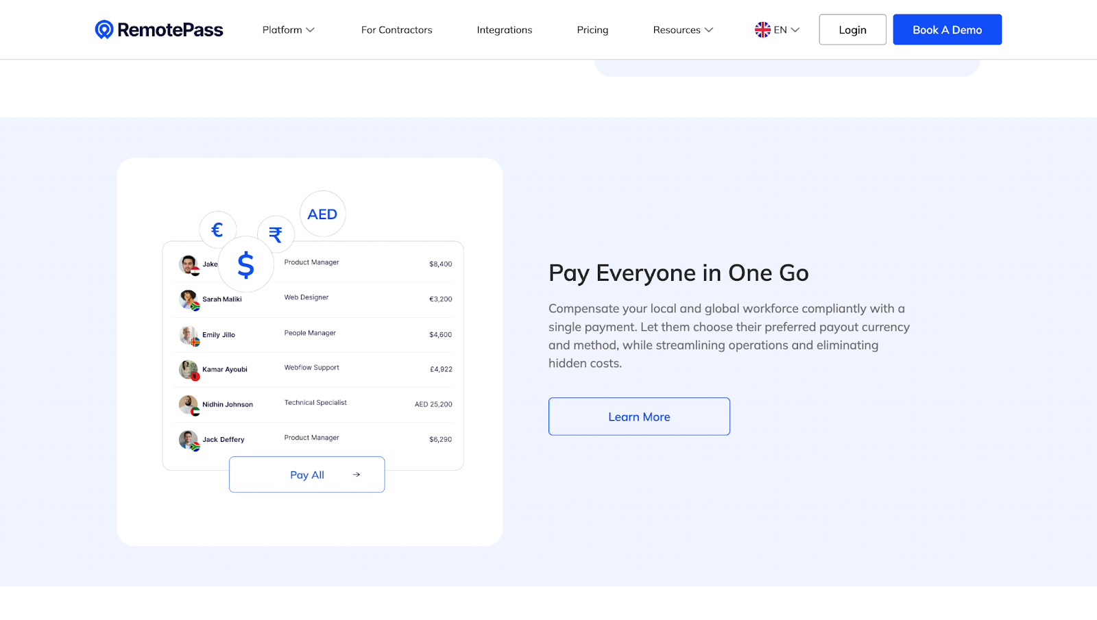
"Pay Everyone in One Go." This CTA shows how RemotePass simplifies a complex process — paying multiple employees in various currencies — into a manageable, one-click task.
"Centralize Your HR Operations." This CTA appeals to teams that are tired of hopping between systems to get work done. “Centralize” hints at a more organized way to manage everything from onboarding and offboarding to time off and documentation.
3. Reshape Biotech
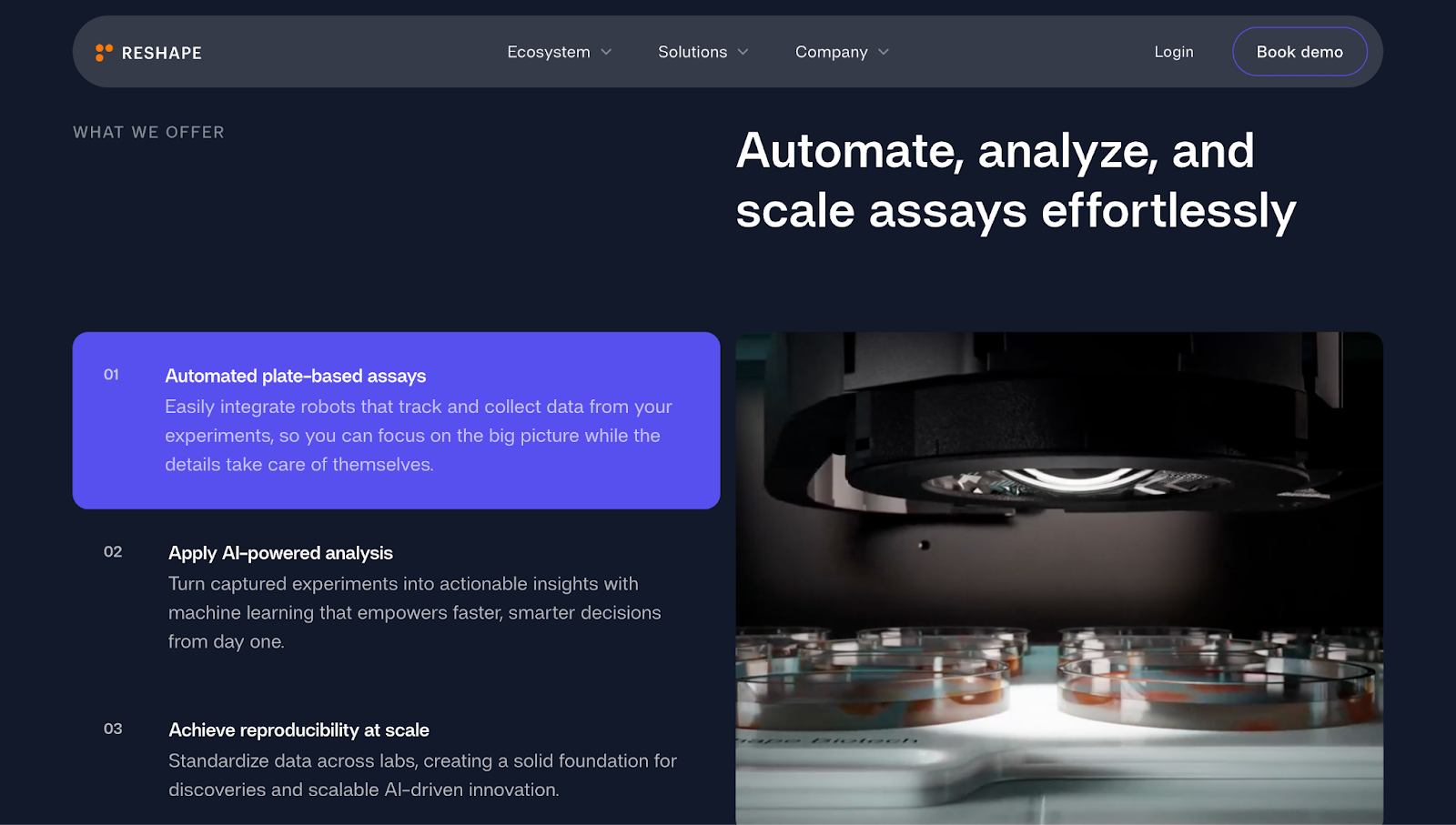
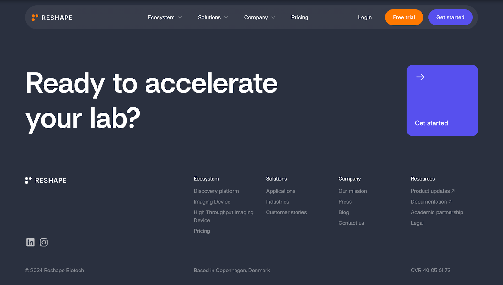
"Automate, analyze, and scale assays effortlessly." This CTA on Reshape Biotech’s website speaks to most lab teams’ wish list, offering automation, data insights, and room to grow. "Effortlessly" softens the promise by removing any hesitation about learning curves. It tells researchers they can work smarter with minimal manual effort.
"Ready to accelerate your lab?" This question-based CTA is conversational and engaging, prompting visitors to act without being overly pushy. It also feels personal and human — a smart approach if your company sells impersonal tech products.
4. Float
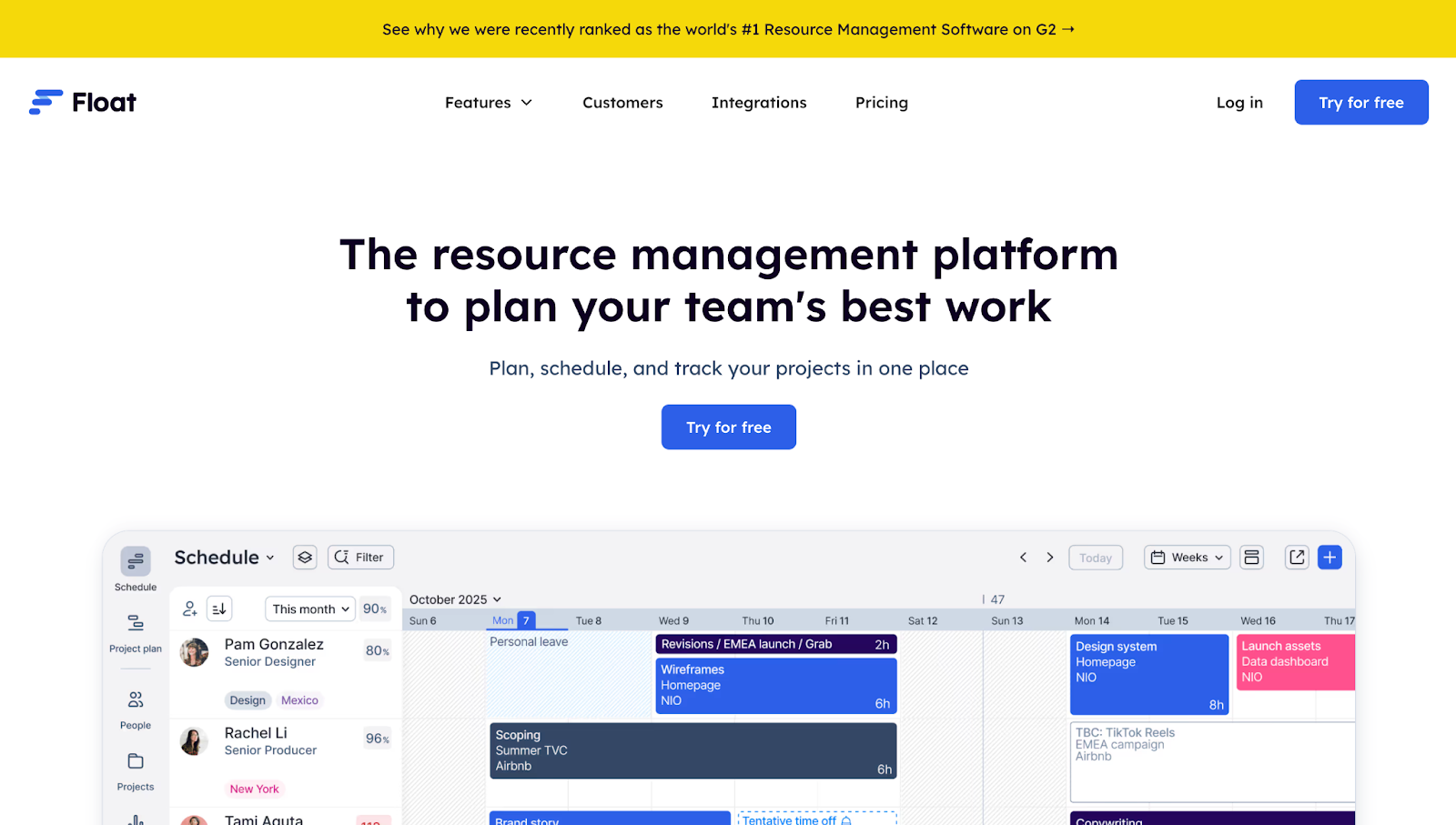
"See why we were recently ranked as the world's #1 Resource Management Software on G2." While technically a promotional banner, this text functions as a trust-building CTA, adding credibility through third-party validation and inviting users to explore what makes Float a top-rated tool. Designed by Candid Leap, the banner copy periodically rotates, maintaining fresh value in a compact space.
"You've scrolled this far. Give Float a try!" This friendly, conversational CTA acknowledges user behavior and uses it to encourage action. By recognizing engagement, the CTA creates a subtle sense of momentum — a smart psychological nudge toward conversion.
5. Mezzi
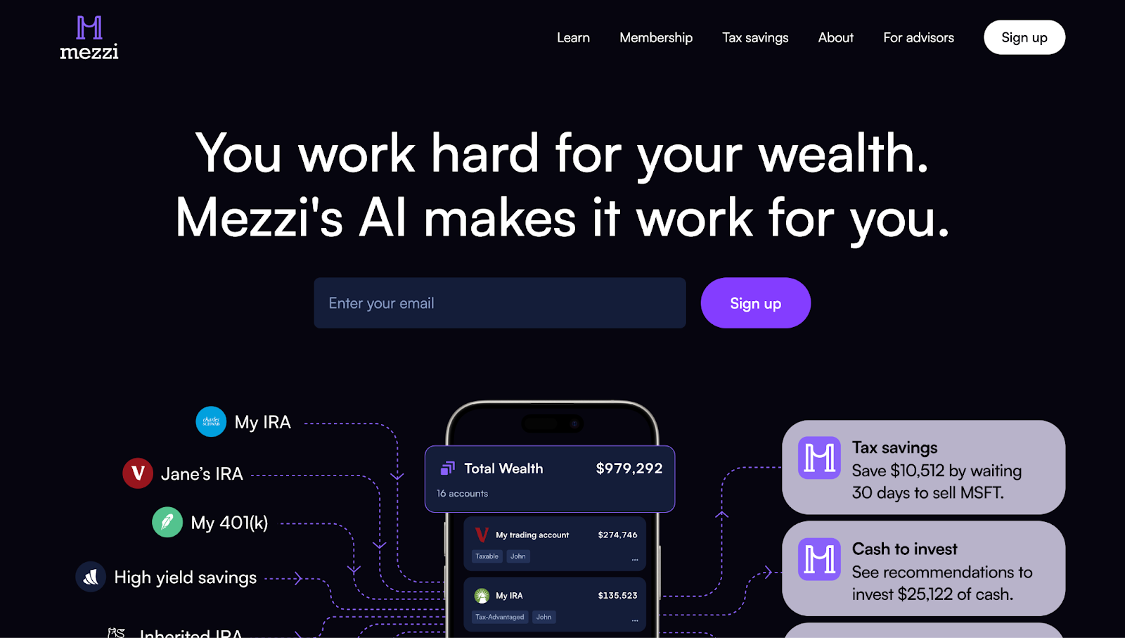
"Sign up." A clear, action-oriented CTA button sits beside a simple form field prompting visitors to enter their email. The message these CTAs work together to send is that Mezzi is a brand worth keeping in touch with, especially when paired with the emotional appeal of the headline’s claim: "You work hard for your wealth. Mezzi's AI makes it work for you."
"Get actionable insights in less than five minutes." This text emphasizes speed and value, addressing potential hesitations by highlighting how you can see quick results by entering your email.
"Sign up" again. Consistency reinforces the primary CTA, ensuring you have multiple chances to sign up regardless of where you are on the page. It’s also a verb, encouraging you to take the next step.
6. Yama
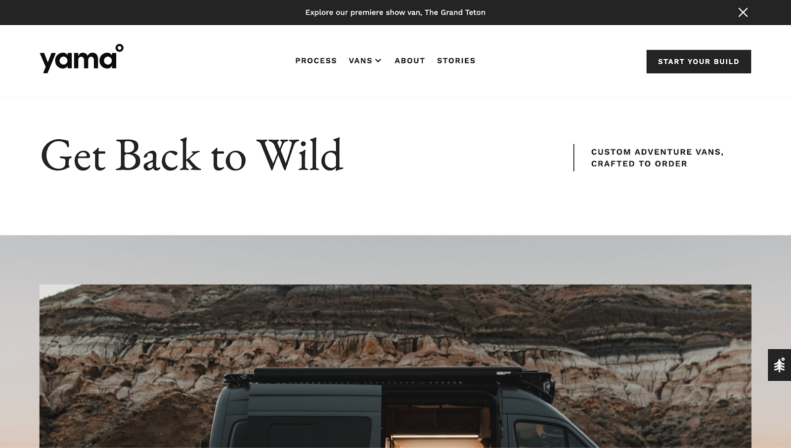
"Explore our premiere show van, The Grand Teton." Positioned at the top of the page and styled in a contrasting color, Yama’s banner CTA grabs immediate attention on the landing page. The clickable text offers a quick route to learn more about Yama's featured build, reducing friction and guiding visitors deeper into the product experience.
"Start Your Build." This CTA button uses personalized, empowering language to prompt action. By emphasizing the word "your," the CTA frames the van-building process as a custom journey, inspiring potential customers to create their own adventure vehicle with Yama.
"Explore Our Process." This contextual link encourages visitors to dive into Yama's approach to van-building. It creates a sense of transparency and trust by giving visitors an understanding of Yama’s materials, sourcing, and design — essential context for a high-investment purchase like a custom van.
"Submit." As part of Yama’s newsletter form, this straightforward CTA invites visitors to stay in the loop on new van builds, company updates, and industry trends. The simplicity of the form fill makes it easy to engage without overwhelming Yama’s potential customers.
7. Closet World
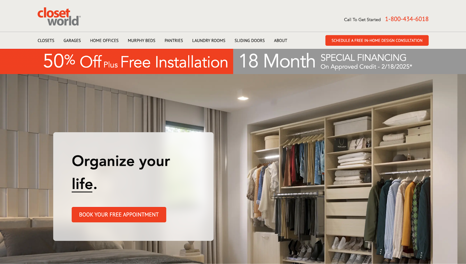
"50% Off Plus Free Installation" and "18-Month Special Financing." These clickable CTA banners use bold offers and large text to grab attention and lower barriers to conversion. The messaging appeals directly to cost-conscious shoppers, positioning Closet World’s services as both accessible and time-sensitive.
"Organize your life." This emotionally driven CTA frames the brand’s offering in terms of personal benefit: Closet World doesn’t just customize closets, they improve your life. Paired with a "Book Your Free Appointment" button, the action-inspiring statement offers a solution and an easy, commitment-free path forward.
"Book a Free Design Consultation Today!" This headline combines three persuasive levers: cost (free), value (professional guidance), and urgency (today). It serves as a high-intent prompt for users who have browsed the full site and are ready to take action.
8. Raft
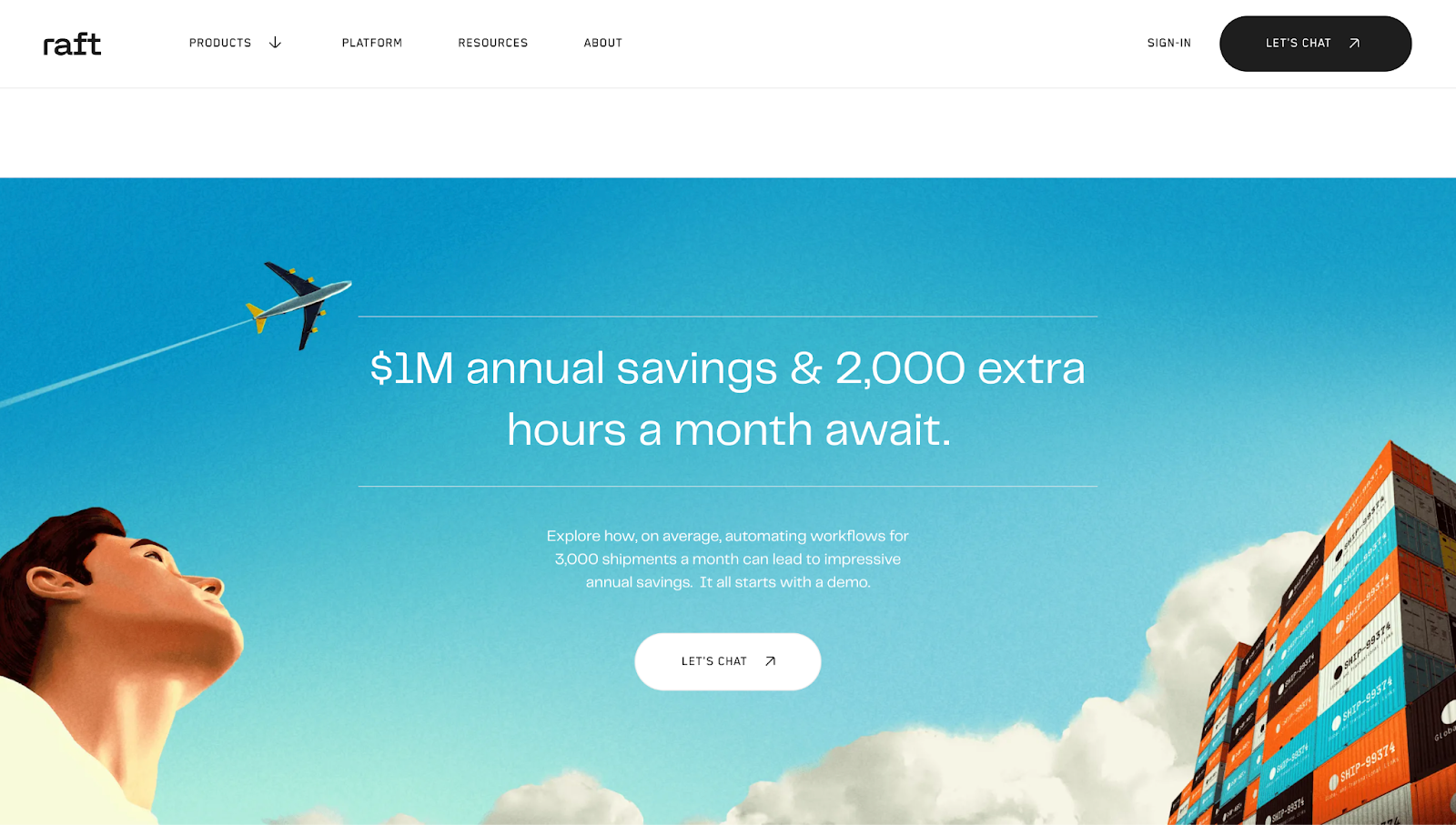
"Let's chat." Cory Runnells designed Raft’s website and positioned this CTA button just below the headline and accompanying text to serve as a low-pressure invitation to connect with Raft. "Let's chat" feels more casual and inviting than standard CTA options like "Contact Us" or "Book a Demo" — a strategy you can use to help your business come across as approachable and service-oriented. The same CTA appears again at the bottom of the website, reinforcing the invitation after users have explored the platform’s benefits.
9. GoPidge
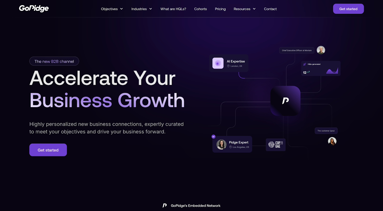
"Accelerate Your [rotating text].” The rotating text on this animated CTA keeps the messaging fresh and relevant by appealing to a range of business needs. The movement captures attention, while the recurring verb “Accelerate” underscores speed and momentum, appealing to growth-focused visitors. Designed by Rod Rosolen, the presentation positions GoPidge as a versatile, goal-oriented solution.
10. Codex
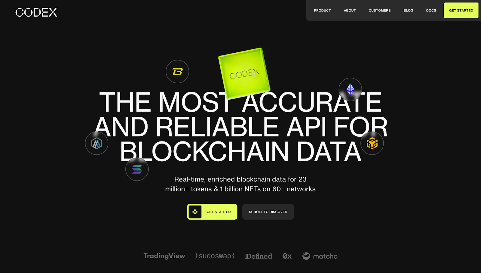
"Get Started." Designer Jordan Gilroy positions "Get Started" CTAs in several forms throughout Codex’s website, including "Get Started Free" and “Get Started with Codex in 5 Minutes, For Free.” Each variation emphasizes ease, immediacy, and low commitment, ideal for those who want to dive in without taking too much time to stop and think.
"Sign up and immediately get free access to real-time and historical pricing, charts, and aggregates for tokens and NFTs." This footer CTA sweetens the deal by listing exactly what users will gain upon signing up. It reinforces the product’s value while encouraging action with no upfront cost.
11. Vesto
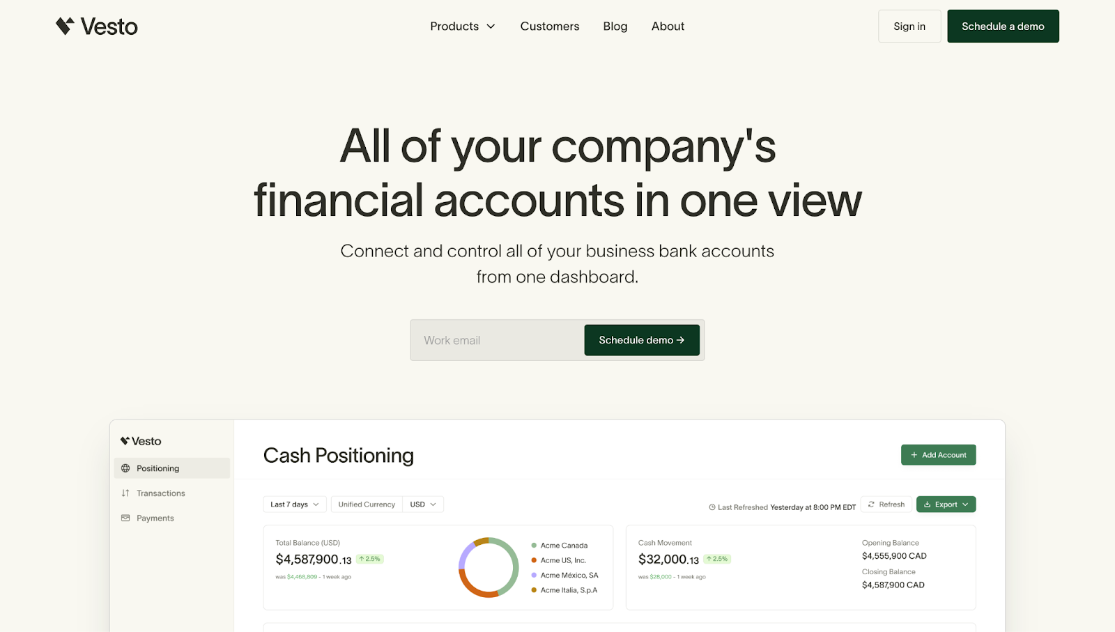
"Connect and control all of your business bank accounts from one dashboard." Sitting just below the headline of Vesto’s website, designer Hendrick placed this supporting text that introduces action verbs like "connect" and "control" to nudge users toward interaction with the product. The text builds on the promise of streamlined control without adding friction.
12. Aura
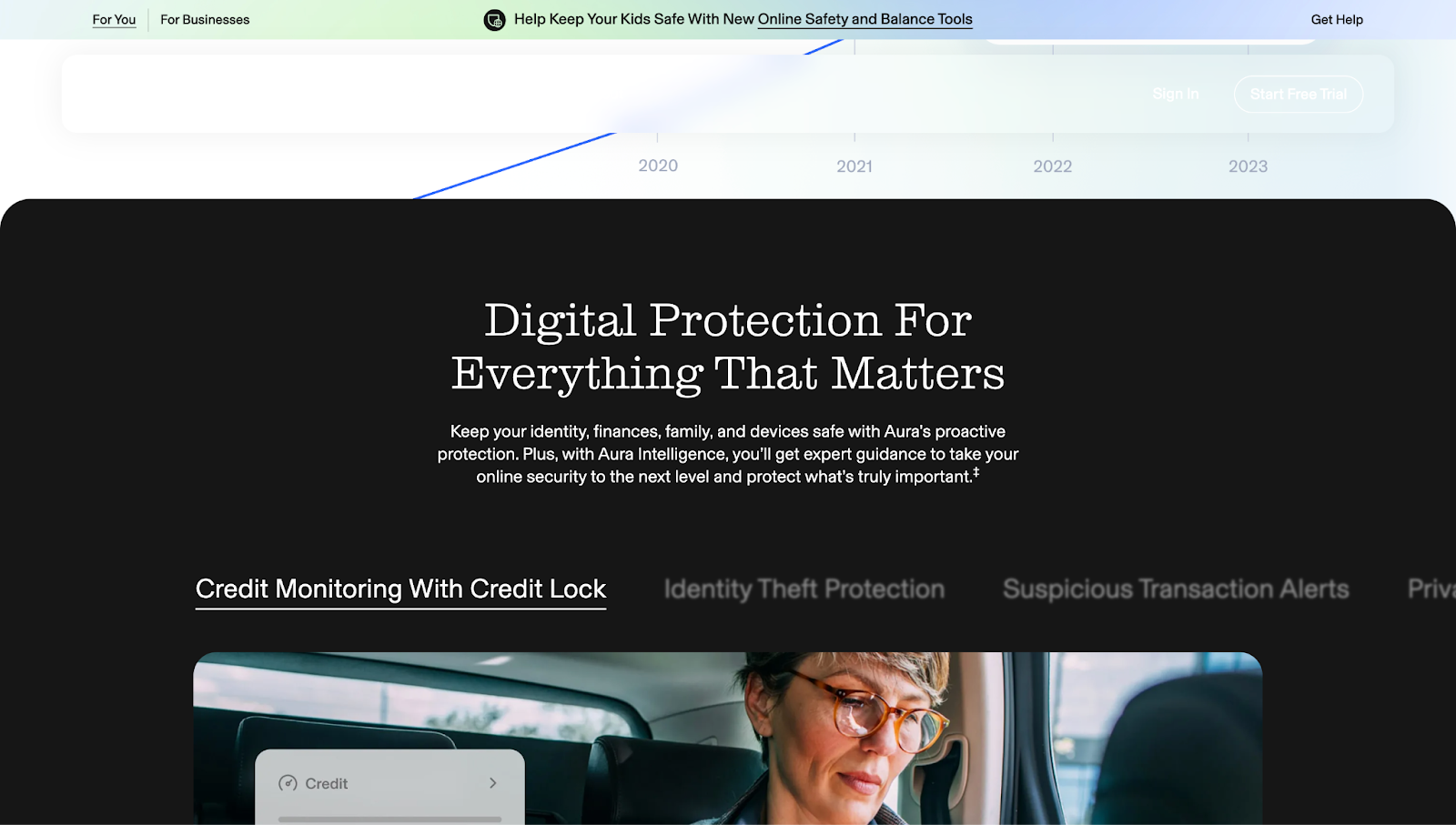
"Help Keep Your Kids Safe With New Online Safety and Balance Tools.” This banner CTA on Aura’s website stands out with a unique color palette compared to the rest of the page — a fun gradient of colors that moves from light blue to green to purple to violet. When readers click on the banner’s link, they reach a sign up page for a free trial.
13. Blaze
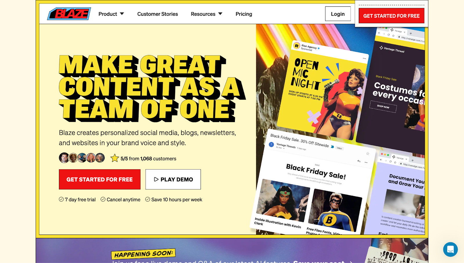
"Make great content as a team of one." Displayed in all caps, this doubles as a bold value proposition and a CTA. It promises efficiency and autonomy, a compelling pitch, especially for solo content creators looking to save time with a service like Blaze.
"Start creating endless types of content. Go from super overwhelmed to super marketer." This line speaks to the reader's emotional state (feeling overwhelmed) and immediately flips it into a confident, aspirational identity: super marketer. It promises a transformation. The phrasing is playful and empowering, helping visitors imagine what's possible when using the product.


Turning traffic into revenue
In this webinar, hear from experts from HubSpot, Clay, Zapier, and Webflow on the future of customer acquisition and marketing automation.
14. Clay
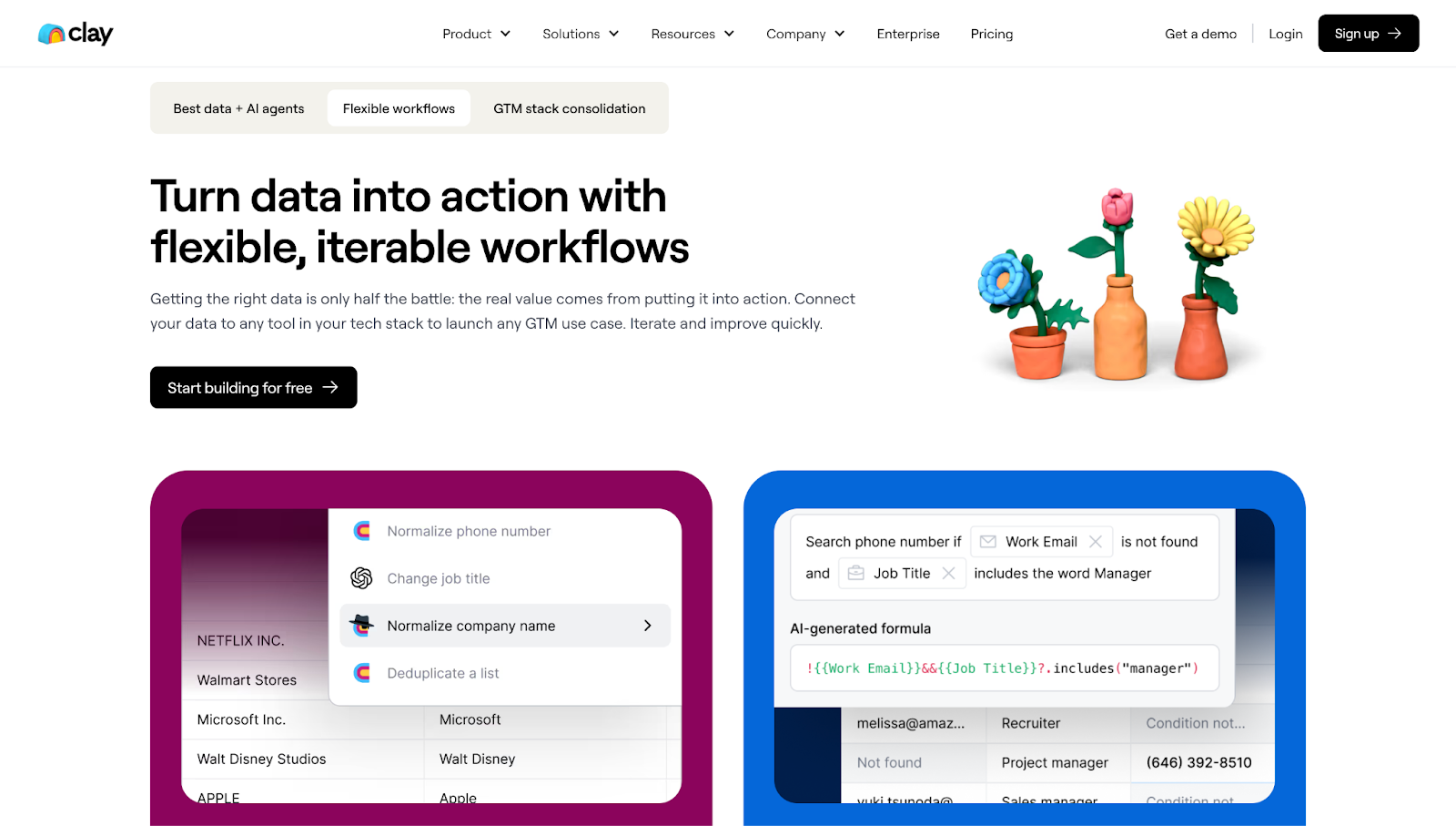
"Turn data into action with flexible, iterable workflows." This CTA distills Clay’s value into a practical, user-first promise. Terms like "flexible" and "iterable" suggest adaptability and control, reinforcing the message that Clay fits into, rather than dictates, your workflow.
15. Instabug
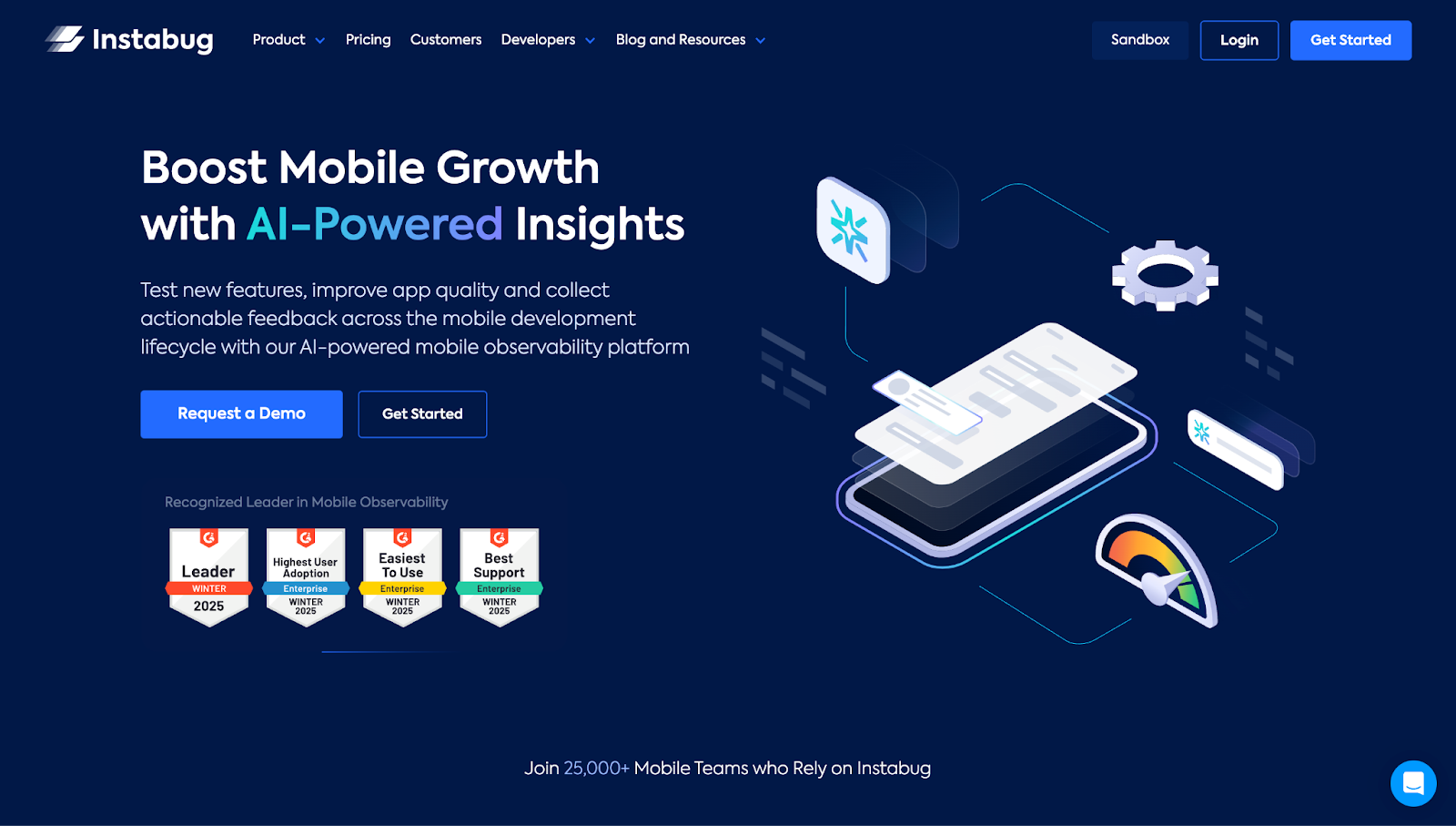
"Boost Mobile Growth with AI-Powered Insights." This headline on Instabug's website leads with a core benefit (growth) followed by the differentiator (AI). The pairing is value-forward and outcome-driven, speaking directly to the pressure on product and development teams to ship and scale.
"Unlock Mobile Growth with AI-Driven Insights." Action words like "Unlock" hint at untapped potential, while "mobile growth" targets a clear, high-impact goal. And "AI-driven insights" promises a future-forward solution, priming your business to scale efficiently.
16. Intelogos
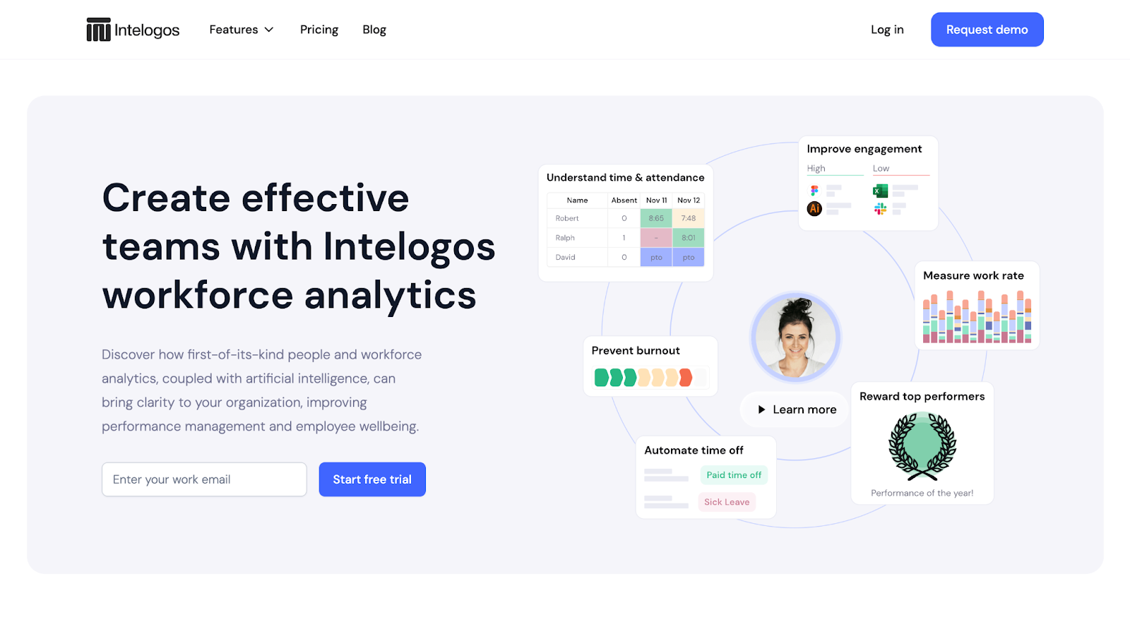
"Create effective teams with Intelogos workforce analytics." Intelogos' primary CTA delivers both a clear outcome (effective teams) and product context (workforce analytics). It's especially relevant for team leads or HR professionals looking to improve performance through data.
"Use Analytics and AI to Make Better People Decisions." This CTA is results-focused, clearly stating the "how" (analytics and AI) and the "why" (better people decisions). It avoids jargon while still appealing to data-minded teams and decision-makers. Meanwhile, "better people decisions" is a fresh, human-centered phrase that reframes HR as a strategic function rather than a purely operational one.
17. Modyfi
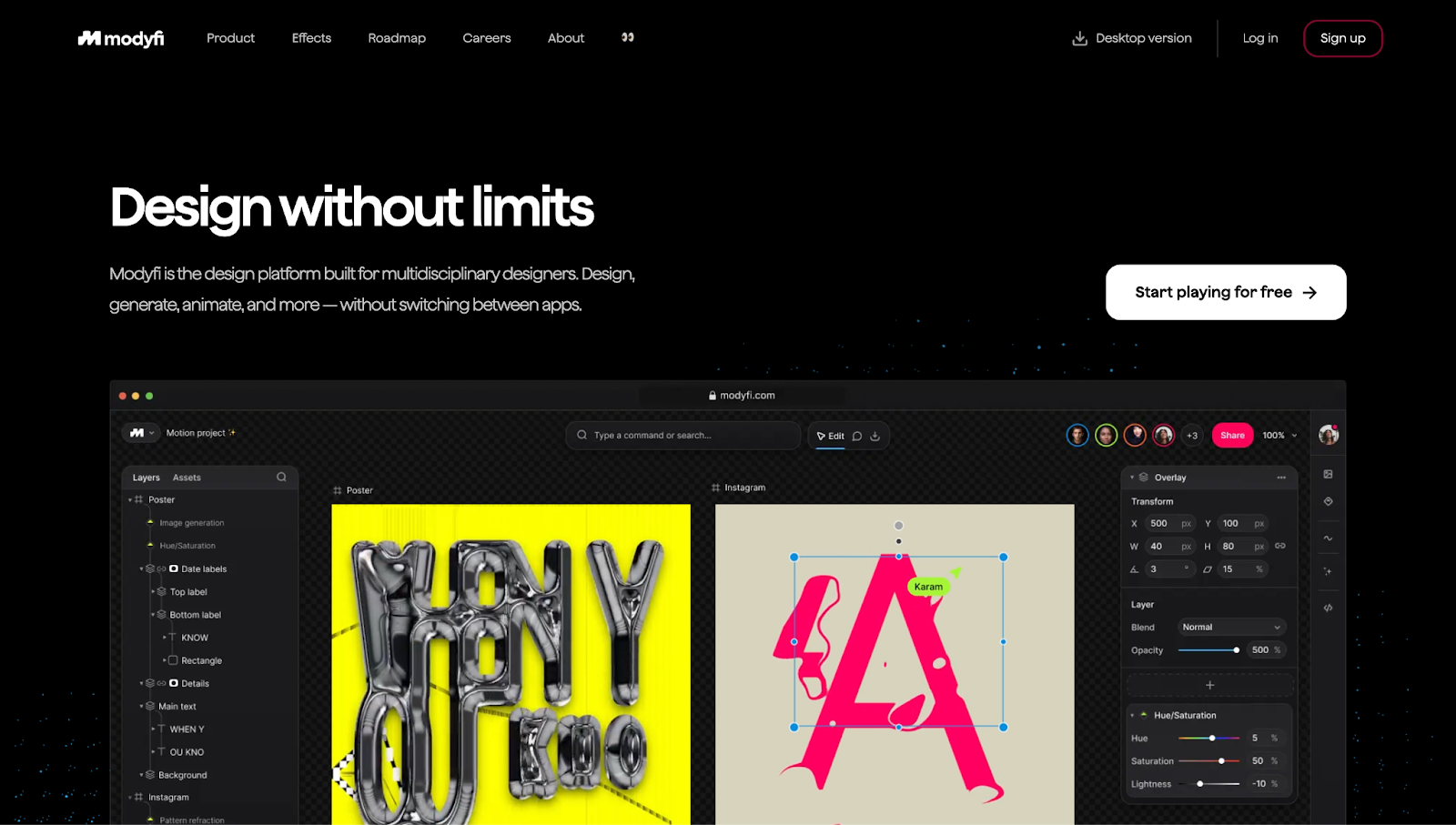
"Design without limits." This speaks directly to multidisciplinary designers who want to break free from rigid workflows and embrace experimentation with their design software.
"Start playing for free." This CTA leans into a playful tone. Swapping "get started" for "start playing" reframes the product as a creative sandbox rather than a tool. Including "free" removes cost-related barriers to entry and invites low-stakes exploration.
"Start. Playing." Repetition reinforces Modyfi's punchy, energetic, and fun brand voice. The staccato structure adds rhythm and flair, appealing to a creative audience that values clever copy.
18. Storylane
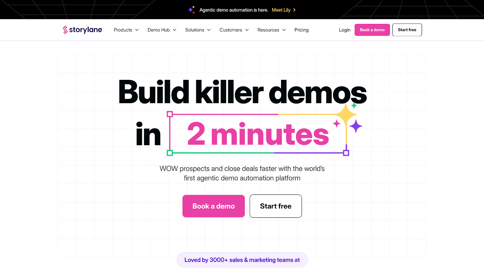
"Build killer demos in 2 minutes." Storylane's countdown animation, designed by ThunderClap, shows that creating great demos for your digital products takes very little time. The phrase "killer demos" uses bold, informal language that makes the promise feel both exciting and achievable, perfect for marketing teams looking to impress without investing much time or energy.
"Connect your marketing & sales stack." This CTA appeals to a common user goal — integrating tools across go-to-market teams — without overexplaining. The word "stack" adds tech-savvy credibility, while "marketing & sales" bridges two often-siloed functions, signaling a more unified workflow.
19. Tango
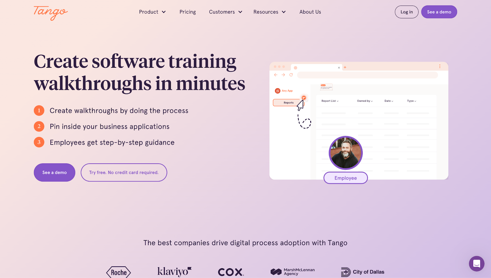
"Create software training walkthroughs in minutes." This headline on Tango's site, made by Candid Leap, sets a time-based promise, which is ideal for busy teams that need quick, repeatable results.
"Try free. No credit card required." This removes the typical friction point: cost. "No credit card" signals zero commitment, making it easy to trial the product.
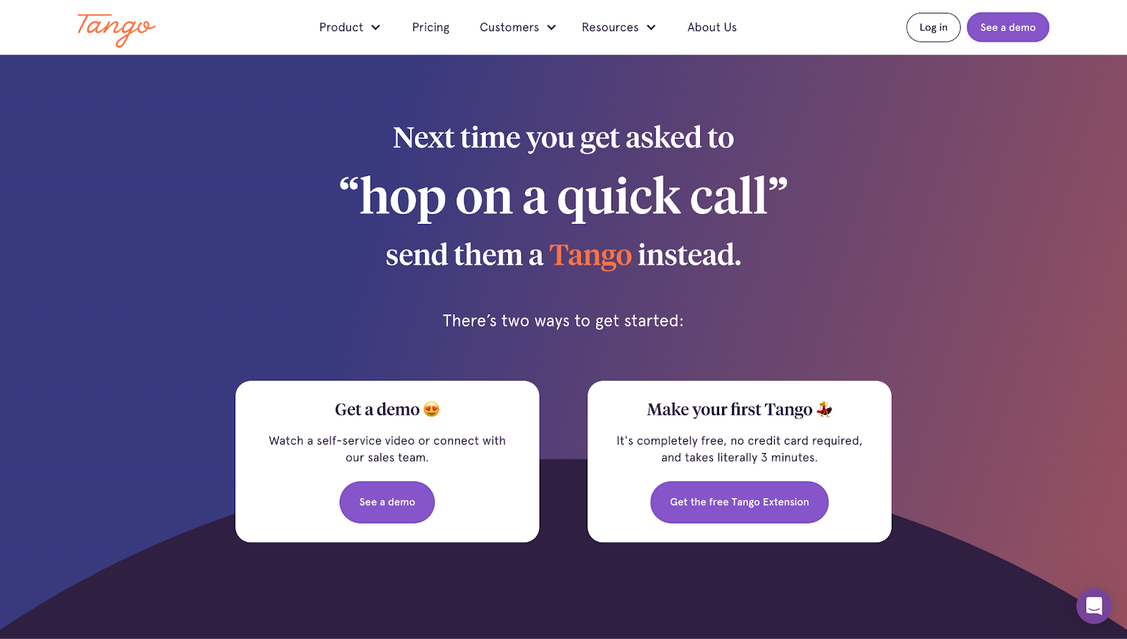
"Next time you get asked to 'hop on a quick call,' send them a Tango instead." This playful copy flips a common workplace annoyance (impromptu calls) and frames Tango as the smarter, more efficient alternative.
20. Way
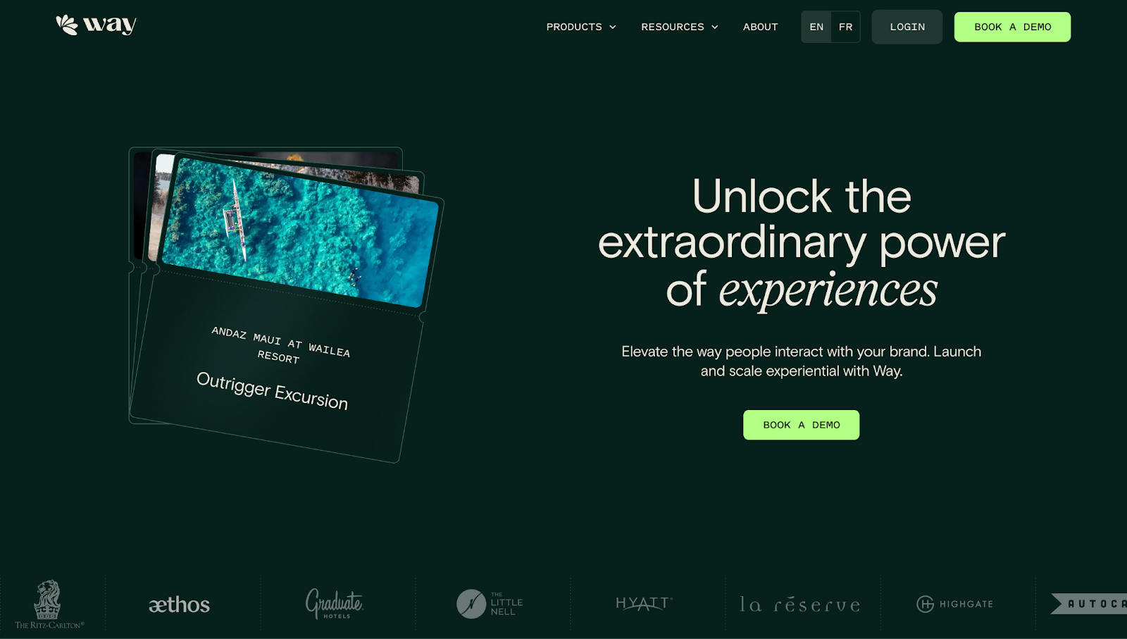
"Unlock the extraordinary power of experiences." Way's website headline highlights the essence of being human. The words "extraordinary" and "experiences" — the latter in italics for emphasis — make it aspirational, tapping into customers' emotional motivations. Plus, "unlock" is action-oriented, adding a sense of empowerment.
"Effortlessly bring your brand to life with a stunning user-interface." "Effortlessly" reduces hesitation before the customer even acts, while "bring your brand to life" taps into a deeper emotional goal: creating something that feels uniquely yours. The phrase "stunning user-interface" adds a visual promise, ideal for teams prioritizing both form and function.
21. Quin
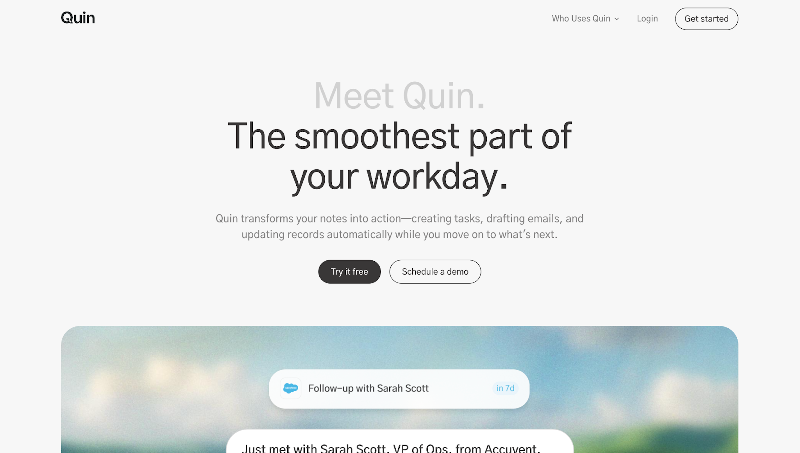
"The smoothest part of your workday." This line makes a big promise in a calm, confident tone. Instead of highlighting Quin’s features, it focuses on how the tool feels to use — smooth, intuitive, and unobtrusive. It's the kind of phrasing that helps the product stand out from the typical "boost productivity" headlines.
22. Teachable
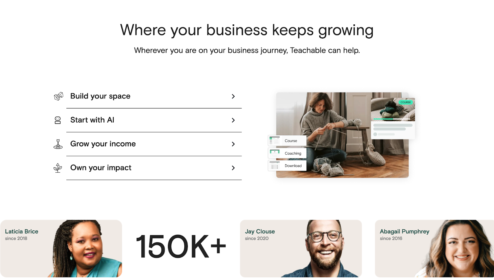
Expandable menus with CTA links. Teachable uses clearly defined expandable menus that link out to important parts of their website — areas they want visitors to reach. When you click on the CTA links (“Go to site builder,” “Explore our AI hub,” “Discover teachable:pay,” and “View student experience”) you reach pages that briefly highlight the product and then showcase a “Start for free” CTA button, encouraging you to act on your interest and sign up.
23. Unity Catalog
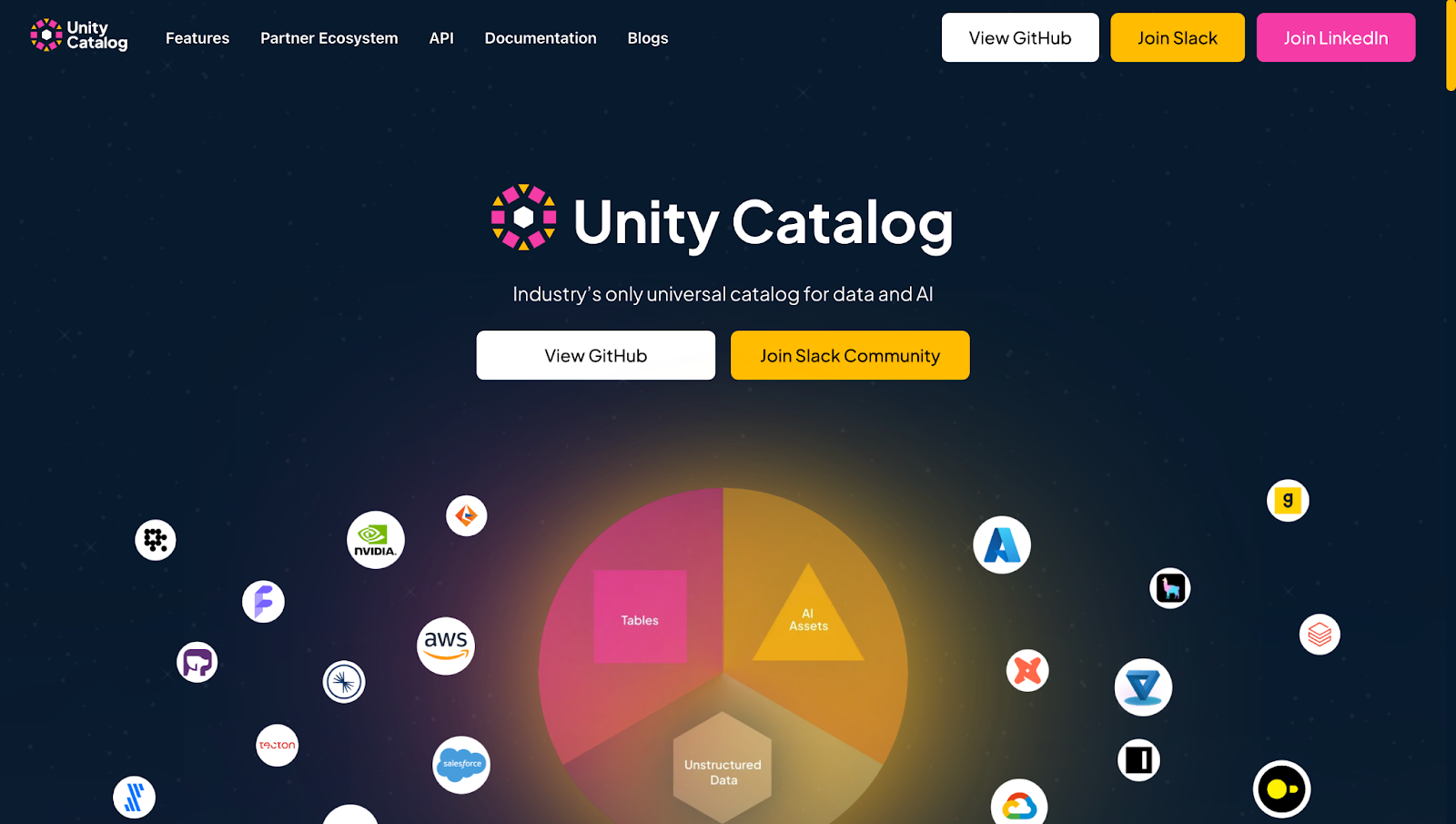
"View GitHub." When dealing with expert audiences like DevOps teams, this is a smart way for Unity Catalog to skip the marketing speak and deliver immediate access for those who prefer evaluating through hands-on experience.
"Join Slack Community." This CTA introduces a human layer to a highly technical product. It invites people to connect, ask questions, and share knowledge — a trust-building move that softens an otherwise enterprise-level experience.
24. AirOps
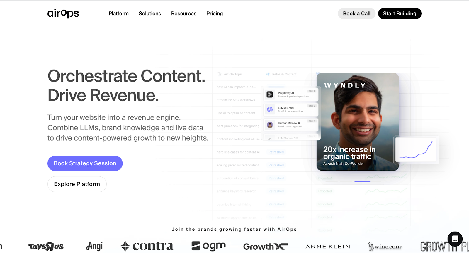
"Orchestrate Content. Drive Revenue." AirOps' CTA has a "cause-and-effect" structure — do this, get that. It clearly communicates the value proposition and appeals to teams focused on outcomes rather than just tools.
"Book Strategy Session." This CTA button offers consulting-style value. "Strategy session" feels more tailored and high-touch than a typical demo, suggesting AirOps is willing to go beyond a standard walkthrough to provide personalized guidance.
"Explore Platform." A softer alternative for curious visitors who aren't quite ready to connect, this CTA invites low-commitment browsing, which is a smart match for the looping video that handles much of the early-stage selling.
25. Jasper
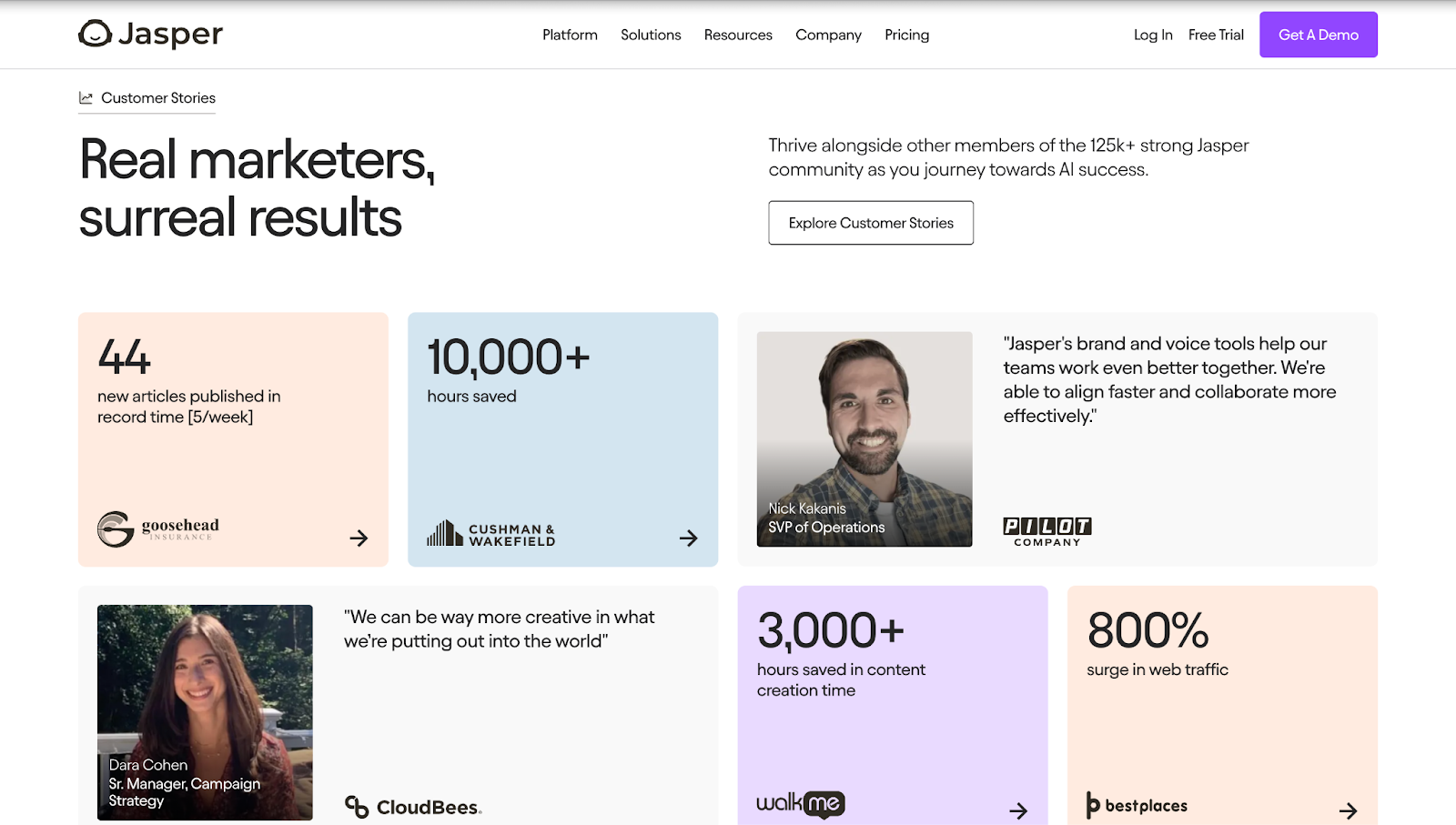
"Explore Customer Stories." As you scroll down Jasper’s website, designed by Josh Jacobs, you’ll reach a section with a few client testimonials and data on how effective Jasper is. Jasper knows how important social proof is when convincing the reader to sign up, so they highlight an “Explore Customer Stories” CTA button that leads to a landing page dedicated to showcasing case studies and client quotes.
26. Lob
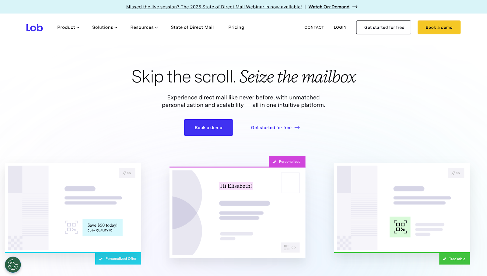
"Skip the scroll. Seize the mailbox." This is playful and punchy, flipping the script on the usual jargon-heavy copywriting. It repositions direct mail as a bold, modern alternative to endless digital scrolling.
"Create, send, measure." This CTA works because it's concise and action-oriented, narrowing the product's core value into just three verbs. It mirrors how marketers think about campaign workflows, making the process feel both familiar and more streamlined with Lob. The structure also reinforces Lob's promise: full-cycle support, from execution to measurable results.
27. Outseta
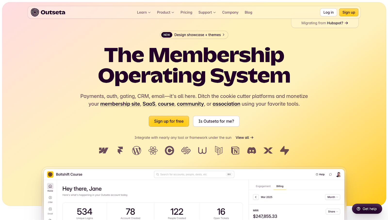
"Is Outseta for me?" This refreshingly empathetic CTA shows that Outseta acknowledges that visitors might still feel unsure. It offers a softer, low-pressure path forward, an approach that’s especially useful if your target audience is early-stage teams that want to explore before diving in headfirst.
28. Harness
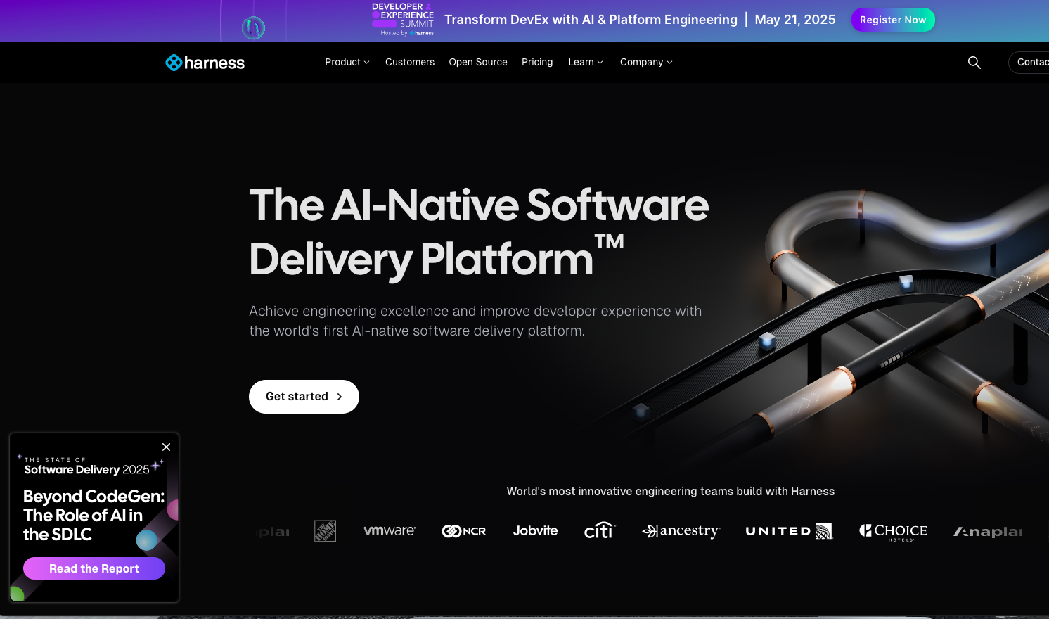
"Read the Report." When you enter Harness' website, a pop-up box appears in the bottom-left corner that states, “Beyond CodeGen: The Role of AI in the SDLC,” followed by the CTA button “Read the Report.” The pop-up says just enough to pique interest without giving away any insights to compel readers to read the report to learn more.
Increase conversions on your website with Webflow
Every detail matters when you’re using CTAs to drive conversions, from persuasive copy to smart, strategic placement. With the right website-building tools, you can capture attention and turn casual visitors into long-term customers.
Start with Webflow Optimize. Your team can run A/B tests to fine-tune CTA copy and placement, personalize site experiences so they resonate with each visitor, and harness AI for better insights and faster results. Build with Webflow today, start converting tomorrow.
Build websites that get results.
Build visually, publish instantly, and scale safely and quickly — without writing a line of code. All with Webflow's website experience platform.