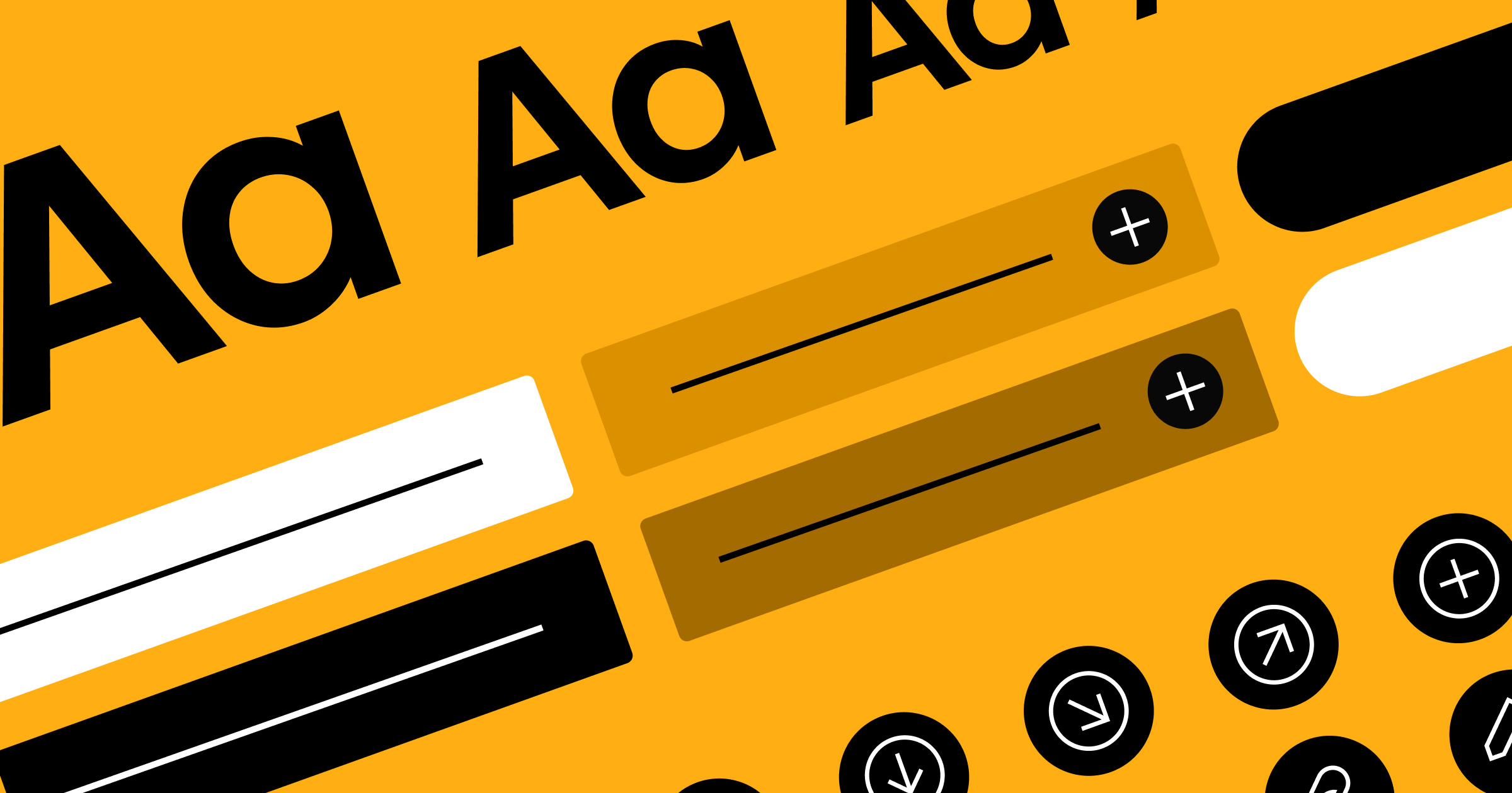
Minimalism makes simplicity an art form.
Minimalism became popular in New York in the late 1960s thanks to artists like Frank Stella and Robert Morris. In response to abstract expressionism, they created simplistic works of art featuring basic shapes in unusual locations, such as a giant ebony cross standing on a lawn.
Today, graphic designers use minimalism to create iconic visuals, from the timeless Apple logo to the distinctive Nike swoosh. In this guide, we’ll cover the basic principles of minimalism and showcase a few examples to inspire your projects.
What’s minimalist graphic design? Simplicity vs. minimalism
When discussing graphic design, people often use the terms "minimalism" and "simplicity" interchangeably, but they have slight differences. Simplicity focuses on clarity — it's about making things easy to understand or use. Minimalism goes a step further by reducing designs to their core elements, conveying a message using the fewest embellishments possible.
While minimalism is an aesthetic choice, it also serves a practical purpose. Minimalist website designs use sans-serif typography (a more easily readable font), limited color palettes, and basic shapes to make every menu and page as intuitive as possible. These design elements reduce cognitive load so visitors can concentrate on the site’s essentials.
Say you’re building a client’s photography website. You can use minimalism to showcase their pictures — perhaps designing a simple black-and-white background so the colorful photos pop on the page. These images will instantly engage site visitors, which may inspire them to hire the photographer.
6 fundamental principles of minimalist graphic design
If you’re looking to incorporate minimalism into your next design, here are six principles to keep in mind.
1. Simplicity
As mentioned above, simple visuals are supposed to be easy to understand. Minimalists can use this tactic to create intuitive, user-friendly designs. But this process can be difficult, as every color, shape, and line in a logo or graphic must be strictly necessary. This precision requires a clear understanding of the design’s core message and the discipline to remove anything that doesn’t support it.

For instance, this whale logo only uses two colors (three if you count the whitespace). The logo has no additional embellishments like shading or ridges. Instead, it relies on negative space to carve out the design and a handful of bubbles to indicate animal activity. The key to its simplicity is that each element is necessary to invoke the message intended: a whale in its natural environment.
2. Visual hierarchy
Another tricky aspect of minimalism is to create a clear visual hierarchy without overusing colors and borders. Instead, designers often rely on a phenomenon called the golden ratio to size and space elements so their relative importance is obvious.
For instance, they might make a site’s main title approximately 1.6 times larger than the body text. This difference immediately tells readers that the title contains important information. And because the title is more easily noticeable, the reader gains context for the information to come — that way, they can choose to read the body text or to skim past it.
3. Functionality
Minimalist designers follow a principle architects call “form follows function,” meaning the shape of something should immediately indicate its purpose. Logos are a great example of this concept.
Take the Dropbox logo: It’s a simple blue box that uses a single color and whitespace to create the visual. People typically use boxes to pack and ship items, so this logo reflects Dropbox’s capability to store and share files well. The open top indicates that there’s still “room” in the box, inviting users to upload files to the program.
By creating a logo that reflects the box’s real-life purpose, Dropbox signals their software’s purpose without having to say a thing.
4. Whitespace
Whitespace is the blank area minimalist designers use to separate page elements. Ample whitespace creates a clean and organized look, makes navigation more intuitive, and contributes to a straightforward user experience.
An easy way to think of whitespace is to imagine a painting of a spotless white desk. To suggest that it's a workspace, some artists would fill the space with coffee cups, a keyboard, and scattered files.
A minimalist would simply add a basic line drawing of a computer and perhaps a mouse, leaving the rest of the space blank. They can get their message across without all the additional indicators, which reduces visual clutter and keeps readers focused on the existing elements.
5. Color consistency
Minimalists can also communicate meaning through color. People often associate minimalism with neutral hues like beige, gray, and black. But these palettes can also feature brighter tones — the minimalist effect comes from using these colors with restraint. A lot of thought goes into how to apply each color and whether it’s necessary.

For example, the Dell logo is a blue circle with the brand name inside it. According to color theorists, blue denotes security and trustworthiness, making it a strong choice for a computer company. By sticking with this single color, Dell subtly signals that they’re a dependable brand.
6. Sans-serif typography
To align with the theme of clean and simple lines, minimalists often prefer sans-serif fonts. Avoiding serif tails simplifies the letters down to their basic elements, contributing to a modern and contemporary feel. Sans-serif fonts also often have a more even line weight distribution than serif fonts, so these letters tend to feel less obtrusive.


Free ebook: Web design 101
Master the fundamental concepts of web design, including typography, color theory, visual design, and so much more.
Minimalism in action: 3 design ideas for inspiration
Designers can apply minimalism to all sorts of projects, from product packaging to web design. Here are three examples of minimalist designs from various mediums.
1. Website — Hello Folk Digital Studio

Hello Folk is a design studio that uses simple, clean designs to resonate with a modern audience. Their website exemplifies this goal with sparse images, sans serif typography, and plenty of whitespace. The navigation is straightforward, too, with only three options that appear when you open the menu.
These design choices all align with the company’s claim that they “believe in simplicity and effectiveness.” By matching their designs to their messaging, Hello Folk creates a strong brand identity to connect with clients who have a similar style.
2. Business cards — Lines & Dots

This business card design from Melody Shar features a distinctly minimalist design that, as its name implies, uses only lines and dots. Adding just those two shapes — and a bit of color — next to the text gives these business cards a modern feel.
Despite their simplicity, these designs don’t follow a traditional business card structure of plain text and a logo, making them a memorable way for a company to introduce themselves.
3. Kitchen Conversion Aid: Infographics

This infographic from Alexander Glante demonstrates how to convert common kitchen measurements, like ounces to cups. There’s ample whitespace, and the icons are simple line drawings. Blue is the only color other than black or white, and the typography is plain.
These design choices make the infographic easy to read, which is essential when doing quick conversions while cooking.
Create elegant designs with Webflow
If your client’s hoping for a straightforward design that draws attention to graphics and logos, minimalism is a great fit. But to bring this minimalist vision to life, you need a platform that gives you complete control over the canvas.
For web design projects, Webflow has the tools you need — like shareable libraries and reusable components — to help you maintain a consistent design system and structure content for both simple and complex projects.
Meet every client’s needs with Webflow.

Get started for free
Create custom, scalable websites — without writing code. Start building in Webflow.