


A website’s menu serves as its North Star — a design element that leads you where you need to go.
Sometimes called a navigation bar, a website menu organizes webpages and presents relevant internal links to site visitors.
Think of it this way: No matter how good the food at a restaurant is, a diner has little clue what to order if they can’t see a menu. Website visitors need the same guidance. A website menu is where you lead a customer toward the webpage, product, or service that fits their needs — much like a restaurant menu leads diners toward the dish they’re sure to enjoy.
Let’s explore the different types of website menus and learn how to create one that guides your customers toward a satisfying experience.
Common types of website menus
Websites require different navigation styles depending on their design and user flow. Here are a few common types of navigational menus you can use based on your website.
- Horizontal menu. This is a horizontal list at the top or bottom of a page. It usually displays the names of your most important pages.
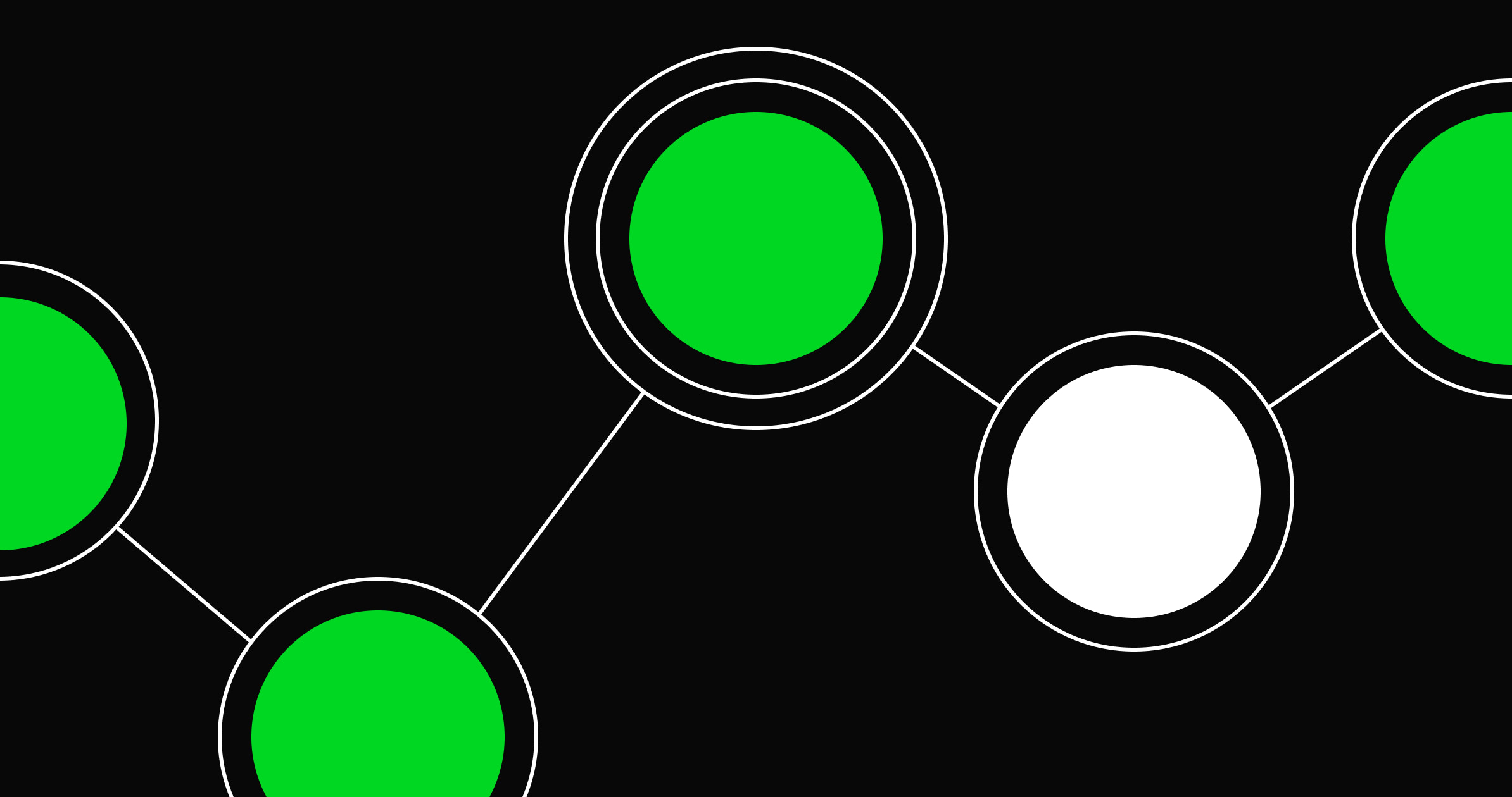
- Hamburger menu. A hamburger menu consists of two or three stacked horizontal stripes. When visitors click, it reveals an expanded list of offerings.
- Sidebar menu. As the name suggests, a sidebar lists items on the left or right side of the page, generally next to the content.
- Sticky menu. Sticky menus, or fixed menus, remain in one place while visitors scroll through a site. They can be any style, as long as the design is consistent.
- Dropdown menu. Websites with dropdown menus save space and add interactivity. They’re usually hidden until a user clicks to display additional options.
Some menus work better than others, depending on a website’s function and target audience. A scroll-heavy single-page website benefits from a sticky menu that visitors can access without scrolling back up. For ecommerce websites, place the menu in a spot that doesn’t interfere with the shopping cart button or other important elements. Menus should offer function without fighting for space.
It’s worth testing out different menu types until you find one that does the job and fits the rest of the web design. Creating multiple menus can be time-consuming, but it’s worth the extra effort to find what works and what doesn’t.
5 websites with cool menus to inspire your next project
We’ve compiled five examples of effective menu designs. They’re all uniquely created to not only guide visitors through content but do so in the most exceptional and artistic ways possible.
1. The Rail Park

On the Rail Park’s website, a full-page menu opens when visitors click on the top left hamburger icon. The menu has all the necessary information in one place, organized into several stylized sections and subcategories, from basic site pages, like news and shop, to the informational map and team pages.
The white font on a black background has ample negative space to highlight menu items. And if you can’t find the link you’re looking for, there’s a large search bar at the top of the page.
A green button in the top right corner with the word “donate” is a standout call to action (CTA) that invites visitors to contribute while adding a pop of color to the monochromatic design. Putting a CTA on a frequently visited element (like a menu) attracts extra attention.
We love this full-page menu because it’s as useful as possible for visitors. It prioritizes functionality and puts its conversion goals first.
2. Swell Nav Menu

Bradley Stallcup created Swell Nav Menu to showcase a menu design that blends interactive elements with a hover effect to engage visitors by adding movement.
Click on the top right hamburger icon to open a full-page horizontal menu that moves side to side with your cursor. When you hover over a menu item, a square black-and-white image appears behind the text with a subtle animation to differentiate pages. Static text at the top and bottom of the page fills the blank space with contact details and social media links.
This design engages and encourages visitors to explore the whole site. If you want a smooth, motion-based menu, use this one for inspiration or clone it from Webflow.


Build websites that get results.
Build visually, publish instantly, and scale safely and quickly — without writing a line of code. All with Webflow's website experience platform.
3. Rita Parker

Rita Harper’s photography site employs a sidebar menu design with a soft grayscale color scheme and serif text. It highlights various portfolio categories — recent, personal, commission, and travel — to bring visitors’ attention straight to her work. White space separates Rita’s contact information, subtly organizing the menu options into categories.
The sticky menu is an ever-present guide to the site, reducing navigation clicks to streamline the visitor experience. It doesn’t take away from the main attraction of the page: her photos. Rita’s portfolio proves less is more when it comes to menus.
4. Hofft
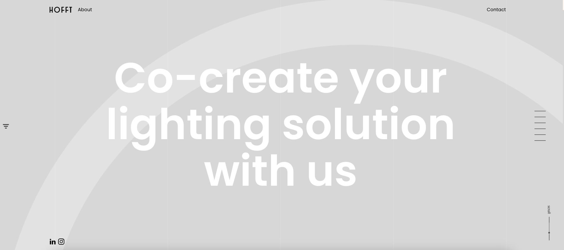
Danish lighting company Hofft uses a sidebar menu with modern UX design features to reduce the number of site elements on the page. Interactive horizontal lines on the right side of the screen reveal category names when users hover over them with a soft, smooth animation.
The subtle design lets the light and color-based web design shine without cluttering the page with text. The entire website is a single landing page, so having a fixed menu avoids unnecessary scrolling while maintaining a clean, minimalist vibe.
5. Raca Design Studio
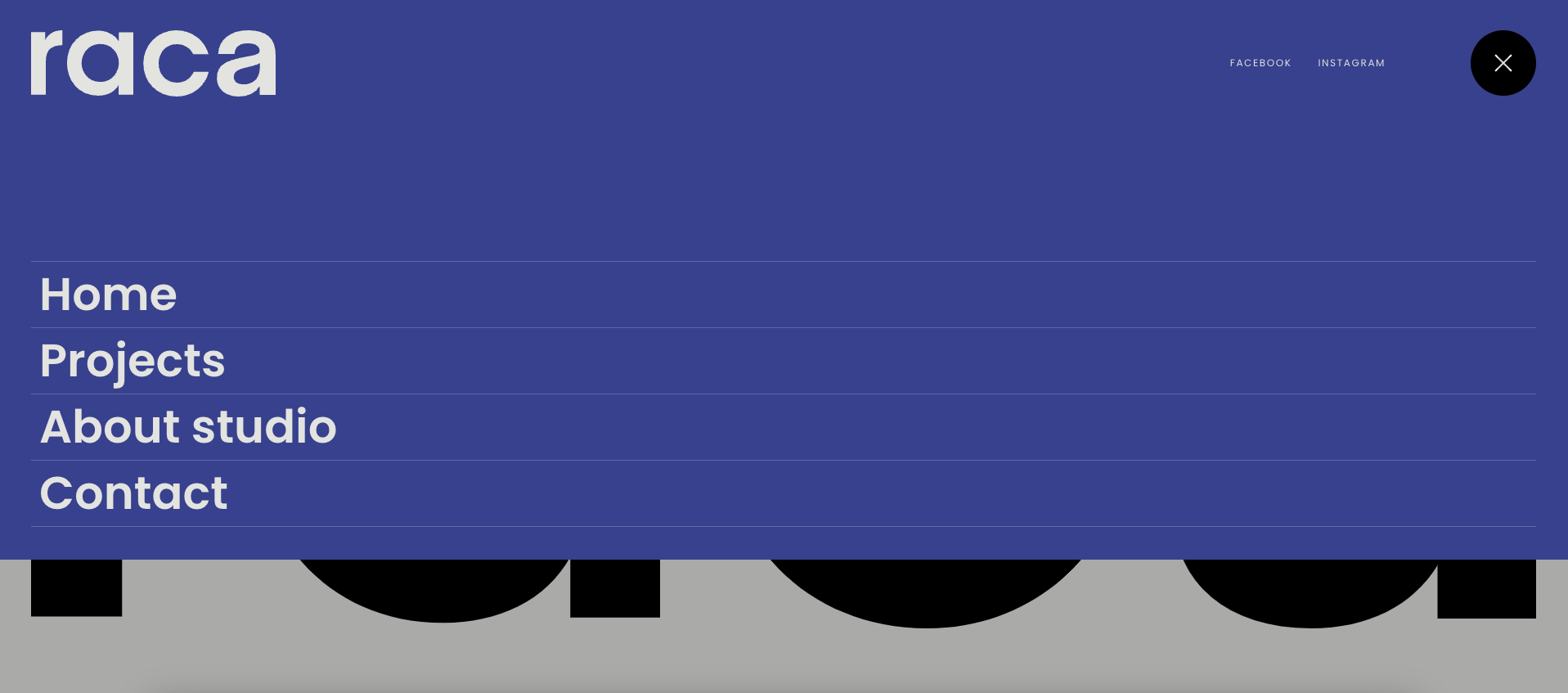
Raca Design Studio’s architectural and interior design expertise translates to their website menu. It opens from a round hamburger icon in the top right corner and drops down from the top of the page to reveal a clean list of categories: home, projects, about, and contact.
Above these categories are social media links and a round “X” button to minimize the menu. These features fill in the otherwise blank space and give users more navigation options without complicating the design.
Raca’s dropdown navigation saves space on the site while maintaining usability. Its minimalist options highlight the color scheme and font, asserting Raca’s branding and design style with only a few design elements.
Create a memorable website
Users don’t want to rummage through webpages to find what they need. Menus make websites navigable, responsive, and user-friendly. When well-designed, they also add new aesthetic interest to a site.
At Webflow, we offer tools and resources to help you create menus that tick all these boxes. Whether you’re seeking attractive templates, responsive web design integration, or inspiration from other designers, we have you covered. Start building your next website with Webflow today.