


Your website can have a big impact even on small screens if you follow mobile-friendly design principles.
Mobile website design is all about optimizing your site to look good and function well on compact screens. Most people rely on their phones for browsing, so that’s how many potential customers will encounter your brand for the first time.
When your mobile website looks good, runs fast, and is user-friendly, you’ll keep more people moving toward desired actions. Read on to learn how to build effective mobile sites, and explore top examples to see design principles in action.
Building websites for mobile vs. desktop
Desktop and mobile web designs have different contexts, so your design approach for each version should be unique.
Desktop websites
On desktop, visitors have greater control when browsing, since most use a mouse/trackpad and keyboard. Also, people on desktop are often in a research mindset and want to use a larger screen so they can absorb lots of information.
As a designer, you have more space to work with, making it easier to use multiple columns and large navigation bars. You can display side-by-side comparisons, larger images, and interactive animations without overwhelming visitors or making it hard for them to click on elements.
Mobile websites
On mobile devices, space is tight and attention spans are shorter. People usually scroll in one direction, tap with their thumbs, and expect the site to respond instantly. You’ll typically stack content into a single column, use limited and collapsible navigation (often through hamburger menus), make buttons larger and easier to tap, and choose highly readable fonts.
It’s also important to consider performance — network connectivity and page load times vary on mobile devices. Content-heavy pages with complex animations and multimedia tend to load more slowly, frustrating visitors. Mobile website development involves prioritizing important elements and ordering them carefully.
To make that happen, there are a few common approaches to mobile design:
- Separate desktop and mobile sites. This requires the most work but means each version of your site can be built to reflect the way it’ll be viewed.
- Responsive design. Typically, this involves designing the desktop version of your site first, then adding code and features that make the site adapt automatically to better suit smaller screen sizes.
- Mobile-first design. With this approach, you’ll design your site primarily for the needs of small-screen users, then further optimize the desktop version to take advantage of the added space.
How to design a mobile site that works effectively
Here are a few on-screen elements and best practices to consider when building mobile-friendly websites:
- Vertical design. Mobile screens are naturally vertical, so design your site with a smooth top-to-bottom flow.
- Finger-friendly navigation. Tappable menus and links need enough space to grab attention and be clickable without causing mis-taps.
- Immediate value proposition. Add a brief “What you do and why it matters” section above the fold to instill confidence.
- Clear headers. Concise website headers help visitors understand each section at a glance, letting them quickly jump to what matters.
- Concise and optimized text. Mobile visitors tend to skim quickly, so short, optimized text keeps pages scroll-friendly and helps people move through the sales funnel faster.
- Prominent calls to action (CTAs). Make sure there’s a prominent CTA at the top of the page so that visitors who are ready to act immediately can do so.
- Responsive pages. Your layout design should be responsive and adapt to different screen sizes to prevent cutting off content.
9 mobile website designs that convert visitors and drive results
Here are nine mobile website examples that show how you can effectively adapt desktop layouts for smaller screens.
1. Jasper

Jasper’s mobile site, designed by OFF+BRAND, works a lot like the company’s desktop version but gets to the point faster. A prominent headline surrounded by plenty of space explains the product concisely. The navigation stays out of the way but is accessible through a hamburger menu.
The rest of the main page clearly routes visitors based on the products they’re interested in, using large, tappable buttons that mirror the desktop version but are organized in a scroll-friendly stack. As the user scrolls down, customer testimonials add at-a-glance social proof in the form of results-related metrics paired with recognizable logos. Large CTAs and arrow links keep visitors scrolling through the page.
2. Coinsetters

Coinsetters’ mobile site is conversion-focused, with an unmissable CTA — “Get free consultation” — pinned at the top of the page. This serves a similar function to the desktop website’s sticky menu but is more concise and doesn’t take up too much space.
Oversized headlines and generous spacing make the rest of the page easy to scroll through while sections about services and results are stacked into a vertical flow with numbered cards. Bold facts and figures present social proof, and step-by-step timelines set expectations for Coinsetters’ 12-hour response promise. All buttons and CTAs are larger than those on the desktop site, making them easier to tap accurately.
3. Circula
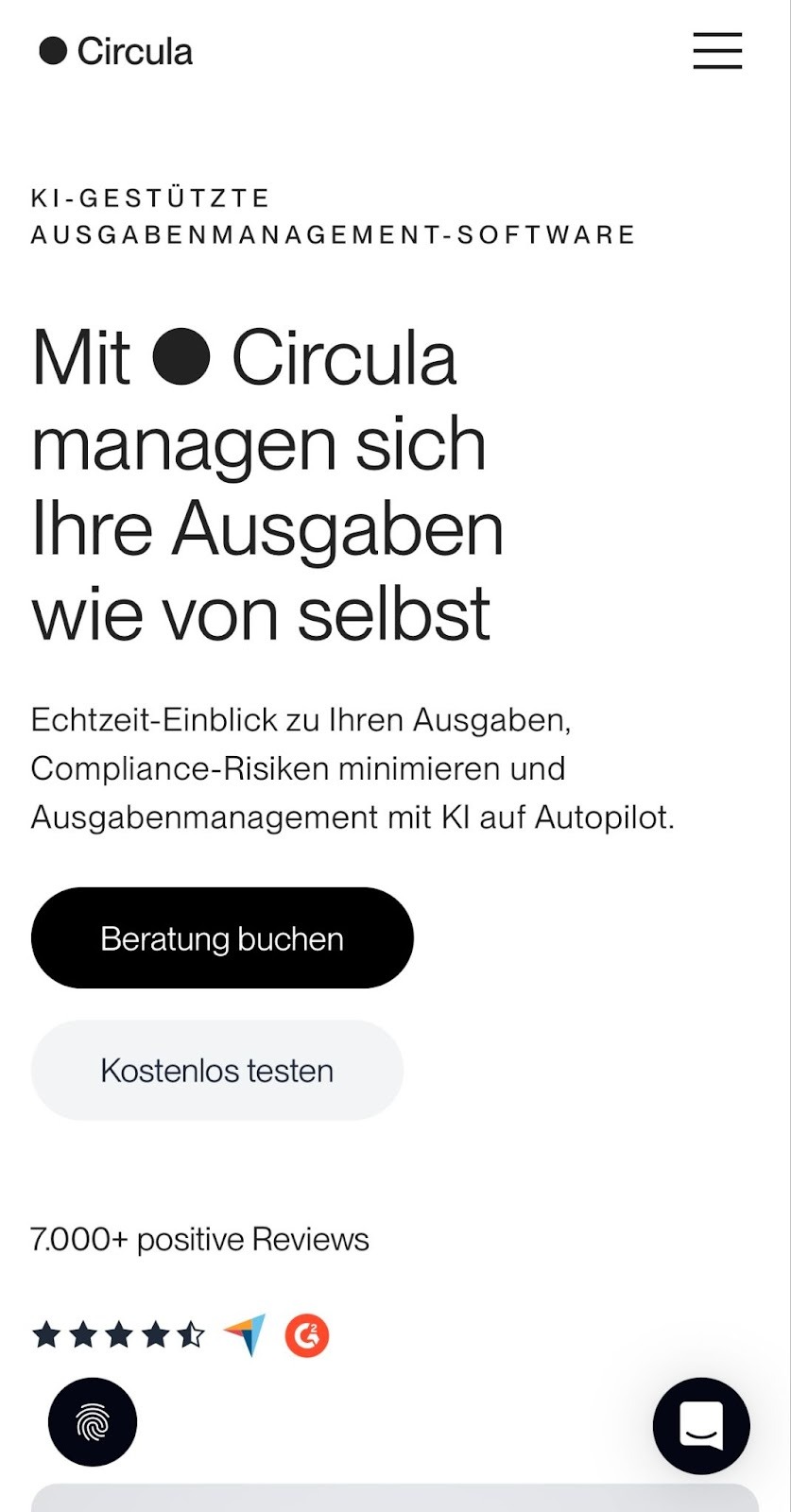
Right from the hero section, Circula’s mobile site uses jumbo fonts, lots of whitespace, and contrasting CTA buttons for improved readability. The CTA pairing works well on compact screens by providing clear choices: a primary consultation button for high-intent visitors and a secondary free option for people who want to explore without commitment.
As a visitor scrolls, the page’s layout shifts into a card-based narrative, with skimmable checkmark bullets that offer a sense of constant progress. Well-cropped screenshots show product features clearly on mobile devices while backgrounds swap between black and white to provide contrast that keeps the user’s attention and prevents scroll fatigue.
4. Cassette

Cassette’s website, on both desktop and mobile, has a distinctive visual design that resembles a mixtape cover. With its gritty black backdrop, oversized typefaces, and punchy yellow accents, the visual brand identity remains consistent across all devices.
Since the desktop site has large elements, the user experience translates well into a vertical story on mobile, with stacked modules for the “About,” “Clients,” “Team,” and “Services” sections. Client logos become full-width tiles, and team bios expand like accordions. Toward the bottom of the page, large and outlined contact buttons help visitors get where they want to go quickly.


Ultimate web design
From 101 to advanced, learn how to build sites in Webflow with over 100 lessons — including the basics of HTML and CSS.
5. Mural
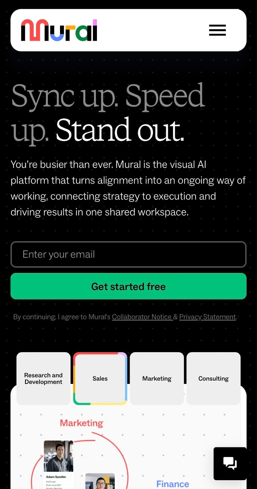
Mural’s website offers a visual, shared AI workspace designed to keep multiple teams within a company aligned. On both desktop and mobile, the headlines and dotted canvas backdrop showcase the product in action, and there’s an email CTA in the header.
On mobile, these elements have plenty of above-the-fold space. Scrolling down reveals persona tabs that target various customer profiles in Mural’s target audience. Enterprise logos, outcome stats, and swipeable customer quotes provide further proof of the company’s impact and are presented one at a time to avoid overwhelm.
6. Joyful Health
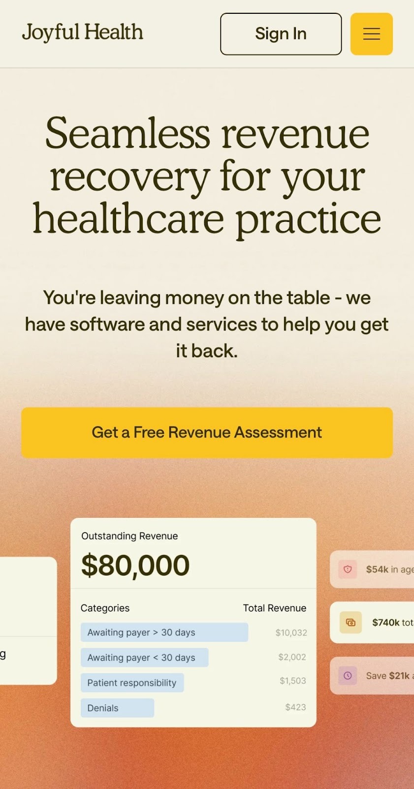
Joyful Health’s website, designed by Paper Tiger, maintains its editorial-style typography and warm color palette on the mobile version but simplifies decisions for visitors who want to quickly take action. A sticky sign-in button is always accessible, placed next to a hamburger icon that expands into a well-spaced and readable two-column menu.
This mobile site organizes its sections into a logical flow that’s great for thumb-scrolling, with prominent headlines and tappable prompts. Dashboard cards offer visual product proof, and floating data labels provide additional context about Joyful Health’s impact while improving the site’s mobile SEO through concise wording that search bots can understand.
7. Distributional

Distributional’s mobile experience retains the desktop version’s technical and sleek aesthetic while making the design more scannable. A sticky menu pairs an “Install now” CTA with a hamburger menu, keeping navigation and conversion opportunities one tap away.
Short section labels and generous spacing turn complex ideas into bite-size steps, encouraging steady progress without losing the visitor’s attention. High-contrast panels and wireframe graphics add visual anchors that don’t crowd the copy. “Learn more” buttons throughout the page let users act whenever they’re ready without forcing them to scroll back up.
8. Nory

Nory’s mobile site, designed by Kyle Craven, keeps a desktop-centric product story readable through legible text and visuals. This helps the target audience — restaurant teams — grasp the company’s value proposition in seconds. For example, results-based stats are arranged horizontally on the desktop site but are vertical and highly visible on the mobile version.
The page explains product features through looping animations that are optimized to load quickly on mobile devices. Instead of a vertical stack, other sections are grouped into swipeable cards, allowing visitors to navigate large amounts of information efficiently and focus on one element at a time.
9. Tavus

Tavus maintains its retro Y2K aesthetic on its mobile website but adapts the design into a clean, single-column stack that visually separates key elements. Large serif headlines and CTAs create clear thumb targets, and each demo has a self-contained card that presents the company’s AI products individually.
The sticky hamburger menu and site logo feature heavy borders and shadows so that they’re visible and accessible. The menu is a collapsible accordion, giving the rest of the site’s elements more room to breathe. Like on the desktop version, each bit of complex API messaging remains readable thanks to spacious breaks.
Bring your mobile web design to life with Webflow
Mobile web design works best when your site respects how people browse — typically with one hand, in short bursts, and quickly. The best mobile websites shrink the desktop layout and prioritize what matters most for a responsive design and tap-friendly experience.
To make that happen, you can use Webflow to design intentionally for mobile users. Customizable page structures and flexible components let you bring your brand to life without compromising usability, and mobile-friendly templates help you get started fast.
Create websites that work great on every screen with Webflow.
Build websites that get results.
Build visually, publish instantly, and scale safely and quickly — without writing a line of code. All with Webflow's website experience platform.