- Customer stories
- Heco
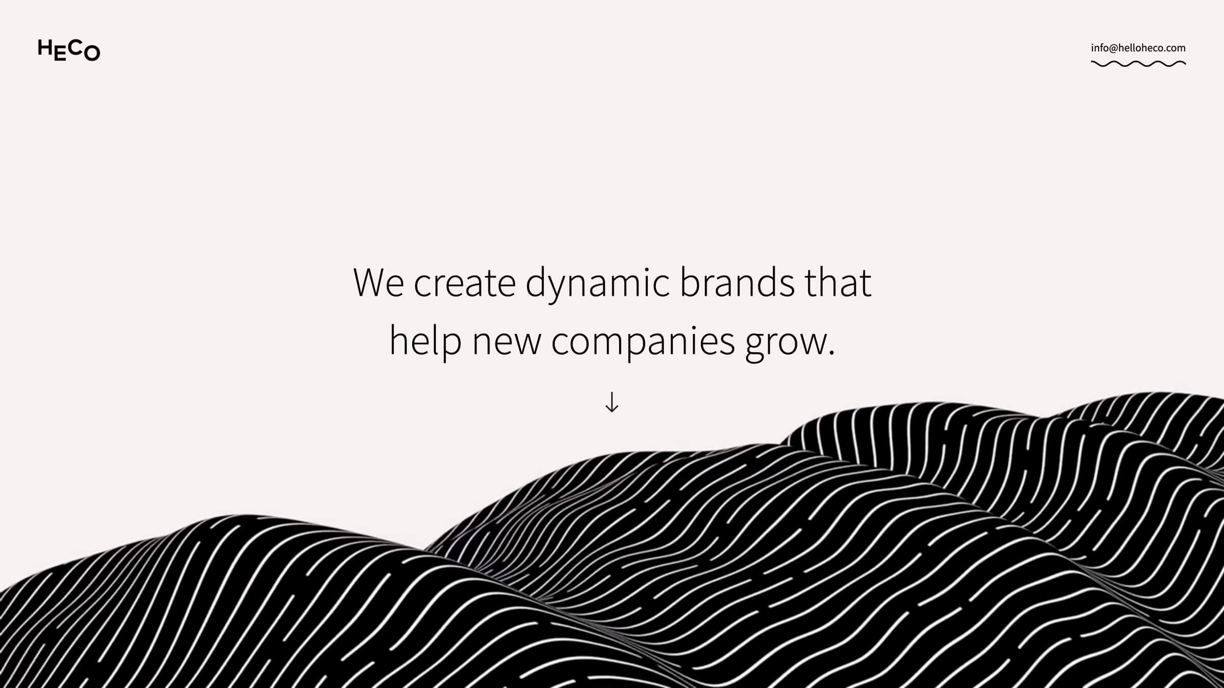
Heco builds world-class sites for clients
Heco Creative Directors JT Helms and Matt Cowen, work together to build custom sites for major clients — and they do everything without relying on developers.
Unlock your site’s full potential with best practices vetted by our experts. Learn the Webflow Way.
“Webflow is the first web design tool that I used that felt like more than a prototyping tool — and gave me the confidence to go live with what I built.”

Life before Webflow
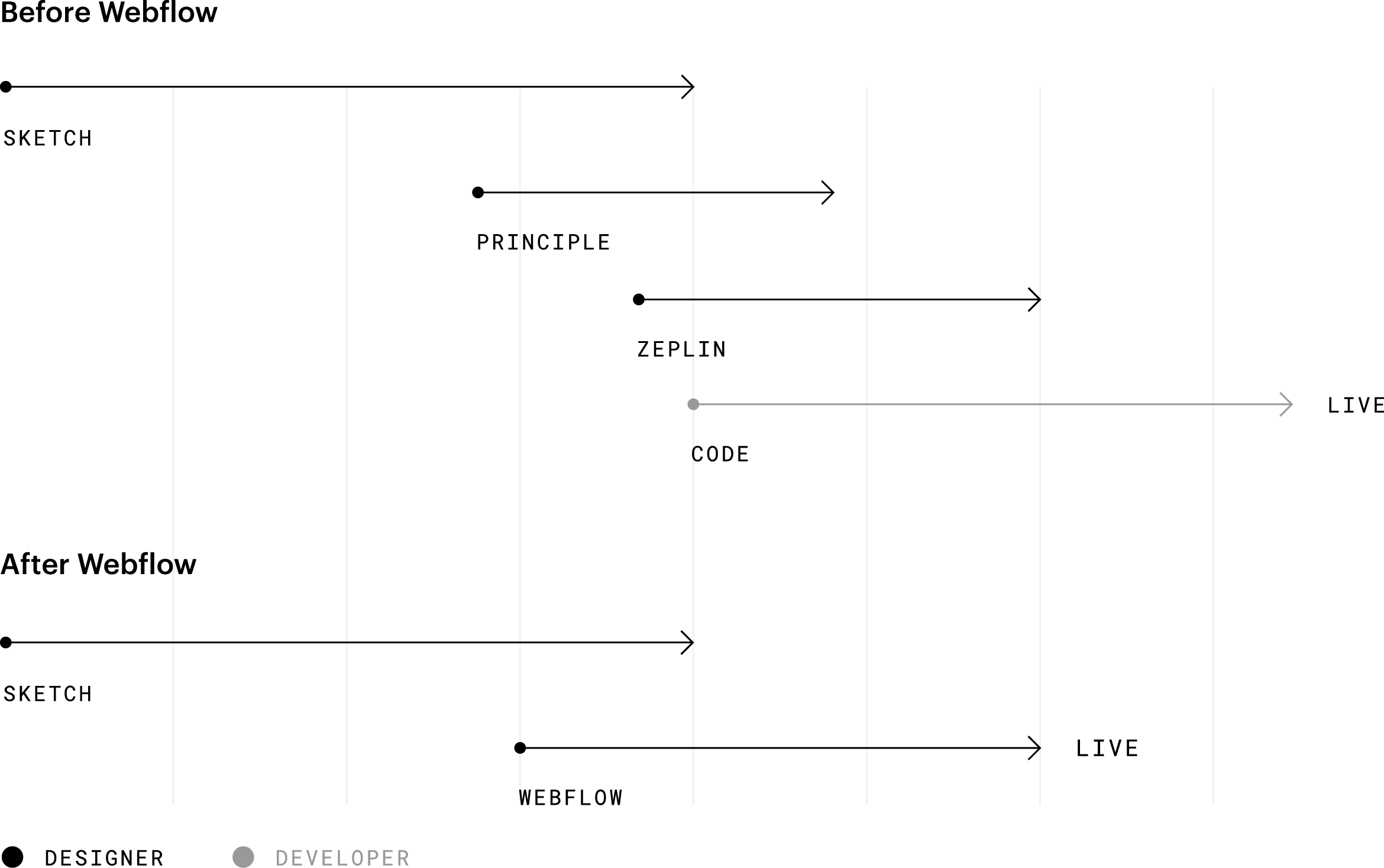
Before JT started using Webflow, his web design process meant spending a lot of time in design software, mostly Figma. And because he didn't do much web development himself, the next step meant handing his designs off to engineers through their design-to-developer handoff tool, Zeplin.
Before a developer could bring his designs to life, though, he had to jump through several hoops. That included marking up mockups with specs, using something like Principle to prototype some animations, and giving the developer some sense of his artistic direction. After that, it was a waiting game.
Life after Webflow
Once JT tried Webflow, he was impressed with the complexity and flexibility of the product. In his words, “Webflow is the first web design tool I’ve used that felt like more than just a prototyping tool — and gave me the confidence that I publish what I built with it.”
Building and collaborating on new sites
Now that JT can design and build sites directly in Webflow without needing to spend time coding — or waiting on a developer to ship it — he was able to move a lot faster. And his copywriting partner, Matt, can easily jump into the Editor and tweak copy without breaking the design. With Webflow, they can collaborate seamlessly, then jump into the production phase a lot quicker.
Once the site is built, JT can set up hosting, and invite clients to update the site right within the Editor. In other words, Webflow makes it easy to build, ship, and manage custom sites across different teams.
There's a big chunk of that web design process that I can skip now. I can sort of merge the prototyping and development phase, which has helped me build client sites a lot faster.
– JT Helms · Partner & designer @ Heco
Putting Webflow to the test

JT and Matt put Webflow to the test when they got hired to build a new site for Second City Works, the professional services arm of the legendary Second City comedy theater. Second City Works use improv activating techniques and metaphors to facilitate team building sessions and company offsites.
Before diving into a site overhaul, Heco worked to help define SCW’s key benefits and differentiators. They also worked together to create a new design language inspired by the classic improv principle of “yes, and.”
A big goal for the website update was to really highlight their new design language in order to make the content more engaging for visitors. Heco did that by leveraging Webflow’s interactions and animations to emphasize key ideas and to make the user experience more playful.
Explore more Enterprise stories


Analyze
Localization
Optimize
With an outdated web platform and a looming global rebrand, Verifone needed to prove their marketing team could drive the company’s next era of growth. With Webflow, they rebuilt their digital presence in just 10 days, repositioning the company for a ‘boundless’ future.

Analyze
Localization
Optimize
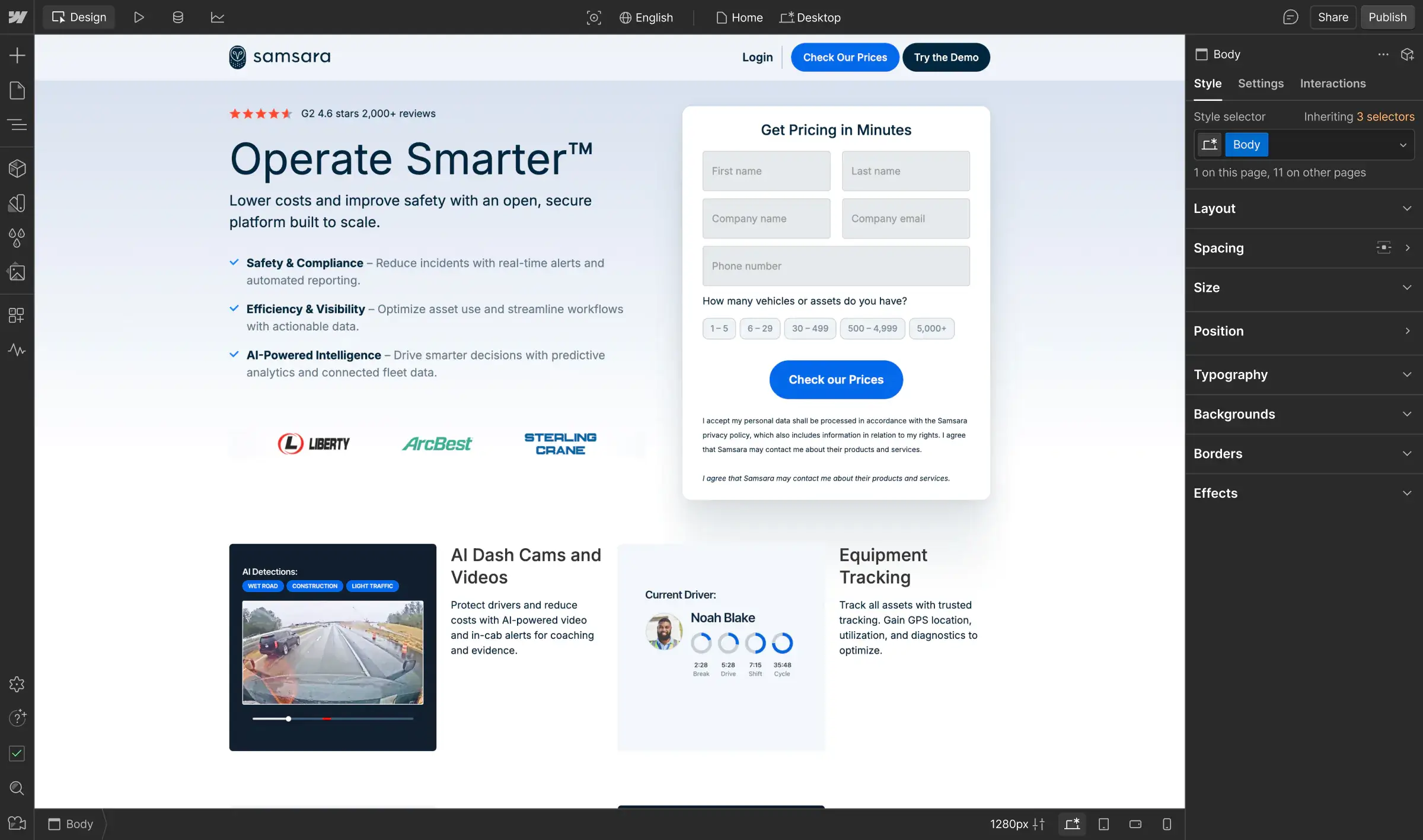
Samsara’s marketing team needed a more powerful way to test ideas and reach the right audiences. With Webflow Optimize, they took control of experimentation and can launch campaigns in days, personalize at scale, and drive stronger results across the funnel.


Analyze
Localization
Optimize
Dermalogica once relied on intuition to guide their digital strategy. With Webflow Optimize, the brand now runs hundreds of experiments across six global sites, uncovering insights that shape both their customer experience and their business investments.

Analyze
Localization
Optimize
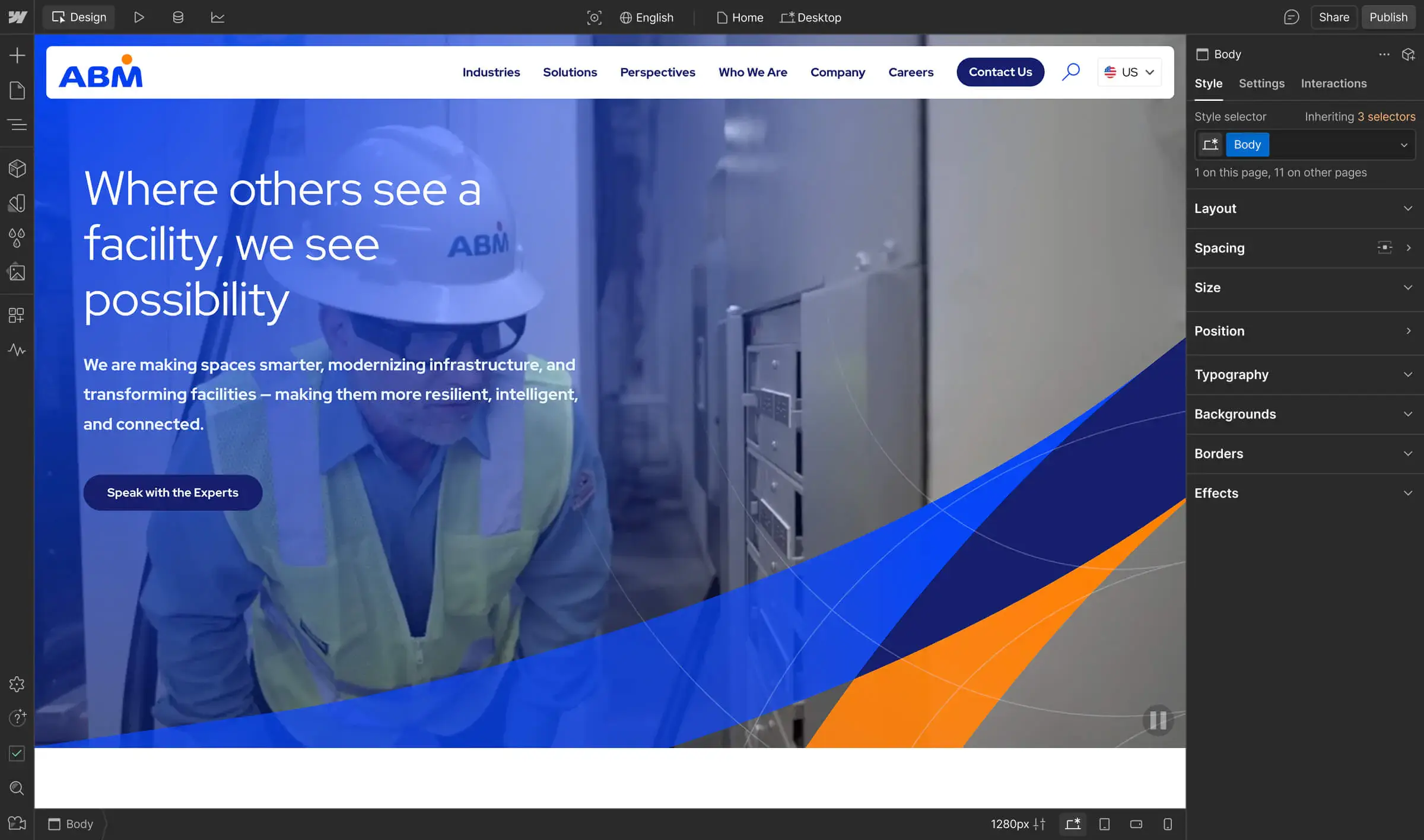
Evolving far beyond its janitorial roots, ABM sought a digital transformation that could match their growth and modern brand. With Webflow, they reshaped their story, accelerated publishing from weeks to hours, and built a website that powers global scale.

Analyze
Localization
Optimize
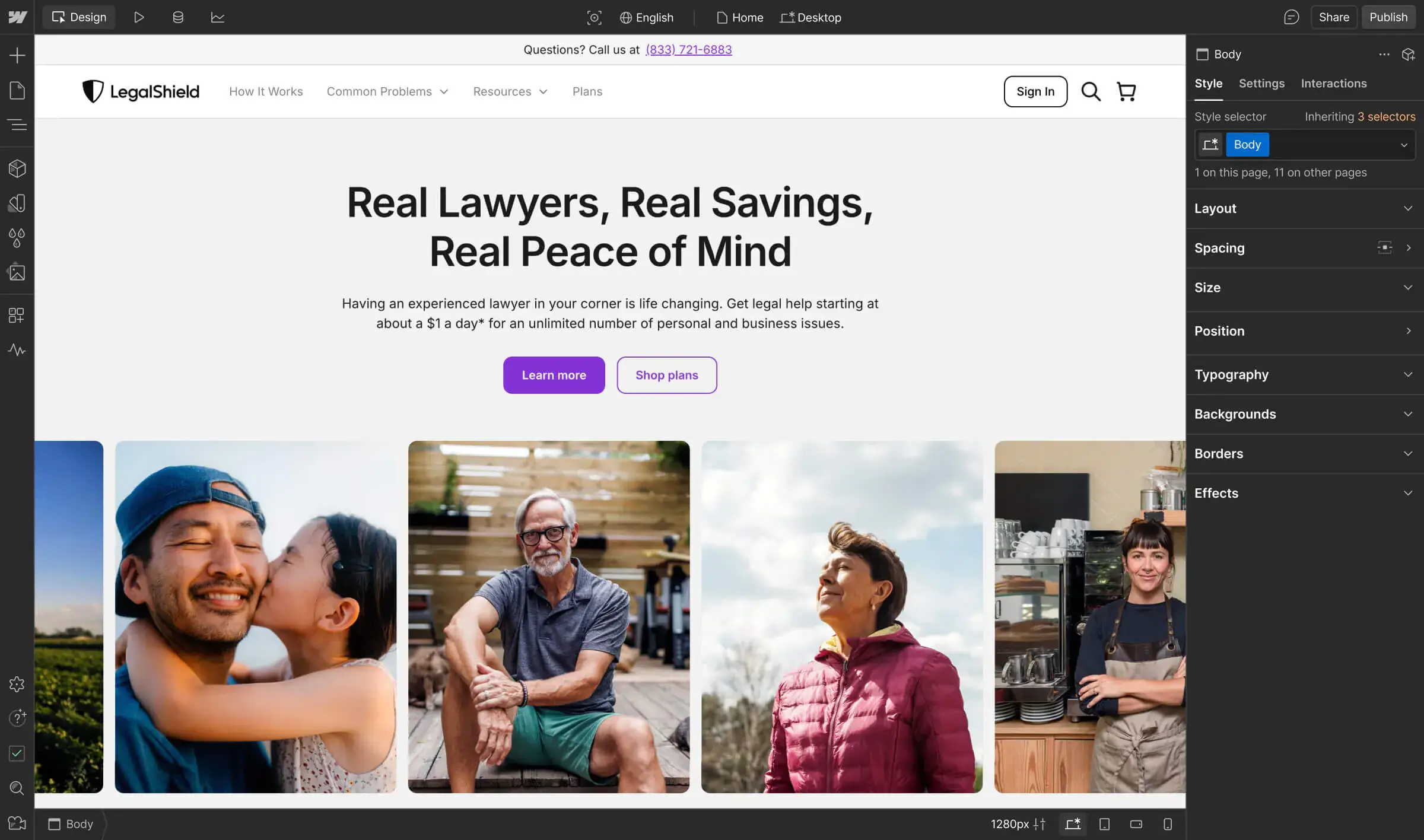
Before Webflow, the legal and identity services provider faced slow updates, engineering bottlenecks, and limited ability to test or scale content. Now, the team runs marketing-led experiments and manages localized content across three languages, no dev handoffs required.

Analyze
Localization
Optimize
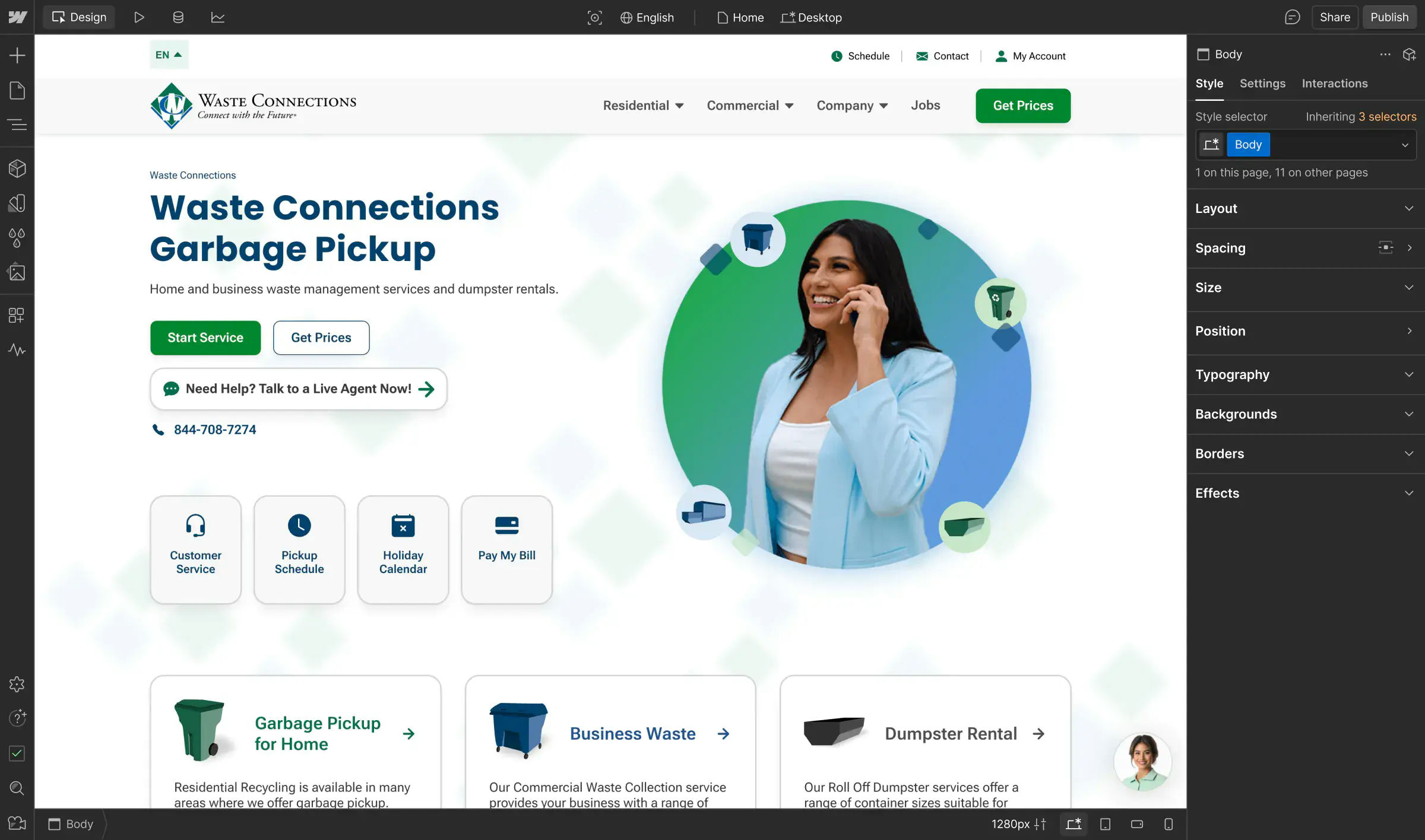
Before Webflow, Waste Connections juggled dozens of disconnected sites across 300+ brands. Now, with Webflow and Enova, they’ve unified their web presence into a scalable system that empowers their technical teams, streamlines growth, and supports ongoing acquisitions.

Analyze
Localization
Optimize
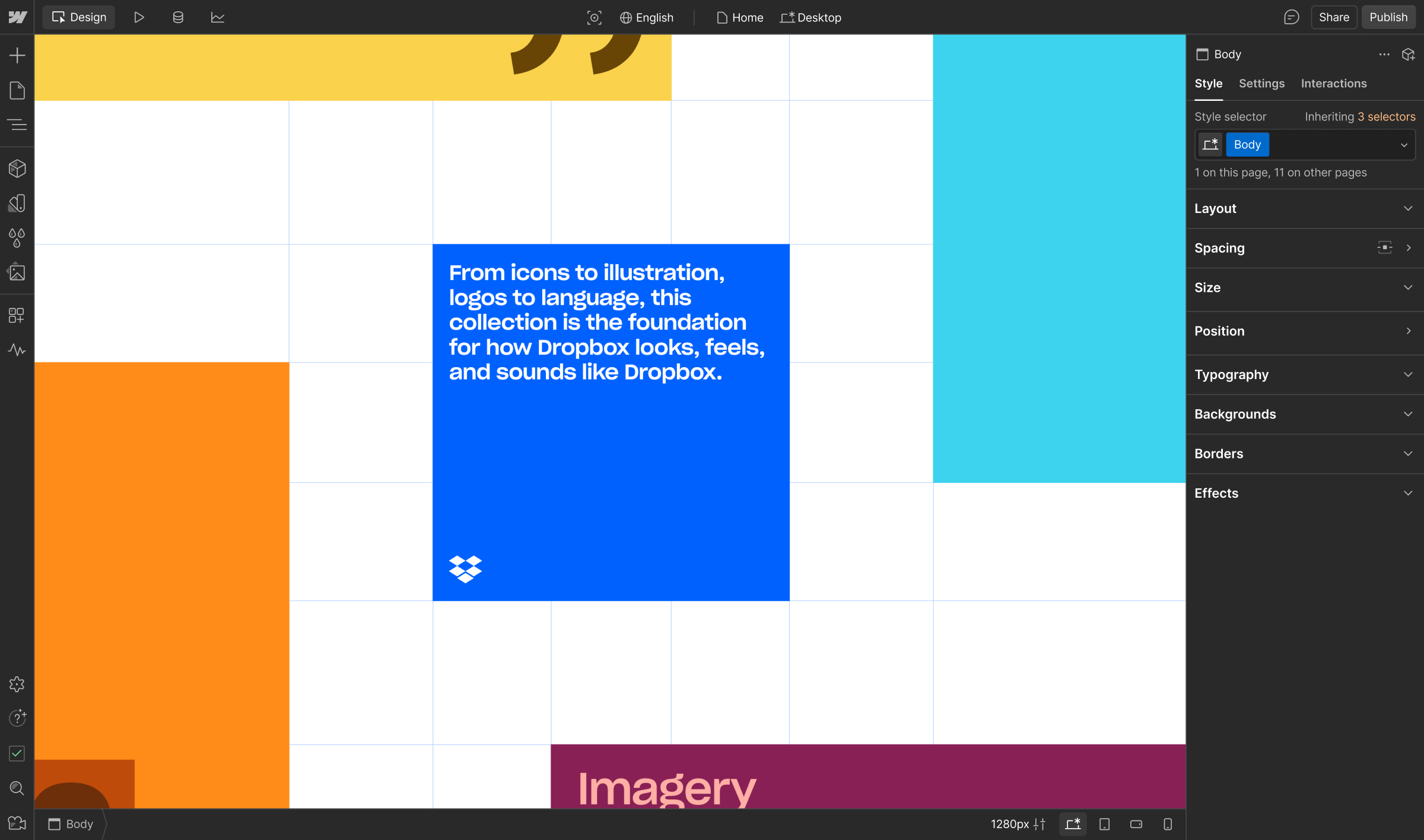
Dropbox needed to evolve their brand guidelines from a static webpage to an interactive experience that reinforced their brand ethos. With Webflow Partner Daybreak, they used Webflow's visual-first CMS to enrich collaboration, building a site that brings their brand to life.

Analyze
Localization
Optimize
Driven to disrupt the industry and transform beyond their legacy roots, Docusign needed a powerful web solution. With Webflow and strategic agency experts, they gained creative freedom and global recognition in the emerging Intelligent Agreement Management space.

Analyze
Localization
Optimize
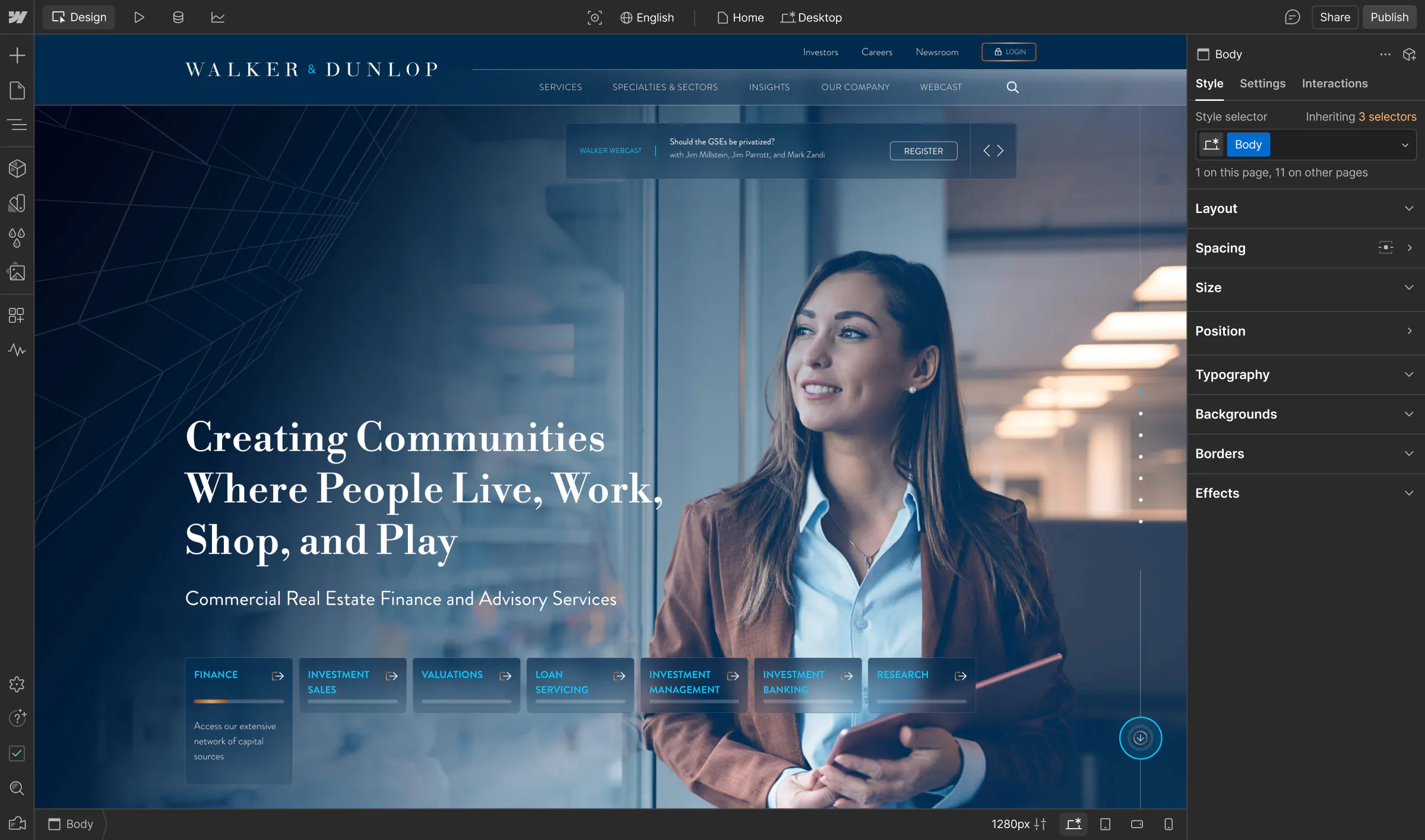
Once struggling to update a static, outdated CMS that didn’t reflect their modern brand, Walker & Dunlop tapped into Webflow's WXP to transform their website into a dynamic, high-performing sales and marketing tool that boosts engagement and drives meaningful business results.

Analyze
Localization
Optimize
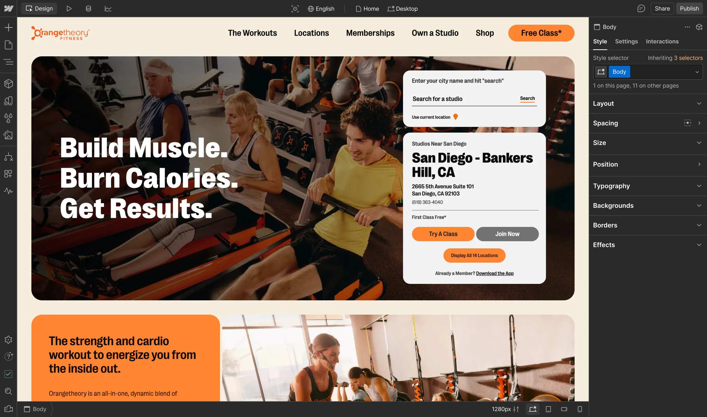
The global fitness pioneer recognized the need for a more agile and efficient web platform to support its growth and innovation. With Webflow’s WXP, they transformed their digital presence, unlocking new revenue streams and delivering dynamic content experiences worldwide.
Analyze
Localization
Optimize
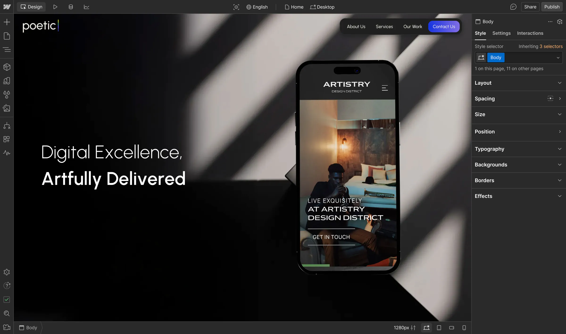
With hundreds of clients and complex site migrations, Poetic was limited by traditional webstacks that made them overly reliant on developers. With Webflow, Poetic now has the freedom to own their own website, all while helping their clients efficiently build and manage their web presence.

Analyze
Localization
Optimize
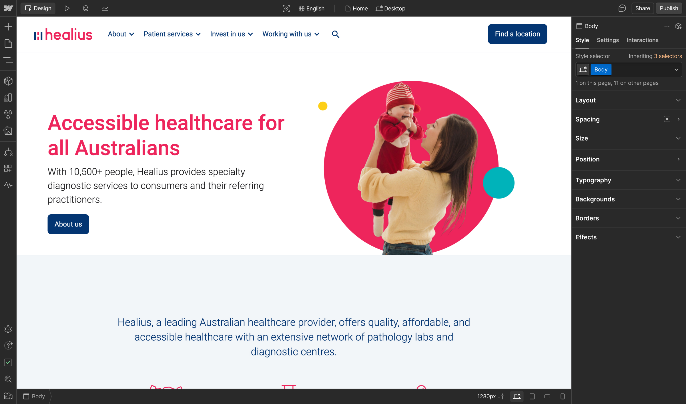
Previously reliant on developers and external resources to manage their web presence on WordPress, Healius migrated to Webflow to bring their team more flexibility, efficiency, and peace of mind.

Analyze
Localization
Optimize
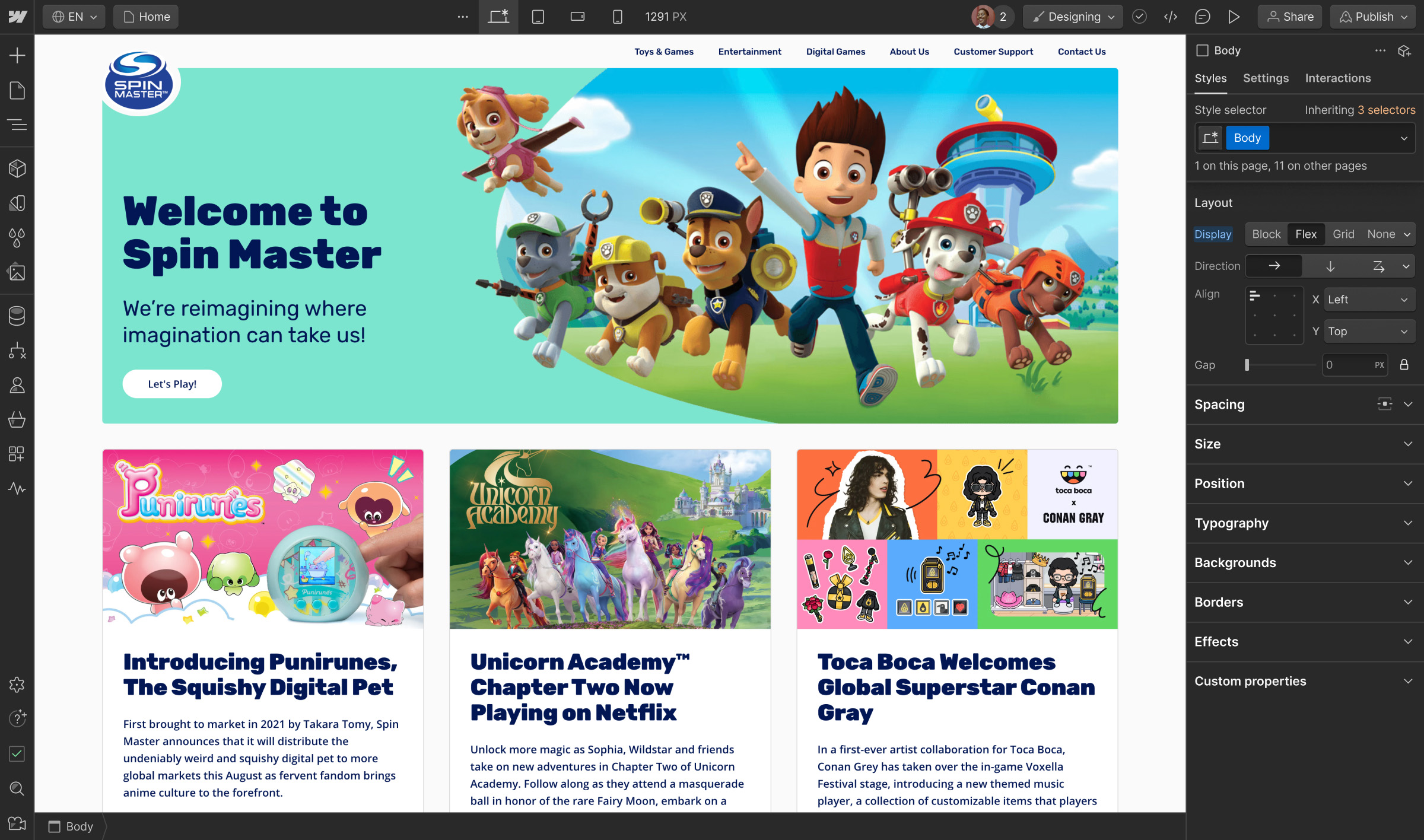
A global leader in children’s entertainment, Spin Master was looking to grow their web presence without relying on limited developer resources. With Webflow, their creative and engineering teams have transformed internal collaboration and efficiency–and can now deliver professional website experiences at scale.

Analyze
Localization
Optimize
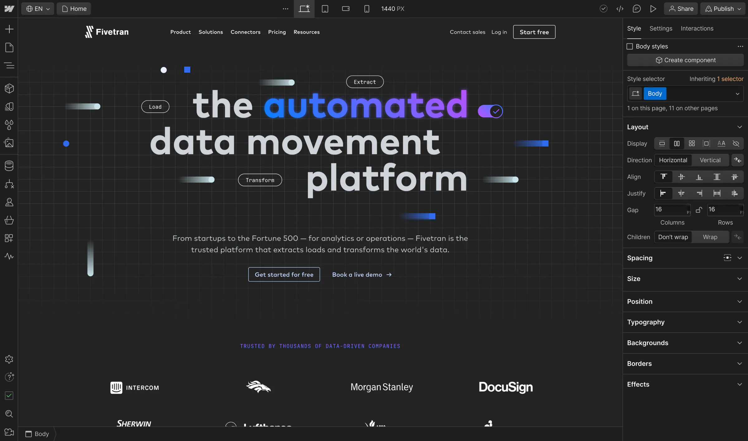
Looking for a web development platform that could support ambitious business goals, Fivetran turned to Webflow to accelerate their speed to market, improve internal collaboration, and take their digital presence to the next level.

Analyze
Localization
Optimize
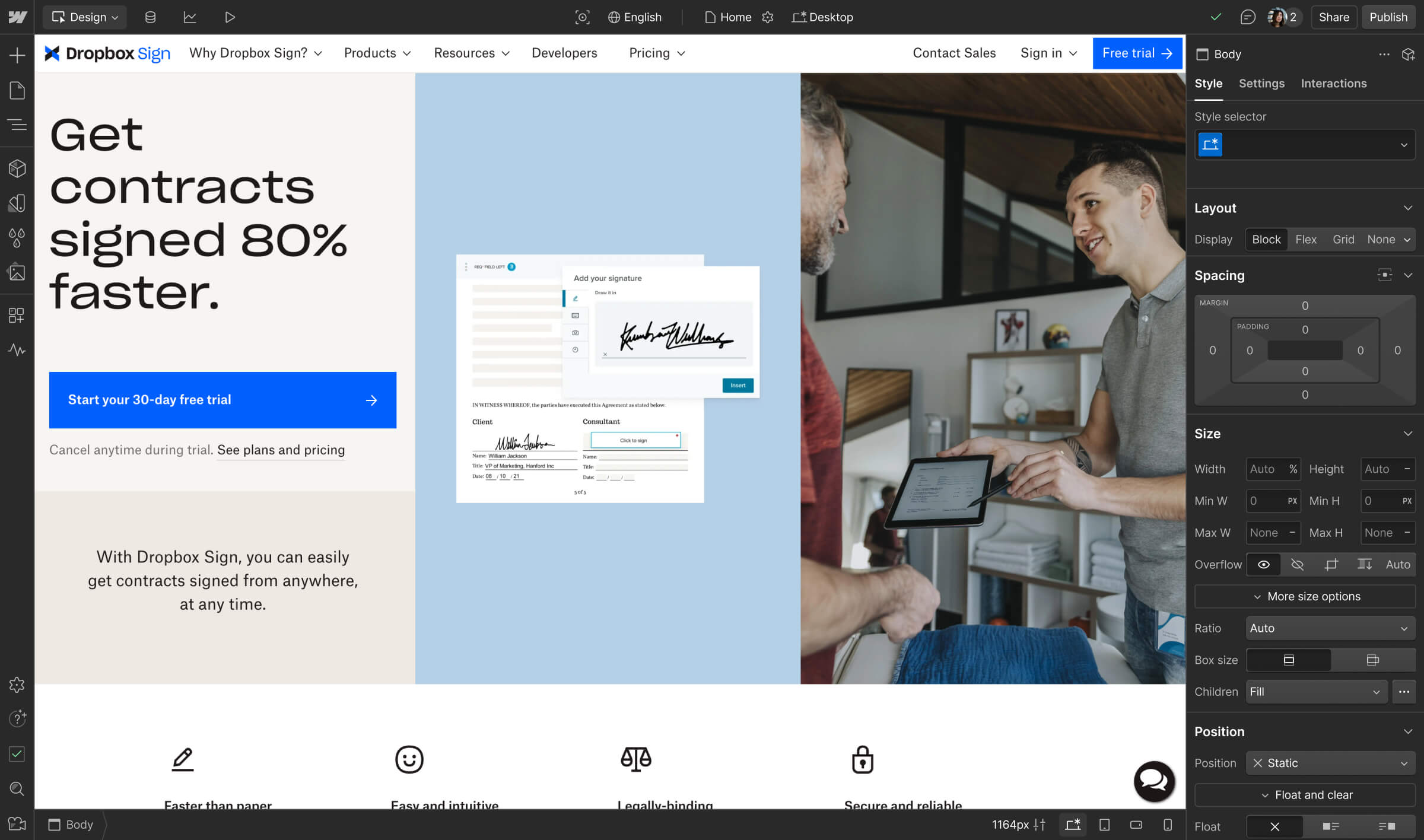
An integral part of the Dropbox suite, Dropbox Sign used Webflow to streamline development processes, empowering its design and marketing teams to deliver the most impactful services, faster.

Analyze
Localization
Optimize
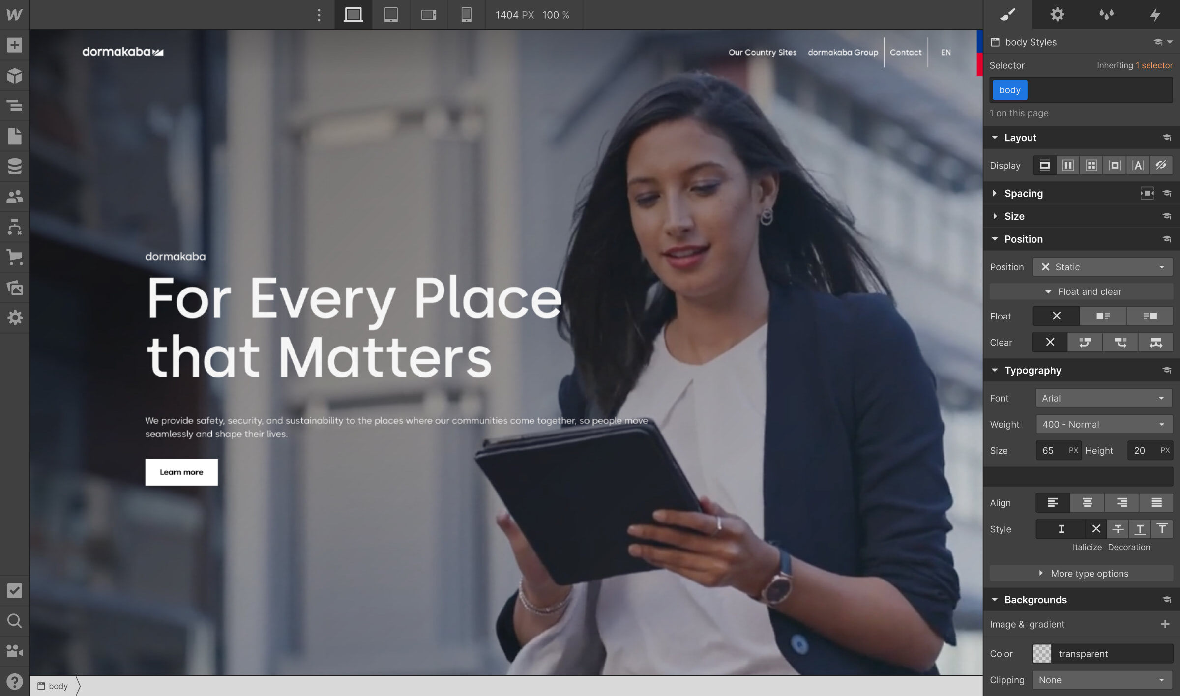
Searching for a platform to easily build microsites, reduce costs, and unify their brand, the leading access control company turned to Webflow to build new web pages that met their global brand standards.

Analyze
Localization
Optimize
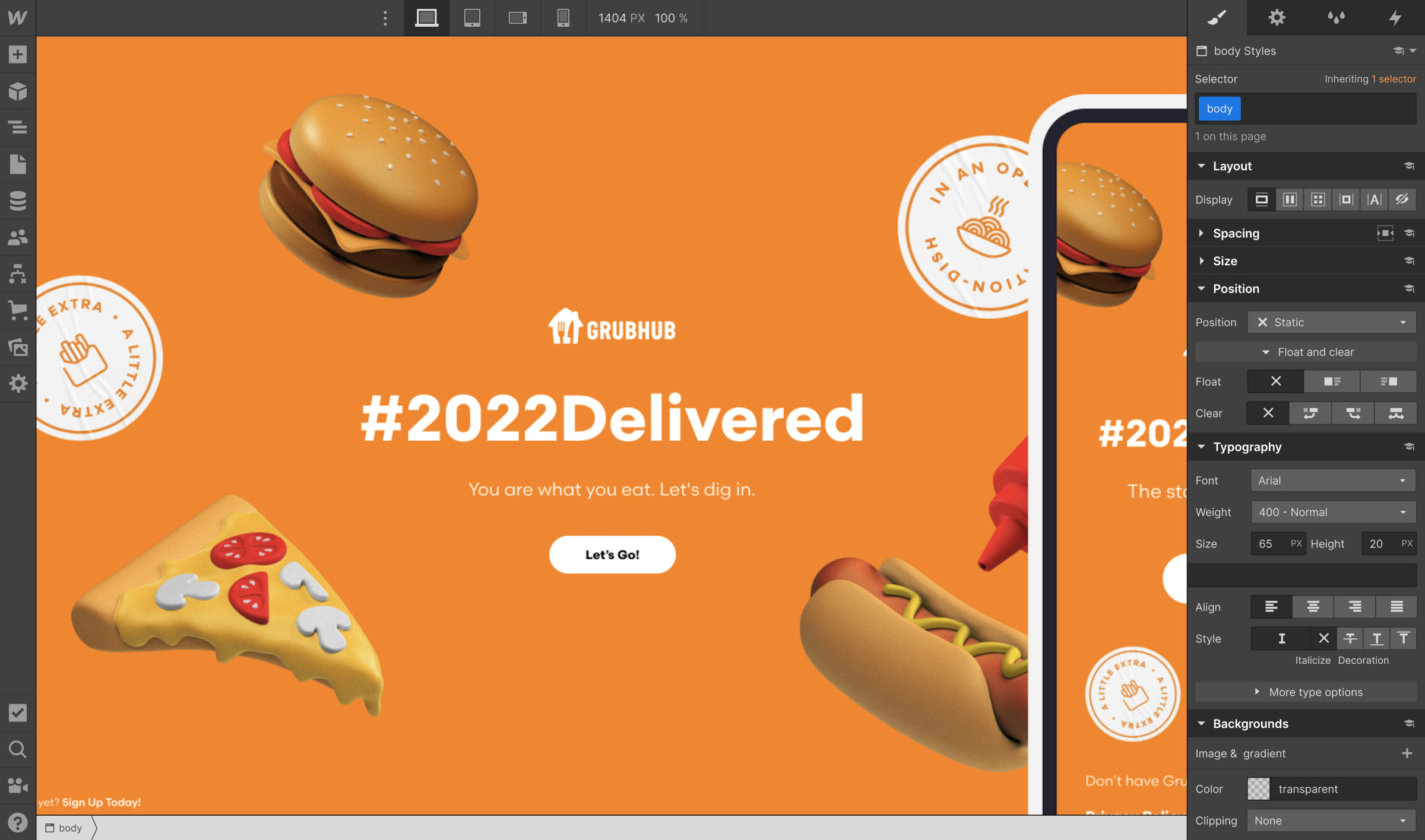
Grubhub worked with certified Webflow Expert, Wondersauce, and leveraged Webflow Enterprise to bring a viral brand moment to life in 7 weeks.

Analyze
Localization
Optimize
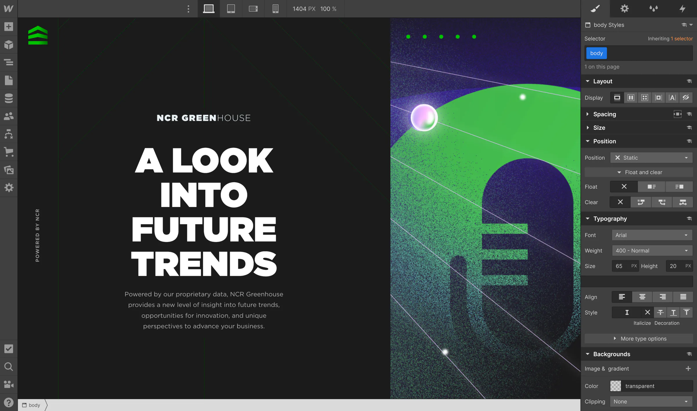
Looking to modernize their tech stack and bring more experiences to life on the web, NCR turned to Webflow to accelerate their time to launch.

Analyze
Localization
Optimize
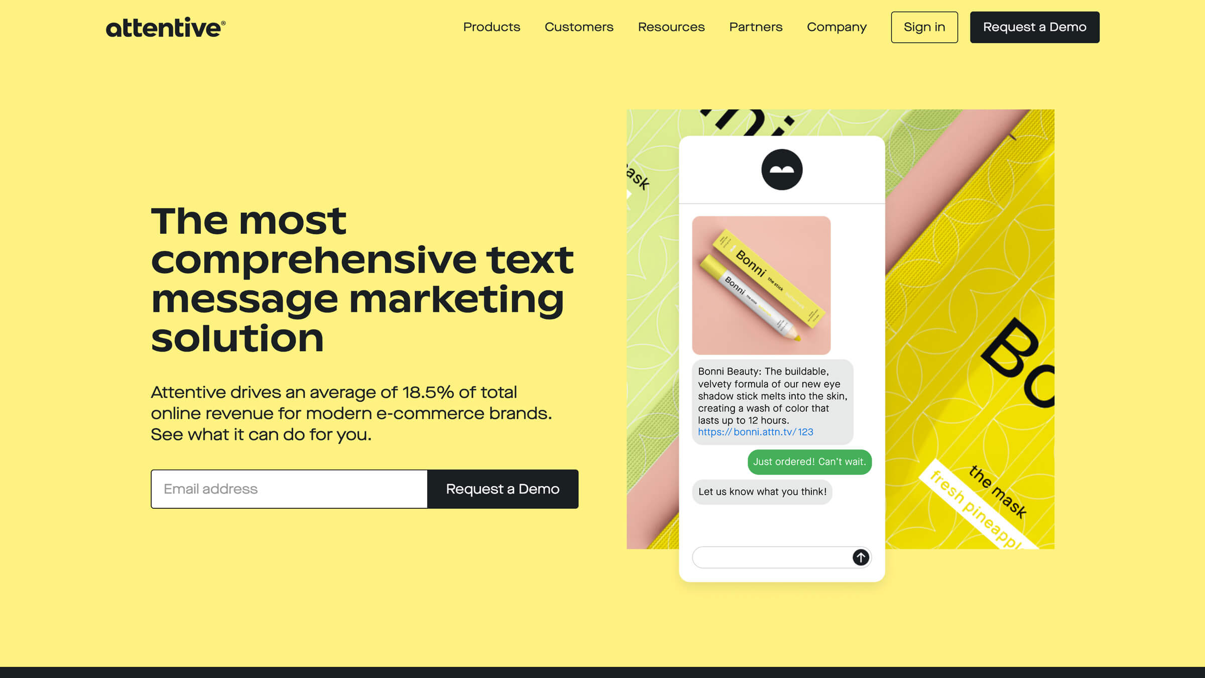
In the midst of a major rebrand, Attentive moved from WordPress to Webflow to unlock the creative potential of their website. From refresh to rebrand: Webflow as a catalyst for growth.

Analyze
Localization
Optimize
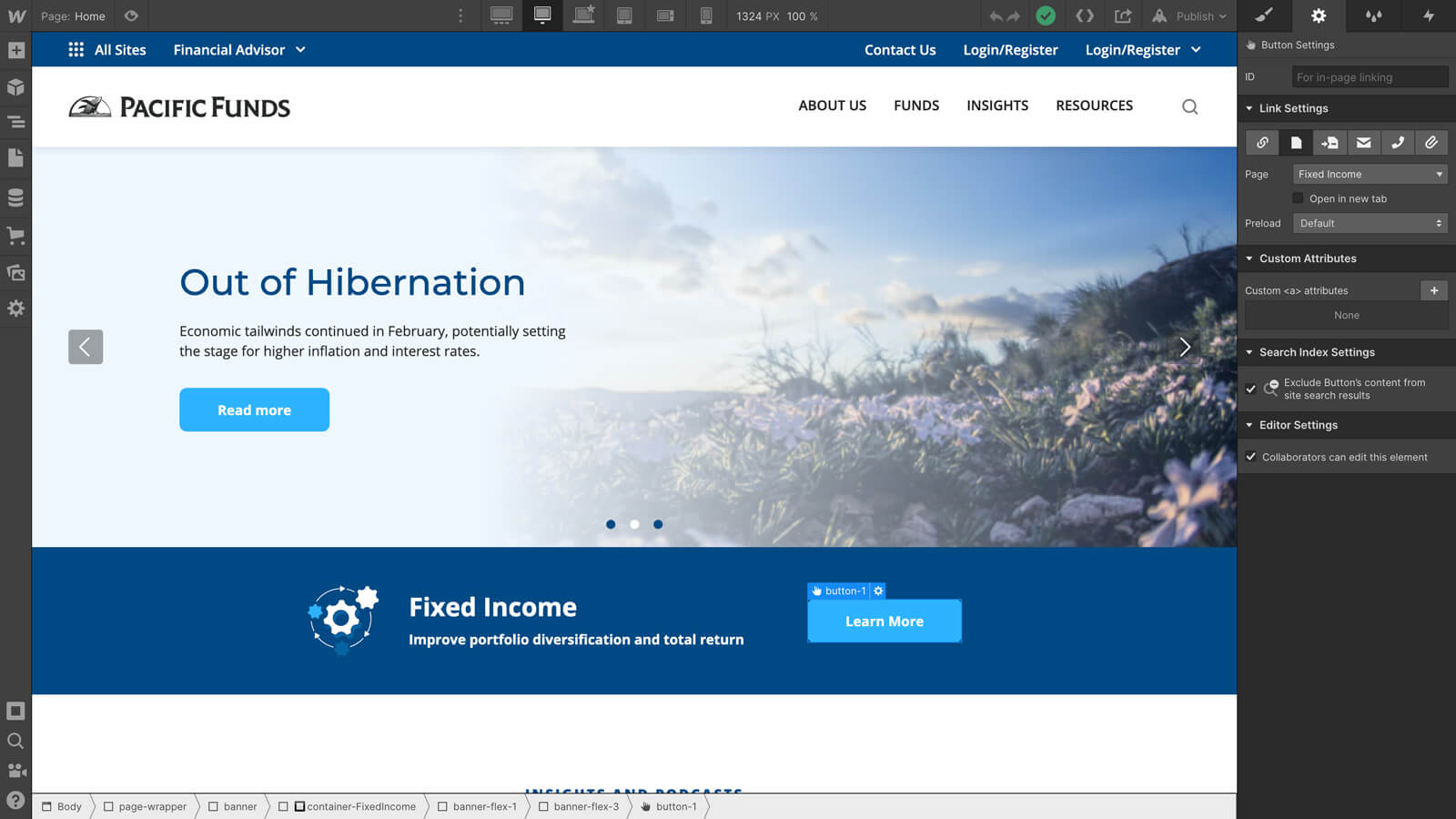
The Pacific Funds team moved from their existing CMS implementation to take control of their site and create a better customer experience.

Analyze
Localization
Optimize
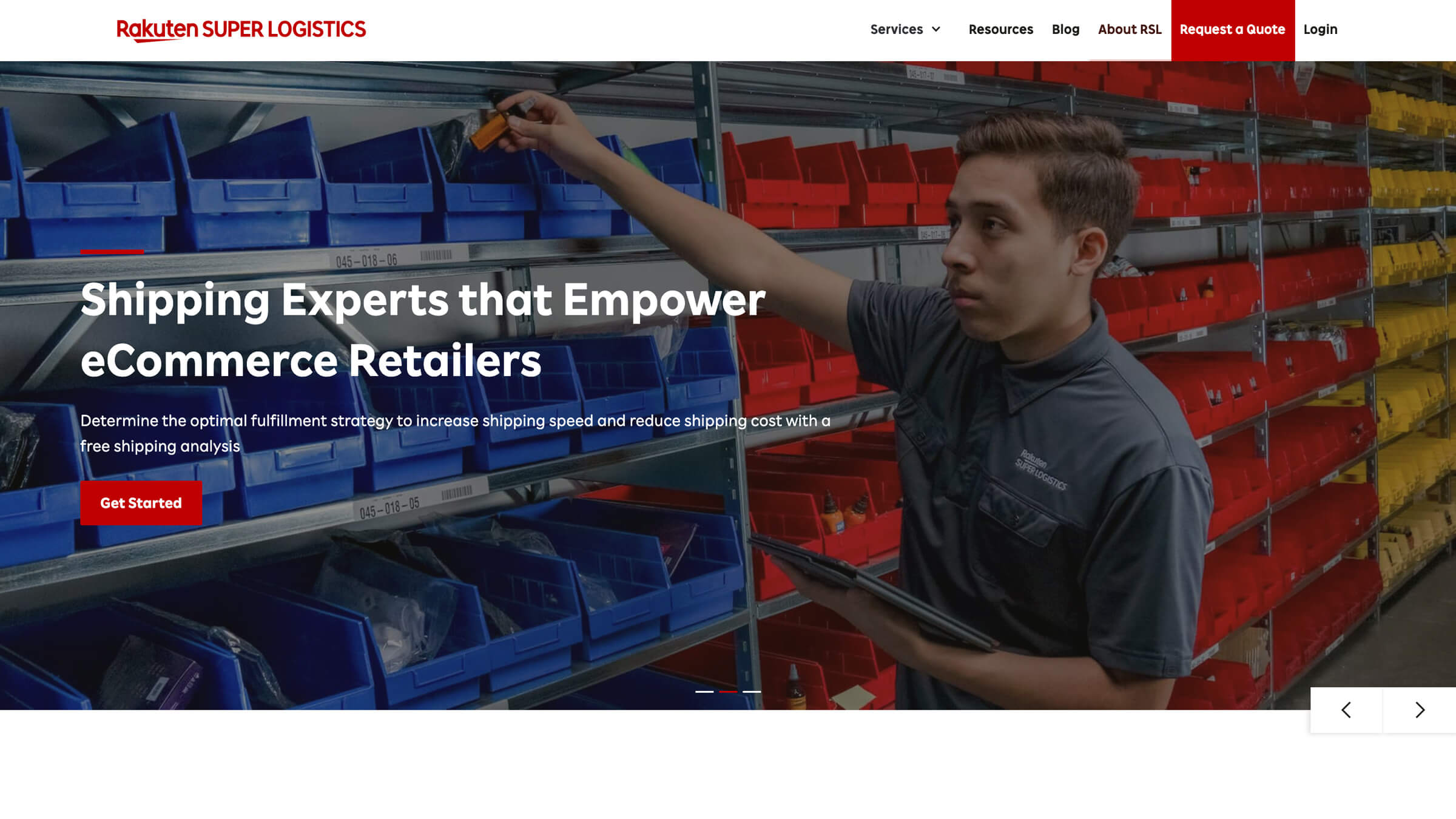
Rakuten SL saved time, money, and security headaches by switching from WordPress to Webflow.
Explore more stories

Analyze
Localization
Optimize
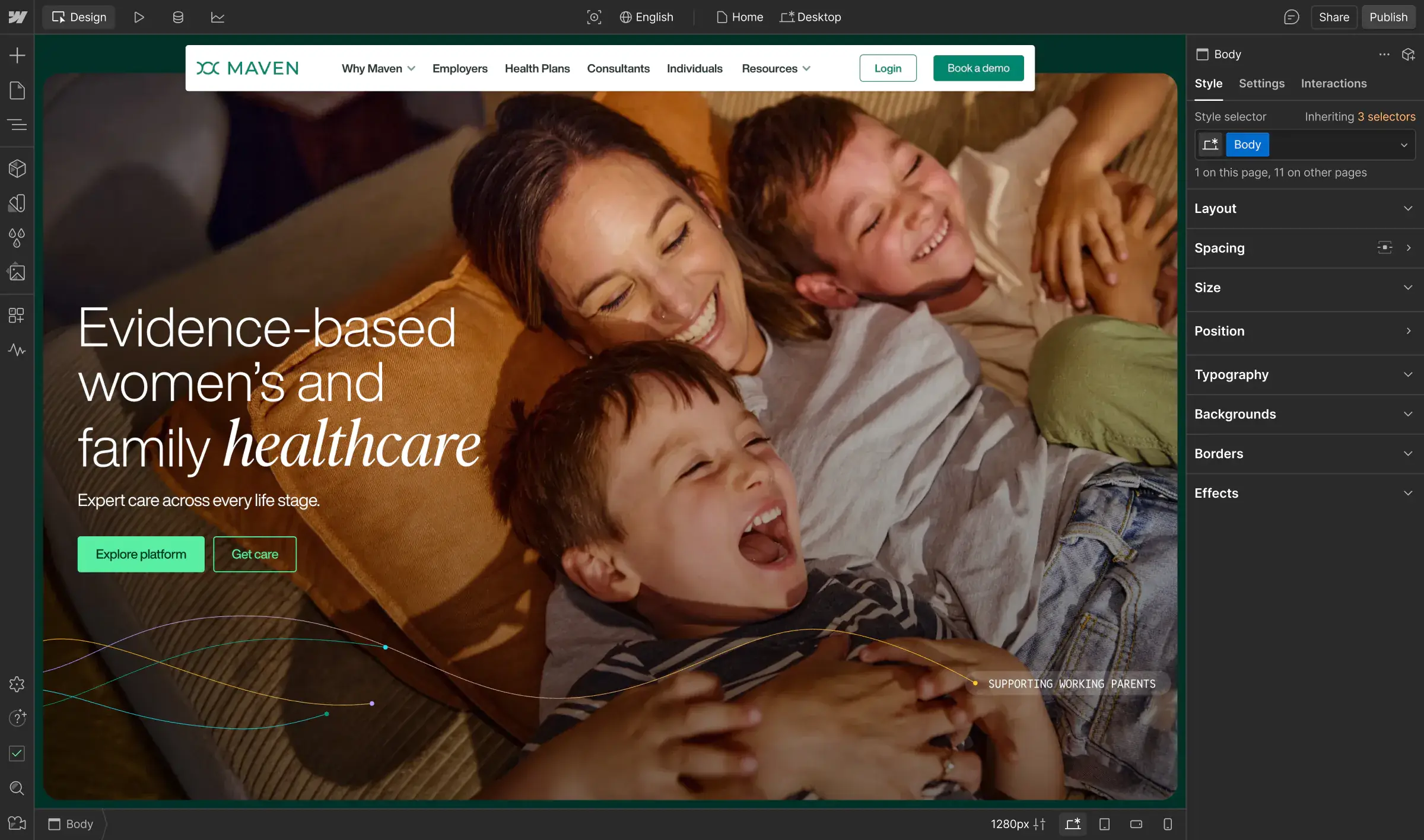
After struggling with a one-size-fits-all site, Maven rebuilt with Webflow Partner N4 on Webflow Enterprise to better serve multiple audiences. The modern, modular system supports real testing, global localization, and smoother collaboration across marketing and design.

Analyze
Localization
Optimize
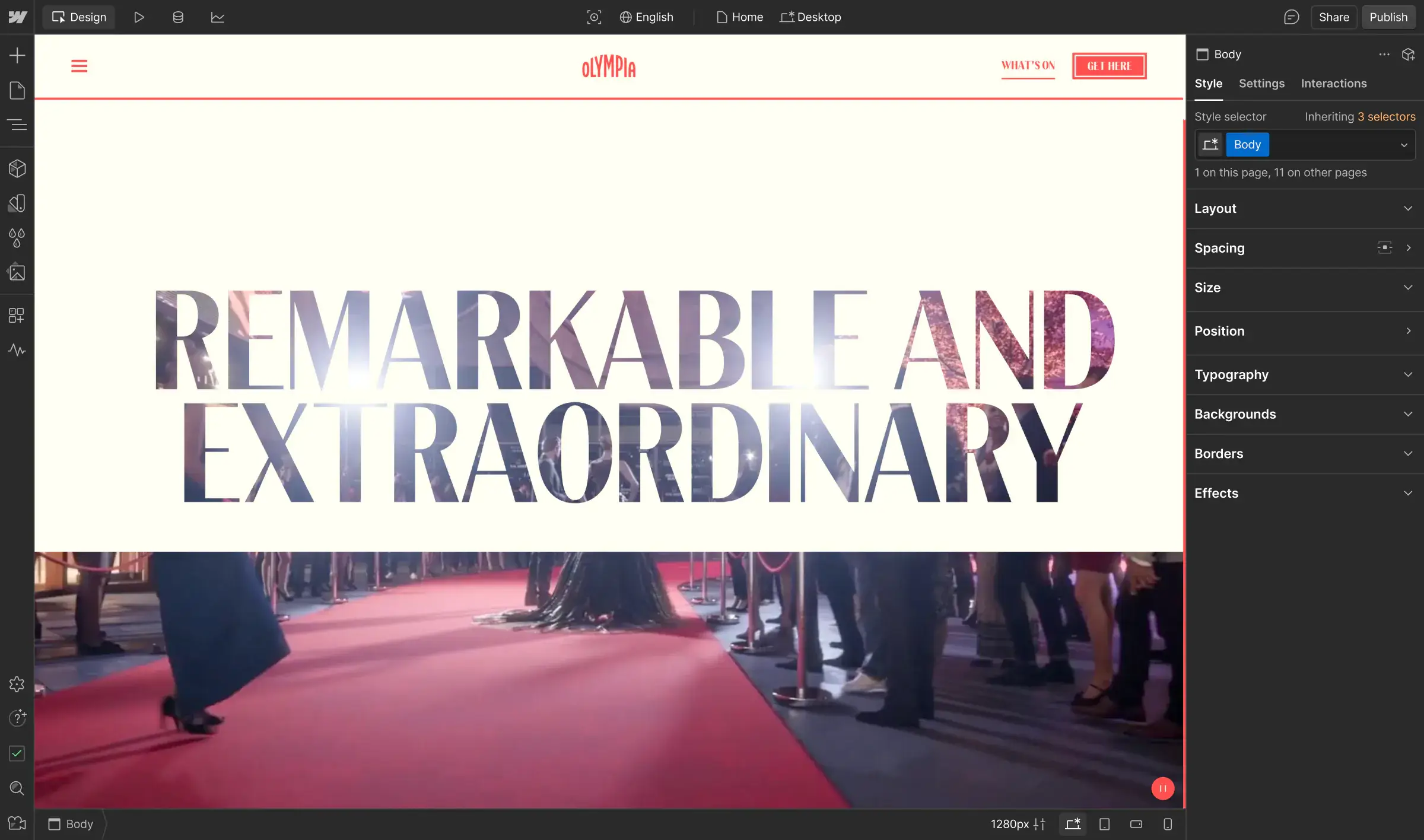
In anticipation of opening their newly reimagined physical destination, Olympia needed a digital home to match a £1.3bn investment into the transformation of this iconic London location from exhibition venue to the capital’s newest entertainment destination. With Webflow and N4, the team now runs a flexible, scalable site built for unprecedented personalization and growth.

Analyze
Localization
Optimize
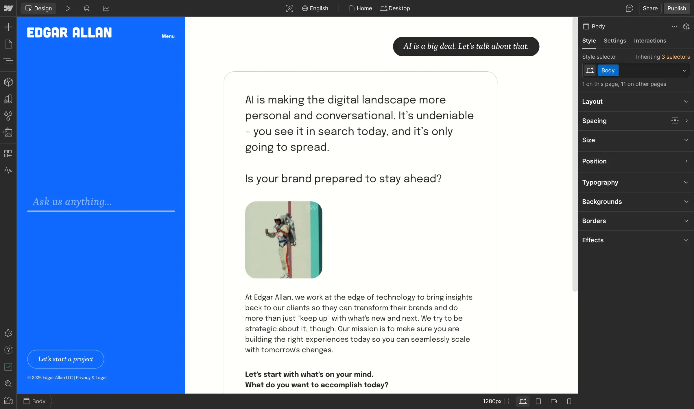
Like many agencies, Edgar Allan wasn’t satisfied with sluggish platforms, heavy handoffs, and post-launch slow-downs. By adopting Webflow more than a decade ago, they embraced a modern agency model that enables a more innovative, scalable way to design, build, and optimize.

Analyze
Localization
Optimize
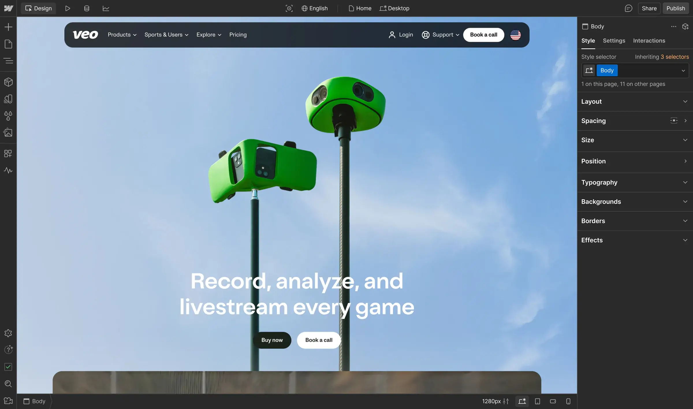
After years of slow, developer-heavy workflows, Veo took back control of their site with Webflow Enterprise and Enterprise Partner Kvalifik. Now the team moves quickly, ships global content with ease, and tailors customer journeys for every sport and market.

Analyze
Localization
Optimize
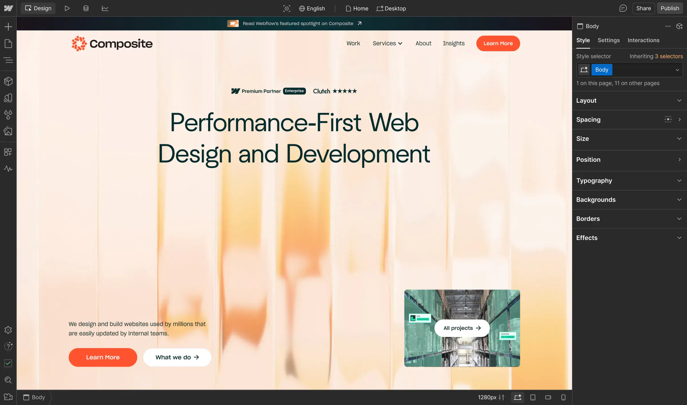
With Webflow, Composite gives enterprise clients the freedom to move faster and own their digital presence. By replacing code-heavy builds with a visual workflow, the team delivers higher-performing sites in weeks instead of months — helping clients ship, iterate, and scale with confidence.

Analyze
Localization
Optimize
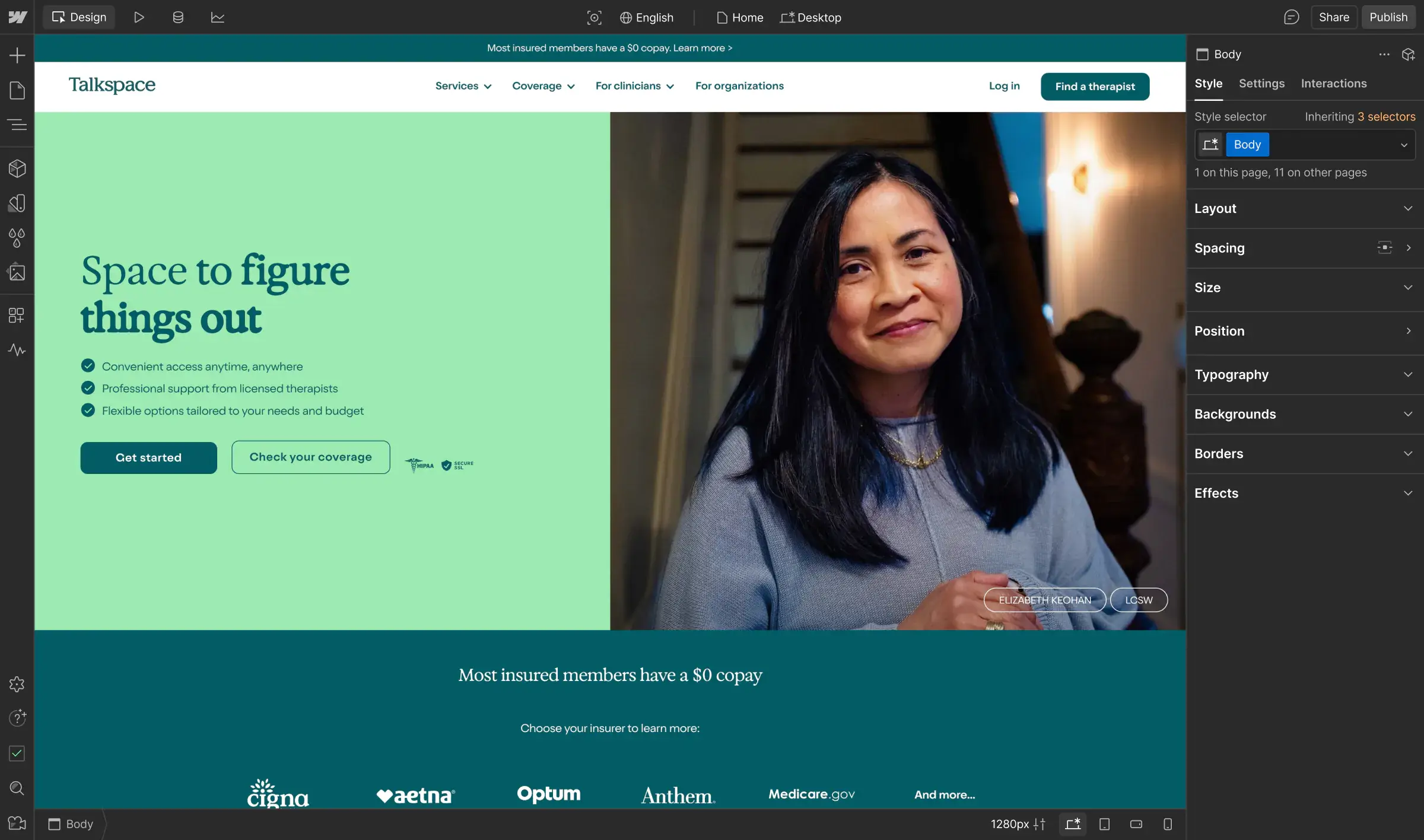
Talkspace needed a way to unify their digital presence and brand identity. With Webflow Enterprise, updates now take hours, new pages launch 7x faster, and the team can focus on their mission to expand access to mental health care.

Analyze
Localization
Optimize
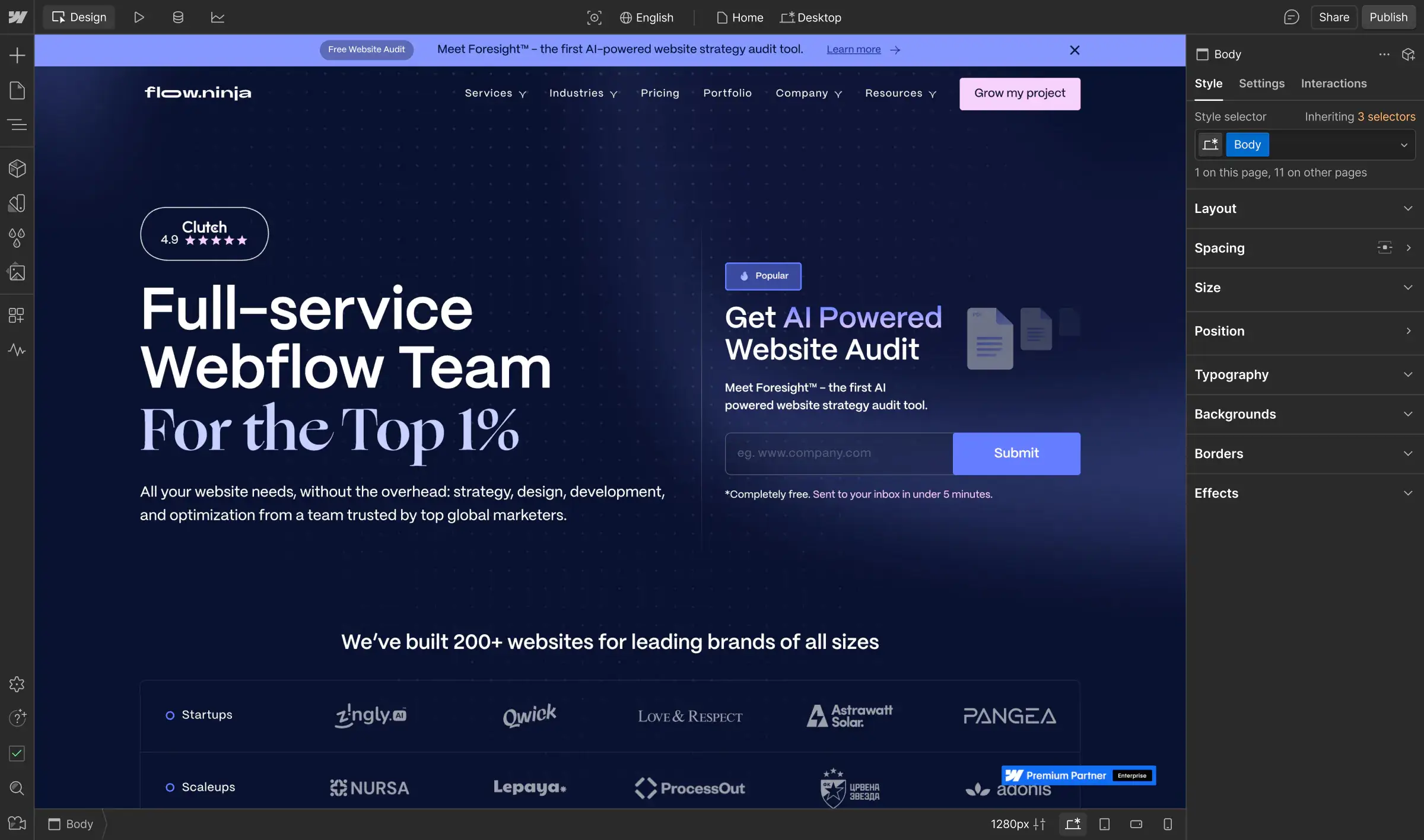
Flow Ninja rebuilt how enterprise teams launch on the web, turning complex, slow-moving sites into scalable, high-performing experiences. With Webflow, they help clients around the world move faster, cut costs, and drive measurable business impact.

Analyze
Localization
Optimize
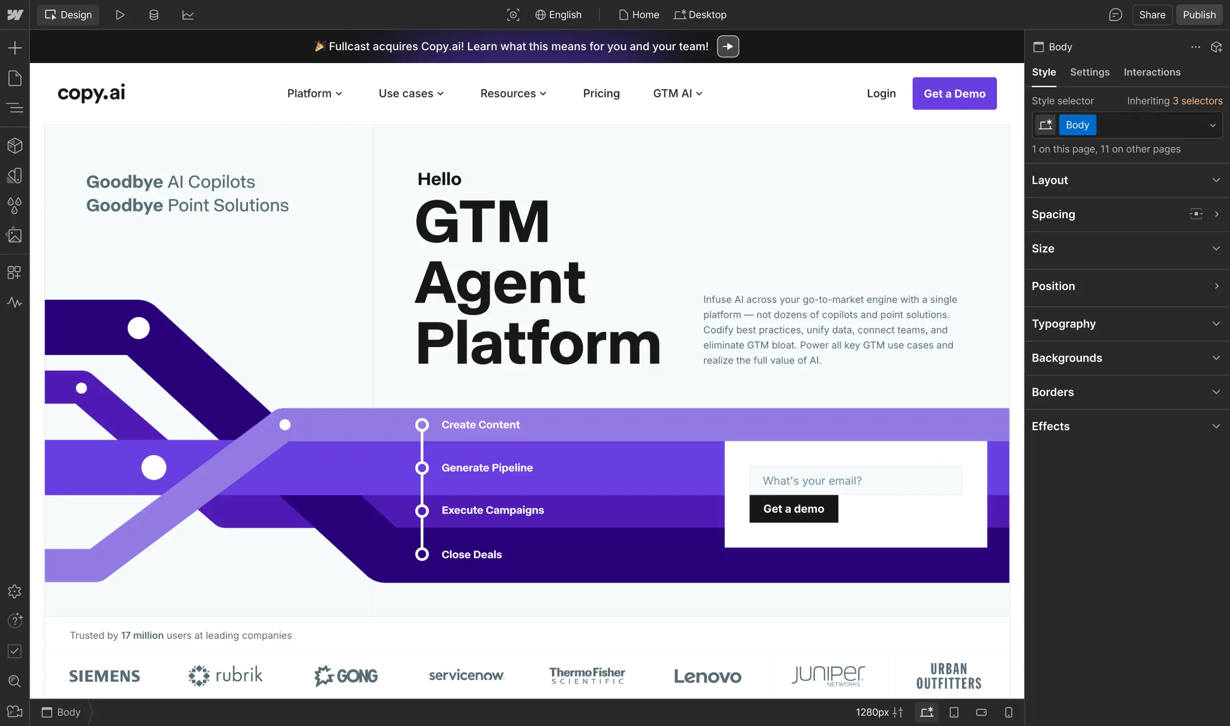
Before Webflow Enterprise, Copy.ai relied on external support for every update, which limited their control and slowed growth. Now, with Webflow’s visual CMS and hands-on support, the team publishes in hours instead of days and drives millions in sales pipeline from organic content.

Analyze
Localization
Optimize
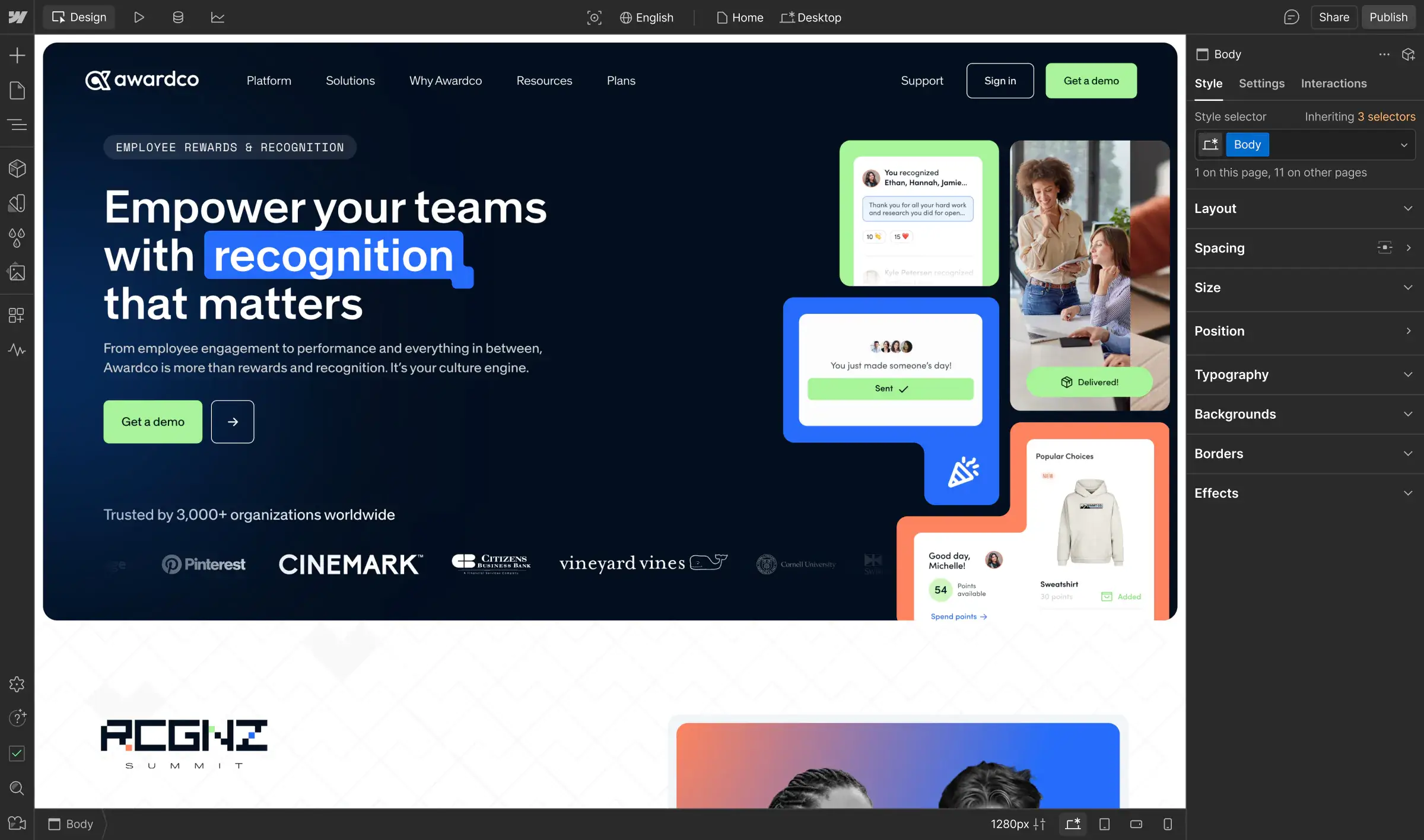
Awardco’s website was slow to update, hard to scale, and no longer reflected their billion-dollar valuation. With Webflow Enterprise and Amply, the team rebuilt in six months, launching 2,000+ pages, scaling globally, and doubling conversions while solidifying industry leadership.

Analyze
Localization
Optimize
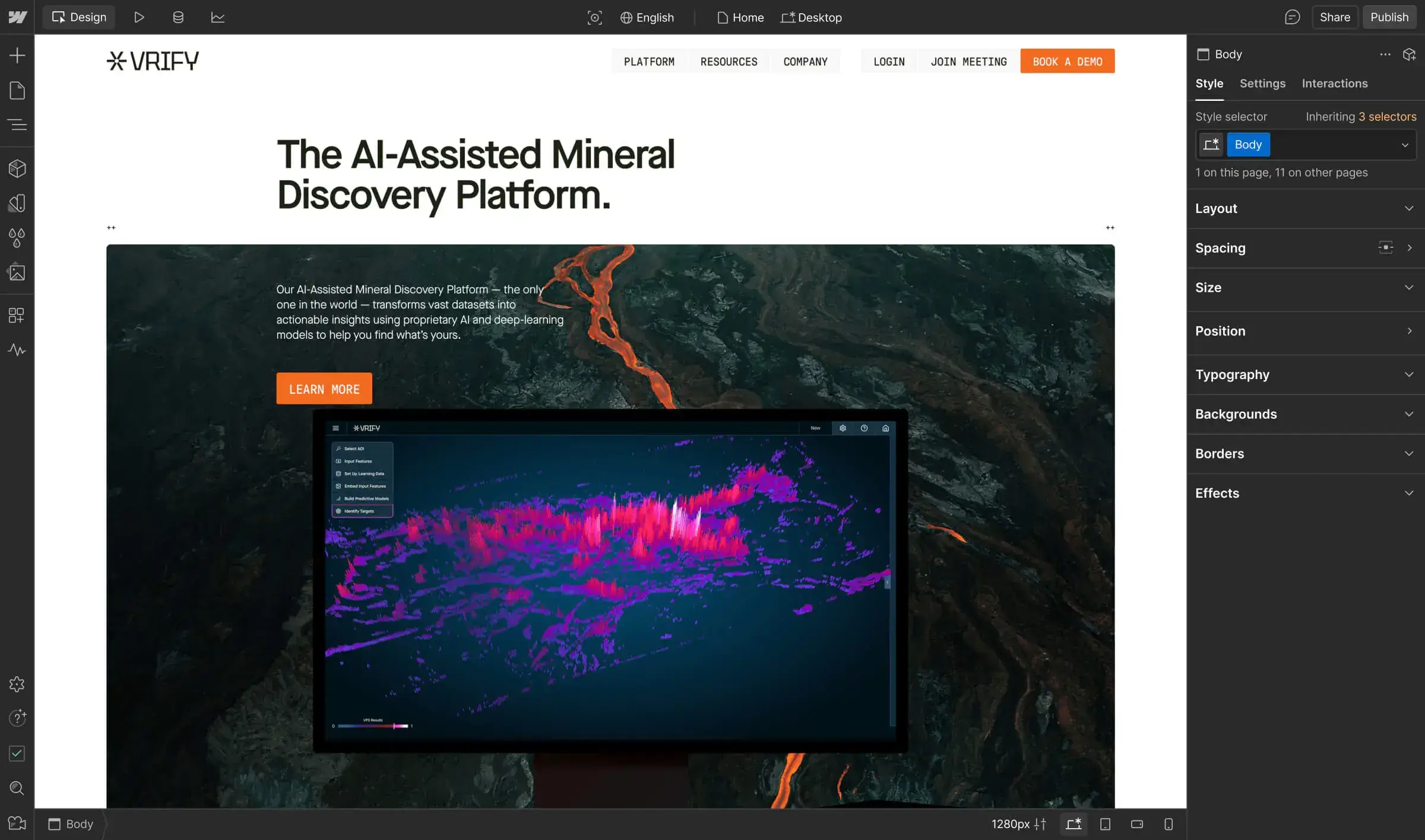
As VRIFY’s go-to-market strategy matured, their team needed a faster, more collaborative way to scale content. With Webflow Enterprise, they’ve unlocked the speed, trust, and flexibility to turn their website into a true growth engine — without adding headcount.

Analyze
Localization
Optimize
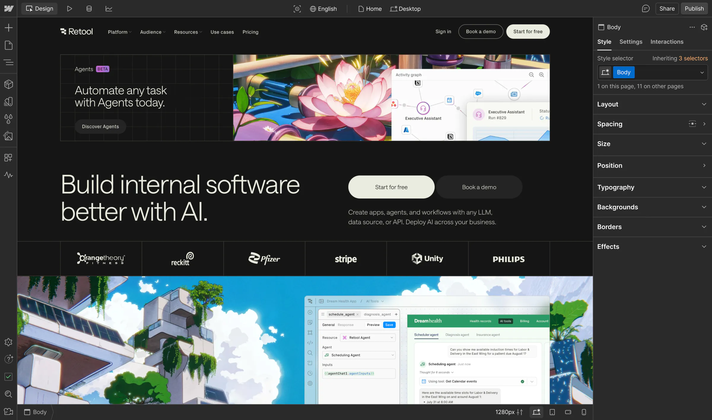
With Webflow Optimize, Retool went from reactive updates to a proactive growth engine. Embracing experimentation, their marketing team gained the freedom to test, learn, and iterate rapidly — driving more demo bookings, a smoother sign-up flow, and stronger collaboration.

Analyze
Localization
Optimize
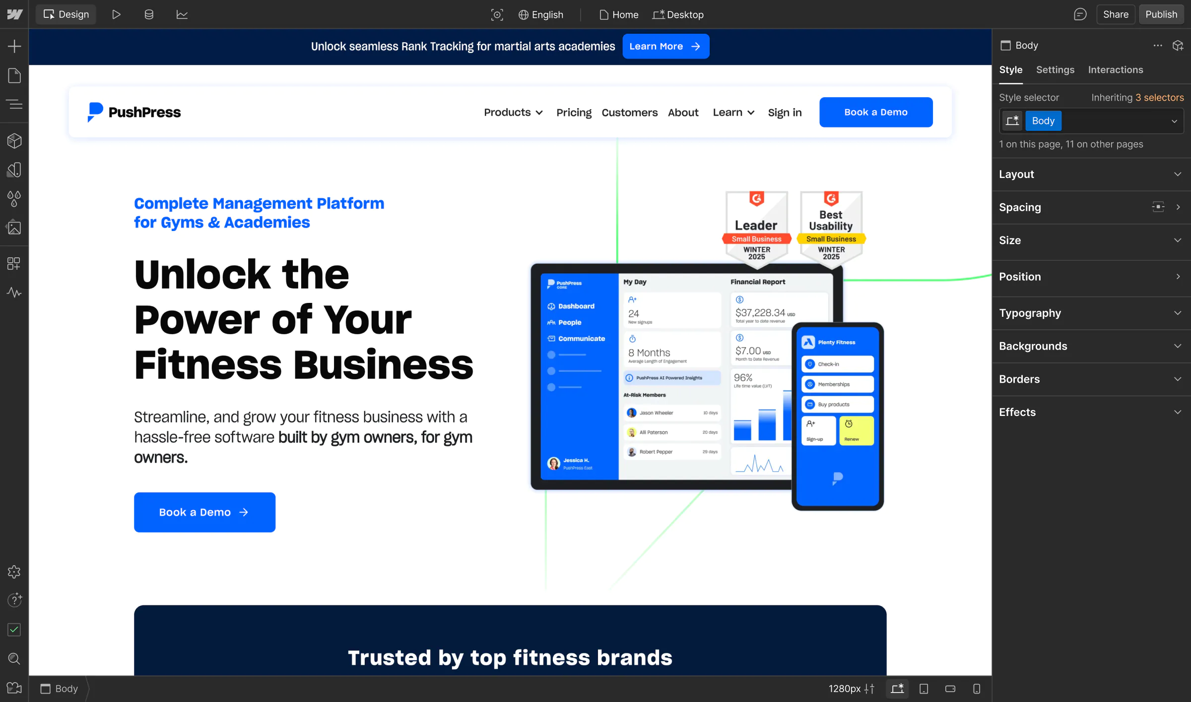
PushPress needed a faster, more flexible way to build unique, branded sites for fitness businesses. With Webflow, they can now deliver high-converting sites at scale — helping gym owners grow faster without bottlenecks or complexity.

Analyze
Localization
Optimize
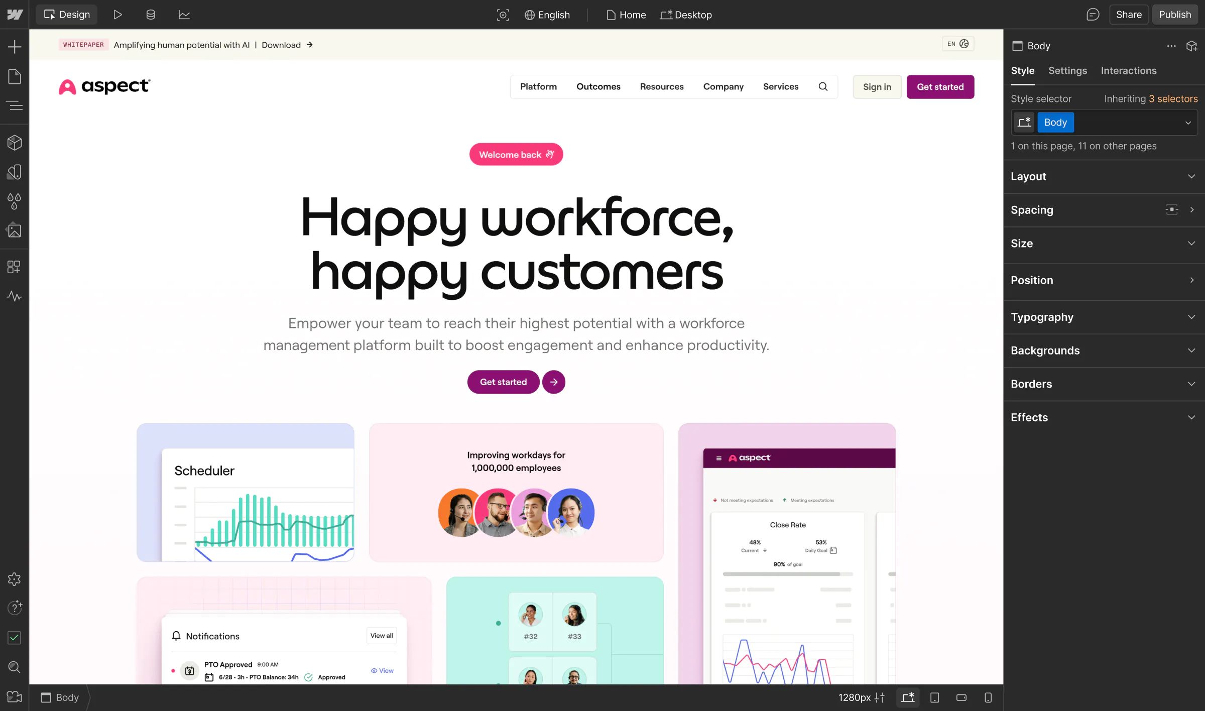
Aspect set out to create a new digital presence from scratch, while honoring their legacy brand. With Webflow, they built a global, modular, high-converting site in just two months — empowering their marketing team to move fast, experiment freely, and scale smarter.

Analyze
Localization
Optimize
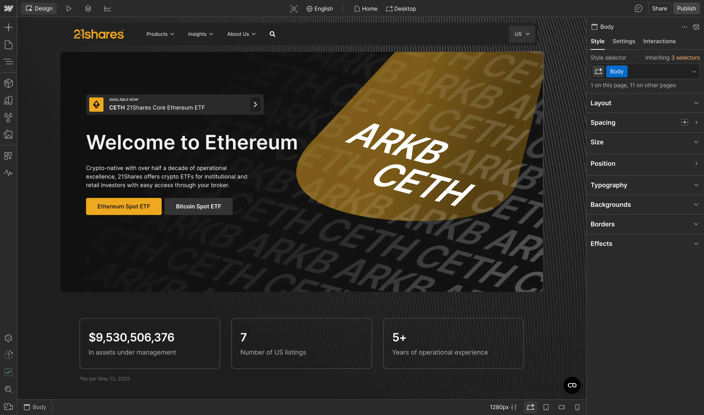
21.co previously relied on engineers for every update, hindering growth. With Webflow, the team builds better together – marketers and designers can move fast to scale content across global markets, while developers step in for more complex web builds and integrations.

Analyze
Localization
Optimize
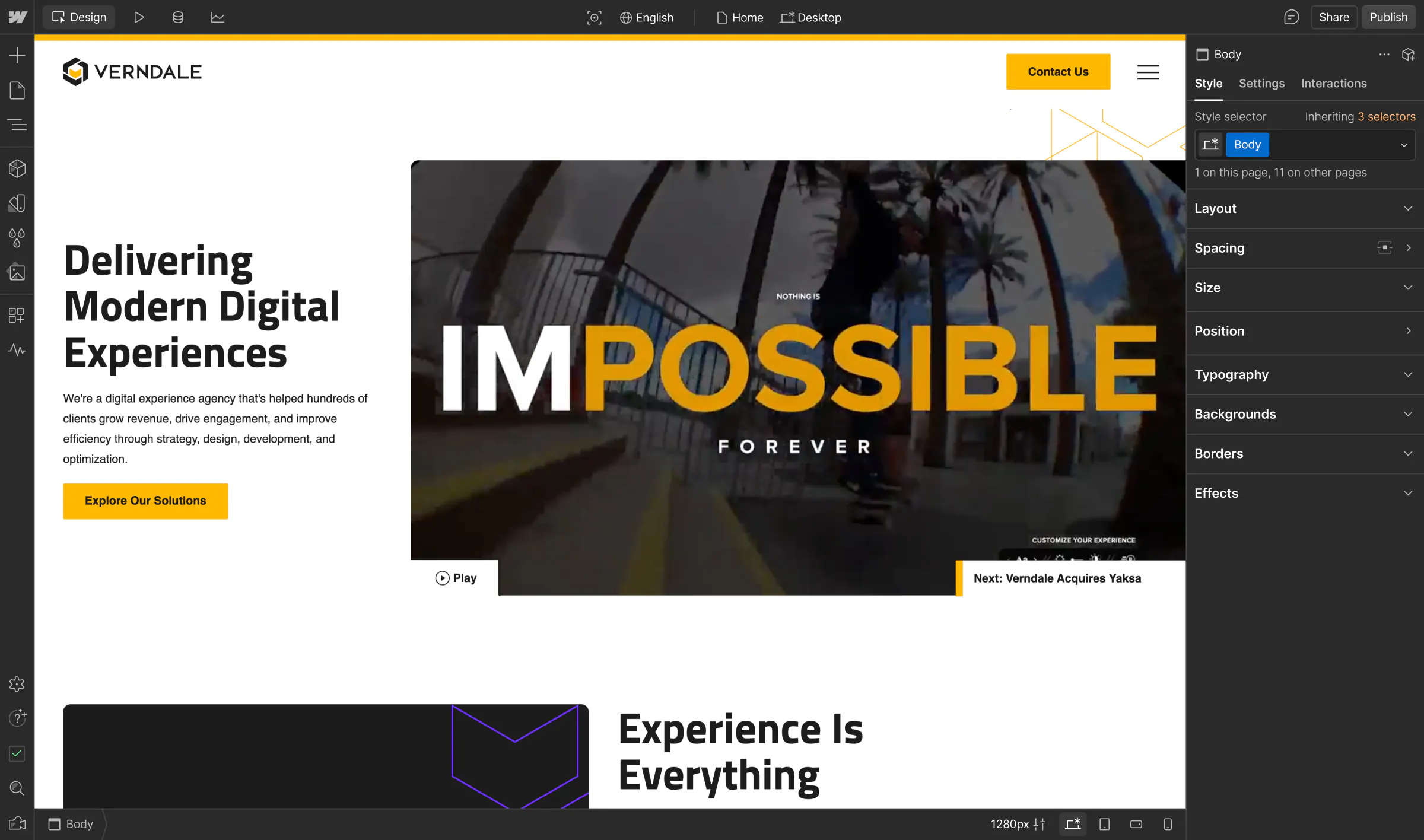
Recognizing the challenges clients face with traditional DXPs and developer-intensive headless CMSs, Verndale turned to Webflow’s WXP. The visual-first, composable CMS allows Verndale to create high-impact digital experiences for their clients – minus the technical overhead.

Analyze
Localization
Optimize
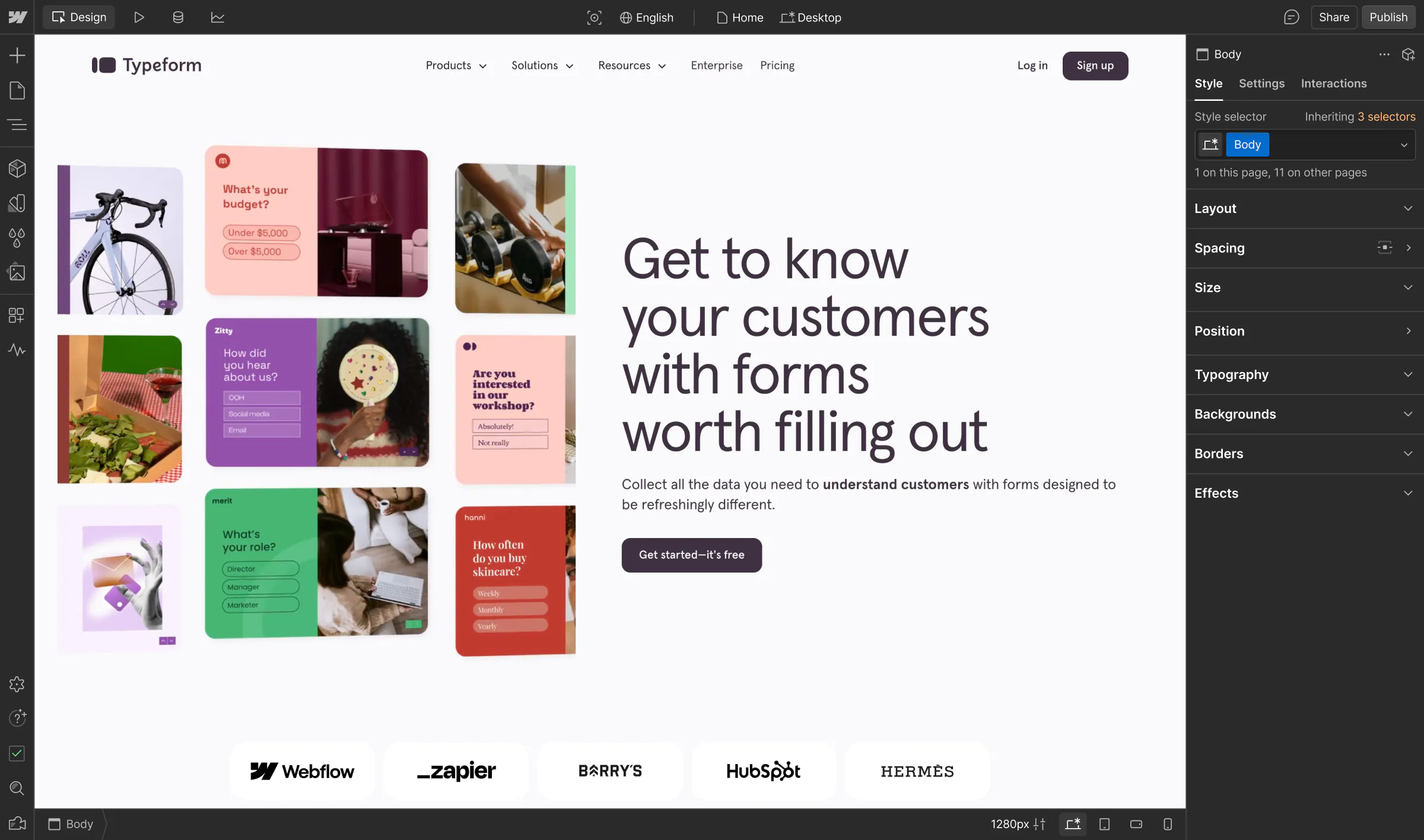
Typeform’s marketing team struggled with a CMS that hindered agility, experimentation, and digital growth. After partnering with Webflow and MakeBuild, they reclaimed website ownership, improved SEO performance, and accelerated speed-to-market.

Analyze
Localization
Optimize
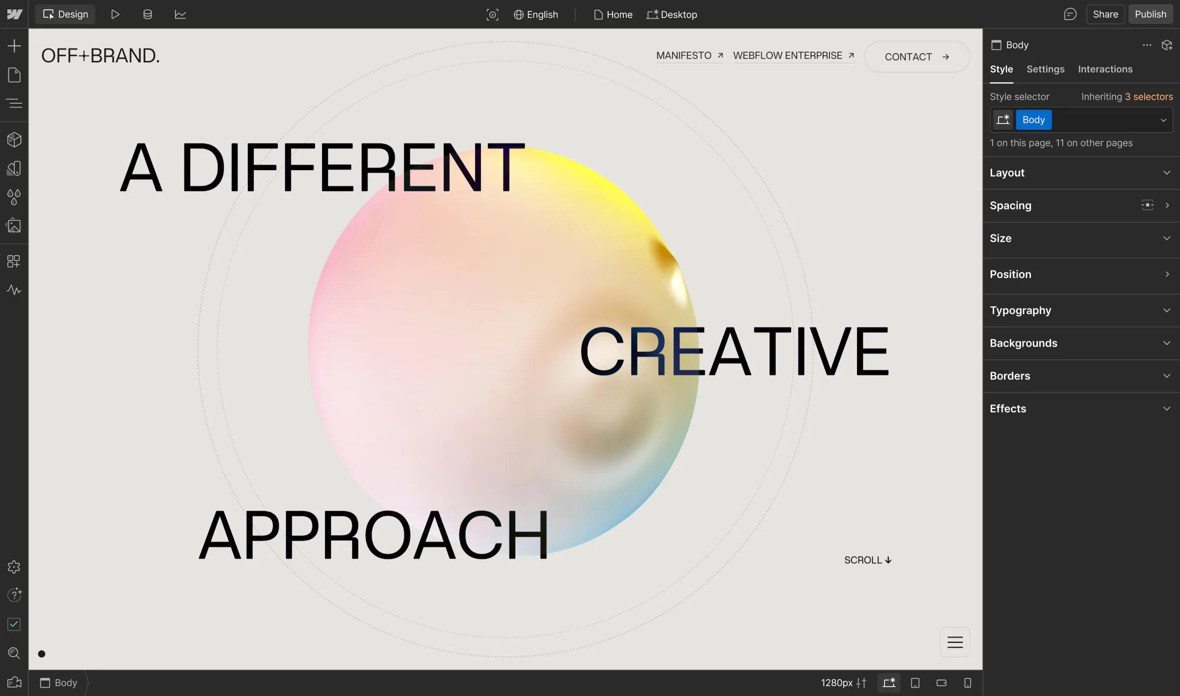
Known for delivering award-winning sites in record time, OFF+BRAND. uses Webflow to create high-performance, scalable content that blends striking design with seamless functionality, enabling clients to manage their sites independently while achieving real business impact.

Analyze
Localization
Optimize
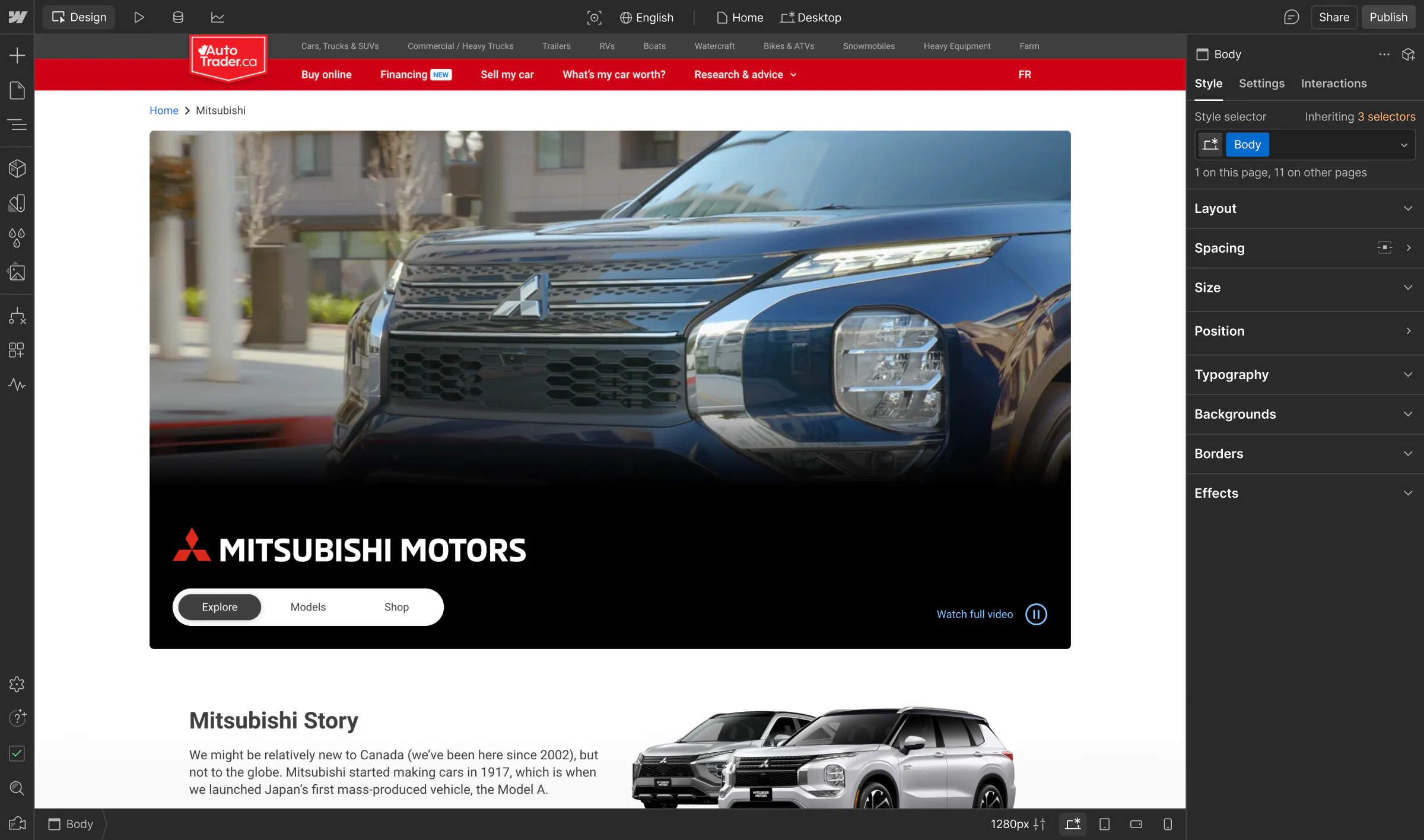
AutoTrader aimed to scale high-performance shopping experiences for individual car brands. By partnering with Composite and Webflow, they improved development efficiency and accelerated speed to market.

Analyze
Localization
Optimize
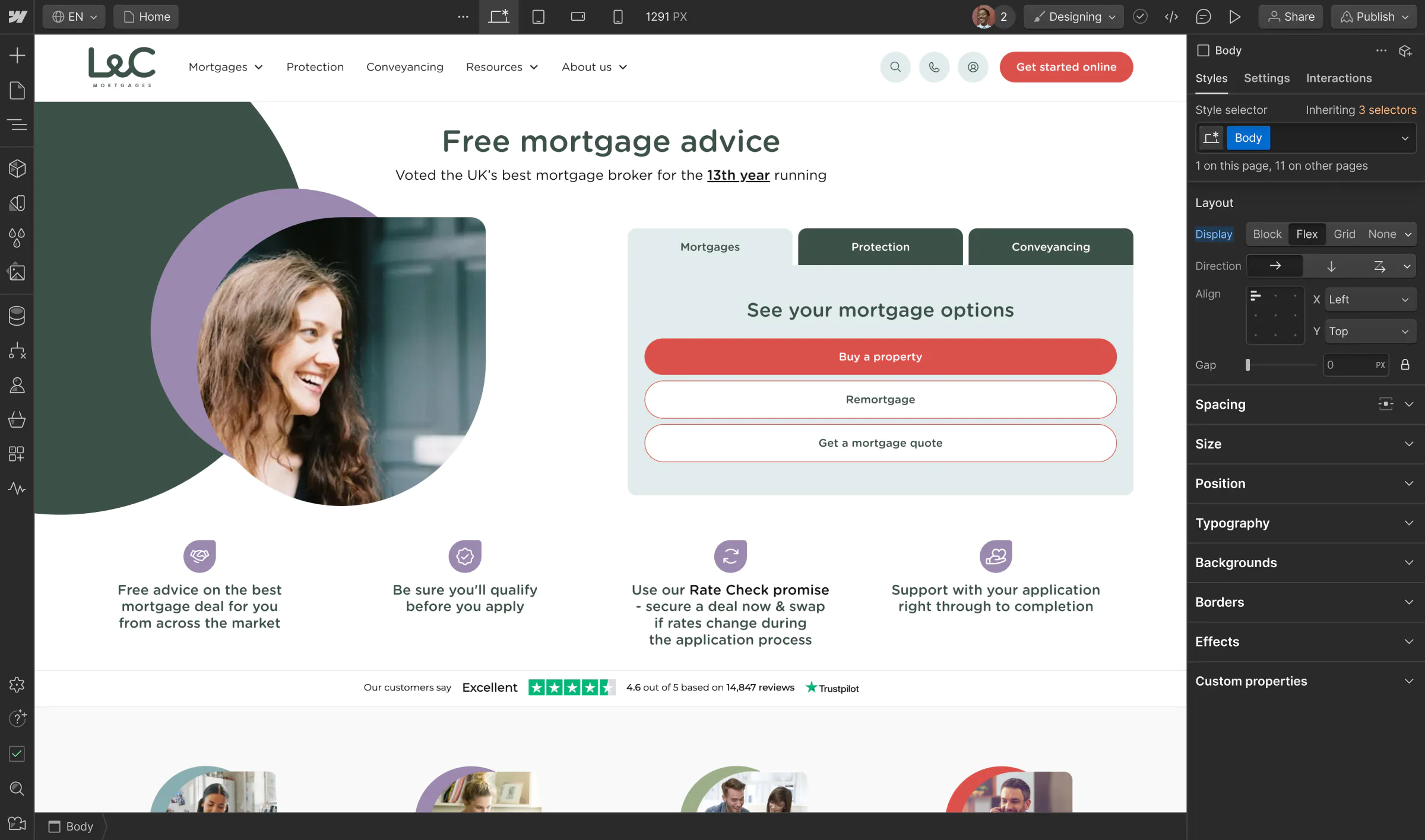
For years, a custom-coded legacy website stifled the fee-free mortgage broker’s creativity, and long development cycles made even the simplest edits cumbersome. Now, L&C’s marketing team has the flexibility to truly own their growth with a more scalable web presence.

Analyze
Localization
Optimize
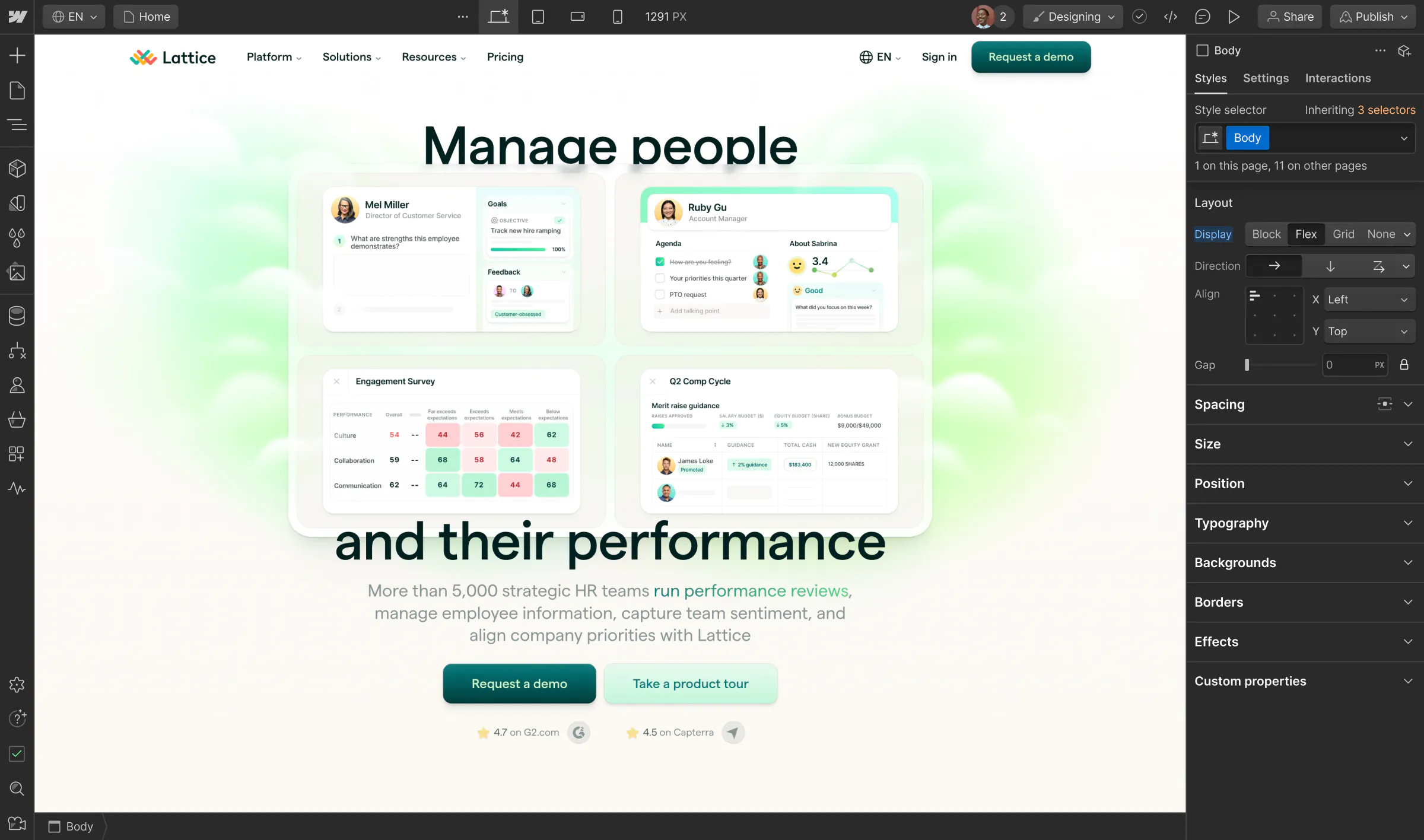
With an ambitious vision of evolving from a talent management tool to an end-to-end HR platform, Lattice bet on Webflow Enterprise to transform their website into a revenue-driving engine that empowers HR professionals around the world.

Analyze
Localization
Optimize
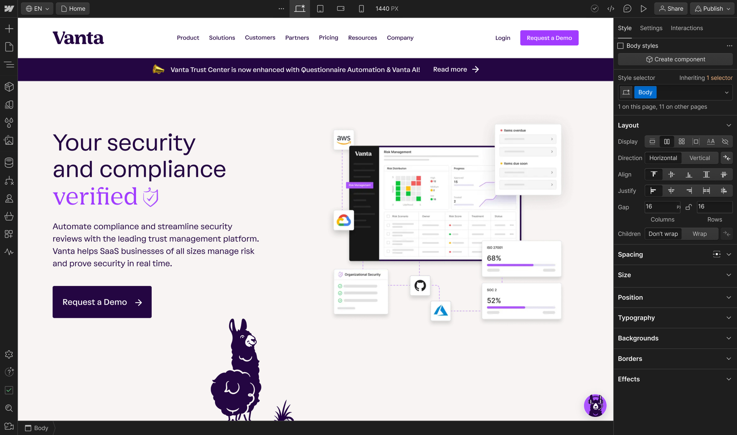
Vanta had ambitious plans to stand out in a competitive space. To bring their new brand to life while unlocking greater flexibility and collaboration, they upgraded to Webflow Enterprise and worked with trusted Webflow partners.

Analyze
Localization
Optimize
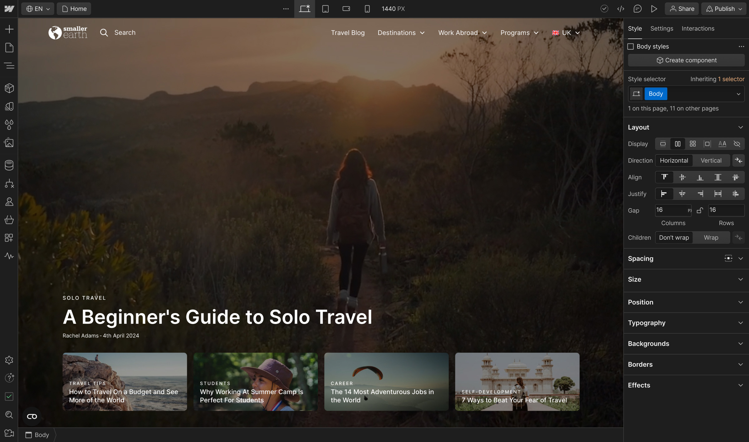
Previously reliant on developers to launch and manage custom sites, the cultural exchange group has optimized localization with Webflow Enterprise, significantly increasing speed to market and providing bespoke, branded experiences globally.

Analyze
Localization
Optimize
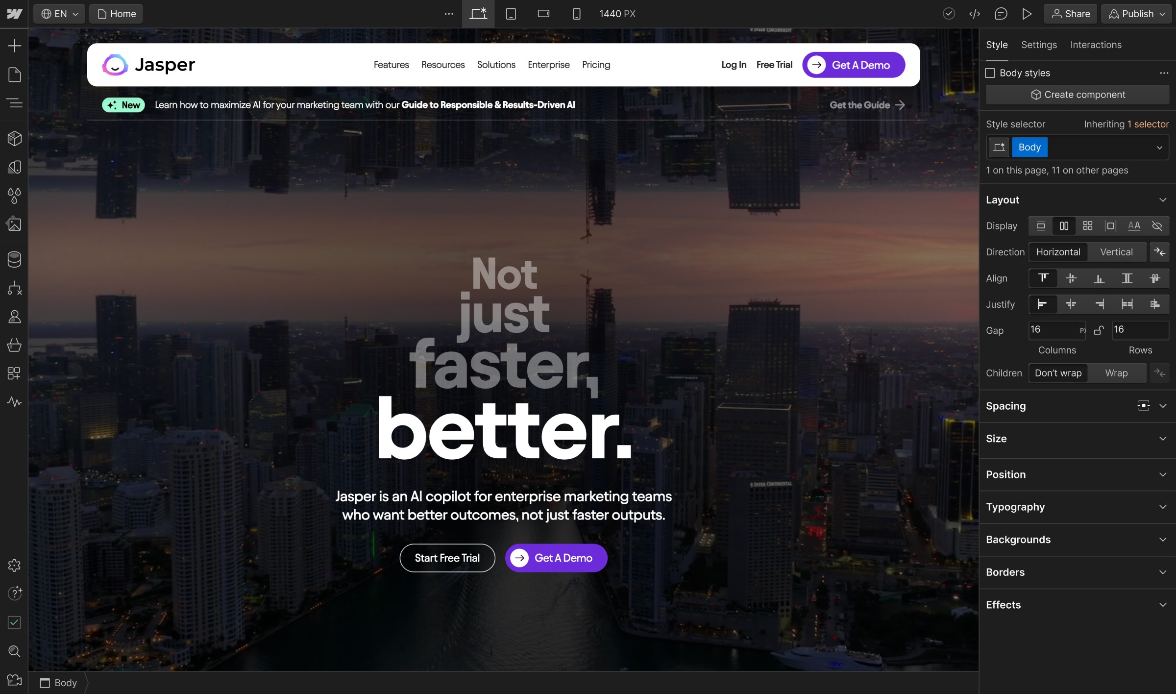
As the company shifted their focus upmarket, they needed a powerful solution to turn their website into their biggest strategic asset. With Webflow and its expansive Apps ecosystem, Jasper has supercharged their workflows to deliver the most performant web experiences.

Analyze
Localization
Optimize
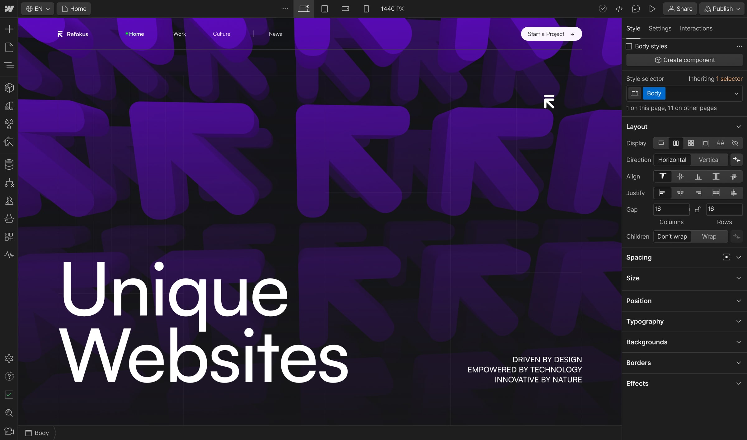
As a Webflow Enterprise Partner, Refokus uses Webflow as a key part of their innovation toolkit to reduce development times and costs while delivering websites that increase engagement and help brands emotionally connect to global audiences.

Analyze
Localization
Optimize
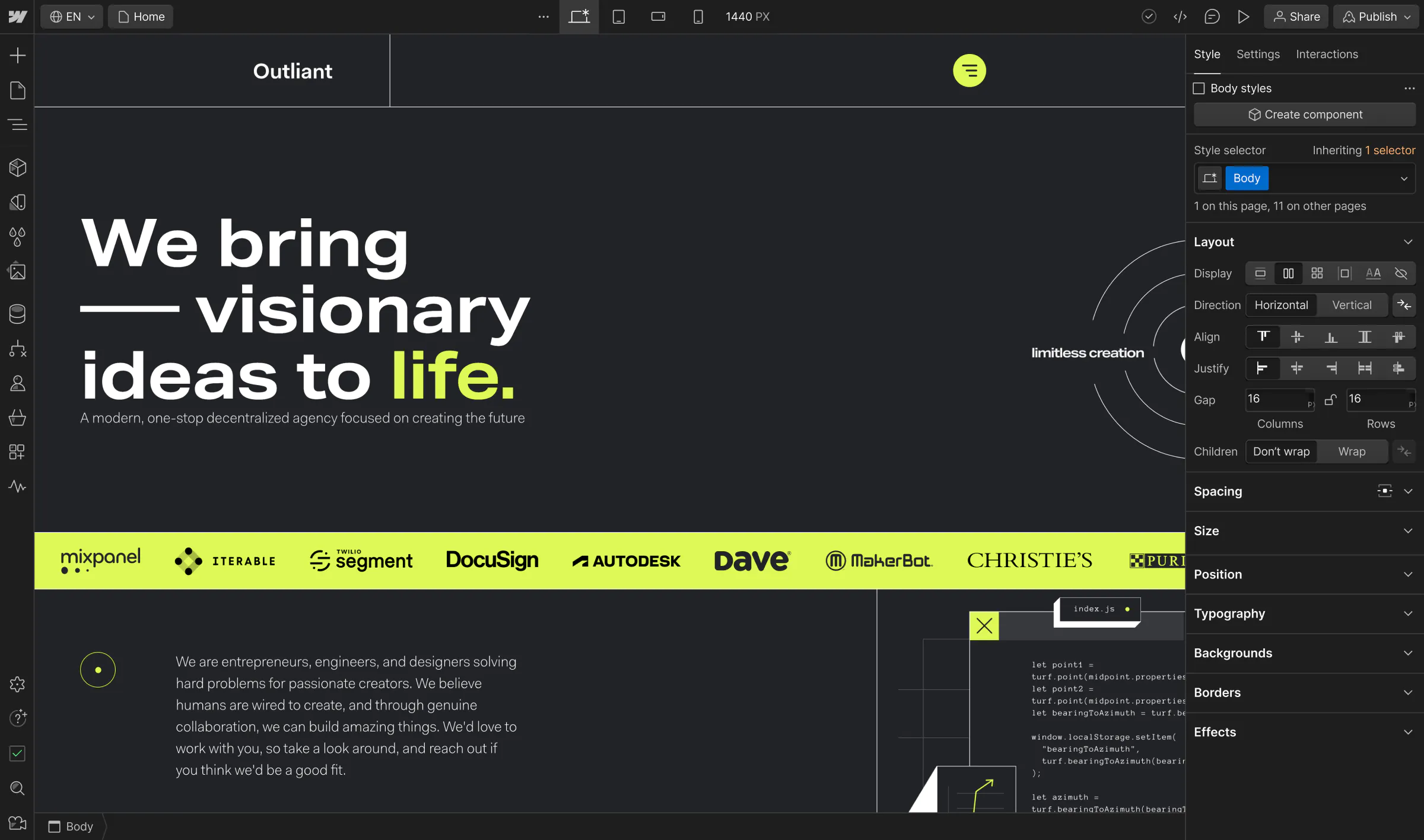
Fueled by the power of Webflow, Outliant drives dramatic reductions in tech costs while empowering enterprise clients to dominate their industry with best-in-class digital experiences.

Analyze
Localization
Optimize
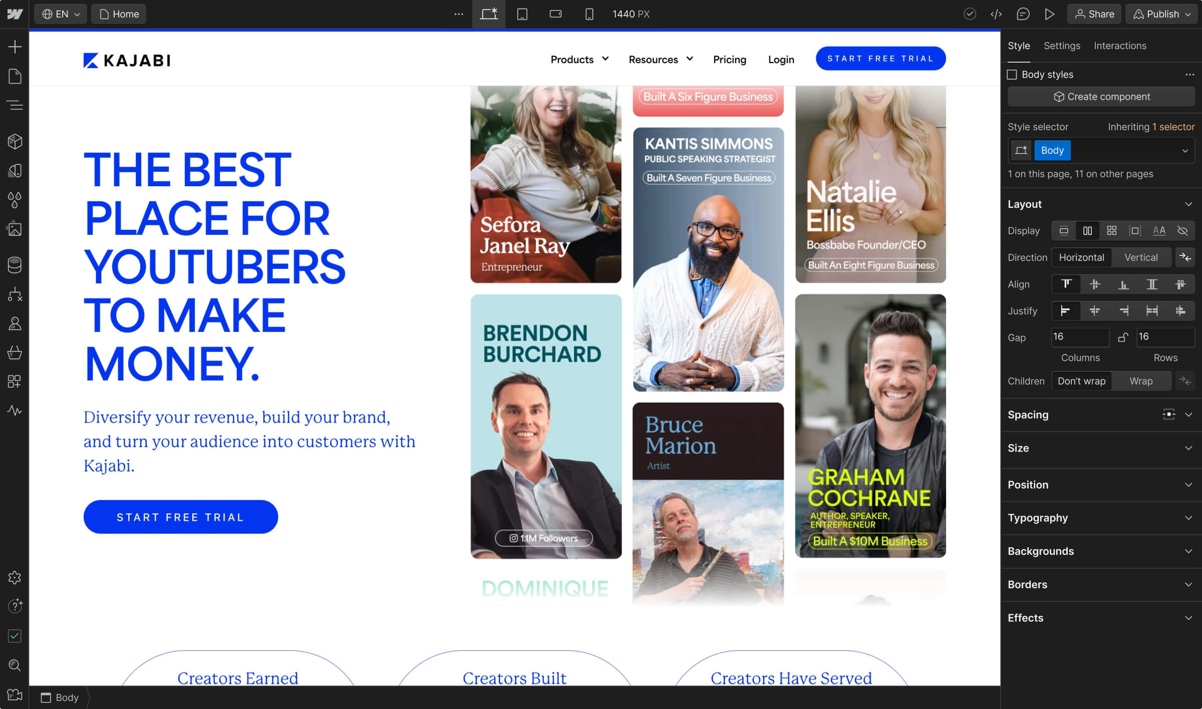
Quickly growing past the limits of Webflow self-serve for their global web presence, Kajabi upgraded to Enterprise to empower internal partners to build more robust web experiences, while ensuring governance.

Analyze
Localization
Optimize
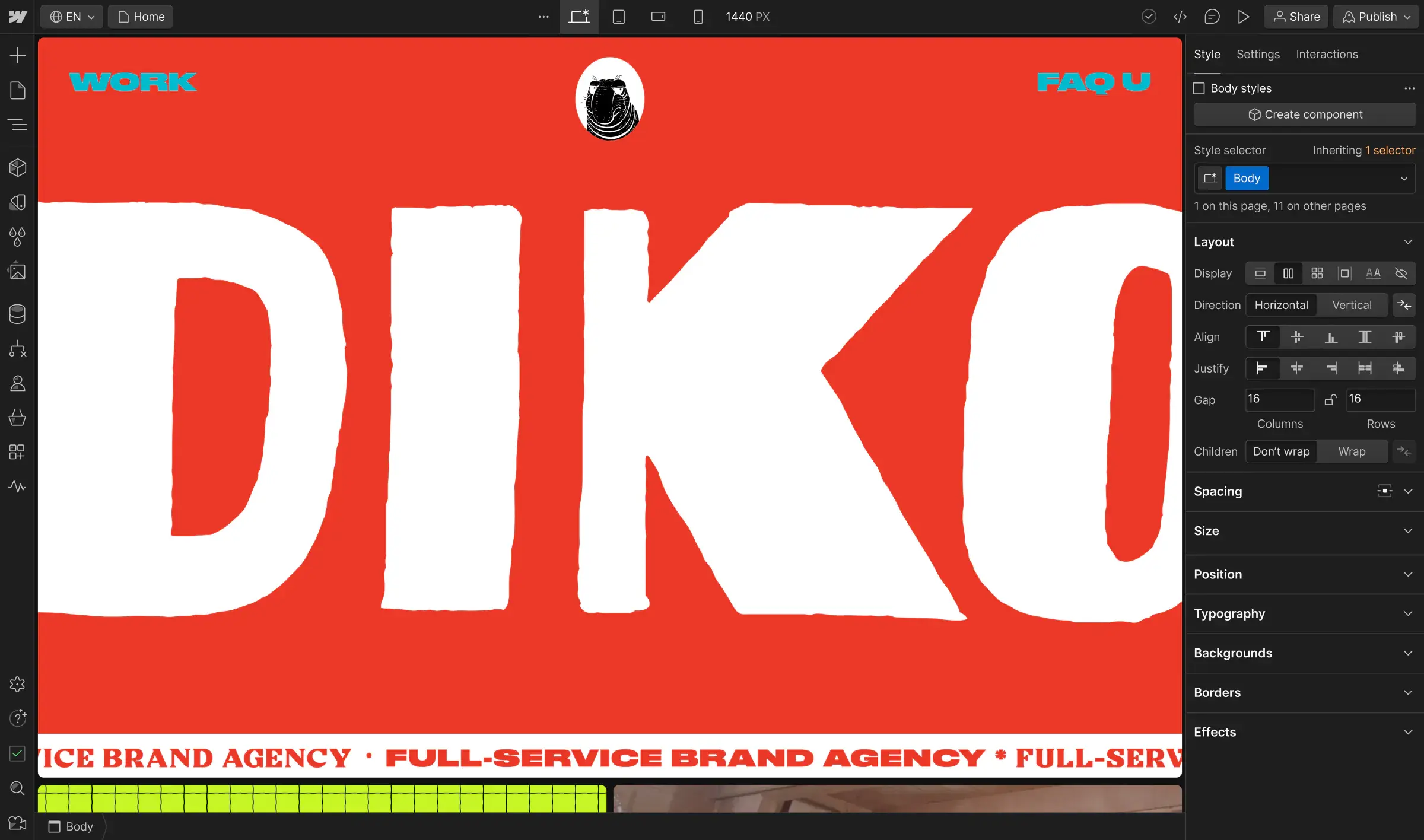
Boutique agencies can often lose business due to long production timelines and tedious feedback loops—but DIKO has moved beyond those constraints to deliver even the most technically challenging projects for big clients.

Analyze
Localization
Optimize
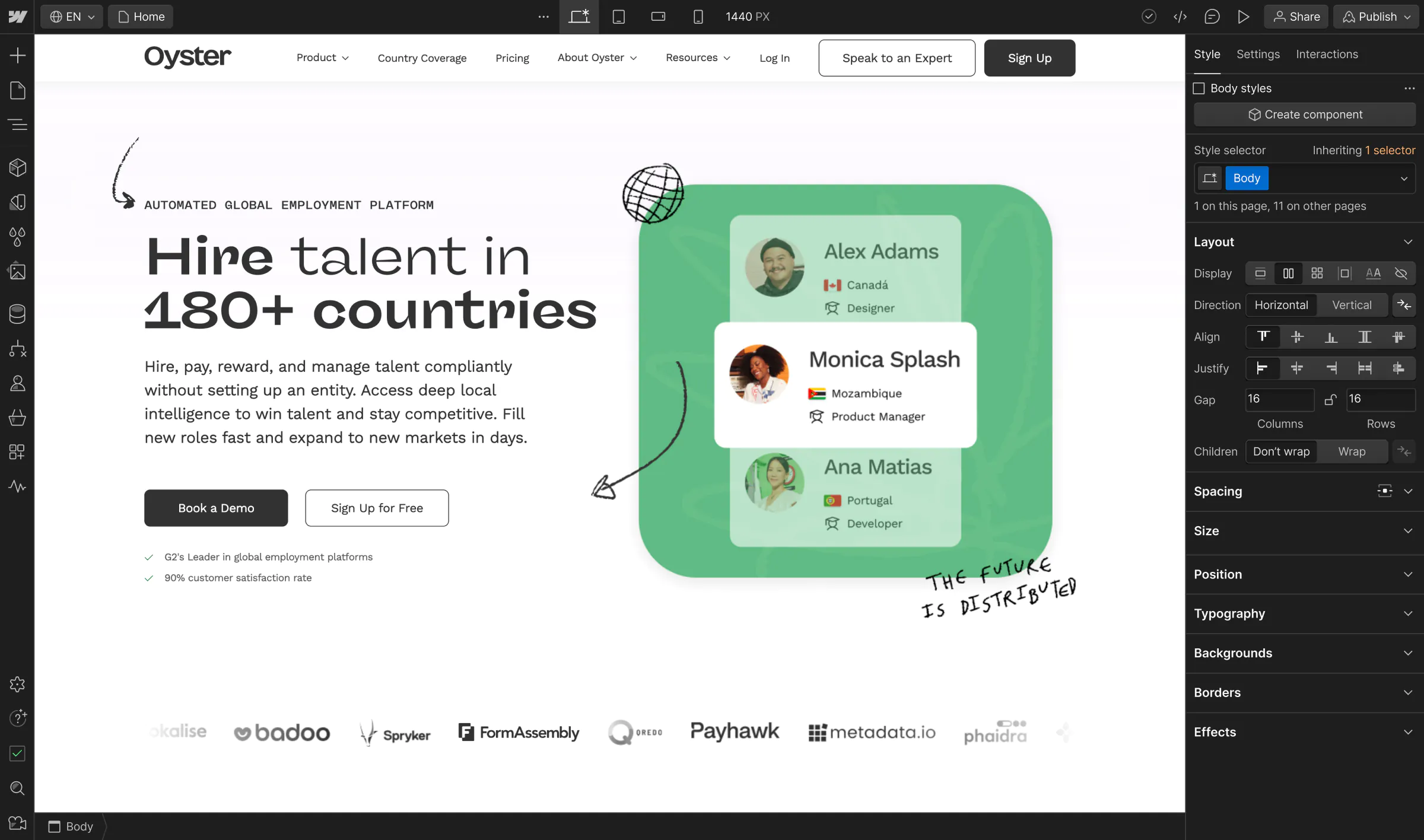
Without a centralized design approach, the global HR company was dealing with an inconsistent brand presence. The team upgraded from self-serve to Webflow Enterprise to uplevel team collaboration, scale global web initiatives, and elevate their brand.

Analyze
Localization
Optimize
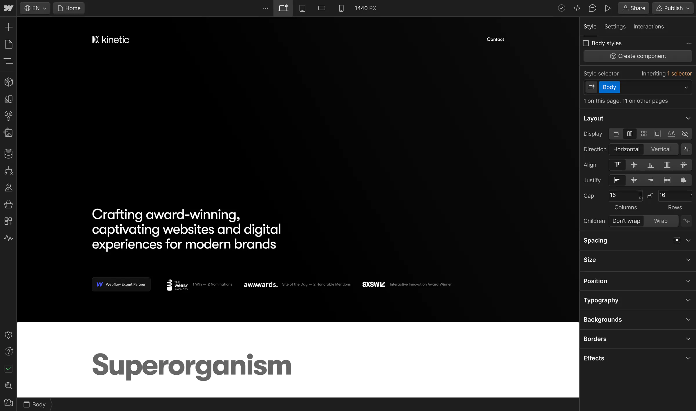
Instead of hoping front-end developers can execute on his big ideas, Kinetic Studio’s Hunter Thompson uses Webflow to control his entire vision, from executing design to setting up hosting and domains, publishing sites, and optimizing SEO.

Analyze
Localization
Optimize
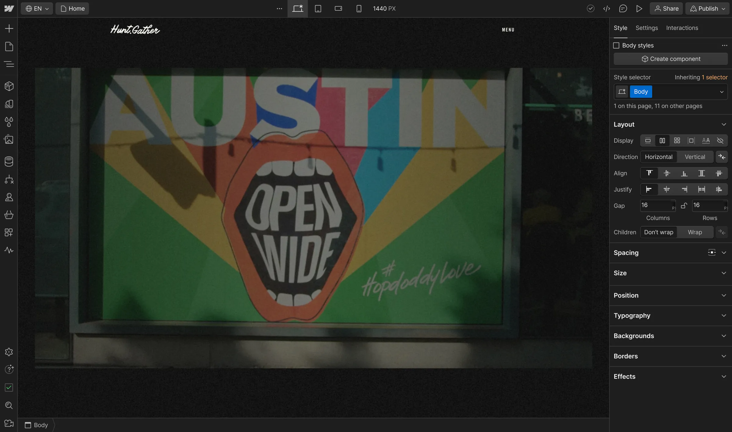
The full-service creative agency can deliver its signature high-design work without having to wait for developers, ultimately saving time and opening the door to more client opportunities.

Analyze
Localization
Optimize
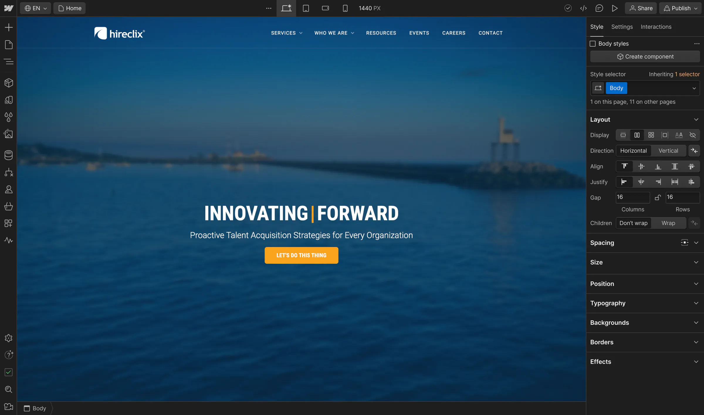
Since migrating to Webflow, the recruitment marketing agency has bypassed the need to outsource web development, attracted bigger clients, and introduced a new revenue stream.

Analyze
Localization
Optimize
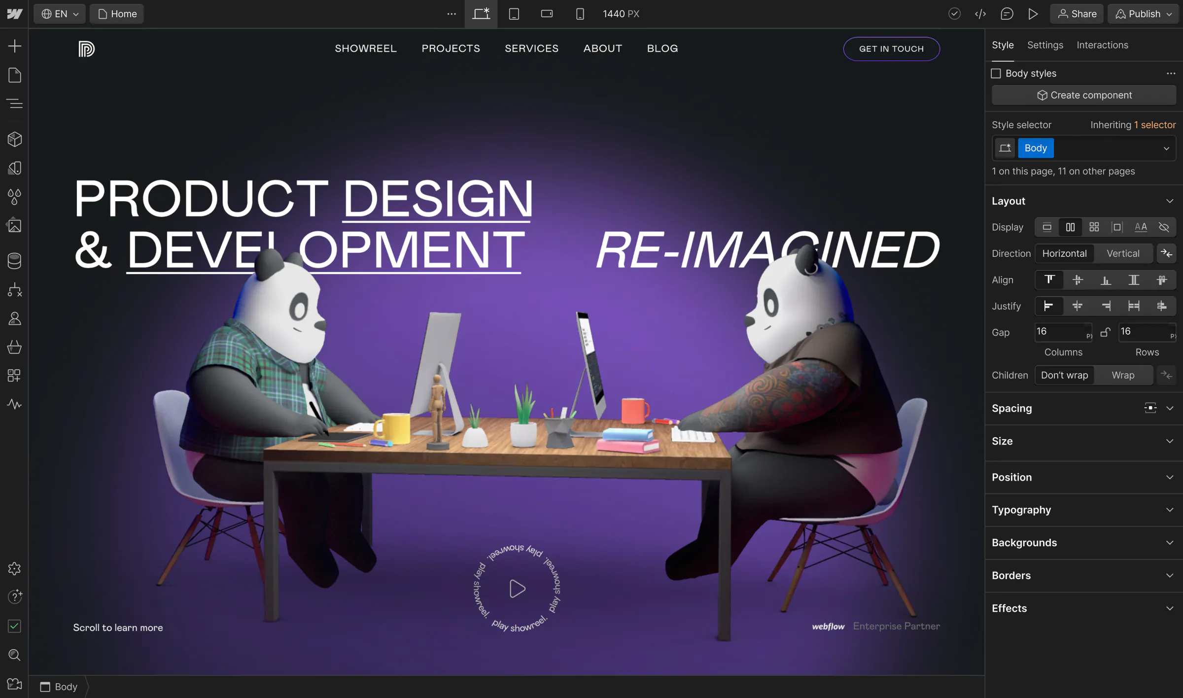
Once hindered by traditional development processes, The Digital Panda’s team of global visionaries now use Webflow to efficiently deliver more powerful web experiences to enterprise clients.

Analyze
Localization
Optimize
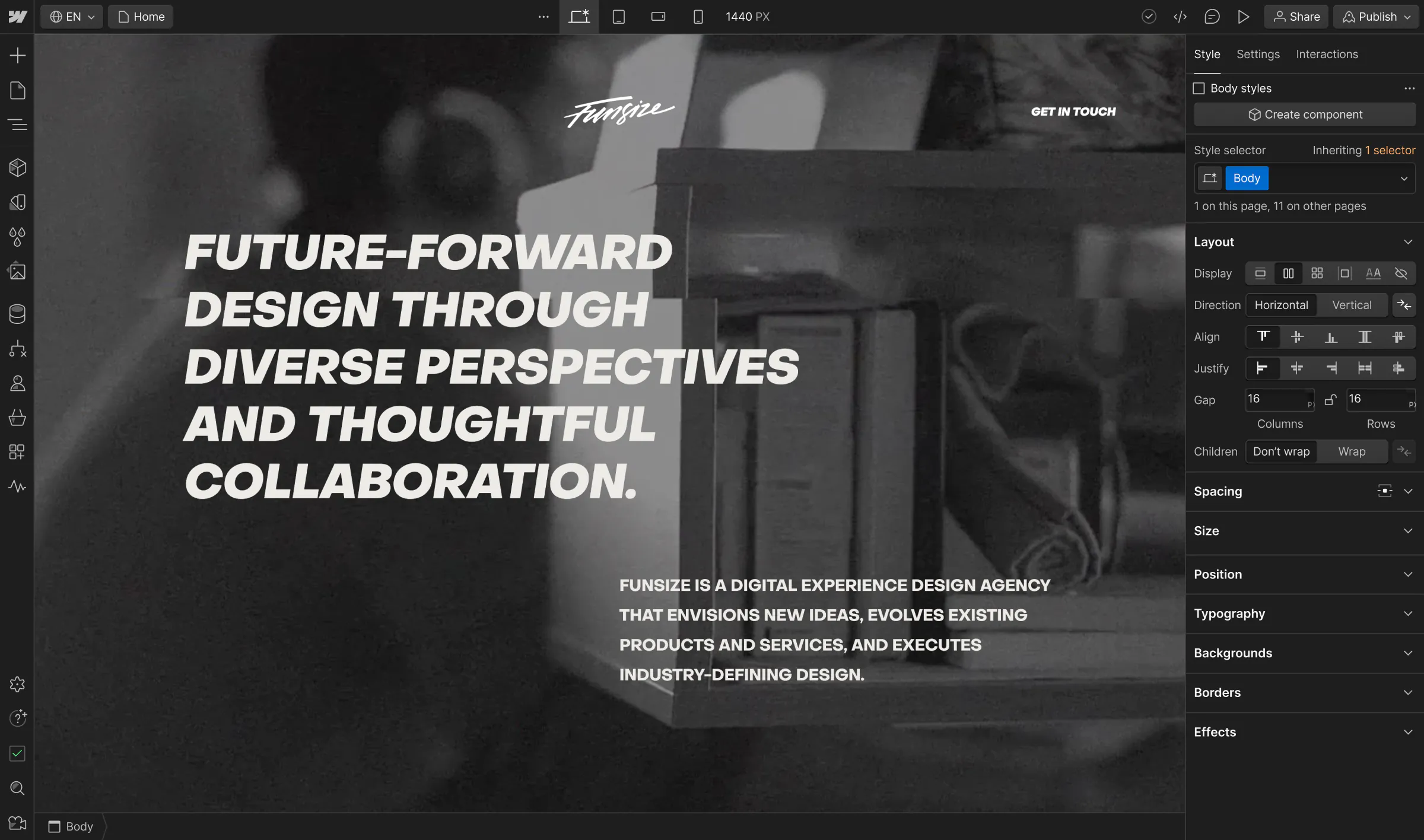
With limited resources and no in-house developers, the Funsize team can tap into the power of Webflow to push creative boundaries and exceed client expectations—delivering better work, faster.

Analyze
Localization
Optimize
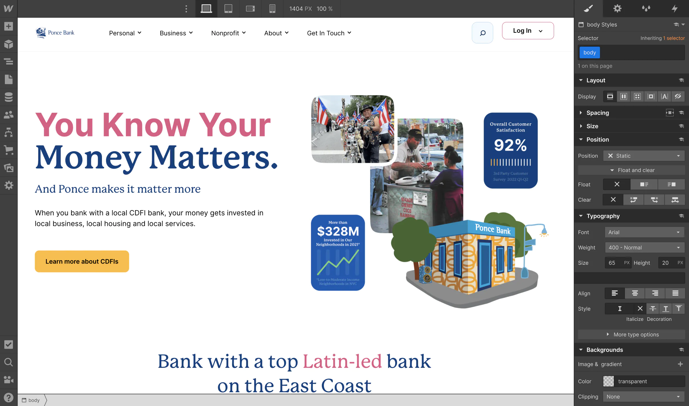
To break free from the traditional web development tools that often limit community banks, Ponce Bank turned to Webflow to deliver higher-quality digital experiences.

Analyze
Localization
Optimize
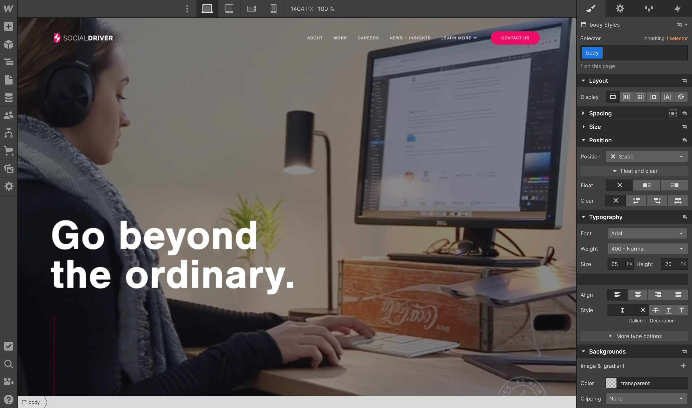
As a Webflow Enterprise Partner, Social Driver expands their client base and leverages comprehensive features to tackle custom builds with high security standards — all while moving quickly with less reliance on developers.

Analyze
Localization
Optimize
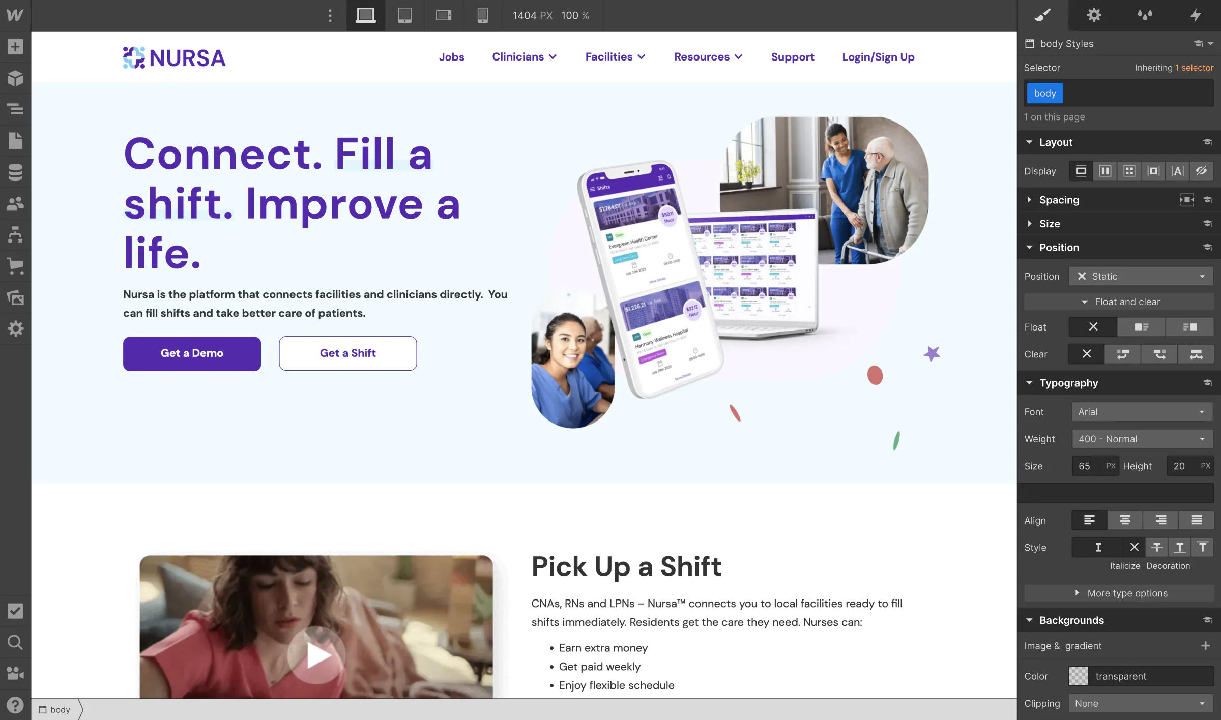
To match nurses to facilities in real time, Nursa moved 40,000 pages and complex marketplace data to Webflow. The team now scales dynamic experiences faster, reduces engineering overhead, and enables AI discovery across a growing healthcare platform.

Analyze
Localization
Optimize
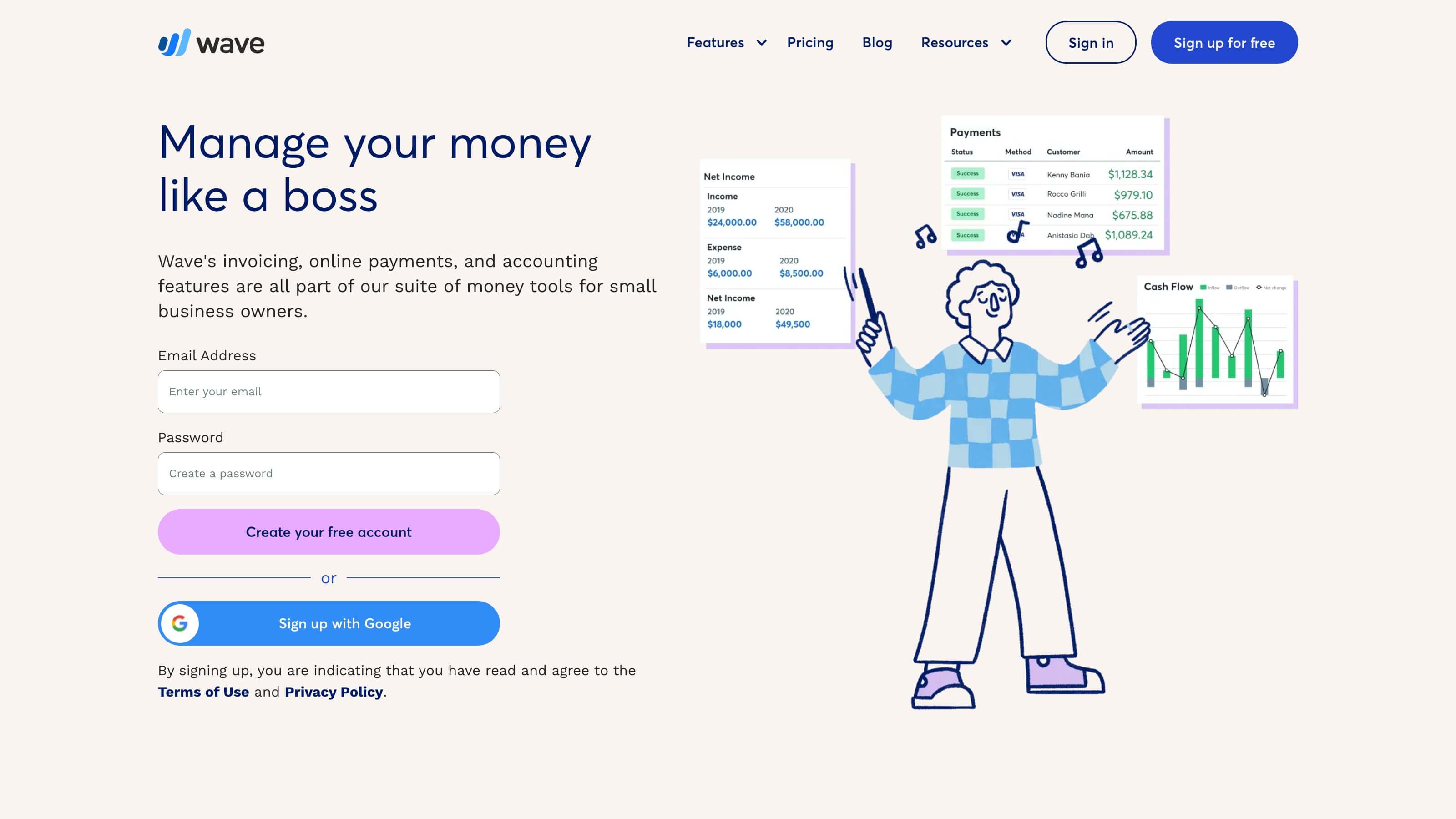
Looking for more design flexibility and the ability to empower more of the team to manage site updates, Wave turned to Webflow Enterprise to reduce their developer dependency.

Analyze
Localization
Optimize
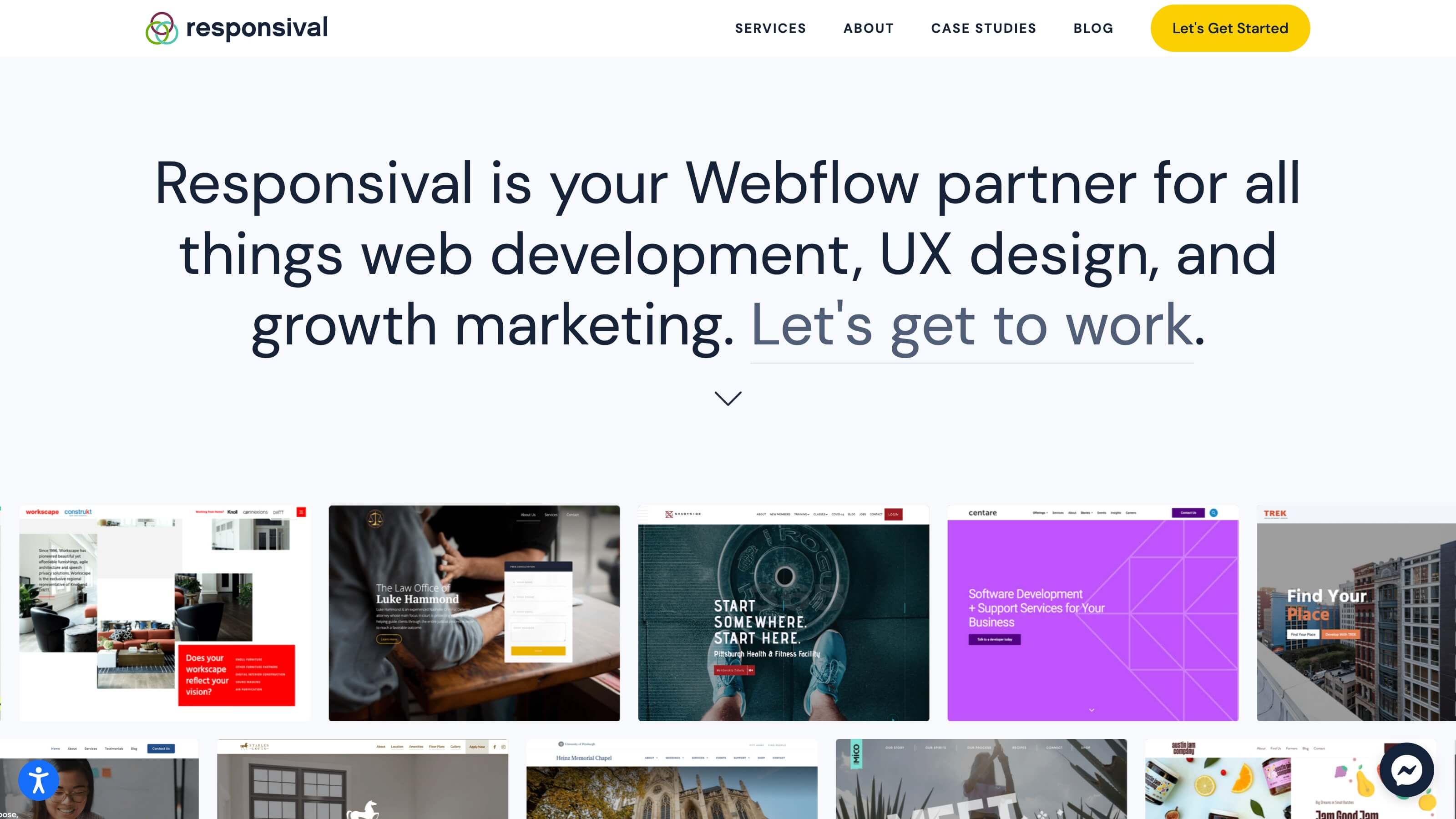
Responsival leveraged the Webflow Experts Program to transform their business with fewer dev resources, a shorter workweek, and drastically increased engagement prices.

Analyze
Localization
Optimize
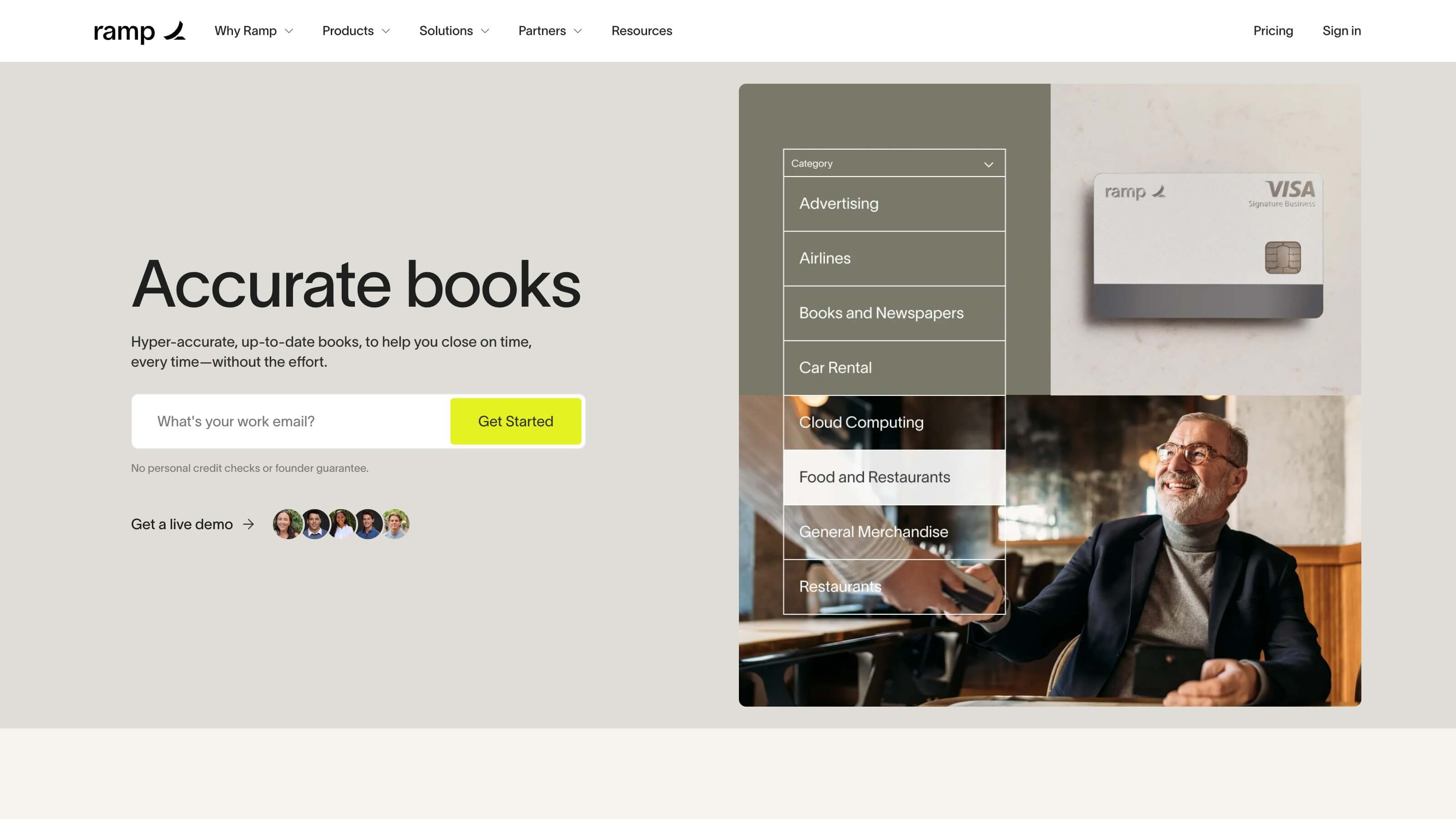
Looking to tackle a redesign on a tight timeline, Ramp turned to Webflow to give its marketing, design, and engineering teams the ability to move quickly together.

Analyze
Localization
Optimize
What started out with just three pages showing what can be built with Webflow was the springboard to redoing the entire website.

Analyze
Localization
Optimize
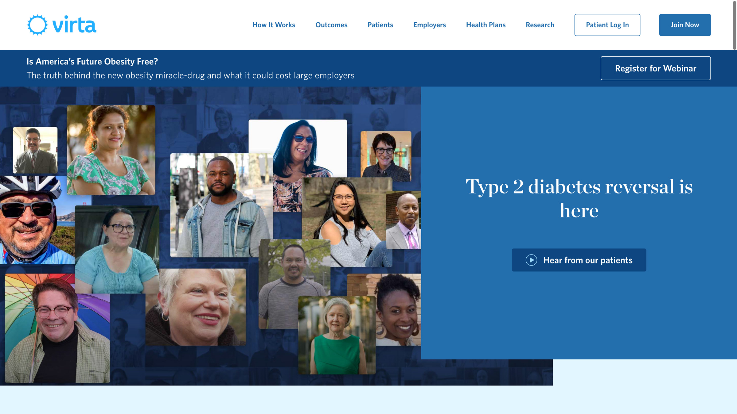
Virta gained a whole lot more than a flexible CMS with their move to Webflow — they also reached a new level of collaboration, creation, and accessibility.

Analyze
Localization
Optimize
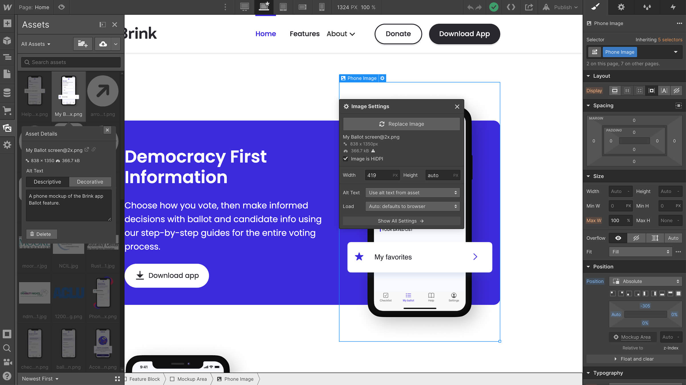
The team at Brink — a mobile Election Guide built with accessible technology to make democracy available to everyone — worked with design agency 8020 to build a website that was accessible by design.

Analyze
Localization
Optimize
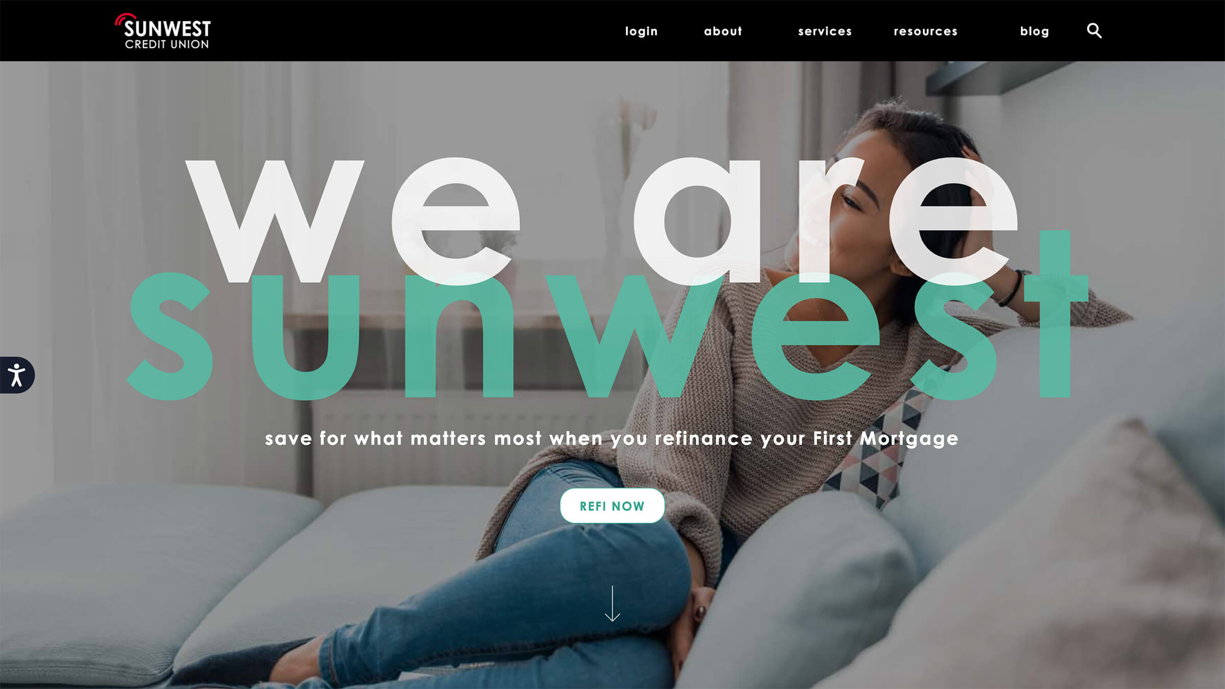
SunWest Credit Union switched from Fiserv to Webflow to give their marketing team control of their site.

Analyze
Localization
Optimize
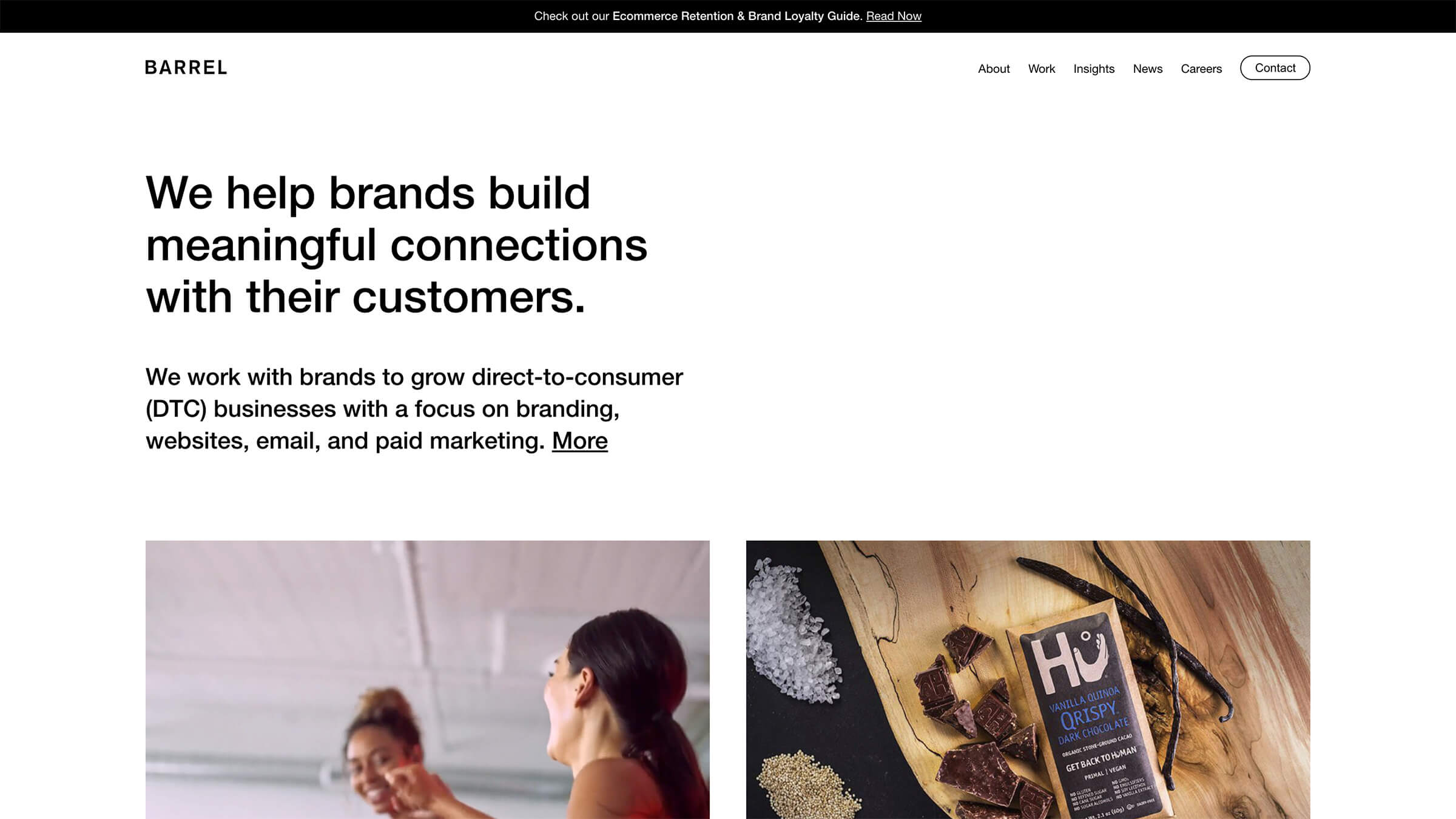
Adding Webflow to their toolkit enabled the team at Barrel to significantly streamline their development and review processes with clients — all while empowering designers to do their best work.

Analyze
Localization
Optimize
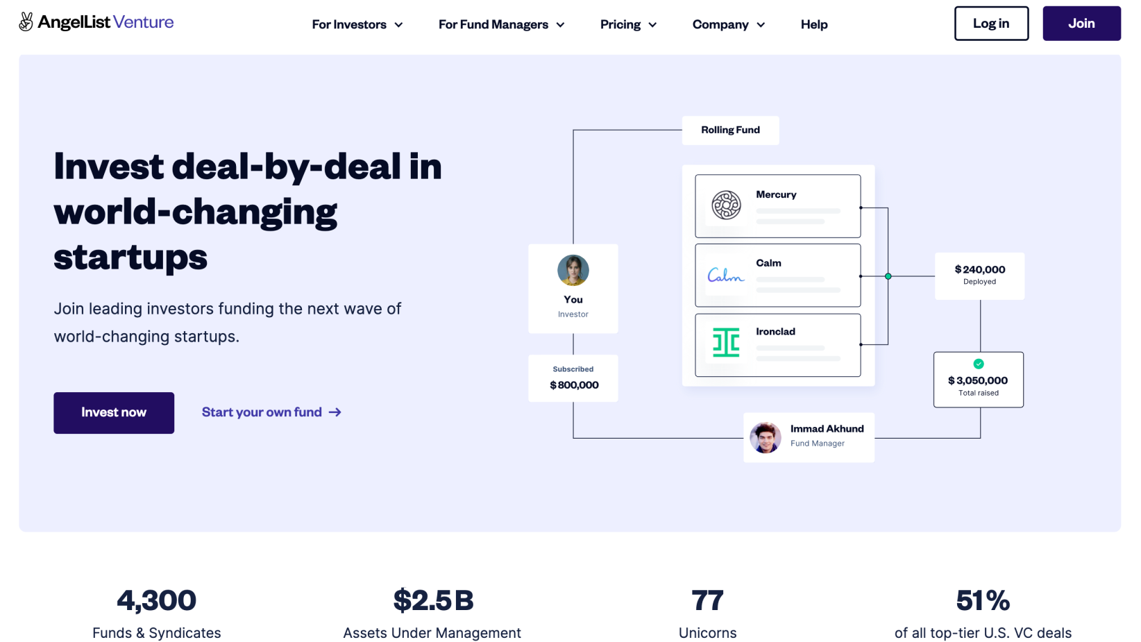
The popular company for fund managers, investors, and venture capitalists has turned to Webflow to empower their marketing team and reach their growth goals streamline their work.

Analyze
Localization
Optimize
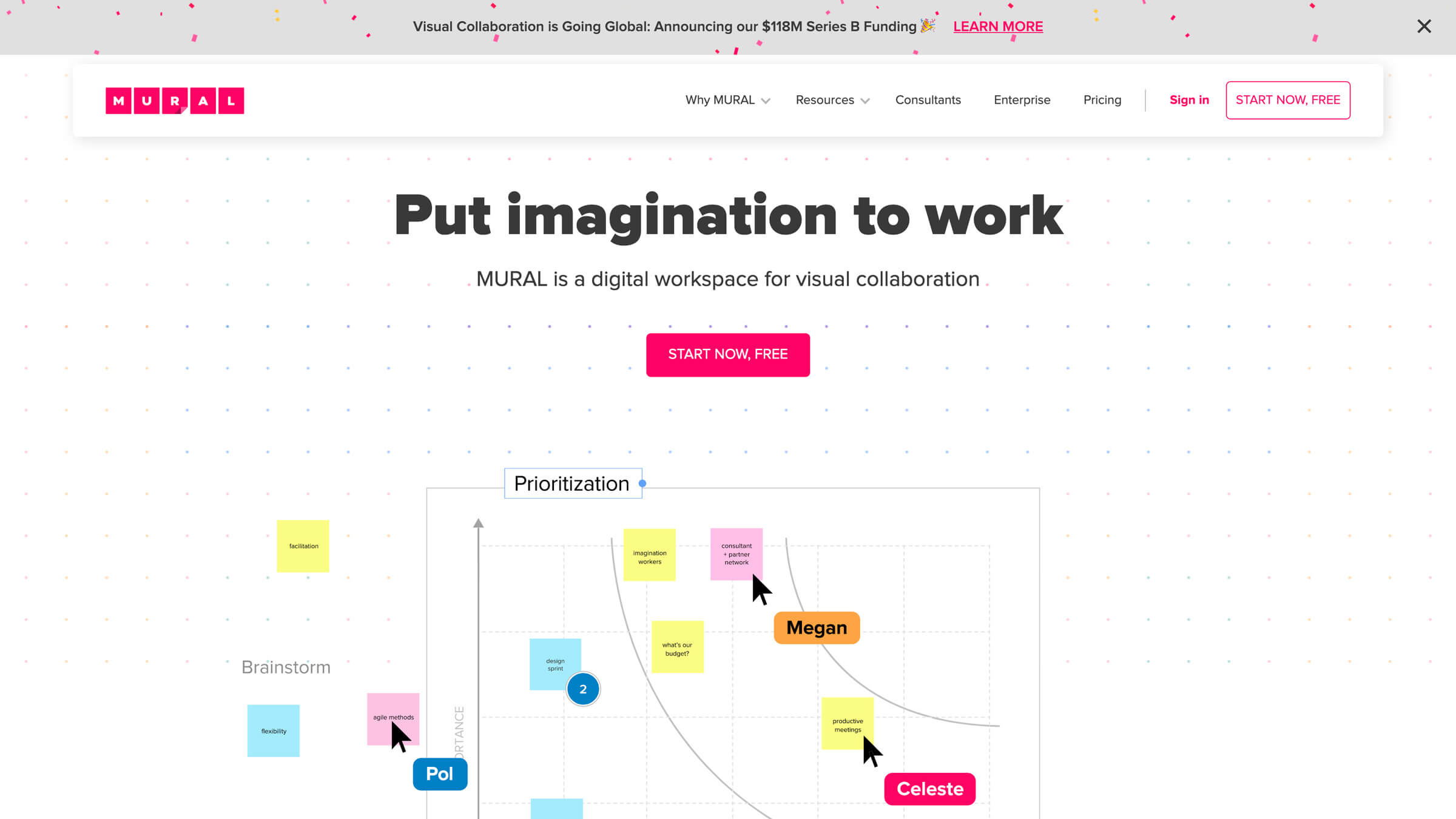
Mural moved from an engineering-owned site to Webflow to let their design team "control their own destiny".

Analyze
Localization
Optimize
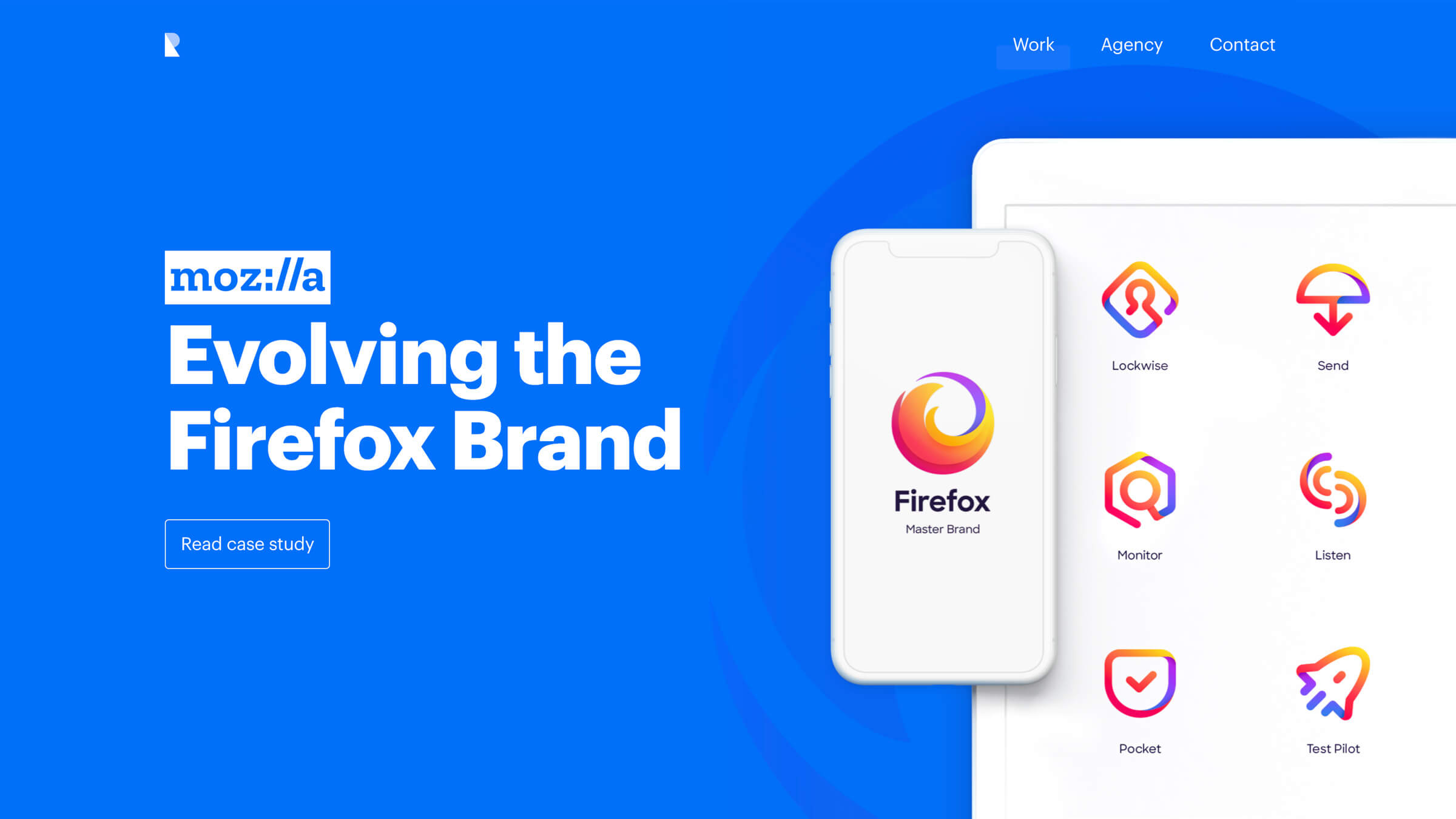
Ramotion switched from React to Webflow to build their marketing sites faster and give clients more control over their site after launch.

Analyze
Localization
Optimize
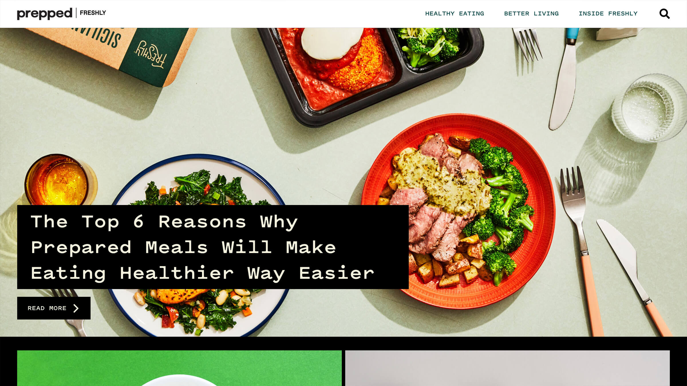
Freshly moved their blog from WordPress to Webflow to give their marketing and design team control.


Analyze
Localization
Optimize
Getaround is a quickly growing car sharing network with over $400 million in funding, and runs their marketing pages on Webflow.

Analyze
Localization
Optimize
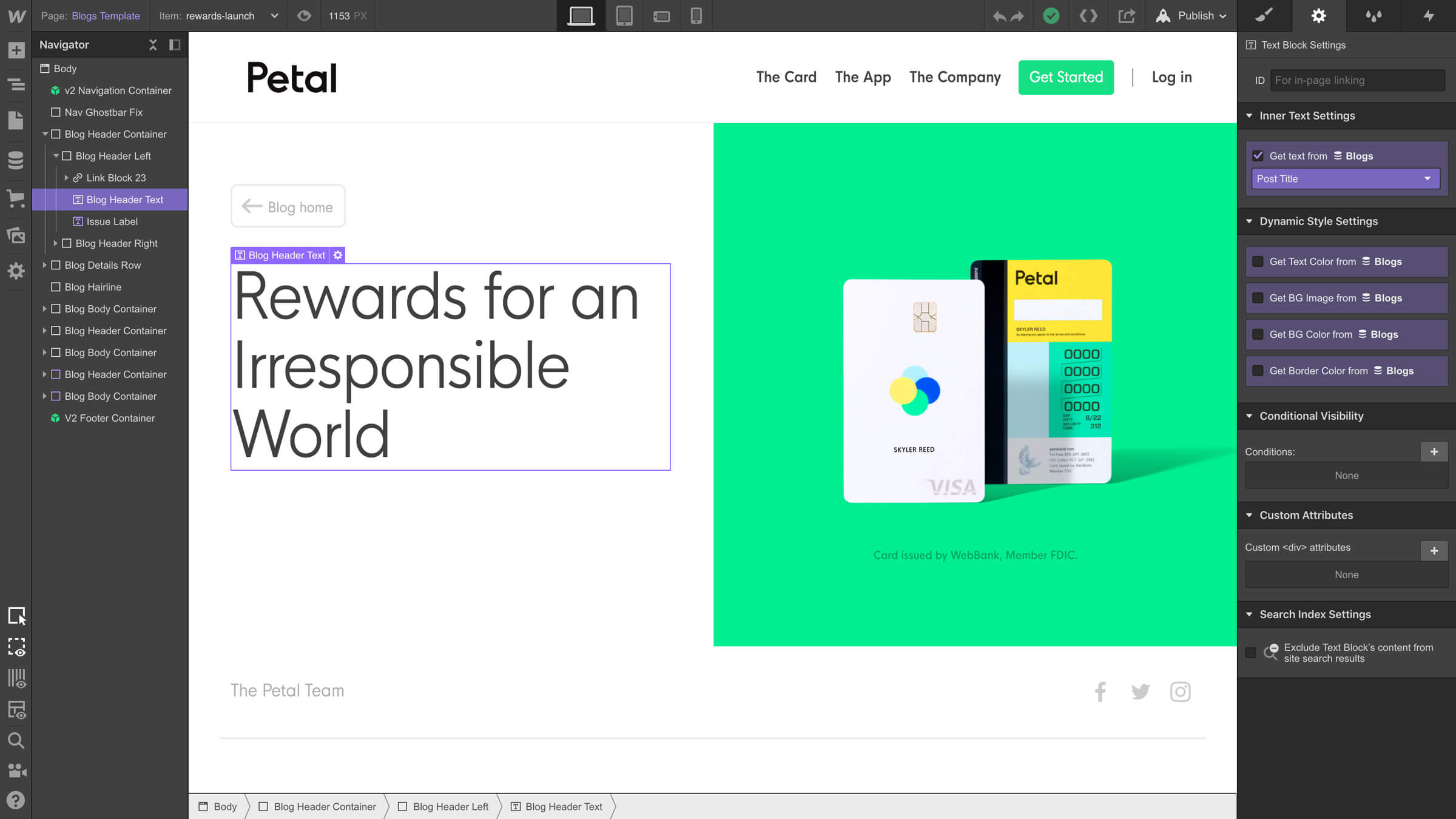
With over $380 million raised, Petal is changing the way people get access to credit, and runs their entire marketing website on Webflow.


Get started for free
Try Webflow for as long as you like with our free Starter plan. Purchase a paid Site plan to publish, host, and unlock additional features.
Try Webflow for as long as you like with our free Starter plan. Purchase a paid Site plan to publish, host, and unlock additional features.


