


Grab attention and drive conversions with a well-designed SaaS site.
SaaS website design is a crucial tool to shape first impressions and educate potential buyers. An effective SaaS site explains what your client’s software does, why it stands out from competitors, and how it solves problems — and it encourages visitors to take the next step.
With the right elements and some inspiration, you can achieve all those goals and more. Read on to learn about the features your designs should include and explore 35 top-tier examples of them.
Key elements of effective SaaS website design
SaaS websites are primarily built to educate and convert. Here are a few features that can turn casual visitors into paying customers:
- Social proof: Testimonials, case studies, reviews, and logos from reputable clients reassure visitors that a product delivers. Social proof encourages confidence in taking the next step, and prominent call to action (CTA) buttons encourage conversion.
- Clear navigation: Whether it’s a landing page or a full site, clear navigation with logical page structure helps visitors find what they need as quickly as possible. It also reduces user frustration and encourages site exploration.
- Clear value propositions: Value propositions tell people how your client’s SaaS product can solve their problems. Your website should quickly explain what the product does and what sets it apart.
- Engaging visuals and product demos: Screenshots, explainer videos, interactive demos, and animated UI cards help people visualize how a product works. Showing the user experience reduces hesitation around the learning curve for it.
- Conversion-focused CTAs: From signup prompts to “free trial” buttons, CTAs should be highly visible and persuasive. Effective CTAs create momentum by nudging visitors to act.
35 best SaaS website designs of 2026
Here are 35 effective and well-designed SaaS websites to inspire you. These examples showcase how various design elements work from both an aesthetic and a marketing perspective.
1. Proof

Appropriately, Proof puts social proof right up front. The main page showcases client logos, testimonial quotes, and metrics like “25,000+ online businesses use Proof” to build credibility.
The headline, “Boost your website conversions by 15% in under 15 minutes,” provides an immediate benefit-driven value proposition. Prominent blue buttons serve as CTAs throughout, visually focusing visitor attention on next steps.
2. Kajabi

Kajabi’s homepage features bold text, a five-star rating graphic, and a brightly colored CTA button to grab attention. Kajabi’s value proposition is scattered throughout graphics featuring real users, with key feature callouts and stats that emphasize the service’s many benefits.
Animated UI cards and multiple color combinations make the content engaging and fun to interact with.
3. Lattice
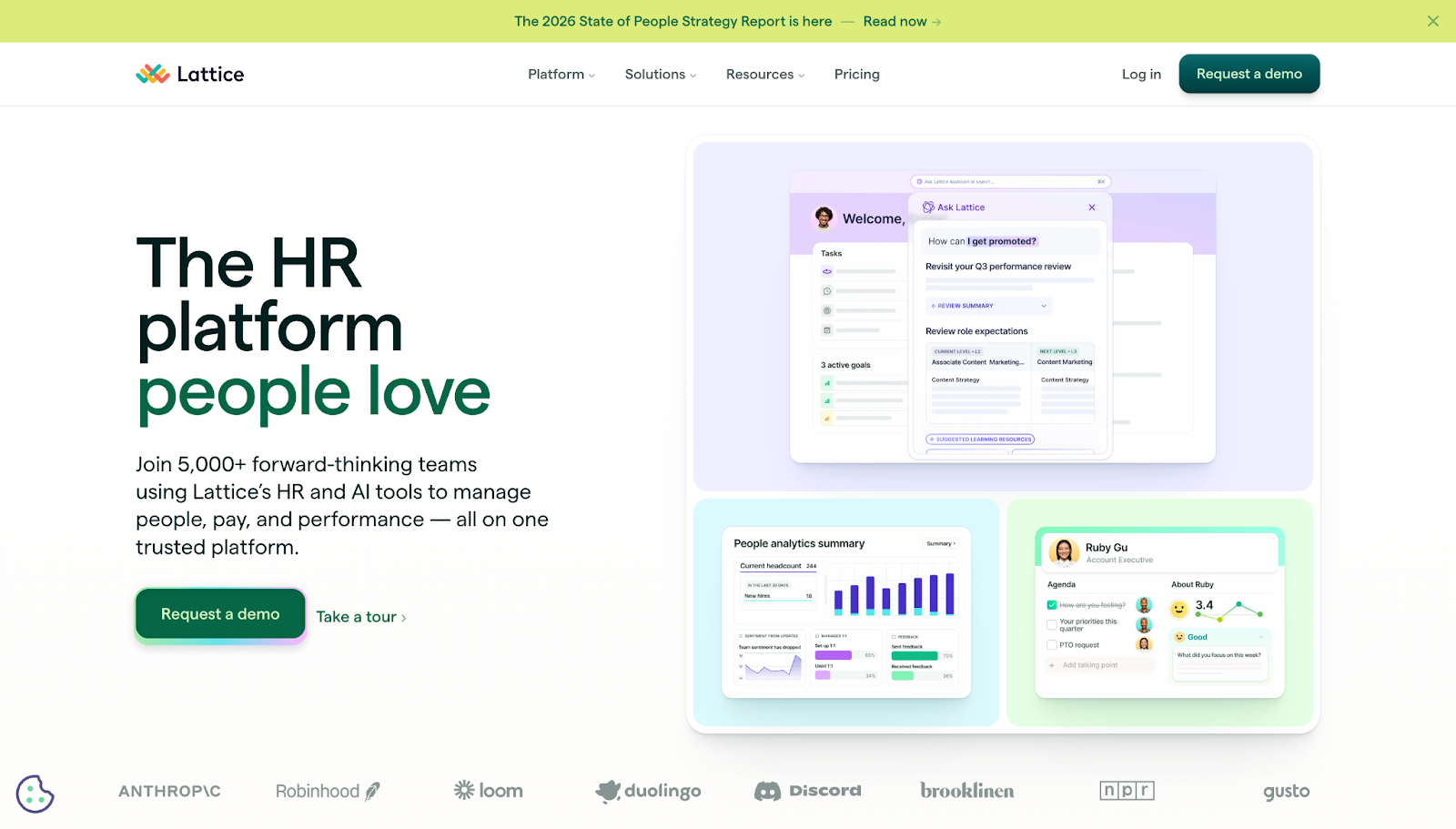
Lattice displays screenshots of their HR platform in action, immediately giving visitors a taste of what to expect. The dark green “request a demo” CTA is contrasted with a pastel color palette for high visibility.
A list of client logos at the fold provides social proof. At the top, a customizable website notification bar lets the Lattice team display timely messages for their target audience, increasing interactivity.
4. Petal

Petal’s website, designed by Devin Fountain, opens with an inviting message: “No experience necessary.” The subsequent copy simplifies a complex financial value proposition, showing how Petal’s services are approachable to any user.
The middle of the page features three clear product options with transparent pricing, along with testimonials and feature breakdowns to educate the target audience.
5. Dropbox Sign
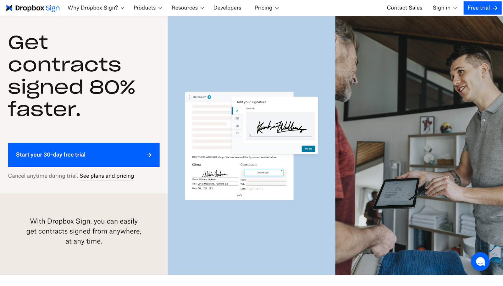
The Dropbox Sign website was designed by Justin Johnson and has a benefit-driven headline: “Get contracts signed 80% faster.” Screenshots of the tool show how it works, and free trial CTAs help interested visitors get started quickly.
Case studies and testimonials enhance the business’s credibility. A list of integrations shows how this service can fit into users’ existing workflows, which supports the message that it’s an approachable tool.
6. Distributional
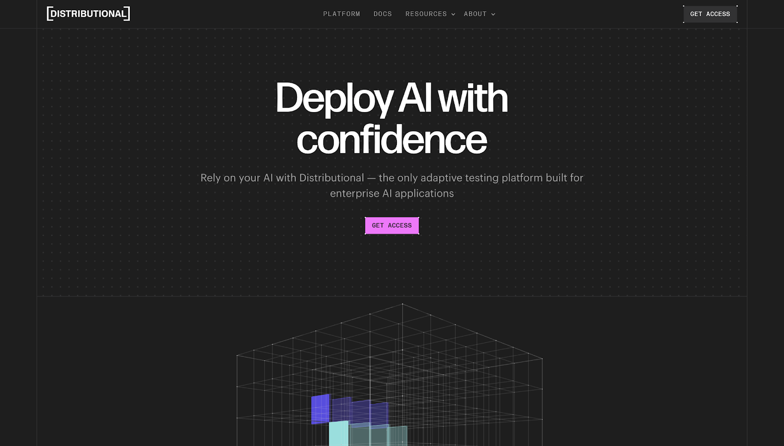
Distributional’s SaaS website leads with the copy “Deploy AI with confidence,” immediately conveying the service’s purpose and value proposition. The follow-up description adds more context on how this service addresses common user pain points.
This site has a well-structured hierarchy, leading readers naturally from problems to solutions and CTAs.
7. Appcues
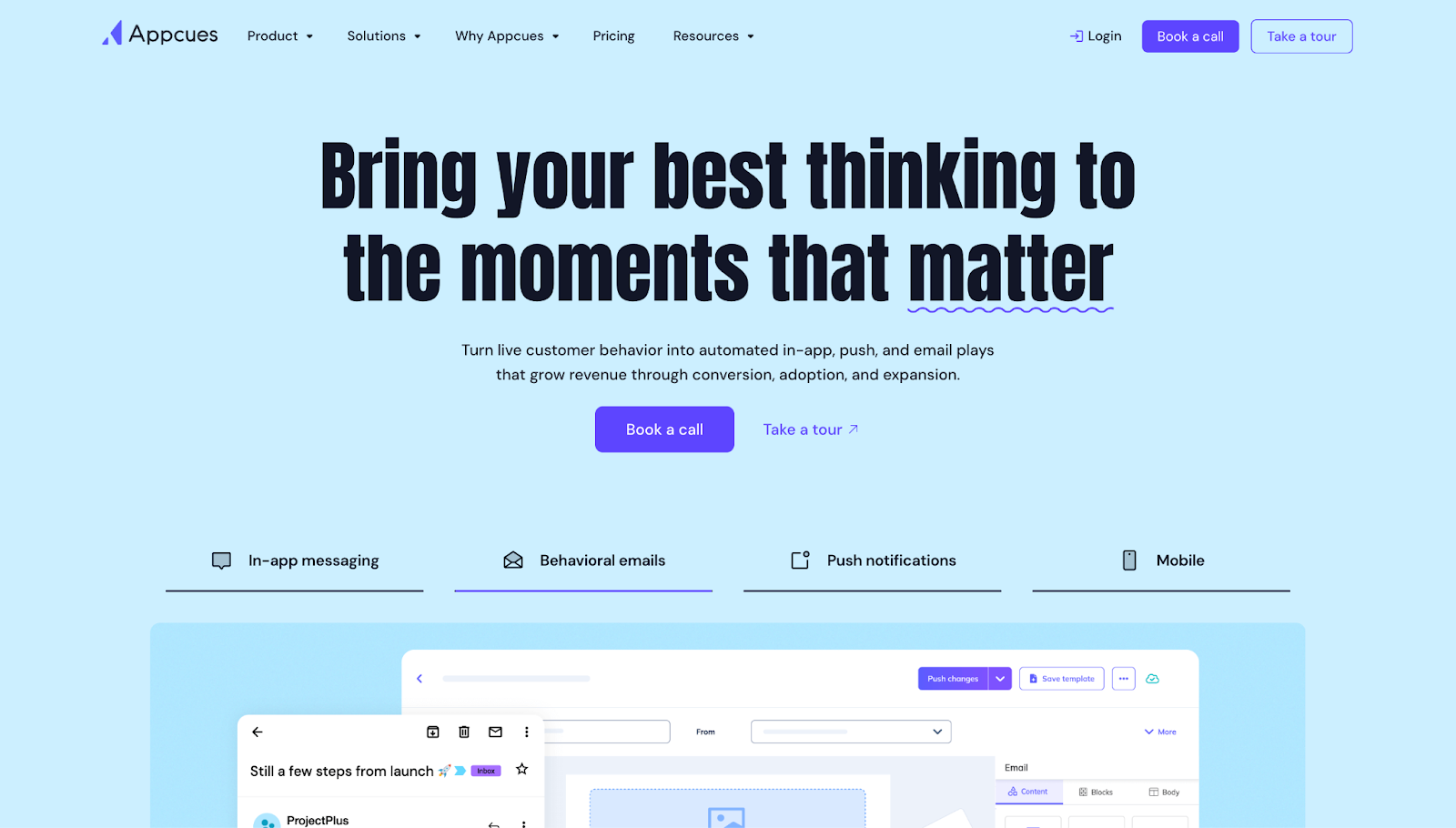
Appcues’ header text, “Bring your best thinking to the moments that matter,” frames the target audience’s problems as lifecycle gaps. Then the site uses social proof and suggested use cases to show how Appcues solves those problems.
Stats shown throughout the landing page, alongside screenshots of the tool in action, provide support to reinforce that Appcues’ claims match user results.
8. Memberstack
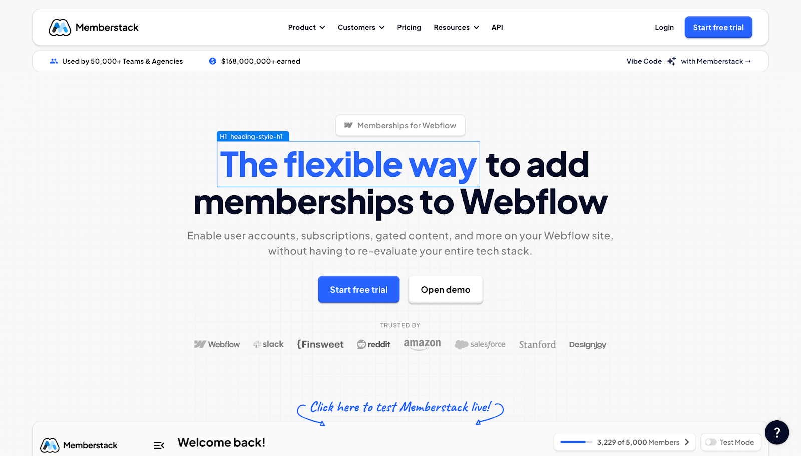
In the header copy, Memberstack positions its product as “for Webflow,” which immediately tells visitors whether this service is designed to meet their specific needs. Immediately below the nav bar, stats on the number of users and amount earned through the tool provide social proof that encourages adoption.
9. Flank
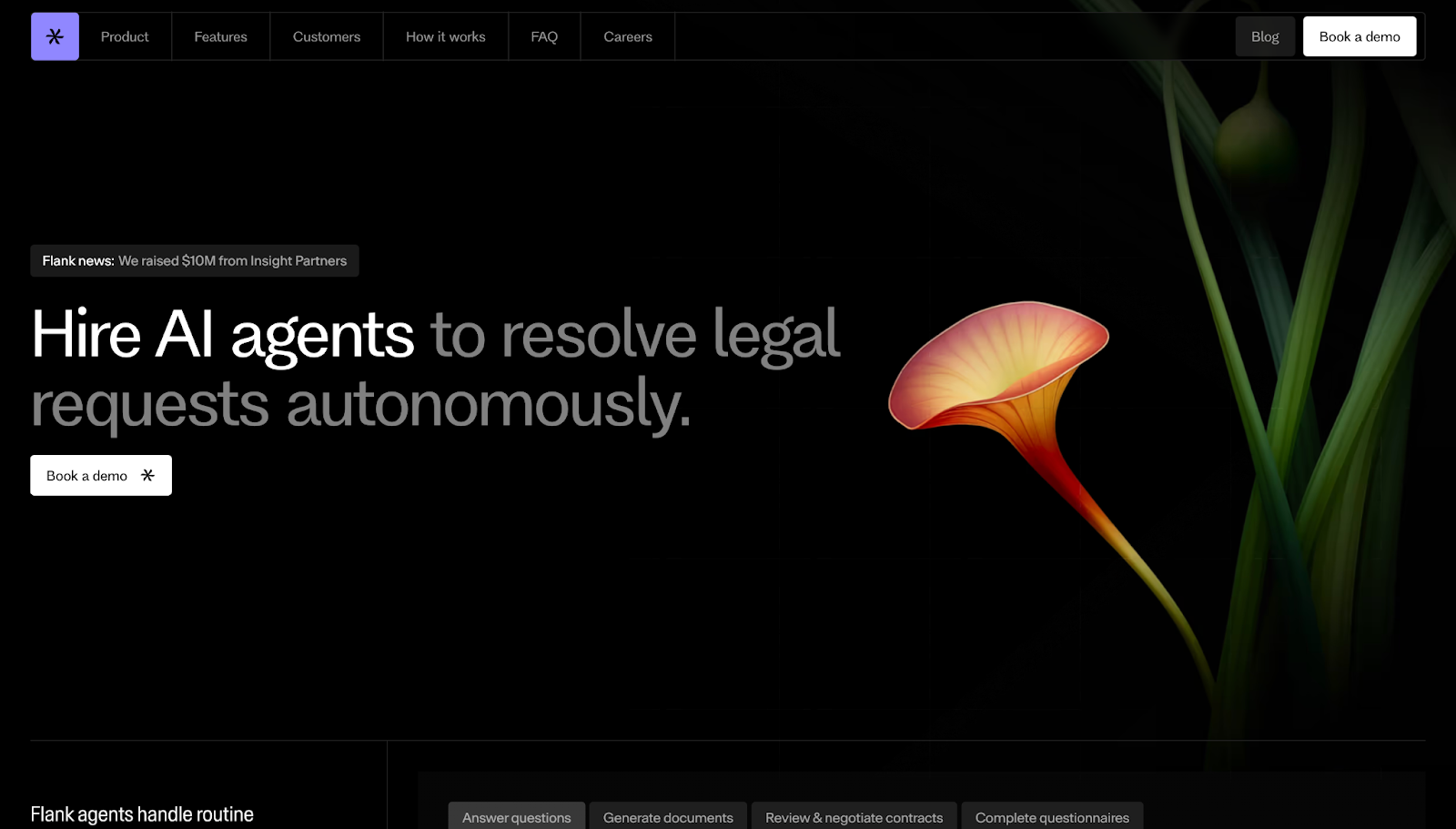
On Flank’s SaaS site, the text “Hire AI agents” positions the tool as a helpful teammate, while “to resolve legal requests autonomously,” sets expectations and benefits. A white CTA button keeps attention on the next step, while a scrolling list of companies that use Flank suggests reliability.
10. Slidebean

On this landing page, hard data like “$400M raised,” “2,000 founders using our budgeting formulas,” and “30K new startups every month” make it clear right away that users trust Slidebean.
A set of sections puts the focus on tangible benefits, outlining why this product is worth considering. The “free sign up” CTA is designed to reduce hesitation, while a list of benefits and testimonials lets happy customers do some of Slidebean’s marketing for them.
11. Formstack
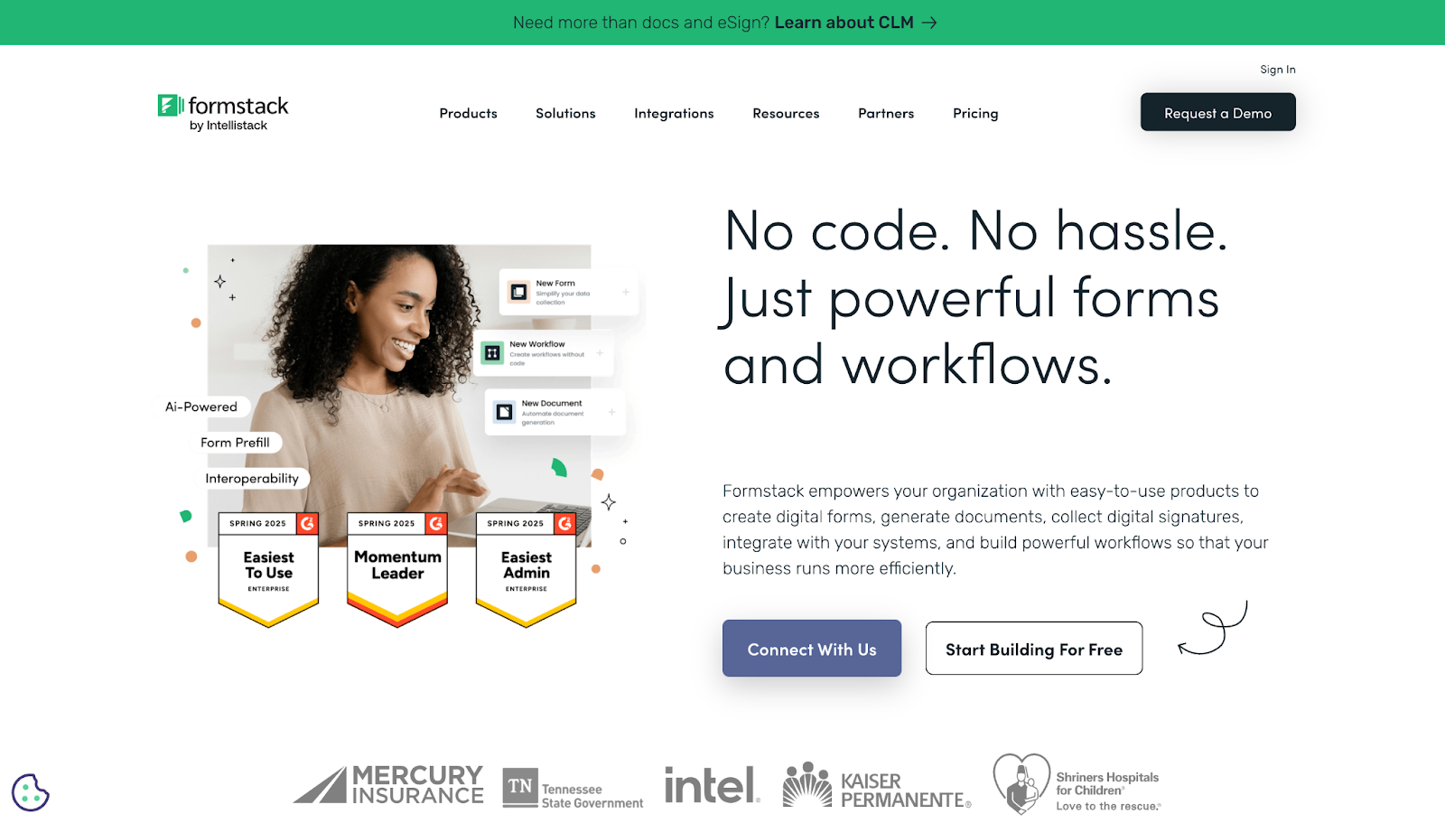
Formstack converts simple forms into more flexible resources. Its website strikes a nice balance between sales and education by combining text with simple graphics and screenshots of the tool.
The copy uses persuasive language about saving money, and there’s a two-week trial CTA to convince visitors to sign up. Plenty of whitespace separates sections, such as the client logos, making it easy to read.
12. Thalamus
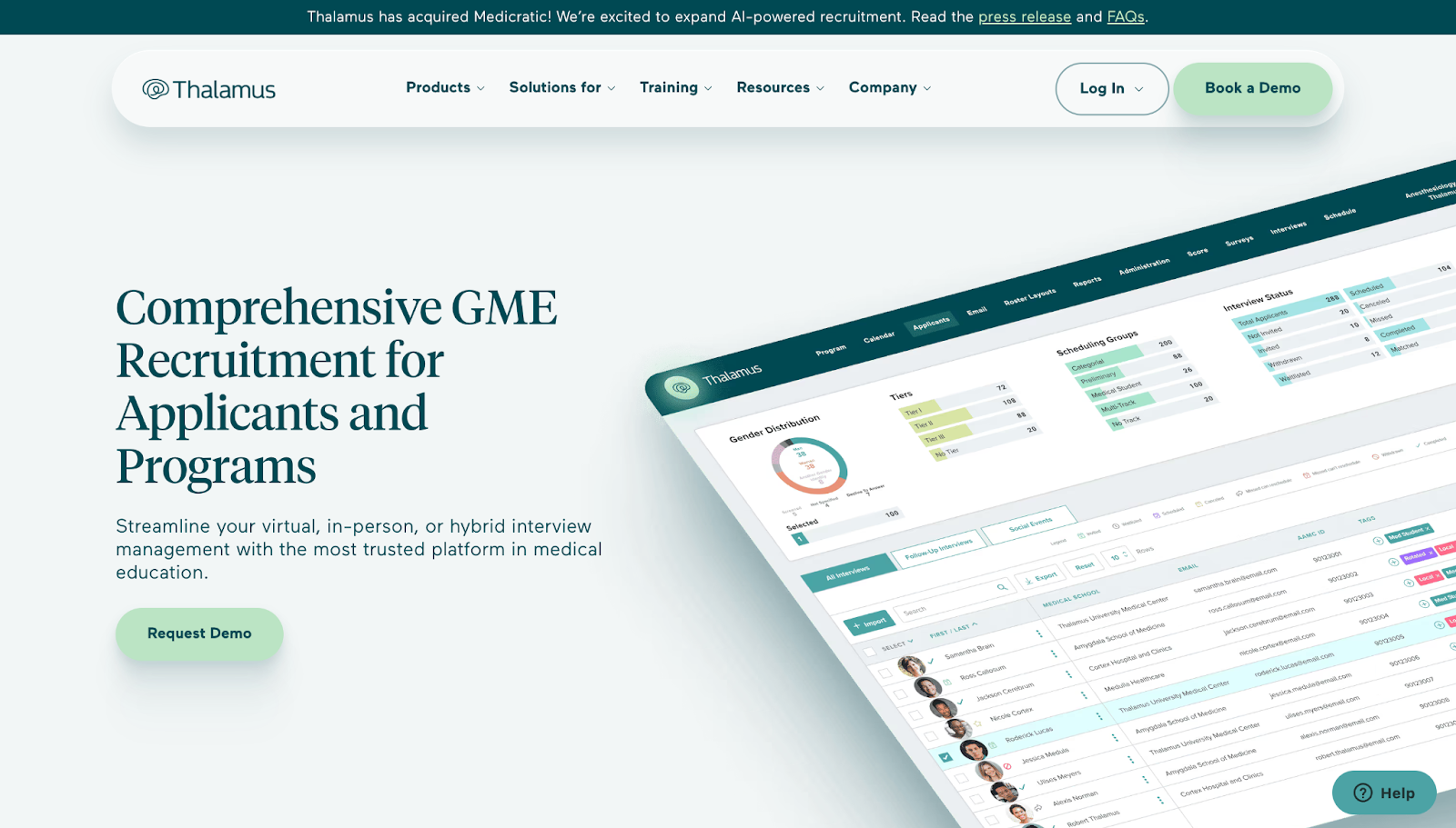
Thalamus is an example of SaaS website design using hyper-specific language and a screenshot of the tool to demonstrate its authority as a thought leader and speak directly to its target audience. Large-volume metrics like “100 million+” and “450K+” suggest reliability at scale, easing the concerns of potential enterprise clients.
13. Grow

Grow’s website focuses on convincing visitors that business intelligence is a shared language, not something only specialists can handle. Messaging choices like “on one platform” and “unlimited users” describe how this software provides flexibility and saves time.
Social proof in the form of starred reviews and visual feature demos shows how the product fits into users’ lives.
14. Gemnote

Gemnote creates brand identity solutions, from conceptual design to production and shipping, even for teams outside of the merchandising industry.
Beginning with the “start a project now” button, Gemnote guides visitors through collections and industry paths to reduce choice paralysis. This site also positions the brand as a thought leader, with links to guides and insights.
15. Draftbit
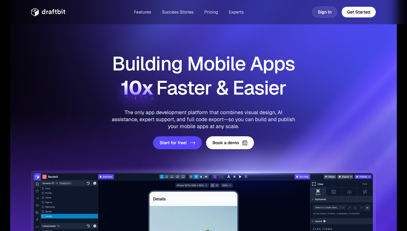
Draftbit’s pitch is about fast, accessible visual design. The website’s design supports this message, with concise, value-focused content and short walkthrough videos. A list of product features addresses common concerns, while testimonials offer social proof for potential buyers who are still hesitant.
16. Payman
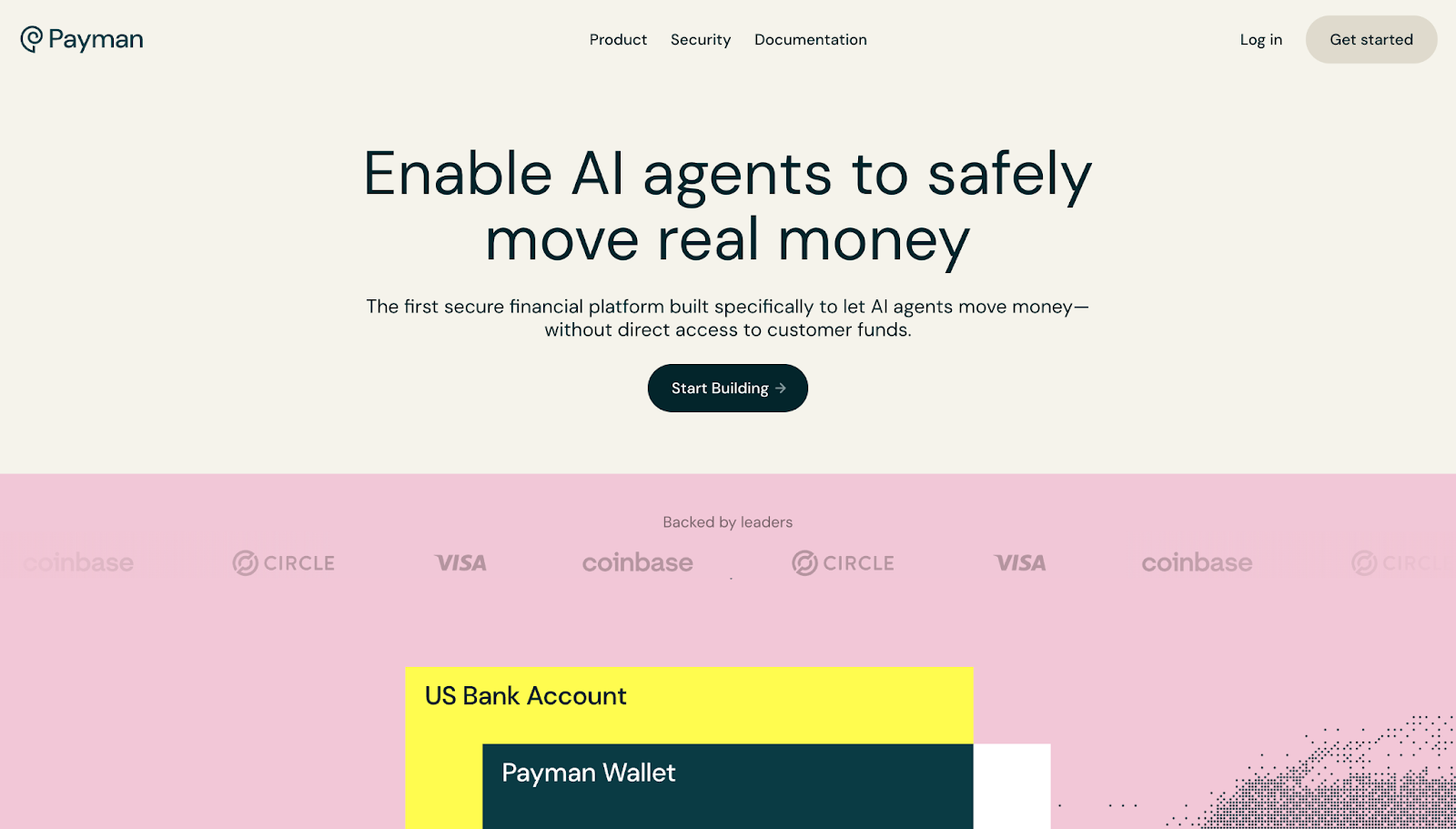
Payman provides a secure finance platform where AI agents handle payments. The headline and tagline focus on words like “safely” and “secure” to immediately address the most pertinent pain point.
An eye-catching animation gives visual language to the prominent pain points. The sections below it are divided into easy-to-understand feature lists that offer more details. Following concerns with value statements and prominent CTAs guide visitors into action.
17. Effortel

Effortel’s layout, designed by Onion Creative Studio, mirrors a telecommunications buyer’s checklist: launch fast, streamline operations, and stay compliant. The site leads with a big claim, positioning the service as the best mobile virtual network enabler (MVNE) globally.
It backs this claim up with screenshots and dashboards that provide detail on key features, as well as multiple social proof elements like testimonials and awards.
18. Adopt
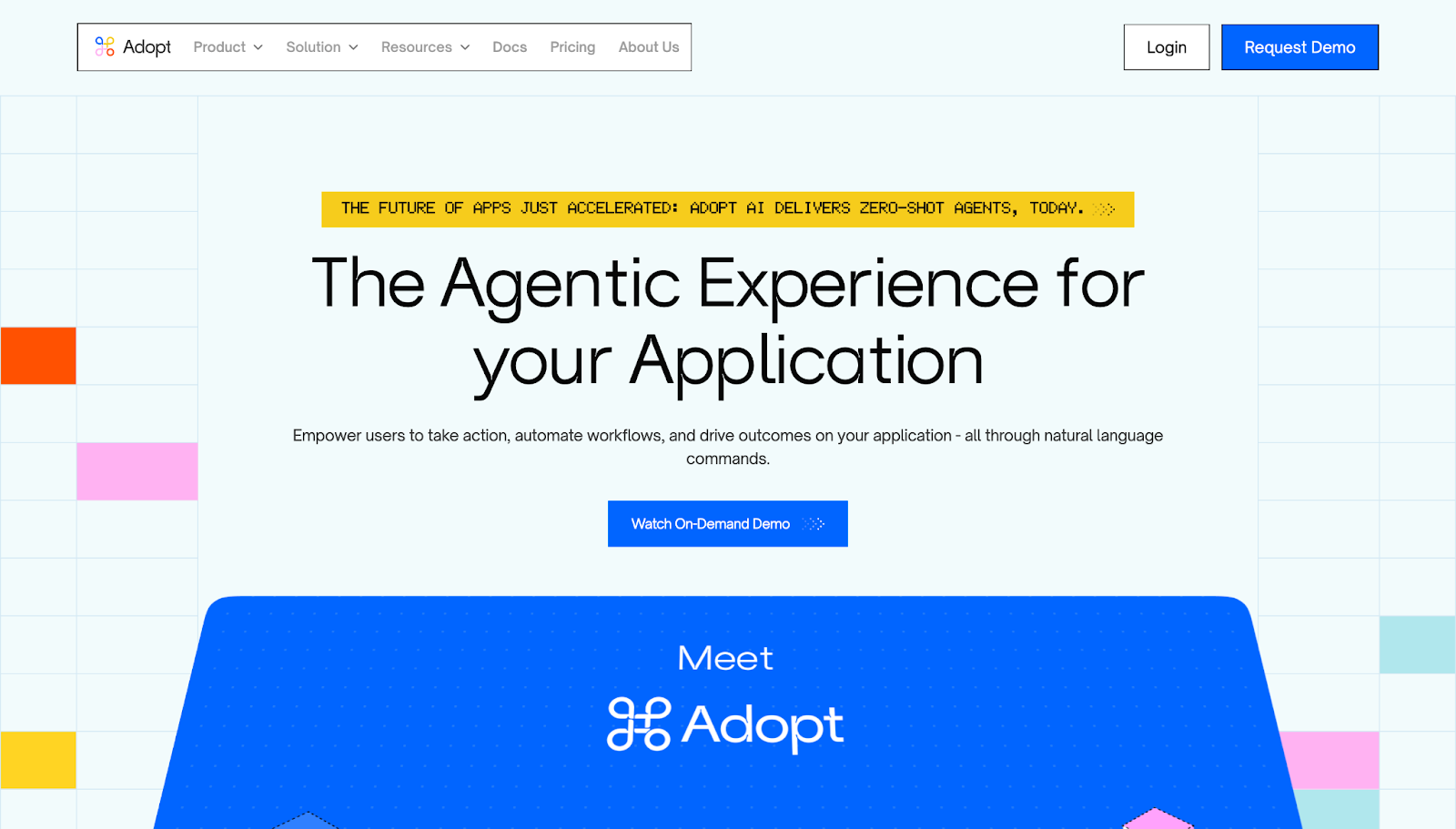
By featuring their “agentic experiences,” automated tools, and Agent Builder, Adopt promises visitors that they’ll be able to work faster through natural language commands.
With benefits-first language, animations, and easy-to-understand FAQs, this site shows how the product can turn complex, technical processes into approachable tasks.
19. Kraftful

Kraftful’s website is packed with information, including a list of product integrations, five-star rating badges, data on how much time users save, and concise descriptions of important features.
This SaaS landing page also enhances credibility through statistics and testimonials. It covers everything a visitor needs to know before conversion, but avoids overwhelm by using a clear structure and plenty of whitespace.


Explore the data behind how web teams are navigating AI, collaboration, and technology shifts
1,000 marketing and technology leaders reveal the biggest challenges — and most exciting opportunities — facing their websites.
20. Greenhouse
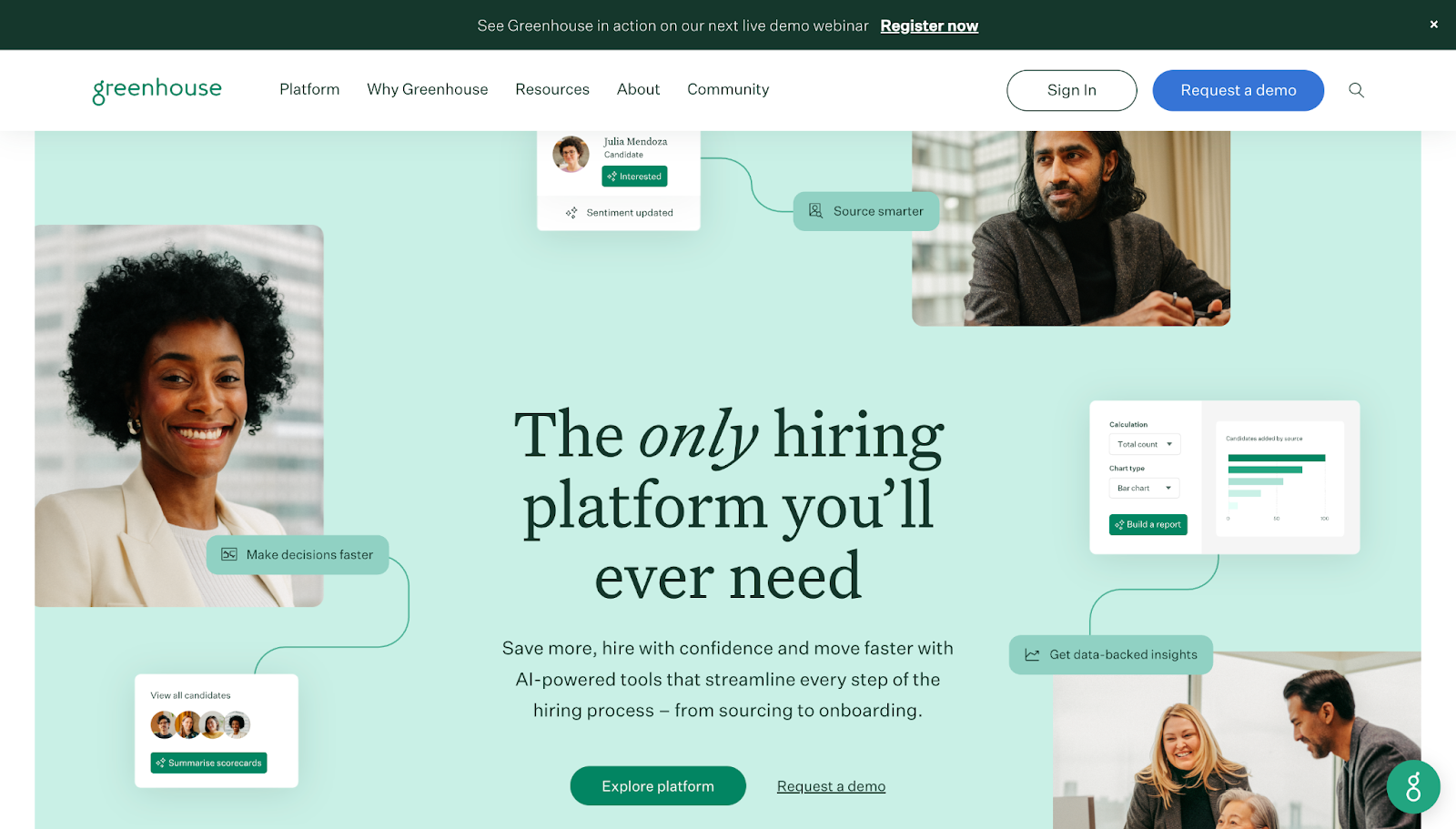
Greenhouse focuses on “structured hiring” and future-proofing with AI, calling their service “the only hiring platform you’ll ever need.” Visuals connecting the platform’s value to screenshots of it in use support its perceived value.
Easy-to-find case studies teach visitors, while interactive AI resources and product tours keep users engaged. You can also find details on enterprise solutions and read customer stories that provide clear examples of how this service benefits various audiences.
21. Weavy
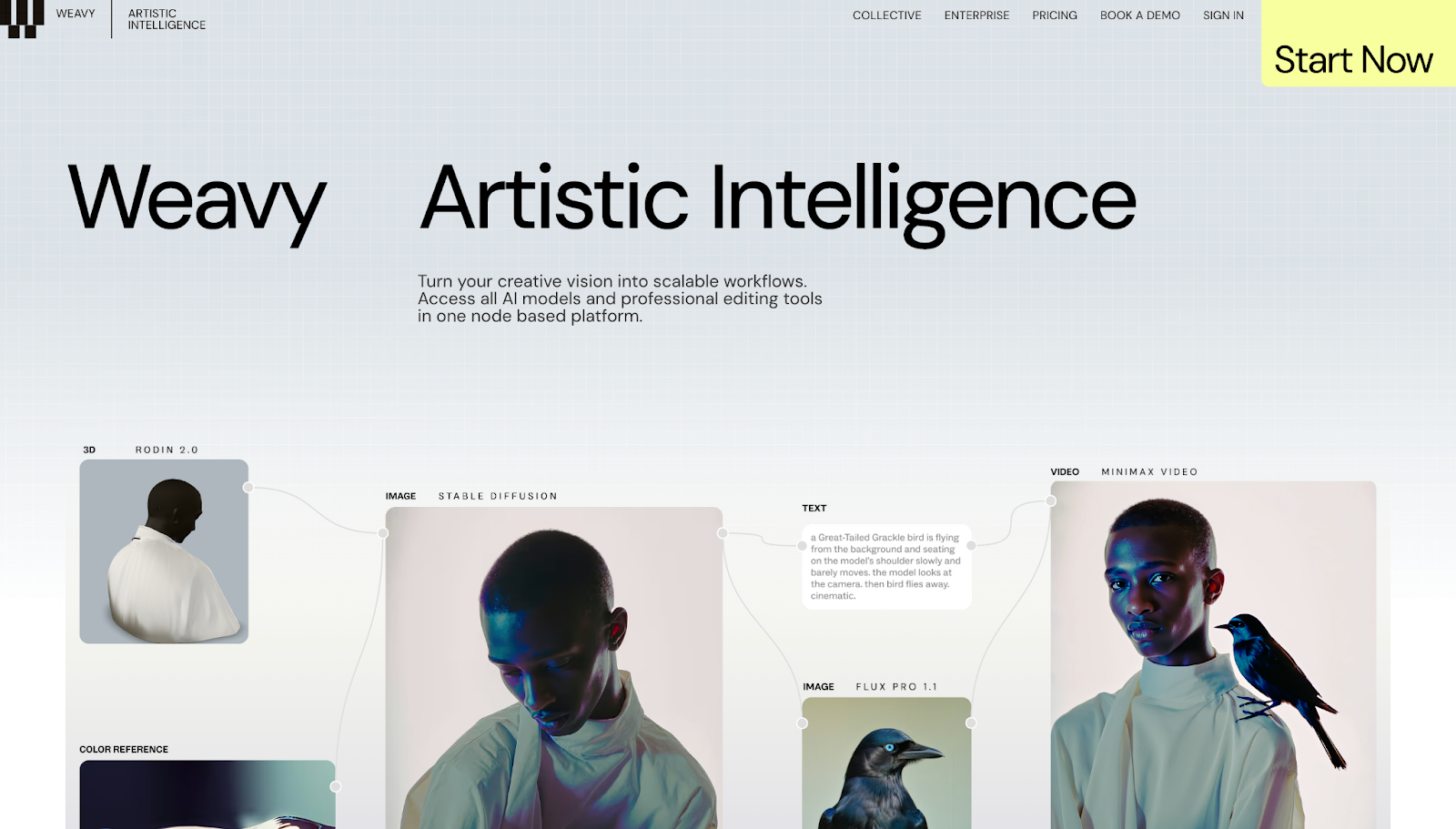
Weavy’s site, designed by Edgar Deiner, creates a narrative about how this service provides one hub for all your AI tools. As you scroll down, each element builds on the previous one, providing visual proof that this platform unifies different AI models and professional editing tools.
Animations bring the images and examples to life, and details about specific use cases encourage users to learn more about the features that matter to them.
22. SafetyKit

SafetyKit’s website features bold claims about being one of the world’s largest marketplaces. It immediately supports those claims with data on user volume, uptime coverage, and language availability.
It also has information about policy coverage, appealing to compliance-centric buyers who are worried about regulatory risks. Using content geared toward a SaaS product’s niche audience further builds trust.
23. Modulify
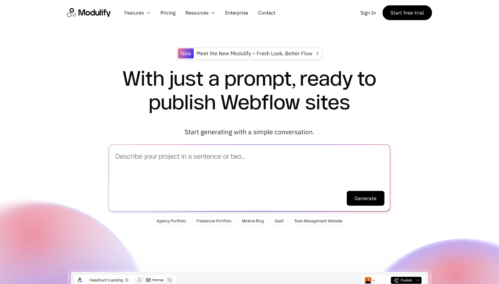
Modulify’s website positions its service as a time saver, focusing on how users can build ready-to-publish Webflow sites based on AI prompts. This design divides the product workflow into logical steps, demonstrating the process from ideation to wireframing to building so visitors can picture it clearly.
The site also highlights a free trial and transparent pricing options, nudging potential users toward a conversion that’s straightforward and low-risk.
24. Realm
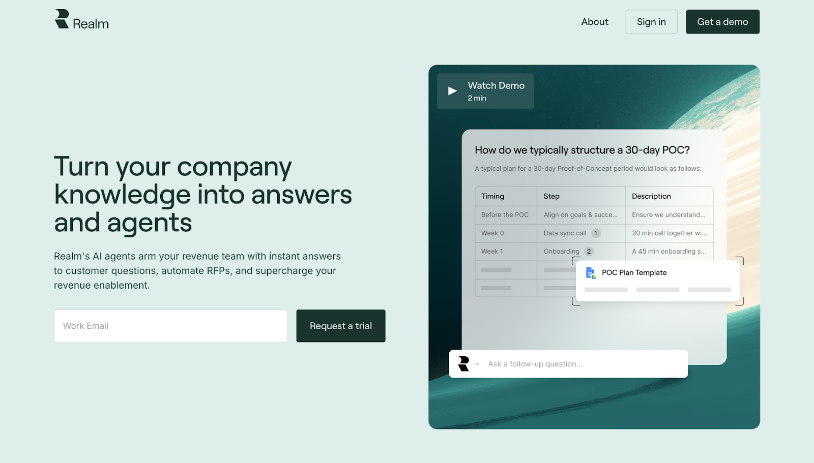
Thanks to plenty of screenshots and a video demo, visitors to the Realm site can quickly see how the product automates documentation, integrations, and questionnaires.
A two-week trial CTA encourages signups, while compliance certifications and investor badges work to address potential concerns quickly.
25. Modyfi
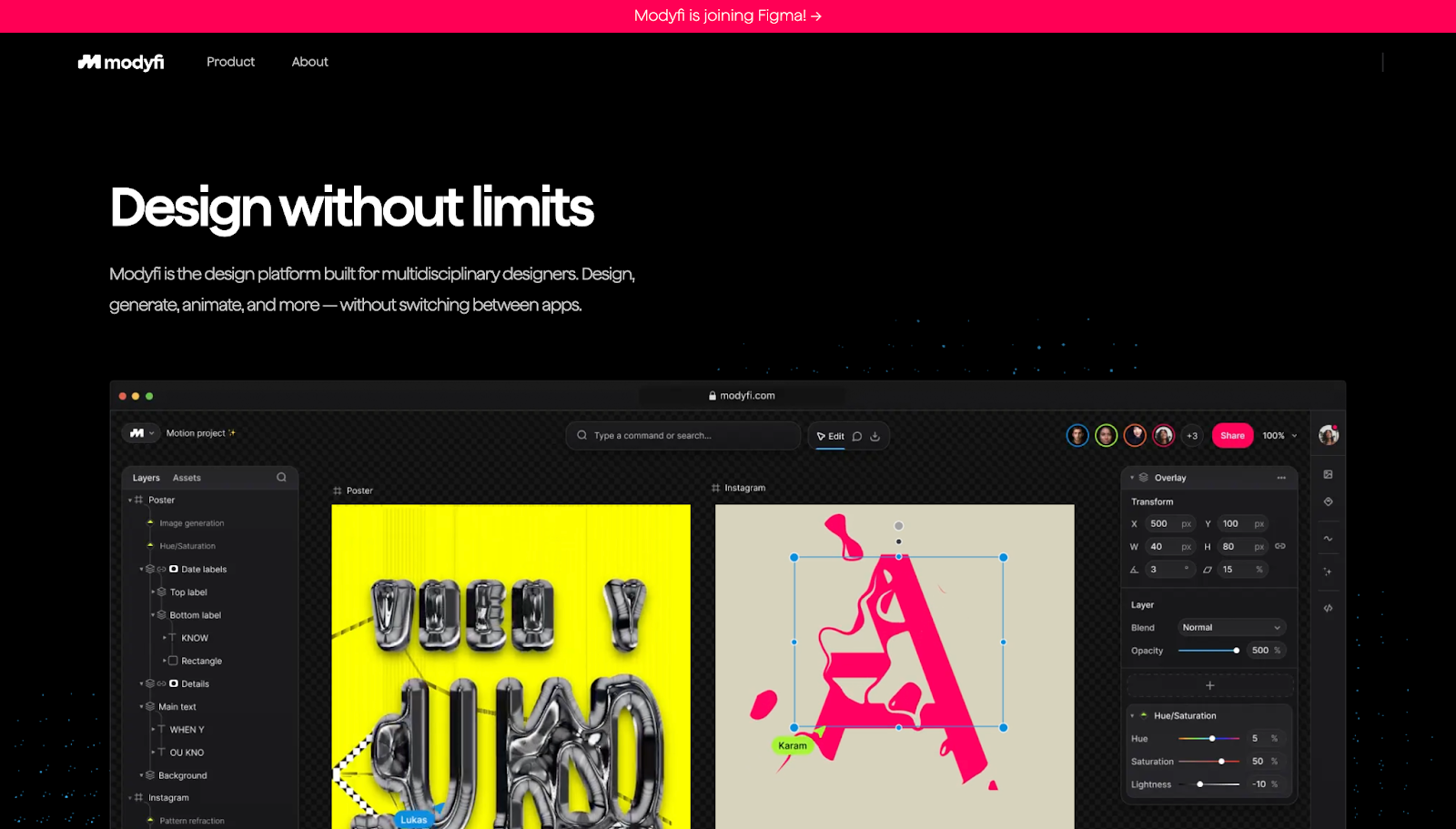
The headline “Design without limits” speaks to multidisciplinary teams, letting them know right away that they won’t outgrow Modyfi. The site goes on to show exactly how that scaling process works, demonstrating how users can generate, animate, and optimize layouts.
The “Modyfi is joining Figma!” banner at the top of the page doubles as both a notification and social proof.
26. Altitude
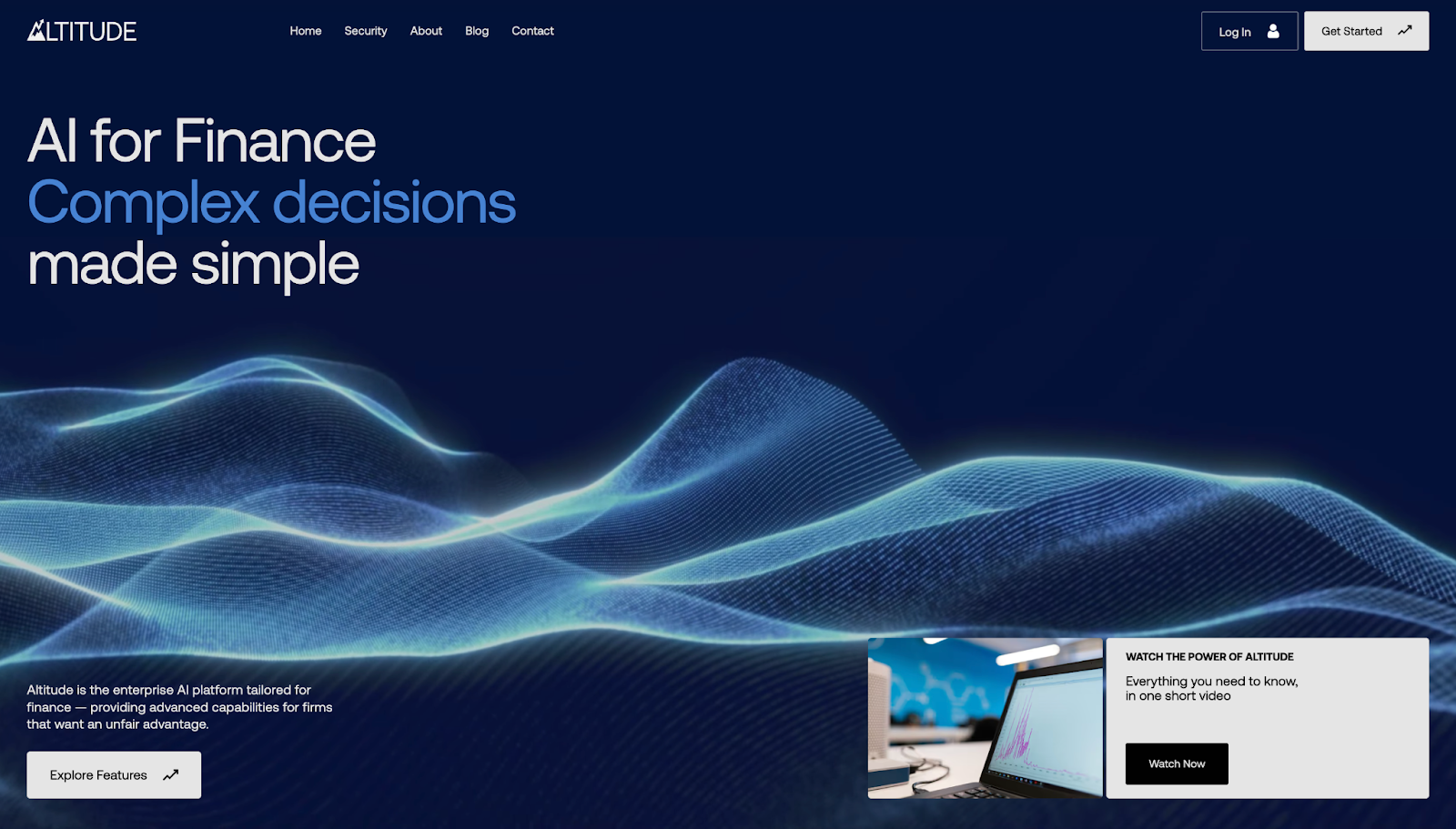
Altitude targets the needs of finance teams directly when introducing their AI-powered tools, demonstrating the product workflows in a clear four-step process.
Designer Artemii Lebedev included a video and animations to demo the tool and make interacting with the website engaging. Plus, the minimal aesthetic with blue tones provides a calming setting, subconsciously easing concerns about AI and security.
27. Way

Way’s website begins with a large, looping video background, allowing visitors to visualize the premium experiences this service provides. Immediately below, you’ll find luxury hospitality brands endorsing Way, acting as votes of confidence to persuade hesitant prospects.
Divided and illustrated sections walk visitors through the consultation process, providing concise information structured into an approachable learning process.
28. Zentail
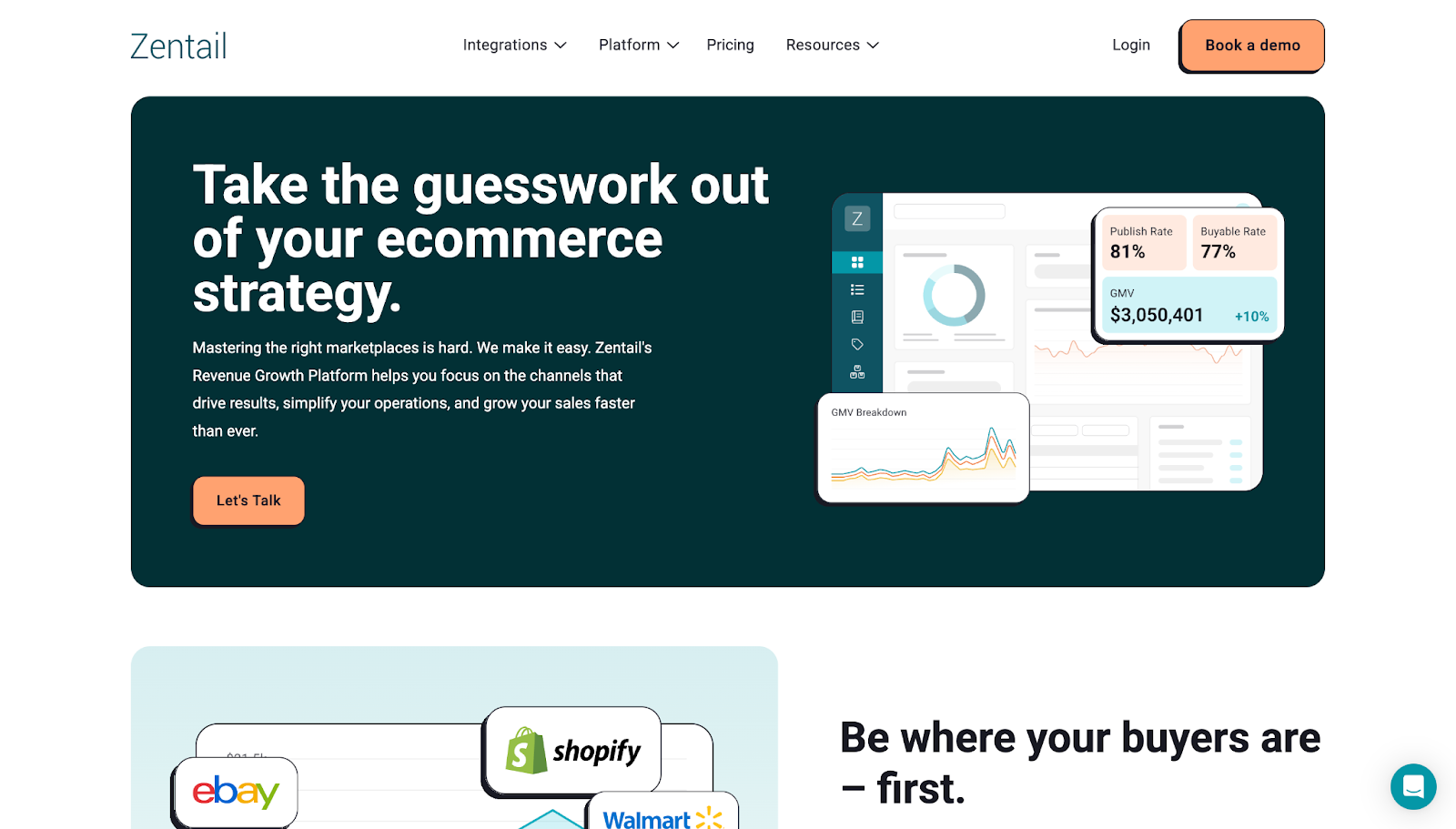
Zentail’s value proposition is about reducing the chaos of typical online marketplaces and removing guesswork and choice paralysis. Their site design boosts this message of simplicity, with a high-contrast “Let’s Talk” CTA in the header and a “Book a demo” button floating in the sticky bar.
Textual information is minimal and focused on specific benefits, while reviews and statistics provide credibility and position Zentail as a trustworthy partner.
29. Zams
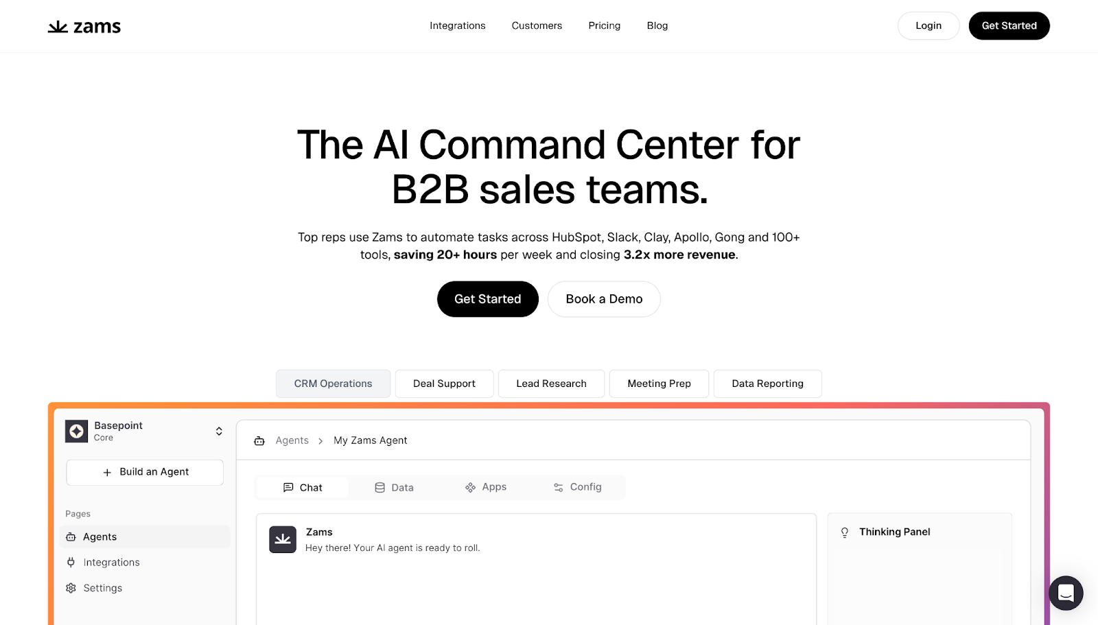
Zams’ “AI Command Center” promises fewer switches between tools and tasks, so sales reps can focus on revenue. Throughout this B2B SaaS website, visual cues like recognizable logos arranged into categories help visitors understand the available integrations.
In addition, quantified gains like “saving 20+ hours per week” and “closing 3.2x more revenue” prove benefit-first claims, while dual CTAs encourage signups.
30. User Interviews
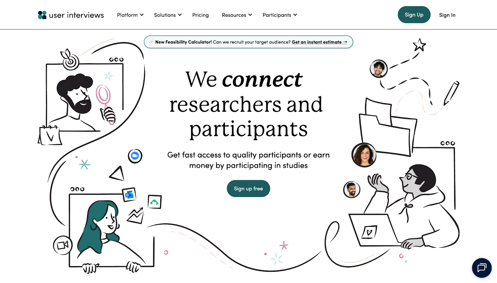
User Interviews connects researchers with willing participants. Its website prominently features measurable, value-based promises like “1 hour to first match” and “98% positive feedback” as key selling points.
The site visually breaks down how users can find the right fit, transforming the selling proposition from a vague idea to a concrete process. There’s also a “Feasibility Calculator” tool for instant estimates to save time and encourage conversion.
31. Bland
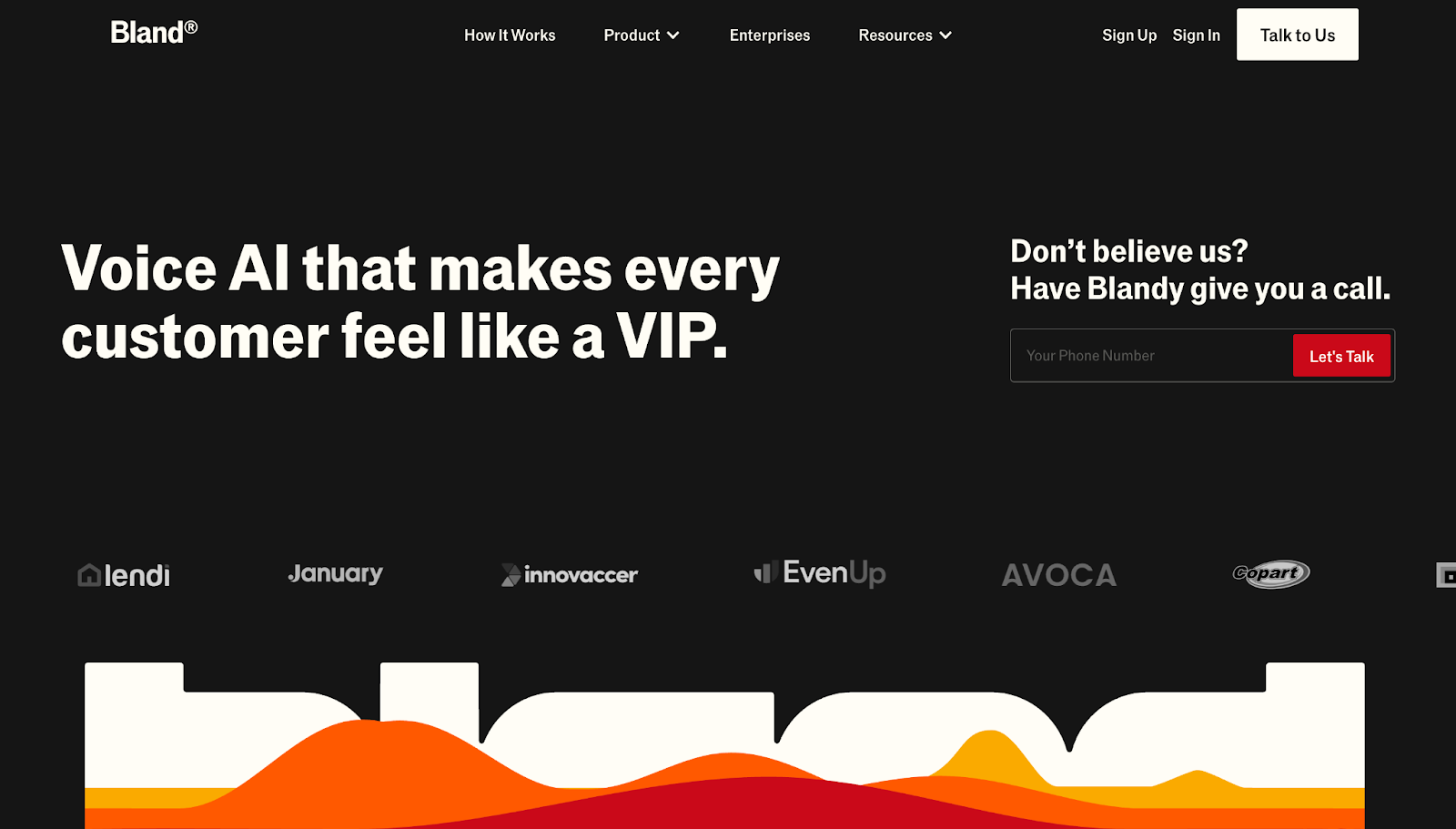
Bland’s website, designed by Tilipman Digital, sells conversational AI for enterprise SaaS companies. A playful background animation mimics audio waveforms, helping users visualize the platform’s purpose. Below it, direct language like “own your AI, don’t rent it” makes the benefits feel personal and concrete.
Its social proof elements, including enterprise client logos, reinforce the story that Bland can successfully help large, growing clients.
32. Nauto
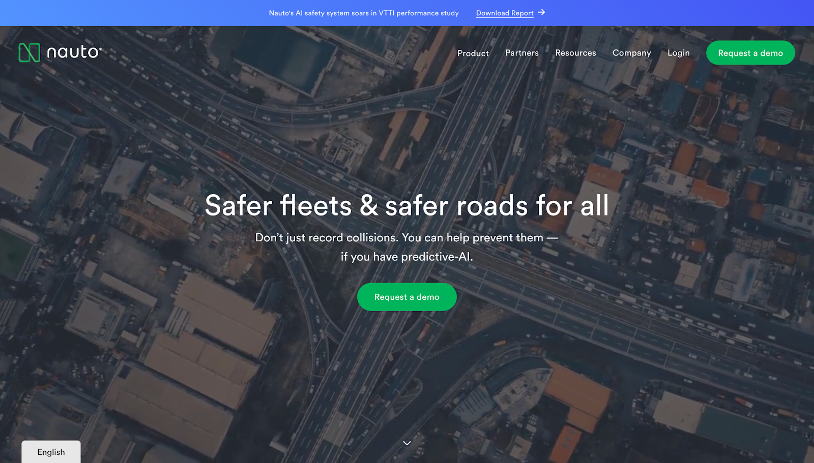
Nauto’s website showcases the benefits fleets care most about: fewer collisions and lower risk for drivers. The value-focused copy is backed by visual demonstrations and plenty of feature highlights.
An awards and recognition section acts as social proof, while multiple mentions of safety throughout the page keep the focus on that core selling proposition.
33. BILL
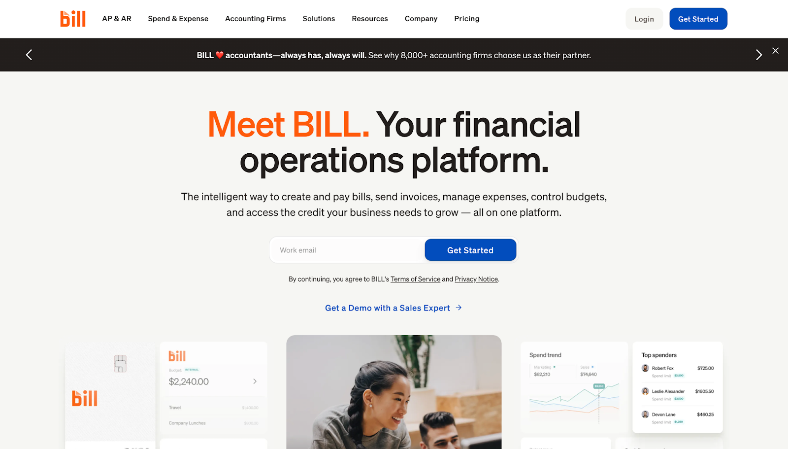
BILL positions itself as an all-in-one financial ops platform. To address common concerns, it prominently positions a CTA demo with a sales expert. Visitors can envision how they would benefit from this product, thanks to clear use case examples and real customer case studies.
Screenshots of the tool in action support the breadth of the tool, as a way to visually back the claims made in the text.
34. Localyzer

The Localyzer website, designed by Asi Fleishhaker, advertises a unified platform solution through prominent, high-contrast text and simple CTA buttons. A scrolling list of client logos, colorful UI cards, and stat-backed visuals provide social proof and quantifiable value propositions.
The wealth of animations and parallax scrolling effects engages the attention of busy marketers without overwhelming them.
35. Jasper
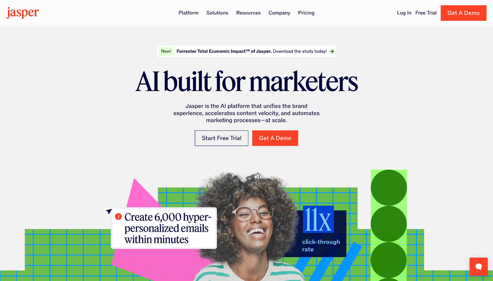
Jasper’s website layout is designed by OFF+BRAND. The animated visuals include statistics, which double as aesthetic and informational elements. The site is colorful and interactive, with parallax scrolling and hover-triggered UI cards. All of this creates an enjoyable learning experience despite the complex topic.
Craft a SaaS website that captivates and converts
An effective SaaS website design makes a complex product easily digestible, convinces visitors of its value, and encourages conversions through bold CTAs. Every design choice should nudge potential users closer to action.
Webflow can help you bring those elements to life. Webflow’s tools let you fully customize your page structures, then add styling and interactions that fit each product and target audience. You can build content-rich sites quickly, or hone each detail of a client’s website until it’s perfect.
Design your SaaS sites with Webflow, and see results that impress clients and encourage conversions.

Build with Webflow
Webflow Enterprise gives your teams the power to build, ship, and manage sites collaboratively at scale.