Turn websites into interactive canvases where brands can tell their stories.
Websites that tell a story tend to feel personal and interesting. A website without a compelling narrative may struggle to build emotional connections with audiences, leaving potential customers to explore competitors.
With the right approach, you can combine brand storytelling and web design techniques to build memorable experiences that stay with visitors long after they leave a site. Read on for inspiration from 10 successful storytelling websites.
Storytelling techniques for websites
Creating an interactive storytelling website requires the right blend of design and user experience (UX) techniques to engage audiences in a compelling narrative. Here are several storytelling techniques to consider.
Infographics
Infographics visually represent information, data, and statistics to show complex ideas at a glance. They combine charts and minimal text to tell a story, making content digestible and visually appealing. Packing information into a graphic also makes content more shareable, encouraging people to circulate your story on social media and broaden your brand's reach.
Data visualization
Various data visualization techniques convert raw data into graphical representations like charts and maps. It helps people see patterns, trends, and correlations within the data. You can use data visualization to tell stories through numbers, especially when you want to add credibility to your narrative by providing precise and convincing evidence.
Interactive story maps
Integrated maps combine geographical data with narrative text, images, and multimedia content. Website visitors can explore the map interactively to uncover different parts of the story. These maps are effective for communicating location-based or historical data while providing spatial context.
Video content
Animations, interviews, and cinematic footage, can support text and images to create a bigger emotional impact. It captures and holds attention, compelling people to absorb your narrative. Videos also improve SEO through titles, descriptions, and keywords and take up a lot of real estate on the SERP.
Parallax scrolling
Parallax scrolling is a visual effect in which background images move slower than foreground images as visitors scroll down the page. This effect creates a sense of depth, adding interactivity and immersion to make the story more engaging. Parallax effects guide site visitors through the story, prompting them to explore more in the direction of the scroll.
Slideshows and carousels
These interactive displays show images in a rotating or looping format. People can click through them or watch the slides automatically progress. These effects let you show multiple content pieces in a limited space and are ideal for highlighting individual parts of the story.






Get our 100 video course on web design — for free
From the fundamentals to advanced topics — learn how to build sites in Webflow and become the designer you always wanted to be.
10 best storytelling websites to inspire you
Here are 10 websites that prioritize design, narrative, and UX to tell engaging stories.
1. BelArosa Chalet
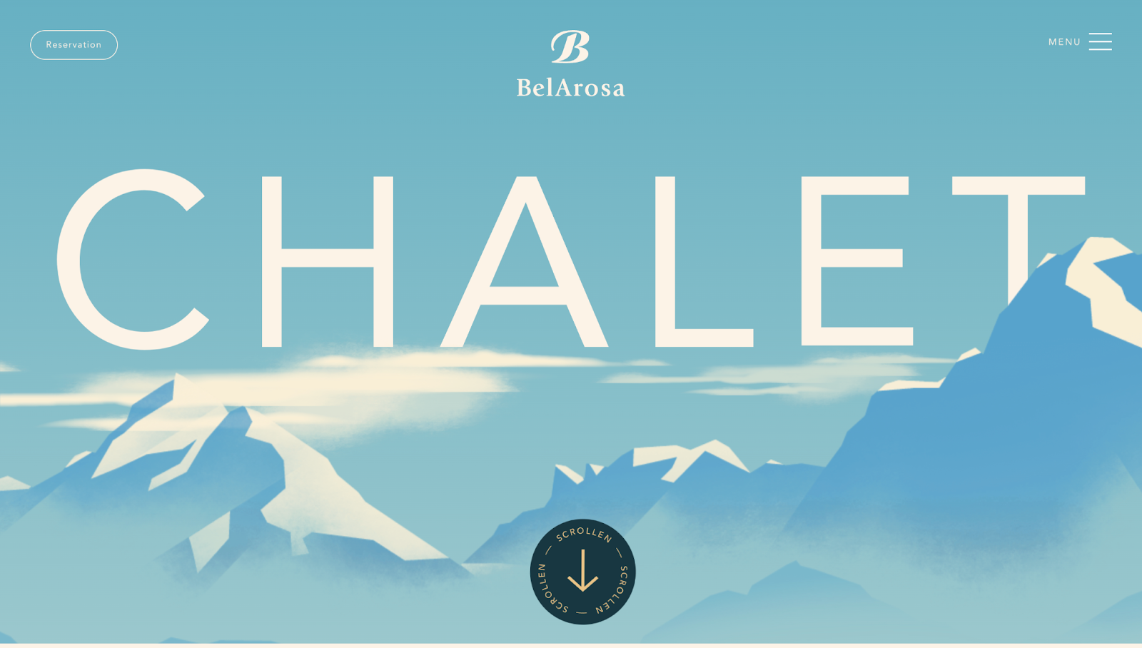
BelArosa is a luxury chalet nestled in the Swiss mountains. Their website, designed by Clou Werbeagentur GmbH, has a graphic-style appearance with illustrated panels taking you through a chalet tour. This tour tells the story of a visitor’s stay, with the website representing the building and its sections serving as the chalet’s floors.
The cursor is a rotating circle that initially prompts you to scroll but shrinks into a circular outline so it doesn’t distract from the narrative. As you scroll, art illustrations show you BelArosa’s luxurious facilities, from the infinity pool on the roof at the top of the site to the chalet’s entrance at the bottom. Faceless characters depict chalet life, with the site’s messaging constantly reinforcing the idea of BelArosa’s warmth and comfort.
2. Amanda Lee Peers
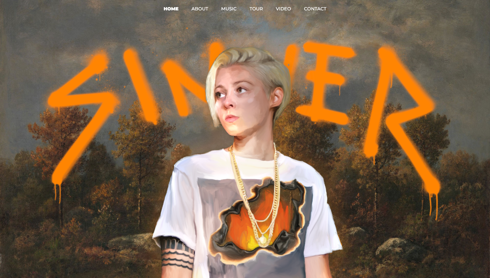
Amanda Lee Peers' portfolio is a one-page website that tells the story of her childhood, genre, and musical journey. The site's banner has an oil painting-style portrait of Amanda with the word "Sinner" in the background. As you scroll, the artwork appears in the frame with the words “Listen Now” beneath to promote her latest album. This design tells you she's an established artist, and it teases the question: How did she get there?
Browsing the page reveals the story, as the website splits into seven sections depicting her life in order:
- The Beginning talks about Amanda receiving a guitar as a gift and discovering a love for music.
- Local Success describes hometown achievements, such as winning local singing competitions, forming a band, and gaining a solid regional following.
- Reality TV was Amanda's big break. She had an opportunity to audition for and participate in the popular reality show The Voice under Gwen Stefani.
The remaining four sections — Summertime State of Mind, Sinner, Tour, and Music — discuss life after The Voice, Amanda's two released EPs, and an ongoing tour. The site features images and video content from Amanda's journey, providing a personal touch, while scroll-triggered parallax effects add visual interest.
3. OSOS | Creative Studio
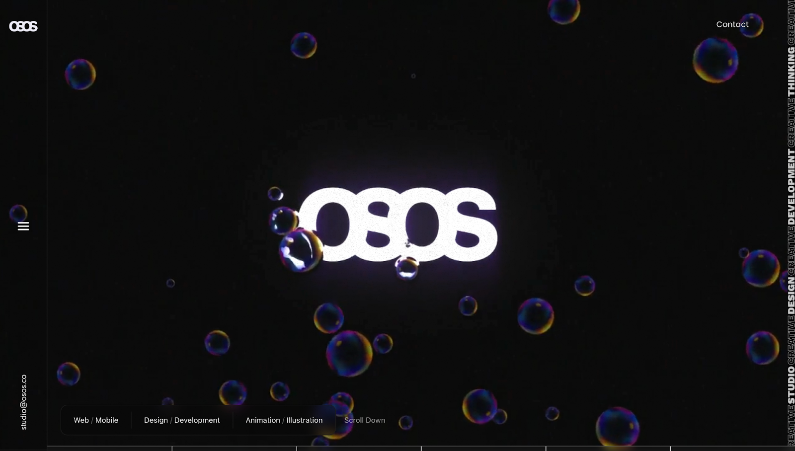
The OSOS website, made by Marcel H., has a carousel-style appearance with a loading bar at the bottom of the screen. The bar shows you how long you have before reaching the end of the story, with minor distinctions to separate each section.
Scrolling shows a white strip filling the bar. Before starting the brand’s story, the first section highlights OSOS’s services, immediately emphasizing the company’s unique value proposition. Then, an interactive story map uses textual and visual elements to explain how OSOS works with clients.
Around the midway point, the predominantly dark-themed website changes to a white background, followed by a red one. The color switch breaks the monotony, while the contrast allows the foreground text to shine and communicate OSOS’s messaging.
4. Haus Of Words
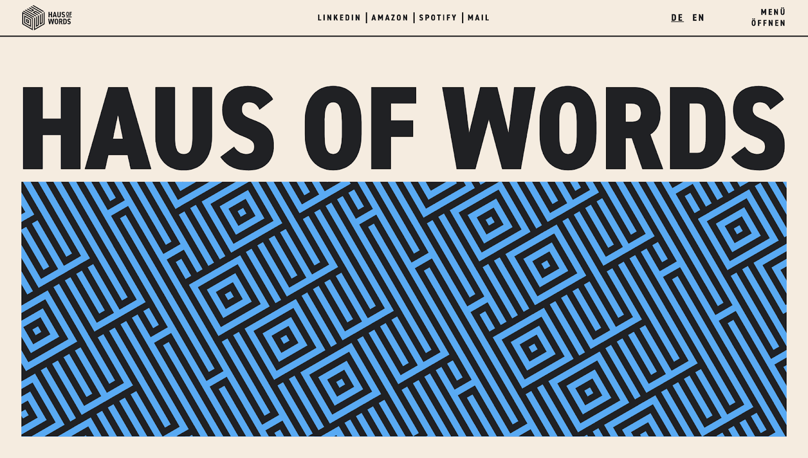
Haus Of Words is a single landing page portfolio for Katie Caiger’s digital marketing services. Designed by Sebastian Beck, it uses vibrant colors and bold typography to draw attention to Katie’s achievements and personality.
For example, the “The Haus in Numbers” section has infographics and data visualizations to tell Katie’s story of working with clients in 11 countries on nearly 3,000 projects. Testimonials and other stats from reliable sources like IBM and IDC enhance Katie's credibility.
With Katie’s pictures humanizing the website and vivid visuals creating an energetic ambiance, the Haus Of Words site makes her seem approachable and ready to collaborate.
5. Outside The Lines
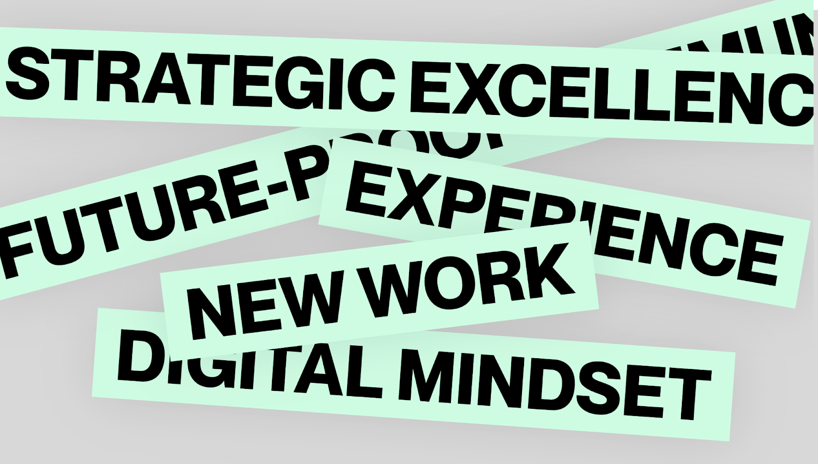
True to its name, the Outside The Lines website uses out-of-the-box designs to tell a story of their own innovation — fitting for a creative agency. The unique sideways scrolling motion creates a parallax effect of movement and progressions, drawing you in.
Designer Michael Cyroll's choices separate this site from traditional top-down scrolling sites, making the experience more interactive. The overlapping elements and changing color palettes also keep the presentation fresh. The dominant mint-green, gray, and black color scheme at the beginning and end reinforces the brand's identity.
When describing Outside The Lines' team, the site adopts more vibrant colors, appropriately adding personality and character to introduce the humans behind the site.
6. AI Takes Over
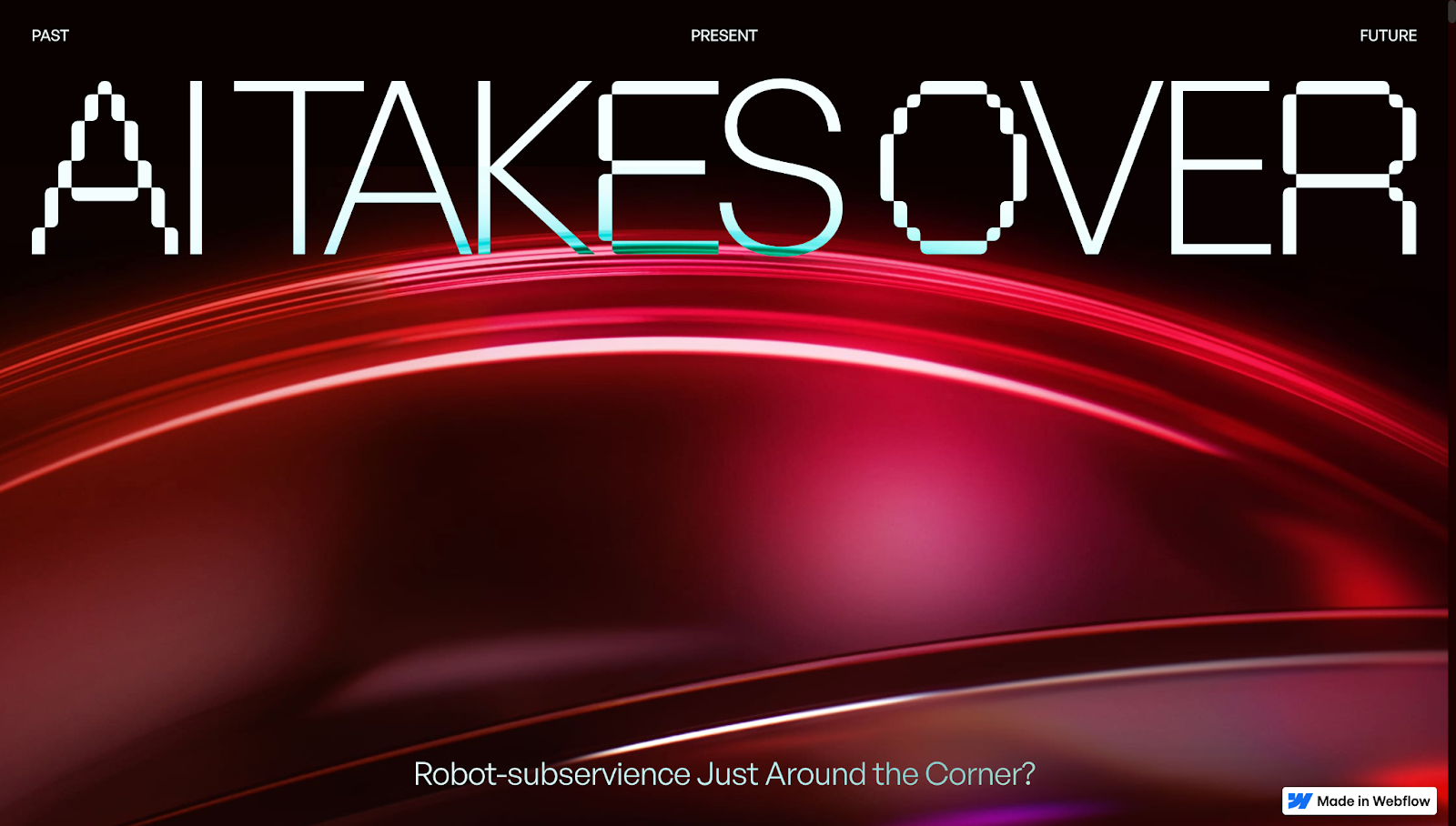
The Adchitects Team uses humor, interactive elements, and visually striking designs to create the AI Takes Over website. The playful introduction — with the “AI Takes Over” headline followed by “Okay, just kidding :)” — immediately sets a relatable and lighthearted tone. This twist humanizes the topic, making AI seem more approachable.
The futuristic design, transitioning from red to purple hues, reinforces the theme and provides a pleasing experience as you move through the story and color spectrum.
By combining historical context with current applications and future potential, the site offers an educational and entertaining narrative arc. Myth-busting sections and statistics help demystify AI, addressing common misconceptions readers might have. This approach informs and reassures visitors, making the complex topic of AI less intimidating. All of these design elements culminate to tell AI’s true story — it’s a tool to use, not fear.
7. Light Factory
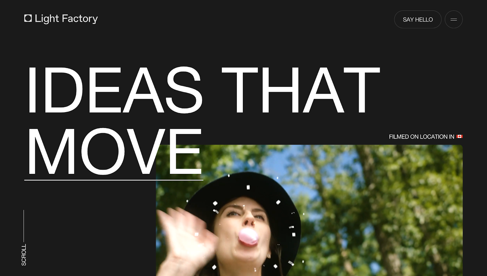
Light Factory’s website, created by Joseph Berry, tells the story of the agency’s dynamic team and successful creative projects. The looping video in the header instantly immerses you in their work while moving shapes and hover-activated video thumbnails bring the site to life.
Negative spacing throughout the site helps guide attention to important sections without distracting from the primary content. In contrast, a sudden shift to a white background in the “Services” section ensures visitors focus on Light Factory’s offerings. This visual break and a clear and concise call to action (CTA) punctuate the narrative and encourage action.
8. Betterworks
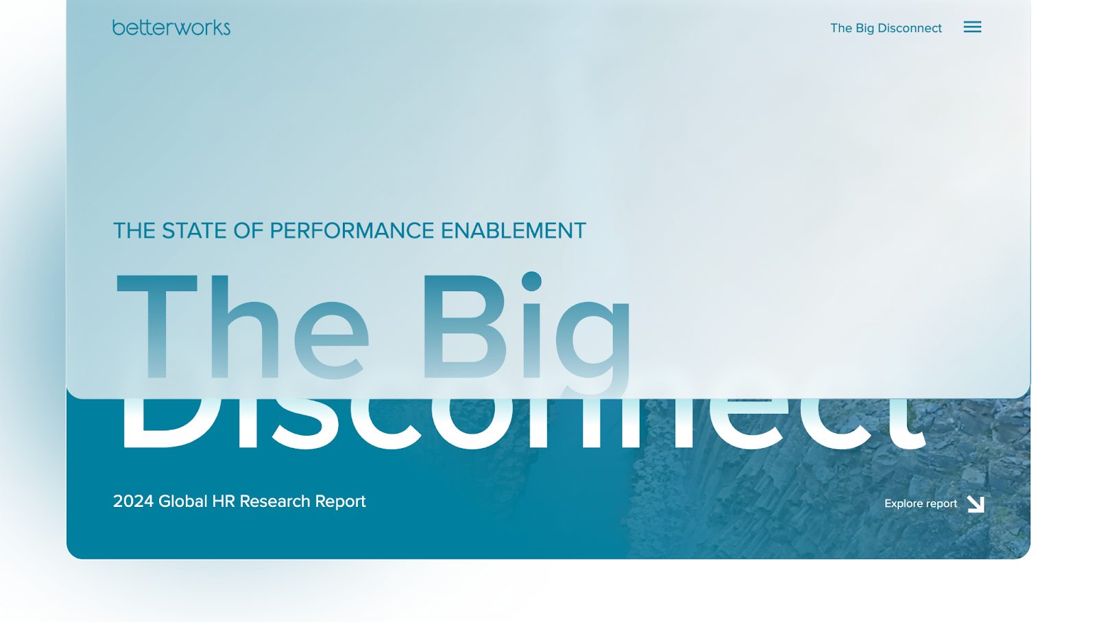
Betterworks’ website showcases the company’s 2024 Global HR Research Report, which focuses on “The State of Performance Enablement.” The statistical story starts with the visually striking title “The Big Disconnect,” immediately hooking the audience with moving gradients and aesthetically pleasing designs. The site has a clear structure — present the problem, illustrate key statistics, and show detailed findings.
The sticky loading bar at the top of the screen shows you where you are on the site. Each section builds upon the previous one, guiding you through a logical flow of data-rich content.
The clean design and legible typography make information more accessible, while the interactive elements and visual aids break down complex information. By the end of the page, readers will clearly understand the disconnect between leaders' perceptions and employees' experiences in performance management.
9. Captions
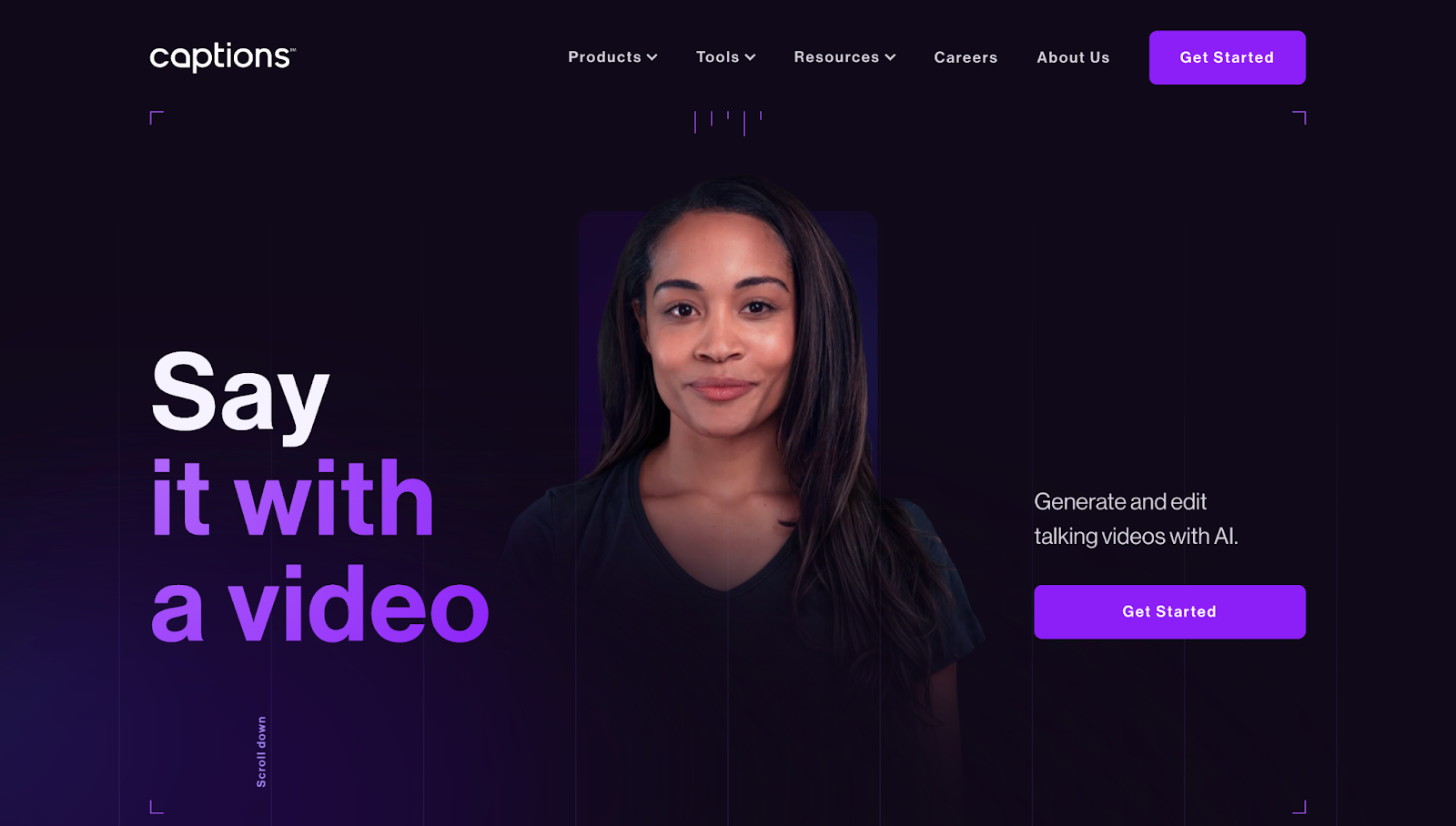
The Captions website uses a consistent and engaging visual theme centered around a single character. She remains the focal point throughout the scrolling experience, providing a sense of continuity and a personal feel to the site. The background changes from before-and-after comparisons to a smartphone mockup, showing how Captions’ AI features take you on a content creation journey.
The site has compelling copy next to these visual elements, highlighting features like multilingual support and real-time editing. Gradually revealing information keeps the story engaging and makes visitors curious about what's next. Stats and data toward the end build credibility, while a final CTA ties the narrative together.
10. Sage East
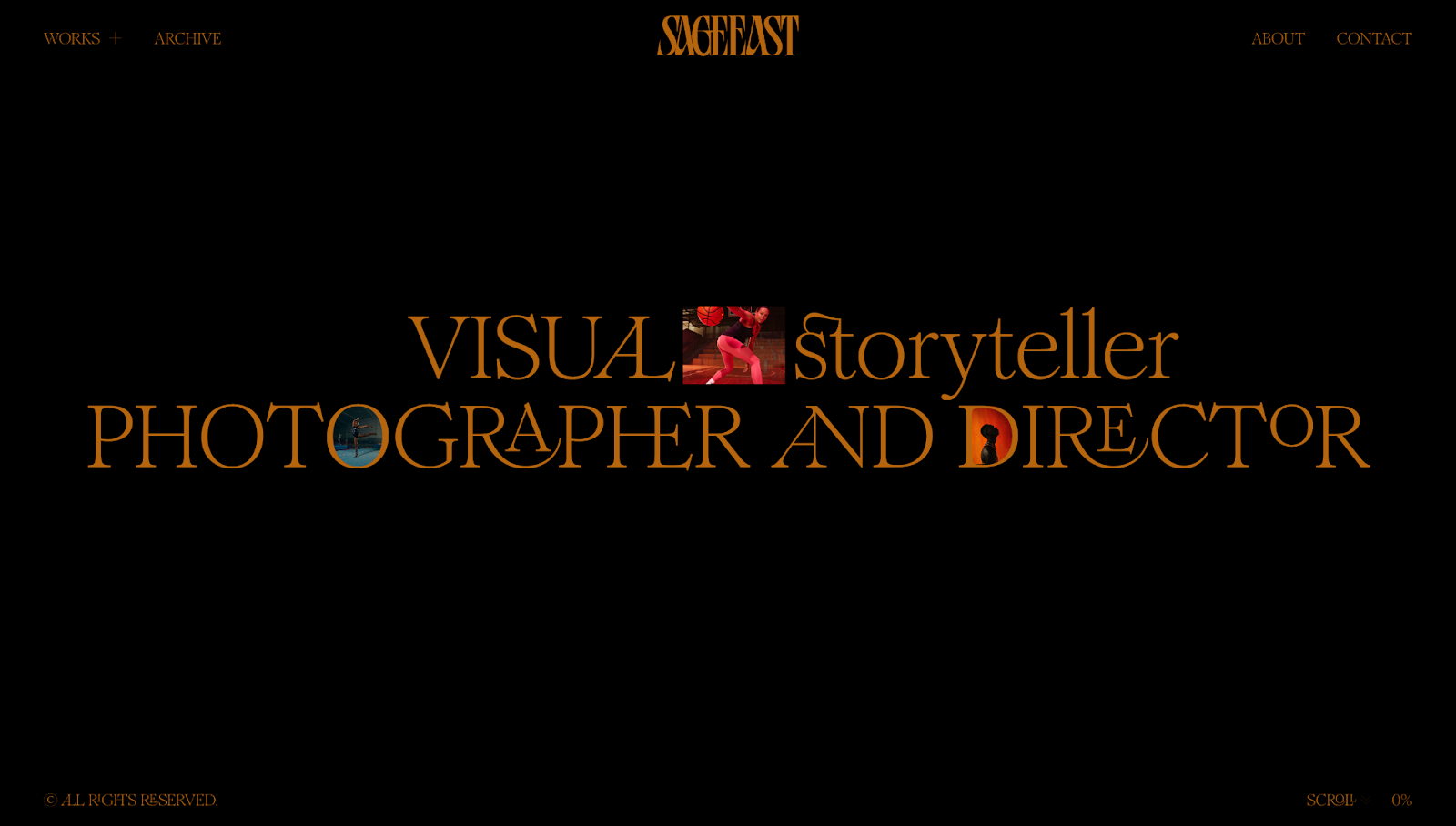
Sage East’s website, designed by The Blackpepper Studio, embodies her artistry and visual storytelling abilities. The homepage’s headline, “Visual Storyteller, Photographer, and Director,” immediately establishes Sage’s identity and sets the tone for the rest of the site. The subsequent message, “I don't shoot what it looks like, I shoot what it feels like,” tells you about her philosophy and invites you to explore the emotional depth behind each project.
Scrolling reveals project thumbnails that appear to fly toward you, with a blurred background enhancing the focus on each image for greater legibility. This design highlights the portfolio’s artistic nature while allowing you to immerse yourself in Sage’s online storytelling. At the bottom, an option to switch between grid and list formats lets you personalize your browsing and navigation experience, giving you control of the narrative.
Share your brand’s story with Webflow
A compelling story connects people to your brand, allowing them to experience offerings beyond products, services, and content. This story humanizes your website and allows messaging to resonate with target audiences.
With Webflow, you can combine narrative techniques with visually appealing, functional design to tell your brand's unique story. With tools like interactions and page building, you can build and scale immersive websites — without relying on developers.
Reflect your brand’s story in your designs with Webflow today.

Interactions & animations
Learn how to animate multiple elements and bring your designs to life with rich, sequenced interactions and animations.
