Color theory definitions vary, but color theory for designers generally refers to the practical guidelines of color mixing and principles that lead to visually appealing and harmonious color combinations.
Familiarizing yourself with the basics of color theory can help you create appealing color schemes for graphic design and web design.
To help you learn color theory, we’ve broken it down into the following topics:
- Vocabulary: from tints to saturation to warm and cool colors — we’ll cover the lingo designers use when talking color
- Color wheel: a powerful tool for visualizing the relationships between colors
- Color schemes: how to use the color wheel to choose accent colors, complementary colors, and create appealing color schemes
- Tools and resources: apps and guides to help you master designing with color
What is color theory?
Let’s explore the fundamentals of color theory and how it guides designers in forming effective color combinations. By understanding these principles, you’ll be able to communicate messages more clearly through color.
Why you should care about color theory
Color theory’s a mix of science, psychology, and emotion — making color an incredibly powerful aspect of design.
Sir Isaac Newton got us started with a basic color wheel based on how light reflected a spectrum of colors. Color theory and the color wheel have continued to evolve, teaching us more about the science behind why certain colors complement each other.
And over time, color psychology has influenced design as well. A combination of cultural, historical, and emotional elements influence how humans feel when they see different colors.
Understanding color theory allows you to arm yourself with the scientific and psychological principles that help you evoke emotion and responses from your target audience.
Color psychology
Colors can suggest confidence, professionalism, or even express a brand persona depending on the palette you choose. They shape how audiences perceive and interact with a design, influencing user behavior and evoking distinct feelings.
For example, many leading coffee brands rely on green in their logos and packaging to convey freshness, growth, and a connection to nature.
The vocabulary of color
Before we dive into theory, you’ll need to know the following terms:
Primary colors
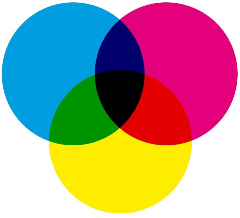
Primary colors form the basis for all other shades. Humans perceive three base colors: magenta, cyan, and yellow (CMY). Every other color we see consists of a combination of these three colors in varying amounts, brightnesses, tints, and shades.
Traditionally, we considered red, blue, and yellow to be the primary colors, but research has shown that magenta, cyan, and yellow better describe our experience of color. If those colors sparked memories of printer errors caused by lack of magenta ink, you’re not alone. The CMYK color model — cyan, magenta, yellow, key (black) — is a subtractive color model based on what’s used in color printing. It’s subtractive because it subtracts red, green, and blue hues from white light.
RGB and hex colors
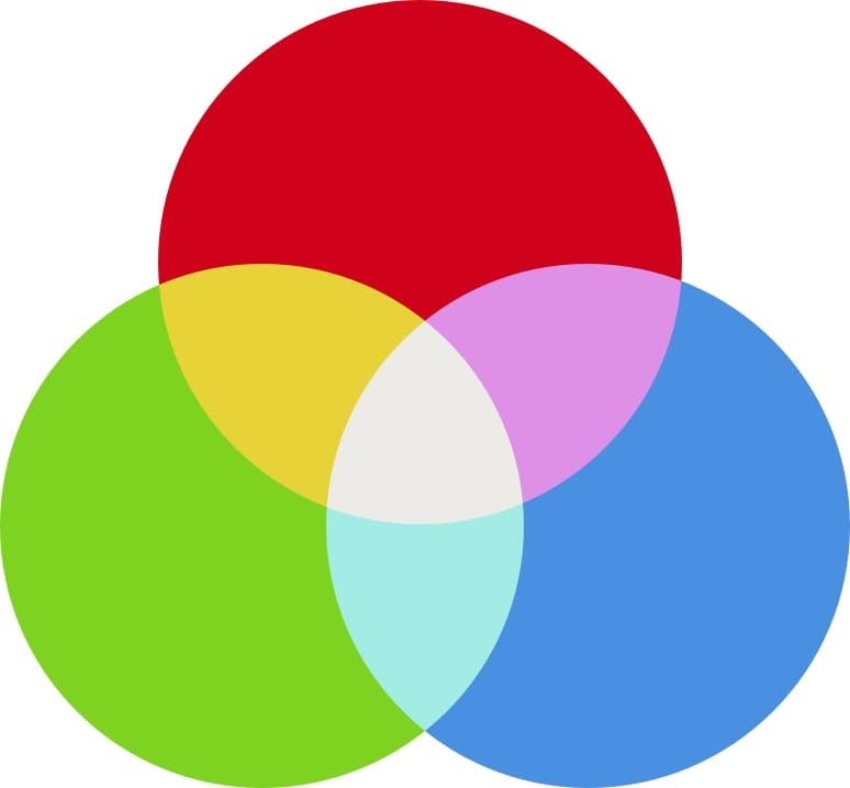
On the web, we use RGB (which stands for Red, Green, and Blue) and hex values to represent colors.RGB is an additive color model — colors are created by adding colored light to black.
The RGB color system defines all colors as a combination of three different values: a particular shade of red, another of green, and another of blue. So:
- rgb(59, 89, 145) equals Facebook blue
- rgb(0, 0, 0) equals black
- rgb(255, 255, 255) equals white
The hex color system converts each value to a hexadecimal (base 16) representation, like so:
- #3b599b equals Facebook blue
- #000000 equals black
- #ffffff equals white
Every two characters represents a color value, so for Facebook blue, the red hue is 3b, the green is 59, and 9b is blue.
Hot and cold colors

Colors also have a “warmth,” and each can be classified as either a warm or a cool color.
Warm colors contain higher amounts of reds and yellows. They can invoke a sense of warmth and passion in a design. They can also feel very aggressive and bold — that’s why red is often used in error messages.
Cool colors contain higher amounts of blue, evoking chilly climates, ice, winter, water, nighttime, death, and sadness. They can carry connotations of loneliness, coldness, and fear. On the more positive side, because cool colors are less aggressive, they can also be soothing — think of a blue sky or calming blue waters on a beach.
Color temperature
Increasing an image’s temperature means increasing its orange levels. It generally makes an image look warmer and happier, similar to how the world looks happier when the sun casts its orange glow upon it. In contrast, reducing an image’s temperature makes it look colder and less inviting, like an overcast day.
Tints and shades
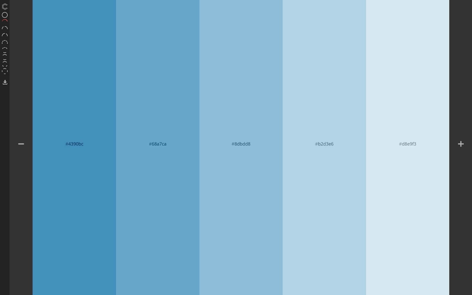
You add white to a color to create a tint and add black to create a shade. Tints and shades let you create monochrome color schemes by adding varying levels of white and black to a base color.





Ultimate web design
From 101 to advanced, learn how to build sites in Webflow with over 100 lessons — including the basics of HTML and CSS.
For example, if your base color is #8dbdd8 (a lightish blue) as seen in the image below, you can create a monochrome scheme by choosing two tints (two brighter blues) and two shades (two darker blues).
Saturation, hue, and lightness
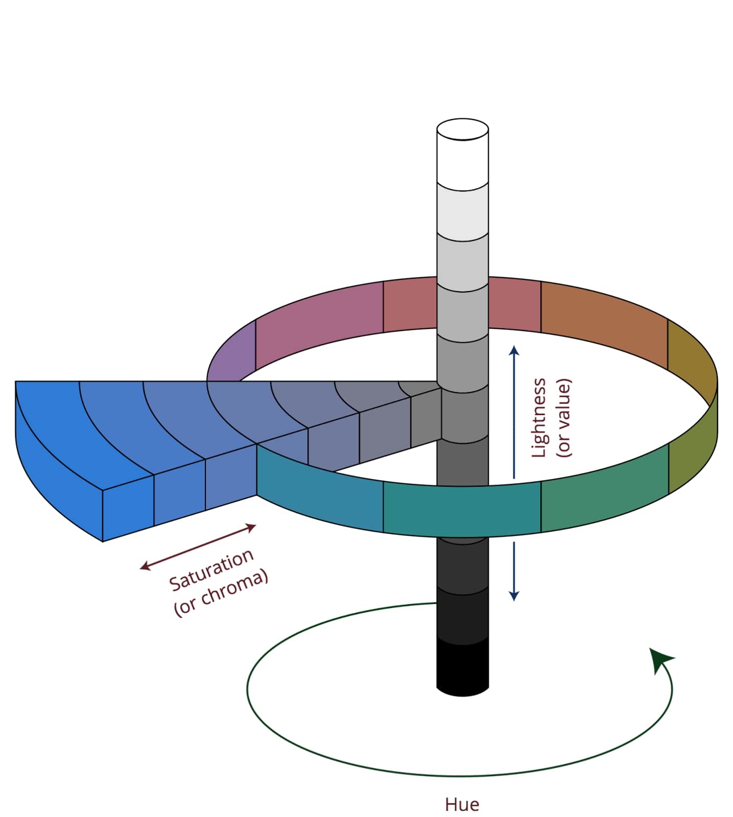
Saturation describes the intensity of a color. Increasing saturation makes the color richer and darker, while reducing saturation makes it look faded and lighter. When we say “light blue” or “dark green,” we’re describing changes in saturation.
Hue defines the degree to which a color can be described as similar to or different from red, orange, yellow, green, blue, indigo, and violet (the colors of the rainbow). So when you describe a color as “blue-green,” you’re defining it in terms of two hues.
Lightness, also known as value or tone, defines the perceived brightness of a color compared to pure white.
The color wheel
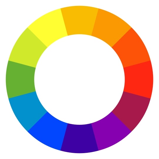
A basic color wheel contains the 12 standard colors used to create color schemes. Each slice of the pie represents a family of colors that can be achieved with different saturations, hues, tints, shades, and mixes of neighboring colors. The color combinations (e.g., yellow-orange, red-orange) result from mixing equal amounts of the base hues (yellow and orange, or red and orange).
Red, yellow, and blue are the primary colors. Violet, orange, and green are the secondary colors. Everything else is a tertiary color — a mix of primary and secondary colors.
Designs use the color wheel to choose one of five types of color schemes.
5 types of color schemes
Designers create color schemes by pairing multiple color families from the color wheel. This works best when you use one of the following patterns that create color harmony.
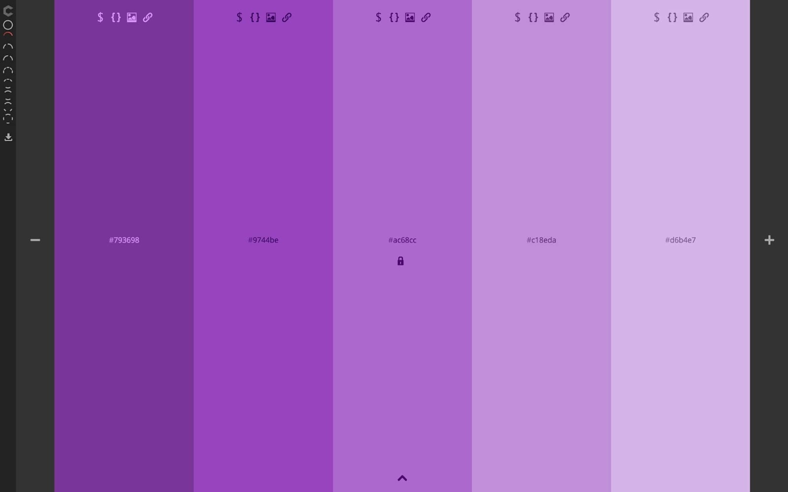
1. Monochrome
A monochromatic color scheme consists of various tints, shades, and saturations of a single base color. They’re very cohesive, but run the risk of becoming monotonous.
2. Complementary
Complementary color schemes are based on two colors from opposite sides of the color wheel. Because the two hues will be wildly different, such schemes can be very impactful and noticeable. There are also split complementary color schemes — where one primary color is used with two analogous colors to its complement.
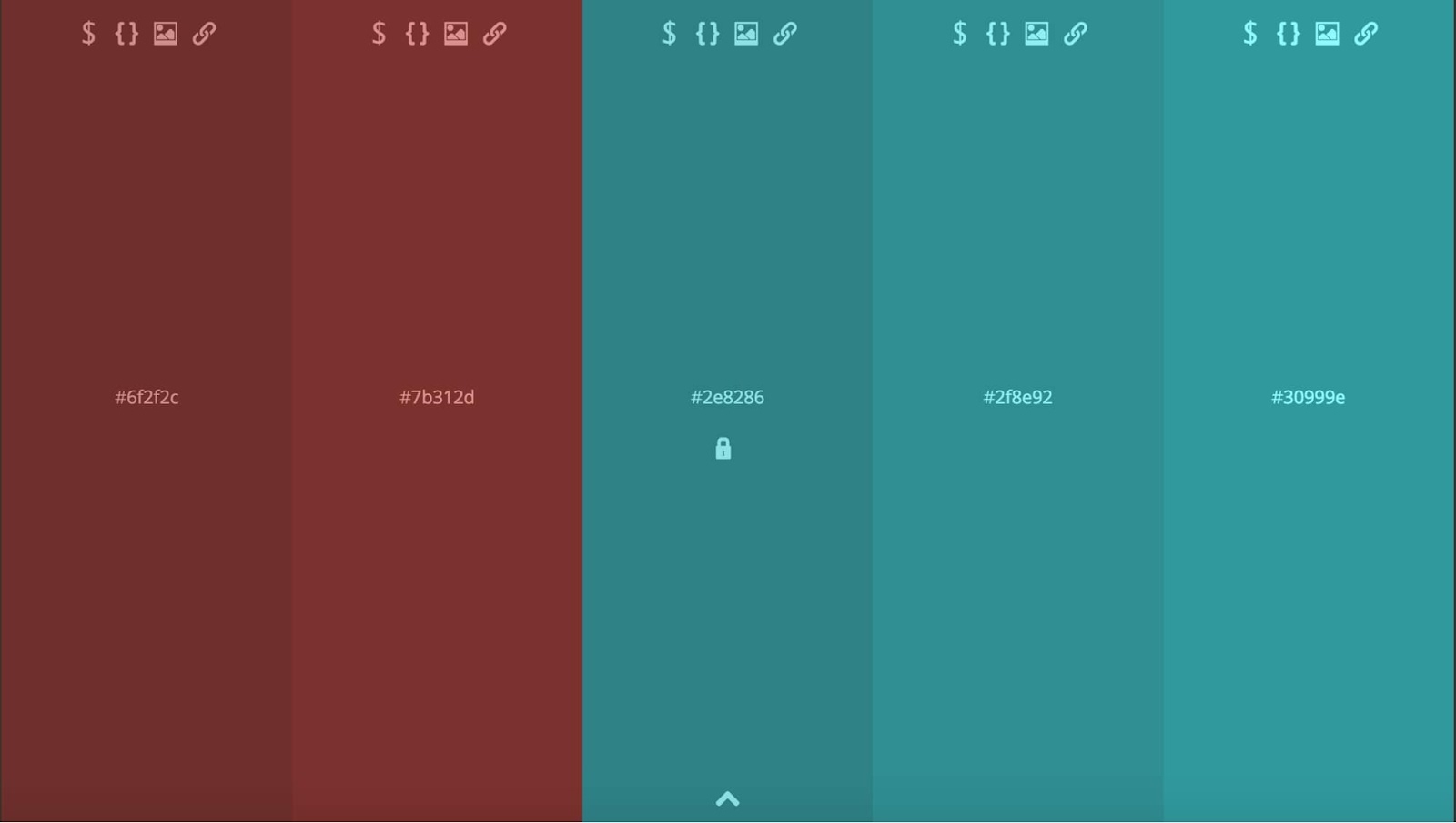
Pro tip: Pick a complementary color for your calls to action. For example, if your background color is mint green, a red-violet button would catch the eye because it’s a complementary color.

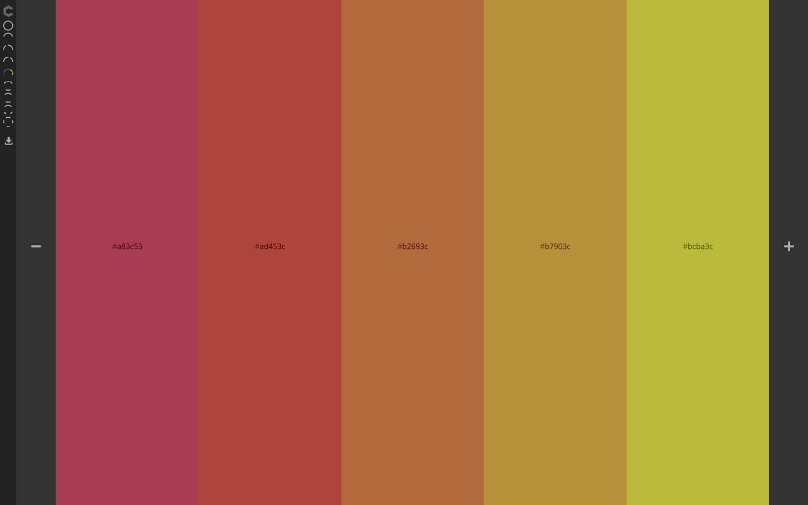
3. Analogous
Analogous color schemes feature three colors that sit next to each other on the color wheel. Because of the tonal similarities, these schemes can create a very cohesive, unified feel, without the monotony of a monochrome scheme.
4. Triadic
To make a triadic color scheme, draw an equilateral triangle (a triangle where all three sides are the same length) on the color wheel, and select the three colors at the points of the triangle. This triad creates a diverse, yet balanced, scheme.
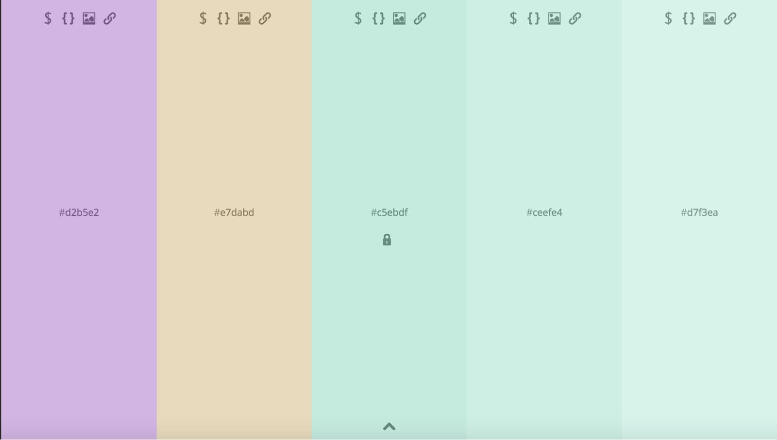
5. Tetradic
A tetradic color scheme includes four colors that are equidistant from each other on the color wheel. Because the four colors can either form a square or rectangle, some resources break these color schemes into two — square and rectangle.
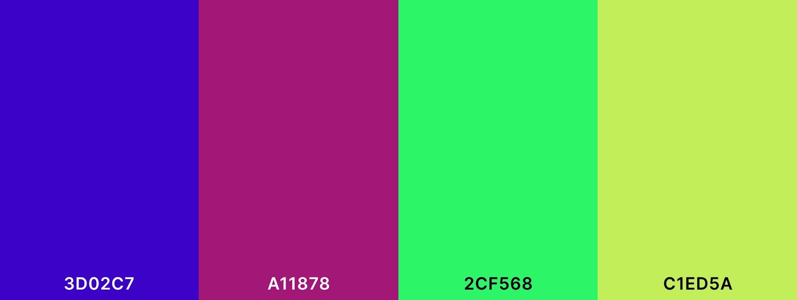
Now that we’ve explored the five main color scheme types, let’s look at how you can create or discover a color palette that suits your design needs.
Color palette creation and inspiration
If you’re feeling overwhelmed, there are plenty of color picker tools and palette generators that can provide inspiration. Tools like Colordot allow you to start with a main color or a few color choices and then create a scheme for you. Meanwhile, tools like Coolors build palettes based on the type of color scheme you want.
Color is a powerful tool for evoking emotion and establishing brand identity. Think about brands you could recognize by color alone — Coca-Cola red or Starbucks green. Color can be so closely tied to a brand’s identity that it becomes a legal trademark — like in the case of T-Mobile magenta.
Whether you’re looking for complementary colors for a logo or building an entire web design color palette, applying the fundamentals of color theory will make your designs more visually impactful. Get out there and use your newfound color knowledge to spice up your designs.
Looking for more color resources? Check Webflow University for various tutorials for both beginners and advanced designers, including lessons on color values, color contrast, and more.

Ultimate web design
From 101 to advanced, learn how to build sites in Webflow with over 100 lessons — including the basics of HTML and CSS.


