


In a world of algorithmic sameness, human craft is becoming the differentiator.
Web design continues to evolve at a remarkable pace — not just because of any single technological shift, but because of how design itself is maturing as a discipline. What we're seeing heading into 2026 reflects designers responding to real challenges: declining user attention, platforms that all look the same, and the pressure to stand out in meaningful ways.
Several forces are converging.
Yes, AI tools have made certain techniques more accessible, but we're also seeing designers reckon with user behavior changes, push back against algorithmic sameness, and explore what it means to create experiences that feel purposefully crafted and human.
These trends are solutions to real problems — designers and brands figuring out how to stand out when the baseline is higher, how to earn attention when it's scarcer, and how to signal craft and intention in their work. Here are 8 trends in web design we have our eyes on heading in 2026 as designers navigate these challenges.
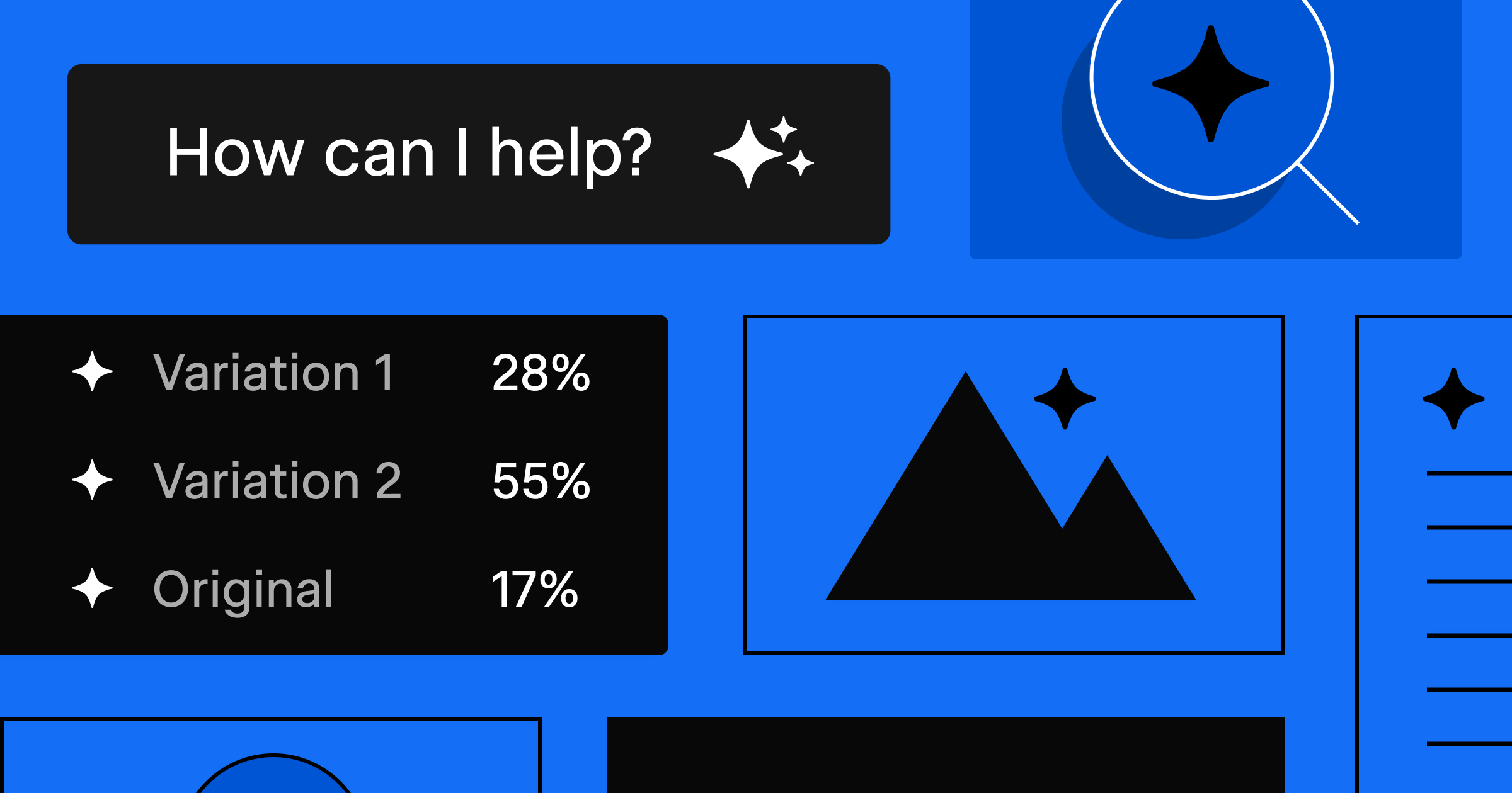
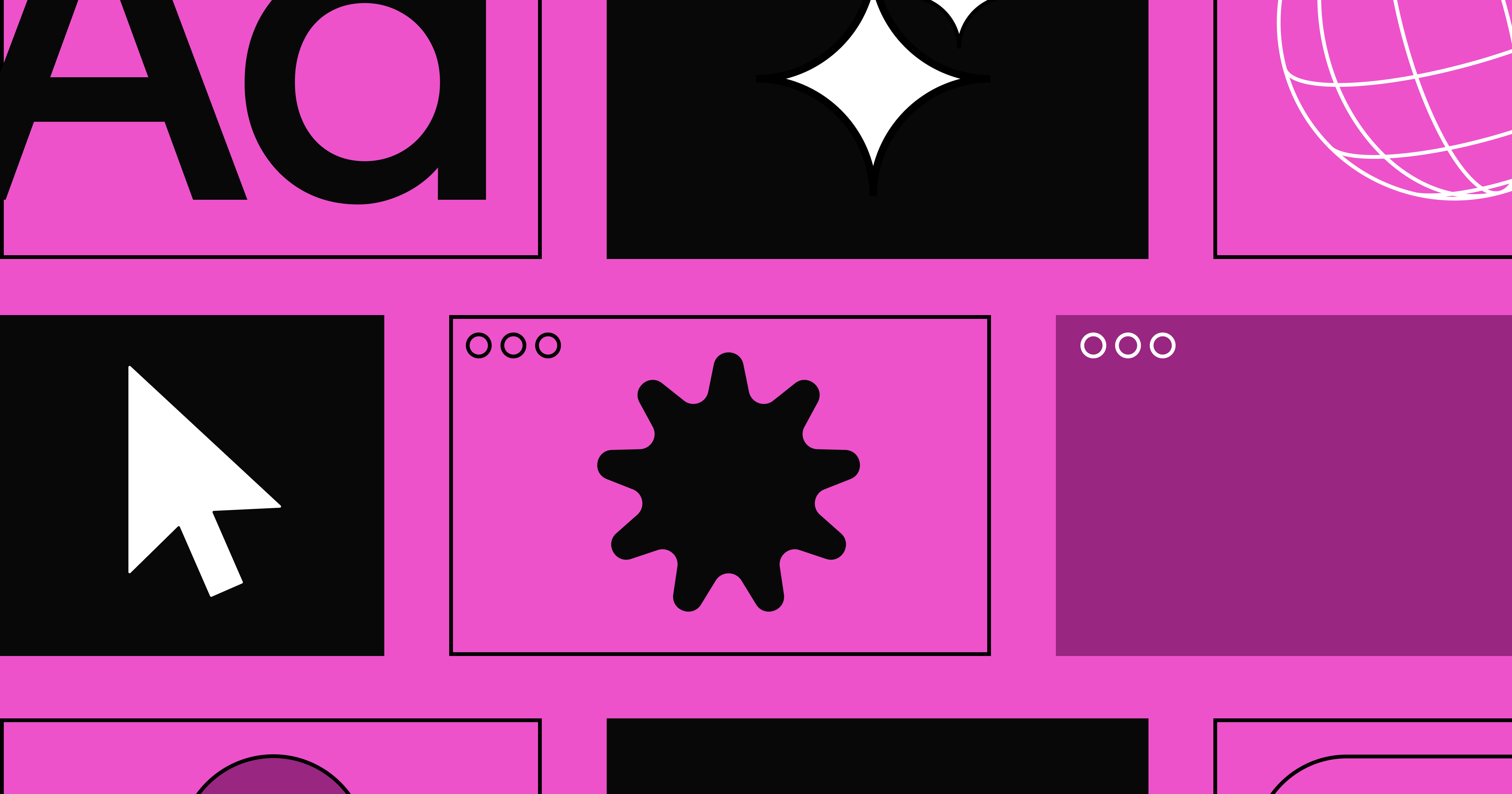
1. Proprietary effects and styles
Creating ownable visual treatments in an era of accessible tools
As design tools become more powerful and accessible, visual homogeneity becomes a real risk. The response? Brands are investing in proprietary effects and custom visual systems that feel distinctly theirs.
Advances in tooling — including AI-assisted vibe coding — make it possible to build cohesive visual systems. Custom filters, signature animations, brand-specific effects that can scale across touchpoints. What once required extensive custom development or specialized skills is now within reach for more teams.
In a world where sophisticated design is no longer exclusive to those with massive budgets or specialized skills, differentiation comes from having a visual language that's recognizably yours. These aren't effects anyone can replicate with a prompt — they're systems that require intention and craft.
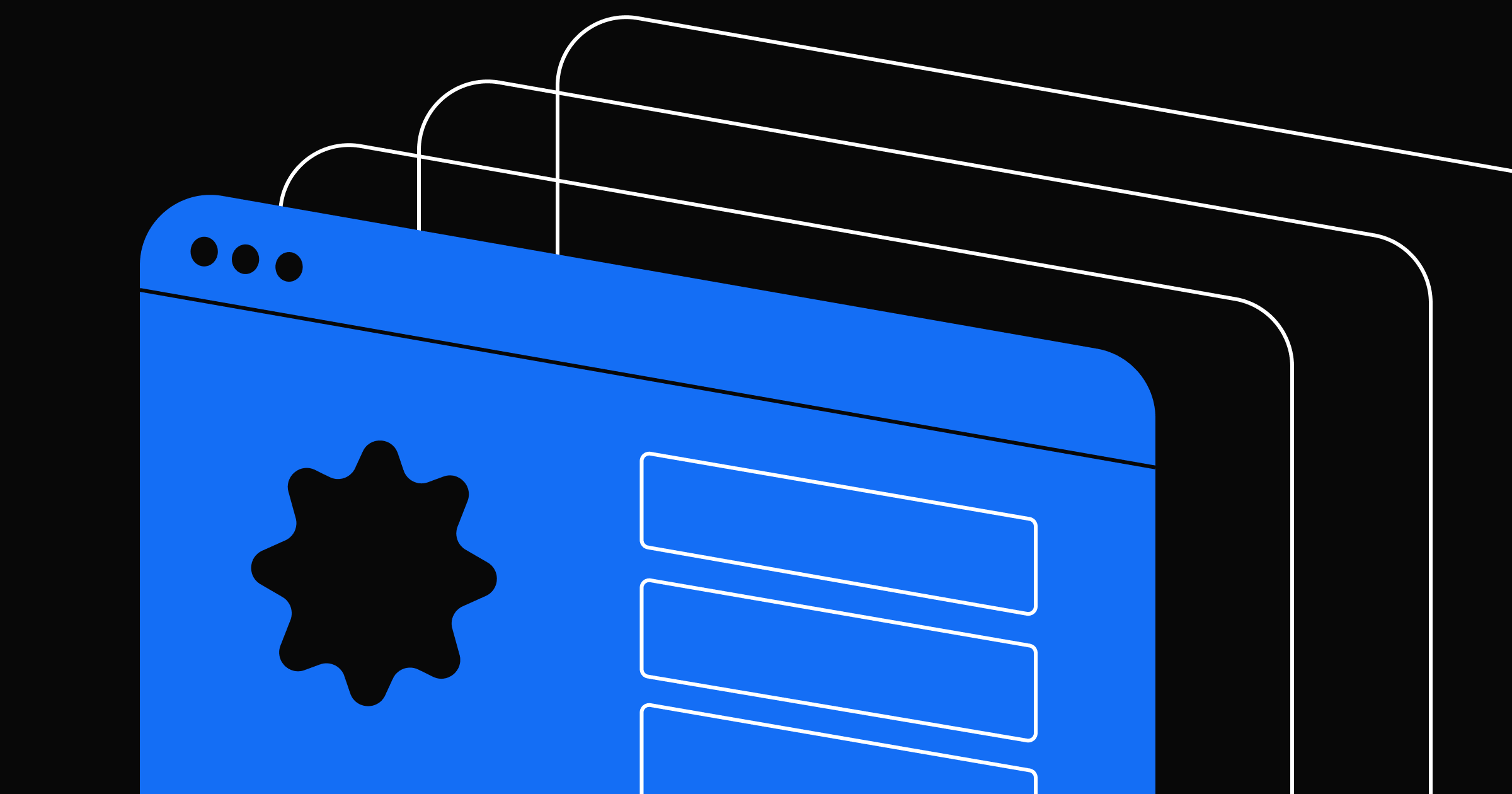
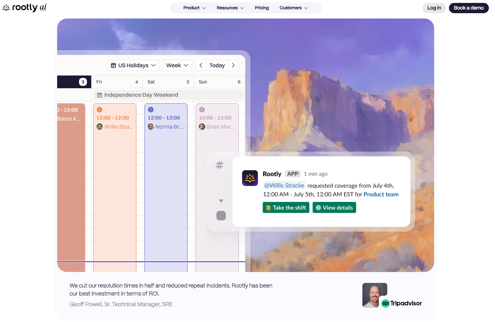
2. Art converging with advanced UI
Combining vintage aesthetics with sophisticated interactions to signal human craft
As digital creation becomes more automated and algorithmic, some brands are deliberately reaching for the opposite — the handmade, the traditional, the unmistakably human.
The aesthetic often features vintage illustration styles, classical art references, and hand-drawn elements paired with modern interactions and sophisticated UI. The juxtaposition itself becomes the message — blending nostalgic visual language with contemporary web functionality to create something that feels both timeless and cutting-edge.
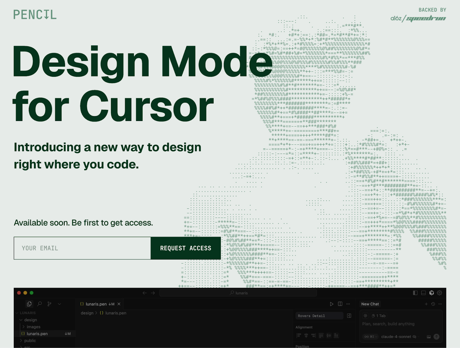
For SaaS brands, there's a specific manifestation of this: presenting product interfaces as if they were gallery pieces. The UI is set against artistic backgrounds — painted elements, illustrated scenes — that frame the interface as something carefully designed, not just "vibe-coded in five minutes." It's a way of countering the perception that everything digital is instantly generated, elevating software as art objects that signal thoughtfulness and a level of craft that takes time.
3. Minimalism in copy
Radical brevity in an age of infinite text generation
The constraint used to be: “Can we write enough?” Now it's: “Should we say this at all?” When you can prompt an AI tool to write headlines, paragraphs, entire essays in seconds, something interesting happens: saying as little as possible becomes counter-cultural.
Designers and brands are starting to strip messaging down to its most essential core. Letting white space and design carry more of the communication load. Making what they do say as meaningful as possible. It requires confidence in your value proposition, the discipline to cut everything that isn't load-bearing, and trust that your audience doesn't need everything spelled out.
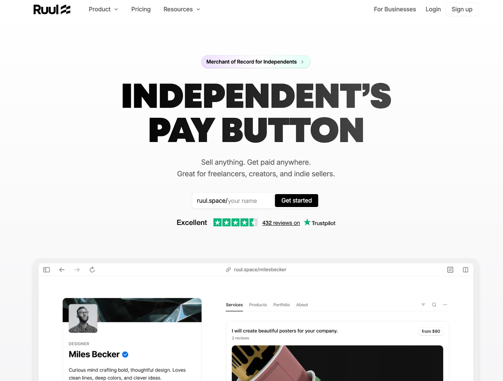
It might look plain at first glance, but in an AI maximalist world where wordy copy is quick to generate and abundant, this restraint is actually a bold take. Brevity signals that someone cared enough to edit. It respects user attention and forces clarity of thought.
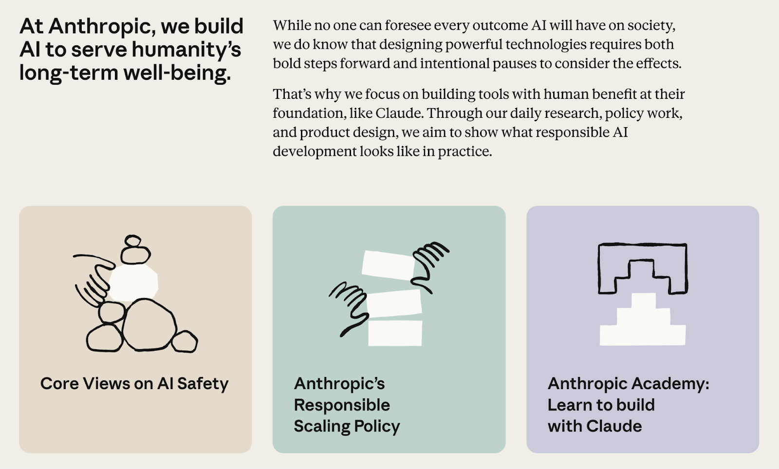
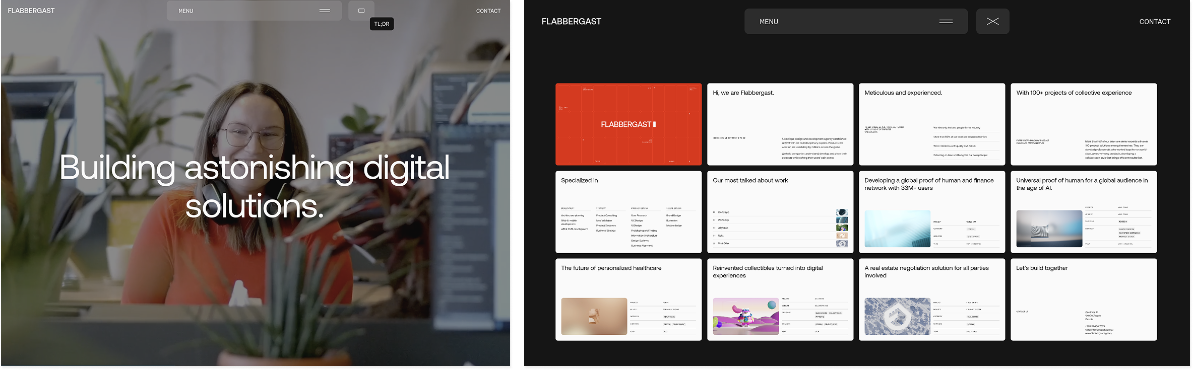
4. The TL;DR experience
Structured overviews that let users explore content selectively
While minimalism is about saying less everywhere, the TL;DR approach is about respecting how people actually consume information online — scanning first, diving deep selectively.
Overview pages, pitch deck-style presentations, structured summaries that present the full picture in digestible format before offering deeper exploration. It's about front-loading essentials without hiding complexity. This format reduces friction to understanding, acknowledging that users want to grasp the full scope quickly before committing time to details.
It works particularly well for complex offerings, B2B services, and consultancies — anywhere that traditionally requires significant explanation to understand value. Rather than forcing users to scroll through long pages to piece together what you do, the TL;DR experience gives them the complete picture upfront, then lets them choose what to explore further.
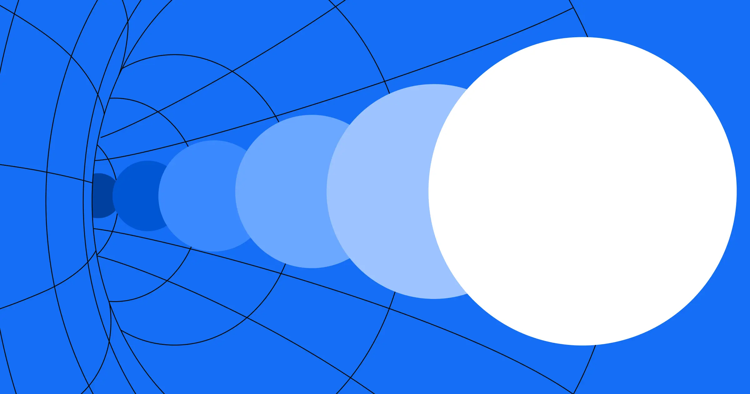
5. Explosion of color
From single accent colors to full color systems
For years, the conventional wisdom in branding was clear: pick one primary accent color and use it everywhere so people associate it with you — Coca-Cola Red, Best Buy Blue and Yellow. That thesis is shifting.
Rather than relying on a single accent color, brands are now using the full range of color values — entire color systems that feel distinctly theirs, deploying all the hues within that system throughout their experiences.
This isn't just about adding more colors randomly. It's about developing a cohesive color system and then actually using it, allowing multiple colors to work together to create energy, memorability, and visual richness that a single accent color can't achieve alone.
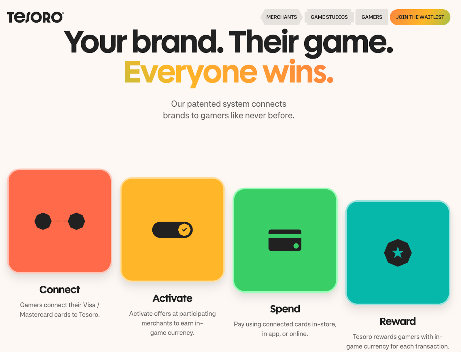
It signals confidence and sophistication. These brands aren't playing it safe with monochrome plus one accent; they're embracing chromatic complexity while maintaining cohesion.
6. Dynamic text treatments
Bringing meaning and attention to important copy
How do you value what you're saying on a site? How do you bring meaning to your words and direct people's eyes toward important pieces of copy? Designers are experimenting with text effects and distinctive styling — animations, bold type choices, and interactive elements — as a way to signal importance and make reading feel more intentional.
Text animates in, treatments feel like someone is actively writing out a statement, and effects make key words shift or emphasize at the right moment. But it's not just about motion; it's also about form — unique text styling and distinctive typographic treatments that make copy stand out whether it moves or stays still.
The trick is enhancement without distraction: adding emphasis and delight to the reading experience rather than overwhelming it. In an environment where engagement is declining and attention is fragmented, these treatments and styles help important copy stand out. They make the act of reading feel more active and rewarding, signaling that the words on the page were chosen deliberately.


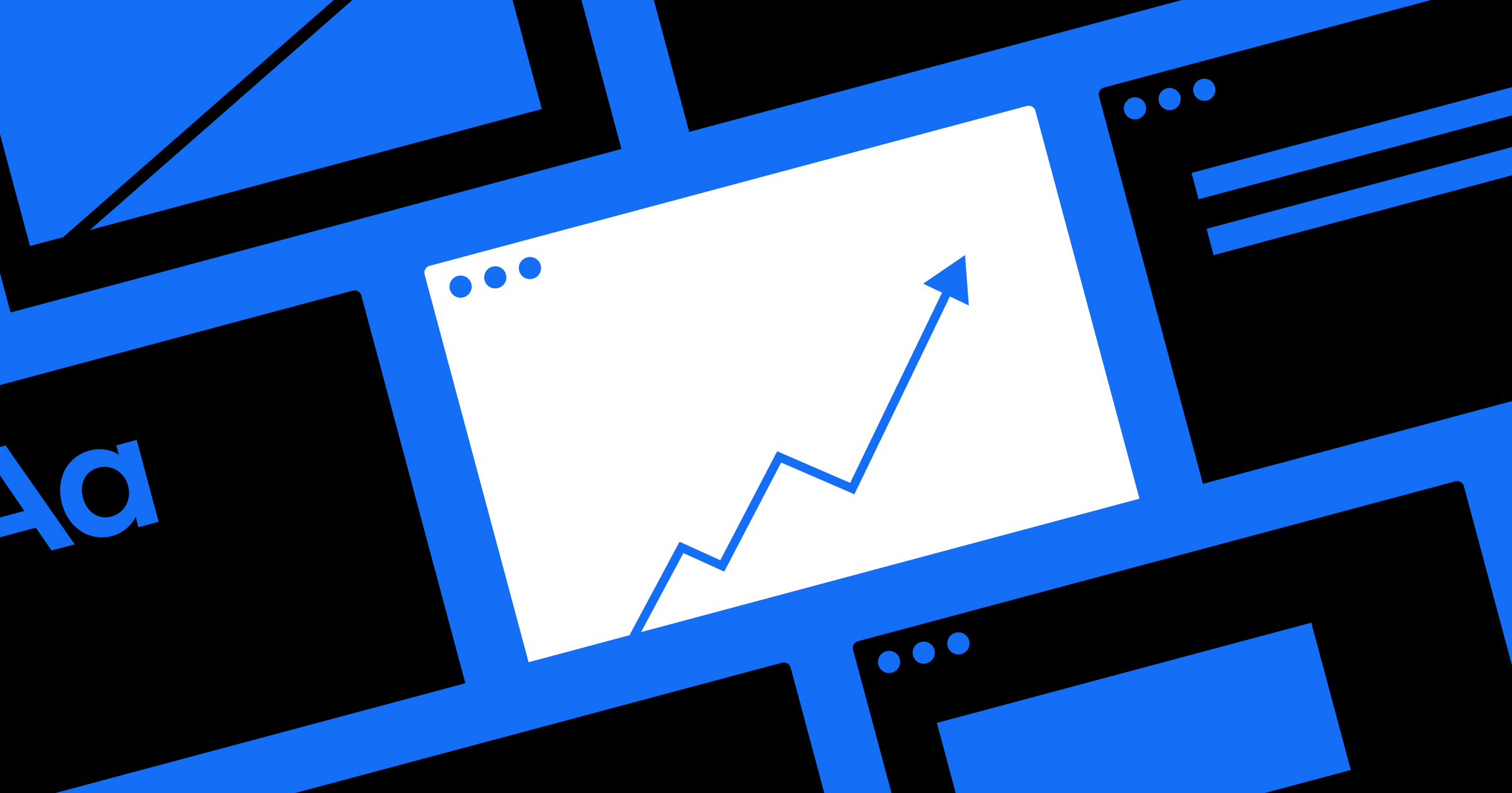
7. Guided scrolling
Scroll-based wayfinding in an age of shrinking attention
This isn't about scrollytelling or narrative experiences. This is about a more fundamental challenge: keeping users engaged. As HubSpot's 2025 State of Marketing report frames it, marketers are shifting from "scaling traffic" to "scaling attention" — a recognition that getting people to your site is no longer the hard part. Keeping them there is.
Guided scrolling helps designers combat this attention challenge with clear wayfinding. Progress indicators, scroll bars, and visual cues show users where they are in the experience and what's coming next. Last year's scroll trend was sophisticated scroll-based narratives. This year is about scroll as a navigation tool, helping users understand how much content remains and why they should keep going.
These interactions take several forms: progress indicators that show how far through content you've scrolled, interactive elements that activate as you move down the page, and visual markers that turn passive scrolling into guided exploration. Others inject playfulness — like speedometers that track your scroll speed — as a way to add personality and keep the experience engaging. As search engines increasingly answer questions directly, keeping visitors engaged once they arrive becomes critical.
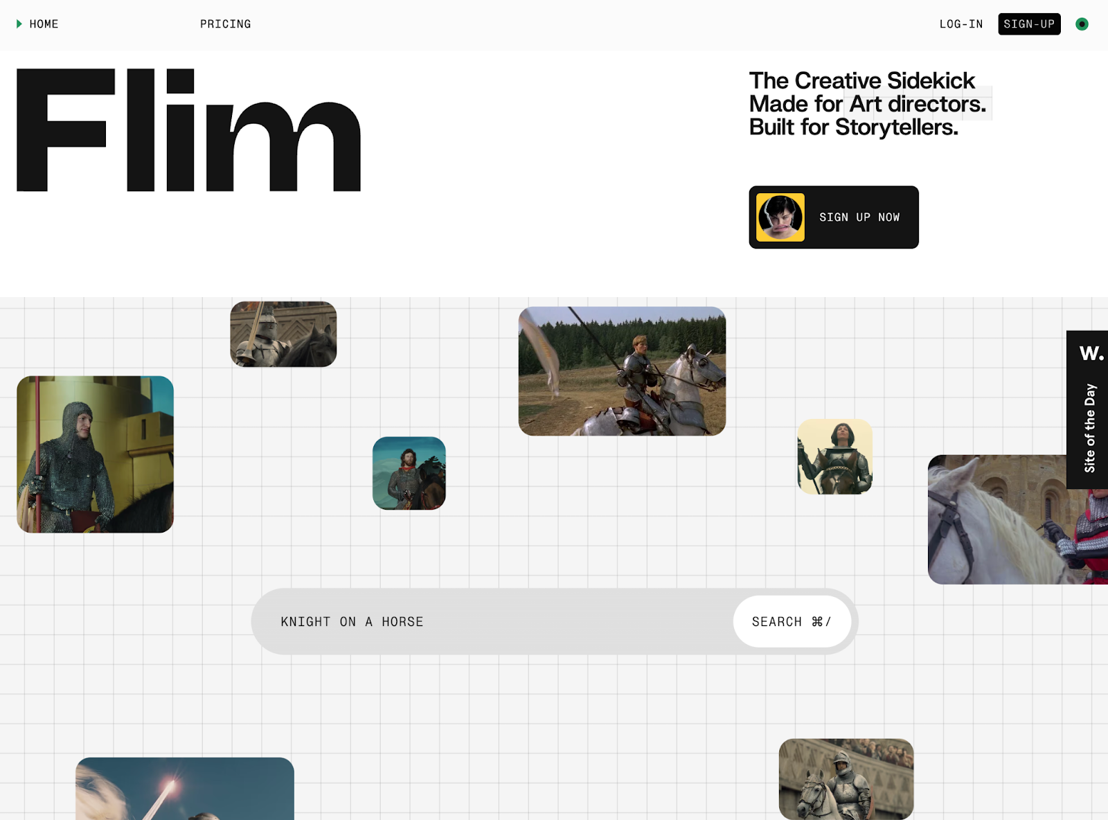
8. The infinite canvas
Visualizing limitless possibility through grids, nodes, and open space
How do you visually represent possibility itself? Potential? The idea that you could create anything? Designers are turning to specific visual metaphors: the blank canvas, the dot grid, node lines, expansive space.
The symbolism is deliberate. The canvas represents creative potential. The grid suggests structure within possibility, order in openness. Nodes and lines indicate connection, flow, systems thinking. White and open space signal room for anything. These visual elements work together to communicate that this is where creation happens.
Creative and generative tools — brands centered on creation and possibility — use this aesthetic most prominently. These are starting points rather than destinations, platforms for developing everything from AI-powered content to visual work to digital experiences. Dot grid backgrounds, node-based visualizations, connecting lines that suggest relationships and potential, and spacious layouts that feel expansive rather than empty.
The aesthetic says: "This is where creation happens. Start here and build anything."
What these trends reveal — and where web design goes from here
Whether it's through proprietary visual systems, careful restraint, or sophisticated interaction design, these trends share a common thread: intentionality. They're about making deliberate choices during an era when it's easier than ever to create, but harder than ever to stand out. These aren't just aesthetic movements — they're responses to fundamental shifts in how people consume digital content, how quickly they expect to find value, and what signals quality and craft in an age of abundant, easily-generated design.
Web design will continue to evolve as technology, user behavior, and cultural expectations shift. The trends and examples highlighted here (the majority of which were built in Webflow) aren't prescriptive — they're invitations to think differently about the challenges your own projects face. If you're looking for more inspiration, explore the latest work from the Webflow community.

Discover inspiring design work from the Webflow community
Made in Webflow is the place to browse, clone, and customize the latest websites built by the Webflow community.