

Feature
Designer
Component Canvas is now available
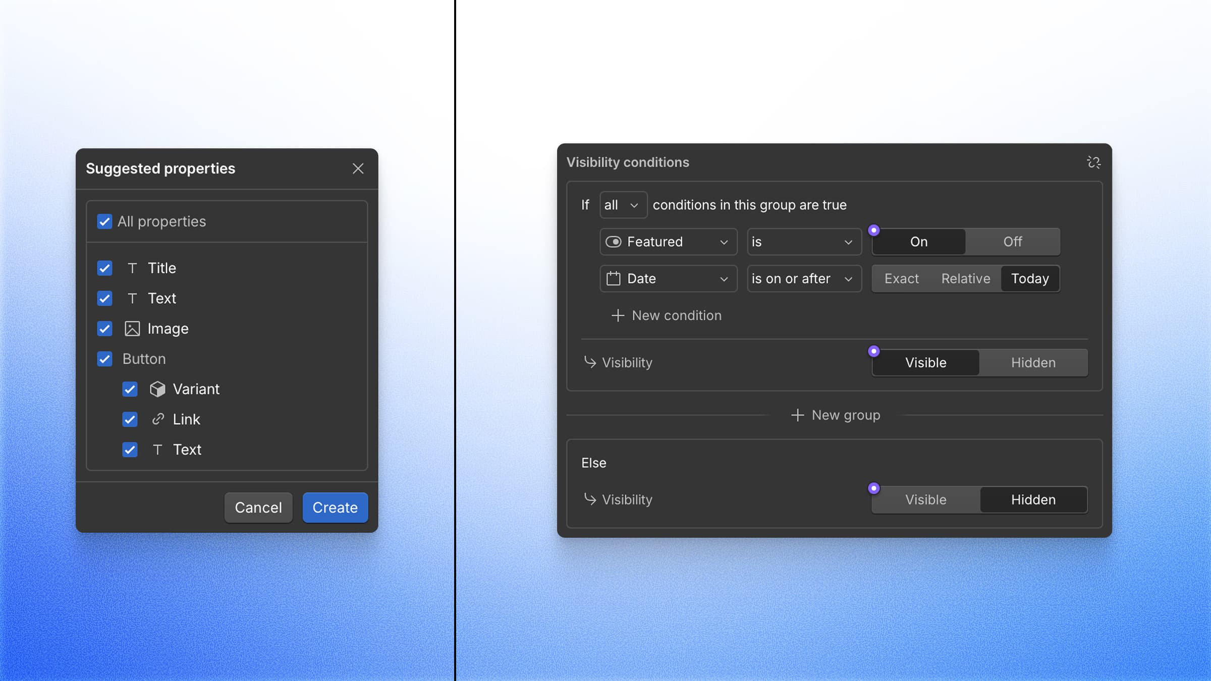
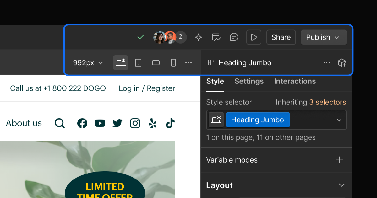
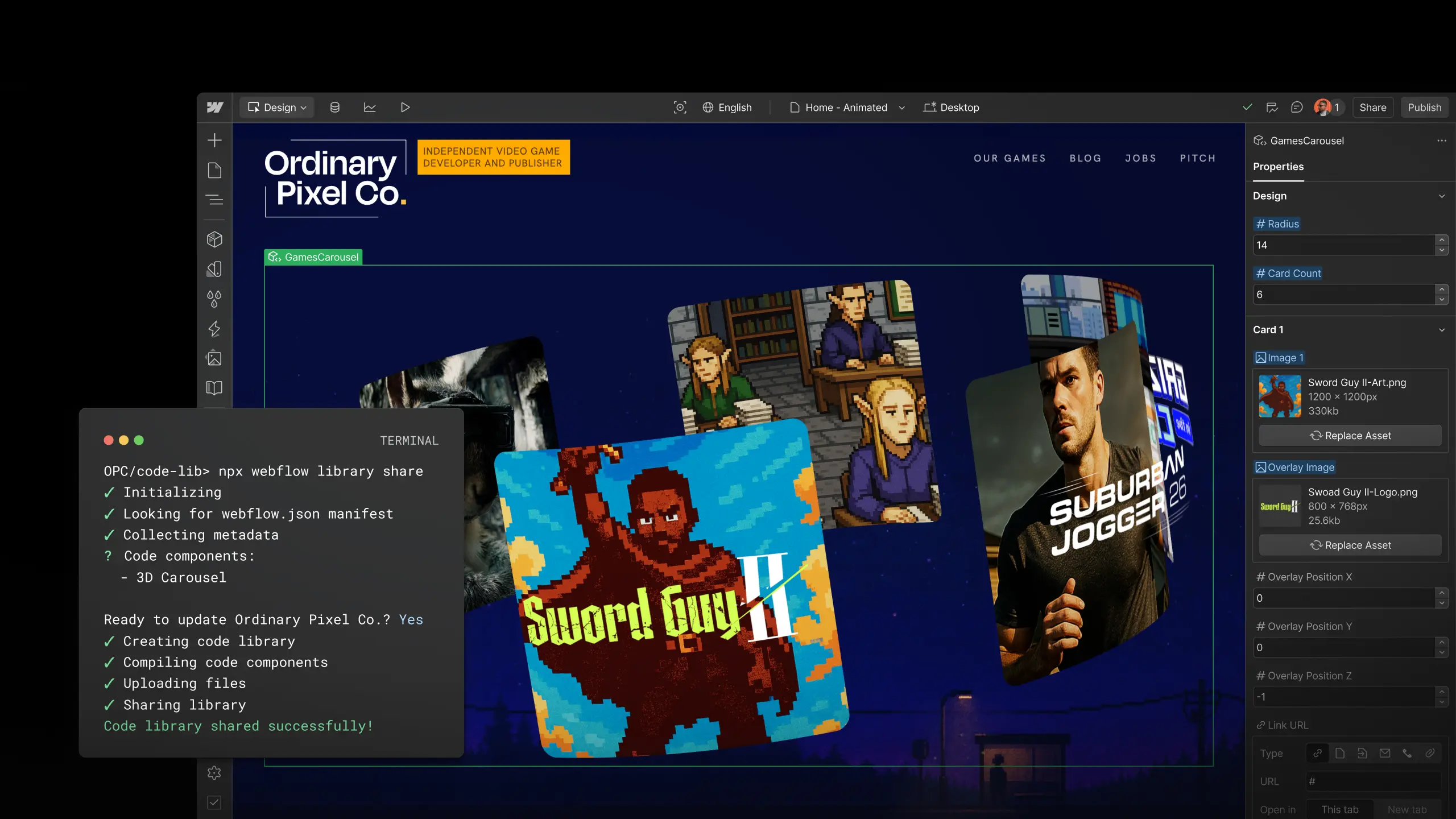
Manage component variants on a dedicated canvas that provides instant visibility into cascading changes across structure, styles, interactions, and more.
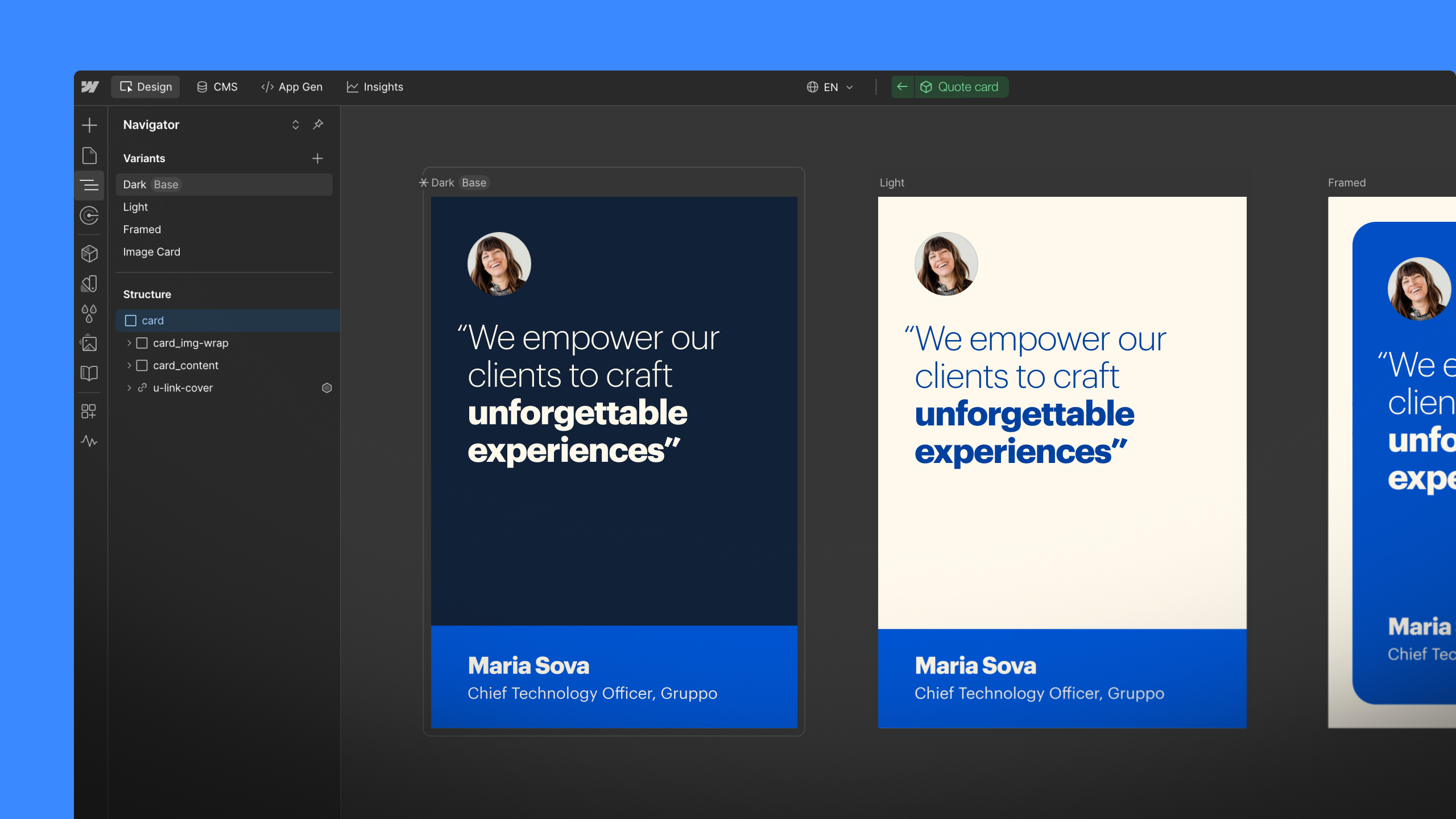
Components are foundational to scalable design systems, but maintaining design consistency across multiple contexts can be tedious and error-prone at scale. Even small changes — like the font size on a button — can require manual auditing across variants, breakpoints, and states.
That’s why we built Component Canvas, a new component authoring experience that helps you move faster, without compromising your design system. Component Canvas is now available to all Workspaces.
With this initial release, designers will be able to:
- Design and manage each component on a dedicated canvas outside the page, with a unified view of all variants.
- Edit multiple variants side-by-side with instant visibility into cascading changes, so you can move fast with far less context switching.
- Stay oriented with automatically organized frames, so you and your teammates can always find what you need.
- Navigate with intuitive canvas controls for scroll, pan, and zoom.
Together, these give you a purpose-built space to design and manage components with speed and confidence.
“Component canvas makes it much easier to manage multiple variants and easily see the impact your changes are having across them, which is invaluable for complex component based builds.” – Joshua Fry, FryUX
And this is only the beginning — in the coming year, we’ll be adding support for a number of additional contexts, including breakpoints and pages.
To get started, click “Open component” when editing in context, or navigate directly from the Components panel. For more information, please visit our help center.
Related updates


Get started for free
Try Webflow for as long as you like with our free Starter plan. Purchase a paid Site plan to publish, host, and unlock additional features.
Try Webflow for as long as you like with our free Starter plan. Purchase a paid Site plan to publish, host, and unlock additional features.