Accessible web design helps make the web a better place for everyone.
Temporary disabilities like a broken hand, or permanent conditions like dyslexia, all affect the ability for someone to navigate a website. Creating more accessible websites means adding features to remove potential barriers that might inhibit visitors from accessing information.
Inclusivity starts with accessibility design guidelines. And although it’s impossible to create a perfectly navigable website, we can — and should — try.
What’s accessibility in web design?
Poor design limits how people engage with websites, including the 1 in 4 Americans reported to have a disability by the CDC. Web design accessibility standards optimize web pages to ensure a site remains usable to as many people as possible, including folks with disabilities, changing abilities, poor internet connections, people using assistive technologies, and more.
Web designers should consider whether people with visual, auditory, mobility, cognitive, or other disabilities can enjoy and interpret a site’s elements. This includes ensuring all photos have alt text written with screen readers in mind, choosing high-contrast colors to make text more readable, and offering transcripts and captions for video content.
Inaccessible web design also affects site owners. If potential customers can’t achieve goals such as purchasing products, contacting the business, or finding information, it harms conversions and alienates the audience.
Types of accessibility considerations
Understanding the different types of disabilities and considerations to take into account before designing lets you incorporate features to better create websites with access options for various disabilities or assistive technologies. You can’t address considerations effectively with a surface-level understanding.
Some common accessibility considerations to note:
- Visual disabilities (e.g. blindness, color blindness)
- Mobility disabilities (e.g. muscle control, arthritis, functional movement disorders)
- Auditory disabilities (e.g. hearing loss, auditory processing disorder)
- Seizure risk (those with photosensitive epilepsy)
- Cognitive and learning disabilities (e.g. dyslexia, processing disorders, impaired memory)
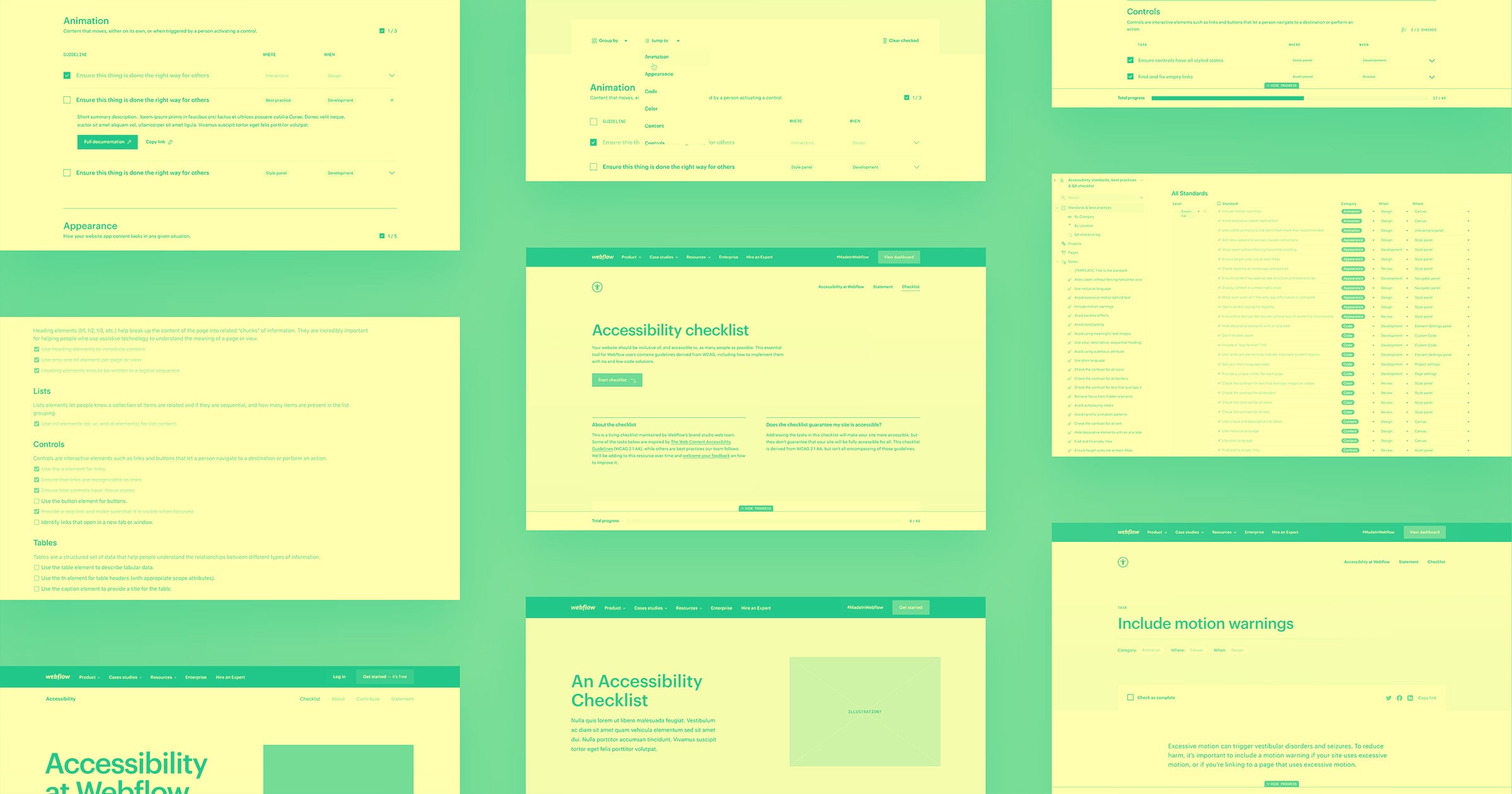
Before diving into accessible web design, research different disabilities and potential accommodations for them through accessibility advocate content or platforms like W3. Webflow’s accessibility checklist is another way to build more accessibly with Webflow.


Accessibility at Webflow
Learn about our commitment to web accessibility and how you can build more accessible online experiences.
What is WCAG?
Another way to learn about assistive technologies is the Web Content Accessibility Guidelines (WCAG), which is part of W3’s Web Accessibility Initiative (WAI). It directly covers the web content side of accessibility to help websites meet Americans With Disabilities Act (ADA) standards.
The WCAG uses a rating system that user experience (UX) and product designers can study and reference during the design process:
Level A is the minimum acceptable threshold for accessibility features and doesn’t achieve broad accessibility. It must be navigable with a keyboard and convey meaning through non-visual elements. This level includes rules around CAPTCHA presentation, alternatives to text for prerecorded audio and video content, and prerecorded captions and text alternatives to sensory content.
Level AA means a site has acceptable compliance — most visitors find it usable, including disabled people. Websites at this level must have alt text, consistent navigation elements, logical headings, and more. These designs also include accessibility options such as live video captions and prerecorded audio descriptions, depending on the site’s content.
Level AAA is optimal for site design and includes everything covered in the first two levels as well as maximum contrast options, the three-flash rule (no more than three flashes in one second), sign language interpretation for audio or video content, and expanding abbreviations. Although there’s no such thing as a perfectly accessible website, those at this level are as close as they can get, according to WCAG standards.
These are just a few examples of accessibility rules found within the WCAG's four main guidelines, each with a subset of descriptive factors:
- Perceivable: includes text alternatives, time-based media, adaptable inputs, distinguishable use of color and audio controls, and text sizing and spacing
- Operable: includes keyboard accessibility and shortcuts, enough time to operate, physical reactions, navigable web pages, and clear headings and input modalities such as pointer gestures and target size
- Understandable: concerns readability, consistent navigation, and input assistance options such as error identification and clear labels and instructions
- Robust: concerns interpretable content by a wide range of people, including those using assistive technologies
4 tips for designing for accessibility
Taking the WCAG’s guidelines to heart means creating more accessible and inclusive sites without sacrificing design:
1. Find the right tools
Conduct website user testing and use website performance monitoring tools to find areas for improvement in site designs. Then, research the best tools to address weaknesses in the accessibility of your site. For example, artificial intelligence could check for accessible color ratios and alt text on images, and incorporating a voice-user interface would let people interact with your website hands-free.
2. Don’t forget design principles
Visual design principles such as font size, contrast, repetition, scale, and visual hierarchies make a website better looking and more accessible. Implement a UX design system to align with WCAG standards while maintaining a consistent brand.
3. Test again
After making changes, test your site with a broad set of participants with varying accessibility concerns to ensure user satisfaction. Triple-check that your site meets at least a level AA WCAG rating before publishing.
4. Regulate accessibility guidelines
From blog posts to new hire bios, teams often add new content. Implement internal accessibility guidelines throughout the content creation, design, and uploading process so anyone responsible for adding site content understands what’s required.
How Webflow can help
Following accessibility guidelines when designing websites often seems like a bonus when it should be the baseline expectation.
Webflow offers tools, courses, and forums to make websites more accessible both before design and after publication. Free lessons from Webflow University about web accessibility also serve as a starting point for designing beautiful, user-friendly websites.


