I knew Webflow was the right platform for me, so I dove in with no plan and chaos in my heart.
I’m no stranger to jumping headfirst into a new web builder and figuring it out along the way. I’ve built blogs for myself and for clients on platforms like WordPress, Squarespace, Ghost, Blogger, Joomla, and Xanga. That’s not even mentioning my graveyard of free trial Wix, Weebly, and Universe logins I’ve poked around in once and never looked at again.
Webflow is not like any of these builders — and that’s a good thing.
Why I picked Webflow
I am not a developer by trade. Don’t get me wrong, I can troubleshoot HTML just like any other MySpace era kid. I understand the lovely logic of div containers and why an <em> tag is chicer and more semantic than an <i> tag, last I checked. I learned about CSS while running a WordPress blog and using it as a tool to bypass our super-constrained dev team — sorry, friends.
Long story short, I’m right in the sweet spot between savvy web native and lazy-but-stubborn DIYer. This means that HTML and CSS actually makes a lot more sense to me than squinting at a what-you-see-is-what-you-get (WYSIWYG) module and adjusting a slider by sight alone.
Despite the fact that I regularly design websites and landing pages for clients, I often experience “I’m not a developer” imposter syndrome. Web development can seem like a walled garden, and I constantly feel as if I’m peeking over the garden wall. I feel so behind the experts. If you’re right there with me, I see you. It can often feel like there’s room for people like us in this ecosystem.
Luckily, I picked the right web builder and community to design and launch my freelance consultancy website on — a visual web development tool that could meet me in my web design journey exactly where I am, without making the process feel unnecessarily juvenile or complex. I’m glad I trusted my instincts and went with the right platform right away.
Don’t bother shopping around (or risk looking like everyone else)
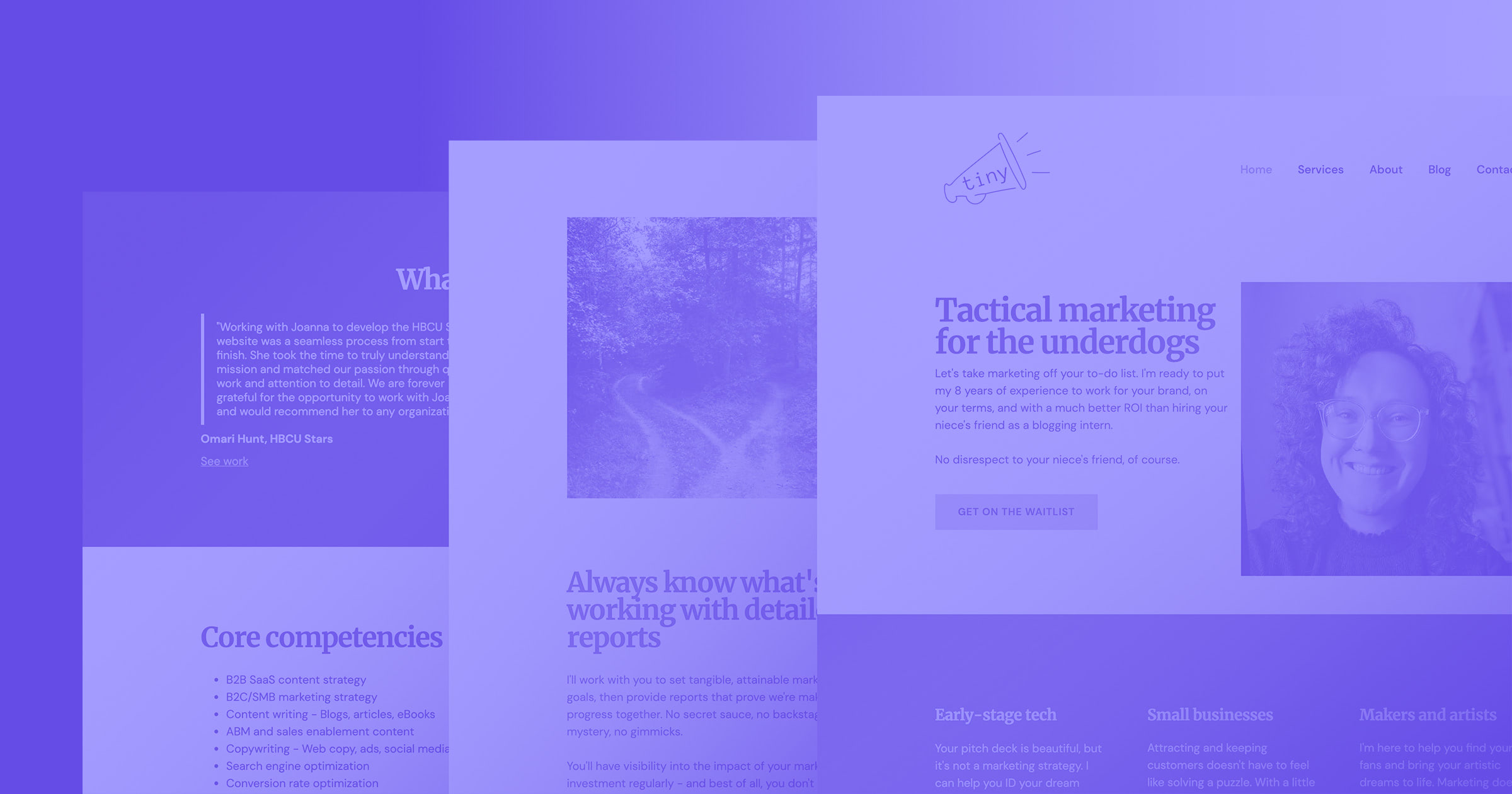
When I started my small business marketing consultancy Tiny Megaphone earlier this year, I knew I needed something more robust and more customizable than my comfort-zone web builders could allow. Plus, the narrow design constraints I once considered helpful had begun to bore me.
Frankly, WYSIWYG builders have rendered most mobile-friendly websites quite cookie-cutter, to the point that I’m now able to name their templates when I see them in the wild. My brand has bold colors and an unusual style. I couldn’t let overused templates steamroll that out of me.
I wish I hadn’t spent so much of my web design life hanging out in WYSIWYG editors. I sacrificed so much flexibility and professionalism. Go with the best platform first.
Read the instructions first (trust me)
Once I knew I wanted to go with Webflow, I just jumped in — a strategy I would advise against. I skipped right over the quick start guides. This made me realize I am likely the reason why IKEA has to write a lot of legal disclaimers about sloppily-assembled furniture.
Us tinkerer types really can’t help it, though. We like bypassing the educational videos and going straight to the tool. But looking back, I wish I had taken some time on a nice rainy afternoon to snuggle up with a chamomile tea and watch all the Webflow University beginner videos like a good student. So, if you can harness an ounce of self-control, read the “instruction manual” first.


Get started for free
Create custom, scalable websites — without writing code. Start building in Webflow.
Dos and don’ts I learned along the way
My speedy Webflow baptism taught me a few lessons, which I’d like to share with you. Maybe you can avoid some of these pitfalls I got stuck in and have a smoother time. Regardless of how bumpy your ride into visual web development feels, know that you’ll came out on the other side just fine (I did).
Give yourself a head start with templates
Do: Take a look at Webflow templates. I know I just said templates steamroll out your personality. But unlike the limited selection you’ll find on other website builders, Webflow has a lovely ecosystem of designers who have built custom templates you can lift from. Most of the prices are under $100, extremely customizable, and more unique than boilerplate templates you can find elsewhere. Plus, you get to support a cool designer instead of a corporation. John D. Saunders is one of my favorite Webflow template designers.
Don’t: Settle for the first template that speaks to you. I tell my no-code web design clients to avoid choosing a template based on an emotional reaction to colors and images when I’m showing them simple mockups — but I can’t even follow my own advice, apparently. I like my template, but I’m pretty daunted by the prospect of switching it someday.
Get organized with tidy classes
Do: Create a hierarchy that will make sense to you later. “Cool H4 #7” is messy. What names will make sense to you after you emerge from your 3 a.m. design cocoon and you have to troubleshoot a malfunctioning section?
Don’t: Just jump in and start naming things willy-nilly. Sit with your design idea for a while. Before chiseling your classes into stone, consider how different elements and colors will work together. I made header text disappear multiple times because I played with text color in header classes without thinking it through. Don’t be like me.
Save a lot of time with Symbols
Do: Use Symbols. I totally ignored this tab in the Designer. Again, I skipped all tutorials and guided education — don’t be like me. Once I discovered Symbols, I realized it functions in a very similar way to section building blocks in other drag-and-drop builders. Basically, if HTML is the deep end to you, Symbols help you cling to the side of the pool and feel safe.
Don’t: Give your Symbols silly names like I did, unless it fits your brand. I called my navigation bar Magic Nav Nav and my footer is naturally called Footy Foot Foot. This makes me smile when I see it, but I have to remember not to do this for clients.
Harness the magic of Webflow CMS
Do: Get into the CMS life. The CMS function is one of the most powerful and flexible features in Webflow. CMS collections are unlike any other feature you’ll find on a web builder. A collection can be a video catalog, a traditional blog, a Team page, etc. — it’s essentially a library of grouped items that you can make appear anywhere you like, anyway you like. Cool, right?
Don’t: Expect the CMS to just turn on like a lamp. Especially if you’re trying to publish a blog post about Bob’s Burgers on a Friday afternoon before you go camping for the weekend. It does take some work to build from scratch. It’s not like logging in to MySpace to blog about your crush. You have to map CMS fields to design elements, which takes some time to get right.
Spare advice
Here are a few final dos and don’ts for your design journey:
- Beware of random widgets. I downloaded a social media widget from a third party that was, in theory, a super-easy script I could grab to drop into my Footy Foot Foot because I was too lazy to track down social media icons and size them correctly. I told you, I’m not a developer, I’m a marketer. This is how I solve problems. It ended up malfunctioning and an important client saw an error message when they tried to follow me. Yikes!
- When you Google a problem you’re having, be sure to watch Webflow University videos alongside other random YouTube design folks. I find that it helps me understand a concept to hear it explained a few different ways from different perspectives. I typically learn best through watching and replicating a task, not by reading about it.
Where I want to go from here
The more time I spend in Webflow, the longer my wishlist gets. Top of mind? I need to have a dramatic, Princess Diaries-esque CMS makeover. I want to play more with making my blog look like a polished, professional publication. This is going to take a lot of time, but it’s also low priority for now because I haven’t published a lot. I also want to add new pages for my writing portfolio, other past work, and my referral network of other freelancers I like to recommend.
And, of course, I already want to rewrite every word on the site. But that’s the life of a marketer/newbie designer anyway. The work is never done, just like my web design journey. It’ll keep evolving, changing, growing, and looking cooler every month.
I’m going to enjoy that journey, and I hope you enjoy yours, too. Start your Webflow journey right here, right now.


