


Architects and web designers share some common ground that makes for impressive website designs.
Designing a great architecture website is about more than showcasing projects — it involves creating a digital space that reflects the firm’s creativity, precision, and innovation. A well-designed website balances form and function, much like great architecture and interior design. Essential elements include clear navigation, high-quality images of architectural projects, and compelling storytelling to communicate the firm’s vision. Incorporating design principles like balance, symmetry, and hierarchy helps web design mirror the artistry and structure of architecture and offers visitors an engaging user experience.
Discover what makes a great architecture site and explore examples to inspire your own projects.
The 12 best architecture website examples in 2025
Here are 12 of the best architecture websites you can draw inspiration from in 2025:
1. Studio MEMM
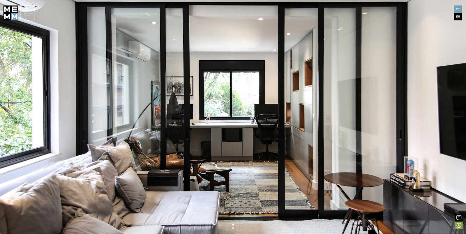
What sets Studio MEMM’s work apart is its fascination with offset shapes. They appear in many of the firm’s architectural projects, such as the asymmetrically arranged, built-in shelving units in this image. Praia Design integrated this unique style into their website design, which features several off-center squares and overlapping page elements. These elements effectively showcase the Studio MEMM portfolio and reflect their design style.
2. Wright Plus
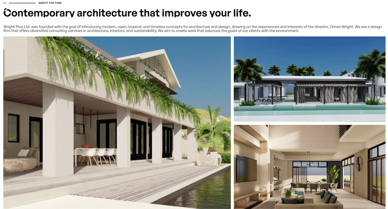
Wright Plus creates modern architecture inspired by the Caribbean lifestyle. Minimalism is a crucial part of their aesthetic, but they also sprinkle in embellishments that indicate their Caribbean roots. Caria Oldham infused this unique blend into their website layout with simple but delightful scroll effects, contrasting colors, and a modern sans-serif typeface that brings it all together.
The navigation is streamlined for simplicity, the text is large and readable, and the interactive elements are immediately apparent, all while balancing the firm’s unique design style.
3. PROCAD Designs
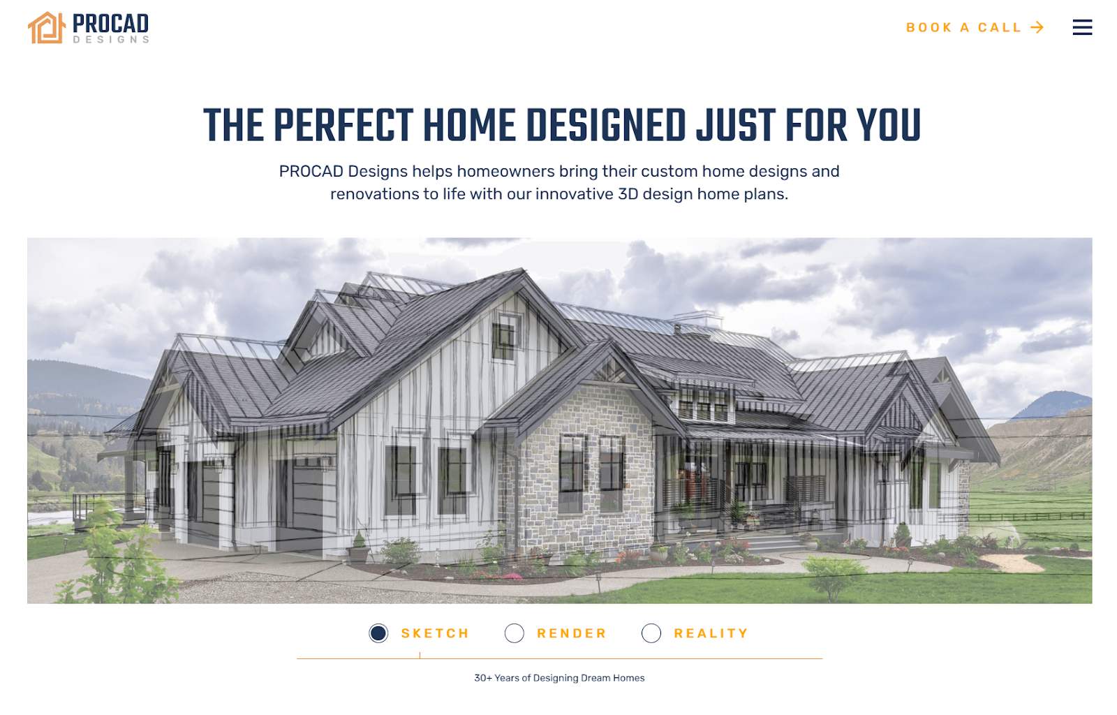
PROCAD Designs delivers precisely what their clients want: modern architectural designs and functional living spaces. They offer a powerful 3D home planning tool that lets clients and architects explore and fine-tune designs to ensure a perfect fit. KHULA placed this unique offering front and center in their website layout, mentioning it at the top of the homepage and showcasing it with interactive galleries and animations.
4. Felicity Christian Architect

Felicity Christian is a New Zealand-based architect who strives to create warm, enduring living environments in even the most challenging sites. Much of the portfolio pieces on her website feature the isolated countryside where these homes stand, demonstrating her ability to create structures that “make spiritual connections to the land.”
PDC Creative, a web design studio also based in New Zealand, highlights Christian’s unique style with a vast gallery of previous projects, glowing testimonials, and a detailed service page outlining her location-focused approach to design.
5. ArchUnion

Ukrainian architecture studio ArchUnion has a thing for glass. Their designs feature it heavily, sometimes in unexpected ways, such as in this concept piece where they use triangles to create a stunning facade.
Fellow Ukrainian Alex Alehnovich carried this fascination over to the studio’s website, where he uses glassmorphism to create interactable elements with a similarly stunning aesthetic. As a result, the website provides a clear window into the studio’s unique design style.


Build websites that get results.
Build visually, publish instantly, and scale safely and quickly — without writing a line of code. All with Webflow's website experience platform.
6. SMP Architecture

SMP Architecture is based in Florida and designs everything from restaurants and hotels to single-family homes. That versatility is one of the firm’s best features, and the website Dylan Spencer made for them highlights it with galleries that showcase chic, modern living spaces next to massive, traditional hotel lobbies. Across this website, you’ll find examples of how SMP Architecture can rise to any architectural challenge.
7. Blackbox Architectonics
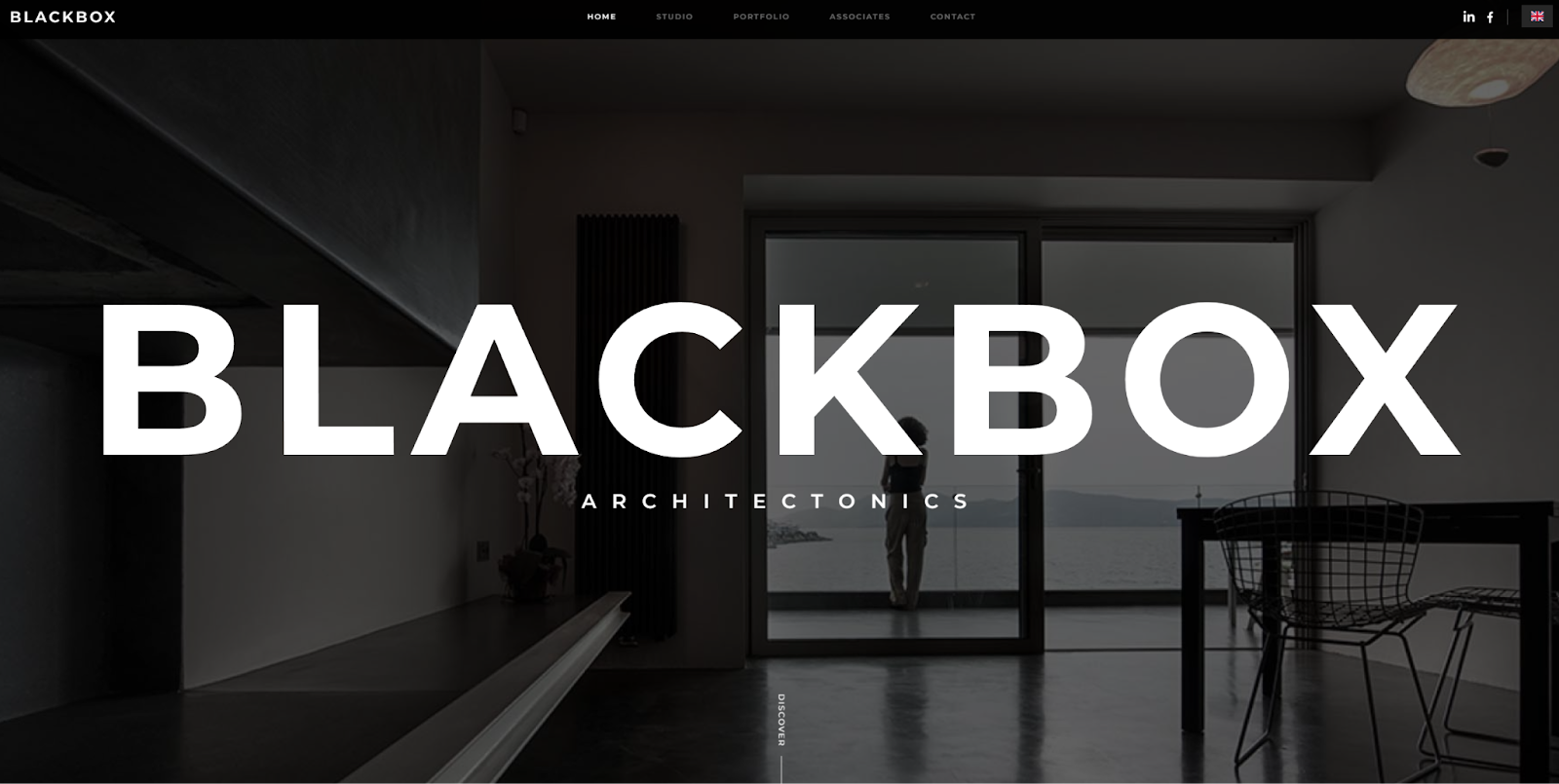
This website that Reform Digital designed for Blackbox Architectonics reflects the unique layering effect that appears in most of their architectural designs. It opens with a bold hero image and modern typography, establishing a distinctly minimalist style. As you scroll down, each row layers in a new featured work or CTA. It mixes up typical F- and Z-patterns, which works because it resembles the subject matter.
8. 988
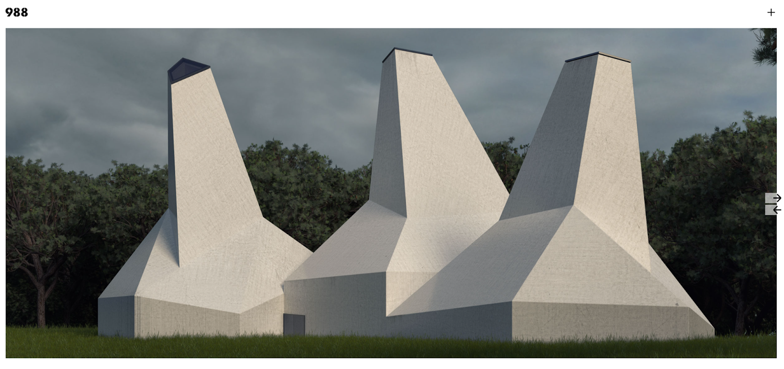
988 is a graphic design and architecture studio based in Spain that makes everything from branding and infographics to buildings.
As seen in the three-part structure pictured here, their architectural projects often favor the number three. This preoccupation carried over to the website they designed for themselves, too. Their logo consists of three numbers, there are three primary navigation options, and all their galleries consist of rows of three. Because there’s enough variety in the page layouts, this pattern doesn’t get redundant — it continuously reinforces the studio’s visual brand identity.
9. Reload Architecture
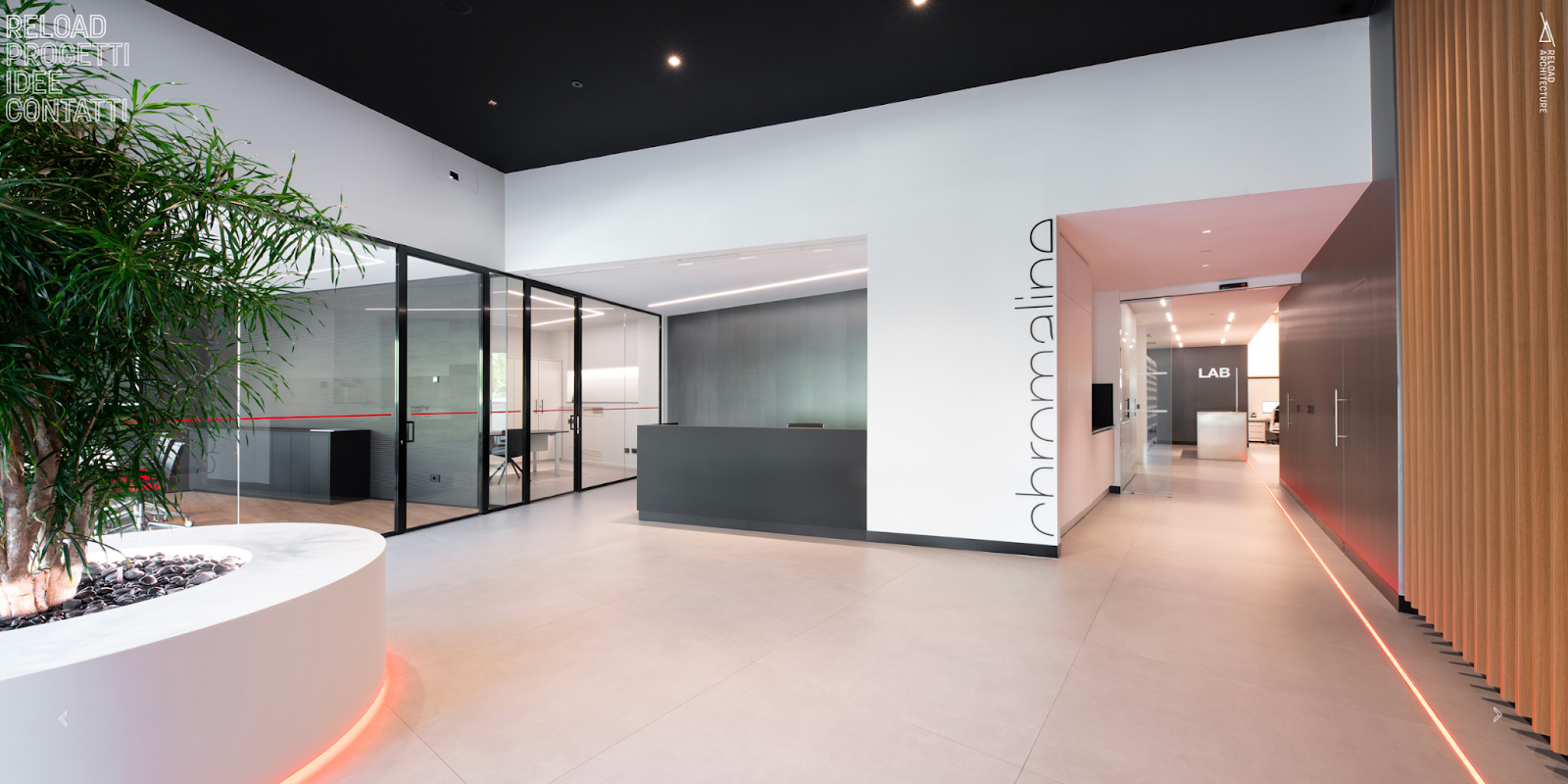
Reload Architecture is an Italian architecture firm committed to designing innovative spaces that seamlessly merge form and function. Designer Lorenzo Faroldi showcases this commitment by leveraging a minimalist design style that contains plenty of whitespace. They also use simple typefaces for both readability and to emphasize their approach to projects.
10. Gary Todd Architecture

The Gary Todd Architecture firm is an award-winning studio based in New Zealand that designs structures for commercial, industrial, and residential projects. Lucy Eru designed a site for them that provides an interactive gallery on the homepage with clickable CTAs like “Read More From Our Clients” and “Find Inspiration,” letting viewers determine their own path through the site based on what’s most relevant to their needs.
11. SPH
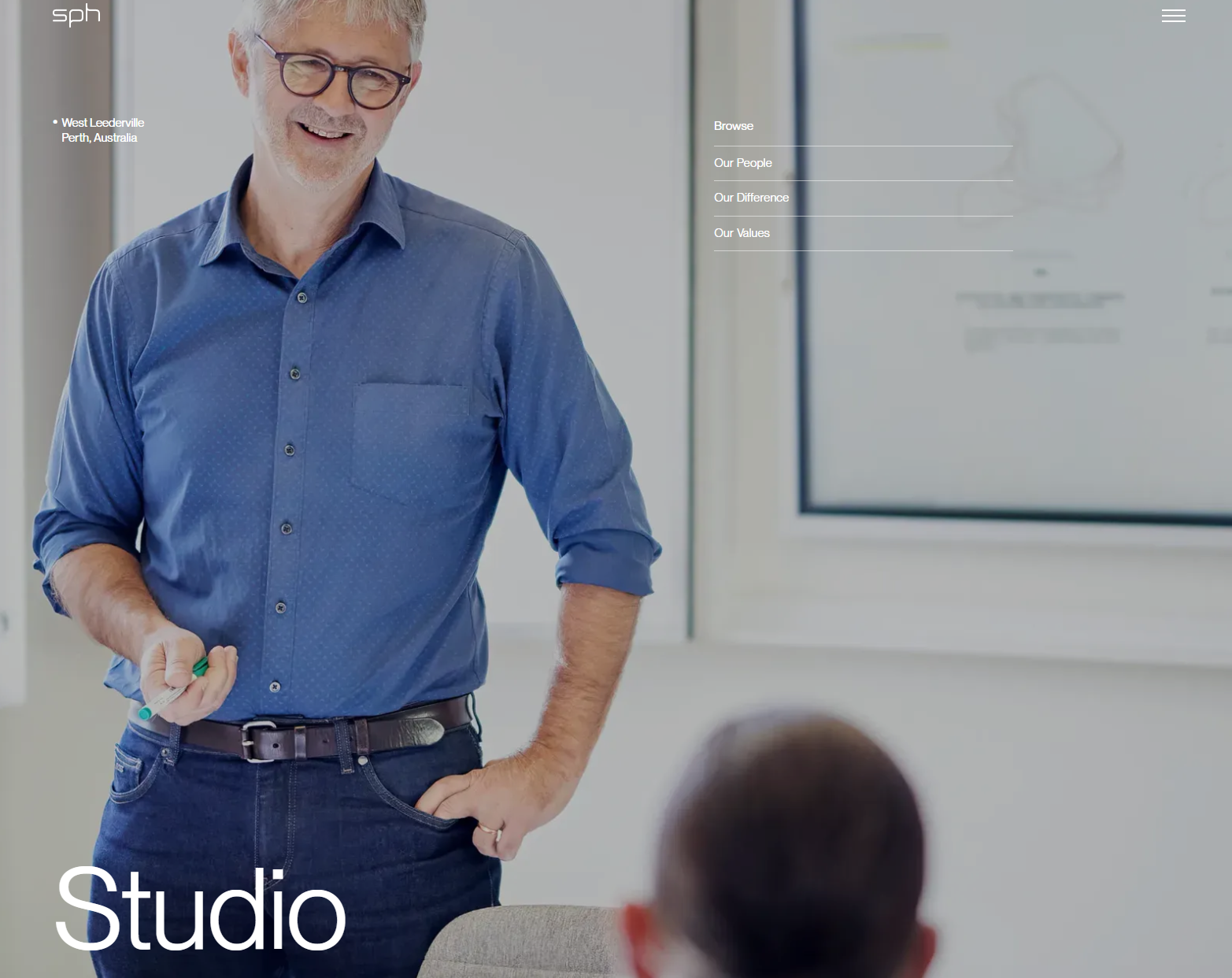
SPH is an Australian design studio that combines architectural and interior design to create spaces that “elevate everyday moments into meaningful experiences.” Their integrated design process is a key feature that they claim reduces their projects' initial and long-term costs.
Baker Creative made a website highlighting this bold promise with a detailed breakdown of their design process, team structure, and brand values. This optimizes the site for conversions by spotlighting the factors that set SPH apart from competitors.
12. SITE Architecture

The founders of SITE Architecture believe that designs tell a story, and that’s what guided Johannes Fraundorfer’s design for their website. Since it’s a single-page site, the reader experiences a beginning, middle, and end that lends itself well to telling the studio's story. Throughout the page, smooth animations pair with crisp images to showcase the studio’s commitment to evocative designs and natural inspirations.
Designing architecture websites: Best practices
Below are a few crucial principles for creating successful architecture websites for your clients.
Showcase your client’s best work
Create an interactive gallery highlighting your client’s best residential, industrial, and commercial projects. Choose buildings that demonstrate their expertise in each space. Pick diverse examples that represent their range as a designer, but make sure their unique style shines through. This is what sets them apart from other architects and designers, so ensure it’s apparent in every project in the gallery.
Layout templates provide an excellent starting point for the interactive gallery and additional pages.
2. Create a logical site structure
Include only the must-have pages the website needs and structure them under a logical navigation menu. You can get creative with where you put the menu or how users move between pages, but keep this consistent. The menu should always appear in the same place, and interactions should deliver reliable results.
3. Prioritize responsive design
Most visitors will first see your client’s website on a mobile device. Search engines also use a mobile-first approach to crawling and ranking sites. Use responsive design principles to help optimize the site for search engines and make a great first impression on visitors.
4. Mirror your client’s architectural design
Find ways to incorporate your client’s unique architectural trademarks into your website’s layouts, animations, and interactions. Look at other websites for design inspiration, but determine what sets their projects and brand apart, and visually translate those characteristics to your design.
Design a stunning digital home for your client with Webflow
Building a digital space for your client’s architecture studio requires attention to detail. You must use every opportunity to highlight their unique style and tailor the web experience to suit their target audience. With architecture websites, that often means optimizing your site’s performance with elements like high-quality images and a premium hosting platform. Luckily, a website builder like Webflow can help.
Webflow’s flexible CMS makes it easy to showcase your client’s portfolio. With customizable animations and interactions, you can create dynamic elements like hover effects and scroll-triggered designs that elevate the user experience. Try Webflow today, and craft a site that meets your client’s needs, captivates their audience, and sets their studio apart.
Build websites that get results.
Build visually, publish instantly, and scale safely and quickly — without writing a line of code. All with Webflow's website experience platform.