

Charts can provide a great visual display to your site's content, and Webflow makes it easy to add charts to your pages and CMS content.
In this tutorial, I'm going to walk through a couple examples of this in action and hopefully inspire you to do the same! Before we get started though, let's consider two basic things we could possibly chart on our sites:
- Non-Webflow content: Your data may be simple and static, for example, the amount of people who voted for a proposition versus those who voted against it. This could be represented by a simple, static pie chart. Your data may also come from a remote source, like an API your code calls to gather that information. The important distinction here is that the data does not relate to your Webflow CMS content (or is not driven by it directly).
- Charts driven by CMS data: In this case, our editors work with the CMS in Webflow Designer and when published, the charts reflect information from the CMS itself.
Let’s look at how to integrate each of these into Webflow. If you prefer to watch this guide instead of reading, you can watch the YouTube version below:
Our library of choice: Chart.js
There are numerous charting libraries built for the web, but for this tutorial, I'll be focusing on Chart.js. This is a 100% free and open source charting library that isn't too hard to use and is pretty flexible. I won't be going deep into the library and its features in my examples here, but check out the docs to get a better idea of what can be accomplished.

Starting simple: Adding a static chart to our site
Let's start simple with a static chart that comes right from the Chart.js’s Getting Started guide:
<div>
  <canvas id="myChart"></canvas>
</div>

<script src="https://cdn.jsdelivr.net/npm/chart.js"></script>

<script>
  const ctx = document.getElementById('myChart');

  new Chart(ctx, {
    type: 'bar',
    data: {
      labels: ['Red', 'Blue', 'Yellow', 'Green', 'Purple', 'Orange'],
      datasets: [{
        label: '# of Votes',
        data: [12, 19, 3, 5, 2, 3],
        borderWidth: 1
      }]
    },
    options: {
      scales: {
        y: {
          beginAtZero: true
        }
      }
    }
  });
</script>
Even if you've never seen Chart.js before, you can probably take a good guess about how it's working here. A canvas element is used to hold the chart. JavaScript creates the chart instance, pointing at the canvas element while also specifying the type of chart, how it renders, and static data. The options block specifies that the y-axis will start 0, and as I mentioned before, Chart.js is really flexible, so there is a heck of a lot more that could be specified here.
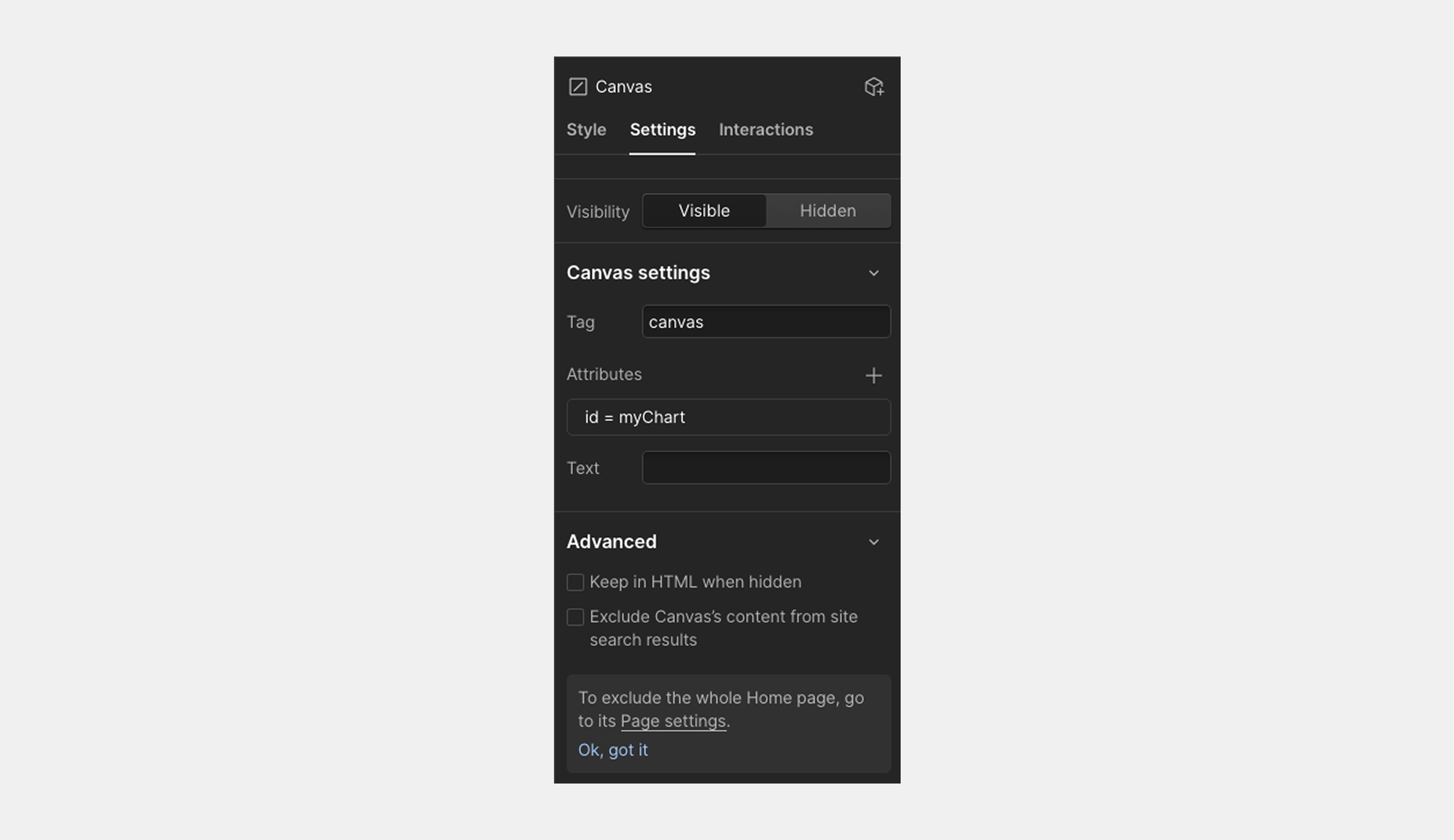
To add this to my Webflow page, I first added a custom element to my page and specified the tag as canvas. I also added an ID attribute of myChart:
Next, I added a code embed where I literally copied and pasted the sample code:
.png)
After publishing my site, I can see the chart rendered:
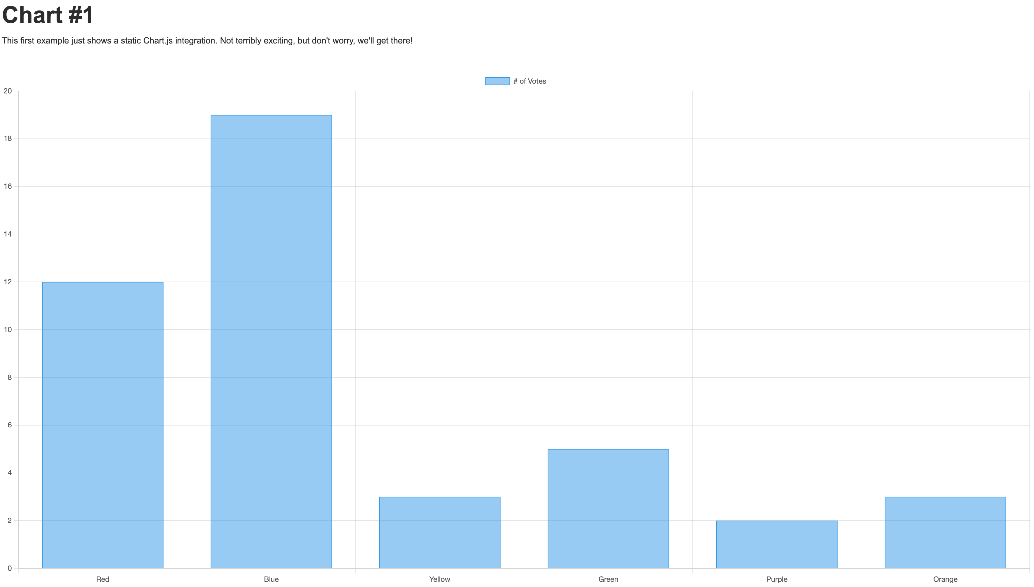
Woot! A chart! A huge chart. Yes, it's way too big, but we'll get to that in a moment. As I mentioned above, a chart like this with hard coded values still absolutely has a place on a web site. You can see this example live here.
Building dynamic data-driven charts
While there is a place for static charts, usually you'll want to chart something a bit more dynamic. There's zillions (real word, honest) of APIs out there, but one fun example is the free TMDB API. This API provides information about movies, TV shows, and more. It's pretty cool if you're a movie fan and easy enough to get started. How about a chart that simply shows the number of movies released over the past few years?
The "Discover Movie" endpoint allows you to query their database and provide date based filters. So for example, this utility function can return the number of movies released in a given year:
async function getMoviesForYear(year) {
	let req = await fetch(`https://api.themoviedb.org/3/discover/movie?include_adult=false&include_video=false&language=en-US&page=1&release_date.gte=${year}-01-01&release_date.lte=${year}-12-31`, {
		headers: {
			'Authorization':`Bearer ${DMDB_KEY}`,
			'accept':'application/json'
		}
	});

	let data = await req.json();
	return data.total_results;
}
Let's add this to our site.
The first thing I did was add a Canvas to my page, but this time I wrapped it in a div. Why? This lets me specify a height and width for the div tag so I can properly size my chart. Chart.js will "fill" the canvas (and as you saw in the previous demo, get rather large), so I can use the div to adjust the size of the chart to my liking.
Once again, I used a code embed element, with the following:
<script src="https://cdn.jsdelivr.net/npm/chart.js"></script>

<script>
const DMDB_KEY = 'eyJhbGciOiJIUzI1NiJ9.eyJhdWQiOiIyZGNlODhhMTYyMDYzNjMyZDk0Yzc4MmYwMDI4YWVmZSIsInN1YiI6IjY0Y2MxNTVkMjk3MzM4MDIwYzVjOGU3YiIsInNjb3BlcyI6WyJhcGlfcmVhZCJdLCJ2ZXJzaW9uIjoxfQ.2dr69jhhwS-weKE7ncFmR2LJCZq4lghO92XJp3jlpyg';

document.addEventListener('DOMContentLoaded', init, false);
async function init() {
	let totalMovies = [];

	// we could run these parallel for better performance...
	for(let x=2020;x<2026;x++) {
		// quick and dirty cache system
		if(window.localStorage['tmdb_'+x]) {
			console.log('from cache');
			totalMovies.push(parseInt(window.localStorage['tmdb_'+x]));
		} else {
			console.log('from api');
			let count = await getMoviesForYear(x);
			totalMovies.push(count);
			window.localStorage['tmdb_'+x] = count;
		}
	}

	const ctx = document.getElementById('myChart');

  new Chart(ctx, {
    type: 'bar',
    data: {
      labels: ['2020', '2021', '2022', '2023', '2024', '2025'],
      datasets: [{
        label: '# of Movies',
        data: totalMovies,
        borderWidth: 1
      }]
    },
    options: {
      scales: {
        y: {
          beginAtZero: true
        }
      }
    }
  });
}

async function getMoviesForYear(year) {
	let req = await fetch(`https://api.themoviedb.org/3/discover/movie?include_adult=false&include_video=false&language=en-US&page=1&release_date.gte=${year}-01-01&release_date.lte=${year}-12-31`, {
		headers: {
			'Authorization':`Bearer ${DMDB_KEY}`,
			'accept':'application/json'
		}
	});

	let data = await req.json();
	return data.total_results;
}
</script>
From the top, you can see I've included Chart.js again and then get right into my code. My API key is safe to share here as it just does read operations, nothing more (Need to hide an API key? Check out my article where I demonstrate doing that, and more, with Webflow Cloud!). I then loop from 2020 to 2025 and for each, and I'll either make a call to the API or use client-side caching with LocalStorage (If you've never seen this API before, the docs at MDN are an excellent introduction.).
The net result is an array of five numbers representing how many movies were released each year. This then gets used in the Chart.js configuration resulting in a dynamic chart ( Technically those numbers aren't changing and technically, I could simplify the code and remove the API, but you could imagine this chart being set up to always show the last five years, let people choose a genre, and more.).
As before, I'll share a screenshot:
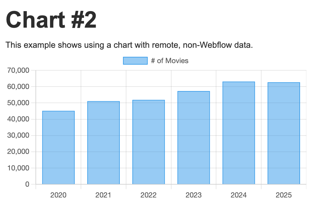
You can see this live example here.
Alright, now it's time for the big show: connecting our charts to our Webflow CMS.
Building charts with Webflow CMS data
Let's start by talking about what we want to represent in our Webflow CMS, and what we'll chart. I've created a collection item named Cat Availabilities. It's a simple CMS collection with the following fields:
- Breed
- Slug
- Count
It represents a type of cat ("Calico," for example) and how many are available for adoption. I used Webflow's built-in tool to generate some sample data for me:

If we want to chart this, we need to find a way to get the "raw" CMS data to the JavaScript charting library. How do we do that?
One way would be via custom code. A few weeks ago I shared on our blog how you can use Webflow Cloud for just that purpose: "Expose your Webflow CMS with a simple API." This works well, but does require a bit of code to set up and manage. Instead I'm going to use a technique I learned from Alex Iglesias of Finsweet. His technique makes use of a CMS collection list that outputs data, not text. Let me demonstrate.
On a new page, I began by adding a Collection List element bound to my Cat Availabilities collection. Then, in my Collection List/Collection Item block, I added a Code Embed element.
That code embed runs once for each item in my CMS and needs to expose its data in a way that my JavaScript can pick up on later. For this, I'm using an embedded JSON block. Here's an example:
<script type="application/json">
  {
    "breed":"Calico",
    "count": 5
  }
</script>
To make this dynamic, I used the Add Field function and selected my two properties:
.png)
For my small set of CMS collection items, this is how it's rendered when published:
<div role="listitem" class="w-dyn-item"><script type="application/json">
{
"breed":"Sphynx Cats",
"count":3
}
</script></div></div><div role="listitem" class="w-dyn-item"><div class="w-embed w-script"><script type="application/json">
{
"breed":"Bengal Cats",
"count":15
}
</script></div></div><div role="listitem" class="w-dyn-item"><div class="w-embed w-script"><script type="application/json">
{
"breed":"Maine Coon Cats",
"count":5
}
</script></div></div><div role="listitem" class="w-dyn-item"><div class="w-embed w-script"><script type="application/json">
{
"breed":"Siamese Cats",
"count":8
}
</script></div></div><div role="listitem" class="w-dyn-item"><div class="w-embed w-script"><script type="application/json">
{
"breed":"Persian Cats",
"count":12
}
</script></div>
Now we need to get these elements, parse them into data, and pass them to Chart.js. For this, I went to my page settings and started working in the Before </body> tag area. Grabbing and parsing those blocks is pretty simple:
let catInfo = [];

document.querySelectorAll('script[type="application/json"]').forEach(c => {
  catInfo.push(JSON.parse(c.innerText));
});
I start with an empty array and then use querySelectorAll to grab all of the JSON blocks. For each block, I get the text, parse the JSON and append it to my array. At that point, it's a simple matter to pass it to the chart again. Here's the entire code block:
<script src="https://cdn.jsdelivr.net/npm/chart.js"></script>
<script>
document.addEventListener('DOMContentLoaded', init, false);
async function init() {

	let catInfo = [];

	document.querySelectorAll('script[type="application/json"]').forEach(c => {
		catInfo.push(JSON.parse(c.innerText));
	});

	console.log(catInfo);

	const ctx = document.getElementById('myChart');

  let labels = []; let data = [];
  catInfo.forEach(c => {
    labels.push(c.breed);
    data.push(c.count);
  });

  new Chart(ctx, {
    type: 'bar',
    data: {
      labels,
      datasets: [{
        label: '# of Cats',
        data,
        borderWidth: 1
      }]
    },
    options: {
      scales: {
        y: {
          beginAtZero: true
        }
      }
    }
  });
}
</script>
And how does it look?

And again, if you want to see this live, click here. If and when the CMS data is updated and published, the chart will reflect the new values.
So to recap, we've covered three different ways to build charts with Webflow. Here's a quick cheat sheet for easy reference.
Start building your own charts!
As I mentioned in the beginning, my use of Chart.js in this demo is pretty simple. I didn't worry too much about sizes or colors and such. The library absolutely will let you adapt and optimize for your site to best match your designs. Many different chart styles are supported and you can add deeper interactions as well. Let us know what you build and share your examples in our new developer community.


Content management, meet visual design
Create the content structures you need, add content (by hand, from a CSV, or via our API), then design it visually. Finally, a content management system that works for editors, designers, and developers.