

It's one thing to build a design system, but it's another to see it successfully adopted throughout the engineering organization.
Without any observability in place, how do you know that the design system is being used effectively or even used at all? How do you monitor adoption? How do you decide what to focus on next?
Design systems boost engineering productivity, help create a consistent and accessible UI, build customer trust, and centralize design decisions in one place. Yet despite all the many benefits of using a design system, companies often struggle to get their design system off the ground. The design system may gain adoption with a small subset of users or in a few areas of the product, but it may not get the universal traction that creators of the design system are hoping for.
There’s a lot you can do to ensure that your design system is successful, but one of the key ingredients to success is being able to see how your design system is being used. A member of the Design System team may be interested in questions like:
- Who is using the design system?
- Where in the app is design system adoption the highest? The lowest?
- What’s going well with the design system?
- What are people struggling with when using the design system?
- Does our design system have the right components that people need?
- Are people using the defaults that our design system provides, or are they commonly opting out with various style or behavior overrides?
At Webflow, we’ve built observability tooling that helps us answer all of these questions and more.
We use an internal design system called Spring, which we created in 2022 and have used for the last three years and counting. Spring includes our component library as well as our foundational design aspects like color palettes, theming, sizing, typography, and spacing scales.
Crucial to Spring’s success has been the observability tooling that we’ve built alongside it. Our dashboards, workflows, and in-app tools help us get the right insights at the right time to help ensure that our engineers are getting as much benefit from our design system as they can.
The tools we use
One of the mantras on our Design System team is “scrappy not crappy.” We find creative solutions to problems to get the job done. The solutions may sometimes be simple or even feel under-engineered, but we don’t cut corners on quality.
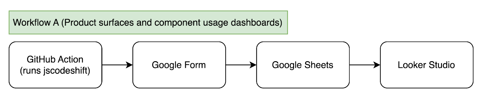
Much of our design system tooling is built on a combination of Google Forms, Google Sheets, and Looker Studio. Google Forms aren’t just for user-facing forms — they can also record data programmatically through their API. Data recorded in Google Forms can be automatically sent to accompanying Google Sheets, and data in those spreadsheets can then power dashboards built in Looker Studio.
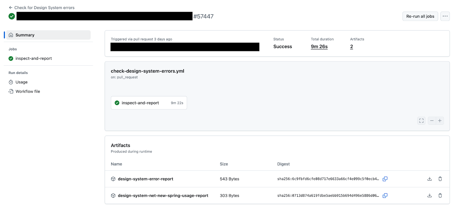
Some of our tools integrate with our continuous integration (CI) process in GitHub. For example, we use GitHub Actions and a jscodeshift script to analyze individual pull requests.
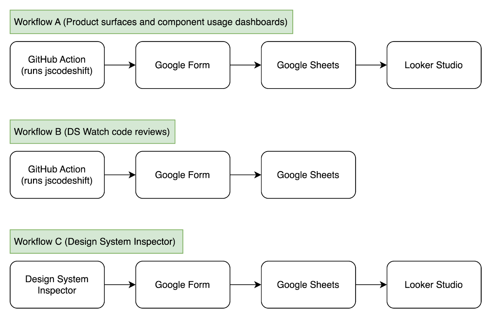
Finally, we’ve even built a custom in-app visualization tool that highlights what components and systems are being used throughout various areas of our product.
Let’s dig into some of these systems now.
Measuring adoption across product surfaces
The first dashboard we’ll look at shows Spring adoption across product surfaces. The Webflow app can be broken down into several different “product surfaces,” or main areas of our product. Three key ones that we wanted to focus on were the Designer, Dashboard, and Marketplace.
(Note that as Webflow has evolved to be a multi-product app that encompasses more than just site design, we no longer refer to the tool externally as the "Designer" but instead just as "Webflow." For historical accuracy and to avoid confusion, we'll continue to refer to it as "Designer" throughout this blog post.)
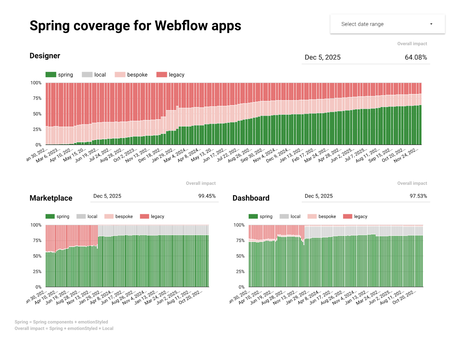
When we first built these Looker Studio dashboards three years ago, our product was undergoing some exciting changes. Dashboard was being migrated from AngularJS to React. Designer was getting a major UI refresh. Marketplace was being migrated to Next.js.
The Looker Studio dashboard you see above tells an interesting story: For brand new product surfaces like Dashboard and Marketplace, our design system Spring was being used quite successfully! 99.45% of Dashboard and 97.53% of Marketplace is being powered by Spring.
For product surfaces like Designer that include over a decade’s worth of code, adoption happened more gradually. Existing code was able to be migrated to use Spring in some places, and new features within Designer continue to be able to be built using Spring. But there still remains a significant part of Designer that is using legacy design systems that existed before Spring was created. Over the past three years, Spring adoption has grown from 0% to 64.08%. It’s great progress, but we still have more work to do.
We gather this data several times per day with a GitHub Action that runs on the main branch of our monorepo. This GitHub Action does a static analysis of the code using jscodeshift. Typically, you’d see jscodeshift used for codemods, scripts that traverse the abstract syntax tree (AST) of your code, make modifications, and then re-compile your code. In this case though, we use jscodeshift to traverse the AST, gather data on our component usage, but then not modify anything. Instead, it’s purely used for data collection.
The results of this codemod are sent to a Google Form through its API, that data is appended to a spreadsheet, and that spreadsheet integrates with Looker Studio.
Observing component usage
Let’s look at another Looker Studio dashboard. This one shows component usage throughout our app. It’s not so much one dashboard, but a series of several dashboards, one for every major component in our design system.
For example, here’s a dashboard for our Popover component:
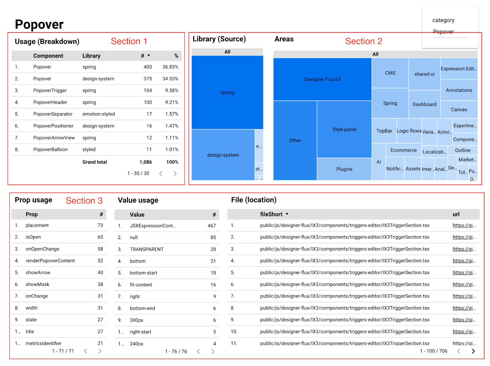
The table in the top-left (Section 1) shows all the different Popover components that we have. Most notably, we see that both our current design system and our legacy design system have a Popover component. We can see component counts for each.
The tree map in the top-right (Section 2) shows us all the areas of our product in which a Popover is rendered. The tables at the bottom (Section 3) show us which props are used with Popover, which prop values are used, and even specific files in which Popover is used, complete with links to the files in GitHub.
All of this information is tremendously useful in answering questions like:
- Which Spring components are being used most often?
- Which legacy components are still heavily used throughout our app and need to be migrated?
- Where are these components most commonly used?
- What props are most commonly used with these components?
- What prop values are most commonly used with these components?
- Are there any invalid prop values being used that snuck through our type system?
All of the charts and tables seen here are interactive, so you can click on them to filter down to view specific information you’re interested in. Consider the following dashboard we have for our Button component:
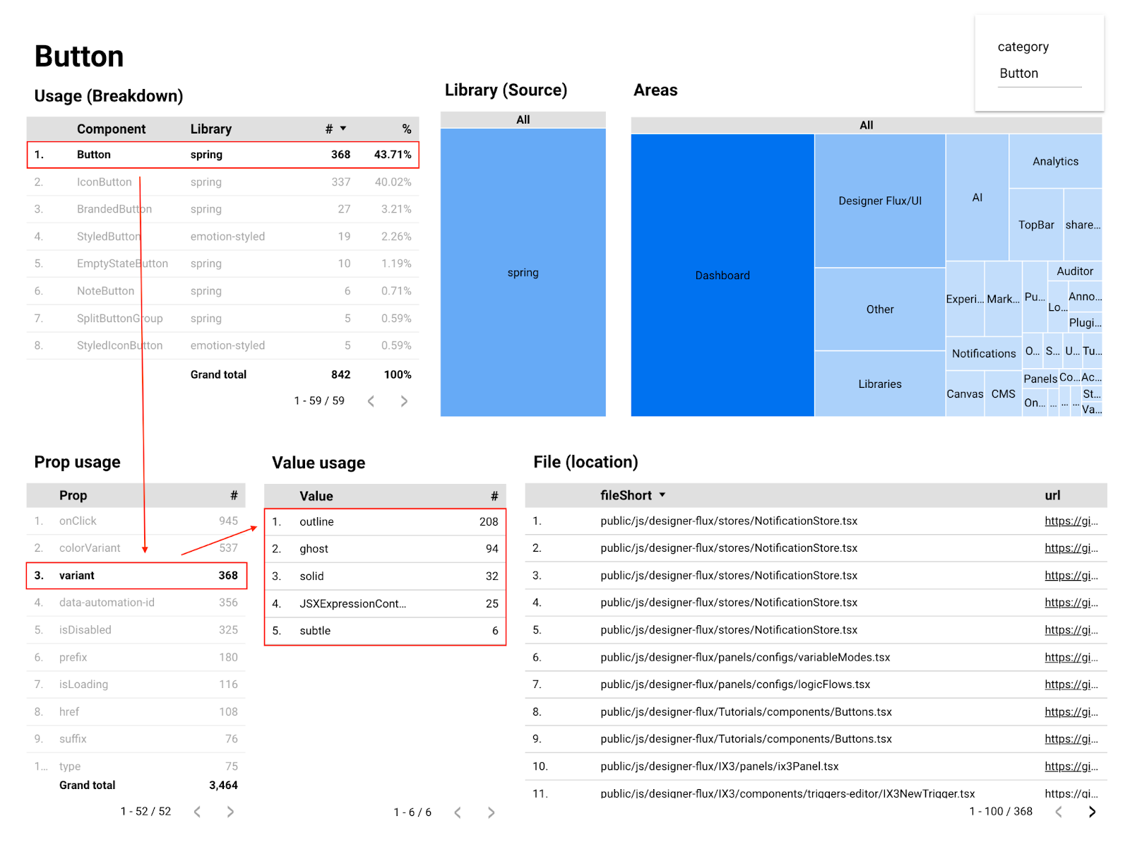
Here we’ve drilled down to look at just Spring Button components, specifically the variant prop used on our Button component. Our buttons default to using a solid variant, but we offer options for other styles that we call outline, ghost, and subtle.
According to the data shown here, when people do choose an alternative button variant style, it looks like outline is the most common choice.
We also see 32 instances of solid being used, which should be unnecessary since that’s the prop’s default value. Thanks to this data, we now have insights into some Button instances we could clean up if we’d like!
All of the info in these dashboards are gathered through the same setup as our product surfaces dashboard we saw earlier — a GitHub Action runs periodically on our main branch; jscodeshift traverses the code to gather data on each component import, props, values, and file location; the data is submitted to a Google Form, then to a spreadsheet, and then ends up in Looker Studio.
Pretty neat!
Gaining insights into design system usage
We’ve looked at a few dashboards so far. Let’s consider another aspect of our observability tooling — gaining insights into how our engineers are actively using the design system.
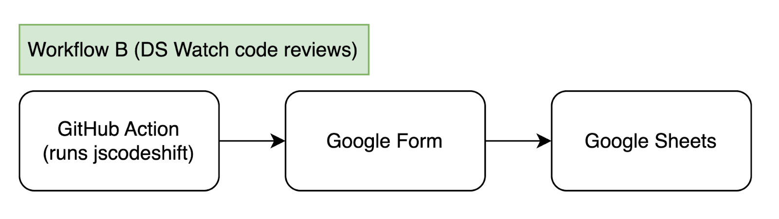
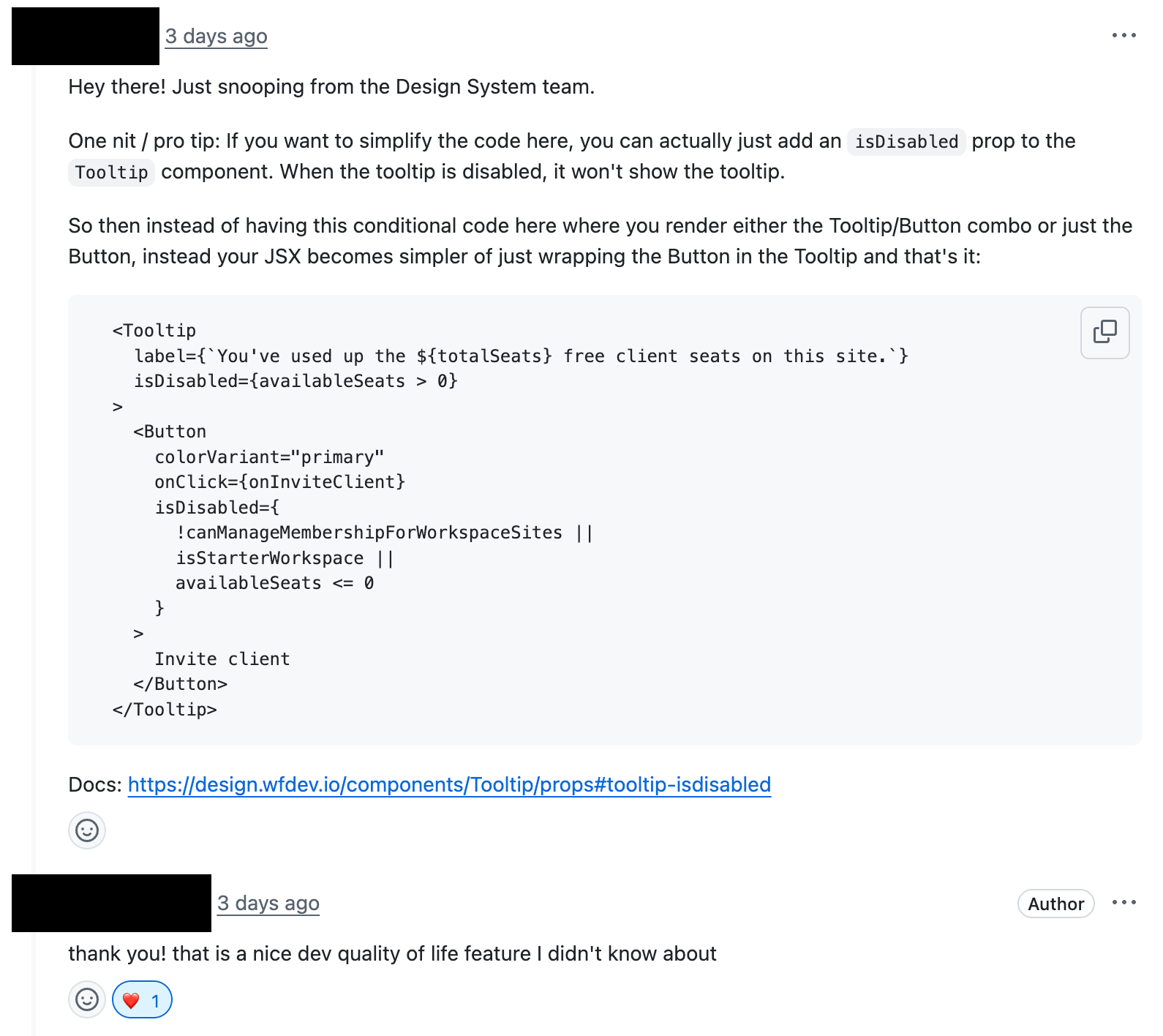
We have a GitHub Action that we’ve named “DS Watch.” It runs on every pull request (PR) as part of our CI process. This GitHub Action also uses jscodeshift to traverse and inspect the code, but this time it only runs through the git diffs for what’s actually changed in the PR. The script then looks for specific violations, like using hard-coded color values instead of design tokens, or using style overrides to change the appearance of components.
These violations get logged through — you guessed it — a Google Form via the API that then appends the data to a spreadsheet. This spreadsheet doesn’t go into a Looker Studio dashboard this time though. Instead, a member of the Design System team reviews the new spreadsheet entries each day. If it appears that the logged issue is indeed a violation, the Design System team member will reach out to the code author on their PR in GitHub to provide some guidance.
The DS Watch program is helpful for a few reasons.
First, it allows us on the Design System team to meet engineers where they are. Engineers are already submitting pull requests and getting code reviews, so why not jump into the process right there and then? This allows us to catch potential issues in real time before they make it into our codebase.
Second, it gives us greater insights into how engineers are using the design system. Looking at the data entries, we can ask ourselves, “Is there anything in particular that several engineers seem to be struggling with? Any repeated mistakes?” When we find these patterns, that’s often a sign that we need to improve something in our documentation or in our TypeScript types. Better documentation makes it more clear what the correct intended usage is, and improved types help prevent blatantly incorrect props or values from being used at all.
Third, the DS Watch program allows us to build relationships with other engineers throughout the company. We joke that we have eyes and ears everywhere, spying on the organization. Jokes aside, this kind of observability hopefully feels less like “Big Brother” and more like a friendly coworker who is always willing to offer help when you need it.
We should also note that this kind of program won’t scale forever as our company continues to grow. Even over the last year as our hiring pace has increased, we’ve sometimes felt ourselves stretched thin in doing these kinds of reviews. The script helps in identifying just the small subset of PRs that need our attention, but even then, it can sometimes be a large amount.
We’ll continue to refine our automated solutions through TypeScript types, ESLint rules, codemod scripts, and AI code reviewers. Even so, these tools should be supplementing rather than entirely replacing the human element.
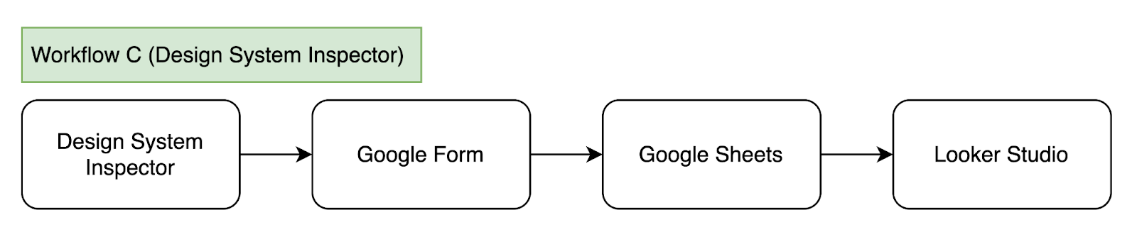
Visualizing the app with the Design System Inspector
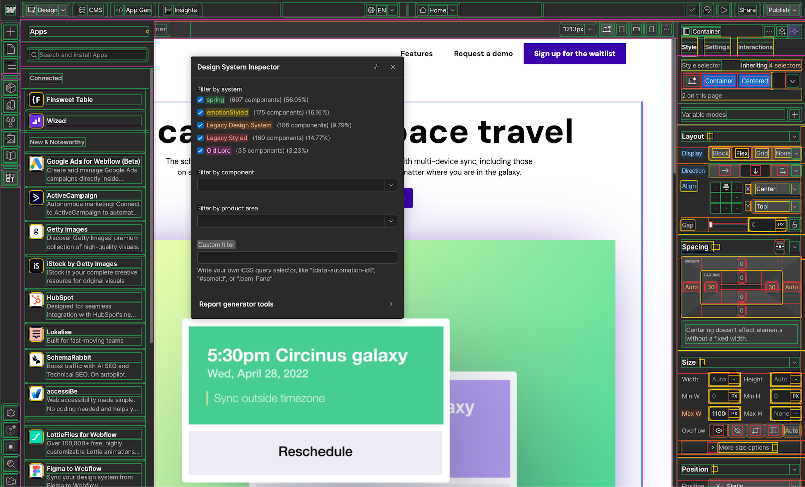
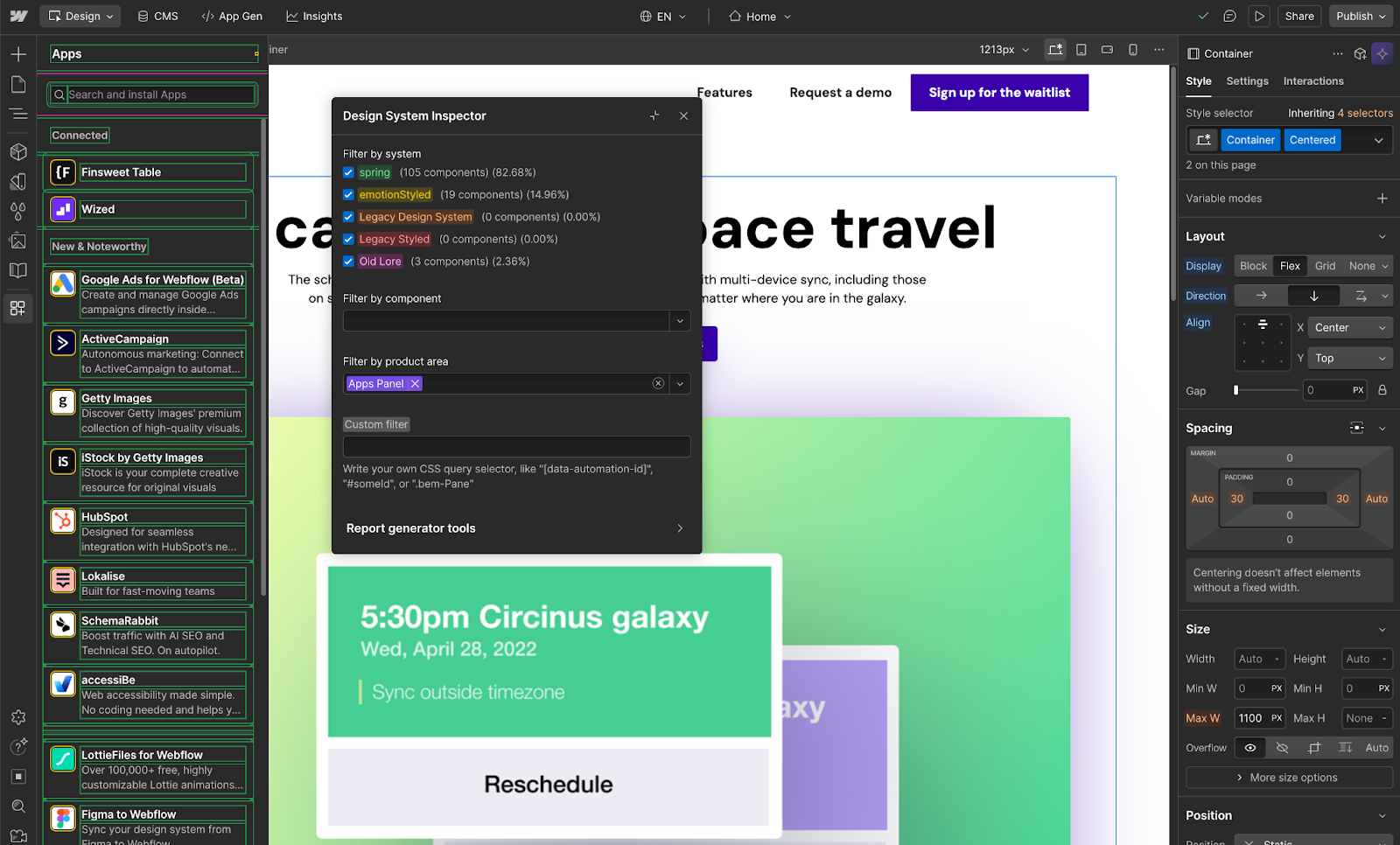
The last tool we’ll look at is a custom in-app visualizer that we call the Design System Inspector. This is an internal-only tool that can be opened on top of the Designer. When the tool is in use, a dialog appears along with an overwhelming number of color-coded highlighted outlines on the page.
The Design System Inspector allows you to see what system each piece of the UI is from:
- Spring, our current design system (highlighted in green)
emotionStyled, our current styling override system (highlighted in yellow)- The legacy design system (highlighted in orange)
- The legacy styling override system (highlighted in red)
- The oldest design system components, which we’ve endearingly called “old lore” (highlighted in pink)
The Design System Inspector dialog allows you to filter by system, component, or product area. For example, in the screenshot below, we’re restricting the highlights to just the Apps Panel.
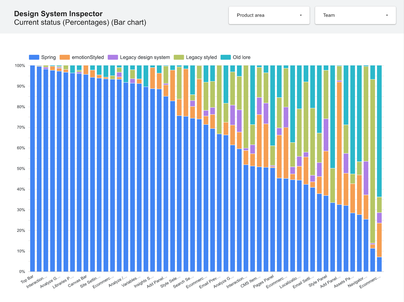
We mentioned earlier in this blog post that the Designer is currently made up of about 64% Spring components, when measured through our static analysis script. The Design System Inspector now gives us an alternative measurement, checking during runtime for what components are actually rendered on the page at any given time.
The Design System Inspector becomes a very useful tool for teams who are wanting to migrate more of their areas to use more Spring. These interested individuals can do some ad hoc explorations to find where they might have the greatest impact in updating pieces of their UI.
Most recently, we’ve started using the Design System Inspector not just for manual ad hoc explorations, but also for sending data to Looker Studio. In doing so, we can get snapshots of the app to show the current state of design system usage, not just by product surface, but also by specific product areas within the Designer:
Conclusion
We hope you’ve enjoyed this tour of some of our design system observability tooling. Perhaps it will inspire you with some ideas for how you can gain greater insights into how well your own design systems are being used.
This tooling has been an incredible benefit to us on the Design System team. Besides just being interesting to us, it’s helped us through many collaborative conversations across the engineering, product, and design organization.
You want to see how well our design system is being adopted? Let us show you.
You want to see which components are being most used, and how? Let us show you.
You want to know what engineers are struggling with? Let us show you.
You want to see what areas for growth there are, or where we should focus our efforts next? Let us show you.
Data wins, and having the right observability tooling in place gives us the right insights we need at the right time.


We’re hiring!
We’re looking for product and engineering talent to join us on our mission to bring development superpowers to everyone.