

FAQ pages answer questions about your brand before website visitors even think to ask.
A frequently asked questions (FAQ) page is a section on your website that answers common questions about your business or product. Most FAQs are organized around visitor goals — whether that’s comparing options, understanding how your product works, or solving a problem with a specific feature.
FAQs improve the user experience (UX) by helping people help themselves and making visitors more confident in moving toward conversion. FAQs are also great for search engine optimization (SEO) and answer engine optimization (AEO), since they include concise, practical information that’s easy for bots to understand and index.
Read on to find out how to create effective FAQs for your website, and explore the best FAQ website examples to learn from.
What’s an FAQ page?
An FAQ lists concise questions and answers and is designed to share basic information with website visitors so they don’t have to search for those details. Most FAQs focus on practical information such as features, pricing, troubleshooting, and policies.
To avoid overwhelming visitors, it’s best to keep your FAQ answers short. Many websites also link out to resources — such as blog posts, documentation articles, or product pages — for people who want to learn more. The goal is to help people find what they need on their own when possible, lowering barriers to conversion and freeing up support time.
Why do FAQs matter?
FAQ pages remove uncertainties and frustrations that stop visitors from taking action on your website. The benefits of including an FAQ section are:
- Improved customer trust. An FAQ answers key questions in seconds, which keeps people moving forward and shows them you understand what they’re looking for.
- More efficient support. With an FAQ handling common queries, your Support team spends less time on repetitive messages and more time on conversion and customer experience.
- Better SEO. FAQs are perfect for AI search engine crawlers, since they explain important information clearly and concisely. This helps AI systems understand what your website offers and show your pages to more relevant audiences.
How to make an FAQ page: 4 steps
Here’s how to build informative FAQs for your website.
1. Identify common questions
The best website FAQs focus on questions customers actually ask, not internal assumptions. Refer to your help desk or customer relationship management platform and collect real queries from support tickets, chat logs, social media posts, and contact form submissions.
Then, group the questions into categories and pick the ones that show up most often. Combine them when possible — if people ask a lot of different questions about whether Product X has particular features, you can group them under a heading like “What features does Product X have?”
2. Determine structure and layout
FAQs are meant for quick help, so they should have readable and user-friendly structures. You don’t need a complex layout — group questions by topic, add a clear table of contents or category tabs, and keep answers short with links to other pages where needed.
If you’re including a lot of questions, consider an accordion-style layout to keep the FAQ organized and take up less space. Collapsible categories like “Billing” and “Security” let visitors jump straight to what they want without having to scan through a wall of text.
Elements such as clear headings, generous spacing, typographic hierarchy, and obvious microinteractions for accordions or links also keep answers visually digestible. Use short paragraphs or bullet points when appropriate, and add dividers between sections so readers know where topics begin and end.
3. Provide live support options
An FAQ page should reduce support requests, but it shouldn’t trap people if they have unique concerns. Live support options catch high-intent visitors when they’re ready to take action and prevent frustration when the FAQ doesn’t cover edge cases.
For example, you might add a prompt like “Still need help?” at the end of your FAQ and include a contact form or support email address. You can also share response time estimates to set realistic expectations and include a chatbot for instant answers or support triage.
4. Regularly update FAQ content
FAQ sections become outdated quickly as customer questions and product offerings change, and incorrect answers create new issues. Set a regular FAQ review cadence and add new questions as they become relevant.
Best practices for an effective FAQ page design
These best practices help visitors find answers fast and make your FAQ easier to update.
Create clear categories
Obvious categories keep your FAQ organized and reduce cognitive load. The categories you choose should suggest clear paths based on user intent, whether that’s to learn about billing policies or understand how your product differs from the competition. Use plain-language labels to ensure the organization is clear and simpler to localize with translation tools.
Order the categories based on what people ask about most so that visitors are more likely to find what they need without scrolling all the way down. Try to keep FAQ categories consistent with your site’s overall navigation, ensuring visitors can move smoothly from FAQ details to relevant information on other pages.
Highlight the most important questions
Even though an FAQ covers common questions, a few entries may stand out as the most popular. Showing those first saves visitors time, so consider adding a “Top questions” section at the top of the page. If you’re not sure what entries to feature, you can use heatmapping tools to test your FAQ and see what gets the most attention.
Keep the FAQ design simple
A clean, nonintrusive layout helps people scan your FAQ fast. Don’t add unnecessary elements, such as animations or distracting backgrounds, that make the page noisy. Many good FAQs use a single-column layout, generous spacing, and a visual hierarchy that logically flows from heading to content.
Write clearly and concisely
People don’t read FAQs from top to bottom — they scan them to find what they want to know. Concise writing helps visitors get what they need and move on. Start each answer with a clear sentence that answers the question, and add only essential details after that. Break long answers into short paragraphs or bullets, and if a full answer is too complex, summarize it and add a link to a deeper page.
Include a search bar
If your FAQ has more than a dozen or so questions, add a search bar that returns answers based on specific keywords. This is a useful shortcut for repeat visitors and anyone with a clear idea of what they’re looking for.
Ask for feedback
Feedback tells you what’s confusing about an FAQ’s current answers and what it’s missing. To help visitors share their thoughts, add a lightweight prompt like “Did you find what you were looking for?” with a simple yes/no button and an optional free-response field. Route responses to a tagged inbox so that you can review them to spot patterns.
When should you create an FAQ page vs. an FAQ section?
An FAQ can be a dedicated page or a section within an existing page. The best approach depends on how people will browse the site and how much detail they’ll need before taking action.
Standalone FAQ pages
A dedicated FAQ page works best when your target audience has a broad range of common questions because it offers more space for multiple categories. From an SEO perspective, a separate page also gives you a hub you can link to from other key pages and support touchpoints, directing everyone to the same answers.
Embedded FAQs
Embedded FAQs are useful when the questions are tightly tied to a specific page’s goal. FAQs can be helpful on feature pages, solution pages, pricing pages, and landing pages. Embedding the FAQ keeps visitors in the page’s flow — they can scroll, have a moment of doubt, and get an answer without leaving the page or losing the narrative.
Combining both approaches
You can also use both types of FAQs to build a larger support strategy. For example, you might use a standalone FAQ to cover a broad set of questions and smaller FAQs that are specifically relevant to key pages.
To avoid repetition, write the embedded FAQ answers in a way that’s relevant to the solution or topic, and link to the standalone FAQ (or deeper support articles) for more context. You can think of the standalone FAQ as a central knowledge base and embedded FAQs as assistive modules.
9 examples of effective FAQ pages and sections
Here are nine FAQ examples from real websites that show how to focus on UX without compromising SEO or brand identity.
1. Real Estate Social Media App
Real Estate Social Media App’s website was designed by Golden Medina Services and has a minimal FAQ page that’s skimmable thanks to an accordion layout and lots of white space. This FAQ’s blue, white, and gray color palette matches the rest of the site, so the section feels connected to the brand’s identity.
A prominent plus sign tells visitors what’s clickable, and the answers are concise but thorough, with links to additional information. This simple but effective design reduces follow-up questions and supports fast page loading while keeping the content SEO-friendly.
Design takeaway: Add only what’s necessary to your FAQ.
2. PrivateAir
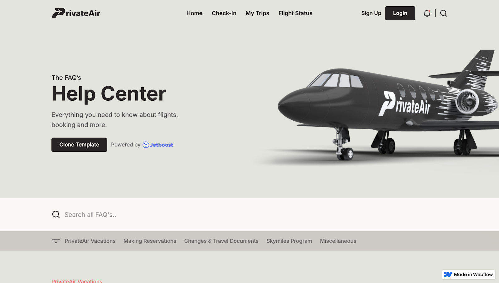
PrivateAir’s help center, designed by Jetboost, has a clear heading and a short description telling visitors what to expect from the page. Category links and a filter keep the long FAQs browsable while a search bar at the top helps people find specific information using keywords.
Each question provides subtle hover feedback, encouraging visitors to open the accordion-style answers. A muted background keeps the focus on the FAQs, and internal links lead to further support options.
Design takeaway: Use your FAQ as a skimmable support hub.
3. Space Business Centres
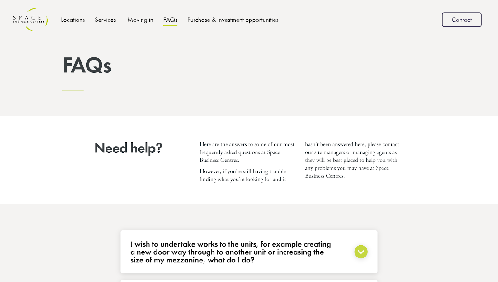
Space Business Centres’ FAQ, designed by Crafted, has an accordion-style layout that lists every question upfront, with bright green chevrons acting as obvious “click to expand” prompts. The answers are specific, including concrete details such as phone numbers, fee amounts, and notice periods. There are also embedded next-step links and forms for questions that the FAQ doesn’t fully answer.
This dedicated FAQ page offers concise answers while encouraging visitors to contact the company’s Sales team for quotes. Plus, the minimal white-and-green color combination blends in well with the rest of the site’s visual identity.
Design takeaway: An FAQ can be an effective starting point for leads, encouraging them to reach out for more details.


Want to understand how your site stacks up for AI-led discovery?
Get your free AEO maturity assessment today
4. The Excel VBA Handbook
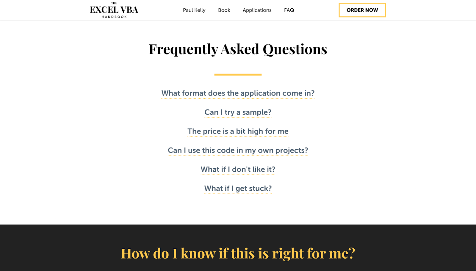
The Excel VBA Handbook’s FAQ section not only answers questions — it also nurtures leads. Designer Dmitry Kravchenko framed each question like a real search query, using plain and first-person language. The questions are highly readable, and the answers are direct but use a confidence-building tone that encourages visitors to try the product (e.g., “If you really get stuck, we can even do a Skype call.”)
Despite the initial list-like appearance, clicking on a question puts it in a separate box, so scanning feels quick and effortless. Follow-up sections labeled “How do I know if this is right for me?” and “Who this is not for” add transparency and reduce mismatched leads.
Design takeaway: An FAQ can provide answers while also encouraging conversions.
5. HatchBridge Incubator
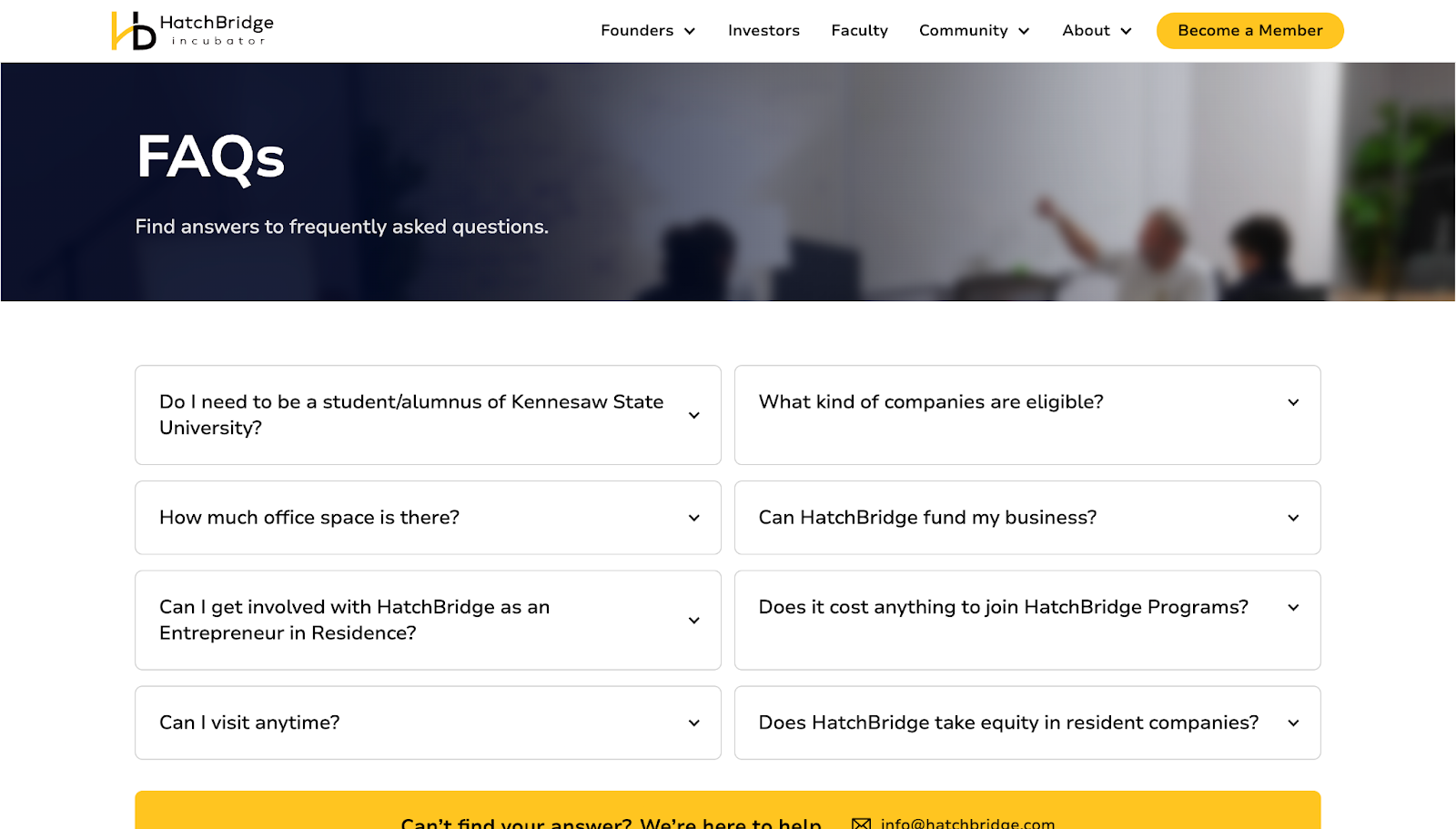
HatchBridge Incubator’s FAQ page gets straight to the point, with a simple “FAQs” header followed by an accordion-style layout that lets visitors quickly scan questions. The entries reflect real entrepreneurial concerns, such as “What kind of companies are eligible?” and “How much office space is there?”, showing that the designer did their research before choosing highly relevant questions.
At the bottom, a contrasting yellow bar labeled “Can’t find your answer? We’re here to help.” stands out, giving people a clear way to get in touch if the FAQ didn’t answer their concerns. An email address and a phone number make HatchBridge’s support readily available through multiple channels.
Design takeaway: FAQs that get results are tailored to the product and target audience.
6. Swan
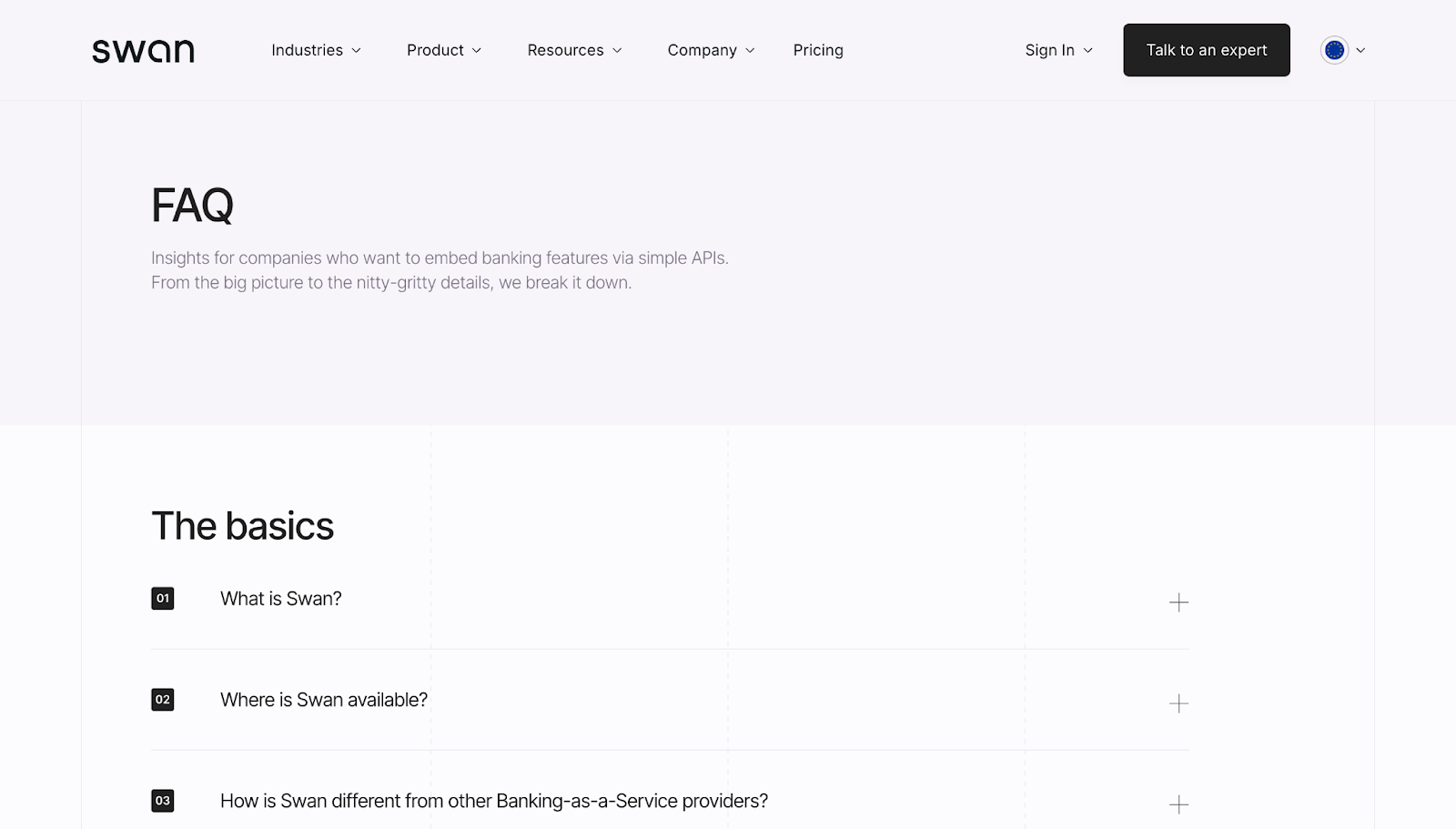
Swan’s standalone FAQ page functions like a mini help center, with a clear H1, a short description, and scannable sections covering “The basics,” “Using Swan,” and “Security.” Numbered questions and plain-language headings help with SEO and accessibility, and detailed answers provide plenty of information without taking up too much space.
There are also “Learn more” and “Talk to an expert” links to external resources for visitors who need further details. At the bottom of the FAQ, there’s a final “Talk to our team” CTA in a contrasting color to capture high-intent visitors.
Design takeaway: Clear organization and simple language put as few barriers as possible between visitors and important information.
7. Shortcut
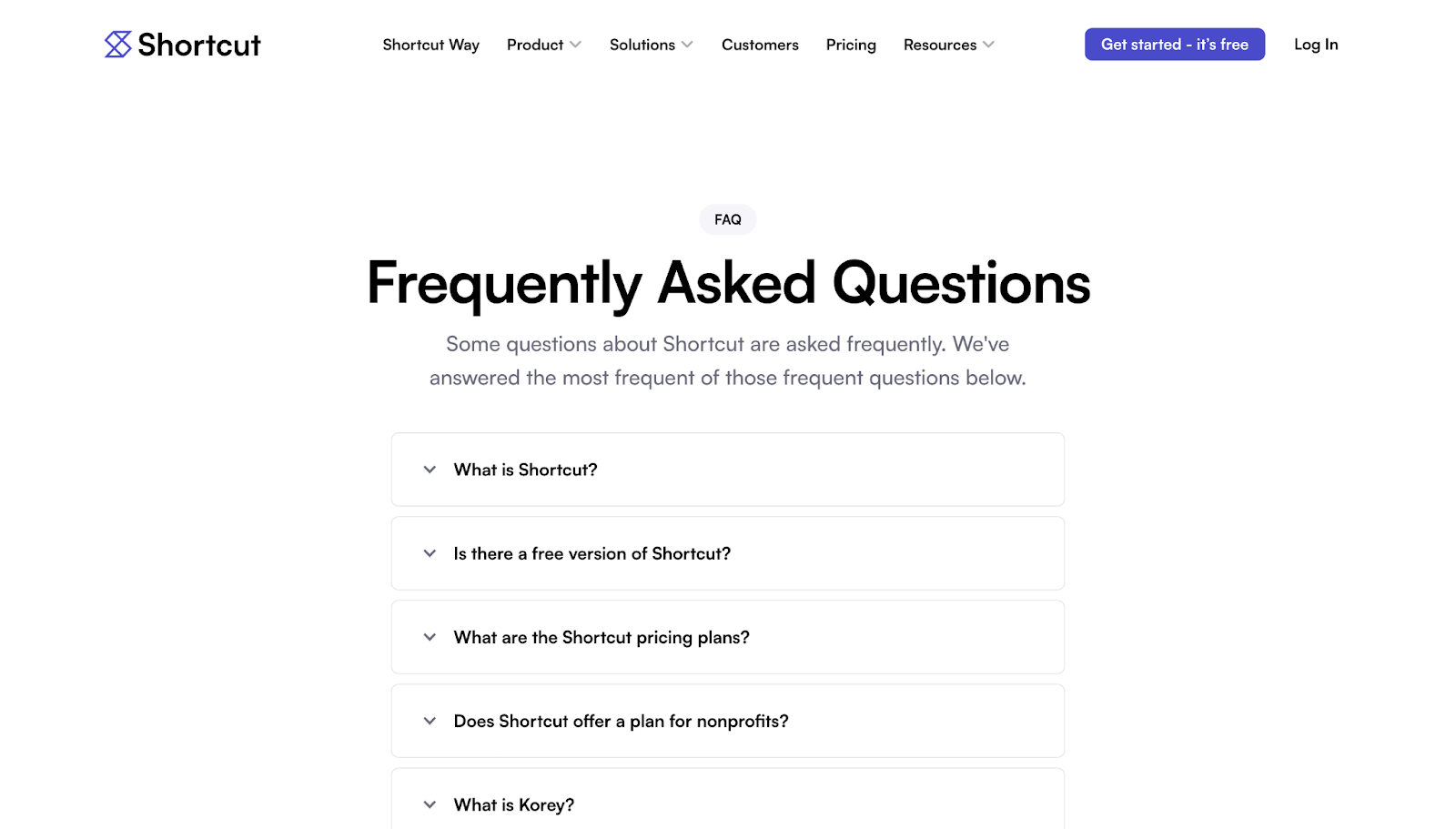
Shortcut’s dedicated FAQ page, designed by Tejus Kabadi, has a long list of questions covering a range of topics, including free versions, pricing, trials, SOC 2 compliance, and imports. Despite its depth, the page is organized into collapsible sections that are scannable for human visitors and crawlable for SEO/AEO bots. The lack of extra design elements or colors keeps the page’s focus on the answers.
The answers are specific, so fewer people have to contact support for details relevant to their situations. There are internal links for those who require more assistance or context about sensitive security topics.
Design takeaway: An FAQ can be an important step in the sales funnel, easing common concerns and sharing details that make visitors feel more comfortable with conversion.
8. Two Hands
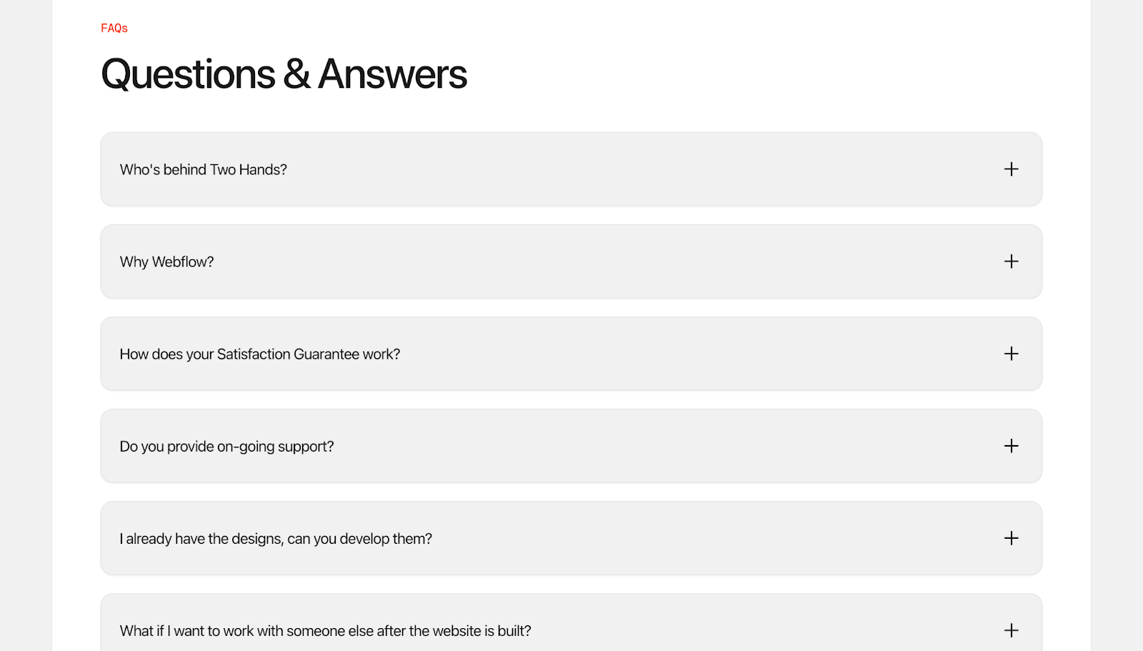
Two Hands’ FAQ section has an unusual tone that grabs attention, since the designer behind the site answers questions using the first person. This makes the FAQ read like a real conversation rather than a generic support page.
This voice builds trust faster, especially when the designer explains the creative process, timelines, and expectations from their own perspective. Visitors feel like they’re getting to know the person they’ll work with while also learning key information. The answers are direct and transparent, making the content approachable for human users and crawlers alike.
Design takeaway: A first-person FAQ provides information while enhancing credibility and giving a glimpse of the team behind the brand.
9. AirOps
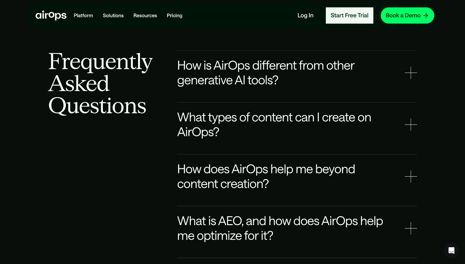
AirOps’ FAQ section is a high-contrast “pause” near the end of a long product story, with a dark-themed layout that stands out from the otherwise white page. The positioning and color contrast grab attention, as does the large font size.
The accordion-style list has plus symbols that expand each question to show the corresponding answer and turn into minus symbols to tell visitors the sections are collapsible. The answers are concise, with links to documentation, and the section ends with a prominent “Book a Demo” CTA in bright green.
Design takeaway: Color and size contrast make an FAQ stand out and give it a distinct identity.
Build FAQs that impress prospects and drive results
A well-structured FAQ page does more than answer questions — it builds momentum and keeps visitors moving through the site’s narrative. When people can quickly find the info they need, they’re more likely to trust the brand and consider conversion.
With Webflow, you can design informative FAQ pages and sections that look and function well on all devices. Use Webflow’s visual design environment to create from scratch, or pick from thousands of templates to start building a branded CX that encourages visitors to convert.
Design an effective FAQ page with Webflow.

Build websites that get results.
Build visually, publish instantly, and scale safely and quickly — without writing a line of code. All with Webflow's website experience platform.