

Turn heads (and pages) with these six digital magazine design examples.
Digital magazines offer interactive features and visually rich content that print can't match. Since the online publication industry is expected to attract over 2.5 billion users by 2029, digital content is a smart investment for businesses looking to boost clicks and conversions.
As a designer, you want to create great digital magazines for your clients that cater specifically to their audience’s needs and preferences. Discover the best magazine layout designs and learn how to create digital magazines to improve your client's reach.
What’s a digital magazine?
A digital or online magazine is an online publication that mimics a traditional print magazine’s format and structure. It's specifically designed for viewing on computers, tablets, and smartphones.
Unlike print, digital magazines have interactive features like embedded videos and animations to improve the user experience (UX). You can circulate these publications through websites and apps or as downloadable PDFs, making them accessible to a global audience.
Digital magazine design tips
Creating a standout digital magazine requires more than just great content. You need to consider visual and functional design principles to deliver an engaging UX. Follow these essential tips to create a digital magazine that stands out.
Place attention-grabbing content above the fold
The concept of "above the fold" originates from print newspapers, where the most eye-catching stories and images sit in the upper half of the front page to entice readers. This design tactic also applies to digital magazines. The first content a visitor sees makes or breaks their impression — you want to engage them right away so they keep browsing.
To catch a reader’s eye, place visually striking images, powerful headlines, or bold calls to action (CTAs) at the top of the page. Consider adding interactive elements or dynamic visuals like animations and parallax effects to engage readers from the moment they arrive on your client's page.
Use high-quality, original imagery
Captivating images and videos help your client's digital magazine stand out. Stock photos can feel generic and might not always align with the brand's unique tone of voice, so invest in custom photography and original artwork when possible to reflect your client's content.
Optimize the images for web use to maintain clarity and detail without slowing page loading times. Also consider how images fit within their surrounding elements, such as typography and CTAs. You don’t want to overwhelm a page by placing too many busy visuals close together.
Prioritize functional typography
Effective typography influences a publication or site’s personality, readability, and cohesion. A bold display font makes headlines pop, while a clean, sans-serif choice improves the body text’s legibility.
Digital magazines introduce a unique challenge: You need to ensure fonts are web-friendly. To maintain consistency and functionality across devices, opt for web-safe and universally accessible fonts.
You can also add creative touches like unique letter spacing, a modern graphic design approach that elevates typography and draws readers deeper into the magazine.
Add interactive elements
Finding an article in a print magazine is as simple as scanning the table of contents and flipping to the page you want to read. Your client's digital magazine should offer a similarly convenient experience, letting readers quickly find what they want.
Create a hyperlinked table of contents, categorize articles by theme, and include navigation features like search bars and menus to help people find what they’re looking for.
Interactive elements improve the browsing experience, but striking the right balance is essential. You want to increase engagement without compromising the reader's ability to enjoy the material.
Instead of overwhelming visitors with flashy animations, auto-play videos, and excessive parallax scrolling, focus on elements that genuinely add value. For example, you might add a hover option for CTAs but keep the color tones muted so as not to distract from important visuals near these buttons.
6 digital magazines that get it right
Here are six digital magazine site examples with thoughtful design choices to keep readers coming back for more.
1. Timid Magazine
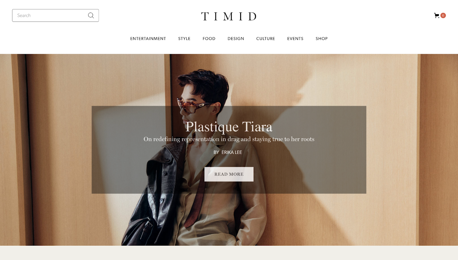
Timid Magazine’s website, designed by Henry Wu, has a minimal design with generous negative spacing to draw attention to its primary elements, such as the hero image and CTAs. The above-the-fold area houses this image, in addition to a menu and search bar for navigation and the brand’s logo.
The menu has various topics: Entertainment, Style, Food, Design, Culture, Events, and Shop. Scrolling reveals that the homepage has a dedicated section for each, with alternating colors to improve legibility and create visual interest. You can click on any thumbnail or section to expand it and go into more detail.
At the bottom, the online shop lets you add print versions of the Timid Magazine to your shopping cart. This feature means the website doubles as a digital magazine and ecommerce platform. For easy accessibility, the footer has another CTA encouraging you to subscribe to the company’s newsletter and links to Timid’s social media accounts so you can explore more content.
2. Fashion Magazine
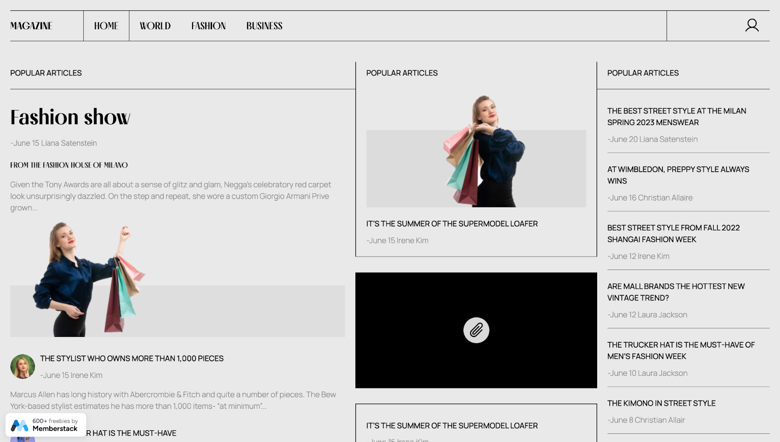
Fashion Magazine’s website, made by Memberstack, is a cloneable magazine template that mimics a traditional newspaper, with gray tones, stylized headlines, and readable sans serif body text.
The website follows a logical visual hierarchy with straight lines separating the three main sections. On the left are the most popular articles, with an emphasis on images and bold headings, while the section on the right is exclusive to headlines and bylines. The middle section balances the two with a customizable embedded element for added interactivity.


Ultimate web design
From 101 to advanced, learn how to build sites in Webflow with over 100 lessons — including the basics of HTML and CSS.
3. Pearler Magazine
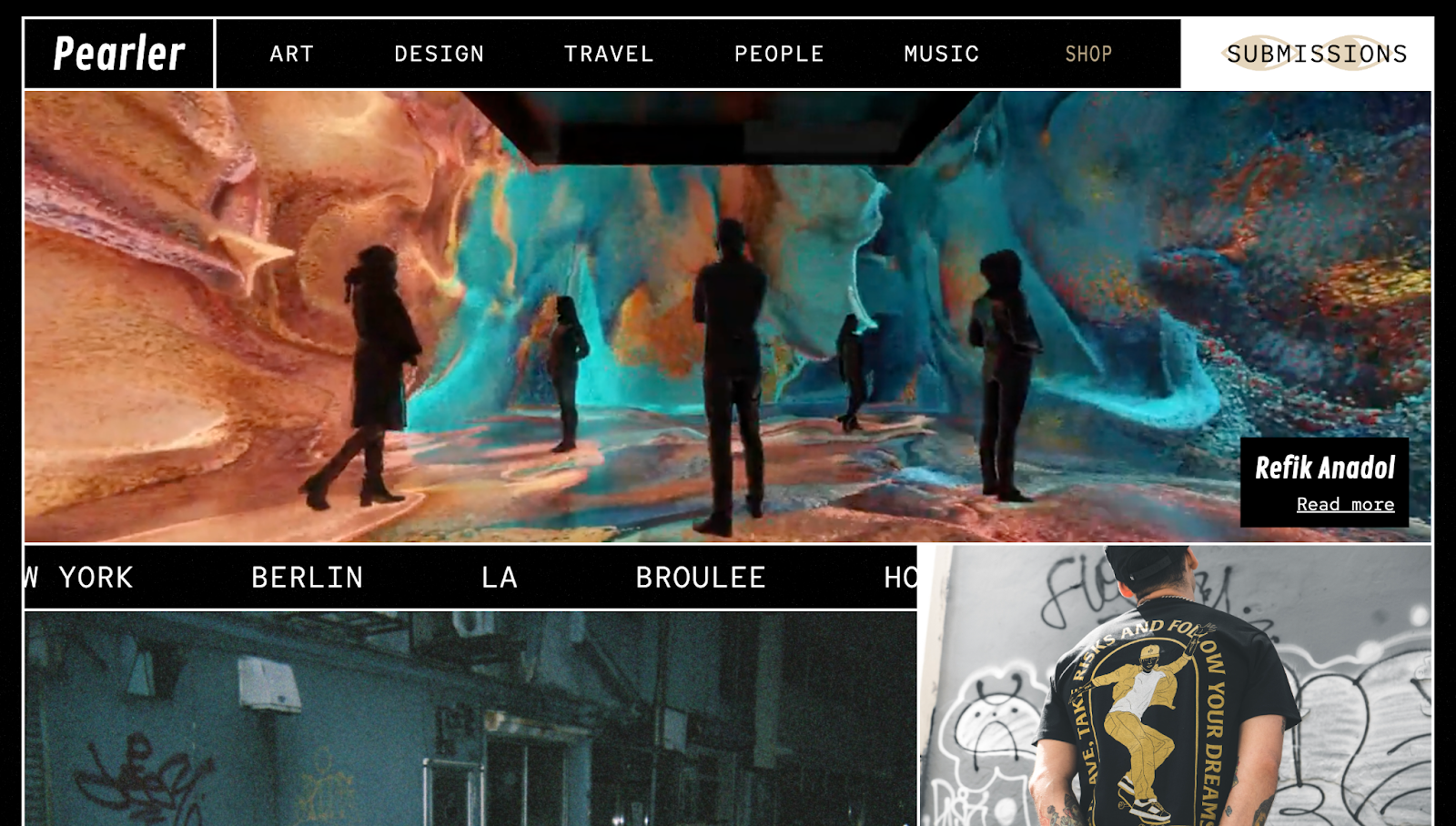
Rhianna Dunn’s Pearler Magazine has maximalist design features, including bold fonts, vibrant colors, and eye-grabbing moving elements. The site strays from traditional news site elements to create a modern, eye-catching appearance distinct from other art-themed digital magazines.
The menu displays various topics, letting you navigate between pages quickly. A rotating “Shop” icon grabs attention, encouraging you to explore and buy art products. You can also click the “Submissions” CTA in the header and footer, a shortcut that opens your default email browser to submit work.
The footer has a press page to show Pearler’s exposure in mainstream media, reinforcing the brand’s identity as a trending platform for collaborative art. To explore more material on social media, you can click a handy link to the publication’s Instagram profile.
4. Society+Space
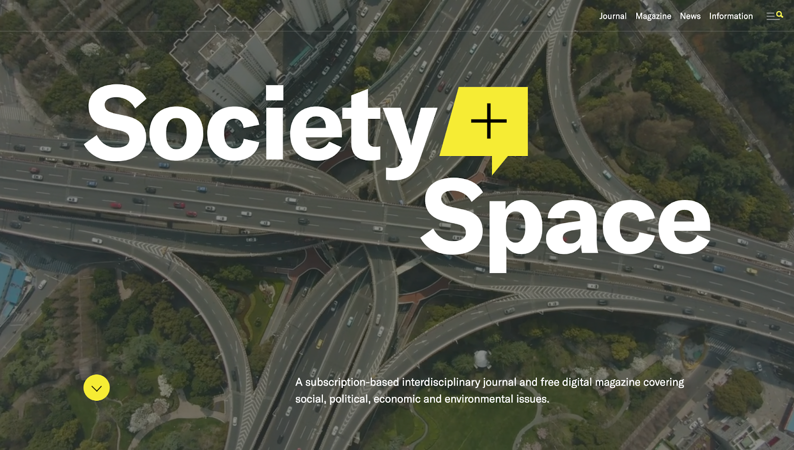
Society+Space by Greg Washington is "a subscription-based interdisciplinary journal and free digital magazine covering social, political, economic, and environmental issues." On the homepage, this brief description and a looping video of highway traffic immediately tell you what the magazine is about.
As you scroll, subtle yellow and white visuals reinforce the brand's identity without distracting from the website's primary content: articles, journal issues, and the latest news updates.
Hovering over the navigation options in the menu reveals multiple pages, letting you quickly navigate to any topic. The footer does the same, providing a list view of all content, social media links, and contact information.
5. Sexta Marcha
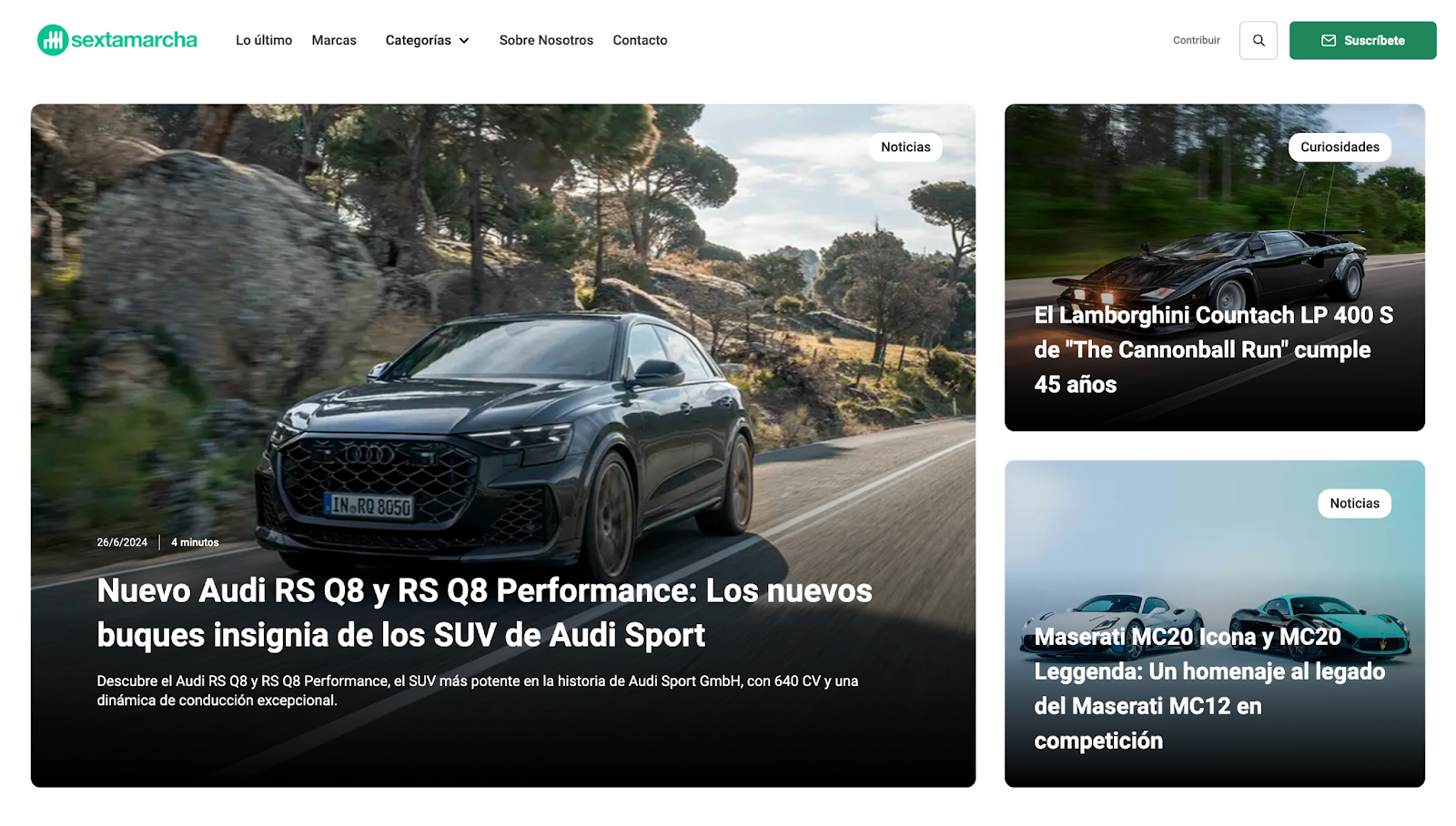
Sexta Marcha is a digital automobile magazine created by RodriDesign. The website header features a sticky menu and search functionality for quick navigation. It also displays the company logo, a "Subscribe" CTA button, and an option for readers to contribute material.
Scrolling shows that each thumbnail has an accompanying headline, a brief description, a publication date, and an estimated reading time. This information provides a quick overview, making it easier for readers to find what they need for a better experience overall.
Ample whitespace and subtle CTAs break the content into more digestible components, ensuring the design doesn't overwhelm readers. A consistent green and white color combination throughout reinforces Sexta Marcha's visual identity while maintaining the site's minimal appearance.
6. Wayfarer
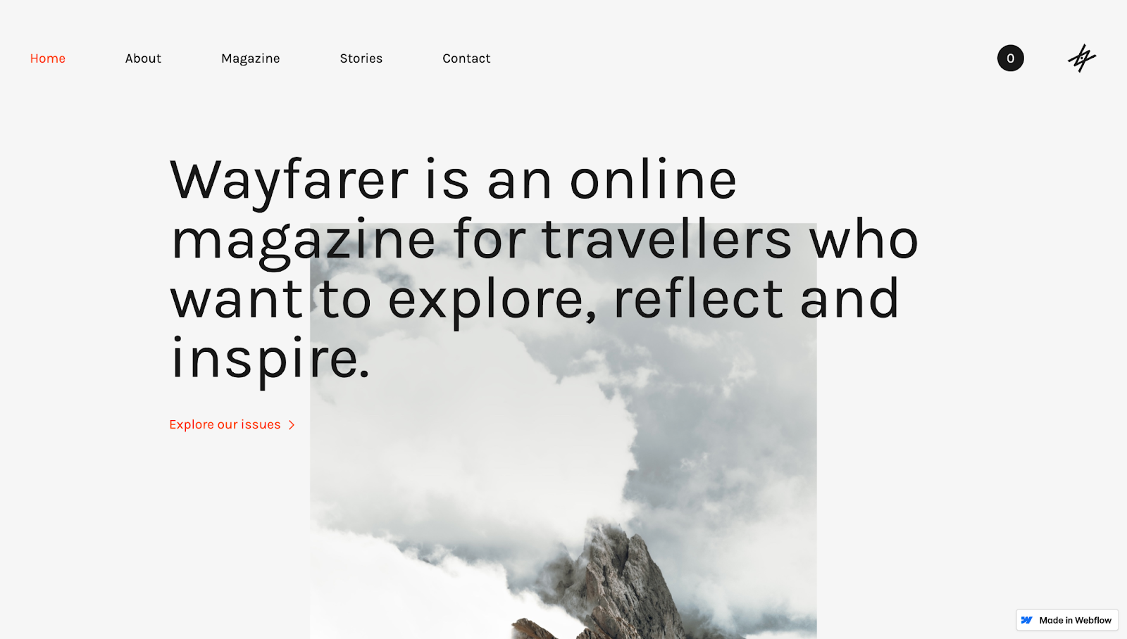
The Wayfarer digital travel magazine, created by Alex Lingeman, features a stripped-down magazine design. It has sufficient whitespace, bold headings, and high-quality images to draw attention to the most essential content.
This monochromatic design allows each CTA (in orange text) to pop, with accompanying arrows nudging readers in the intended direction. A darker gray section in the middle of the site divides the primarily white background, guiding your gaze to an embedded video of waves crashing on a beach. The visual hierarchy indicates that the video content is distinct from the rest, clearly breaking up the viewing experience.
Each section is expandable with a dedicated web page that you can easily access from the menu, footer, or CTAs throughout the page. To drive conversions, there’s a shop section encouraging you to add print versions of the Wayfarer magazine to a shopping cart.
Design stellar digital magazines with Webflow
Different digital magazine types present unique challenges: business sites might focus on search functionality, while art magazines rely on high-quality multimedia.
No matter your client's industry, you can create stunning digital magazines with Webflow — without relying on developers. With features like flexbox and grid layouts and responsive design components, you can build sites your clients will be proud of. Start from scratch or browse thousands of templates to suit any brand.
Find inspiration from the most popular online publications and start designing digital magazines today.
Get started for free
Create custom, scalable websites — without writing code. Start building in Webflow.