


Learn how to design a website with a step-by-step guide that helps you navigate this complex but rewarding process.
It’s no use planning out a lengthy resource blog for a website that doesn’t yet have a homepage. Every step of website design, from planning layouts and internal linking structures to selecting font pairings and optimizing for search engines, becomes more efficient when done in the proper order.
The process defined here streamlines how to design a website from scratch, so that you can spend less time strategizing and more time building.
How to design a website from scratch: 10 steps
Following this 10-step process, you’ll plan, develop, and publish a website efficiently, without much effort or running into roadblocks. Read on for a tried and tested website design process that can help you turn your website idea into a reality.
1. Determine the type of website you want
Every website is designed to meet certain user needs. You should determine early on which one you're designing so that you can know what kind of user experience you're planning to create.
Below are some examples of common website types.
Transactional
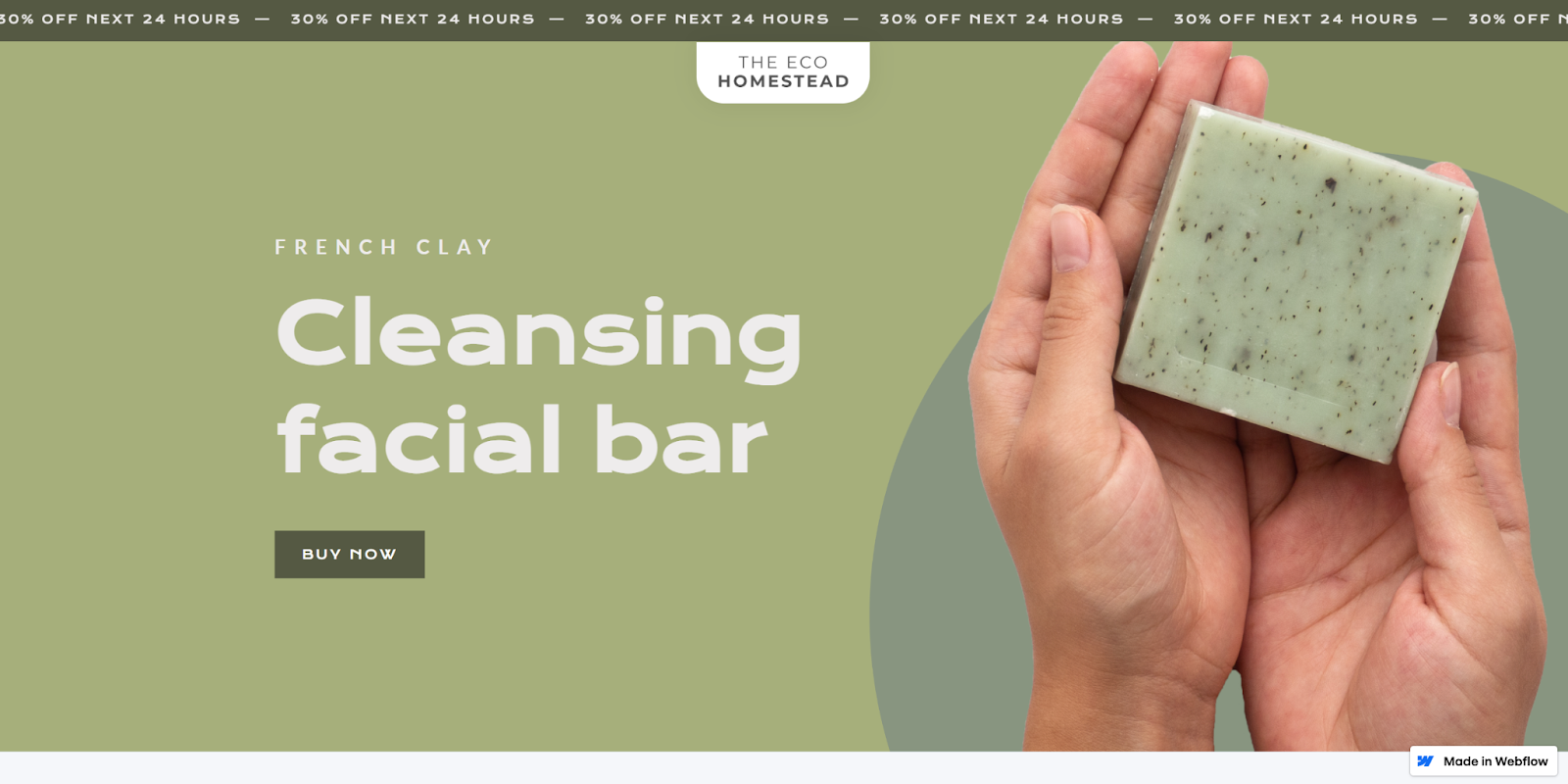
Transactional websites like The Eco Homestead from Charlee Alexeev are online stores, or ecommerce sites, that market and sell products. They often use rich text and structured data as search engine optimization (SEO) techniques so that their product pages appear higher in search engine results.
Informational
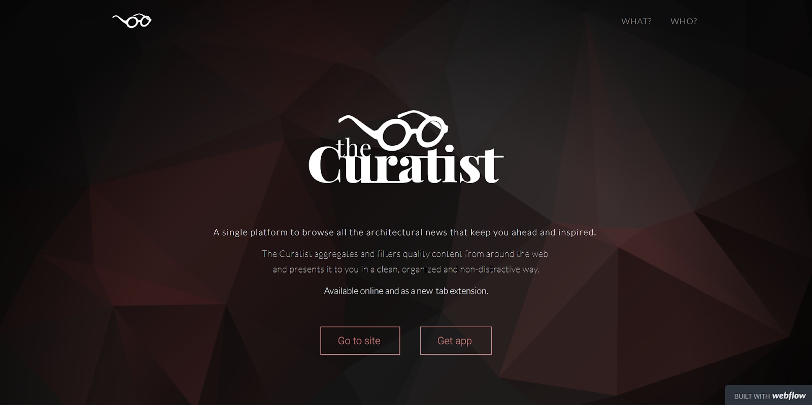
Informative websites like The Curatist from Timea Szabo aim to teach website visitors something and act as a credible source of data that they'll want to use again. Their web designs often feature blogs that excel at capturing keywords and topics that search engines look for when ranking content.
Interactive
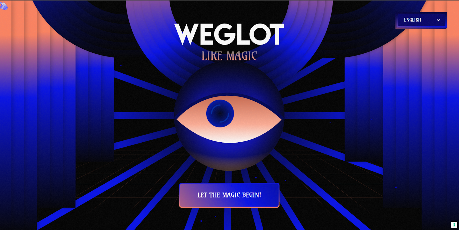
Interactive web designs, like Weglot like Magic from Refokus, offer entertaining, memorable user experiences. They typically invite visitors to actively engage with their content through games, videos, and animations. Interactive sites focus less on selling anything and prioritize impressing their audience with visually appealing interactions.
2. Define your website’s scope and goals
Now that you’ve chosen a website type, it’s time to develop a clear idea of what you want your website to do. Ask yourself these questions to begin building a foundation:
Why should this website exist?
Determine why you’re building this website for yourself, a client, or a team, paying special attention to how the target audience should engage. Review competitors’ sites, too and identify how you’ll differentiate yours from theirs. Define what will make your user experience different from theirs, and why that’s important.
What should this website achieve?
Define the goal your website should drive visitors toward, such as making a one-time purchase, signing up for a newsletter, or subscribing to a product. To keep your design choices focused, your website should have one primary goal — although you can also have secondary goals in mind.
How will the website serve its purpose and goals?
Outline some basic strategies this website will use to engage its audience and encourage them toward the end goal. Typical methods include offering SEO content, showing testimonials, and leveraging creative layouts. How you execute these techniques will be unique to you, but you should be able to grasp the guiding principles for your design decisions.
3. Plan your site architecture and content
Get some paper and a pencil, or use a digital whiteboard tool like Figma, and sketch a basic skeleton for your website design. List every page your website should contain, and organize them into categories, just as you would in a card sorting test. This structure will become the navigation menu for your first draft.
With the basic skeleton sketched, take notes about the content that belongs on every page. For example, an “About us” page might include information about your brand’s history or mission statement. Planning these details now will help you later when designing the interconnected user experience (UX) that directs visitors through the website.
For complex sites, take this planning further with a flowchart tool like Lucidchart. Use lines and arrows to indicate which pages connect and highlight the intended user journey with color coding. This flowchart can help you add new pages or consolidate content later in the process.
4. Pick your preferred website builder
Now that you clearly understand what you want your website to do and how it should look, find a tool that can aid you in achieving your vision. Here's a list to help you select the best website builder for your needs.
Webflow
Webflow is a comprehensive website platform with a visual-first canvas, a powerful native content management system (CMS), built-in SEO tools, and fast web hosting. You can use it to create any website from scratch, or customize one of hundreds of website templates available in the Templates marketplace. Try it for free, and when you’re ready to upgrade, there are several plans to choose from.
WordPress
WordPress offers a core platform that you customize with plugins and add-ons. These extensions add to the overall cost of WordPress and require you to purchase the toolset you need to design your website piecemeal. While its drag-and-drop editor makes designing easier, it introduces limitations that make for basic layouts.
Wix & Squarespace
Wix and Squarespace are both streamlined website-building platforms that don’t share WordPress’ reliance on plugins. Their secure web hosting is on par with Webflow’s. However, their lean design tools can limit creativity. They’re great for people with little web design experience who want to quickly build a simple but serviceable website.
Shopify
Shopify specializes in creating websites for selling products online. Their content management system, SEO tools, and templates are all built with ecommerce in mind. These features make them an excellent choice for online merchants, but designers using Webflow can also get the best of both worlds by integrating with the Shopify platform.
If you’re having trouble deciding between these website builders, try one. Pick a page or feature you know your website needs and try building it with each platform — it shouldn’t take long to determine which provides the best experience for you.
5. Create wireframes and draft site copy
Now that you’ve settled on a website builder, use it to plan out all the pages your website needs. Start wireframing the UX and add rough draft headlines, calls to action, and text that establish the basics. Try experimenting with making your layouts responsive for different screen sizes, which will increase the accessibility of your content.
You don’t have to settle on anything just yet. If you’re having trouble getting your ideas off the ground, find a template or website design example that sparks your creativity. And if you’re adding an SEO blog to your website, take this time to draft a few articles. That way, you’ll have something to work with when planning your blog layout later.
6. Develop a design system
Create a separate page where you’ll build out your design system — a collection of reusable components, principles, and guidelines that provide designers and engineers with a shared language. Include a reference for your color scheme, icons, and typography so that all elements are in your brand style. Then, use these to create all the reusable components your site needs. While you’re doing this, keep accessible design principles in mind to ensure that you can reach a broad audience.
Headings
Dedicate a space to create text boxes for headings. Organize them by size (H1, H2, H3) and configure them with the font pairings you want your website to use. A general rule of thumb is to reduce the font size by 20% for each step down. For example:
- H1: 20pt
- H2: 16pt
- H3: 12pt
CTA buttons
Create your call-to-action buttons, such as “Contact sales,” “Learn more,” and “Get started.” Organize them by priority and make multiple versions that align with your color palette. Primary buttons should use bold colors and thick outlines, while secondary ones can be more subtle, using pale colors without outlines, like ghost buttons.
Modals
Create modal windows for pop-up windows, cookie consent banners, and login screens. Configure them to respond to changes in screen size with breakpoints to make navigation easier. If you want to expand your options, there are templates you can clone.
Logos
Create multiple versions of your logo for various uses, organizing them by size and color so they’re easy to drag and drop into navigation menus, headers, and footers where needed. It’s best to use Scalable Vector Graphics (SVGs) for logos, since they can be readjusted to different screen sizes without losing resolution.
Containers
Create empty containers for images and text blocks so you can quickly drag and drop them into new pages. Next, configure their padding and alignment so they seamlessly drop into pages without disrupting the layout.
7. Build your website
With all the building blocks created, you can now use them to construct your page layouts. Start with the homepage since it sets the tone for your web design. Review your answers to the questions you answered in the first step, and build a homepage that sets a strong foundation for the goals you set out to achieve.
With your homepage complete, consider the next steps you want website visitors to take. Then, build your web pages in sequential order along that journey. Do this for every use case you think visitors will come to your website with, reusing and adapting pages as needed. Eventually, you’ll have a web design that serves every user’s intent.
Review the site architecture you worked out in the second step to see if you missed any pages. If so, reconsider whether they’re necessary. You might not need them if they didn’t naturally fit into any use cases.


Get our 100 video course on web design — for free
From the fundamentals to advanced topics — learn how to build sites in Webflow and become the designer you always wanted to be.
8. Conduct user testing and gather peer feedback
Sign up for a user testing service like UserTesting.com and reach out to peers to ask for feedback. Use established research methods like tree testing and A/B testing to extract actionable insights you can use to improve your designs. Do multiple rounds of research to discover every opportunity for optimization and ensure your site functions well.
9. Publish your website domain
Purchase your domain name and run through a pre-launch checklist. When you’re ready, hit the “Publish” button and watch for build errors as your website goes live. Troubleshoot any last-minute bugs and extensively check your published web design. If you can get through every page without detecting glaring issues, then congratulate yourself on a job well done!
After publishing your website, configure your version control system. Set up a separate staging environment to experiment with new optimizations and web design ideas. Most website builders do this automatically, but check that you know how this process works. If you ever need to roll a change back, it’ll help to know an easy way to revert.
10. Manage, scale, and optimize
After publishing your new website, it’s time to set it up for long-term success. Establish a cadence for checking all your pages regularly for bugs, errors, and opportunities for optimization. It’s also important to monitor your analytics and set specific goals for conversion rates and traffic. With this data, you’ll be able to look for new ways to improve its SEO and streamline the intended user experience.
What are the key components of great website design?
As you review your site to find ways to fine-tune it, you’ll undoubtedly discover some minor improvements to make. Follow these best practices to avoid common site design mistakes and optimize your content:
Clean layouts
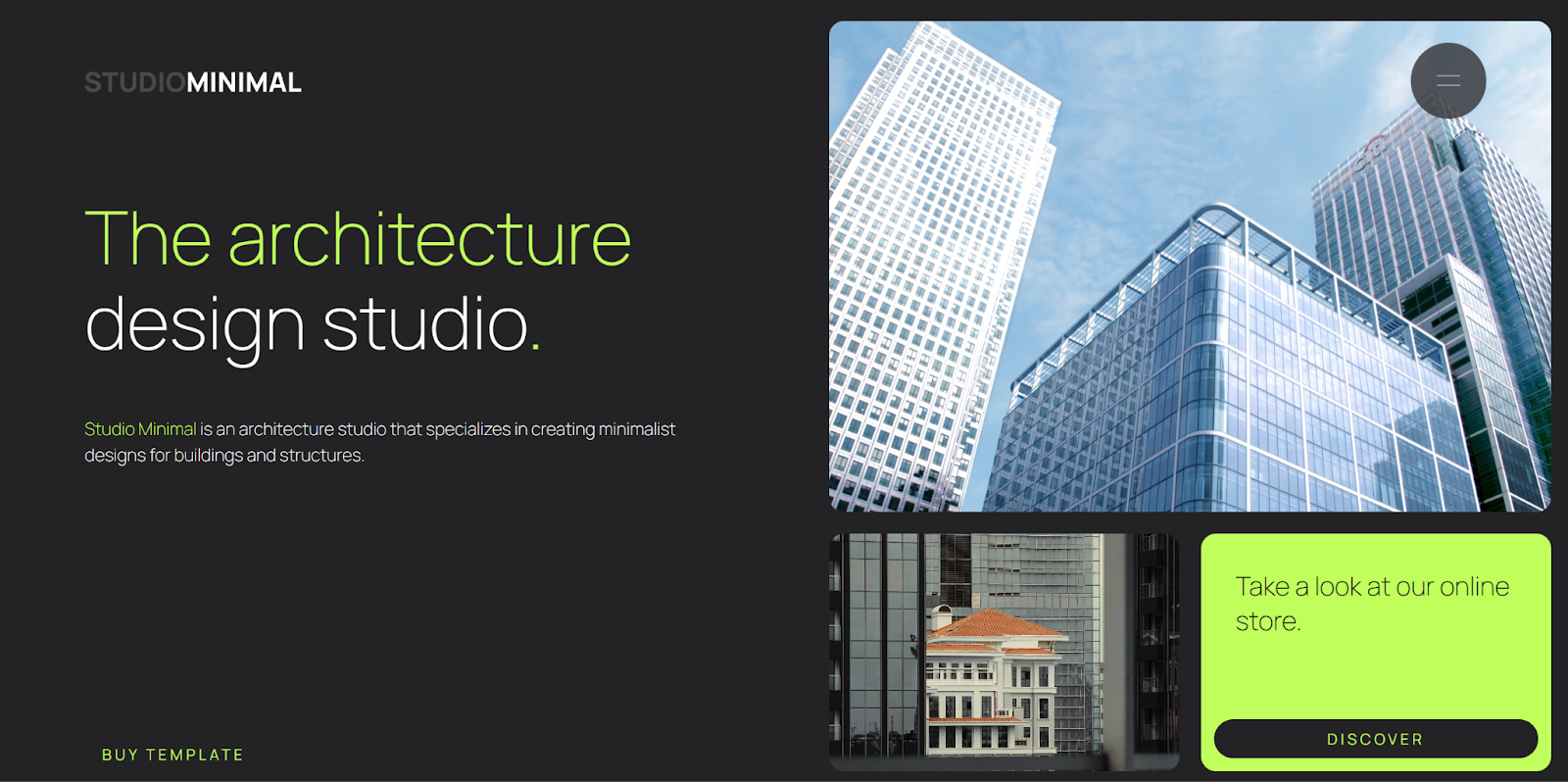
Web designers are full of brilliant ideas that help them create immersive, memorable user experiences, but sometimes they don’t know when to stop. Let the Studio Minimal template from Mateusz Jaromin serve as a reminder that simple website designs, executed well, can often outperform flashy ones. For every design element in your layout, consider whether it's truly necessary to meet your goals.
Mobile responsiveness
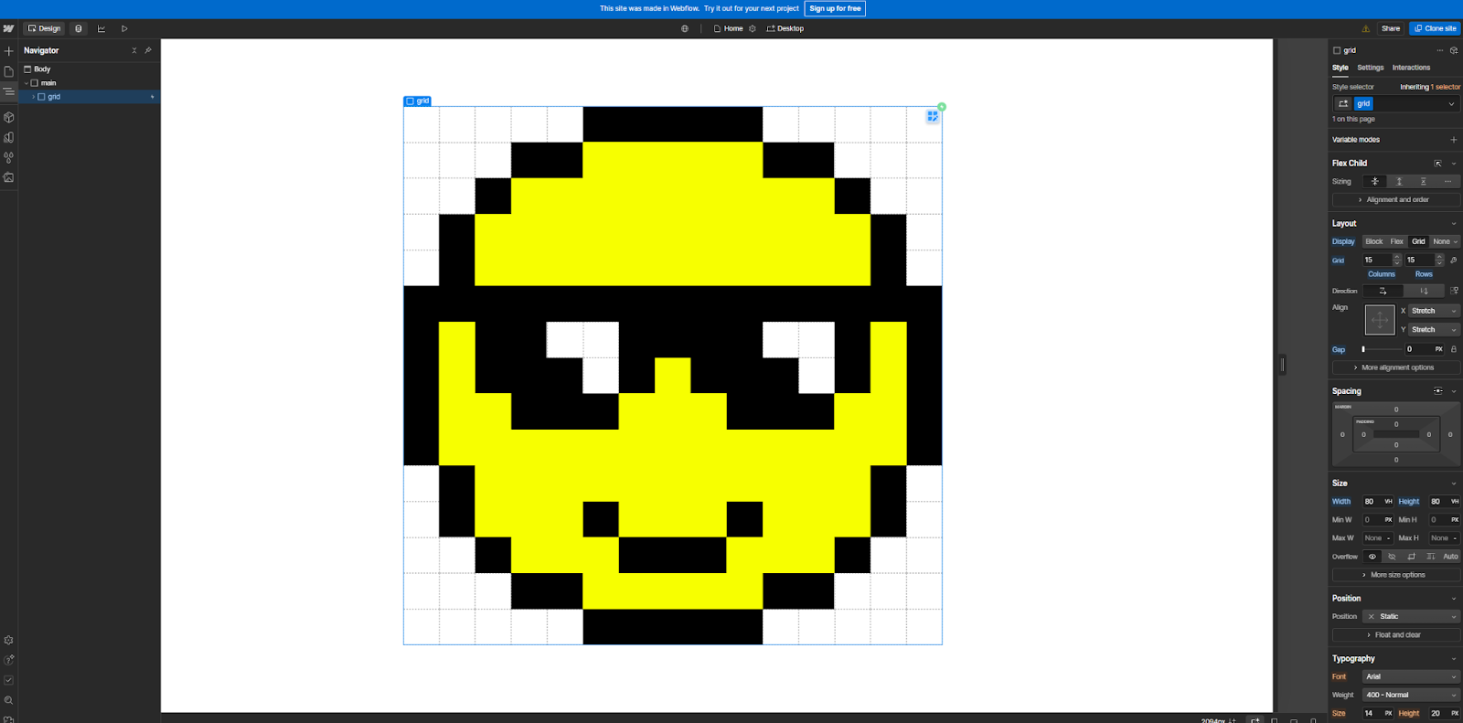
Every page in your website design should respond to changes in screen sizes so visitors can intuitively navigate it from any device. There are several ways to do this, from flexboxes to Cascading Style Sheets (CSS) grids like this Smiley Grid from Peter Dimitrov. Webflow has built-in tools that optimize access automatically, making your unique web designs adaptable for any device.
Loading speeds
Page speeds can impact your rankings with search engines, which are key traffic sources. Use a speed testing tool to measure your page load times. Then, look for opportunities to compress images, streamline animations, and simplify layouts. Check that your hosting provider uses a Content Delivery Network (CDN) and enable any features that can help you achieve faster loading times.
Intuitive navigation
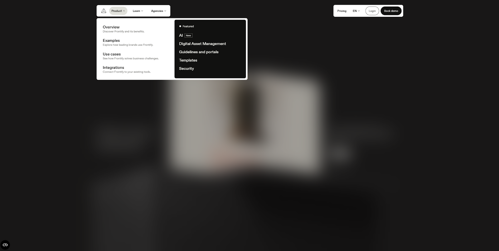
Regularly reassess your navigation menu to find ways to make it more intuitive, like this one Nancy Peng made for Frontify. It’s compact when closed, not taking up too much screen space, and it blurs the background when open to make it easier to find the category you’re looking for.
Experiment with new categories or unique presentations that could better organize your pages or make them more inviting to visitors. In your mobile designs, use techniques like the hamburger menu to make menus more compact so they’re easier to navigate on handheld devices.
Engagement optimization
Check your analytics regularly to identify pages that aren’t getting much engagement. Look at bounce rates, view times, and clicks to determine whether some pages perform better. Then, try to identify any consistent themes and apply those lessons to the pages that aren’t getting the same engagement. For more granular data, use a heatmap tool like Hotjar or Webflow Analyze to determine where users get hung up in the user experience.
SEO
Search engine optimization can help you rank higher on search engine results pages. Take the time to review your website regularly to look for ways to improve technical aspects like loading speeds and editorial SEO aspects like keywords and topics. Use an SEO tool like Ahrefs or Semrush to run regular checks on your content and discover opportunities for optimization.
What are the best web design tools?
Even after you’ve settled on a website builder to use, there are still several web design tools you might want to try. These tools can help you iterate on your designs and prototype new pages and features. Here are a few tools that make good additions to any web designer’s toolbox.
Webflow
Webflow is a website experience platform with a visual canvas and powerful CMS. It’s also a great place for you to test out new ideas. You can access its wealth of templates and pre-designed assets, adapt them for your needs, and then export the HTML to your preferred platform. Its visual canvas streamlines prototyping and experimentation so you can quickly try new things and take anything that works with you.
If you decide to migrate your website to Webflow permanently, you’ll find it offers several tools to help you, like a widely compatible content management system and web hosting that supports custom domain names. The tools you’ll need will depend on which website builder you’re coming from and your goals, but rest assured that any site can move to (and look great on) Webflow.
Figma
Figma offers a digital design space that’s very useful for experimenting with new templates, fonts, and interactions. Its browser-based design tools make it easier to share a link to a proposed design with other web designers to get their feedback. With its version control and automatic prototyping features, you can collaborate on and test designs quickly, and the Figma integration makes transferring finished designs to Webflow seamless.
Canva
Canva is very similar to Figma, but with a lower price tag and leaner design tools. It’s great for casually experimenting with layouts or interactions to see how they look in practice. It offers several templates and pre-made assets that can provide some inspiration, too. While it doesn't have as much content as Figma, it does offer a capable design space where you can collaborate with other web designers and gather feedback.
Unsplash
Unsplash offers a library of visuals that you can drag and drop into any website builder. Your subscription gives you unlimited, royalty-free downloads and access to unique, members-only content. Given the cost of hiring a graphic designer or commissioning artwork, this tool can be a huge cost saver for web designers. It won’t help much with an ecommerce site that needs a dedicated photographer, but it can help with blog articles and service pages where stock images won’t look out of place.
Minifiy
Minify is a code-checking tool that can validate your HTML, CSS, and JavaScript. Minify can also find opportunities to optimize your code, which helps it load faster. Minify is a free, reliable HTML validator, but keep in mind that some website builders, like Webflow, validate your code automatically to save you the extra step.
WebAIM
Tools like WebAIM ensure that you have enough contrast in your color scheme. Before you select a color combination to use for text and backgrounds, run it through WebAIM to make sure it passes at least a “WCAG AA” test. If not, you can use the sliders to help you find a better combination.
PageSpeed Insights
PageSpeed Insights checks your website’s load times and runs several other SEO checks on your content. Enter your domain name and it'll surface actionable insights about optimizing your website for visitors and search engines. It also offers some accessibility checks that can help you detect ways to improve your web design.
Design smarter, launch faster with Webflow
You now have all the tools you need to streamline the entire web design process, from concept to launch. It might seem daunting at first, but with a clear goal and the right resources, you’ll hit the “Publish” button in no time.
If you want to take your website from idea to reality with a comprehensive, visual-first website builder, Webflow can help. With its secure web hosting and wealth of templates that streamline creating and managing your content, Webflow provides a great starting point for any new website.
Try Webflow for your next best website build, and check out Webflow University to access more design resources.
Migrate your site to Webflow
Unlock your site's potential with Webflow. Migrate to a visual web platform, powerful hosting, and unmatched performance.