


These news websites show how to draw readers in and put the focus on your content.
News websites translate the focused simplicity of reading a newspaper to the screen. Most news sites do this with a careful balance of uncomplicated page layouts, readable design fonts, careful organization, and clear visual structure. The best ones also add a creative touch that supports effective storytelling without compromising the reading experience.
This article will share ten news website examples to provide some inspiration for your own site design.
10 top news website examples
Here are the best news websites to learn from, so you can turn your site idea into a content hub that attracts excited readers.
1. The Washington Post
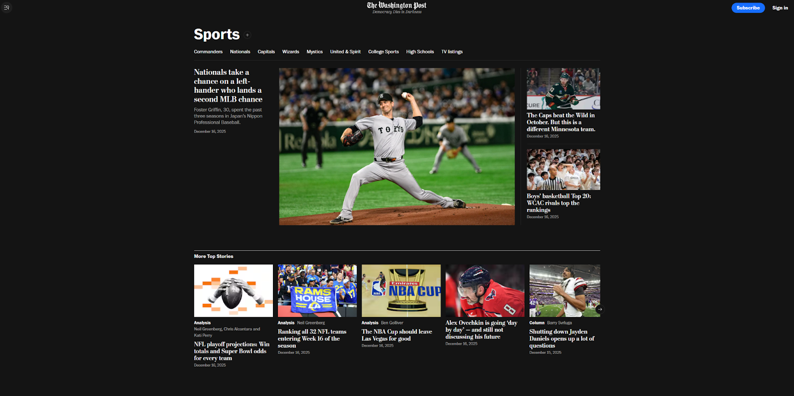
A trusted source of news since 1877, The Washington Post made the move online earlier than many of its peers in 1996. That legacy survives in a layout that resembles a traditional newspaper, organizing headlines and images into simple columns and rows.
Featured news stories take up the largest portion of the homepage, with smaller stories in the margins. The images are simple and clean, with a realistic style, and the background is plain black to avoid distraction. This is a good template if you want to replicate the experience of reading a newspaper or magazine digitally.
2. BBC
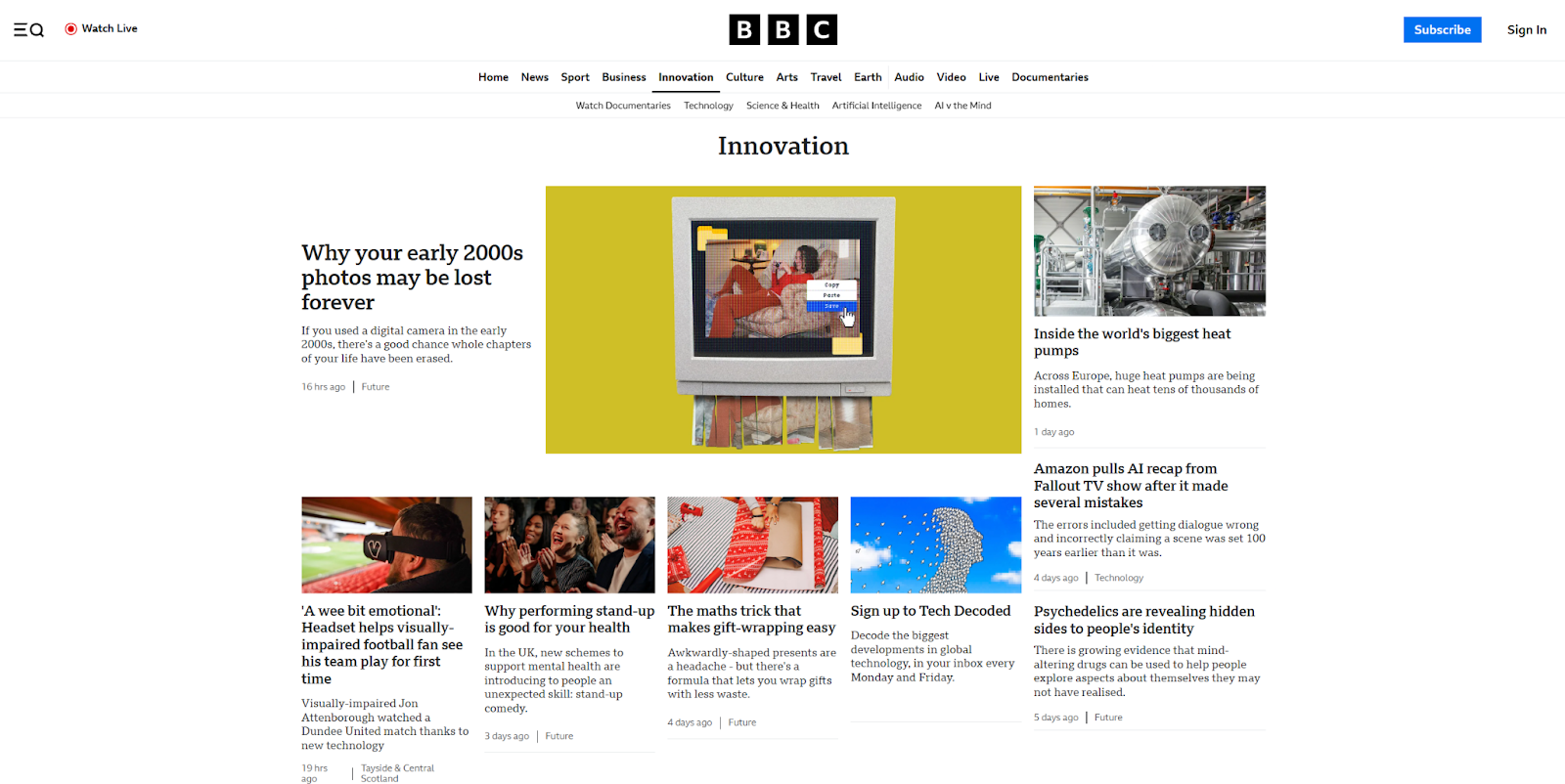
The BBC’s web design presents readers with a slightly more embellished reading experience than The Washington Post. The site’s top bar offers a link to watch live news coverage, along with a navigation menu organized into typical newspaper sections such as “business” and “culture.”
The serif typography is reminiscent of paper news but is also modern enough to be readable for fast browsing. Overall, this website is a good example of how to balance a traditional look with the demands of online reading.
3. Good Morning Italia
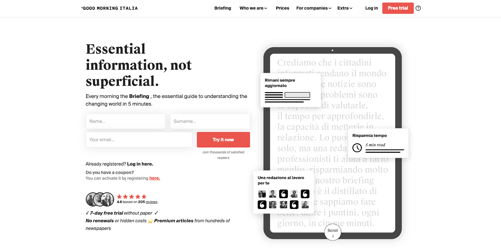
Good Morning Italia, created by Studio Nilo, isn’t a standard news site — it’s actually a landing page for a daily newsletter. The site’s team curates stories and sends them to subscribers, while also featuring paywalled articles and ebooks on their website.
For this reason, Good Morning Italia’s site is laid out like a traditional landing page, with a strong call to action (CTA) and a signup form right at the top. It also shares details about the newsletter, FAQs, social proof in the form of reviews, and sales copy to convince readers why they need these daily emails. This is a good format to follow if you’re building a similar newsletter or a premium, subscribers-only site.
4. The Northern Voices
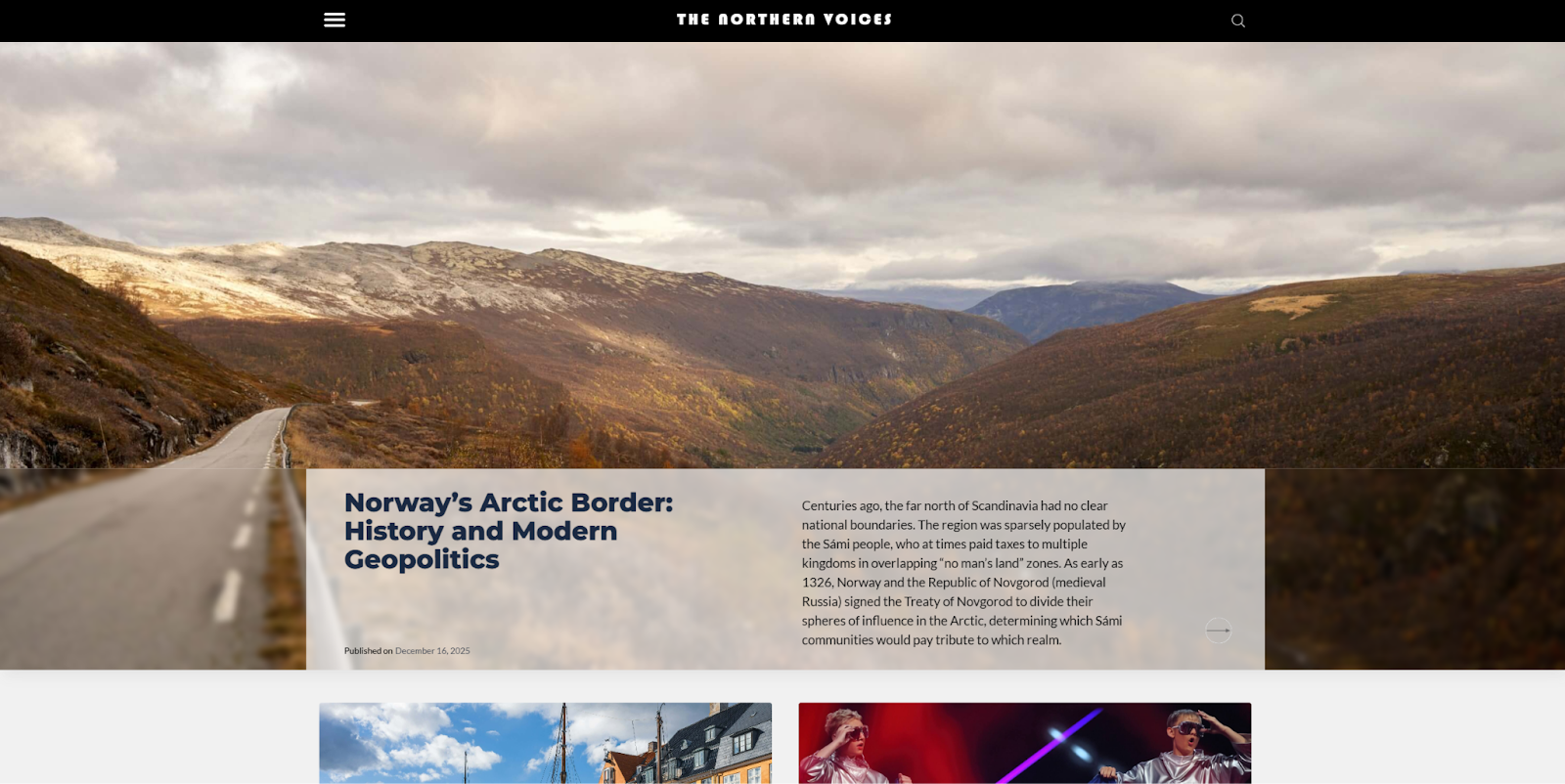
The Northern Voices site, designed by Valev Laube, strays from a more traditional newspaper website design while still using a simple, clear layout. The large hero image at the top of the homepage is an unusual choice for a news site and is more reminiscent of a blog.
Below, there’s plenty of whitespace to keep the page free of distractions and offer room to zoom in for visitors who may be vision-impaired and those using mobile devices. For a similar effect on your website, leave plenty of empty space on each side of your pages and opt for a simple background.


Rethink your CMS
Find out why a cutting-edge enterprise CMS is not just a nice-to-have, but a necessity for teams.
5. Gatopardo
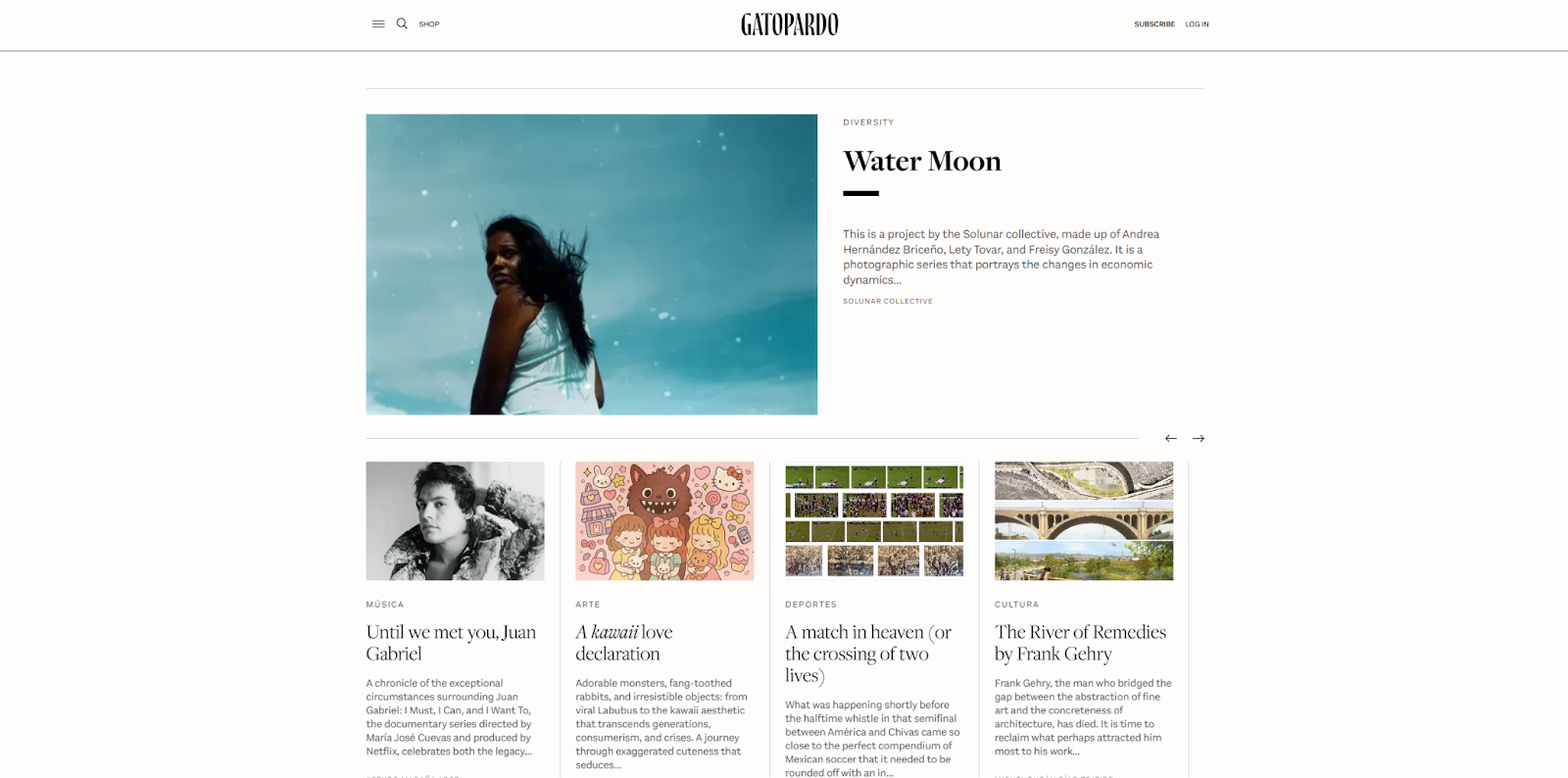
Gatopardo is a Mexican news website developed by Panorama that uses a traditional newspaper layout. The serif typography and plain black-on-white color palette make the experience feel like reading a broadsheet. The full-color images and hamburger navigation menu are the only elements that diverge from that aesthetic.
Aside from a very minimal header, a straightforward footer, and the occasional ad, this site puts all the visibility on its stories. If you want to translate the paper-reading experience as precisely as possible, this is a good example to study.
6. Good Good Good
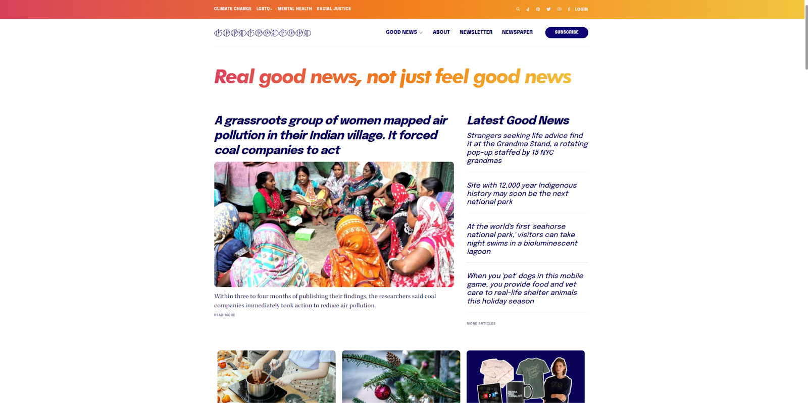
Good Good Good is an optimistic news website built by Branden Harvey that breaks the mold both in content and form. It only offers positive news, which can be a refreshing departure from the sensationalism of traditional news sites.
This website's design is colorful, with a layout that resembles a blog more than a newspaper. Every article includes tags that help readers find related stories and CTAs styled much like you’d see in a blog post. There are cheery quotes from figures such as Mister Rogers, and the social media links are tucked away at the bottom of the page so they’re not too distracting. If you’re wondering how to make your news site uplifting, Good Good Good shows the way.
7. La Converse
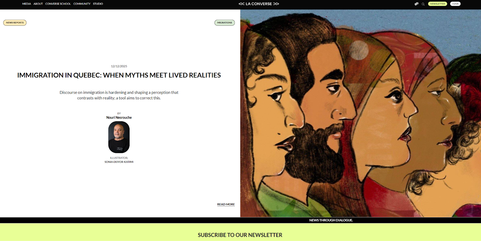
The La Converse news site by senusi is an original take that breaks away from newspaper layouts entirely. Instead of a featured news section, the homepage greets visitors with colorful visuals, high-contrast backgrounds, and asymmetrical layouts.
The news stories feel personal because they highlight the writers and include transparency notes detailing each author’s relationship to the article’s subject. Imagery throughout the site focuses on faces and uses a variety of styles. If you want your news site to feel more like a conversation than a static resource, these choices may be worth emulating
8. Deuxmoi
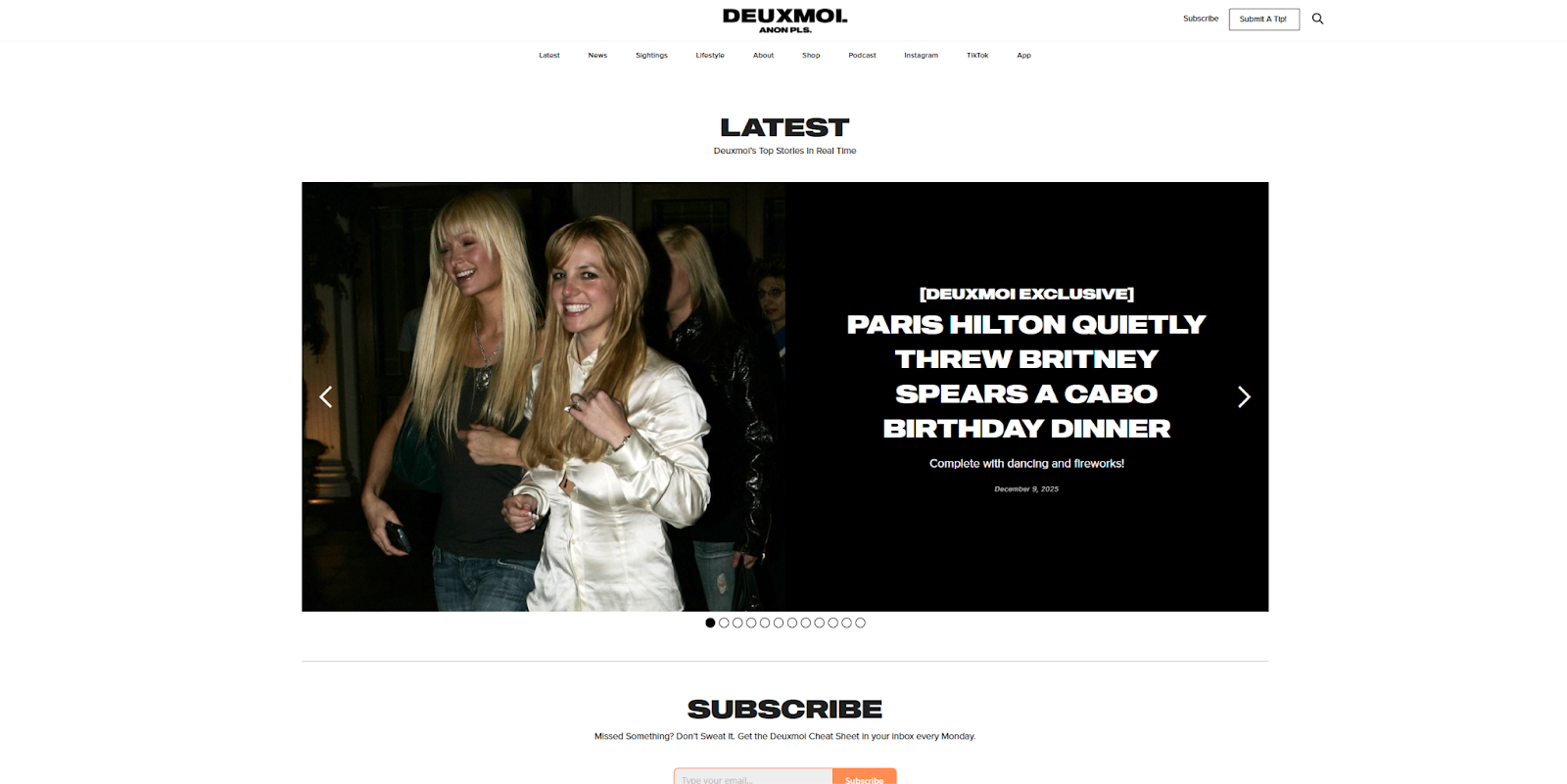
Deuxmoi is a gossip website that shares online news about celebrities’ daily lives. It features humorous graphics and candid photos, along with sensational headlines designed to grab attention.
If your site has a similar focus, you’ll want to provide disclaimers, such as the ones you’ll find in Deuxmoi’s footer design. It’s also helpful to convey some credibility through social proof — Dexumoi does this with an “As featured in” section at the bottom of the homepage, featuring recognizable names such as The New York Times and Vanity Fair.
9. Revista Level
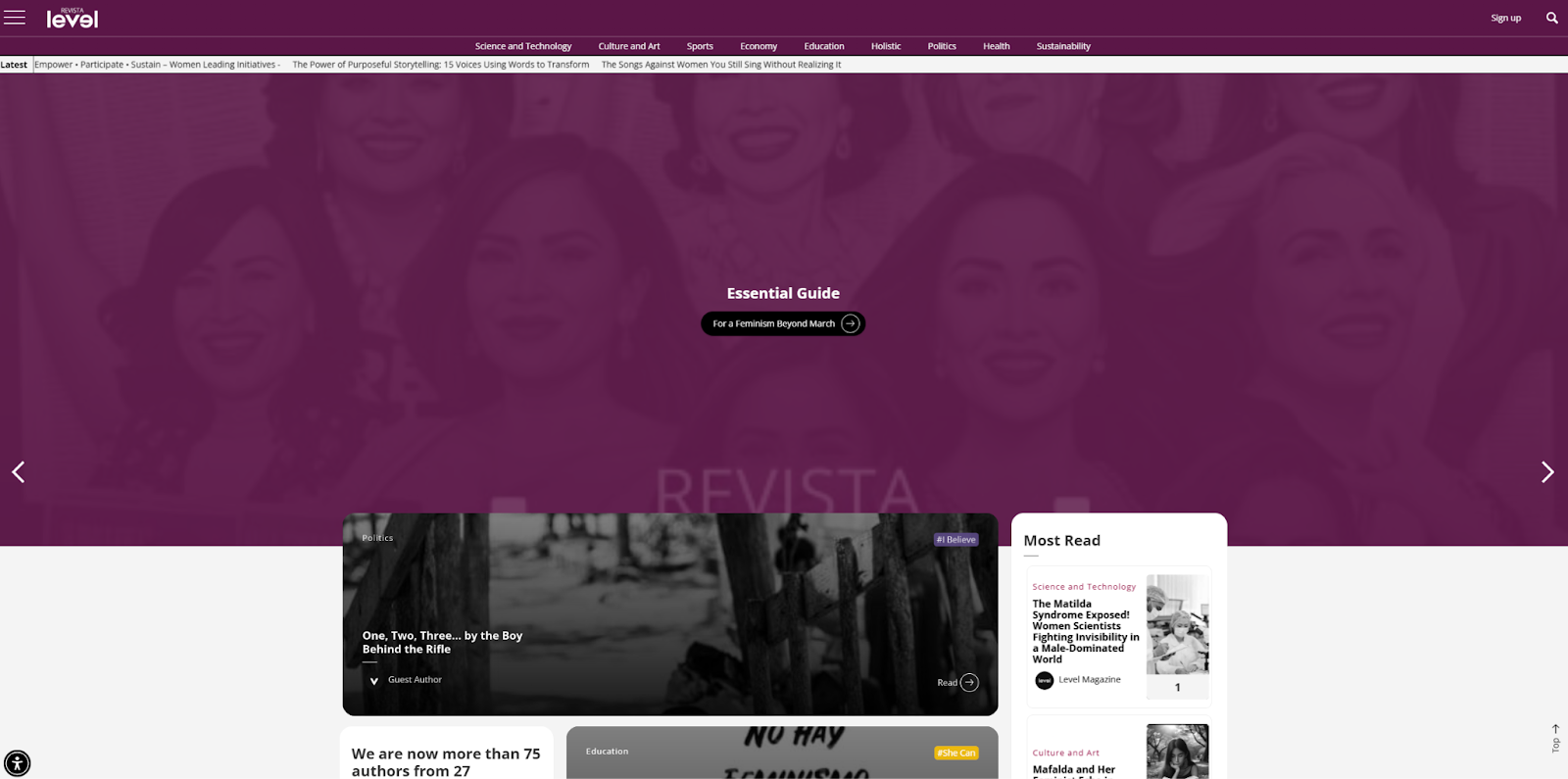
Revista Level is an independent human rights news site developed by Xent SAS. Its goal is to highlight feminist initiatives across every sector, from culture and art to science and technology. To convey that goal, this site emphasizes female faces in its images and graphics, and it uses colors traditionally associated with femininity.
There’s a lot of content on this site, so there's also a robust menu that categorizes news stories by topic and genre, putting the full range of coverage on display. If you have a lot of news articles to organize, you can learn from the way Revista Level uses hierarchical navigation.
10. Undrafted
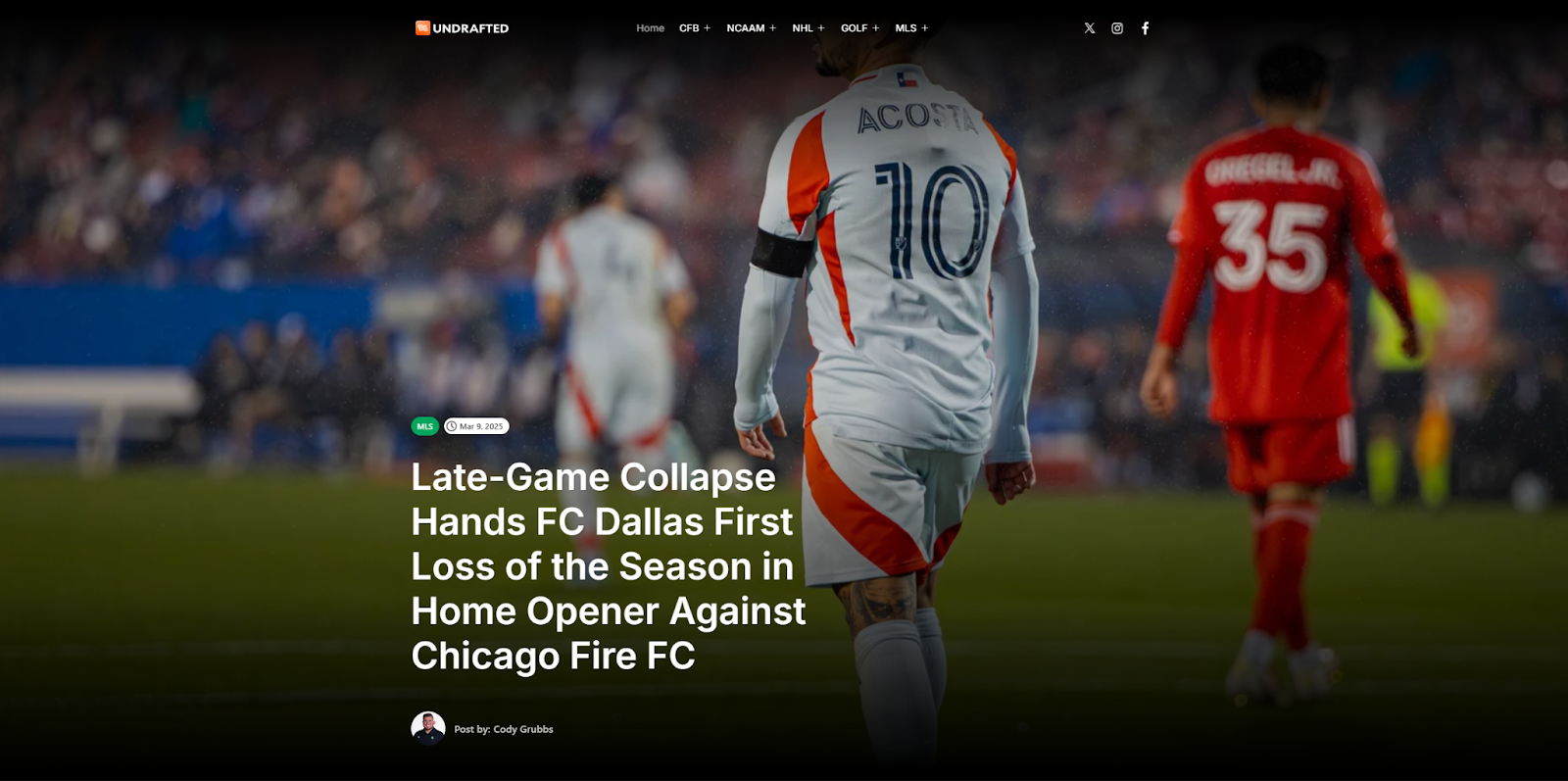
Undrafted is a sports news site built by Austyn McFadden, and despite its limited focus, it includes a wide variety of topics. With so many international sports to cover, this site’s navigation needed heavy streamlining.
Undrafted doesn't have a single menu at the top of the page. Instead, it offers a vertical list of sports associations that readers can use to filter news stories and find the right kind of content about their favorite sports. If your niche is specific and your audience is too, you may want to use a similar approach.
Build a news site that draws readers with Webflow
All of these examples show creative ways to highlight breaking news and featured articles and are worth learning from. What’s less visible is that each site also needs a sophisticated back end, where teams can quickly draft and publish articles. If you’re creating a similar website, choose a flexible content management system that helps you design your news site, then publish and adjust content daily.
Webflow makes adding new content fast and seamless, with a visual design environment your team can use to collaborate and make changes in real time. Plus, Webflow’s actionable search engine optimization suggestions let writers and editors spend less time on descriptions and schema markup and more time finding newsworthy stories.
Discover how Webflow supports the fast-paced workflows news websites rely on.

Build websites that get results.
Build visually, publish instantly, and scale safely and quickly — without writing a line of code. All with Webflow's website experience platform.


.png)


