Transform potential exits into engagement with exit-intent pop-ups.
Keeping visitors consistently engaged and moving toward conversion can be challenging, even with a meticulously well-designed website. Users may browse through your site, contemplate purchasing, and still inch their cursor toward the exit button.
This is where exit-intent pop-ups come into play. They appear at the crucial moment before a visitor intends to leave by offering a compelling reason to stay. These well-timed interventions can turn a near-exit into a conversion opportunity by encouraging users to pause, reconsider their decision, and perhaps even complete a transaction.
Well-crafted exit-intent pop-ups are more than just last-ditch efforts to grab attention — they’re strategic design elements that enhance your site’s overall user experience and improve its retention rates.
What are exit-intent pop-ups?
Exit-intent pop-ups are design elements that engage visitors who are intending to leave a website. These pop-ups present themselves as small windows and modals overlaying the current page and activate when users exhibit exit behavior, like moving toward closing a tab and navigating away from the page.
These pop-ups typically offer enticing deals, like special discounts, subscription invitations, and other persuasive calls to action (CTAs), that incentivize visitors to remain on the page. They effectively leverage the moment when a visitor’s engagement wanes by offering a compelling reason to stay.
Exit-intent pop-ups are popular among ecommerce platforms, content-focused websites, and other online businesses like software-as-a-service (SaaS) providers and educational platforms. They maximize user interaction and allow businesses to recover potential leads, reduce bounce rates, and capitalize on every conversion opportunity.
How exit-intent pop-ups work
Exit-intent web pop-ups operate based on user behavior, specifically when a cursor moves toward a browser’s close button or a new tab. These pop-ups leverage programming that continuously tracks the cursor’s screen movement. When this tracking system detects the cursor heading toward an exit point, such as the browser’s close button or a new tab, it promptly triggers the pop-up, effectively capturing the user’s attention at a critical moment.
For mobile users, who typically switch rapidly between apps and pages, exit-intent pop-ups require a more nuanced approach. Because mobile devices have limited screen space, designing these pop-ups involves using smaller, less-intrusive windows, subtler animations, and quick-loading content to reengage users considering an exit.
No matter what device exit-intent pop-ups operate on, their efficacy hinges on these key elements:
- Behavioral tracking. Exit-intent pop-ups use tracking algorithms to monitor a cursor’s on-screen movement. When these algorithms interpret the cursor’s movement toward an exit as a potential departure, they initiate the pop-up to intervene. For mobile users, these algorithms adapt to detect touch and scroll behaviors that signal exit intent, such as rapid scrolling and switching between apps.
- Relevant content. Exit-intent pop-up content often features immediately compelling content, like exclusive offers or special discounts. This targeted material serves as a final effort to engage and retain users on the website.
- Responsive design. Responsive design practices ensure web elements adapt and appear consistently across devices. For mobile devices, pop-ups adjust in size and presentation to prevent them from dominating the screen while providing an engaging experience.
How to create an exit-intent pop-up: 4 best practices
Whether you’re designing exit-intent pop-ups for a desktop or mobile screen, following best practices maximizes their effectiveness. Here are four tips to ensure your pop-ups are compelling and user-friendly.
1. Write compelling copy
Write concise, engaging copy that speaks directly to your audience and highlights the value of staying on your website. Instead of a basic “Don’t leave yet!” prompt, offer a more enticing and interactive message like “Unlock an exclusive 15% discount on your first order!”
Experiment with various persuasive phrases and rotate them to keep your brand messaging aligned with your brand’s voice and tone. And use A/B testing to compare different copy variations — like “Unlock savings!” and “Claim your discount!” — to identify which resonates best with your audience.
2. Use attractive designs
Craft your exit-intent pop-ups to captivate attention and reflect your brand’s personality. Visually appealing pop-ups resonate more effectively with visitors and make them more likely to pause and consider the message. When visually aligned with your brand’s personality and website aesthetic, these pop-ups also create a cohesive user experience, reinforcing brand recognition and recall even if the visitor leaves. If you’re using images, choose high-quality ones and ensure they complement rather than overwhelm your ads.
Suppose you’re a software company specializing in enterprise project management (EPM) tools. You might use a clean, minimalist design in your pop-ups and incorporate subtle animations and interactive elements that reflect your brand’s focus on innovation and user-friendly interfaces.
But if you run a website selling technology products like Bluetooth headphones and speakers, using captivating photos from your latest collection as a pop-up backdrop and a transparent message box might be more effective. This approach lets you subtly introduce new products to customers and keep them engaged with relevant and visually appealing content.
3. Personalize the pop-up
Understanding your target audience is key for personalizing exit-intent pop-ups effectively. By using data visualization tools, analytics software, and heatmaps, you gain insights into visitor behavior and preferences. This information lets you tailor your pop-ups to specific audience segments, making them more relevant and engaging. You can also incorporate hyperpersonalization techniques powered by artificial intelligence (AI), like precision ad targeting and tailored recommendations, to make users feel seen and understood.
If a visitor has been exploring web design tutorials on your site, an exit-intent pop-up offering a free webinar on advanced design techniques would directly appeal to their current interests. Beyond capturing the visitor’s immediate attention, this targeted approach demonstrates that you understand their needs, potentially transforming a fleeting visit into meaningful engagement.
4. Add a CTA
Incorporating a compelling CTA in your pop-ups guides visitors toward a specific action to enhance the chance of conversion — and it also makes your pop-up stand out. To make your exit-intent pop-up as effective as possible, combine thoughtful design choices that make the CTA immediately noticeable and engaging with strong, action-oriented language.
For example, you can use heatmaps to visualize your site’s layout and reduce its bounce rate. Scroll maps show where people hesitate, potentially signaling when they’re considering leaving the site. These are effective areas to add pop-ups and bold CTAs that encourage visitors to keep exploring.
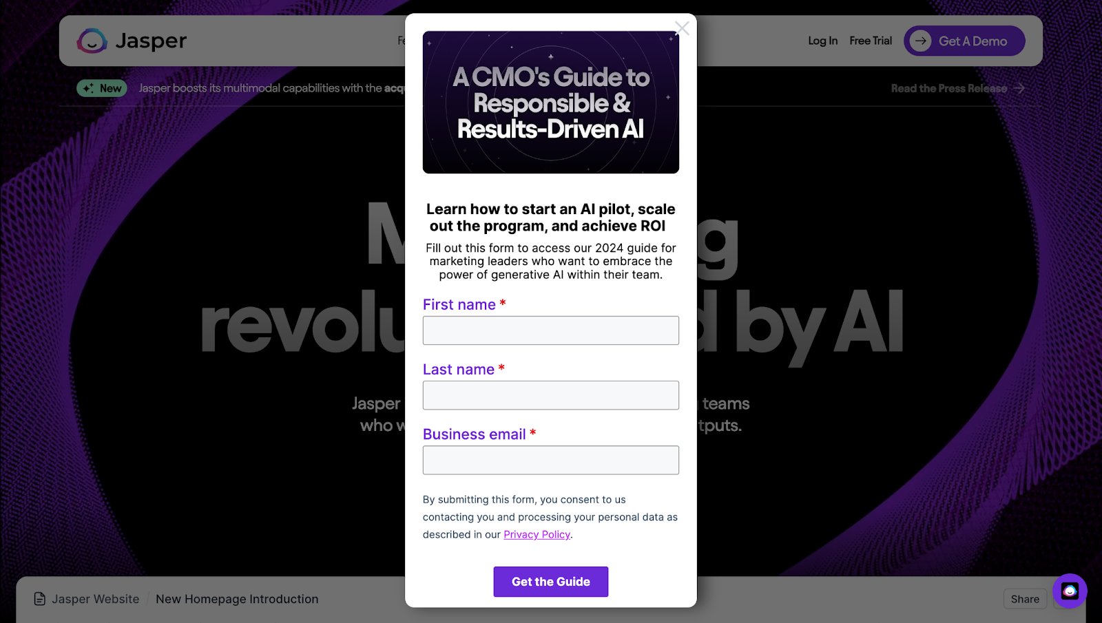
Language-wise, use action-oriented phrases like “join,” “subscribe,” and “purchase” to emphasize the CTA and clearly define the desired user action. For example, Jasper’s exit-intent pop-up uses “Learn how to start an AI pilot, scale out the program, and achieve ROI” followed by a “Get the guide” button. The CTA is concise and effective, and it captures the essence of Jasper’s marketing guide in three short lines.


Get started for free
Create custom, scalable websites — without writing code. Start building in Webflow.
5 website pop-up ideas to minimize user exits
No matter what industry and field your business operates in, incorporating well-crafted exit-intent pop-ups can be a game changer in converting bouncing visitors into customers. Here are five effective exit-intent pop-up examples that work across various sectors.
1. Provide limited-time offers
Limited-time offers leverage the powerful psychological principle of urgency. This tactic — driven by the fear of missing out (FOMO) — compels visitors to act quickly and make decisive decisions. For example, a compelling offer could be “Wait! Before you leave, how about a 15% discount on your next consultation? Just share your email, and we’ll send you the discount code. Available only until 10 p.m. tonight!”
FOMO on a time-sensitive offer can deter users from leaving by incentivizing those interested to capitalize on the opportunity. It’s particularly effective for sites running special promotions.
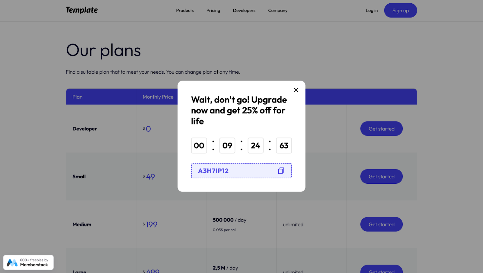
In the example below, created in Webflow by Memberstack, you’ll see an exit-intent pop-up highlighting a 25% discount. Not only is this offer time-bound, but it also personalizes the pop-up and makes the recipient feel like they’re receiving a unique coupon.

Customers actively seek deals and are more inclined to seize offers that promise significant savings for a limited time. It’s an effective approach to retaining interest while increasing revenue.
2. Understand why users want to leave
Asking customers why they’re leaving helps identify potential site issues and improvement areas. It also demonstrates that you value their feedback and your commitment to customer satisfaction.
To understand why users bounce from your site, implement a courteous exit-intent pop-up that requests feedback, like “Can you share why you’re leaving? Your insights help create better experiences for you.”
Consider incorporating interactive elements such as checkboxes and radio buttons to let users quickly select their reasons. This streamlines the feedback process and provides you with valuable data. Analyzing these responses can guide you in adjusting your marketing tactics and content strategies, leading to a more satisfying user experience that keeps visitors on your site.
3. Test pop-ups on different landing pages
Use A/B testing methods to trial variations in copy, design, and CTAs to understand which overall layout resonates best with specific audiences and yields the highest engagement and conversion rates.
For example, a B2B software provider might find that a more technical audience, like IT professionals, responds better to pop-ups highlighting product features. And marketers might prefer pop-ups emphasizing a return on investment (ROI).
4. Promote gated resources
By providing gated resources like whitepapers, case studies, and premium content in exchange for contact information, you incentivize visitors to share their email or phone number with your business, helping you generate leads. This approach works by presenting a mutually beneficial proposition — the visitor receives something valuable, and you can keep in touch and nurture a relationship with them.
For example, an exit-intent pop-up might invite users to sign up for your event with a message like, “Wait, don’t miss out! Our exclusive webinar on the latest design trends starts in 30 minutes. Register now for free access!” This offer adds immediate value for the visitor and makes them more likely to engage and share their contact information.
The benefit here is threefold. First, it minimizes the chance of a user leaving without engaging. Second, by collecting contact details, you create an opportunity to engage the visitor in the future with personalized marketing efforts, fostering a longer-term relationship. And it increases future conversion chances through direct and personalized communication.
5. Advertise positive customer reviews
Positive reviews reassure visitors about your product and service quality, addressing any doubts that may prompt page exits. Consider this exit-intent pop-up focusing on reviews: “See why our customers love us! Discover their favorite features and read their rave reviews.” By leveraging social proof to build visitor trust, this approach reduces visitor uncertainty and enhances their perception of your brand.
Keep visitors on your website with Webflow
The best exit-intent pop-ups work most effectively on captivating and smoothly operating websites. And Webflow Enterprise provides everything you need to craft such exceptional sites, like managing high user traffic and delivering personalized content, as well as ensuring rapid and reliable website performance.
Plus, our visual-first approach empowers teams to collaborate effectively, regardless of technical expertise. With Webflow, you can design engaging pop-ups to prevent exits and build websites that entice repeat visits, setting a strong foundation for sustained business growth and success.

Webflow Enterprise
Trusted by over 300,000 of the world’s leading brands, Webflow Enterprise empowers your team to visually build, manage, and optimize sophisticated web experiences at scale — all backed by enterprise-grade security.


