

Getting a startup to stand out is all about first impressions, and your website’s design is the perfect place to start.
You know your startup has something amazing to offer — you just have to convince potential customers to give it a chance. Your business site is potentially their first introduction to your products and how it can improve their lives. Through a carefully considered startup website design, you can build trust with your target audience and make a lasting impression.
To do that effectively, it is good to consider examples of other successful startup websites. In this article, you’ll find a list of the best startup websites to serve as inspiration, along with some tips to help you fine-tune your design.
What makes a startup website successful?
The key to building a successful startup website design is through trust and memorability. You need visitors to find value in your company’s story, believe that your brand is reputable, and remember it when they’re ready to buy.
Here are four ways you can achieve that:
- Make a lasting impression. Effective startup websites often have attention-grabbing user experiences (UXs) that visitors can easily remember. They use special typography, animations, color schemes, or navigation to highlight their unique brand.
- Make your product enticing. The product or service you’re promoting should have an attractive value proposition, and your website needs to showcase that benefit in a compelling way.
- Include social proof. To build trust with your target audience, you can highlight testimonials and reviews from users. If you are still building clientele, try showcasing your partners or investors instead.
- Create clear calls to action (CTAs). Your UX design should make it clear how visitors can become early adopters of your product or service. Concise, action-oriented CTAs like “Try a demo” and “Join the waitlist” make next steps clear and set expectations.
20 startup website examples you can learn from
These top-quality startup sites demonstrate how to grab attention, nurture credibility, and can serve as web design inspiration for your own business site.
1. Zebracat

Zebracat’s startup homepage design makes a big claim immediately — “Create viral videos in seconds” — then spends the rest of the page backing up that promise. It uses phrases like “No editing skills needed” and “Create unique videos 10x faster and easier” to elaborate on the product’s benefits. These calls are then backed up with testimonials, reviews, and reputable logos.
2. Jasper

Jasper is one of many quality software-as-a-service (SaaS) startup website examples created by design studio OFF+BRAND. The homepage begins with a headline aimed at a specific target audience: “AI built for marketers.” This language reassures marketers that they’re in the right place and informs them that this tool is designed with their needs in mind. Every row on the rest of the homepage backs up that claim by detailing how Jasper addresses specific pain points and needs.
3. Vareto

Vareto’s startup landing page design puts the focus immediately on the product, opening with an attention-grabbing headline and an animated image of the tool interface. The rest of the page explains how the product works, using concise yet detailed language and visual demonstrations. The designers use technical jargon to highlight their knowledge and skill, which can be a useful tool to build trust with potential customers.
4. Contiant
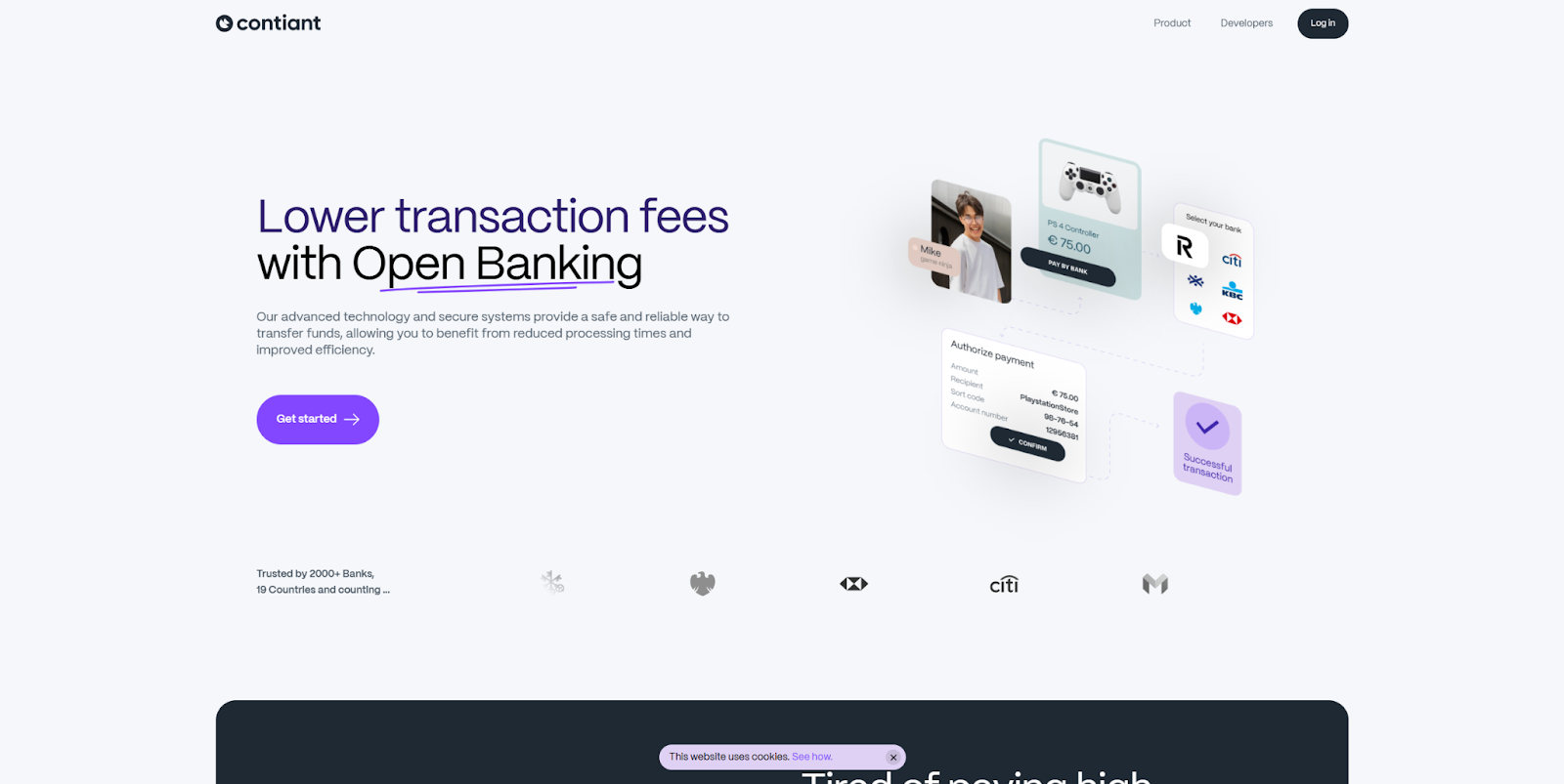
Contiant is an open banking service whose modern startup website, designed by StanVision, carefully unpacks everything there is to say about the service in a series of animated rows. The colorful, scrolling sections near the bottom of the page break down three key features of the product, along with concise text and relevant screenshots for clarity. If your service is similarly complex, breaking it down into digestible segments like this is a great way to explain the benefits without overwhelming visitors.
5. KeyReply
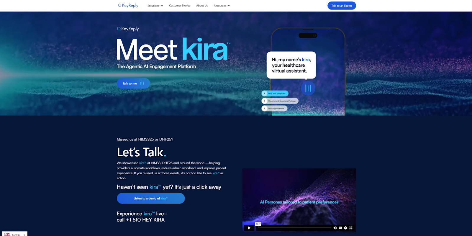
The startup website KeyReply, designed by Gita A. Ramdhani, explains what the product offers, using a clear value proposition and several demonstrations. One of the product’s primary features is seamless integration with other platforms, and the horizontal list of compatible tools shows visitors how this product fits into their existing workflows. Highlighting integrations like this showcases your service's versatility as well as credibility in its relation to other platforms.
6. Retell AI

Retell AI helps users create custom AI agents. Their website’s design is user-friendly and inviting, with sticky navigation and a clear visual hierarchy that makes it accessible for users. The most successful tool used on this site is their provision of a live demo. If you enter your information on the homepage, a Retell AI agent will call you immediately to simulate scheduling an appointment. Brief, real-time experiences like this are an excellent way to relate credibility for an unknown service.
7. Clay
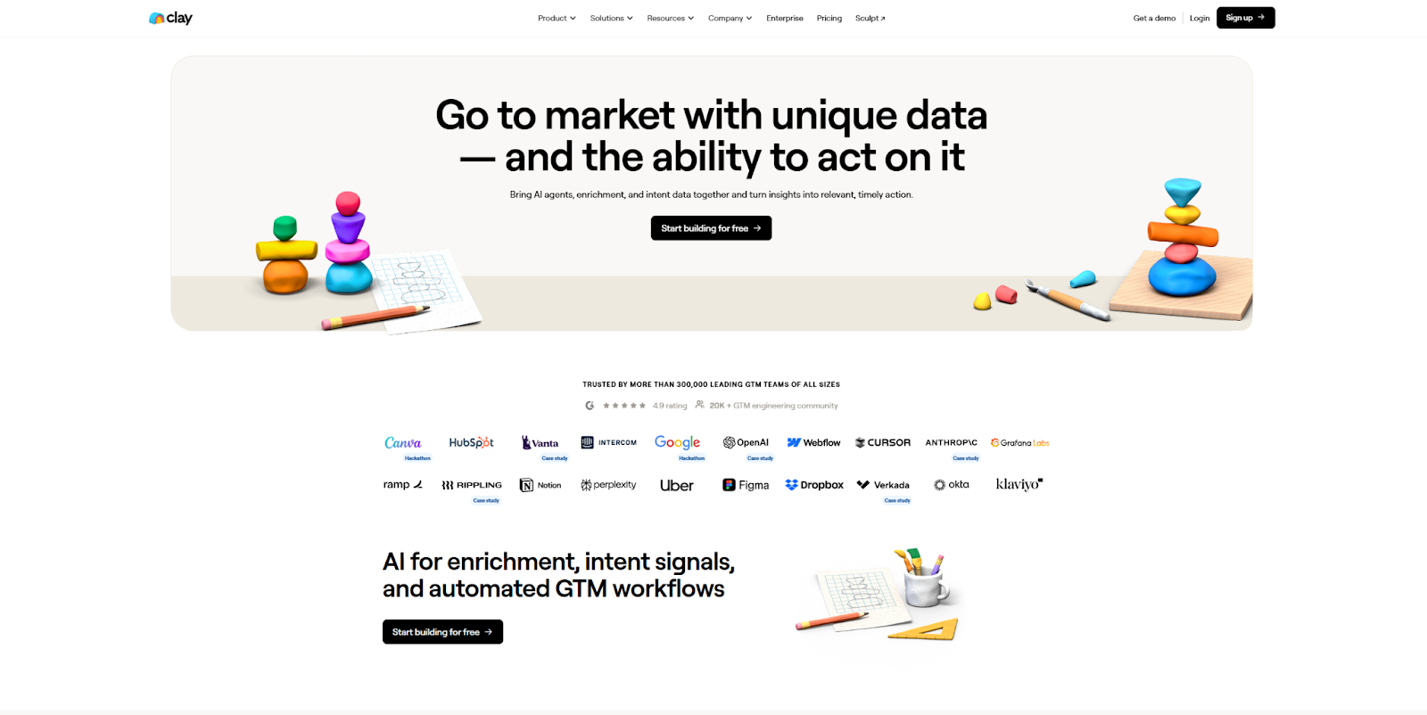
Clay’s web design is a good example of how you can use social proof to build trust with your target audience. The first row below the hero image is a large list of well-known businesses that use this startup's product. Every row after that dives into a case study for one of those clients, showcasing how Clay’s service benefitted each client. The site is highly informative, and every element works to highlight Clay’s credibility and effectiveness.
8. Egglife
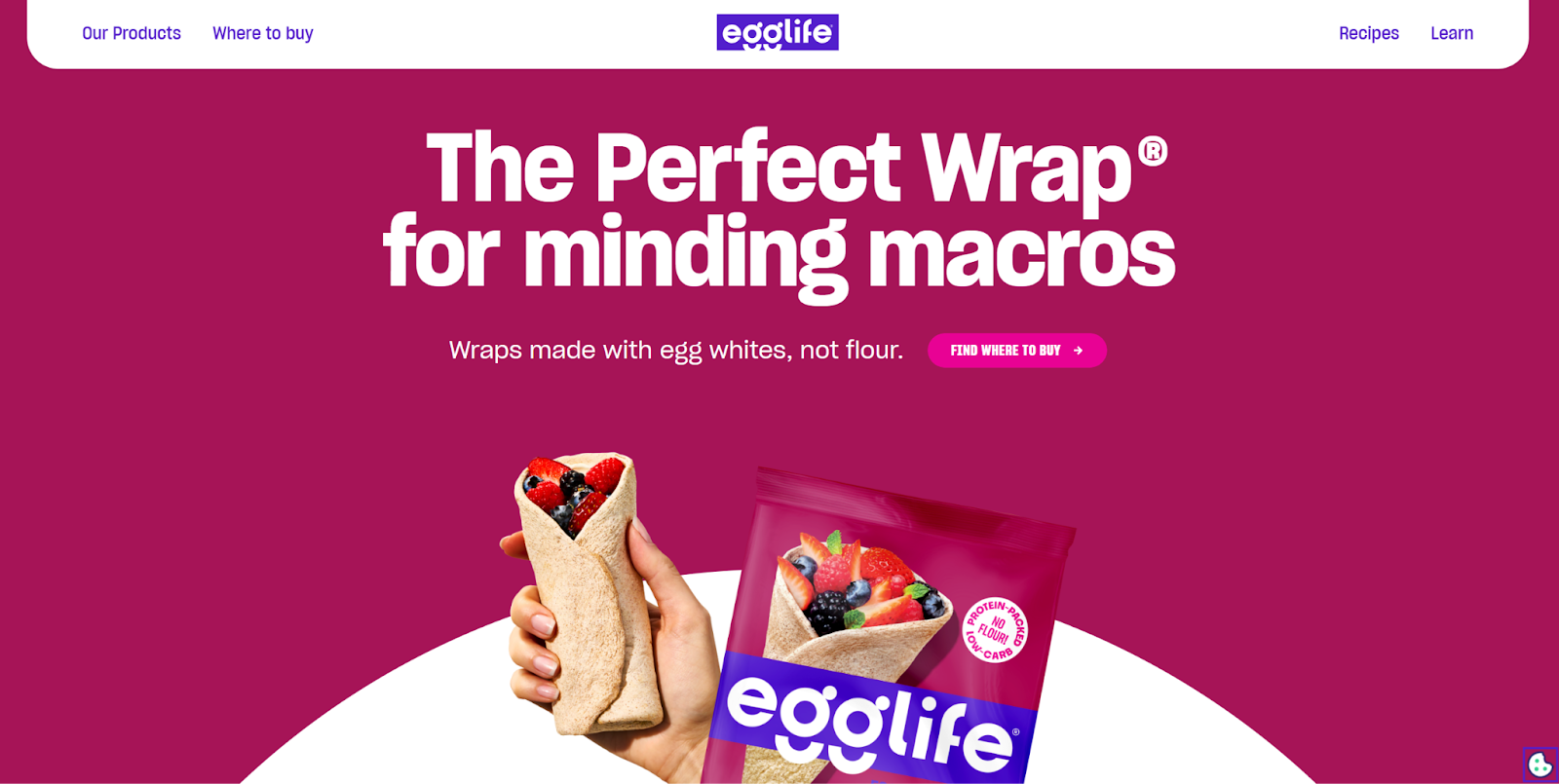
Egglife makes protein-packed gluten alternatives that fit into most diets. Their startup website, designed by Paper Tiger, opens with images of their products to entice visitors. The following content answers common questions like “Where to Buy,” “Why egg whites,” and “Why we do it.” There is also a recipes section that offers over 150 ways to use Egglife’s wraps to make meals, showing potential customers exactly how the product might fit into their lives.
9. SHUUGA

The SHUUGA website was built by Floyd van Joost with Webflow. The design opts for unusual typography, bold animations, bright colors, and big images. The cursor — a large yellow smiley face with the text “Bounce That” — is equally quirky, completing the thematic experience. All of these unusual design choices make for a strong first impression that’s sure to be memorable.
10. Tengo

Tengo is an AI startup that creates tools to help companies reach suppliers and analyze markets. Their website, built by Justa, outlines how the tool works, using several concise overviews and a clear value proposition. “Finally win more public tenders” is an action-oriented phrase designed to grab the target audience’s attention, and the several featured highlights aim to answer any immediate questions. Meanwhile, the “Request access” CTA conveys exclusivity while clearly indicating the next step.


Startup website
This Webflow startup kit has everything you need including homepage variations, about pages, feature pages, and more.
11. Metomic
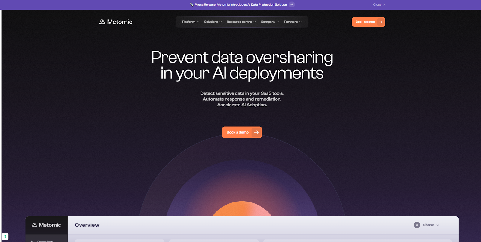
Metomic is a SaaS security tool for AI developers crafted by MakeBuild using Webflow. SaaS websites benefit from informative visuals to clearly explain technical, complex products. This site also uses many animated images to help digital features feel more concrete. The cohesive color palette makes each graphic educational and expresses the Metomic brand identity.
12. Starcloud
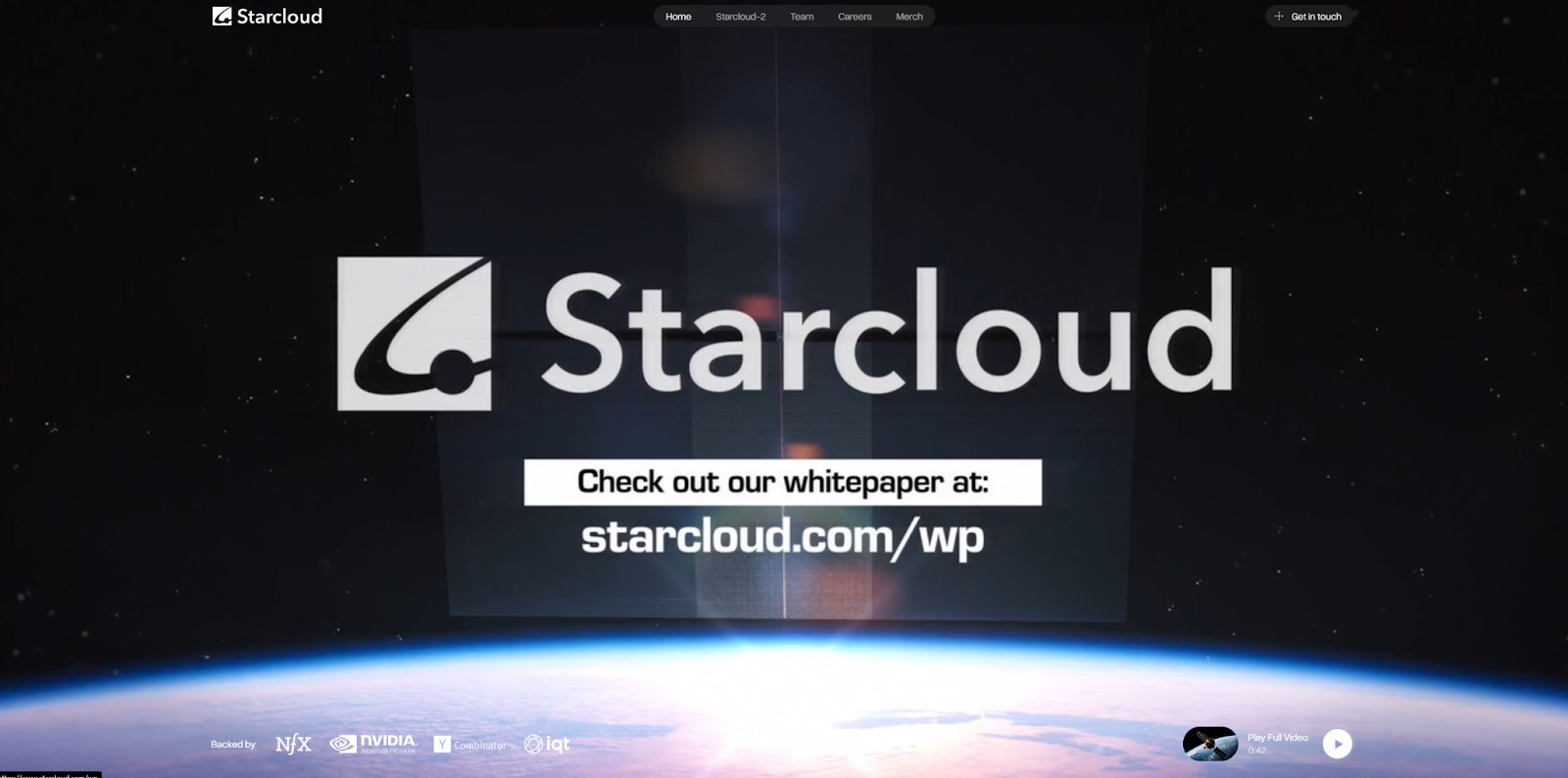
Starcloud is a project that aims to deploy satellite data centers. The hero visual at the top of Starcloud’s homepage highlights that ambition with a full-screen video outlining their goals. They also mention some well-known backers, such as Nvidia and Y Combinator, to earn credibility with their clientele. The rest of the page leans even further into social proof, showcasing partners and sponsors alongside founder profiles.
13. Tedy
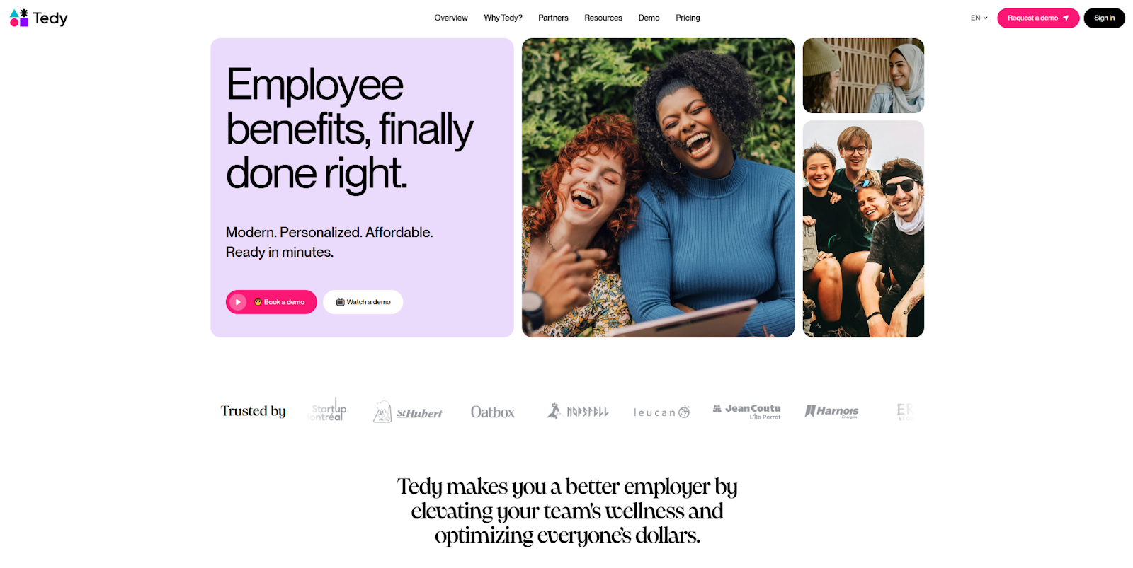
The web design Jordan Gilroy developed for Tedy showcases a brand identity centered on people. The site puts images of smiling faces and harmonious colleagues upfront, using its content to uplift and showcase how Tedy benefits both employees and employers. The pleasant imagery is the perfect lead-up to the final CTA which encourages visitors to either watch a video or receive a demo if they are ready for the next step.
14. Little Lagniappe

Anntoine Marketing + Design knew what they were doing when they put smiling children at the center of their web design for Little Lagniappe. Every row captures a wholesome moment with subtle color changes and high-quality visuals. Their use of positive emotional content is paired with text that makes clear, concise statements about the company’s mission and product. This startup site is a good example of how to positively engage visitors both emotionally and intellectually.
15. Arcium
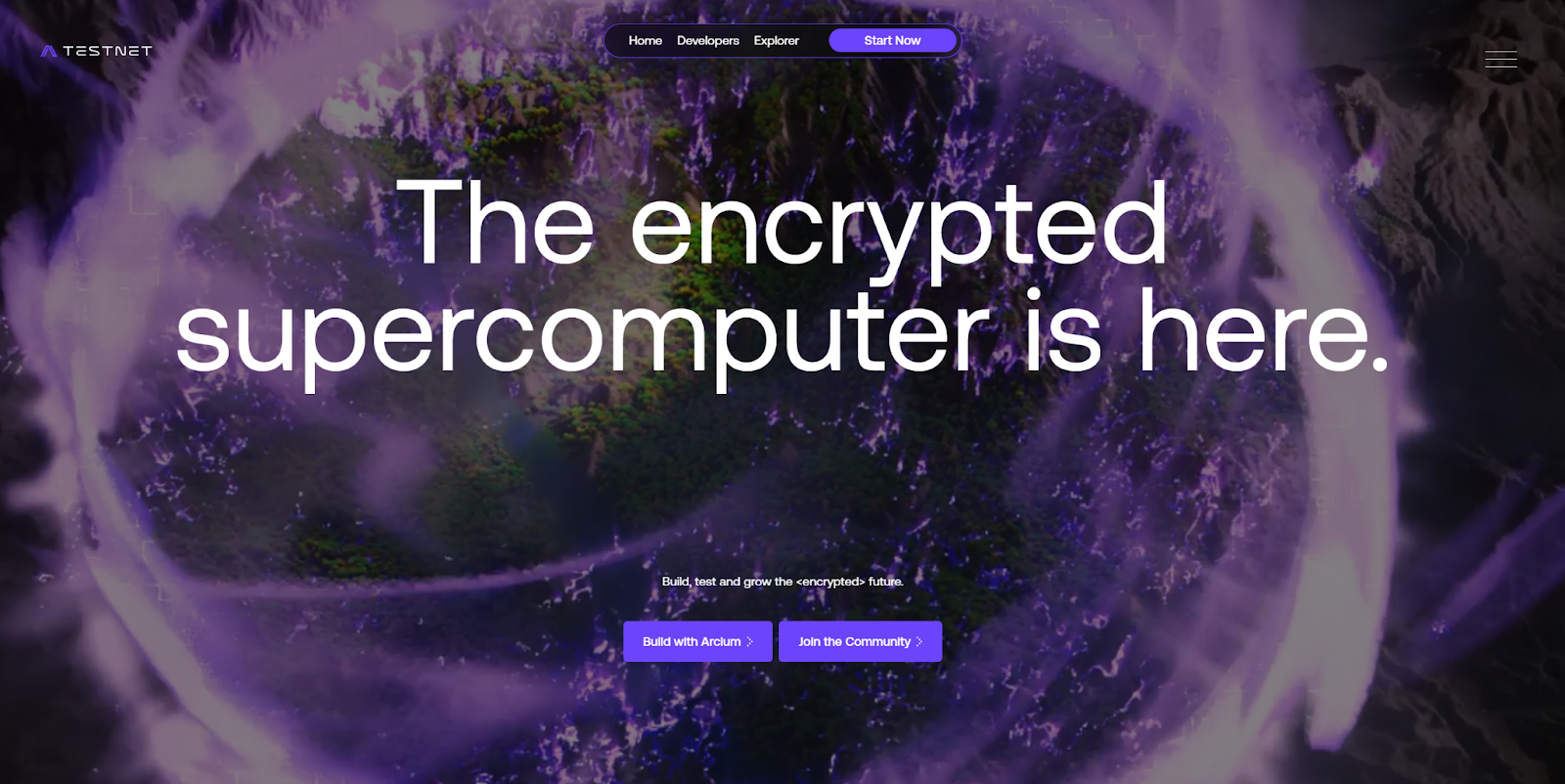
Arcium is a complex encryption platform, and their Testnet landing page focuses on educating visitors. It starts with an impressive visual and a big promise (“The encrypted supercomputer is here”), then offers a step-by-step breakdown of how the platform works. Each step is clearly labeled with concise titles, and there are demo apps that visitors can experiment with immediately. This is a good example of how to build an effective landing page that grabs attention and provides a curated educational experience.
16. Things.inc

The website that Psychoactive Studios created for Things, Inc. is playful and interactive. It has reactive animations, a customizable appearance, and even a scavenger hunt. The scavenger hunt is particularly noteworthy, as it’s a fun way to keep visitors interested for longer and encourage them to check every page. Since the software is meant to be interactive and playful, this website design is very on-brand and gives potential customers a taste of what they’ll get.
17. Outseta

Outseta is a centralized platform to manage your business’ tech stack. It even integrates with Webflow to help you set up user accounts. The homepage begins with a CTA that targets the most pressing question: “Is Outseta for me?” The article that follows guides visitors through what Outseta does, who it’s for, and how they can get started. The “before and after” section concisely highlights key pain points and how the product addresses each one.
18. Rewind
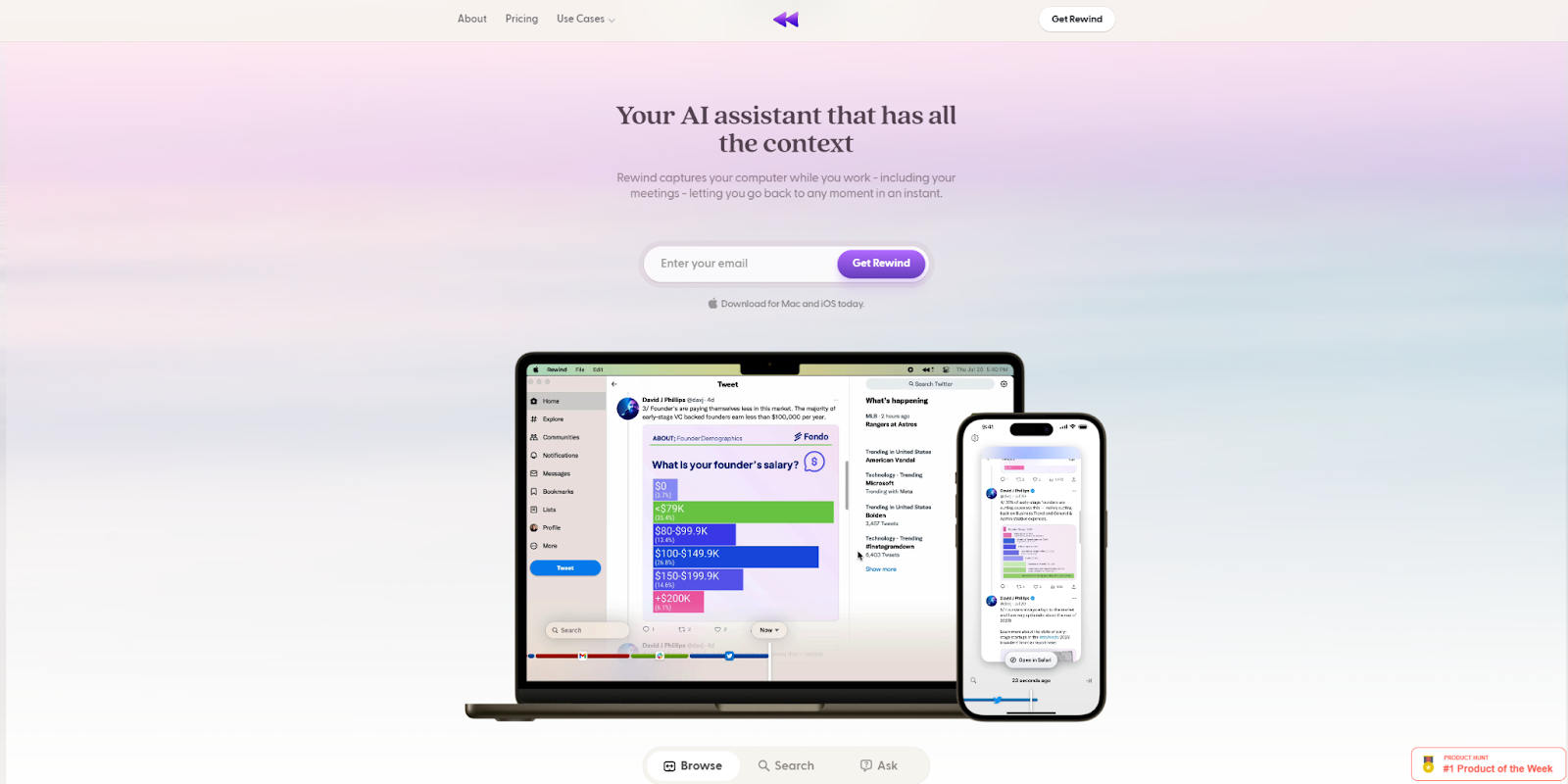
Rewind can play back anything you’ve done on your phone or desktop, through a wearable device and software. This startup website covers multiple use cases in detail with clearly labeled section headings. The color palette keeps the page easy to read with muted background shades, and there’s plenty of whitespace to help the design work well on mobile devices.
19. Pogo
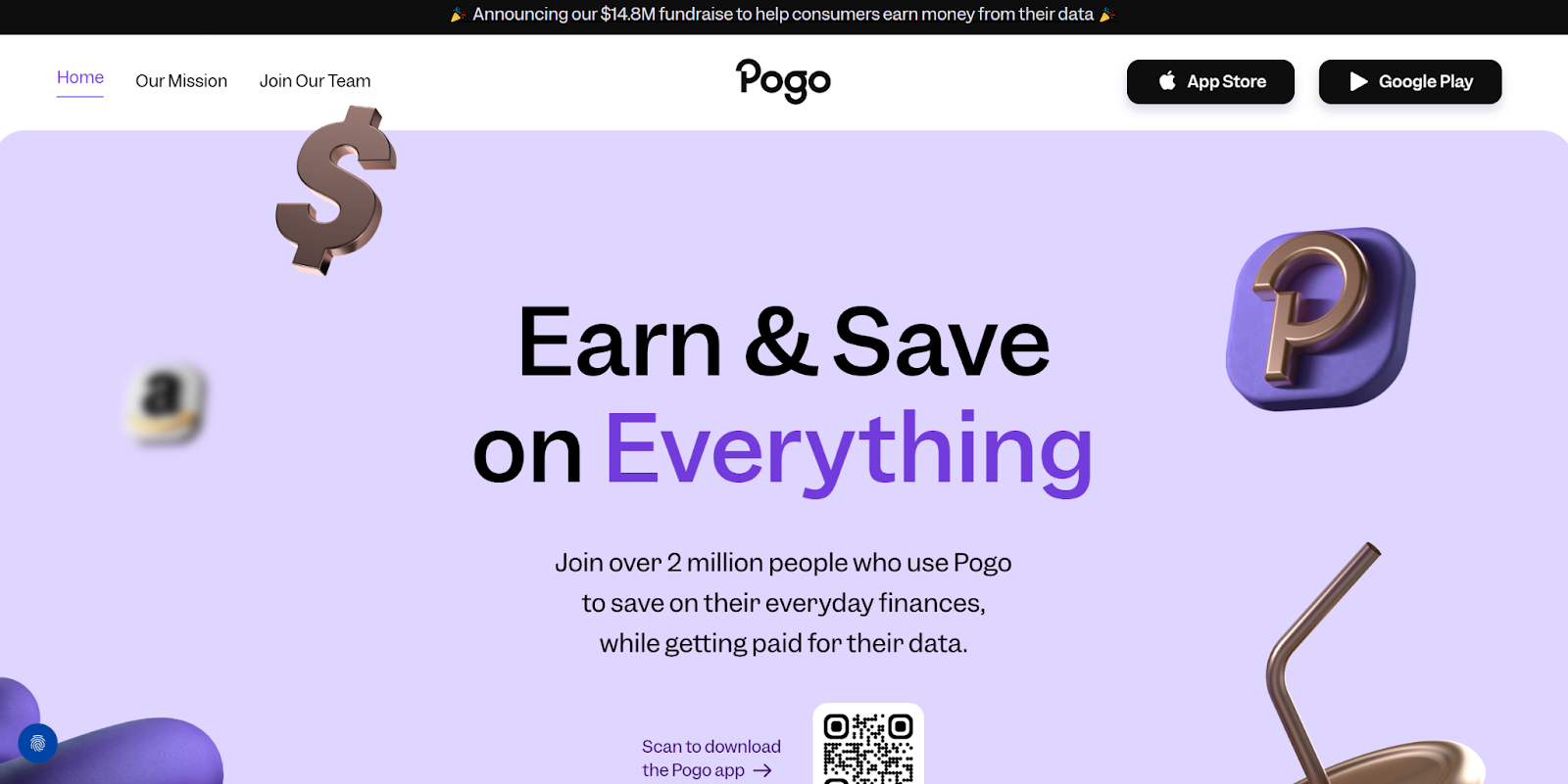
Pogo helps consumers earn money from their data by using a simple app that tracks purchasing behaviors. Since the main draw for users is the reward system, Pogo wisely made that the core of their homepage design. The website also provides data about the number of app users as well as trustworthy logos and testimonials to increase credibility.
20. Bland AI

Bland helps companies build AI voice agents to handle customer calls. Designed by Tilipman Digital, this startup website features a live demo at the top of the page, and ample space dedicated to unpacking what the service does. It also builds credibility through its use of data, visual examples, technical but accessible language, client logos, and even a link to the company’s security policy.
Tips for creating your own startup website design
The best startup sites follow sound web design principles, while including a few unique elements to differentiate themselves from the competition. As you consider how to apply the lessons from the examples above, here are a few startup website design tips:
- Create a clear structure. A well-structured page with divided sections keeps potential buyers from getting overwhelmed, especially if you have a lot of information to share. You can use Webflow Optimize to A/B test various structures for visitor retention, or try a method like card sorting or tree testing to generate new ideas.
- Design from the top down. Before you add content to your site, you can develop a design system that keeps layouts, animations, text, and graphics consistent with your brand identity. You might also want to build templates and reusable components that ensure every new page fits within your overall UX design.
- Curate the user experience. The best sites have a curated UX that moves visitors through the conversion funnel naturally, with the fewest possible steps. Approach each page as a guided journey, and look for ways to streamline the path from interested visitor to engaged customer.
- Optimize your website and content. Even if your website is designed well, it won’t convert if the right people can’t find it. You can use a search engine optimization (SEO) tool like Ahrefs or Semrush to identify keywords and topics that are relevant to your target audience, then incorporate them into your content and metadata.
Build a startup website that impresses and converts
While a unique design can be powerful on any type of website, startup sites in particular benefit from visually appealing, creative looks and layouts that capture visitor attention. This field can be quite competitive, so it is important to curate a memorable website experience using the right inspiration.
In addition, you’ll need a website builder that can support your vision. Webflow's visual-first platform is versatile enough to help you achieve your dream design. With Webflow, you get a complete toolset for creating custom layouts, reusable components, unique styling, and engaging animations.
Get started with Webflow today, and build a startup website that drives business growth.
Build websites that get results.
Build visually, publish instantly, and scale safely and quickly — without writing a line of code. All with Webflow's website experience platform.