UX prototyping helps you validate your ideas and check for errors at every development stage.
UX prototypes turn ideas into practical demonstrations designers can use to gather crucial feedback from users, leaders, and colleagues. Using these proofs, teams can identify and correct flow errors much earlier in the design process, saving time and money.
Read on to learn more about these models’ types, functions, and benefits.
Understanding UX prototyping
User experience (UX) prototyping involves using paper or software to model your product’s navigation, visual design, and functionality — all crucial elements of the user interface and experience. With a mock-up prepared, you can test your designs with potential users, demonstrate the intended functionality to developers, and present your design ideas to leadership to get their buy-in.
What are the different types of prototypes?
Prototypes range from rudimentary outlines with pen and paper to detailed digital mock-ups with tools like Adobe XD, ProtoPie, or Figma. Most UX design teams use both methods, gradually moving from paper to low and high-fidelity models as their designs mature.
Low-fidelity prototypes
Low-fidelity (lo-fi) prototypes fall into two categories: paper or digital. Both models focus on functionality rather than aesthetics but use different tools to accomplish these tasks.
Paper prototypes
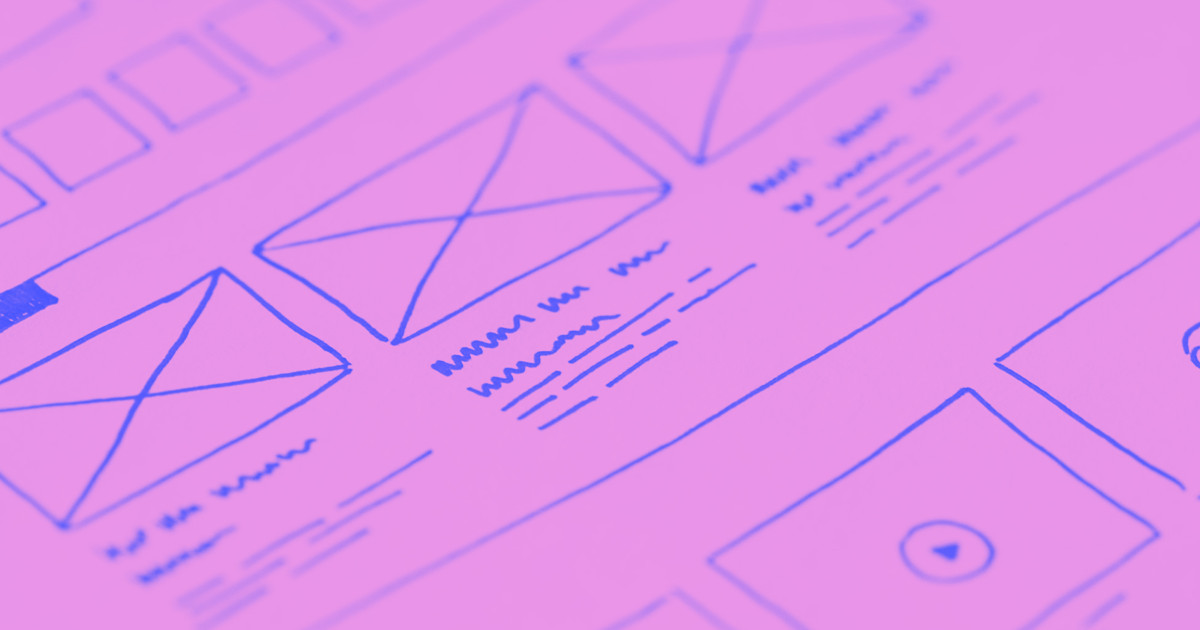
Paper prototypes use printouts or drawings to demonstrate how your product should appear to users. After arranging the pages, you guide users through the UX one screen at a time. As they physically tap the paper, you switch to one that represents the resulting page.
These models are quick to create and don’t require special software — drawings or image editing tools that support wireframes will work. However, the need to be physically present means you can only perform user testing one at a time, and each test is time consuming.
Digital lo-fi prototypes
Digital lo-fi prototypes have limited aesthetics but can respond to user input and function. These mock-ups typically focus on modeling how users navigate the product, with placeholder text and images filling in actual content. The goal is to test the spacing and functionality of text blocks, product images, and icons.
It takes longer to make digital low-fidelity prototypes than paper ones. You’ll spend about the same time wireframing each screen, but the added interactions take time to configure. Design tools like Figma, Sketch, and Adobe XD can make this process faster.
High-fidelity prototypes
High-fidelity (hi-fi) prototypes show every screen in your UX flow in a detailed, functional demo. Each interaction is operational and includes real images, logos, and text that demonstrate the finished product’s appearance. More than just navigation, these models can use multi-state containers, functional forms, and dynamic content to test the flow’s look and feel.
If you’re going through the trouble of making hi-fi prototypes, the UX you’re testing is probably crucial to the overall product. If so, you’ll want to test it with as many people as possible. Use a full-service prototyping tool like Axure RP, Justinmind, or ProtoPie to export your mock-up to a cloud server. From there, any authorized user can test it and leave feedback.


Evolving design systems
In our ebook, learn why experts are investing in scalable design systems and how they are thinking about the future of design systems.
"Internally at Webflow, the design team has been asking product managers to prototype and vibe-design things — not because that's going to be the final design, but because it helps communicate what they have in their mind. So the designer can hear them better and then go do their excellent, super-creative design work that a PM typically isn't able to do."
- Guy Yalif, Chief Evangelist, Webflow
Advantages and disadvantages of UX prototyping
Creating a mock-up of your UX, even a rudimentary one, helps you understand a product’s structure. But this process isn't always necessary. Consider the following advantages and disadvantages when deciding whether to make a UX prototype.
Advantages
Here are the advantages of investing time and effort into creating prototypes:
- Identifies errors. Even a paper prototype allows you to discover possible design errors. When you let users explore your flow, you’ll often find that they discover dead ends or other issues you overlooked.
- Validates ideas. Prototyping your designs translates your ideas into a practical experience. In the process, you’ll verify that the flow works as you imagined. If you designed your flow to be intuitive and convenient, for instance, a functional prototype lets you simulate real use cases to determine whether you’ve accomplished just that.
- Accelerates development. A prototype gives developers a functional demonstration they can use to understand which features, flows, and interactions they need to build. Whenever they have questions about when an animation should trigger or a button should appear, they can reference the model to find out.
Disadvantages
While prototyping offers several advantages, this process has some drawbacks as well:
- Adds time. Assembling your design elements into a functional prototype requires setting aside considerable time to configure interactions, test flows, and interpret results. If the journey you’re designing is relatively small or may not be used in the finished product, the time investment might not be worth it.
- Requires users. Designers often build prototypes so other people, whether colleagues or real-world users, can interact with the product. Before building these models, consider whether you have a second set of eyes to review them.
- Increases cost. These models take time to develop and review, leading to longer and costlier projects. Additional resources, such as user testing services or prototyping software, may also cost money.
4 tips for making a UX prototype
Whether you’re making paper or digital prototypes, here are four ways to streamline your process and get better at UX prototyping.
1. Use a design system
Before you assemble the first screen, compile a library of components, palettes, and text blocks to create a basic design system. As you discover the need to change button colors or menu styles, you can update them all at once from your central asset library.
All prototyping tools feature some support for reusable components and variables, but Figma is perhaps the best at it. Its elegant whiteboard UI simplifies the process of organizing, visualizing, and updating your entire design system.
2. Create an information architecture
Use a diagram or bulleted list to organize your headers and menus, and add this information in logical places based on their priority. For example, the top navigation bar for a SaaS website should detail product features, solutions, and pricing. These categories help users easily understand the program’s benefits and whether or not it’s a right fit for their needs.
3. Back up your work
As you build your prototypes, create separate files that capture each iteration. After testing, you might discover that an iteration you moved past was actually better. If you saved that iteration in its own file, you can quickly revert to it without undoing all the work you’ve completed since.
4. Try rapid prototyping
Rapid prototyping uses lo-fi models to quickly create, test, and iterate a design. The purpose is to gain user feedback and implement it to improve the product. Use this strategy to validate small changes or meaningful interactions before you commit to them.
If you’re curious how an onboarding flow functions, for example, you might create a stripped-down prototype of the beginning and end of the experience. The testing would confirm that entering and exiting the flow works as you intend.
Collaborate on UX designs with Webflow
Feedback is an essential part of prototyping, and collaboration is crucial to crafting a well-designed product. Used correctly, that input can help you find issues before they make their way into the finished product.
When crafting website prototypes, bring the whole team — from designers and developers to editors and marketers — into one platform with Webflow. Collaborate in real time and design using actual content. And if you work with Figma, check out the Figma to Webflow integration, which lets you carry over your designs from Figma with just a few clicks.

Get started for free
Create custom, scalable websites — without writing code. Start building in Webflow.


