Update
Layout & design
Introducing a new look and feel to Webflow
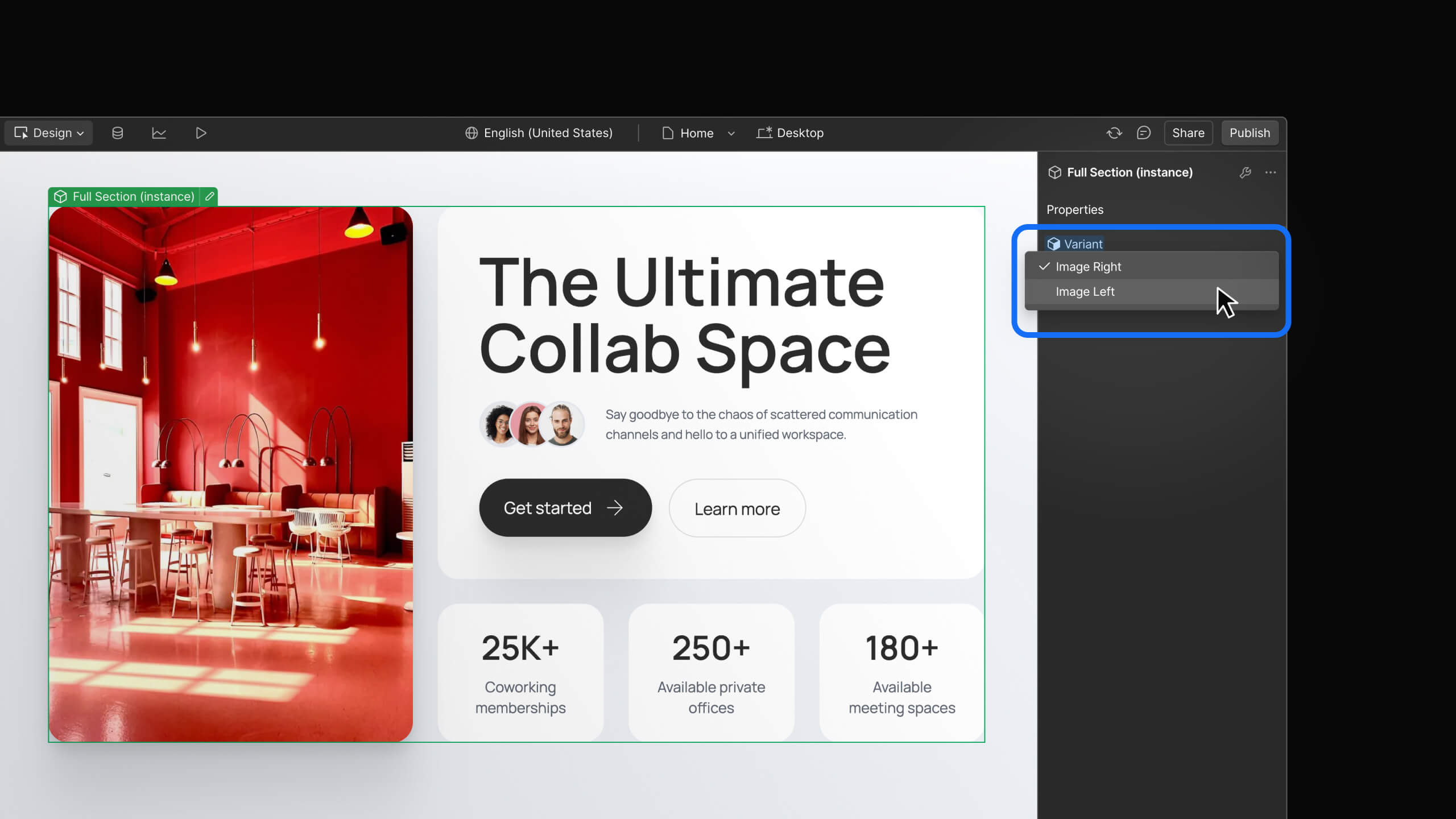
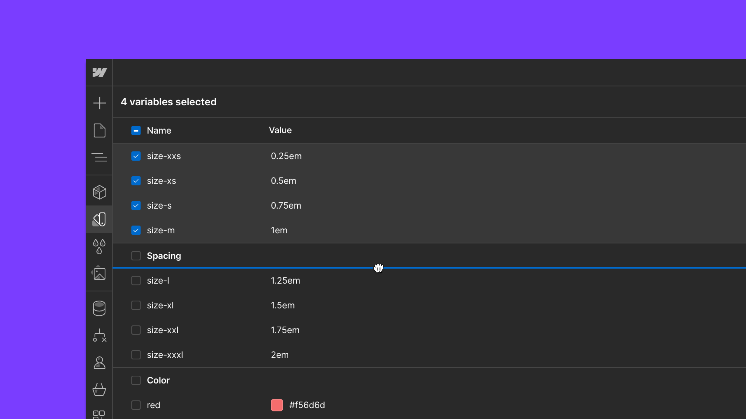
Webflow’s improved user interface provides a more focused workspace and modern design.
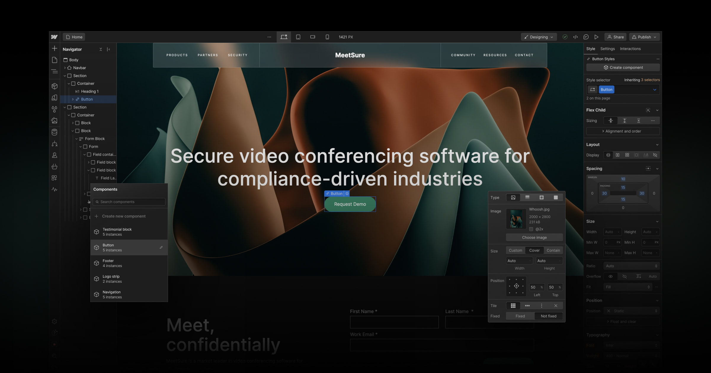

Today, you’ll notice that all parts of Webflow — especially the core Webflow Designer — are evolving to reflect our new brand direction, the power that makes up our platform, and the kinds of pro websites we want to enable all of you to build and scale.
Specifically, you’ll notice:

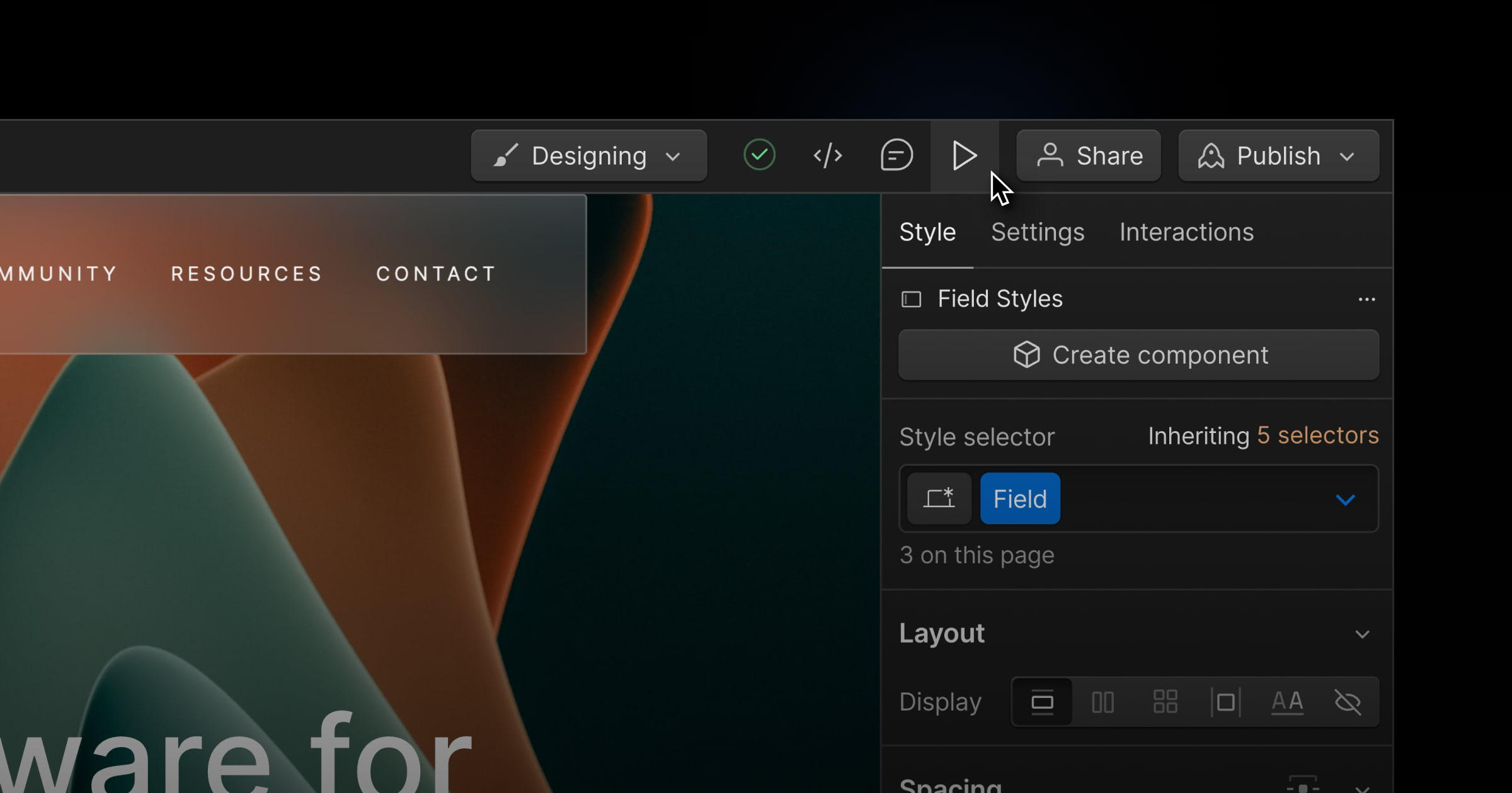

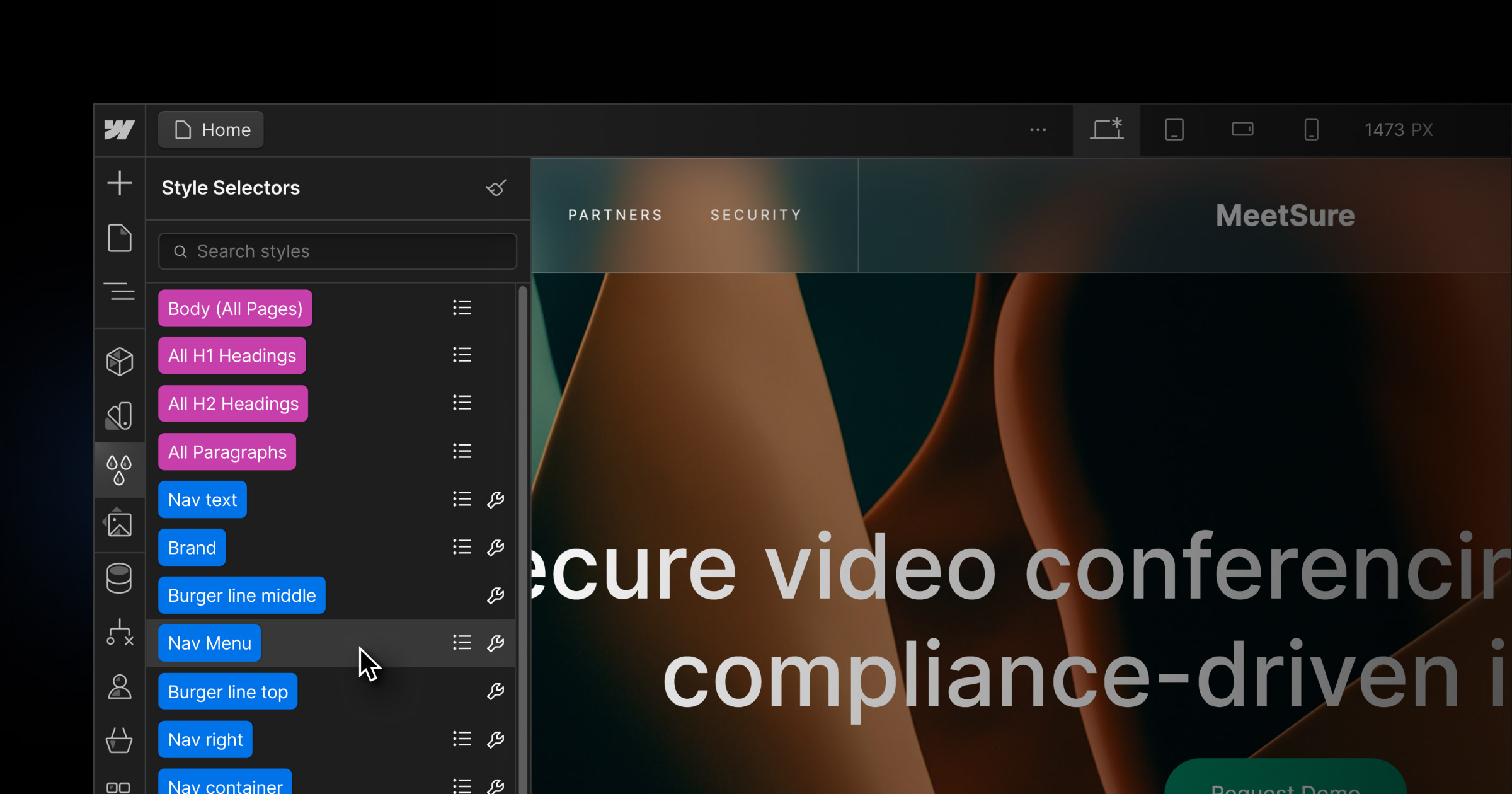

Our goal is to provide you a more focused environment, improved navigation and swift access to the powerful tools and capabilities you love from Webflow. Additionally, this redesign paves the way for new features and establishes a uniform experience throughout the platform.
Over the coming months, you can expect ongoing refinements to bring more consistency across Webflow.
To learn more about our brand refresh, check out our blog post.
Related updates
Get started for free
Try Webflow for as long as you like with our free Starter plan. Purchase a paid Site plan to publish, host, and unlock additional features.
Try Webflow for as long as you like with our free Starter plan. Purchase a paid Site plan to publish, host, and unlock additional features.


