

See how top homepage designs work and learn how to achieve similar results.
Your website’s homepage is the front door to your brand — it’s where most new visitors decide whether to scroll deeper or bounce away. Since the homepage serves many functions, like communicating your core selling proposition and encouraging conversions, great design requires a delicate balance of diverse elements.
For example, you’ll need to start with a headline that grabs attention, plus clear navigation that guides visitors toward important content. When all its elements work together, your homepage can strengthen your brand’s presence and get visitors excited.
Read on to learn about the building blocks of great homepage design and see examples of those techniques done right.
The importance of homepage design
A high-impact homepage effortlessly guides your target audience toward solutions that fit their needs. Here’s what an effective homepage design can do:
- Build credibility. Elements like a functional layout, strong headline, clear navigation, and professional fonts signal that your company is trustworthy and established.
- Direct the user journey. Good homepages show visitors where to click or scroll next, pointing them toward the most important parts of your site and keeping them oriented.
- Boost search visibility. If you prioritize search engine optimization (SEO) and answer engine optimization (AEO) on your homepage, you increase the odds that search algorithms will show it to relevant users.
- Differentiate your brand. In a sea of bland designs, a unique homepage highlights your value right away and makes you stand out from competitors.
Elements of effective homepage design
While every brand brings its own priorities and style, strong homepages share these characteristics:
- Clear value proposition and headline. Your headline should be the most prominent piece of text on the page, explaining exactly what you do and hooking the target audience by speaking directly to their pain points.
- Intuitive navigation. Clear, prominent menus help visitors find what they need fast, or show them what to explore next.
- Strong CTA. If your homepage drives conversions, it needs a primary call to action (CTA) that stands out using strong contrast and central placement.
- Compelling visuals. High-quality media, purposeful whitespace, creative fonts, and on-brand styling are hallmarks of effective web design, as they keep visitors engaged and make your company memorable.
- Product or service overview. Visitors should understand what you offer at a glance — a concise overview of your product or service, paired with supporting visuals, helps them grasp your brand’s value.
- Contact information. Prominent contact options and forms make it easy for visitors to reach out and take the next steps in their user journeys.
10 inspirational homepage design examples
Now let’s look at 10 of the best website homepages, and see how brands in various industries use creative layouts and effective design trends to command attention.
1. Ben

Ben’s homepage leads with a few simple elements, like a headline and subtitle that introduce the product, sticky navigation, and CTA buttons. After establishing the basics, this page draws the eye down with a large, colorful looping visual that features lots of movement and happy customer faces. Together, these elements convey professionalism while also presenting the brand as friendly and engaging.
2. Cleft Notes
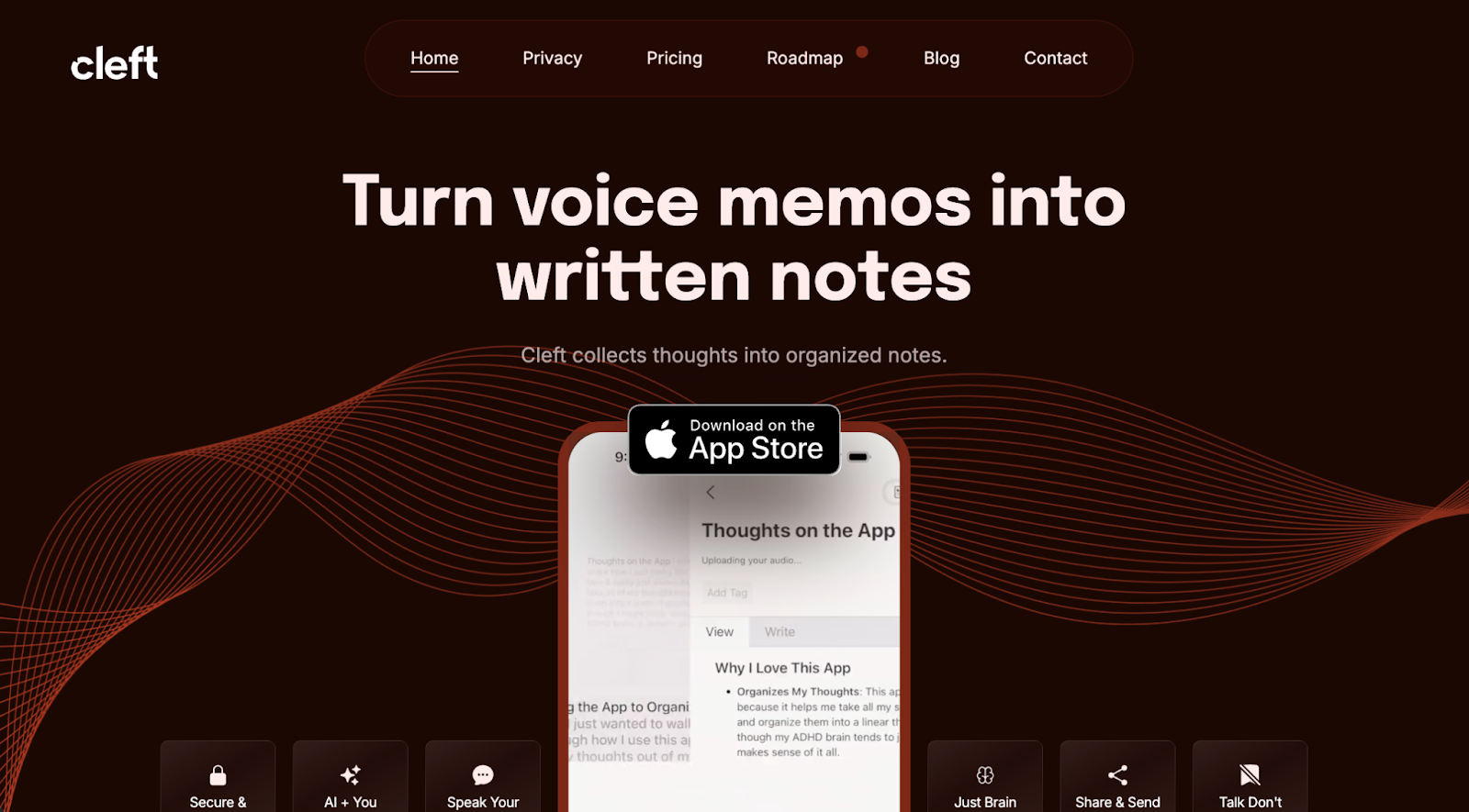
Cleft Notes’ homepage design leans into visual storytelling, leveraging bold graphics and animations to grab visitor attention. The headline, “Turn voice memos into written notes,” immediately communicates Cleft Notes’ offer. After that, the page unifies diverse elements, like a social proof carousel and product callout boxes, through a consistent narrative by focusing on who the product serves and how it can improve their lives.
3. DeepFlow

DeepFlow’s homepage, designed by Diego Toda de Oliveira, presents the company’s workflow tools via product overviews that make features digestible through large font sizes, concise text, and short, clearly divided sections. Sticky navigation lets users move elsewhere on the site whenever they’re ready, while scroll-triggered transitions and animations engage the eye and draw attention to important details.
4. Human Voice Over

Human Voice Over’s homepage, designed by Todor Dimov, starts with a bold headline and supporting subtitle, which combine to quickly introduce the company’s dubbing services and communicate their value. Of special note is the page progress tool in the bottom-left corner, showing visitors where they are within the page at all times. Plus, generous whitespace and sections with minimal content make this homepage mobile-friendly.
5. Lavender

Lavender’s homepage, which was designed by Refokus, feels approachable right away thanks to fun purple coloring plus casual language like “Your buyers hate cold emails” and “Loved by 30k+ email wizards." That first impression intensifies when you scroll down to find a simple interactive game, which lets you shoot at angry red bees and envelopes with a magic wand. This is an unusual touch that stands out while communicating both the brand identity and selling proposition in a tangible way.


Launch with Webflow Templates
Choose from hundreds of professionally designed website templates for any industry or style. Customize visually, launch instantly — no coding required.
6. Streamtime

Streamtime’s homepage, which was designed by Koysor, uses a broad color palette that pairs neutral grays and browns with vibrant yellows, pinks and blues that draw attention to important information. When paired with scrolling elements and lots of hover animations, these elements make the site more engaging than a typical static landing page. The menus echo that design, and they’re prominent but collapsible to keep focus on the text and visuals.
7. TechTO
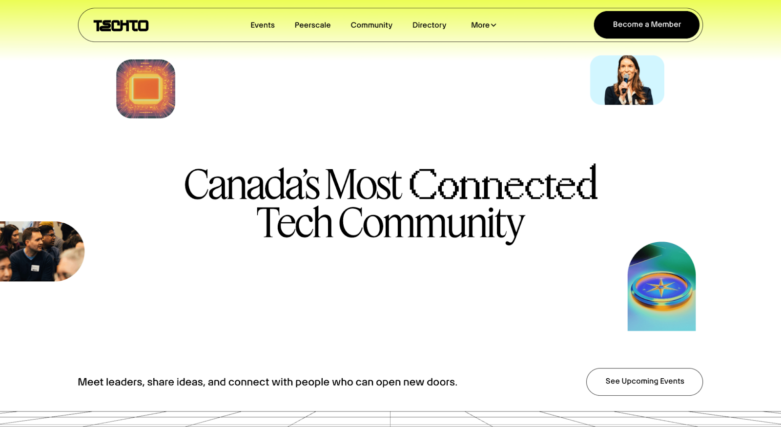
TechTO is an events platform, so its homepage puts the focus on people right from the start. Above-the-fold images show speakers and audience members and are paired with phrasing like “Meet leaders, share ideas, and connect with people who can open new doors.” After that is a sizable callout showcasing an upcoming event, so interested visitors have a way to jump right into the action.
8. UpGuard
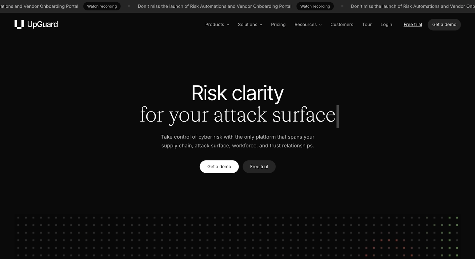
UpGuard’s homepage uses a stark black-and-white color contrast and concise copy like “Risk clarity for your attack surface” to establish credibility and professionalism. Cyber security is a serious topic, so this website opts for straightforward visuals and to-the-point explanations of features and benefits. And there’s an emphasis on social proof, with the largest images on the page leading visitors toward detailed customer case studies.
9. Vibrant
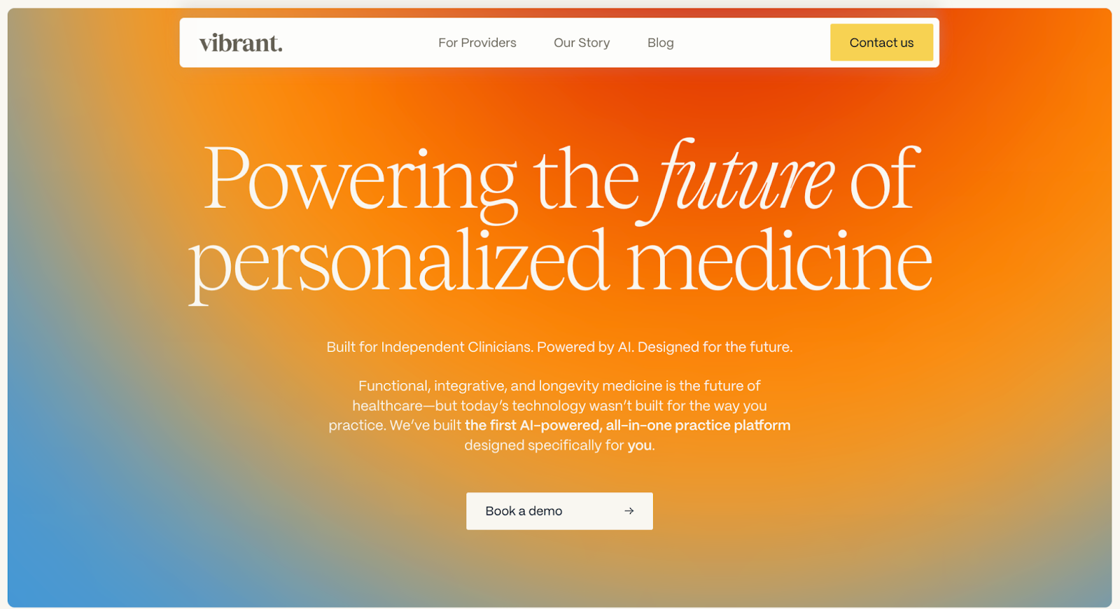
Vibrant’s homepage, designed by Paper Tiger, grabs attention with an orange-and-blue color palette and elegant fonts that reinforce the brand’s creative identity. This page uses whitespace to prevent the bold colors and large images from overwhelming readers, while clear navigation and headlines (i.e., “For Providers” and “Our Story”) make it effortless to learn about the company and explore the product’s features.
10. Wispr Flow
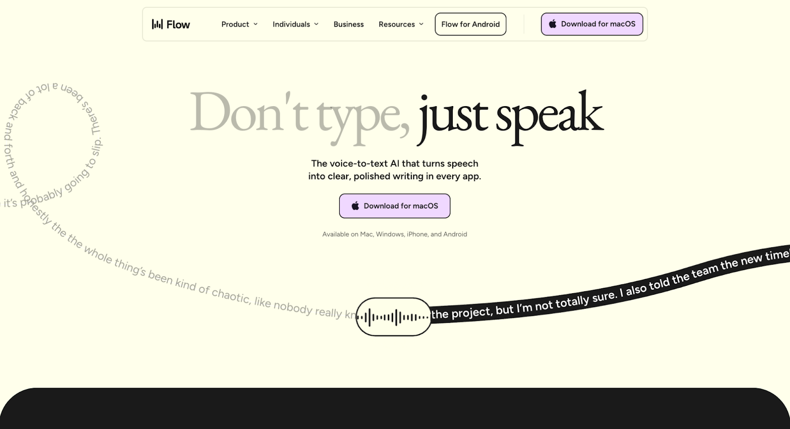
Wispr Flow’s homepage builds a compelling narrative by showing visitors how the product works, instead of just telling them. The scrolling banner above the fold visualizes the product’s voice-to-text function, and right below is a high-definition video that demonstrates the tool in action. Plenty of CTA buttons throughout the page encourage visitors to give the product a try.
Pro design tips for strong homepages
Here are a few tips for making your homepage engaging and effective:
- Perfect the art of whitespace. Using generous whitespace allows your most important elements, such as your logo and primary CTA, to stand out and command attention.
- Use high-contrast CTAs. Your primary buttons should practically jump off the page and guide users toward the next step. Make sure they’re prominently placed, surrounded by whitespace, and contrast well with the page’s background.
- Select legible, on-brand fonts. Typography impacts your brand’s personality and your website’s accessibility. Look for fonts that reinforce your homepage’s design but are also highly readable.
- Prioritize responsiveness. Most visitors will arrive at your homepage via mobile devices, so your website must be responsive to different device types and screen sizes.
- Optimize for SEO and AEO. Structuring your headlines and content for search engine algorithms makes your brand more visible.
Design homepages that win business with Webflow
Most homepages serve multiple goals: You have to impress visitors, educate them about your brand and product, and move them toward conversion. Every element must be carefully considered, since small details like color choices and CTA placement do a lot to shape the user experience. When everything works together and reinforces the same narrative, your homepage becomes a powerful engine for growth.
If you’re ready to make that happen, Webflow provides the professional-grade toolkit you need. Our website experience platform gives your team complete creative freedom, so you can build custom page structures filled with brand assets and engaging elements like interactions and animations.
Try Webflow and design a homepage that gets results.
Build websites that get results.
Build visually, publish instantly, and scale safely and quickly — without writing a line of code. All with Webflow's website experience platform.