


A well-designed checkout page turns casual visitors into paying customers.
Cart abandonment is a common challenge for clients with ecommerce websites, where potential buyers leave their shopping carts without completing purchases. This happens due to complicated checkout processes, hidden fees, or a lack of trust.
Over 70% of shoppers abandon their carts, so optimizing checkout page designs for your client’s websites can significantly impact conversion rates. By focusing on visually appealing, user-friendly layouts, you can guide customers through the final steps of their purchase.
What makes a good checkout page?
A well-designed checkout page ensures a seamless shopping experience and reduces cart abandonment. Here are several essential elements to include in your design:
- An uncluttered user interface (UI) reduces distractions and helps customers focus on completing their purchases.
- Progress bars and step indicators show customers where they are in the checkout process and how many steps remain.
- A guest checkout option allows customers to buy products and services without creating an account, helping first-time buyers and those in a hurry.
- Autofill options and minimal input fields reduce the time and effort required to complete a purchase.
- Trust signals like security badges, payment method logos, and privacy assurances instill confidence and let customers know that their information is safe.
- Mobile-friendly designs ensure the checkout page is responsive and performs consistently across multiple devices and screen sizes.
- Prominent call-to-action (CTA) buttons like "Continue," "Next," and "Place Order" stand out on the page and encourage customers to take action.
- Order summaries provide a concise rundown, including product details, prices, and shipping costs, helping customers review their purchase before completing it.
- Multiple payment options, including credit and debit cards, PayPal, and digital wallets, accommodate different preferences.
- Real-time error prevention and validation features provide messages to help customers correct mistakes like unfilled input fields or invalid card numbers.
- Customer service features like live chat, phone support, and email allow shoppers to reach out if they encounter issues with their orders.
- Post-purchase pages show a confirmation message with order details and provide options to track shipment or contact customer support.
Adding these design elements to your checkout page builds trust, encourages customers to complete their purchases, and creates a positive impression that might result in return business.
7 checkout page examples for a smooth shopping experience
Here are seven of the best checkout pages from a range of industries to inspire your next website design project.
1. FeatureCo.
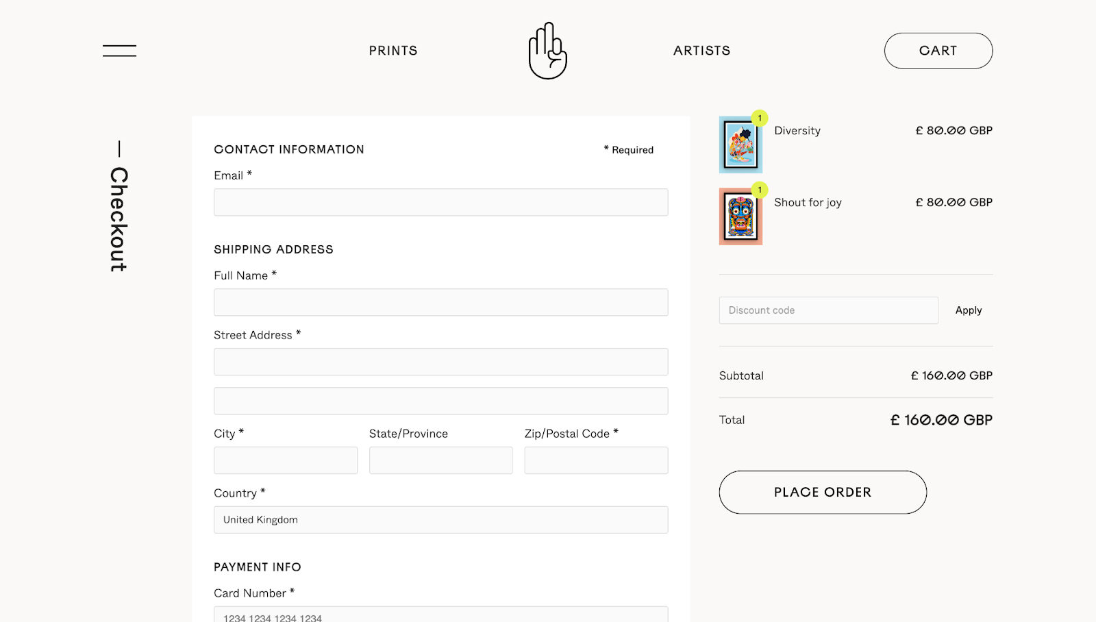
FeatureCo.'s website, designed by Simple As Milk, has a minimalistic, user-focused checkout page. The layout has clear sections for the shopper’s contact information, shipping address, and payment address, with ample whitespace making each section distinct.
The largest interactive element is a prominent "Place Order" button, encouraging you to complete your purchase. The cart summary on the right displays your selected items and total cost, reducing any surprises at the end of the process.
A header and footer include FeatureCo.’s logo, reinforcing the brand's identity. The footer also has scrolling bar animation to break away from the minimalist theme, avoiding monotony while promoting themes like "Independent Artists," "Studio Quality," and "Limited Run." Plus, it provides quick links to FAQs, returns, and contact information, offering fast access to additional support.
2. The DigiStore
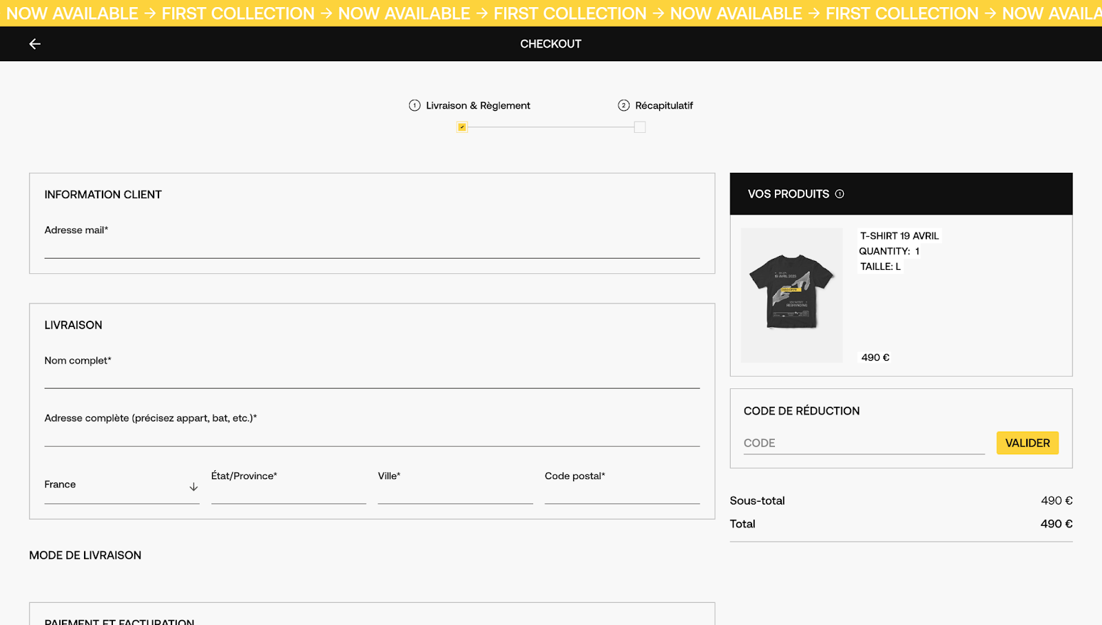
Digidop organized DigiStore's checkout page into distinct sections for customer information, delivery details, and payment information. At the top, a progress bar indicates the current step ("Livraison & Règlement," which translates to "Delivery & Payment") and the next step ("Récapitulatif” or "Summary"). The product summary on the right ensures transparency by showing you selected items and the total cost.
An input field for discount codes ("Code de Réduction" or “Discount Code”) allows you to redeem promotional offers or coupon codes, improving satisfaction and encouraging customers to keep shopping from DigiStore. The yellow CTA button ("Valider le Paiement" or "Confirm Payment") stands out on the page, with an arrow symbol nudging you in the intended direction — to complete the transaction.
3. Hedrick's Clothing Division
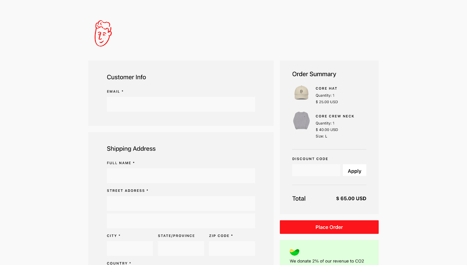
Hedrick's Clothing Division's checkout design, created by Hedrick, has plenty of negative spacing on the sides to focus attention on the center of the page, where the checkout form is. In addition to clearly labeled sections for customer info, shipping address, and payment details, the two outstanding elements are the red logo and the red "Place Order" CTA button. Not only do these pop off the page, but they also reinforce Hedrick's visual identity.
A green box below the order button highlights the company's commitment to donating 2% of revenue to reduce CO2 levels in the atmosphere. Green works well in two ways here. It’s ideal for environmentally focused design elements and also encourages action — like a green traffic light.
4. Webflow Merch Store
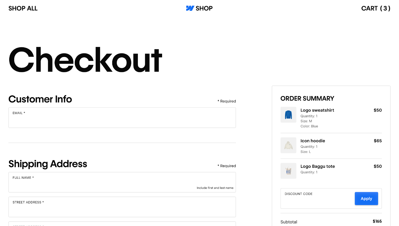
Webflow's Merch Store combines functionality, modern aesthetics, and brand consistency. The prominent blue branding throughout the page reinforces the company's image, including the large “SHOP” in the footer with Webflow's logo. Each section has a clear, bold heading, like "Customer Info" and "Shipping Address," to prevent confusion.
Interactive features, such as the input field outlines thickening on hover, provide instant visual feedback, letting you know which field is currently active. The “* Required” text next to the input fields and clear instructions like "Include first and last name" help prevent errors, ensuring shoppers provide all necessary information.
A "Billing address same as shipping” checkbox under the payment design offers a convenient option to toggle between addresses, reducing the steps required to complete the purchase. On the right, an order summary with a vibrant blue "Place Order" button displays an overview of the items, quantities, and total costs, minimizing friction and encouraging you to complete the purchase.


Supercharge your site with Webflow Apps.
Increase your site’s functionality and extend Webflow’s core capabilities.
5. Tomorrowland Store
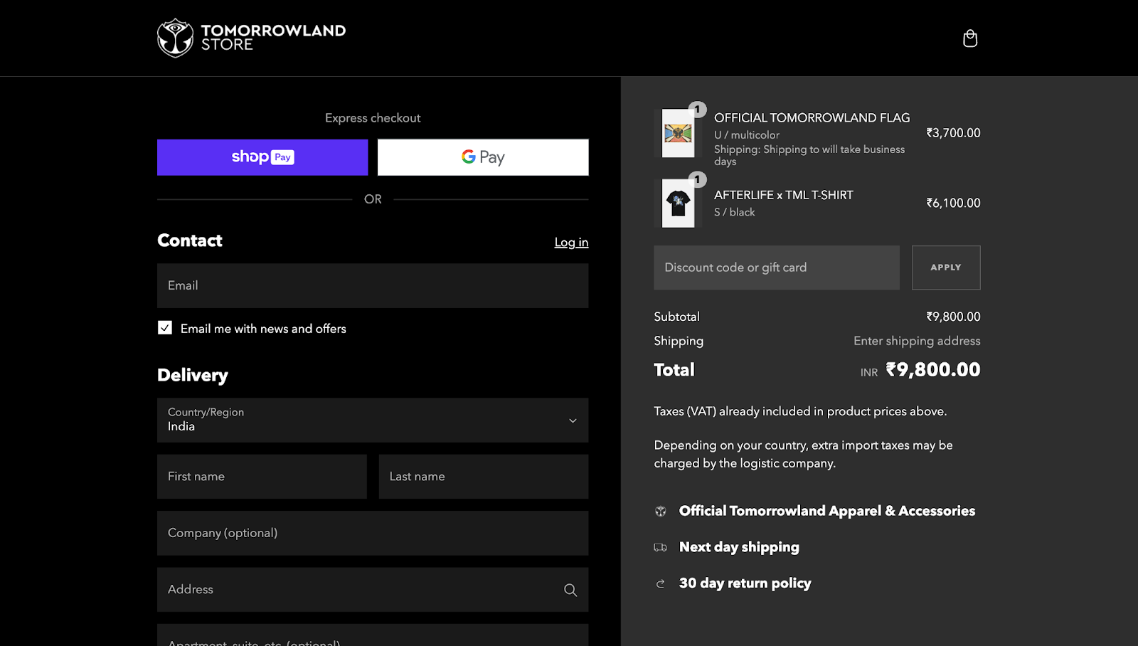
The Tomorrowland Store checkout page has a dark theme that provides high contrast for colorful elements like buttons and product visuals, making them stand out. The split-screen layout separates the input fields on the left from the order summary on the right, using a lighter gray color to distinguish between the two.
The page supports multiple payment options, with credit card company logos for visual aid. It automatically detects your region and adjusts the currency accordingly, shown here in Indian Rupees (INR). This highlights Tomorrowland's global appeal and reach, showing how they cater to an international audience. The "Remember me" option also creates a faster checkout process in the future by saving your details.
A "Show your support" section allows you to donate to the Tomorrowland Foundation, adding social responsibility while promoting Tomorrowland as a trustworthy platform for positive initiatives. Plus, transparent messaging like “Depending on your country, extra import taxes may be charged by the logistic company" prepares you for additional costs.
6. Stripe Checkout Rebuild
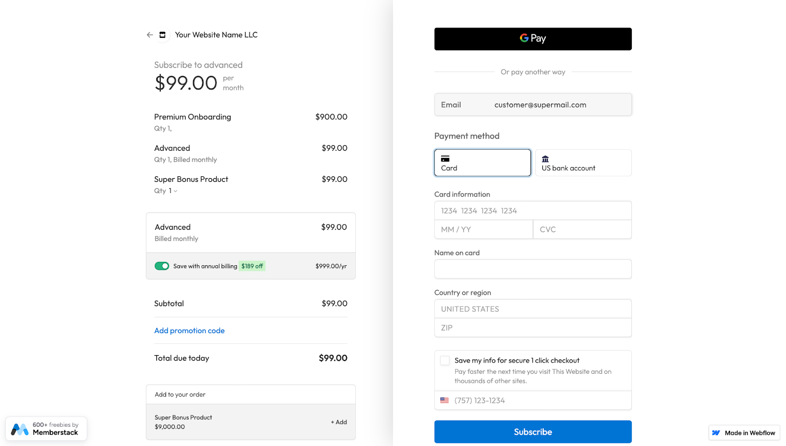
Like Tomorrowland's design, Memberstack’s Stripe Checkout Rebuild page neatly divides the input fields from the order summary in a half-and-half checkout UI, with subtle shadows creating an illusion of depth. Both sides have dark text on a white background to improve readability.
Multiple payment types, including a prominent button for Google Pay and an option to use bank transfers, provide flexibility and convenience. The page automatically detects your location, as seen with the U.S. region settings. Clear instructions, such as "Save with annual billing" and “Add promotion code,” guide you through potential savings.
The green “$189 off" button stands out, urging you to opt for the annual subscription over the monthly one. And the “Save my info for secure 1 click checkout" option on the right encourages you to toggle the checkbox for fast future purchases.
7. Egglife Foods
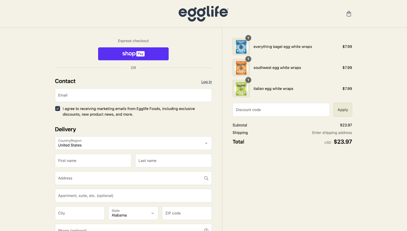
Egglife Foods’ checkout page, designed by Paper Tiger, has an eggshell-colored background that plays off the company’s name and reinforces the site’s style guide, with the company's logo centered at the top of the screen.
A vibrant purple “Express checkout" button breaks the neutral appearance and provides a quick payment method for returning customers. The split-screen layout separates the contact, delivery, and payment details on the left from the order summary on the right.
The only input field on the right is a discount box, with the transparent "Apply" button changing color as you enter a coupon code. This interactive element attracts attention while providing instant visual feedback so you know what to click.
A "Remember me" checkbox saves your information for faster future checkouts. And at the top, another checkbox represents an optional email subscription box for marketing emails without being intrusive.
Design ecommerce websites with Webflow
Marketing efforts and content guide visitors through their journey, and a well-optimized checkout page is the final step in turning interest into sales. From interactive visuals to multiple payment options, every detail contributes to increasing conversion rates.
With Webflow, you can build high-performing websites without relying on developers. Responsive design features, checkout page templates, built-in ecommerce functionality, and ecommerce integrations bring your clients' online stores to life.
Choose a template or start from scratch with your own design, and watch conversion rates grow with Webflow.
Get started for free
Create custom, scalable websites — without writing code. Start building in Webflow.