

Heuristic evaluations serve as validation checkpoints to ensure your interface meets usability standards and user expectations.
Developed by Danish consultant Jakob Nielsen, heuristic evaluations guide decisions about a website or application’s user interface (UI) and user experience (UX). They give organizations a structured approach to improve usability and visitor satisfaction.
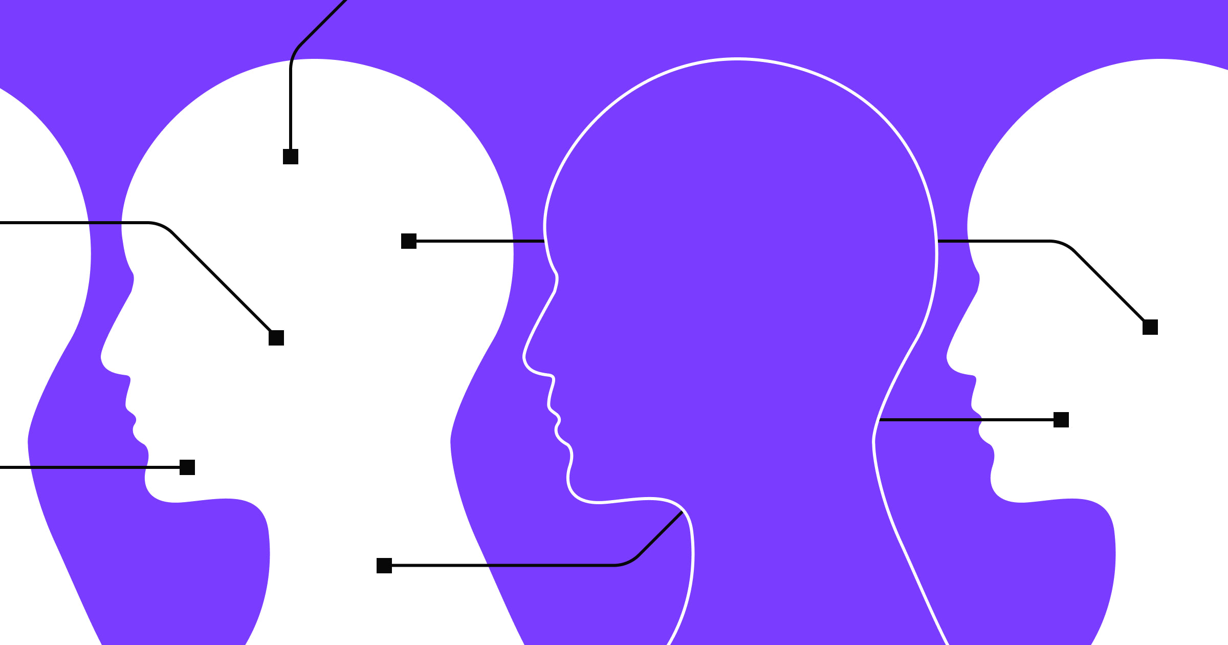
Read on to learn more about different heuristics and how you can use them to evaluate and strengthen your web designs.
What’s a heuristic evaluation?
A heuristic evaluation involves measuring a website or application’s usability. UI/UX design experts systematically examine an interface based on predetermined usability principles called “heuristics.”
Heuristics are broad rules derived from previous research and experience about what works well in web design. Evaluators apply heuristics to identify potential usability issues, like navigation challenges or confusing layouts, and improve a site or app.
Here are a few benefits these evaluations provide:
- Issue detection. Heuristic evaluations allow you to identify usability and accessibility problems early in the design process, preventing costly revisions later on.
- Solution prioritization. After identifying issues, you can prioritize solutions based on their severity and focus on the most critical problems first.
- Quick turnaround. Compared to other usability methods (like wireframing or heatmapping), you can conduct heuristic evaluations fairly quickly and provide fast feedback to your design teams.
- Expert insight. With their experience and knowledge, evaluators provide valuable insights that might not be evident through user testing alone.
- Collaboration. The findings from heuristic evaluations promote collaboration between design, development, and marketing teams, aligning everyone toward common usability goals.
You can find usability issues early in the design process through A/B testing, surveys, and case studies. This information encourages more data-driven and informed decisions about the user experience so you can make sites and apps more intuitive, user-friendly, and enjoyable for visitors.
Usability heuristics checklist for UI/UX design
Jakob created several usability heuristics, each addressing various touchpoints in the user journey. Here’s how each heuristic works in a UI/UX setting.
Visibility of system status
This heuristic emphasizes informing users about a website’s status by providing clear feedback and updates.
Say you’re using a banking website to transfer money. As you initiate the transfer, the site displays a loading spinner to show the transaction is processing. Once complete, the site presents a confirmation message with the updated account balance.
The platform informs you of a successful transaction through visual feedback (the loading spinner and confirmation message), providing reassurance and clarity about the system’s status.
Error prevention
The error prevention heuristic suggests that you should design websites to prevent users from making errors in the first place. If errors do occur, they should be readily apparent and reversible.
For example, a cloud storage service might require users to enter their email address in a form when registering. The form could include validation checks to ensure the email address is correctly formatted. If a user forgets to include an @ symbol, for instance, the form immediately highlights the error and tells them the format is incorrect. It can also provide real-time feedback as the user types, like changing the input field’s color or displaying an error icon.
In this scenario, the error prevention heuristic proactively prevents common issues, like incorrect formatting, through real-time checks. Immediate feedback helps users avoid errors, in turn reducing frustration.
Match between the system and the real world
This heuristic suggests that your website or app’s language, concepts, and actions should mirror real-world experiences to make the interface more user-friendly and intuitive.
A photo editing service might use icons resembling real-world tools like brushes, pencils, and erasers to help users quickly grasp various functions. When you see an eraser, you naturally associate it with removing an element, and this helps improve the match between the website and real-world-related expectations.
User control and freedom
Users should feel in control of an interface and be free to navigate and take action without worrying about making irreversible errors. This heuristic emphasizes control by providing clear options for undoing actions or exiting undesirable states.
Take a video editing software — it allows you to preview changes before applying them, while the interface has cancel and undo buttons to give you control over edits. If you accidentally delete a video clip, the undo feature lets you reverse the action and regain command over the editing process.
Consistency and standards
Consistent web design elements and interactions help users predict how different interface parts will behave. Follow established design conventions and implement a uniform design language based on your company’s style guide to make the site more familiar to visitors and reduce cognitive load.
For example, in a browser or operating system, users expect the placement of navigation elements like the back and forward buttons to be consistent across sites. This consistency means they can quickly use any website adhering to this standard.
Recognition rather than recall
Users shouldn’t have to recall information from memory — this introduces too much human error and frustration. Instead, they should be able to recognize relevant options and actions within the interface.
This heuristic emphasizes a design language in websites and apps that presents information intuitively and aids recognition rather than relying on user memory.
Consider a task management tool. Instead of asking users to commit specific syntax to memory (like creating new tasks or setting due dates), the interface provides intuitive options for them to recognize and select. You might add a prominent “Add task” button, followed by a calendar pop-up where users can visually browse and select dates. This design approach not only reduces cognitive load, but it also improves usability and accelerates workflows.
Flexibility and efficiency of use
Any website or enterprise application you build should accommodate both novice and expert users by providing shortcuts, customization options, and efficient workflows.
A word processing tool that offers keyboard shortcuts for frequently performed actions, like copying, pasting, and bold formatting, caters to users of all technical experience levels. Beginners can use the toolbar buttons at the top or bottom of the page, while experts can accelerate their workflow with keyboard shortcuts.
Aesthetic and minimalist design
This heuristic prioritizes essential elements (product and service, contact, about, and checkout pages) and encourages removing unnecessary distractions (extra text, images, and sections). Following aesthetic design principles and a minimalist approach creates a visually appealing and clutter-free interface.
Consider a weather service that displays information with flat-style, minimalist design elements — such as simple icons, few colors, ample white space, and clear typography — to improve the app’s aesthetics and readability. By removing excess visual clutter, you can help users quickly grasp the forecast at a glance without nonessential elements distracting them.
Help and documentation
While the ideal user interface is intuitive and self-explanatory, no website or app will be sufficiently usable if visitors encounter unfamiliar features. Providing help and documentation is essential for guiding users who are having trouble and shows your commitment to accessibility.
For example, offering context-sensitive help or a search bar in a software program allows users to access relevant information when needed. Suppose someone finds a feature they’re unsure about. In that case, they can access tooltips (context or information shown when a user hovers over an element), enter queries into a search bar, or read FAQs to overcome challenges and complete tasks effectively.


The modern web design process
Discover the processes and tools behind high-performing websites in this free ebook.
When to conduct a heuristic evaluation
Conducting a heuristic evaluation at specific UX design process stages offers increased visibility and reduced resource use, among other benefits. Here are a few steps in the process when adding this assessment to your workflow might be useful:
- Before user testing. Early heuristic evaluations that are conducted before user testing or finalizing significant design decisions can provide an opportunity to identify fundamental usability issues at a stage when changes are less costly to implement. By comparing your interface to established heuristics upfront, you can catch potential pitfalls and prevent their integration into the final design.
- During iterative design phases. Conducting heuristic evaluations iteratively throughout design cycles allows you to validate changes and new features as you implement them. You can also assess whether the changes effectively address previous usability issues or introduce new ones. Say you’re redesigning a website’s interface. By conducting heuristic evaluations after each iteration, you can gauge whether the changes align with usability criteria and customer expectations, then refine accordingly.
- Before launching a digital product. Heuristic evaluations conducted before releasing a website or application allow you to mitigate the risk of launching a product with critical usability issues that could impact user adoption and satisfaction. Although costlier than early-stage assessments, a final evaluation provides confidence that the interface is user-friendly and ready to go.
- When resources are limited. Compared to other UX research methods, like user testing and cognitive walkthroughs, heuristic evaluations require fewer experts and resources, making them a cost-effective assessment option. If extensive testing isn’t feasible due to time or budget constraints, you can use heuristic evaluations to gather insights and guide major design decisions.
The difference between heuristic evaluations, user testing, and cognitive walkthroughs
Heuristic evaluations. In heuristic evaluations, experts and UI/UX designers focus on heuristics to identify usability issues rather than relying on direct user feedback. These analyses typically occur early in the design process.
User testing. In user testing, you observe real users interacting with a website or application. They provide feedback based on their experiences, which offers an understanding of how visitors will navigate the interface, where they face challenges, and what design aspects stand out most. This approach is valuable for validating specific design decisions and discovering user preferences. And it reveals usability issues a heuristic evaluation might miss.
Cognitive walkthrough. A cognitive walkthrough measures an interface’s usability by simulating real consumer thought processes. Evaluators consider each action an actual visitor might take and assess whether the interface intuitively supports the user’s goals, expectations, and mental models. So, a cognitive walkthrough focuses on understanding human logic and reasoning, helping you anticipate and address potential usability concerns.
How to conduct an effective heuristic evaluation: 5 steps
After familiarizing yourself with Jakob’s heuristics checklist and deciding the best time for your organization to evaluate its digital product, follow these steps to conduct a thorough evaluation.
1. Establish the scope
Start by defining your project scope to create a clear road map that outlines team goals, tasks, and responsibilities. And determine which aspects of the website or app to evaluate, like specific user flows or design elements.
Recall the banking website mentioned for the “Visibility of system status” heuristic example. You might evaluate the site and narrow the scope to assessing the login process, search functionality, and transaction history feature.
2. Understand business requirements and end-user demographics
Knowing your audience and business goals helps you focus the evaluation on elements that matter most to users and your organization. Identify who your website or app services and what objectives it should accomplish.
For example, if you’re evaluating an online project management platform aimed at enterprise users, consider business needs like secure payments and two-factor authentication. Here, focusing on the “Match between the system and the real world” heuristic ensures that the system aligns with user expectations, like intuitive task management and clear language for financial transactions.
3. Select appropriate reporting tools and heuristics
Choose the proper tools and heuristics for conducting the evaluation. Two more relevant heuristics for your project management site might be “Aesthetic and minimalist design” and “User control and freedom.” You can use the data gathered from tools like Google Analytics and measure them against predetermined objectives and key performance indicators to evaluate the interface’s usability and performance.
4. Assess user experiences and pinpoint usability issues
Conduct the evaluation by examining the interface based on your selected heuristics. Navigate the website or app, interact with different features, and perform tasks based on your target audience’s behavior patterns. While playing out typical user journeys, you can identify usability issues and see where the existing interface deviates from established heuristics.
When evaluating the project management tool, for instance, you might observe how clearly error messages are communicated during the sign-in process, the search functionality’s accuracy, and any inconsistencies in transaction history logs. Use screenshots, screen recordings, and detailed notes to support your findings.
5. Analyze and present findings
Evaluate the collected findings to identify patterns and common usability issues. Assign a priority level to each issue based on severity, like “light,” “moderate,” and “heavy,” so you know which problems to fix first. For further clarity, you can prepare a comprehensive report summarizing the evaluation data, including actionable recommendations for design and performance improvements.
You might highlight recurring issues after completing the project management platform’s evaluation, like unclear navigation and inconsistent error pop-ups. Recommend design suggestions, such as redesigning the menu and standardizing error messages across the interface. Then, present your findings to the design and development teams with proposed solutions and collaborate with them to improve the platform’s overall usability.
Effective evaluation with Webflow
Conducting a heuristic evaluation helps you optimize product strategies and usability. By following best practices and leveraging tools like Webflow, you can create high-performing websites that meet business objectives and your target audience’s needs.
Webflow’s modern web design guide and maintenance tips make the web design process more approachable than ever. Whether you’re an established business or scaling startup, Webflow empowers you to build visually appealing and user-friendly sites that leave a lasting impression.

Get started for free
Create custom, scalable websites — without writing code. Start building in Webflow.