


Captivate website visitors at first glance with splash pages.
Initial impressions stick around. Splash pages, also called splash screens or loading screens, are often the first digital point of interaction between your site and visitors and play a crucial role in shaping these impressions.
Unlike landing pages, which typically focus on a single call to action (CTA), splash pages are not for direct conversions. They’re purpose-built stopover points for communicating critical information or setting the website’s tone.
With the right combination of design and copy, you can create effective splash pages to start visitors’ experiences on a positive note. Read on to learn how.
What’s a splash page?
A splash page is a preliminary or introductory webpage before a visitor enters a website’s primary content, like its homepage or landing page.
You can use splash pages for:
- Brand introduction and engagement. Splash pages often feature a bold representation of your brand, like a color scheme, logo, or tagline, and set the tone for the entire website. These pages engage people from the start, creating a memorable first impression that aligns with your brand’s identity, while the rest of your content reinforces those visuals and that messaging.
- Language or region selection. If you serve a global audience and offer multilingual support, splash pages can let visitors choose their preferred language or region and direct them to a localized version of your website. This improves your site’s user experience (UX) by catering to diverse linguistic and cultural preferences.
- Compliance and disclaimers. Splash pages ensure legal compliance by verifying your visitors’ age. If content has an age requirement, you can provide important legal disclaimers or notices. This allows you to meet regulatory requirements without disrupting your main site’s UX.
- Promotions and announcements. Whether marketing a personal portfolio or an enterprise site, you can use splash pages to highlight services, promotions, events, discounts, offers, and important announcements before people access the main site.
- User preferences. Splash pages enable visitors to manage cookie settings and select browsing preferences, such as light or dark mode. This lets visitors personalize the experience to suit their preferences and needs.
While splash pages are primarily for communication or guidance, they’re equally effective for creating strong brand impressions and strengthening your company’s identity. By immediately engaging users and establishing your brand’s presence, you build awareness during the browsing experience and sales funnel.
That said, splash pages aren’t disadvantage-free. They add an extra step for users before they reach the main content, which can be frustrating. And they require extra site loading resources, potentially slowing page load times. Plus, by creating a barrier to the core content, splash pages risk driving visitors away — particularly those seeking quick access to information.
Consider these factors when deciding whether a splash page is the right fit for your site. If you do decide to create one, monitor metrics like bounce rate and load speeds to ensure this page isn’t negatively affecting your site’s performance.
Splash pages vs. landing pages
Splash pages are typically lightweight in design and provide a one-time opportunity to share essential information or establish a brand’s tone. They’re ideal for conveying quick messages about a business or the site’s content.
There’s generally little room for interaction on splash pages. You create them for visitors to pass through rather than to engage with. For example, a splash page might only have an “Enter site” button with a preference selection tool.
Landing pages, on the other hand, focus on conversions. They lead visitors toward a specific action, like filling out a form, signing up for a newsletter, or contacting you for a service. These pages are content-rich with persuasive design elements like testimonials, benefit-oriented copy, and attention-grabbing CTA buttons.
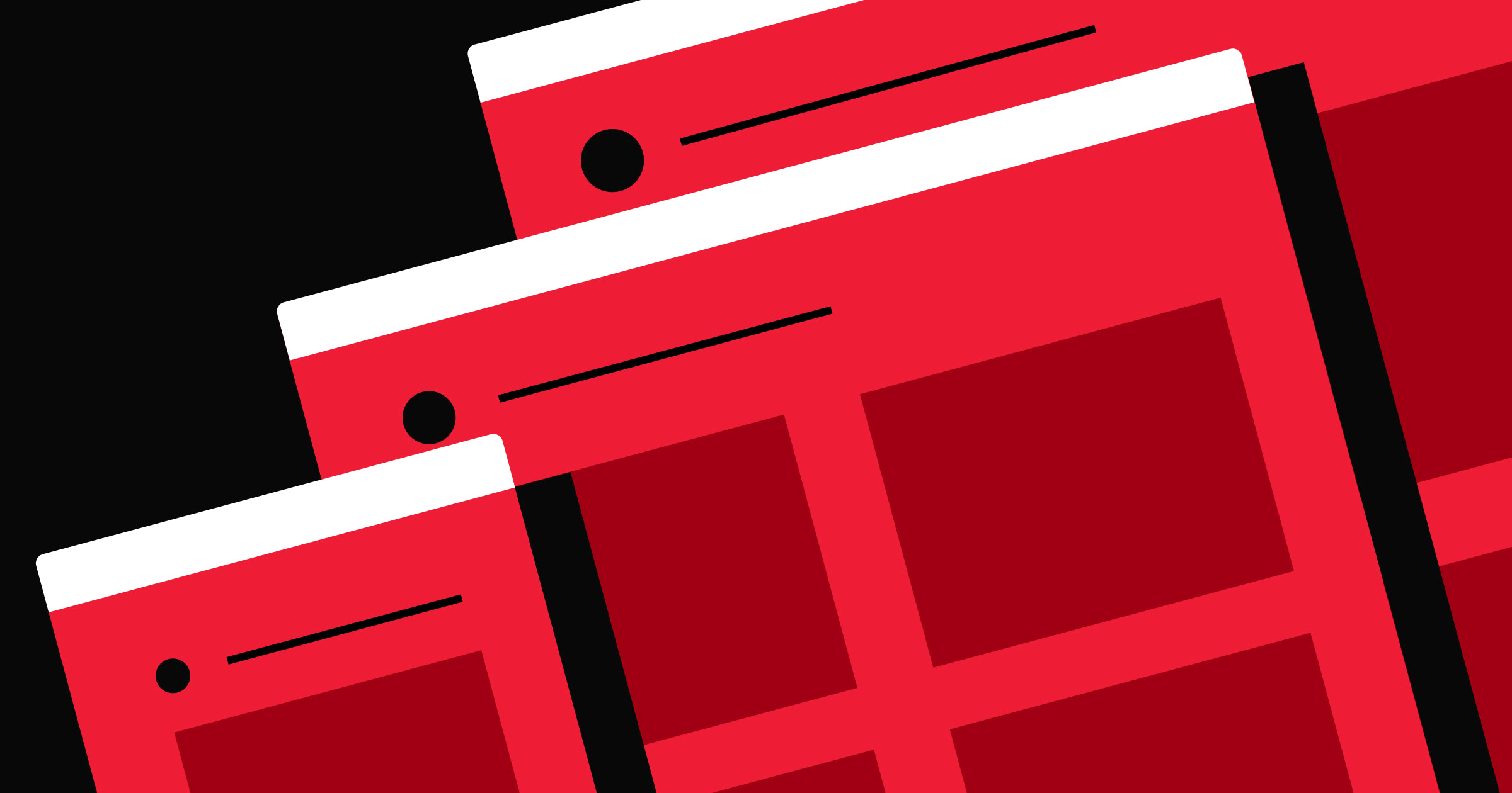
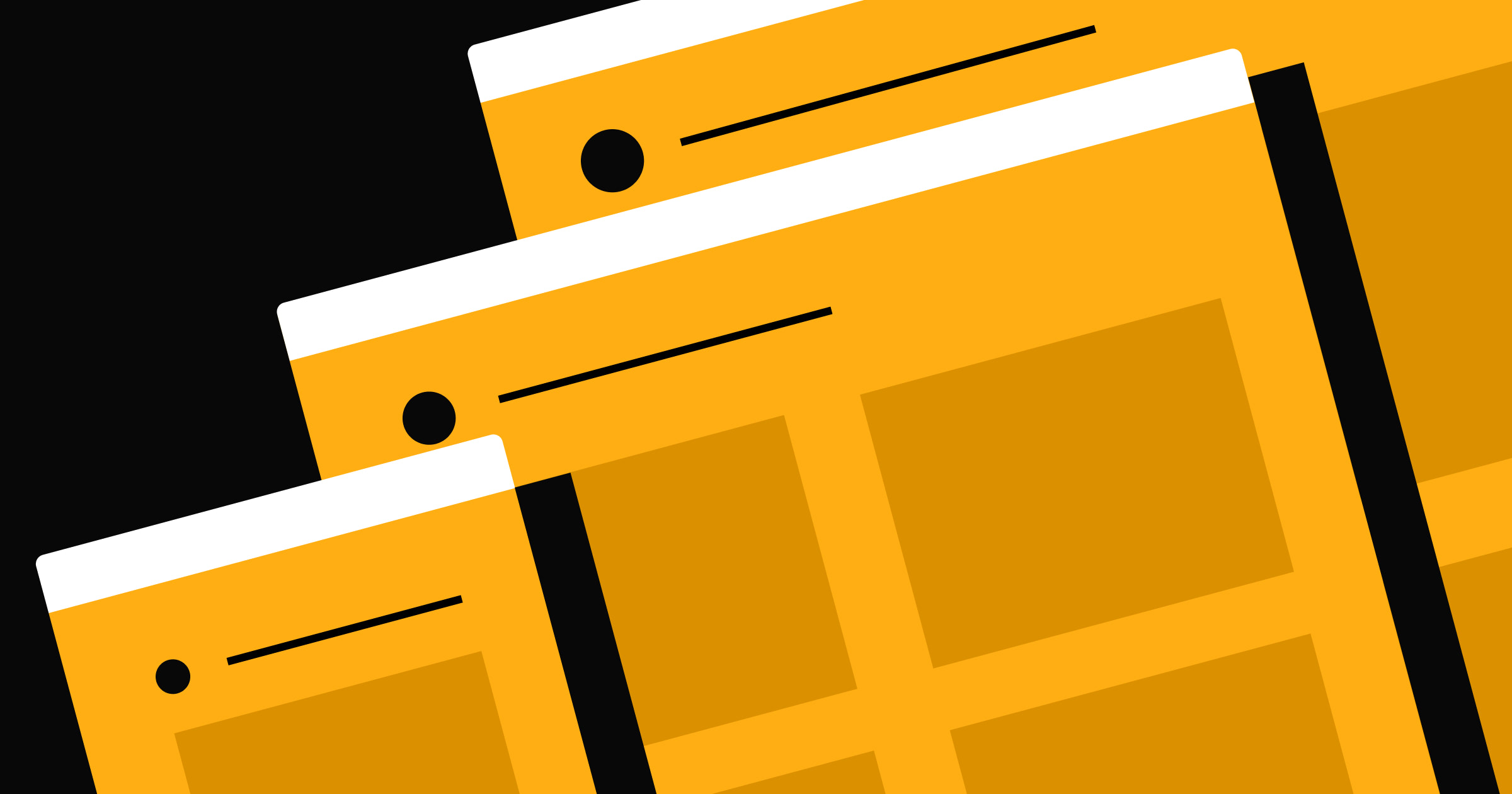
What to include on a splash page
An effective splash page has design elements that ensure it serves its purpose while providing a positive user experience. Here are a few elements to incorporate:
- Clear and compelling visuals. A splash page’s appearance is visitors’ first impression of your brand. Use high-quality, on-brand designs that immediately engage visitors. Whether a fullscreen background image, a video, or a logo, the visual component must draw visitors in without overwhelming them.
- Concise and clear messaging. Since splash screens are transitional, their text should be minimal but powerful enough to deliver the relevant message or information. This can be a brief greeting, a disclaimer, or an announcement visitors can understand at a glance without unnecessarily delaying them.
- A responsive and mobile-friendly layout. As more people access websites from mobile devices, a responsive design that adapts to different screen sizes is essential. A mobile-compatible splash page includes touch-friendly navigation and fast-loading elements, ensuring all visitors have a positive and consistent experience regardless of their device.
- An exit option or skip button. Respect visitors’ desire to access your website’s primary content quickly. Include a visible and distinct exit option or skip button that lets them bypass the splash page. This feature ensures people don’t feel forced to interact with it, improving their experience and satisfaction.
How to make a splash page: 4 steps
It takes careful planning and implementation to design a visually appealing splash page and a functional entry point. Here’s a step-by-step guide to help you get started.
1. Create visual mockups or wireframes
Start by sketching the layout and design elements of your splash page. Use wireframes to establish the basic structure and placement of visuals and text. Wireframes provide an early visualization and reference point to help you identify and solve usability issues before moving to more detailed designs.
Consider creating prototypes to simulate user interactions with the splash page for a more interactive approach.
2. Design the visual elements
With your wireframe or prototype in place, start designing your splash page’s high-fidelity visual elements with a reliable and robust website builder. Choose high-quality images and videos, and select color schemes and typography that match the visual tone from your personal or business style guide.
The design should be eye-catching, relevant, and harmoniously balanced so that it’s aesthetically pleasing without overshadowing the page’s message.
3. Add relevant and concise copy
Your splash page’s text should be modest but bold enough to communicate essential information or guide visitors. Whether it’s a brief welcome message or a region selection option, ensure the copy is short and to the point.
Use clear, actionable language that’s legible and understandable at a glance. Also, the text’s placement should complement the visual elements, with ample white space to maintain a clean and uncluttered layout.
4. Optimize for responsiveness and performance
Finally, test your splash page to ensure it performs consistently across devices and platforms. Prioritize responsive design because mobile users often face varying screen sizes and connectivity conditions.
This also means optimizing images and other media for fast loading without compromising quality. You can use performance testing tools like Google PageSpeed Insights to identify response-related issues and achieve a respectable site speed score.
4 effective splash page examples
Here are four splash page examples that suit various functional goals to inspire your own designs.
1. Free Roam Brewing Company’s age verification splash page
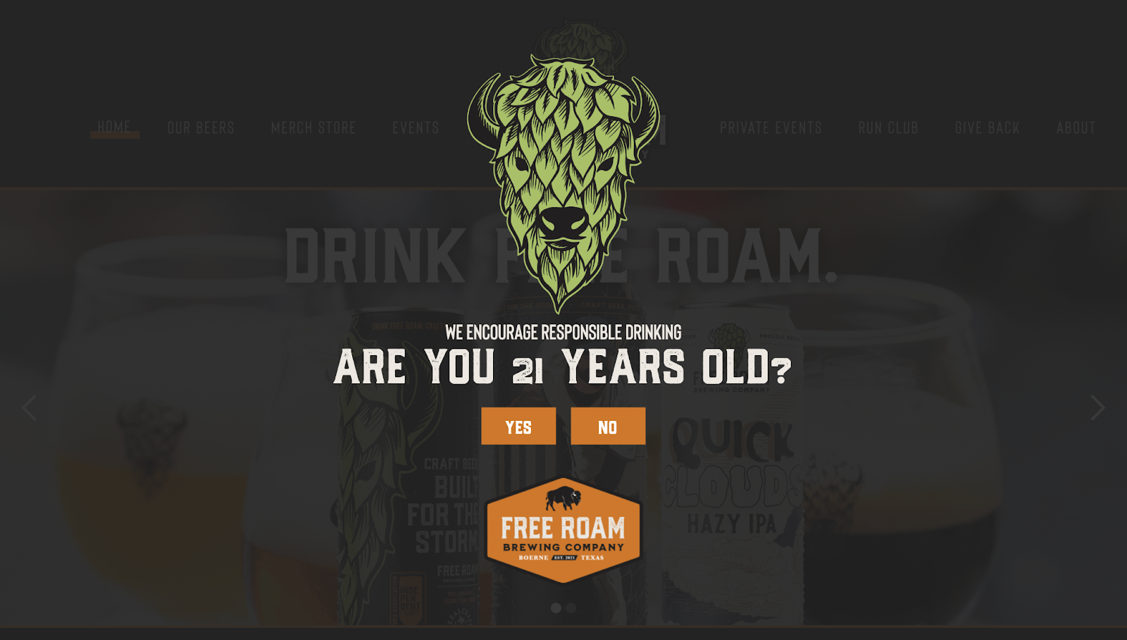
Free Roam Brewing Company’s splash page, designed by the Beardman Technology Group, prioritizes compliance and brand awareness. It features a prominent age verification message, which is essential for alcohol industry companies that must ensure legal compliance.
The bold typography makes the text highly readable, with the large yes and no buttons standing out on the page. Free Roam’s logo is a leading design element, setting the tone for brand identity right from the start.
The background subtly shows the company’s products, hinting at what lies beyond the splash page, which piques curiosity without distracting from the primary message.


Ultimate web design
From 101 to advanced, learn how to build sites in Webflow with over 100 lessons — including the basics of HTML and CSS.
2. Pierre-Louis Labonne’s portfolio splash page
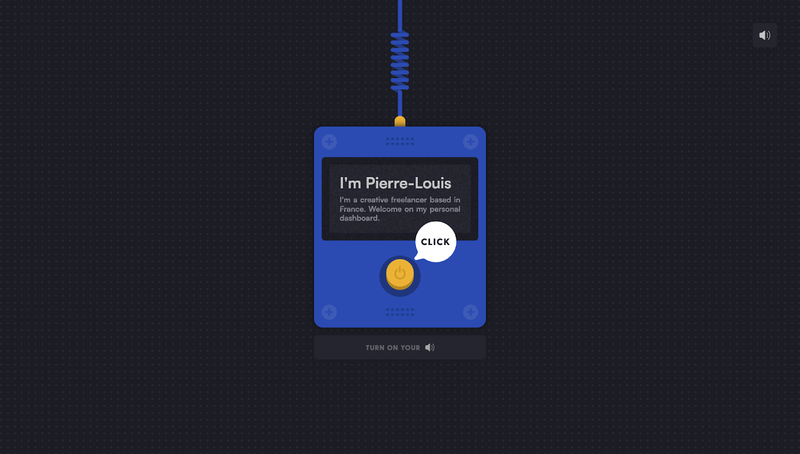
This splash page introduces Pierre-Louis Labonne’s portfolio. The minimal design immediately draws attention to the central message: an introduction to Pierre-Louis, a France-based freelancer.
An interactive yellow click button invites you to interact and enter the main site. The color scheme is visually appealing and consistent, with the contrasting blue and yellow ensuring the button stands out.
This playful design continues with a “Turn on your audio” prompt, providing visitors with a customizable and personalized experience. Not only does this splash page capture interest, but it also establishes a strong initial impression of Pierre-Louis’ creative style.
3. STR8FIRE loading screen splash page
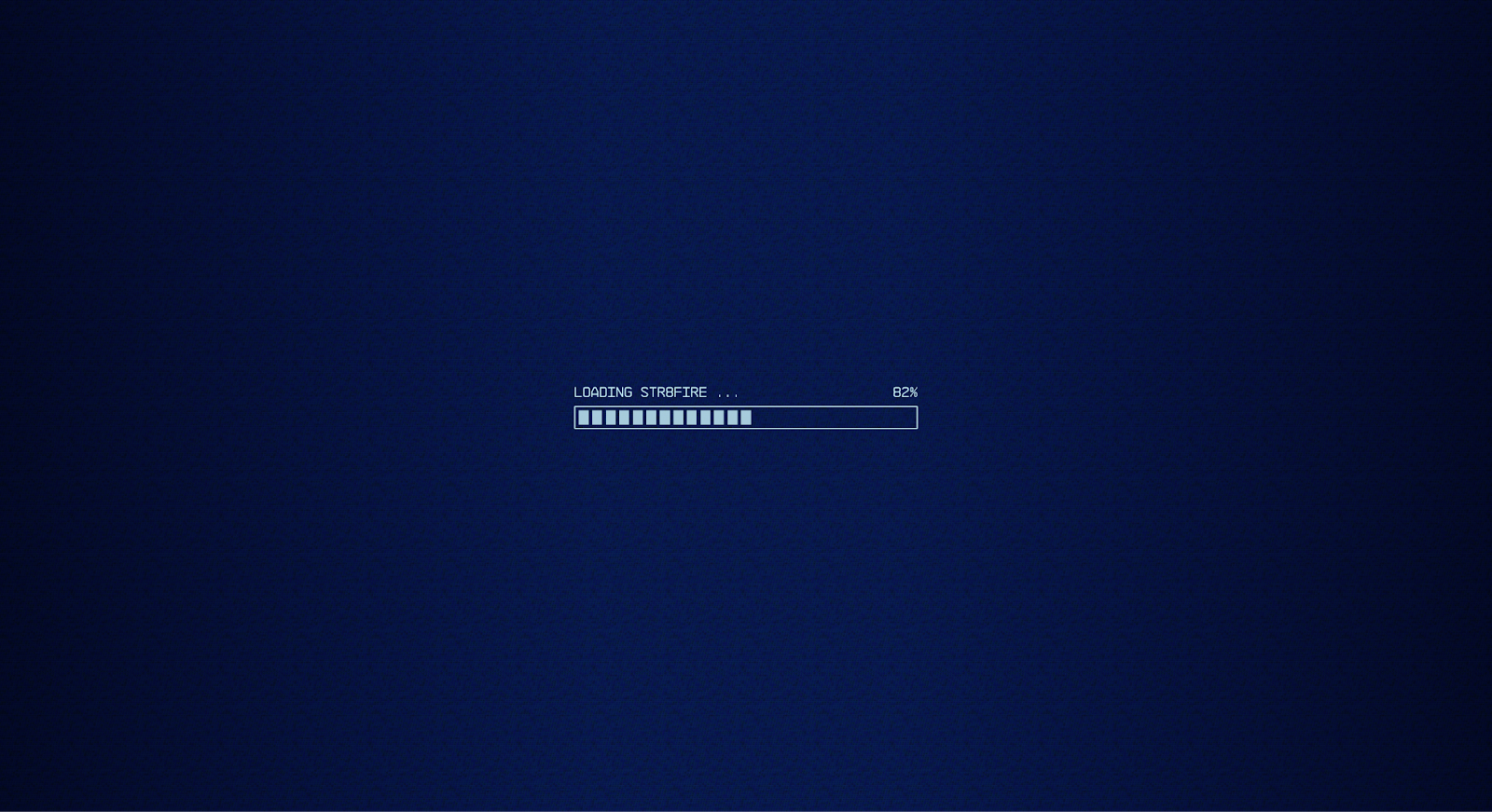
The STR8FIRE splash page has a loading bar animation paired with a cryptic digital font that captures the brand’s futuristic, tech-driven vision of tokenizing entertainment. The percentage bar’s quick progression is long enough to capture attention and build intrigue without causing the visitor to wait very long.
The minimalist light and dark blue palette creates a sleek, modern aesthetic, which works nicely for a tech-focused brand. Overall, this page primes visitors for the unique concept the homepage eventually reveals — all in a few seconds.
4. AWGE’s retro-themed splash page
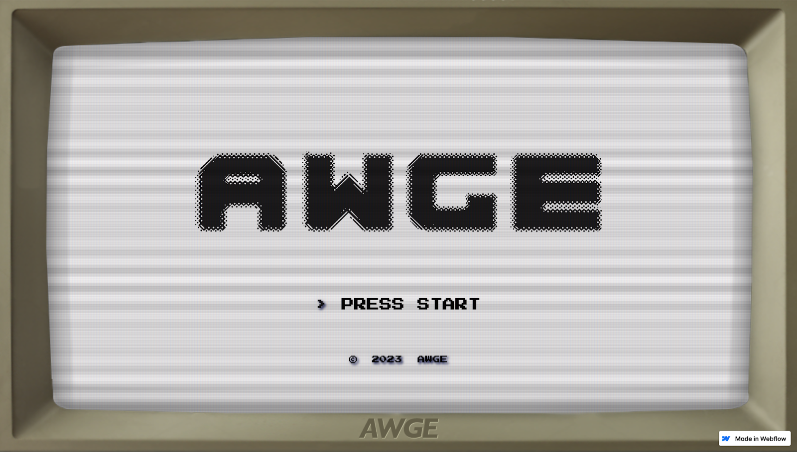
AWGE’s splash page has a fun, retro design that stands out. The old computer screen aesthetic, with pixelated graphics and a near-monochromatic color scheme, mimics a late ’90s video game and evokes feelings of nostalgia and curiosity.
Along with the large, bold AWGE logo in the screen’s center, every element boldly captures the brand’s identity before you enter the main site. A minimalist design ensures the visuals don’t overwhelm you while encouraging you to take action with a “Press start” prompt.
By focusing on essential elements, keeping the layout uncluttered, and using gamification tactics, AWGE’s splash page draws attention and encourages you to explore, ticking two crucial boxes for engagement.
Make a splash with Webflow
Splash pages are excellent touchpoints for introducing your brand, conveying important information, and improving the user experience. They set the tone for what visitors can expect from your site, making a solid first impression and encouraging people to explore further.
With Webflow, you can design and update your splash pages without relying on developers. Whether you’re a freelancer or at an agency, you can build and launch dynamic splash pages and the full-fledged websites they lead to.
Ensure your brand stands out from the very first click with Webflow
Get started for free
Create custom, scalable websites — without writing code. Start building in Webflow.