UI cards present content in a digestible and engaging format.
User interface (UI) cards are compact, versatile, and interactive elements that maintain your website’s aesthetic appeal without sacrificing functionality. Whether you’re using them to display product demos or user profiles, these design components declutter content and allow visitors to intuitively explore your website.
Read on to learn about the different types of UI design cards and actionable tips on implementing them in your next website project.
What’s a UI card?
UI cards are rectangular elements, often with borders, that contain components like images, text, and icons inside them. Designers use these content blocks in a website layout to group related information. They’re a versatile way to display different types of information in a consistent and compact format.
Designers use these cards to highlight individual content pieces, like product details, blog excerpts, user profiles, or service descriptions. By organizing content into distinct sections, these content blocks improve readability.
For example, this cloneable template by James Baduor uses UI cards to show property listings so viewers can see basic info about each property on one page without needing to click through to each individual listing.

UI card designs: 4 styles
UI cards come in various styles, each suited to different content types and interactions. Understanding them helps you choose the right one for your website. Below are four common types of UI cards:
- Pin-style cards. Popularized by Pinterest, pin-style cards resemble physical bulletin board pins. They’re compact and vary in height based on content, and they are often arranged to create a staggered or asymmetrical grid pattern. Pins are ideal for displaying a collection of items, like images, videos, or text snippets. It’s a popular style for social media feeds and content discovery platforms.
- Flat-style cards. Flat-style designs use straightforward typography, bold colors, and two-dimensional icons so viewers focus on the card’s content rather than decoration. This minimalist approach typically includes subtle animations and microinteractions like hover effects to improve engagement without compromising a sleek aesthetic.
- Grid-style cards. These website card designs arrange content in a structured, evenly spaced layout. Grids typically appear in picture galleries, portfolios, and ecommerce sites where uniformity is vital for simple browsing.
- Magazine-style cards. Inspired by print magazines, these cards combine large images, varied typography, and layered content to create an immersive, editorial-like experience. This style often includes elements like interactive fold-outs and parallax scrolling, making it suitable for blogs, news sites, and text-heavy platforms.
UI cards: Common design elements
UI cards often include the following elements to present content effectively:
- A container is the outer frame that holds the UI card’s elements. It provides structure and separates the widget from the surrounding content. To stand out on a page, this digital box uses borders, shadows, or background colors.
- The thumbnail is a small image that visually represents the card’s content. It grabs attention and provides a brief overview of the topic or theme.
- The card’s heading is a prominent text element that displays a brief and clear title for its content. Headings are more prominent and bolder than other text elements to stand out and maintain a visual hierarchy.
- The subheading provides additional context to the heading. It builds on the main title or adds extra details.
- Supportive text includes supplementary information that complements the heading and thumbnail. It can be a brief description, summary, or critical points related to the content.
- Media includes images, videos, infographics, and other multimedia items that make the card visually appealing and engaging.
- Buttons are interactive components that encourage visitors to take action, like clicking on them to see more details, read an article, or buy a product. They’re typically call-to-action (CTA) elements with contrasting colors and clear labels.
- Icons are small graphical elements that represent categories, actions, or features. They convey information quickly and visually.
Here’s a UI card example of a Webflow blog post card to illustrate these elements:
- Container: Includes the elements detailing the blog post
- Thumbnail: Holds a small version of the blog post’s header image
- Heading: Reads “Why every digital creator needs a powerful website”
- Subheading: Contains the author byline “by Tonner Jackson”
- Supportive text: Contains the blog post category “Inspiration”
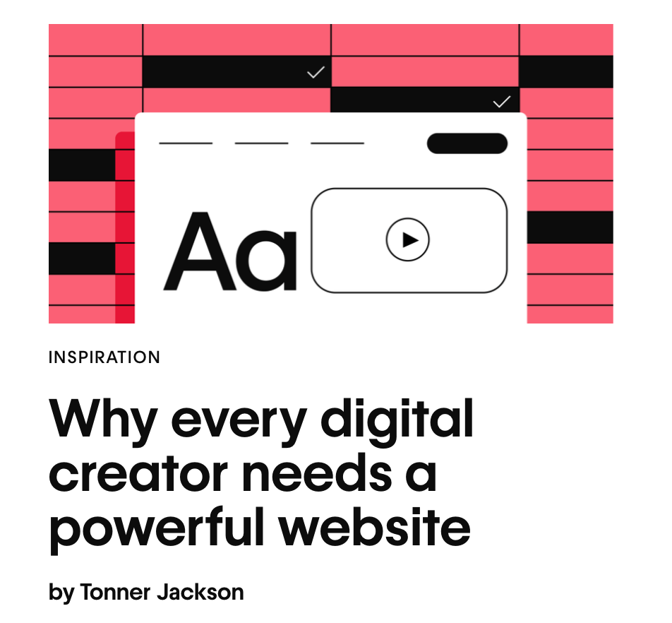
As a whole, these visual elements organize and convey information in a logical order.


Ultimate web design
From 101 to advanced, learn how to build sites in Webflow with over 100 lessons — including the basics of HTML and CSS.
9 types of UI cards
Here are nine types of UI cards with examples of how to use them.
1. Interactive cards
These cards typically change appearance when users interact with them, featuring hover effects, clickable areas, and animations. This response provides immediate feedback and encourages exploration.
Interactive cards effectively showcase products and services, infographics, and portfolios.
2. Content cards
Content cards display an equal mixture of text and media. They include images, videos, headings, and text snippets to provide a snapshot of the complete resource.
They’re ideal for blogs, news platforms, and multimedia galleries because they offer a preview that encourages visitors to click for more information.
3. Product cards
Common for ecommerce websites, product cards feature thumbnails of items with descriptions, prices, and CTA buttons.
They’re visually appealing and informative, and they allow shoppers to browse and compare products quickly.
4. Profile cards
Profile cards present an individual’s information, such as their photo, name, job title, and contact details.
They often appear in a website’s team section, social networks, and personal portfolios. Interactive elements like social media links and expandable sections provide more details.
5. Action cards
Action cards prompt people to take specific actions, like sign up for a free trial or download a free resource.
They feature a prominent CTA with compelling messaging and persuasive marketing techniques, like testimonials, to boost conversions.
6. Dashboard or data cards
Dashboard cards are typically on admin panels and display metrics such as charts, graphs, statistics, and summaries. They provide a quick synopsis of key data and allow users to highlight specific numbers or click for more details.
7. Media cards
Media cards display rich content like videos, audio, and gifs. Users can easily find relevant details about the media, including titles and artists.
They’re ideal for video streaming sites, music platforms, and multimedia blogs.
8. List cards
List cards include several items, making them suitable for grouping information like features or steps in a process. These are excellent for to-do lists, instructional guides, and product specifications.
9. Modal cards
Modals appear as overlay windows that prompt interaction before they allow site visitors to proceed. They help focus attention on critical tasks or announcements. For example, notifications, alerts, forms, and exit-intent pop-ups require immediate attention without taking users away from the current page.
Best practices for creating effective UI cards
Here are some UI card best practices that combine modern design principles and practical UI design tips.
Use contrast and shadows to outline the cards
Contrast and shadows help define the boundaries of each card, making them stand out from the background and other page elements. This technique creates visual separation and allows visitors to quickly scan and interact with content.
For example, a light-gray product card might have a light shadow and a slightly darker border to distinguish it from a white background. Ensure that similarly themed widgets use the same contrast and shadows for consistency.
Maintain balanced font size and content hierarchy
A clear content hierarchy, supported by balanced font sizes, improves readability by guiding readers through the content in a logical flow.
Most cards have headings, subheadings, and supportive text. Use a large, bold font for the title (18–24 pixels), a medium-sized font for the subheading (14–16 pixels), and a smaller font for the body text (10–12 pixels). This creates a visual hierarchy and highlights the most important information first.
Have each card represent one concept
Each UI card should focus on a single theme or content piece to avoid overwhelming the reader. This structure also keeps the layout clean and intuitive.
For example, marketing portfolio cards should represent one project throughout its image, headings, and a brief description. This helps visitors differentiate between different projects.
Choose suitable images and animations
High-quality images and subtle animations improve your cards’ visual appeal and interactivity. When designing, choose images that are relevant to the content and use animations sparingly to draw attention without detracting from the main message.
For example, a subtle animation of a ticking clock on a productivity app adds visual interest without overwhelming the interface.
Define a fixed spacing
Consistent spacing between elements ensures a clean and organized layout. This improves readability and creates a visually harmonious design. You might set a fixed margin of 20 pixels between each card and a consistent padding of 10 pixels inside. The negative spacing gives each element room to shine.
Avoid inline links
Inline links are hyperlinks embedded directly within the text, typically referencing additional information from related pages. Multiple inline links clutter the interface and confuse visitors because they don’t know where to click. Instead, use distinct buttons for action-oriented tasks.
For example, instead of embedding links within a profile card’s text, use a button at the bottom labeled “View profile.” Ensure the button has sufficient padding and a contrasting color to make it stand out.
Improve website navigation with Webflow
UI cards can transform how people interact with your website. They’re versatile and adaptable to various contexts but require proper implementation to be effective web design elements that encourage clicks.
With Webflow, you can use customizable component libraries and UI kits to create visually appealing UI cards. Plus, the Webflow community has thousands of website examples and templates, so you never run out of inspiration.
Get design ideas and build your website projects with Webflow.

Get started for free
Create custom, scalable websites — without writing code. Start building in Webflow.


