A digital marketing portfolio is your online pitch to future clients and employers.
Wondering how to impress hiring managers and potential clients with your past campaign wins? By assembling a powerful marketing portfolio, you can show off your unique style and data-driven achievements in one place. Online portfolio makers and platforms like Webflow help you create a polished site in less time, so you can focus on refining your personal brand.
You curate your best work into a single space to highlight your expertise in areas like social media campaigns, email outreach, and SEO.
A well-designed marketing portfolio demonstrates your abilities and provides evidence of your success, showing potential employers and clients the value you can bring to their projects. You also get the chance to highlight your personal brand, showing what differentiates you from competitors.
Explore more ways to refine your online presence with modern marketing portfolio examples.
What is a marketing portfolio?
A marketing portfolio is an online showcase of your best campaigns and professional accomplishments. It helps prospective employers or clients understand your approach, creative style, and measurable success. By curating your top projects, you can build credibility and highlight the results you’ve achieved.
How to create a marketing portfolio
Before diving into each element, let’s outline a straightforward process to help you plan. Think about who you want to impress, which campaigns best illustrate your style, and where you’ll host your work.
Choose a platform
Select a builder or content management system that lets you combine design flexibility with simple content updates. Prioritize a layout that can quickly highlight case studies and results. Webflow offers visually driven design tools that keep your pages professional and customizable.
What to include in your marketing portfolio website: 7 elements
Creating an effective portfolio involves more than just listing your main projects. Here are seven critical elements to include.
Each element serves a purpose: together, they create a balanced portfolio that highlights both your storytelling approach and your measurable impact.
1. An introduction
Your introduction provides context about who you are as a marketer. It builds a personal connection with your audience to help prospective clients and colleagues understand your journey, values, and methodologies.
Write a concise, engaging background summary that includes your education, experience, and what drives your passion for marketing. Try to strike a balance between a friendly and professional tone to present as both personable and knowledgeable. Look at “about me” examples from other marketers to see how they emphasize personal stories while remaining professional.
For example, you might write something like:
“Hi there! I’m John Doe, a creative professional with a digital marketing career spanning seven years. I love forming innovative strategies that drive sales and engagement. With a degree in marketing and expertise across SEO, social media, and data analysis, I have what it takes to help a wide range of brands tell their stories.”
2. Case studies and success stories
Proven records of successful client stories and case studies provide concrete evidence of your marketing work’s positive results. They also demonstrate your problem-solving skills and unique value proposition.
Create detailed case studies with dedicated webpages for a few standout marketing campaigns you’ve worked on. Outline the challenge you took on, your approach, and the results. Be sure to include before-and-after metrics to highlight the difference you made.
Here’s an example:
- Case study: How we increased social media engagement for a design company.
- Challenge: The company’s social media content performance was low, so they needed a six-month turnaround.
- Strategy: My team developed a comprehensive content plan, leveraged influencer partnerships, and ran interactive ad campaigns.
- Results: Within four months, the company achieved a 46% engagement increase and gained 31% more followers.
3. Project overviews
A project overview provides a snapshot of your best accomplishments, roles, and outcomes. This section should differ from your case studies by outlining your project approach rather than focusing on how your client benefited. It helps visitors quickly grasp the scope and scale of your work and highlights your versatility and experience across different campaign types.
Create a section with thumbnails and descriptions of your best projects. Ensure the images are high-quality and relevant to the work samples. Use bullet points to highlight key contributions, objectives, strategies, and results. Summarize the objective, the key marketing tactics you used, and any achievements that set the project apart.
4. Data and statistics
Data and statistics quantify your achievements by providing real-world results for your marketing efforts. Metrics like increased website traffic, conversion rates, and return on investment validate your skills in numbers and build credibility.
Include these stats in your case studies and project overviews. For SEO-driven campaigns, reference your rankings for key terms and show before-and-after data backed by reliable SEO tools. You can also use graphs, charts, and infographics to make the data visually appealing and easier to understand. For example, you might include the following metrics for an SEO campaign:
- Increased organic traffic by 60% over six months
- Improved search engine rankings, with 5 target keywords reaching Google’s top three positions
- Achieved four featured snippets for blog articles
- Gained a 30% lead increase through improved brand reach and website visibility
5. Compelling visuals
Visual content captures attention, conveys complex information more clearly, and makes your website more engaging. It also shows your creative skills as a content marketer with an eye for design.
Use high-quality images, infographics, and videos to illustrate project work and campaigns. You can also combine statistics with visuals to break up the text and make it more readable.
6. Testimonials and endorsements
Testimonials from satisfied clients and knowledgeable peers add credibility to your advertising portfolio. Endorsements from professionals and customers who know your work reinforce your reputation and skills by affirming your positive impact on projects.
If you don’t have reviews to display, reach out to past clients and colleagues and ask for brief recommendations that highlight your strengths. Use positive pull quotes and feature these testimonials prominently on your website. Ask past clients if they’re open to giving brief quotes about your work ethic and the value you provided.
7. Contact information and social media links
Make it convenient for potential clients and employers to get in touch with you. Provide contact information like your email address and phone number and add links to your professional social media profiles, including LinkedIn, Instagram, X, and Facebook. This encourages visitors to connect with you on multiple platforms.
Place the contact information and social media links in your website’s header or footer (or both), and include a contact form with a brief message.
3 inspiring marketing portfolio examples
Here are three diverse marketing portfolio websites that include essential design elements and make a compelling pitch.
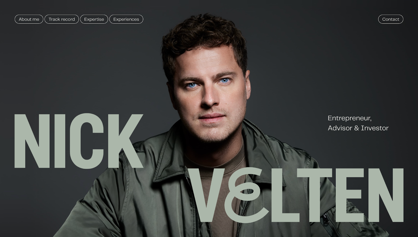
1. Nick Velten

Nick Velten’s online portfolio, designed by Dennis Snellenberg, starts with a prominent portrait of Nick occupying the whole screen. The image is bold, as is the creative typography spelling out Nick’s name. The text color complements Nick’s clothing and the background, forming a complementary color palette. These elements immediately offer a personal touch, as if you’re looking Nick straight in the eye and saying hi.
After the header, the site is divided into four sections: an about section, an overview of Nick’s track record, an expertise segment highlighting Nick’s skill set, and an experiences section with testimonials from satisfied clients. The color palette switches between the olive green and black combination and a blend of off-white and purple to avoid visual monotony as you browse.
Buttons in the top-left corner form a sticky navigation bar, so you can navigate to any section with one click. At the bottom of the portfolio, you’ll find Nick’s email and social media links with a smaller portrait, reinforcing the personal approach and encouraging you to reach out for work.
2. 345 Marketing

345 Marketing is a creative agency whose site appears cohesive with a dark color palette. This website shows 345 Marketing’s commitment to minimalist, modern design trends with sans-serif text, ample white space, and parallax scrolling effects.
A methodical and aesthetically pleasing layout and design contribute to making 345 Marketing’s portfolio appear professional and appealing. The agency’s logo at the top of the page splits the menu into two parts. The menu section on the left includes the homepage, about page, and work sections. The collection on the right displays client success stories, services, and the contact page. Apart from the “Our work” and “Stories” sections, which create visual variation due to the colorful images, the rest of the site consistently maintains darker colors with negative spacing.
On the about page, you’ll find smiling team members in monochromatic portraits with names, job titles, and phone numbers. Not only are contact details readily available, but each individual has a dedicated profile page, allowing visitors to decide who aligns with their project demands before reaching out.
3. Volta Agency

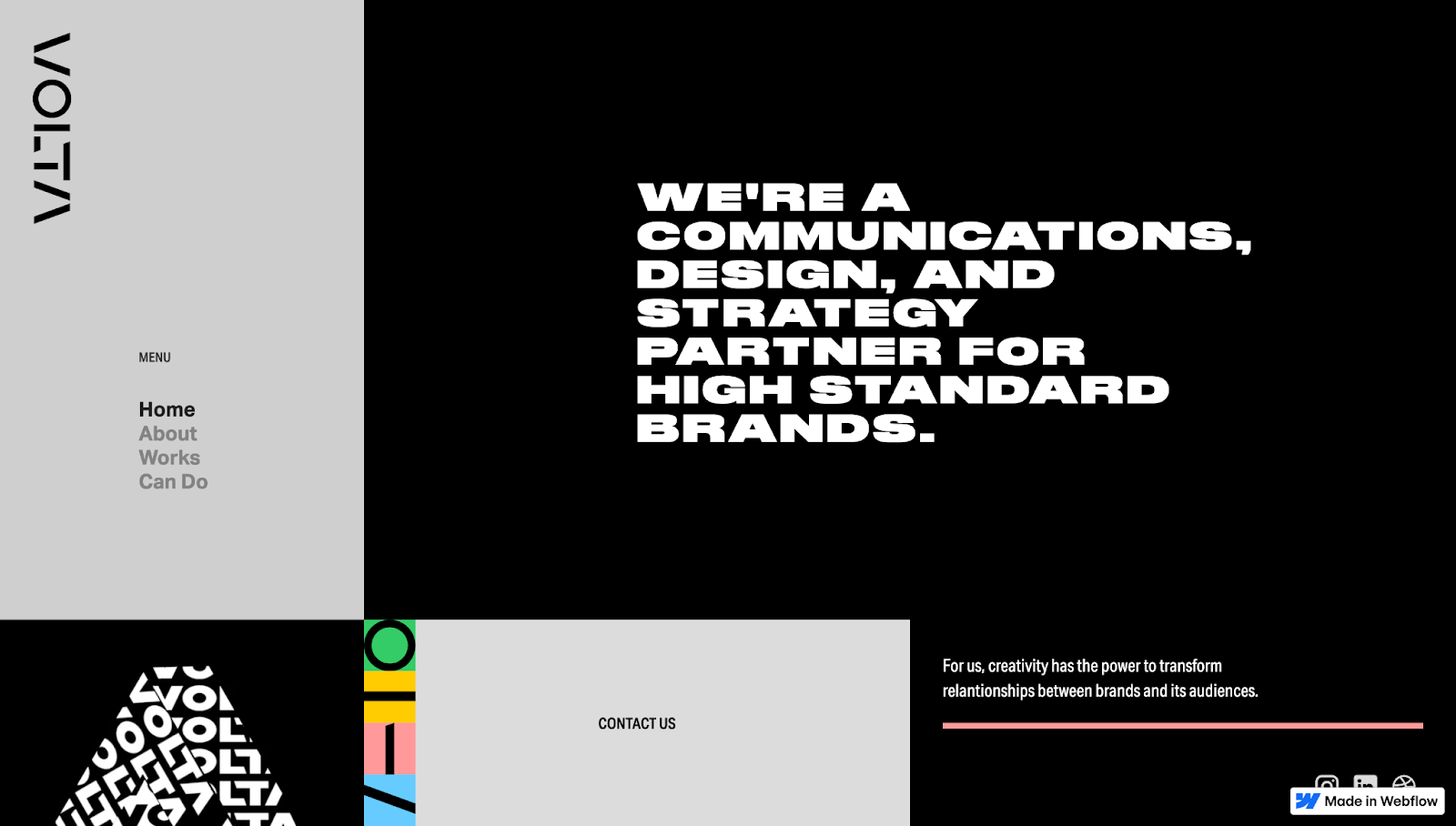
Source: Volta Agency
Volta Agency’s portfolio website, designed by Gabriel Rivera, has an eye-catching single-page layout split into two parts and features engaging dynamic components. The left side features a menu with a static animation below it. Click on any of the options in the menu, and the site shows you its equivalent section on the right.
The homepage introduces the brand with bold white text against a black background and a contact block below it. The color palette is primarily black, white, and gray, but the contact block adds a dash of color, making it stand out.
Scrolling down reveals a short about section, followed by Volta Agency’s projects. Hovering over each case study animates a thumbnail, which moves and distorts with your cursor’s motion to create an engaging user experience.
At the bottom of the page, Volta’s V-shaped mascot shows you an A-OK hand gesture, encouraging you to contact the agency for your next marketing or branding project.


Ultimate web design
From 101 to advanced, learn how to build sites in Webflow with over 100 lessons — including the basics of HTML and CSS.
More marketing portfolio examples to explore
Beyond these three sites, you’ll find countless other inspiring portfolios. Look for unique approaches to storytelling, data visualization, and user engagement. Don’t shy away from referencing multiple styles to shape a portfolio that best matches your brand.
Turn visitors into customers with Webflow
The first step to creating your own unique marketing portfolio is using a dedicated website builder. With Webflow, you can attach a custom domain, integrate forms to capture leads, design visually, maintain complete creative control, and optimize your site’s performance — all without writing code.
Check out the Webflow Blog for more unique websites, and explore Made in Webflow’s marketing portfolio website examples if you don’t want to build from scratch. Ready to showcase your marketing work? Build a portfolio with Webflow and give potential clients a clear view of what you can achieve.

Build websites that get results.
Build visually, publish instantly, and scale safely and quickly — without writing a line of code. All with Webflow's website experience platform.


.jpeg)


