

Great doctors strive to understand a patient’s needs, then present thoughtful solutions — and the most effective healthcare websites aim to do the same.
Outstanding healthcare web design assures visitors they’re in good hands from the start. Designers cultivate this trust by drawing on calming aesthetics, showcasing the compassionate side of practitioners, and delivering a seamless user experience.
But web design for healthcare is more than just aesthetic appeal — it represents a dedication to patients by crafting a comforting environment amid potentially stressful times.
By blending professional function with a personal touch and curating informative, reassuring content, healthcare websites can mirror an empathetic doctor’s warmth to provide a welcoming, supportive online extension of patient care.
Building a healthcare website: The essentials
The basic aspects of web design for healthcare are the same as for other service websites:
- An uncluttered homepage: Creates a positive first impression and facilitates navigation to important information
- Detailed service descriptions: Help patients understand available treatment options and make informed healthcare decisions
- High-quality images: Enhance the aesthetic appeal and instill trust in the provider
- An about us page: Introduces staff and tells the organization’s story to foster trust and emphasize expertise
- Contact information: Enables communication for queries or emergencies
- Responsive design: Ensures website accessibility and user-friendliness across all devices
Many healthcare sites use color strategically — greens, blues, and soft pastels are the most popular choices. By using color in web design, designers tap into color psychology, linking each color to its intrinsic connotation and the emotions they evoke. With close connections to nature, growth, and healing, green is an intuitive color choice for a healthcare page.
Regardless of the industry or field, there are website features that any web design can incorporate to optimize user experience. Here are a few worth considering:
- An online booking system: Enables patients to schedule appointments anytime, reducing wait times and improving scheduling efficiency
- Testimonials: Enhance credibility by showcasing positive feedback
- Appealing photos of the location: Reassure visitors by previewing the environment they’ll visit
In addition to these standard elements, medical sites that handle private patient data must comply with local privacy and protection laws like HIPAA. HIPAA, for example, requires U.S.-based healthcare providers to encrypt all confidential patient data they transmit online.
Moreover, web designers must incorporate Web Content Accessibility Guidelines (WCAG) into their medical web designs. Adopting inclusive web design practices is paramount, as people with diverse abilities often access medical sites.
8 thoughtful health and wellness website design examples
These eight medical web designs are for a diverse range of clients, but you’ll notice some common themes: Most have subdued color schemes, photos of smiling doctors and patients, and copy that empathizes with patients’ needs and concerns.
1. Goodall-Witcher Healthcare
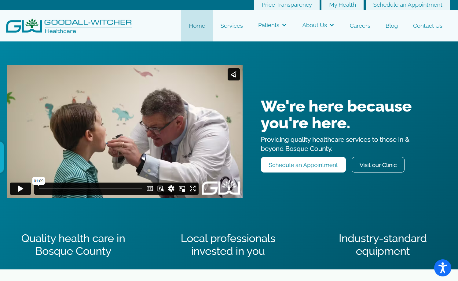
Goodall-Witcher Healthcare services the Bosque County Hospital District in rural Texas with their hospital, home-care facilities, long-term care facility, and fitness and wellness programs. Marketing and business consulting firm 360 Solutions revamped the Goodall-Witcher Healthcare website and developed a social media marketing campaign, delivering a result far beyond an ordinary hospital website.
Site visitors immediately notice the calming cyan-and-white color palette and a comprehensive yet elegantly tiered navigation menu. The website’s empathetic copy speaks directly to patients with phrases like “We’re here because you’re here” and “Quality health care shouldn’t be waiting rooms or long commutes,” enhancing the connection with the audience by addressing their needs and concerns directly.
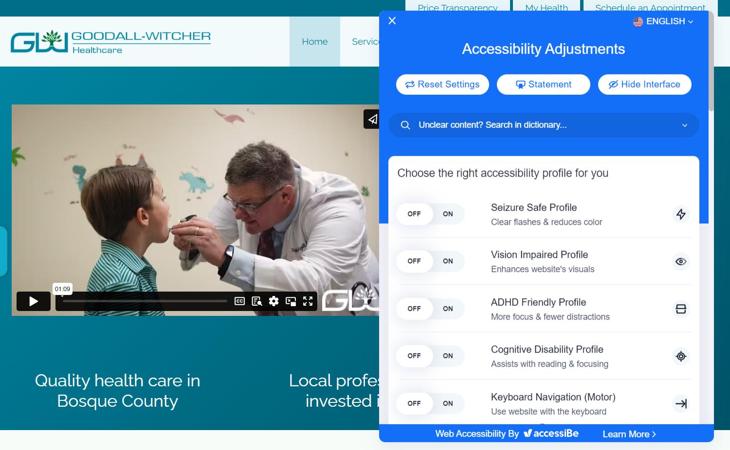
The Goodall-Witcher Healthcare site is an outstanding example of accessibility best practices in web design for healthcare. Highly readable typography and contrasting colors enhance visual clarity, facilitating better comprehension of the information for all users. The choice to feature a landing page video that doesn’t autoplay also respects user autonomy, reduces potential distractions, and makes the site more user-friendly for those with sensory sensitivities.
To further enhance accessibility, an icon at the bottom right of the screen opens an extensive menu of adjustments with advanced functionality: special profiles for people with different disability types, plus the ability to turn off animations, change font sizes, increase or reduce color contrast, change the cursor size, and use other accessibility options.
2. The Children’s Practice
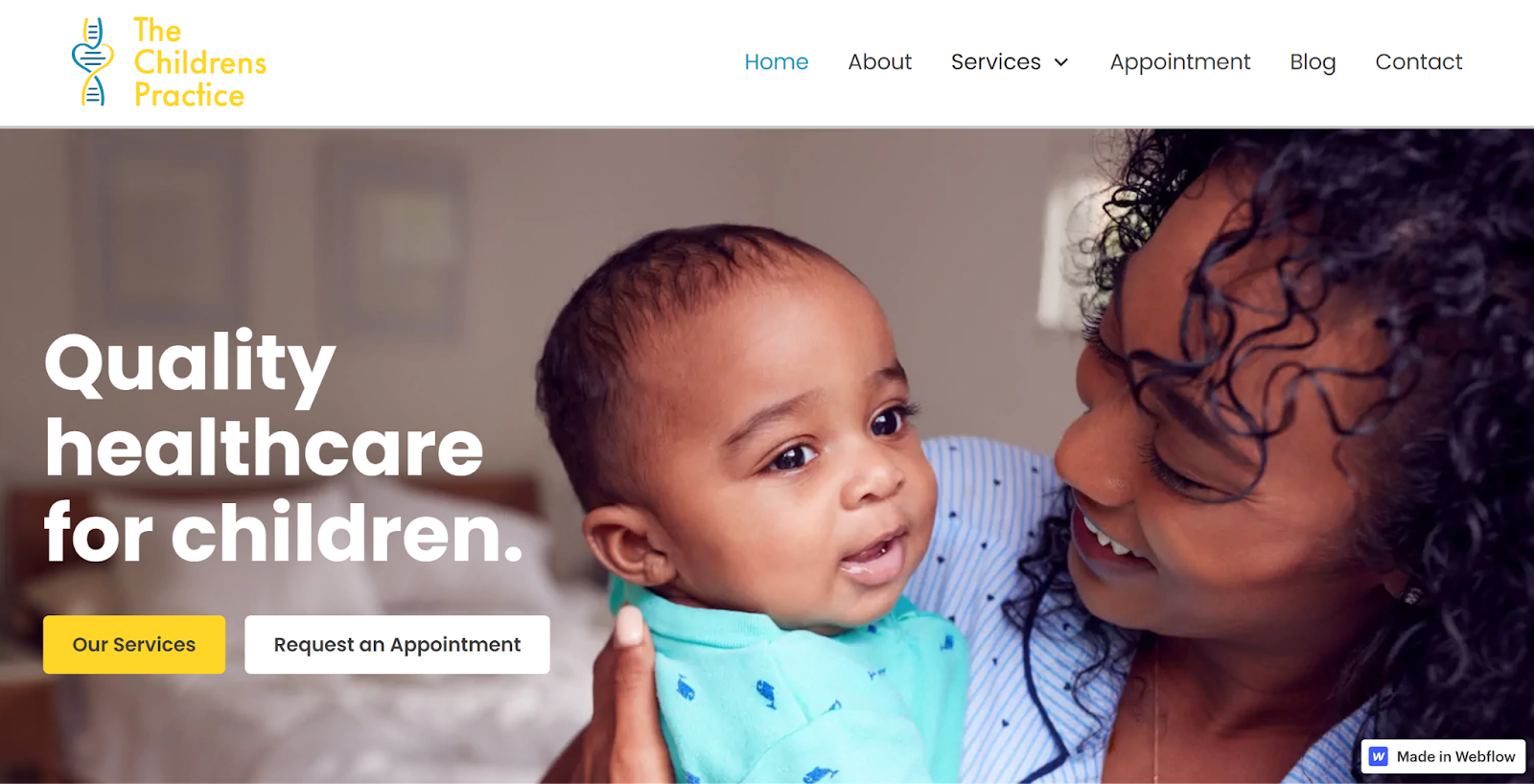
The Children’s Practice, a pediatric center in Lagos, Nigeria, departs from the typical green color scheme by embracing a cheerful golden yellow. Designer Leke Karunwi’s color choice and hero image of a happy parent holding a cute baby capture the delightful experience offered at the clinic, conveying to parents and guardians that the visit will be a positive experience for their children.
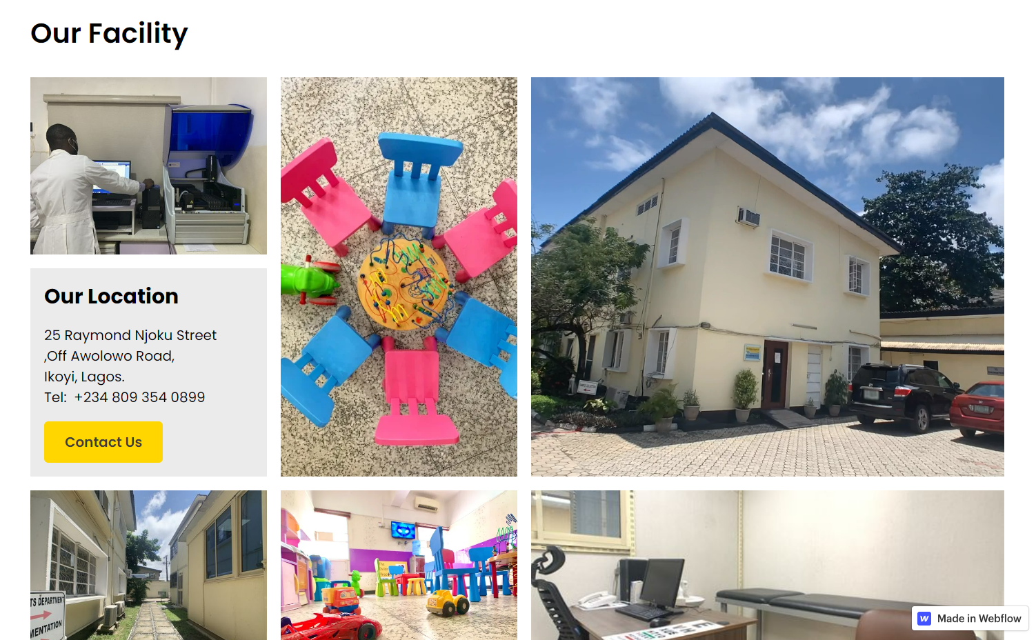
The about page of The Children’s Practice site is especially welcoming and informative — it includes photos of smiling people, a patient testimonial, and a note from the principal doctor. A dynamic count-up animation quantifies the center’s impact by demonstrating the number of health screenings and vaccinations administered. The page further highlights the inviting facility with images of vibrant toys and children’s furniture, while a looping video of the exterior further enriches the site with soothing touches of nature — clouds passing overhead and trees swaying in the breeze.
3. Magnolia Place
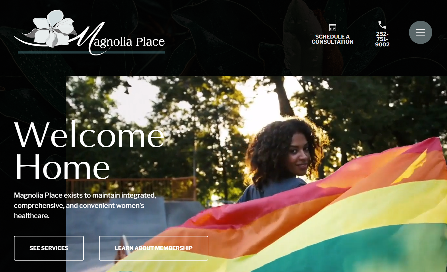
Magnolia Place is a full-service medical practice for women. Red Shark Digital’s design for the site expertly combines relatable visuals of women visiting the clinic with considerate copy. This fosters a sense of familiarity and understanding and conveys the clinic’s female focus and dedication to patient well-being. The homepage greets visitors with a video loop of women and families leading healthy, active lives, setting a positive tone for potential patients exploring healthcare options. Highly empathetic copy assures visitors that practitioners understand their busy lifestyles and any apprehensions about consultations and treatment.
Beyond serving as a digital front for the practice, the website also functions as an educational hub. Magnolia Place’s blog includes posts designed to educate patients and assuage doubts, like “What to know before your pelvic exam” and “Your pregnancy and your first ultrasound: What to expect.” This content enhances patient trust and bolsters the site’s search engine optimization (SEO) performance, contributing to higher visibility and rankings in the search engine results pages.
4. The Physio Joint
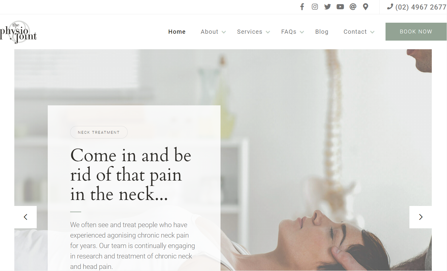
Healthcare is a serious business, but that doesn’t mean there’s no room for fun. Given that The Physio Joint’s name is a pun, the practice cleverly incorporates cheeky turns of phrase to connect with visitors. Designer Mark Taggart’s work demonstrates that healthcare industry sites have different options to show their human side. While Magnolia Place opts for deep empathy, The Physio Joint connects through humor, catering to non-life-threatening conditions with a healthy dose of levity — a treatment for the funny bone, even as they mend the rest.


Get started for free
Create custom, scalable websites — without writing code. Start building in Webflow.
5. TheraHive
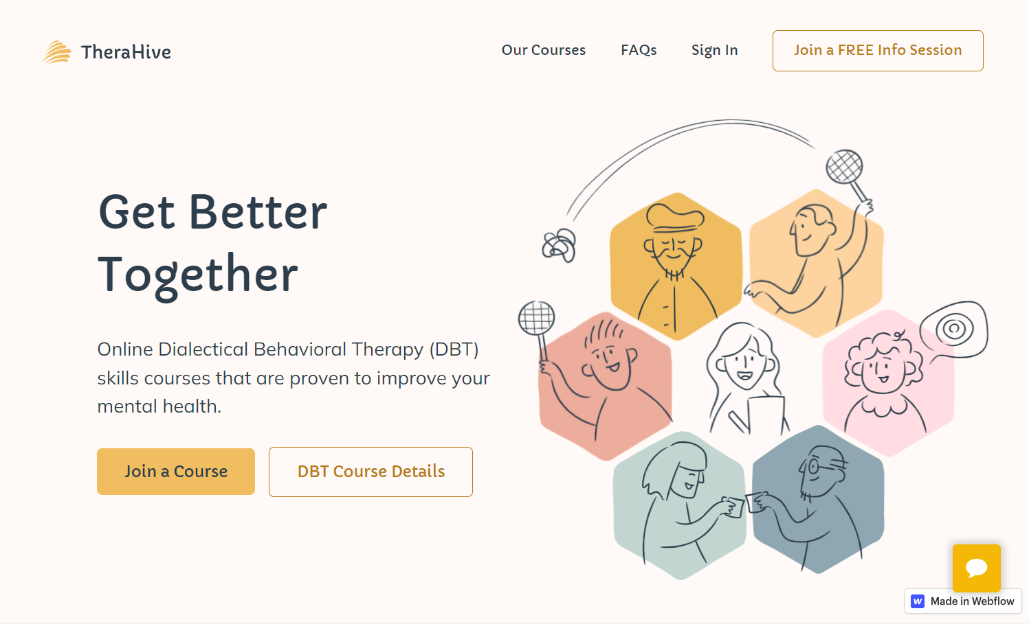
TheraHive, a group therapy platform, has a unique visual language based on line drawings of people and stylized honeycomb cell hexagons. The website features photos exclusively of clinicians, a deliberate choice that underscores their absolute confidentiality — an essential promise of the TheraHive program — to new patients. Talented illustrator and designer Martin Ollivere enhances this mental health education site to create a welcoming and engaging user experience. Martin’s main typography choice, the handwriting-inspired Capriola font, gives the website a personal touch.
6. Deia Health
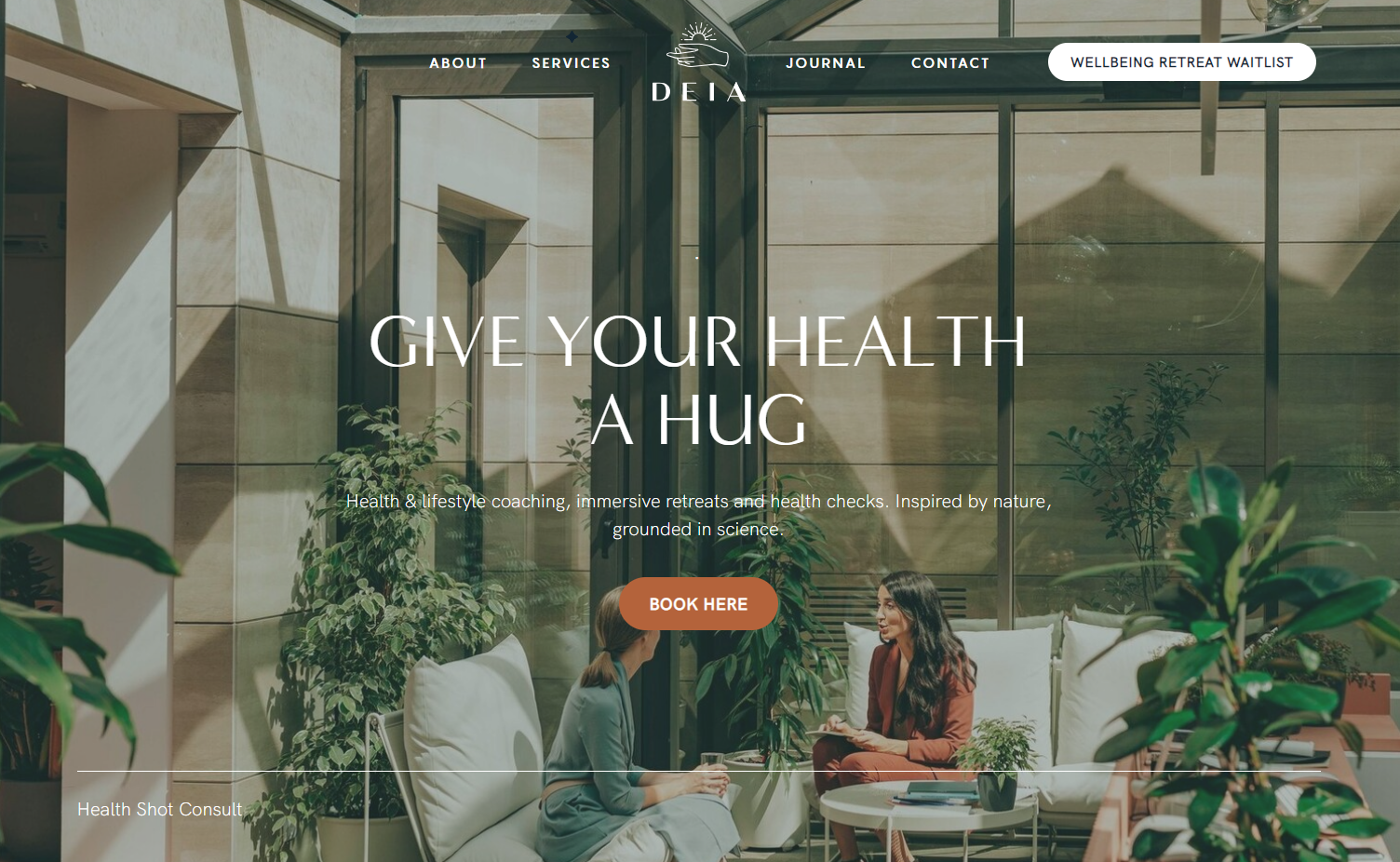
Studio Kanda’s site for Deia Health, a lifestyle wellness practice, is another testament to how medical website design can integrate the healing properties of nature and reflect the healthcare provider’s ethos. This site’s design skillfully incorporates a nature theme using images of people in green surroundings and earth-toned clothes, all harmoniously complemented by a soothing, earthy color palette and a light-brown call-to-action (CTA) button.
Unlike most websites, the navigation bar encircles the logo at the page’s center, aligning with the centrally placed text and CTA button. This design choice provides a balanced, aesthetically pleasing look to the site and signifies Deia Health’s holistic approach to wellness, highlighting the synergy between design and philosophy.
7. Hospitalia
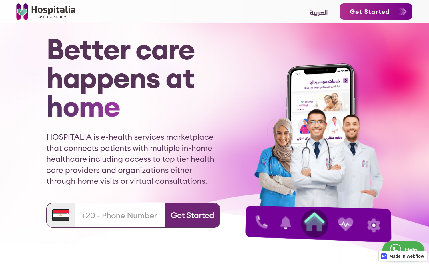
Wolvers Tech’s design for the Egyptian e-health app Hospitalia exemplifies how digital health services can be accessible and engaging. The app facilitates booking home-based services from reputable providers. The design team at Wolvers Tech, which created the app’s user interface and the site, uses a vibrant pink-and-purple color scheme across both the site and the app. This lively palette is transformed into a series of captivating gradients that add visual interest to the website.
Recognizing the prevalent use of WhatsApp in Egyptian social and professional communication, the design smartly incorporates a WhatsApp chat widget for seamless interaction between patients and providers. The site presents brief video clips illuminating each e-health app process stage, which further enhances user understanding. Testimonials in both English and Arabic add to the site’s credibility and approachability, making the healthcare service more accessible to a broader audience.
8. Balanced Healthcare
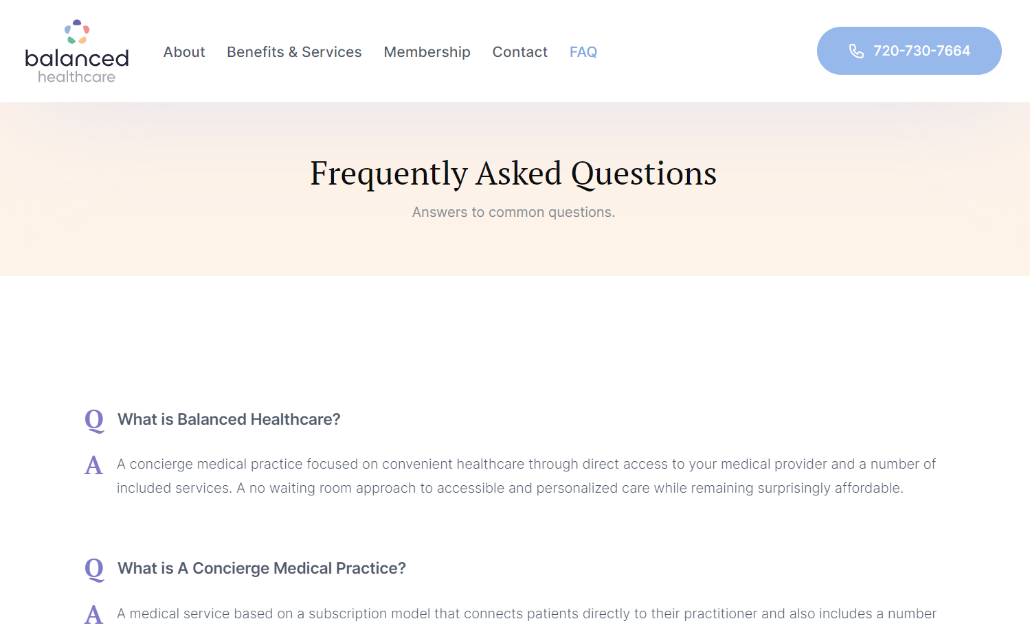
Noah Raskin’s refreshingly minimalist website redesign for Balanced Healthcare uses a soothing palette of pastel colors, balanced with plenty of white space, to create a calming browsing experience. Because Balanced Healthcare is a concierge medical practice — an unfamiliar healthcare business model to some visitors — the site strategically includes an extensive FAQ section. By covering topics like prices, insurance, cancelation, and Medicare, the site reduces psychological entry barriers and increases conversions. The design’s clear anticipation of user concerns and questions underlines the thoughtful, patient-centered ethos of Balanced Healthcare.
Build a robust health website with Webflow
Web development for healthcare requires empathy and a drive to get even the most minor details of the user interface right. With Webflow’s powerful drag-and-drop Designer, you don’t need to code, so you can focus all your energy on perfecting your site’s design elements, user flow, and interactions.
Browse Webflow’s healthcare templates for more ideas or use one to get a head start on your compassionate and competent healthcare website design with Webflow.