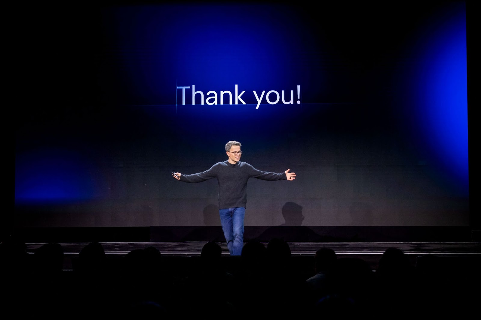
That’s a wrap from us, folks!
Whether you joined us in-person or online, we had an incredible time meeting up with all of you, hosting live demos, tuning into inspiring breakout sessions and fireside chats, and giving our community a first peek at all of the exciting things that are coming to Webflow!
Here’s a (not-so-quick) recap of everything that happened over the last two days.
What we announced
Over the course of the next year, we’re focused on growing the following three initiatives: deepening the power of visual development, continued investment in collaboration, and elevating our community and ecosystem.

During our keynote, we announced a comprehensive slate of features that helps you, your team, and your business grow and reach new heights in these three key areas.
Here are some highlights:
Deepening the power of visual development
For us, this means pushing the frontiers of visual development and broadening the possibilities of what can be built with Webflow. To support this initiative, we announced:
- Evolving “Symbols” to “Components”
- Scaling the CMS beyond 10,000 items
- Higher product limits on ecommerce plans
- Ability to sync Webflow components with any React project with DevLink (coming soon)
- Variable font control (coming soon)
Wow. @Webflow DevLink is such a game changer. I'm even getting smiles from my grizzled engineering team. https://t.co/TafEi3J4bC #webflowconf
— Dan Dawson (@DanJDawson) November 9, 2022
Continued investment in collaboration
For this focus area, we’re working to improve workflows and admin controls for growing teams as well as the agencies and freelancers that support these teams. To further this investment, we announced:
- Agency or freelancer guest role (coming soon)
- Control who can access different sites in your Workspace (coming soon)
- Design in parallel with page branching
Elevating our community and ecosystem
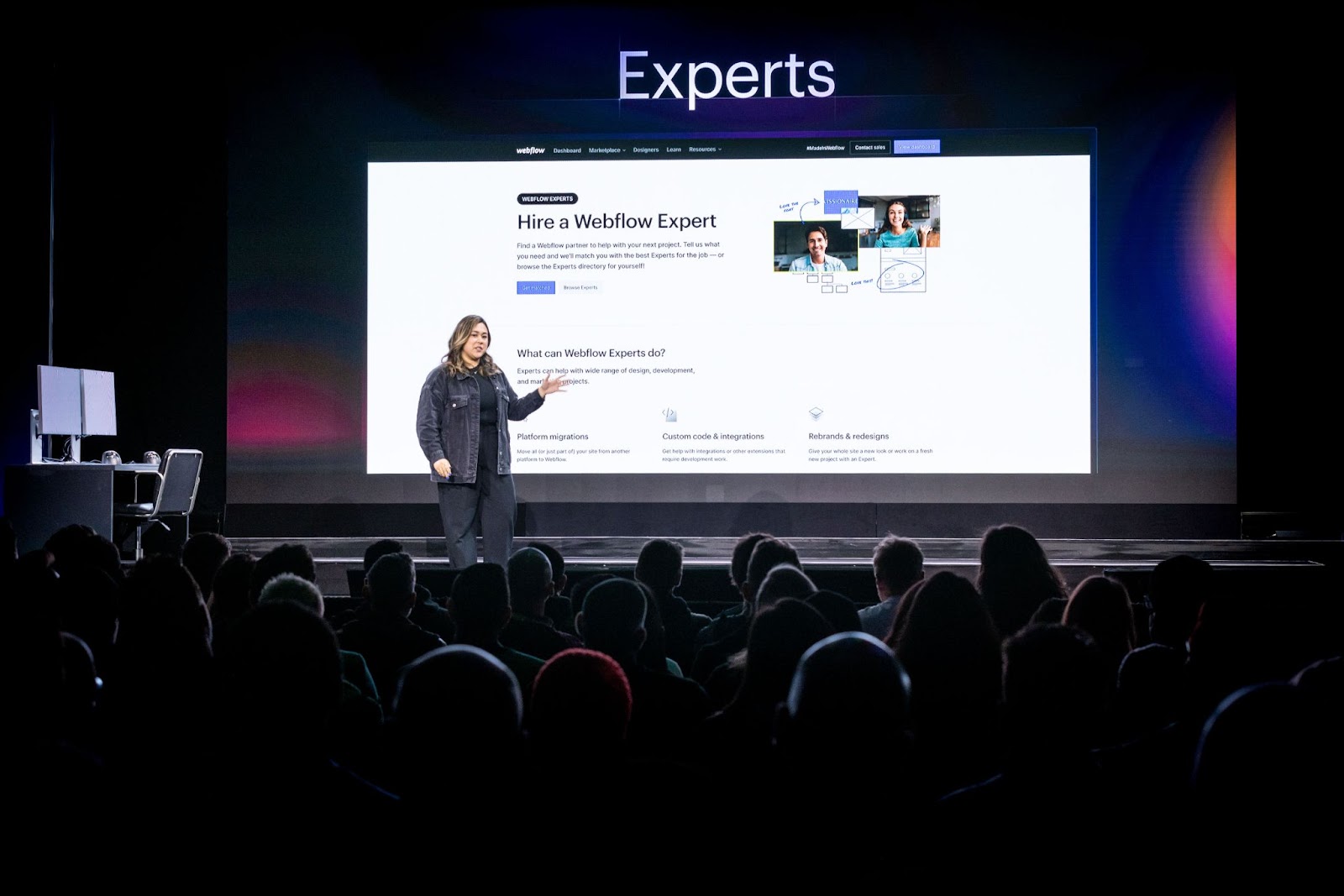
Lastly, our final focus area dials in on creating simplified and better organized channels for our community to help grow resources, apps, and connections. To support this effort, we announced:
- The Webflow Marketplace
- New opportunities for your Webflow business such as building your own Webflow apps, updated developer documentation and support, and more.
Jaw to the floor with the announcements at @webflowconf 😳
— keith 𓅪 (@keif_xyz) November 9, 2022
Future is looking real bright for this community. ❤️
For more info on these product announcements, check out the keynote recap blog or watch the full event here.
Session highlights from the conference
How Webflow changed the way the Discord team works
Discord’s Parris Khachi, Nick Ben, Megan Thaler, and Sean Fitzmartin joined our very own Brando Roche to discuss how their team came together and used Webflow to transform their CMS, improve internal processes, and launch incredible web pages on their site.
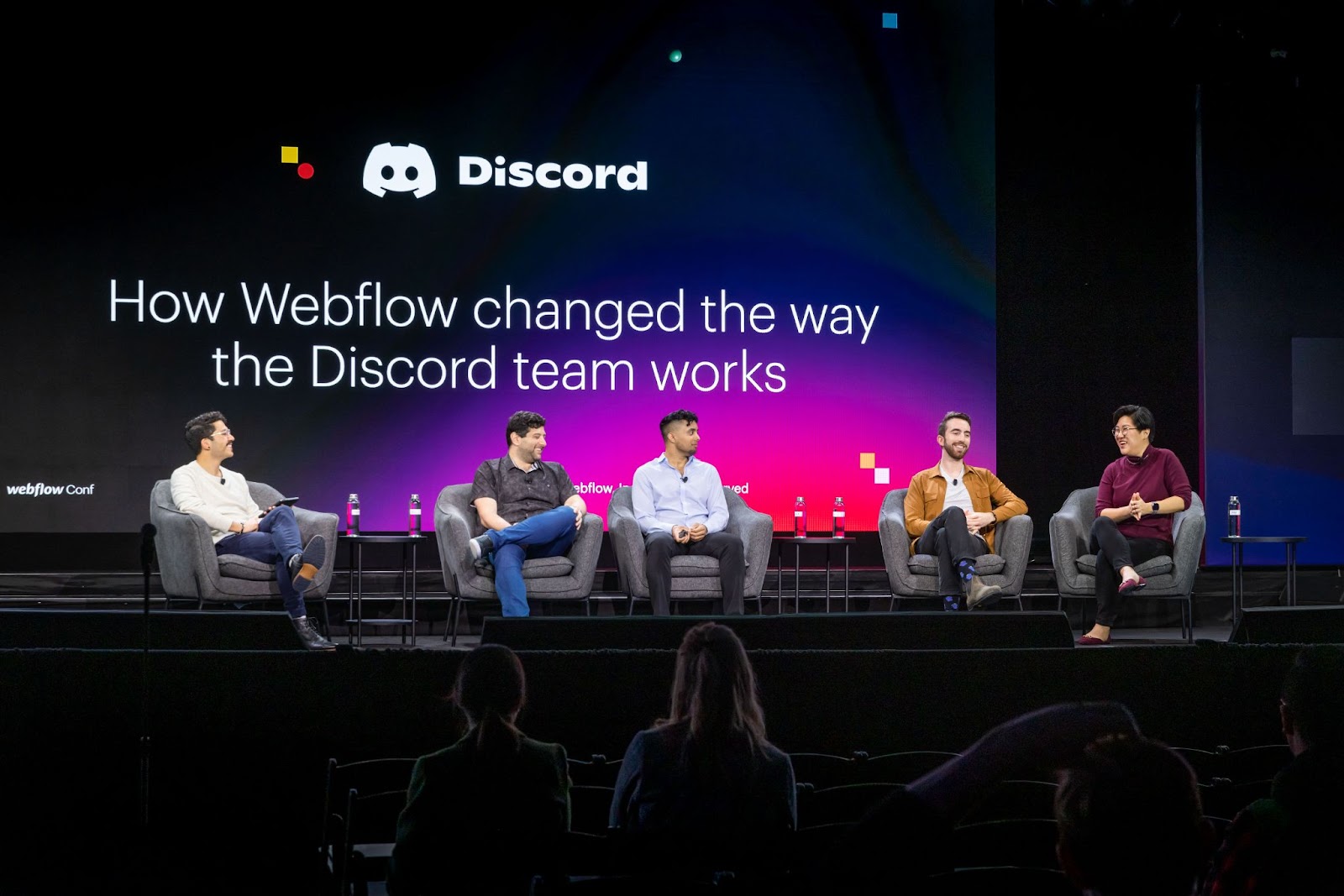
The team gave tips on processes like blog migrations, how they’re able to empower other team members to build sites, the importance of a single source of truth, and lessons learned from their time using Webflow. They also touched on how Webflow has helped them save time and eliminate internal inefficiencies.
“We’re not relying on engineering to save the day…anyone can make a change, and make it quickly.”
- Nick Ben, Senior Product Marketing Manager at Discord
Growing a Webflow business through collaboration
Far too often, businesses see competitors as rivals. But what if your competition is actually your best collaborator? Matt Varughese of 8020 and Mason Poe of Edgar Allen shared the story of their unconventional friendship with user experience designer Emily Giordano.
During this meeting of minds, they discussed the power of networking and community building and why they believe collaboration — even with competitors — is an agency for mutual growth.
DevFlow: Bridging the gap between engineering and marketing
ChattyKathi is a digital social assistant that unlocks endless ways for you and your team to stay connected. As a startup, the team at ChattyKathi needed to move quickly and speed up development timelines, while still having the flexibility they needed for custom design elements.
During this session, CEO Kaylee McHugh and fullstack software engineer Mary Beth Ingram discussed how they were able to bridge the gap between engineering and marketing while building their new website with Webflow.
Small on purpose: Thriving as a Webflow solopreneur
Grace Walker is a Webflow Professional Partner and company of one. At this year’s conference, Grace explained the three main reasons she chooses to be a solopreneur: simplicity, flexibility, and control.
Grace emphasized that the agency model isn’t wrong, but it’s not the only option for creatives. “Staying small means I can focus on my craft without having to add extra energy for things like team meetings, direction, and management,” she explained.
Grace also shared five key tips for anyone who wants to run a thriving business that focuses on doing the things they love — during and after work hours.
Enhancing visual design with web accessibility
For their session, Mirela Prifiti, co-founder of Matechs and Carmia Weideman, Creative Director of Approachable Systems explored the relationship between visual design and accessibility.
They touched on the importance of web accessibility and demonstrated how designers and developers can use Webflow to make the web more accessible and inclusive.
In particular, they showed the audience how to add ARIA attributes to interactive elements, build for those who prefer motion and those who don’t, ensure sites are mobile ready, use the Webflow built-in accessibility audit, and more.
“Visual design is not complete without accessibility,” says Carmia, “you are not taking full advantage of the web if you do not reach all possible users.”
Speed Build

After hosting the Speed Build qualifiers and quarterfinals live on YouTube in October, we brought the four finalists out to San Francisco to compete in person at Webflow Conf.
For each semi-final, competitors received a random prompt. Competitors then had 5 minutes to brainstorm and 8 minutes to build — in front of a live audience and streaming to thousands more in real-time. Winners of each semi-final moved onto the finals.
Felixander Yuan beat out Ankita Gupta with his interpretation of the prompt: create a footer section with two-step color gradient that also has a page load interaction.
Next, KC Katalbas beat out Carlos Sepulveda with her build for prompt: build a weather card UI with a three-step color gradient that also has a page load interaction.
Competitors and audience alike were surprised (and stressed) by a third place tie breaker between Ankita and Carlos — a race to build two continuous scroll interactions with two Lottie animations. Carlos finished first for the third place title.
Finally, KC and Felixander faced off for the final prompt: a tabs component with a three-step color gradient that also has a mouse click interaction.
Congratulations to the 2022 Speed Build Challenge winner: Felixander Yuan!
Felixander Yuan, the speedy Webflow Designer from Indonesia is our Speed Build Challenge winner! 🎉
— Webflow Conf (@webflowconf) November 10, 2022
Congratulations and thank you to all of our incredible contestants 💙 pic.twitter.com/Wjq6iqwrNk
Celebrating the winners of the Webflow Awards
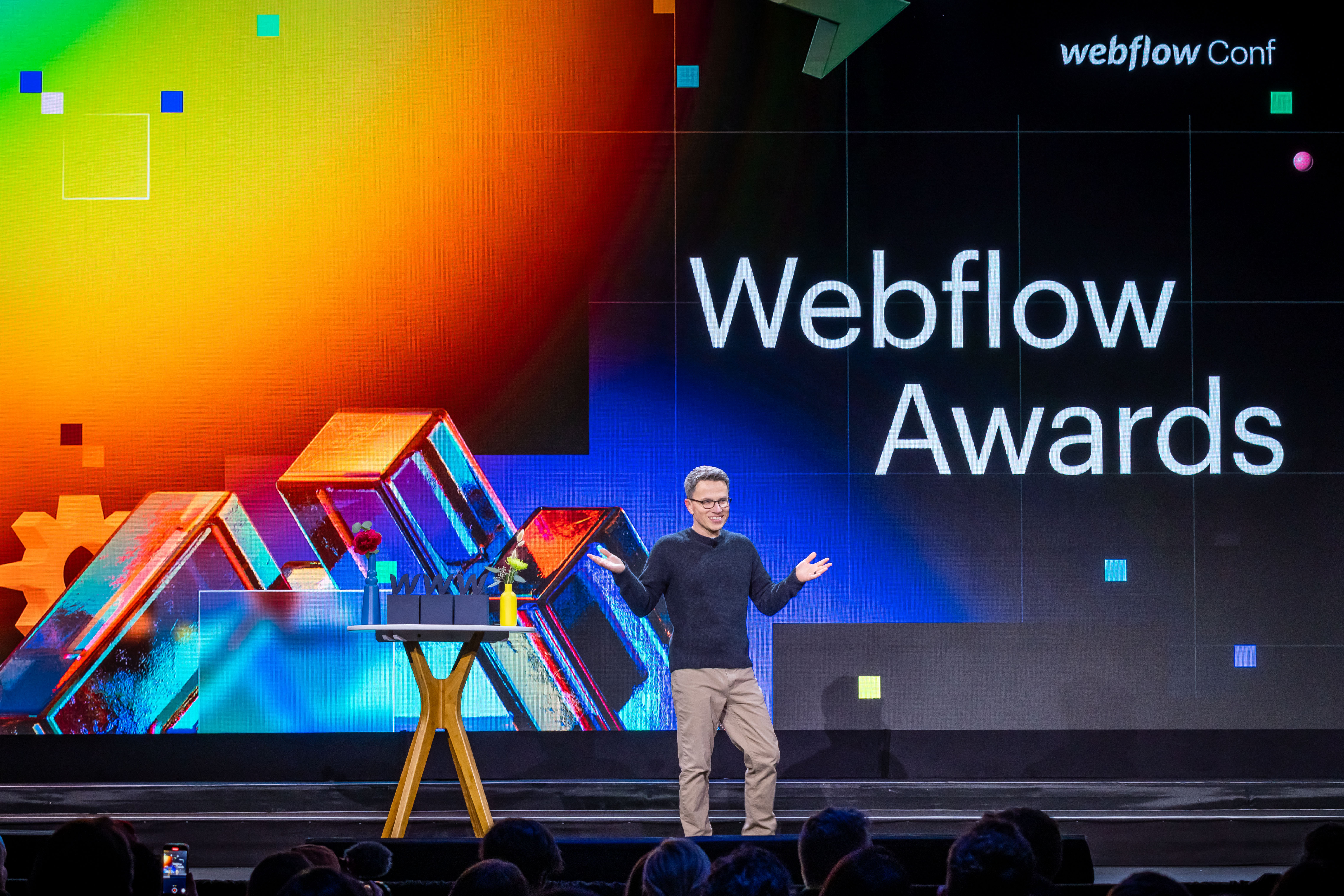
This year’s awards included three different categories — Community, Customer, and Partner — all with subcategories highlighting technical achievements, visually stunning creations, rising stars, and more.
Learn more about the amazing finalists and winners in this blog post.
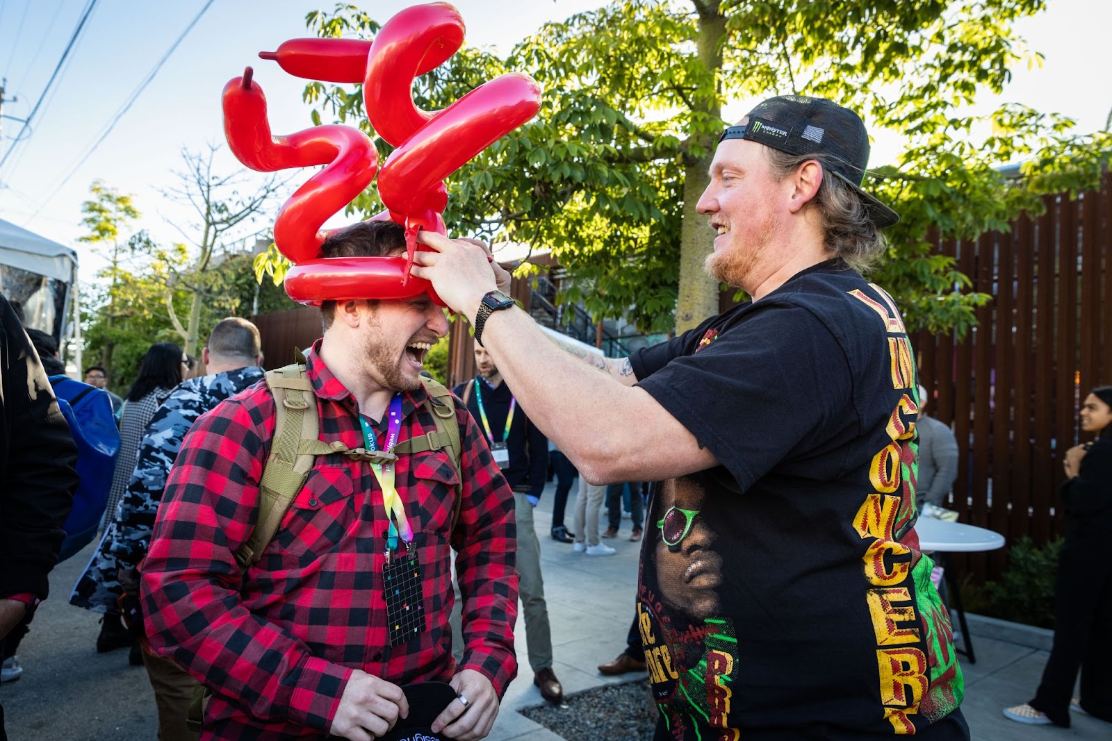
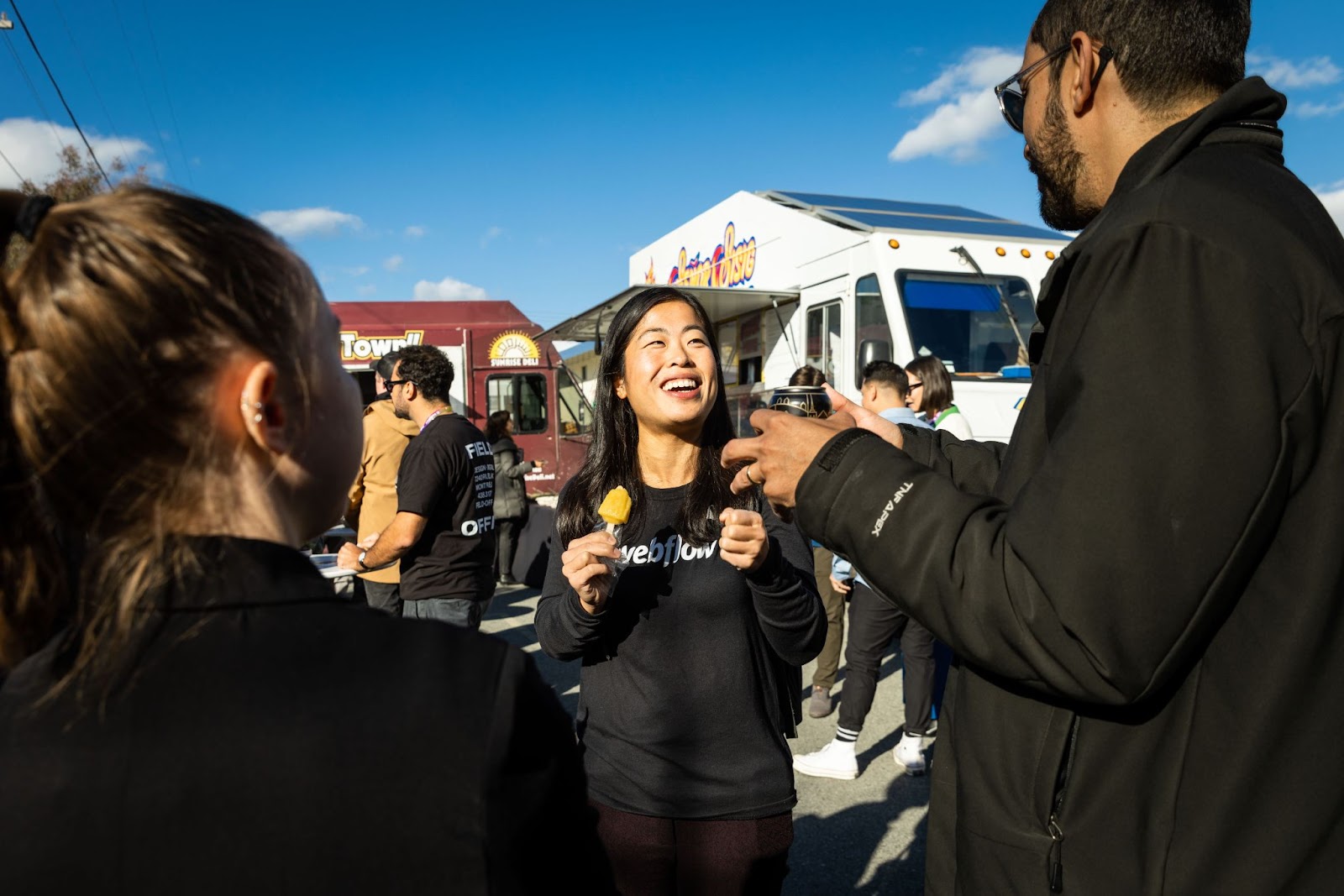
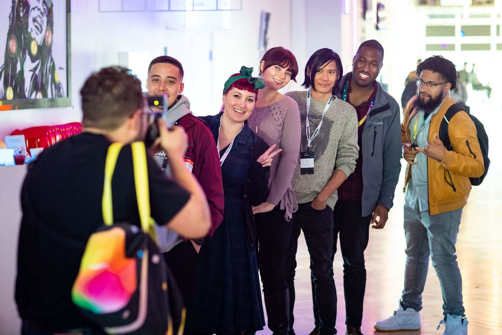
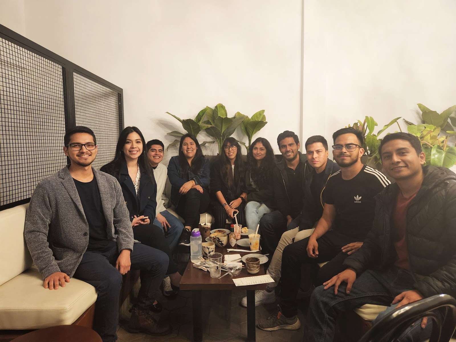
Around Webflow Conf: in-person and around the world
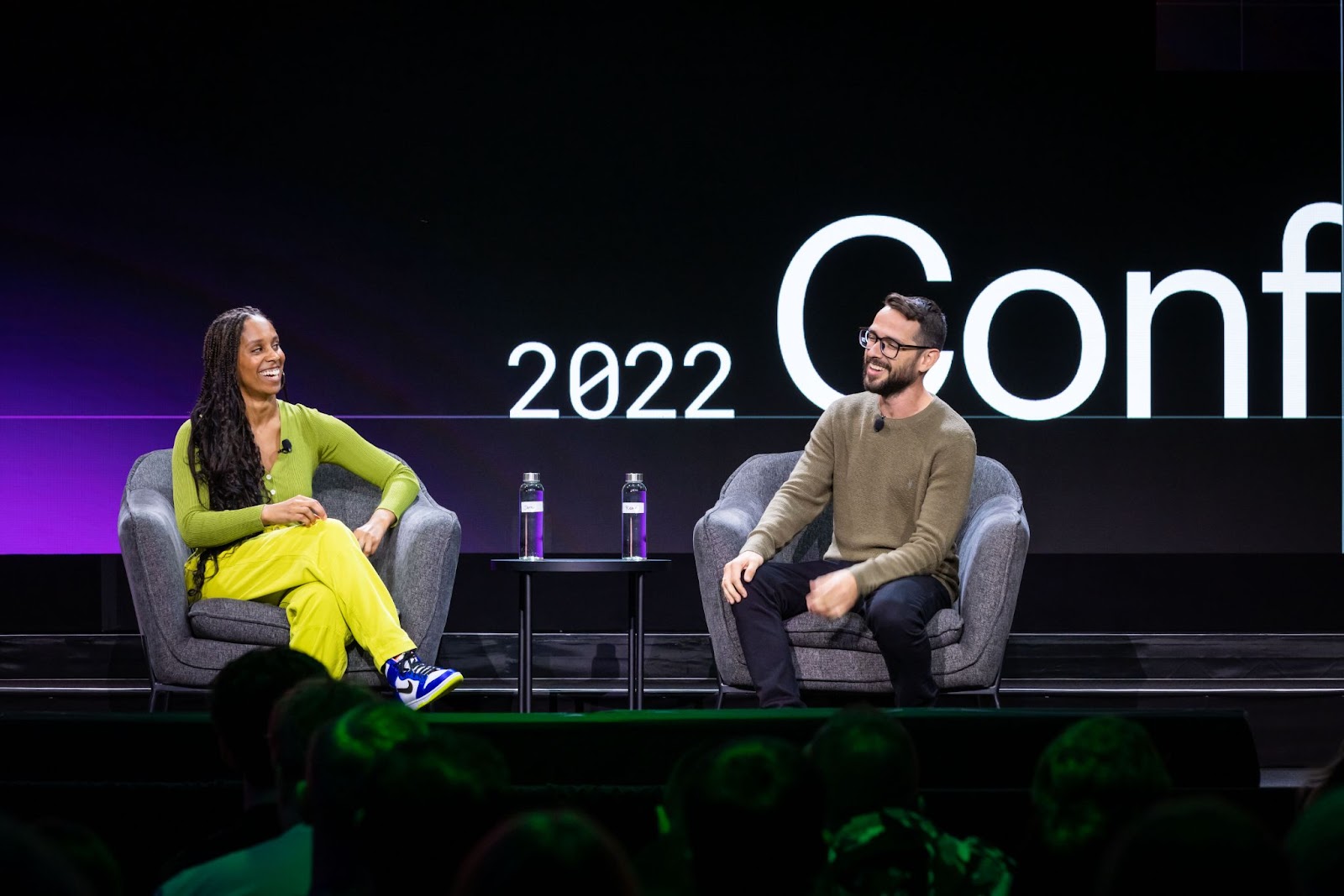
Thanks for joining us!
From all of us at Webflow, thank you for joining us at Webflow Conf 2022. We can’t wait to see you next year!


Missed Webflow Conf 2022?
Catch up on all of the sessions right now on Webflow TV.


