Update
Designer
Symbols are now in their own panel
We’re moving symbols to their own panel on the left side of the designer to make them easier to find — and to make way for some exciting planned upgrades to ou

Heads up: we just moved symbols to their own panel on the left side of the Designer to make them easier to find and to make way for some exciting planned upgrades to our entire symbols toolset (details below).

To learn more about how we’re evolving symbols at Webflow, check out our blog post on symbol content overrides and keep an eye out for upcoming releases, including:
- Nested symbols. Put symbols inside of symbols for hyper-detailed layout control and management.
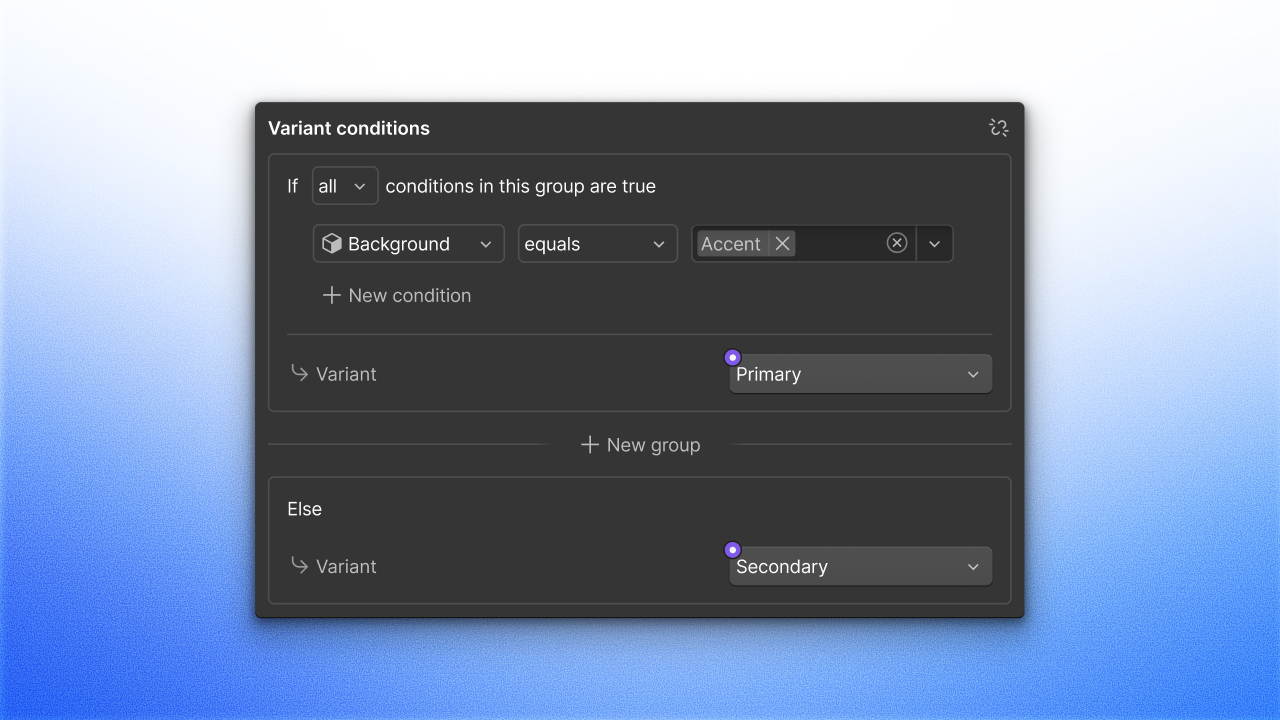
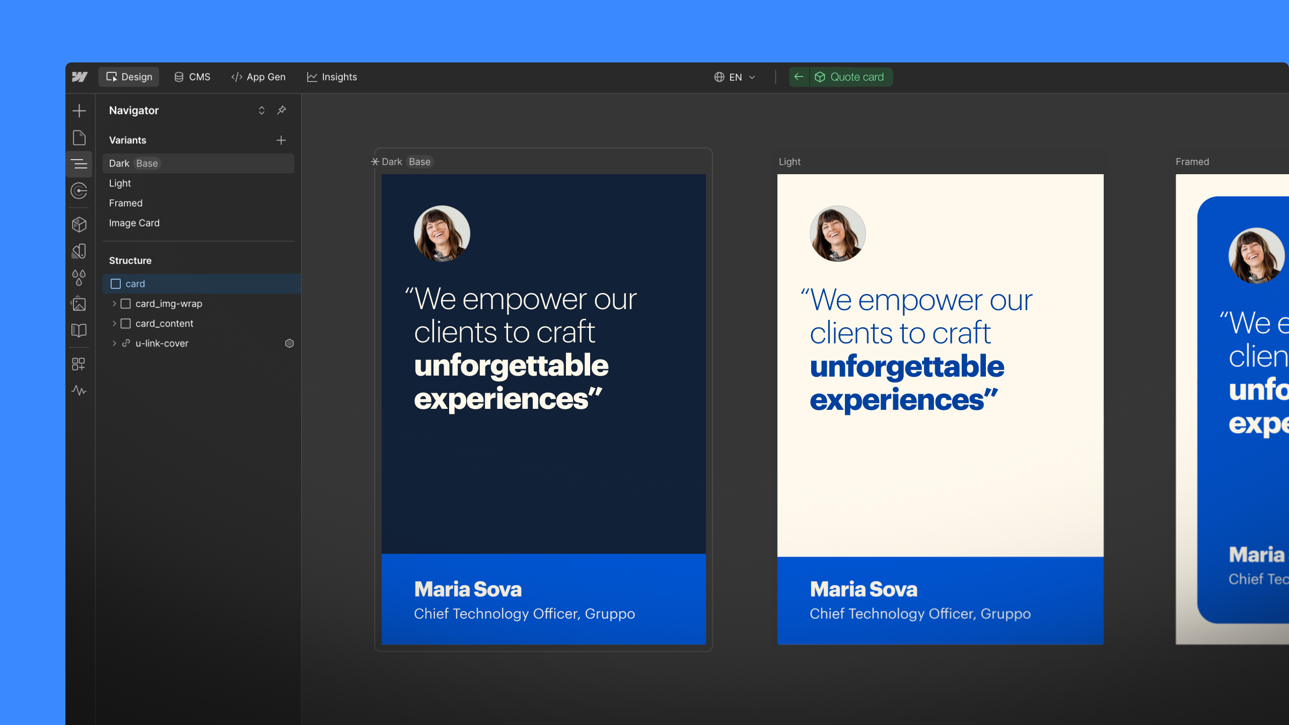
- Style overrides and variants. Define which element styles (e.g. background color) can be overridden on instances, and create multiple variants (e.g. a dark and a light version).
- Renaming symbols to components. To reflect the dramatic expansion of what “symbols” will be able to do, we’ll be renaming “symbols” to “components” in a future release.
Related updates
Get started for free
Try Webflow for as long as you like with our free Starter plan. Purchase a paid Site plan to publish, host, and unlock additional features.
Try Webflow for as long as you like with our free Starter plan. Purchase a paid Site plan to publish, host, and unlock additional features.


.jpeg)


