

Including busy graphics on a single webpage is a valid stylistic choice. But cluttered designs can inhibit the user experience.
If a crowded webpage design obscures information, visitors bounce at rates of up to 90%. A clean web design offers a clearer path to the information users seek.
Enter flat design. This approach focuses on two-dimensional (2D) design elements to keep a website user-friendly and understandable on any screen. It’s an option every designer should keep in their toolkit when the user interface (UI) starts to feel claustrophobic.
What’s flat UI design?
Flat design is a minimalistic style that focuses on graphic simplicity. It removes shading, highlights, and three-dimensional (3D) design in favor of 2D shapes, stripping elements to their basic functions.
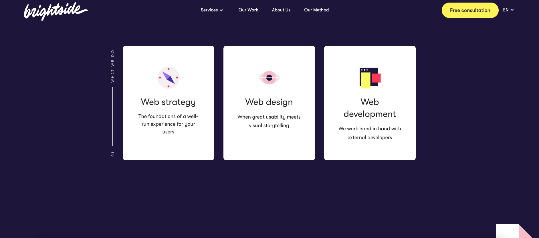
In the above example, brightside Studio’s “What we do” section uses flat icons to present their main pillars:
- Strategy: A compass to point users in the right direction
- Design: An eye to represent visual storytelling
- Development: Multiple stacked rectangles resembling web browsers
These icons communicate brightside Studio’s story — complemented by short copy — without weighing readers down in the details.
As a design choice, flat imagery isn’t better or worse than maximalist design. Both styles have their benefits. Maximalist design offers excitement, strong brand identity, and unique user experiences. Flat design is more decipherable on smaller screens and may even speed up loading times. It’s a good choice for brands that want to keep things straightforward.
Key elements of flat design vary but can include:
- Uncomplicated icons and shapes that quickly communicate meaning
- Sans-serif typography with a focus on readability
- Flat, clean textures
- Plenty of white space
Skeuomorphic: The opposite of flat design
Skeuomorphic design imitates real-life objects and uses shadows, gradients, and other elements to add depth and complexity. Using a detailed image of a vintage film camera to represent a smartphone’s digital camera app, for example, is a skeuomorph in action. The movement’s popularity has also sparked shorter-lived design movements like neumorphism.
Forbes reported the fall of skeuomorphic design in 2007, but some say it’s making a comeback. Though overusing skeuomorphism can cause clutter and confusion, it’s useful when companies and brands want to represent real-life objects on screen. It connects a digital product to its real-world counterpart.
Designers choose skeuomorphic design to show recognizable versions of a company’s products. It also lets 3D objects shine by better representing their shapes. Think of a 3D trash can as a desktop trash icon — it’s not photo-realistic, but it’s recognizable. That familiarity can make designs more intuitive and help clarify what an app or product represents.
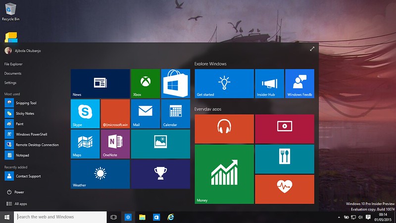
In contrast, many flat designs, like the updated Microsoft menu below, offer an uncomplicated 2D version of recognizable symbols. A 2D white sun signifies the weather, and a 2D white letter serves as the Mail app. These flat icons represent what people will find after clicking without adding unnecessary detail.


Build websites that get results.
Build visually, publish instantly, and scale safely and quickly — without writing a line of code. All with Webflow's website experience platform.
Why use a flat design style?
2D design elements are a common web design trend, partly because big names like Google, Apple, and Microsoft use them.
Above is an example of the flat icons used in the Windows 10 menu. Microsoft introduced these icons back in Windows 8. The clean lines and icons keep the layout from becoming overwhelming, even though there are many navigation options.
Website owners itching for change might choose flat design websites for their modern appeal and minimalist motifs. But flat designs can also help them meet goals they’ve been struggling to reach, like reducing load times and cleaning up the interface.
Here are a few ways flat design benefits a website.
Updates cluttered homepages
Flat UI design gives businesses a chance to update an older website without a complete redesign. Updated icons and illustrations can refresh the UI while leaving the basic layout intact. It helps websites look more modern without a total overhaul — replacing a few old elements with flat design is sometimes all it takes to add contemporary flair.
Lowers bounce rates
Confusing landing pages, unclear menus, and slow websites all contribute to high bounce rates. Bouncing occurs when visitors don’t make it past the first page they open because it was hard to navigate or unrelated to their search or took too long to load. Flat design addresses these issues by using basic graphics that clearly indicate what users can expect to find when clicking through an icon or button to improve usability.
Reduces load time
Complex graphics and high-resolution images contribute to long loading times, and longer load times might lead to visitors growing impatient and leaving the site before seeing what’s there. Google found that the probability of visitors bouncing increases 32% when the load time goes from one second to three. Flat designs don’t have the same large file size as high-resolution photos or animations, meaning a webpage loads the content faster.
Reaches a wider audience
Photographs can limit representation — it’s impossible to include every type of person. Flat design styles like Corporate Memphis use non-human skin tones and exaggerated bodies to display a more universal population instead of a specific few.
Optimizes the mobile experience
Mobile design needs to fit a smaller screen and cater to users on the go, and websites with too much going on might not meet these criteria. Flat design helps websites adopt more mobile-friendly elements that load faster and don’t crowd the space.
Streamlines the sales funnel
As customers get closer to a transaction — whether it’s signing up for a newsletter or making an ecommerce purchase — website navigation should be as straightforward as possible. Flat design highlights important calls to action (CTAs) and buttons with minimal clutter so users know where to go.
How to incorporate flat design into your website
Remember that not everything on a webpage has to use flat design. A little shadow or glassmorphism (which adds shading to provide depth to an otherwise flat design) still benefits a website. There’s even material design, which combines flat elements with select spots of animation or depth to hold user attention.
But design elements add up, and incorporating just a bit of flat iconography or minimalism gives tired elements a new look without overwhelming visitors. Focus on updating a few elements to refresh a design if you don’t want a complete overhaul.
Choose a new color scheme
Choose a bold but basic color palette that stands out without texture. Flat design works well with high-contrast colors, especially if there are lots of icons and smaller elements. Backgrounds often benefit from a slightly desaturated shade that brings other elements like text boxes and CTAs into focus.
Use a grid-based layout
Grids aren’t always necessary for flat design, but they offer a guideline to help designers create a clean layout. A basic horizontal and vertical grid highlights the right spots for elements to stand out against each other and the flat background. More adventurous diagonal and irregular grids also work for flat design.
Incorporate flat icons
Adding a few flat icons is a subtle way to update a website. Create a suite of minimalistic icons to represent actions and sections, and switch out detailed images with less-demanding illustrations. A minimal button with clear text beats a carefully designed but complex icon.
Choose a new font
Flat web typography — like many from the sans-serif family — doesn’t need shading to shine and removes clutter from the site. Ensure all text has a high contrast with its background and is well-spaced to optimize readability.
Adjust navigation
After adjusting a website’s layout and adding new designs, check on the navigation. Updated icons might be striking, but they could obstruct user flow if they’re too basic to be recognizable or in the wrong place. Flat design isn’t useful if it takes away from the heart of a website. Lead customers in the right direction.
The downsides of flat design
Like any design style, flat design won’t complement every website. Flat icons need clear context clues to back them up. Otherwise, flat design can be too minimal — to the point of being unclear to new visitors. An ecommerce shoe store using a shopping cart icon to represent the digital shopping cart matches user expectations, but using a high heel might create confusion.
While flat design avoids using photographs and prefers more basic illustrations and icons, sometimes the right photo better represents a brand. And maximalism, 3D elements, and skeuomorphic design can all work together in the right design.
Less is more with flat design
Flat design has become a go-to solution to create clean, speedy websites. But it doesn’t have to be the only style — use the elements that work and toss the ones that don’t.
And thanks to creative illustrations and appealing icons, flat design still has plenty for designers to work with. Webflow’s design tools offer templates, icon banks, and educational resources to incorporate flat design at any level.