

To create a high-performing landing page, you need to understand your target audience and design the right sections to communicate your value in a compelling way.
The primary purpose of a landing page is to facilitate conversions — whether those conversions be product purchases, product demo requests, or lead capture for email marketing purposes. If done well, landing pages play a crucial role in transitioning a one-time visitor into a loyal customer, no matter your business goals.
In this article, we’ll walk you through everything you need to know when designing an effective landing page, including high converting landing page sections you should have and stellar examples for design inspiration.
Types of landing pages
The purpose of a landing page is to convert visitors into leads or customers by guiding them toward a specific conversion goal or action. Many are often confused about the difference between a landing page and a website; unlike a traditional website, which may have multiple objectives and navigation options, a landing page focuses on a single call-to-action (CTA) and drives visitors toward that goal.
While landing pages can come in different forms, some typical landing page types include:
Lead capture landing page
Purpose: Lead capture, or lead generation, landing pages collect visitor information, such as names and email addresses, in exchange for valuable content or offers (e.g., eBooks, whitepapers, webinars). The primary goal is to build an email list and nurture leads for future marketing efforts.
Components: These landing pages typically include a headline that communicates the offer's value proposition, a lead capture form to collect visitor information, and a compelling CTA button encouraging visitors to submit their details.
PPC (pay-per-click) landing page
Purpose: Marketers specifically create PPC landing pages for paid advertising campaigns, such as Google Ads or Facebook Ads. The goal is to maximize the conversion rate of the ad campaign by providing a seamless and relevant experience for visitors who click on the ad.
Components: Marketers optimize these landing pages for relevance and continuity with the corresponding ad, featuring a headline and copy that align with the ad messaging. They often include a prominent CTA button that mirrors the ad's call-to-action and removes distractions to keep visitors focused on the conversion goal.
Product landing page
Purpose: Product landing pages showcase and promote a specific product or service, with the goal of driving conversions and sales. These landing pages highlight key features, benefits, and value propositions to persuade visitors to make a purchase or take the desired action.
Components: Product landing pages typically include a captivating headline, product images or videos, detailed product descriptions, customer testimonials or reviews, pricing information, and a clear CTA button prompting visitors to make a purchase or learn more.
Anatomy of a high-converting landing page: 8 sections
To choose the right sections for your landing page, consider where this page is on the site.
For example, if you’re optimizing your home page, which is the central landing page on your website, you’ll want to include elements based on your company value proposition or unique selling proposition.
If you’re building a campaign landing page, which could be on any unique URL, you’ll only want to feature elements and CTA buttons related to that unique campaign.
While there are multiple ways to construct a landing page, each typically requires a few common elements, including:
1. Hero
According to research Google conducted, it only takes 0.05 seconds for users to form an opinion about a website. This data means the initial impression of your website is absolutely essential — a poor first impression will cause users to leave the page while a good one will encourage them to stay, learn more, and perhaps take the desired action.
Simply put, the hero section of a landing page is where you have the opportunity to grab your visitor’s attention and tell them precisely four things:
- What you do
- Why you’re different
- What the key benefits are
- How to get started
To communicate these points, the hero section should include:
A headline: The headline is the first thing visitors see and should be attention-grabbing, concise, and relevant to the offer. It sets the tone for the rest of the page and entices visitors to continue reading.
A subheadline: The subheadline provides additional context to the headline, elaborating on the offer or value proposition. It should complement the headline and further engage visitors' interest.
Visuals: An appealing hero image or video captures visitors' attention and reinforces the message in the headline and subheadline. It should be relevant to the offer to encourage further engagement.
2. Unique value proposition
A compelling unique value proposition addresses the visitor’s question, "Why should I choose your product or service over others?"
This part of the landing page is your chance to display your product in action and how the features create a solution for your target customer. To accomplish this outcome, highlight unique features or solutions, address customer pain points and fears, and emphasize what sets your offer apart from your competitors.
When it comes to formatting your unique value proposition on a landing page, you can take a few different routes:
- Bullet points
- Graphics/infographics
- Statistics
- Testimonials/reviews
- Product demos, screenshots, or gifs
3. Call to action
A well-crafted CTA serves as a guide for visitors, directing them toward the desired conversion goal — and is, of course, one of the most crucial parts of a landing page. When done correctly, a CTA prompts visitors to take a specific action, such as signing up, making a purchase, or downloading content.
Depending on your goals and organization, you might use one of the following common formats for your CTA(s):
- Button — These clickable elements typically have text that prompts visitors to take action, such as "Sign Up," "Buy Now," or "Learn More." Buttons can vary in size, shape, color, and style, but they should always stand out and be easily clickable.
- Text link — Format these links differently from regular text to make them more noticeable and clickable.
- Form submission — For lead generation landing pages, the CTA may take the form of a form submission field where visitors can enter their information and submit it to access a resource or request more information.
- Popup — CTAs can also appear in popups, or modals, that appear at the top or bottom of the landing page content. You can use popups for special offers, promotions, or to capture email sign-ups.
4. Social proof
One of the best ways to tell a story on your landing page is to provide evidence of real people who have benefitted from your product.
The goal is to inspire your visitors, build credibility, and create trust.
In order to accomplish this goal, you can include a variety of different types of content, including:
- Customer testimonials — Quotes or reviews from satisfied customers who have had positive experiences with your product or service can be highly persuasive. Testimonials should be authentic, specific, and ideally accompanied by the customer's name, photo, and affiliation (if relevant).
- Case studies — Detailed accounts of successful customer experiences or use cases to demonstrate real-world results and provide evidence of your product or service's effectiveness.
- User ratings and reviews — Display star ratings or numerical scores.
- Customer logos — Showcase recognizable logos or badges of well-known customers, partners, or industry affiliations.
- Social media mentions — Highlight social media mentions, shares, or endorsements from influencers or industry leaders.
- User-generated content (UGC) — Share user-generated content such as photos, videos, or testimonials your customers create that relate to your product or service.
- Trust badges — Include badges like security seals or industry certifications that prove the reliability and authority of your website.
Each piece of content adds credibility to your offer and reassures visitors that others have had positive experiences.
5. The team
Okay, so you have a great product and people understand how it works, but do they actually know who you are?
Part of converting visitors, as we’ve discovered, is about creating trust. To solidify that trust, it’s often advantageous to provide insight into the human faces behind your company. This approach helps assuage fears about whether or not visitors can rely on you to support their needs over the long term.
Anyone who’s going to invest their hard-earned money into a new solution most likely wants to know who they’re getting involved with. While this isn’t always the case, showcasing how awesome your team is may set you apart from the competition.
6. Pricing
One of the biggest objections that new leads will have as they near the closing stage of the buying cycle is price. If you are in the SaaS or ecommerce industry, you’ll save yourself a lot of time by handling those objections up-front.
Including a clear, transparent pricing section breaks down the specs for visitors who are ready to buy. Even if they still have a few lingering questions, you should be able to get a conversion — if you detail exactly what they’re paying for.
7. Frequently Asked Questions (FAQs)
Even with all the descriptions, demos, visual storytelling, and social proof, people will still have questions and objections to buying. They might have a unique problem they’re not sure you can solve. They might just want to learn more about the product in action.
The FAQ section provides a straightforward way to handle these objections directly. Think of this section as a poll. Questions that repeatedly come in are the perfect candidates for the FAQ.
Typically, organizations format this section using accordion dropdown menus. This format allows visitors to expand individual questions to view the answers without overwhelming them with too much information at once.
8. Contact information and support
After reviewing all the information on your landing page, including the FAQs, visitors might still have unanswered questions.
To support customers and help them feel knowledgeable about your product, include things like a phone number, email address, contact form, or live chat.


Build your online portfolio
Build and visually design a full portfolio website in just 21 days — with our free online course.
Landing page best practices
The best landing pages follow a few simple best practices in order to provide a seamless user experience and guide visitors toward a desired action.
Some best practices include:
- Use clear and persuasive copywriting — Use clear and concise language to communicate your message effectively, focusing on benefits rather than features. Address common objections or concerns and provide reassurance to alleviate any doubts visitors may have.
- Leverage urgency and scarcity — Use countdown timers, limited-time offers, or limited availability messages to convey that the offer is time-sensitive or in high demand, motivating visitors to act now rather than later.
- Get personal — Personalized content converts 202% better than non-personalized content. That’s why it’s crucial to leverage techniques such as dynamic content or targeted messaging based on visitor demographics, behavior, or preferences.
- Optimize performance and loading speed — Pages that load in one second convert 3x higher than those that load in 5 seconds. So be sure to optimize images and leverage caching techniques to reduce loading times and prevent visitor frustration.
- Abide by UX design best principles — Design your landing page thoughtfully with carefully chosen visuals, interactive elements, layouts, typography, fonts, and colors. Be sure these elements are on-brand and will resonate with your target audience, too.
- Prioritize mobile-responsive design — Implement responsive design techniques, such as flexible layouts, scalable images, and touch-friendly navigation, to accommodate mobile device users and maximize engagement and conversions on all platforms.
- Design with structure in mind — The structure and layout of your web page play a significant role in driving conversions. Use visual hierarchy, whitespace, and directional cues to highlight key elements and reduce distractions.
- Experiment with A/B testing — A/B test different variations of your landing page (such as headlines, visuals, CTAs, etc.) to identify the most effective elements.
- Focus on responsive forms — If your landing page includes a form, optimize it for usability and conversion on all devices. Use clear labels, input validation, and error messages to guide visitors. Keep the form as short and simple as possible by only asking for essential information. Fewer form fields reduce friction.
Best landing page design examples
Mailchimp
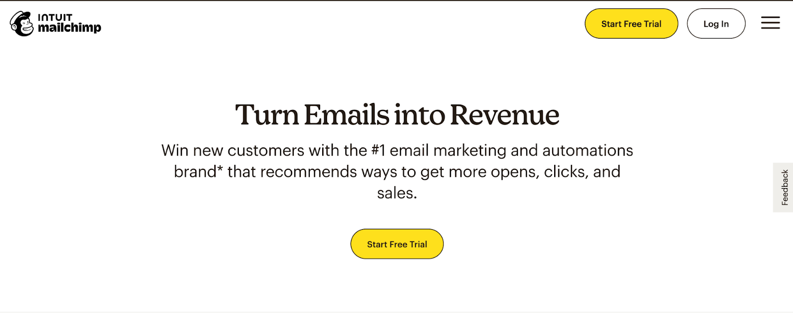
Mailchimp's landing page features a clean and minimalist design with a clear value proposition. The headline and subheadline succinctly communicate the benefits of using Mailchimp for email marketing (turn emails into revenue), while the prominent CTA button encourages visitors to sign up for free.
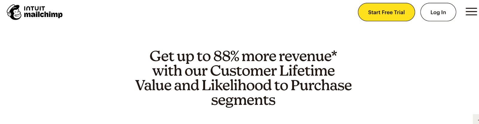
As users scroll, Mailchimp provides more information about the product, including features and social proof, as well as some straightforward statistics about the results of using their services: signing up for Mailchimp could result in 88% more revenue.
Hubspot
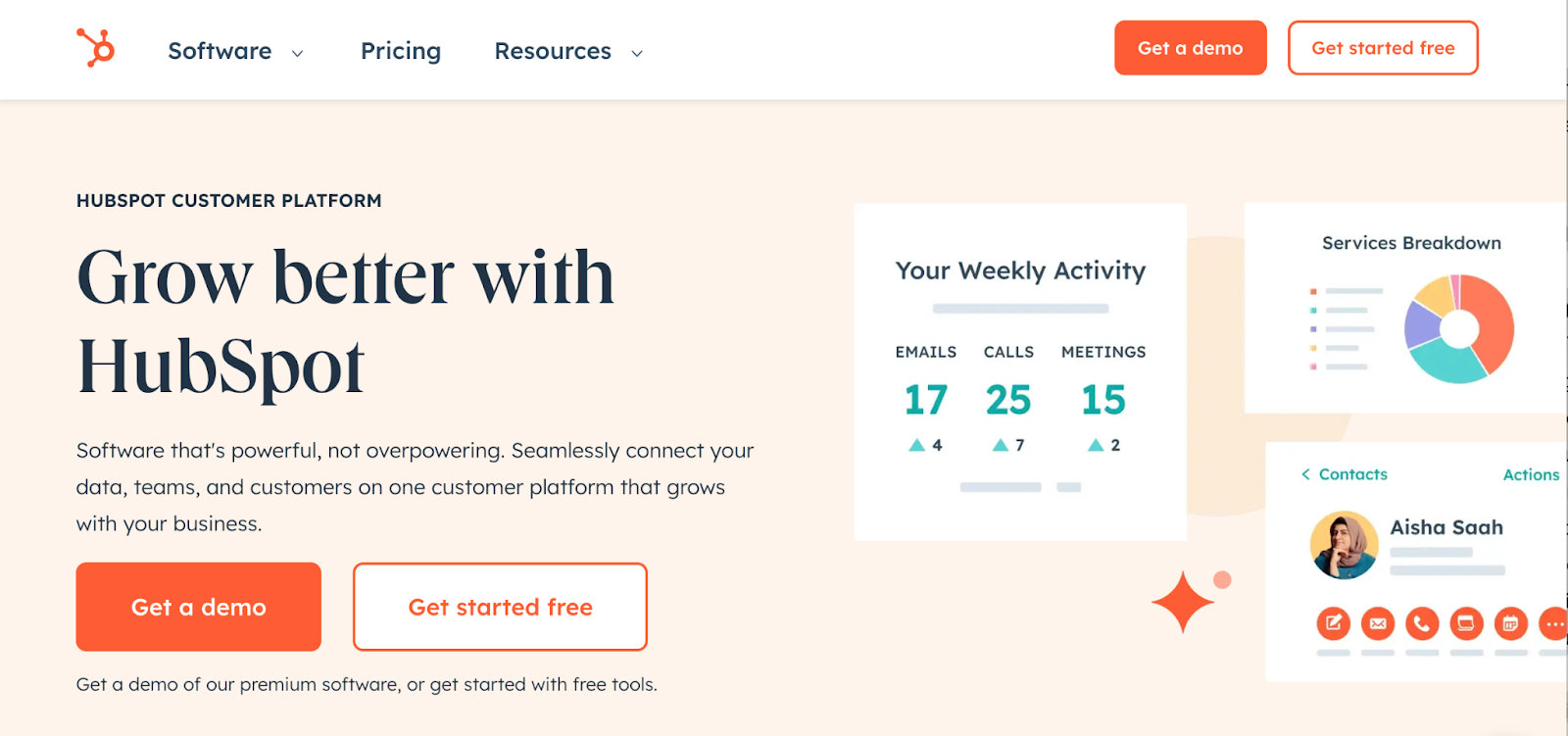
HubSpot's landing page for marketing software highlights the benefits of its platform with concise copy and engaging visuals.
The landing pages greets visitors with a unique value proposition (connect data, teams, and customers with one platform that grows with you), as well as a free trial offer and an eye-catching CTA button to encourage visitors to explore the platform further through a demo.
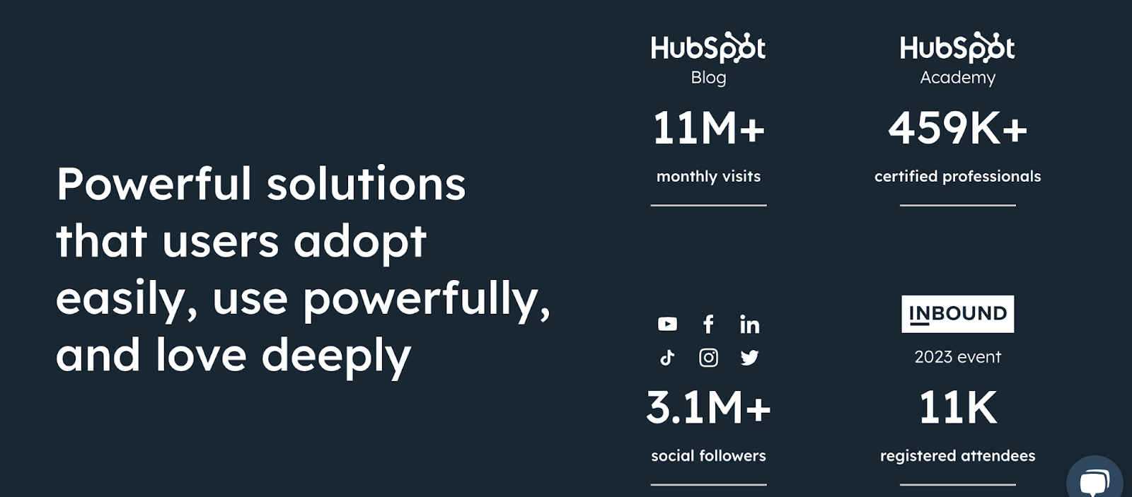
As users scroll, they can also view some pretty compelling social proof: Hubspot lists how many monthly visits their blog gets, how many professionals they have in their academy, how many social media followers they have, as well as how many event attendees they have. All of these stats reassure visitors that their site is credible and trustworthy.
Grammarly
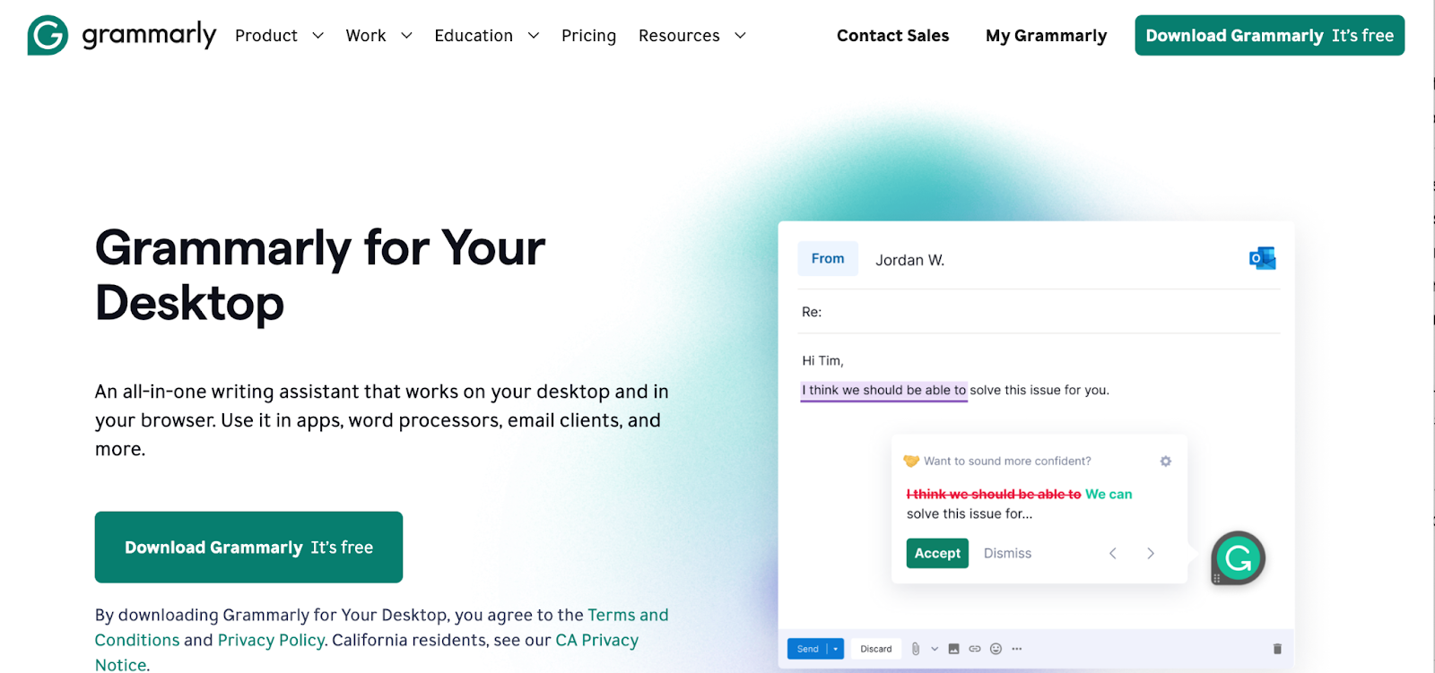
Grammarly's landing page for its Desktop writing assistant tool addresses visitors' pain points and showcases the value of its product immediately. The page features a clear image of the product in use within an email, emphasizing the benefits of using the app to correct spelling and grammar mistakes. Of course, Grammarly’s landing page also features a prominent CTA to install the browser extension for free.
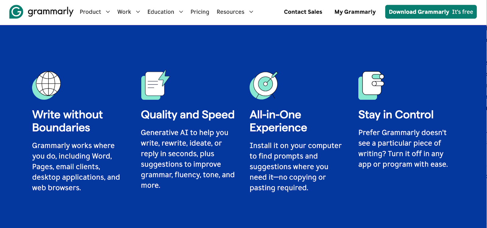
To explore the product even further, Grammarly artfully lists some of its core benefits using infographics and easy-to-read typography.
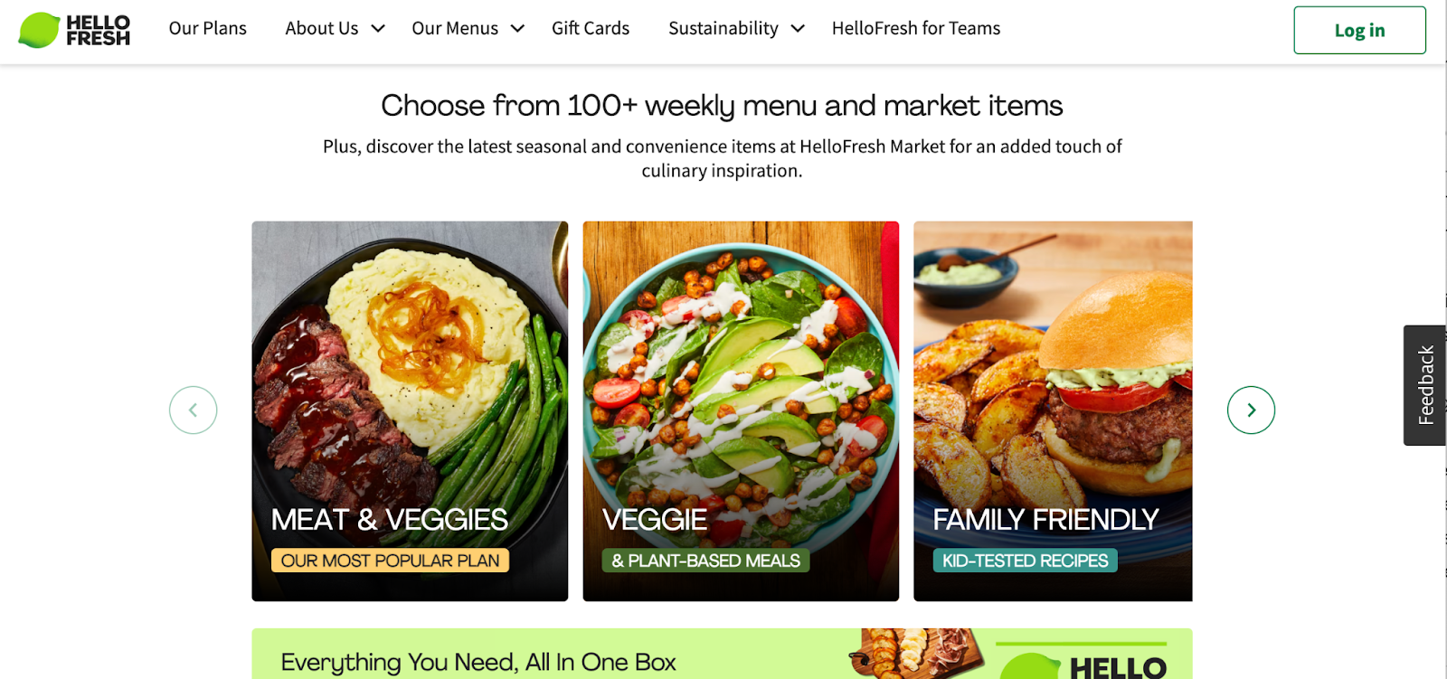
HelloFresh
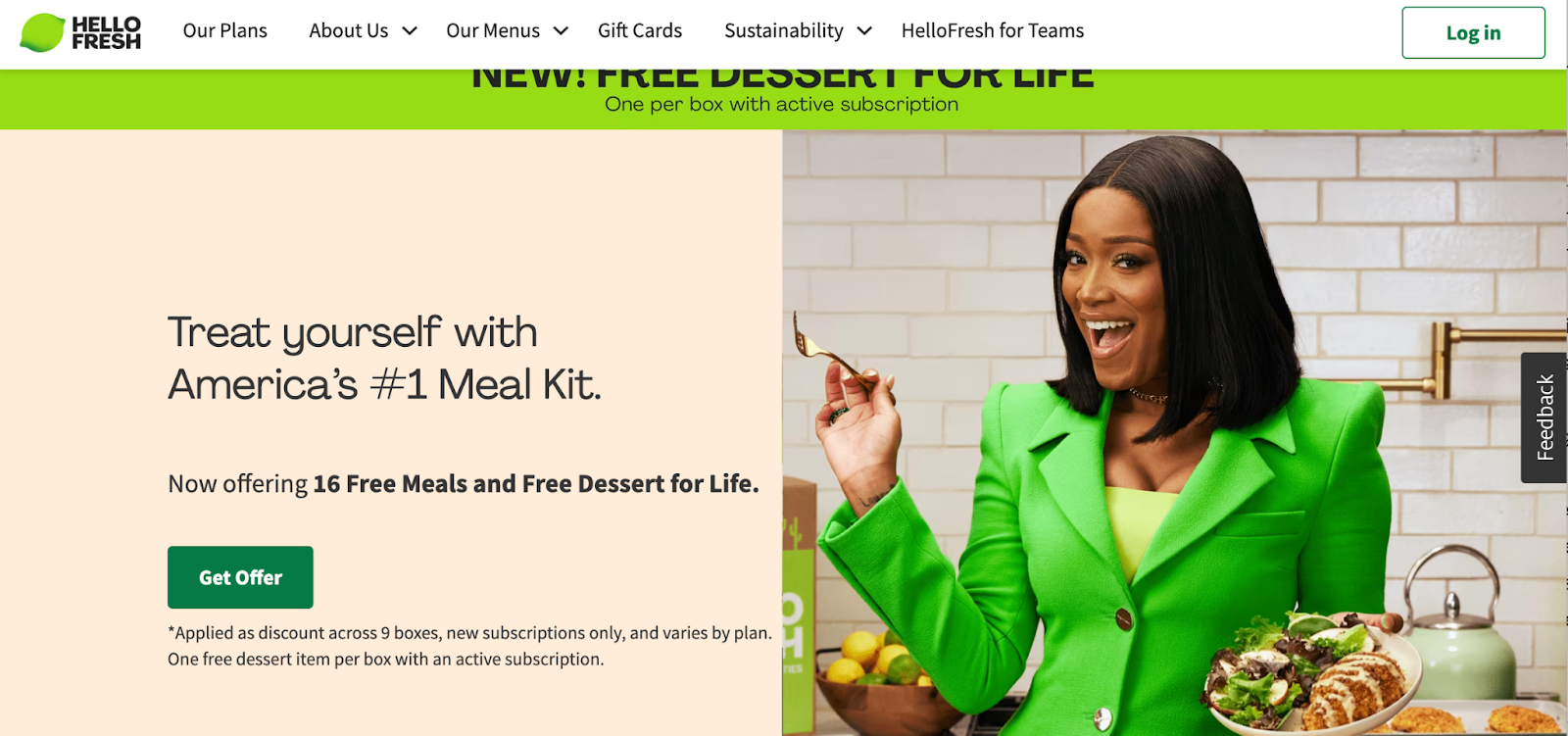
HelloFresh's landing page for their meal kit delivery service focuses on convenience and quality. The page features mouth-watering imagery of delicious meals along with clear messaging highlighting the benefits of subscribing to HelloFresh. The option to choose a meal plan and sign up for delivery encourages visitors to take action and start enjoying fresh, home-cooked meals.
Design high-converting landing pages with Webflow
Understanding the art of landing page design is essential for any marketer or business looking to drive conversions and maximize the impact of their digital marketing efforts. By understanding the key components and best practices outlined in this guide, you can create high-converting landing pages that effectively capture visitors' attention, communicate your value proposition, and guide them towards taking a specific action.
Ready to start creating your very own landing page? Get started with Webflow for free.
Build websites that get results.
Build visually, publish instantly, and scale safely and quickly — without writing a line of code. All with Webflow's website experience platform.