Discover secret design ingredients from these seven sites to make your client’s dream bakery website.
A well-designed bakery website is crucial for attracting customers, increasing conversions, and driving traffic online or in-store. It should constantly reinforce your client’s brand identity, leaving a lasting impression on their buyers and setting their bakery apart from the competition.
Learn the essentials of a successful bakery website and explore seven examples to get inspired.
What makes a good bakery website?
Here are the primary design components that make a bakery website effective:
- Visually appealing designs, including appetizing images of baked products, tempt visitors to order online or visit the store.
- Consistent branding across the site, including the logo, font, and colors, promotes the company’s visual identity.
- User-friendly navigation, including logical visual hierarchies and responsive design, ensures the site looks and performs well across multiple devices.
- Engaging content like brand-focused messaging about the company's journey and unique selling points keeps visitors on the site.
- Call-to-action (CTA) buttons encourage people to take action.
- Reviews and testimonials show positive feedback from customers to build trust and credibility.
- Contact information, including your client’s email, phone number, email address, and social media links help customers get in touch.
- Product descriptions and pricing, including information on available quantities and whether anything’s out of stock, informs customers of offerings.
- Ecommerce features like an online ordering system helps customers securely place orders online.
Sites that include these elements will serve as an inviting digital storefront for your client’s bakery business.
The 7 best bakery website designs to inspire you
Here are seven inspiring bakery websites with different design styles to help you create or update your client’s online store.
1. Lennox’s Bakery Landing Page
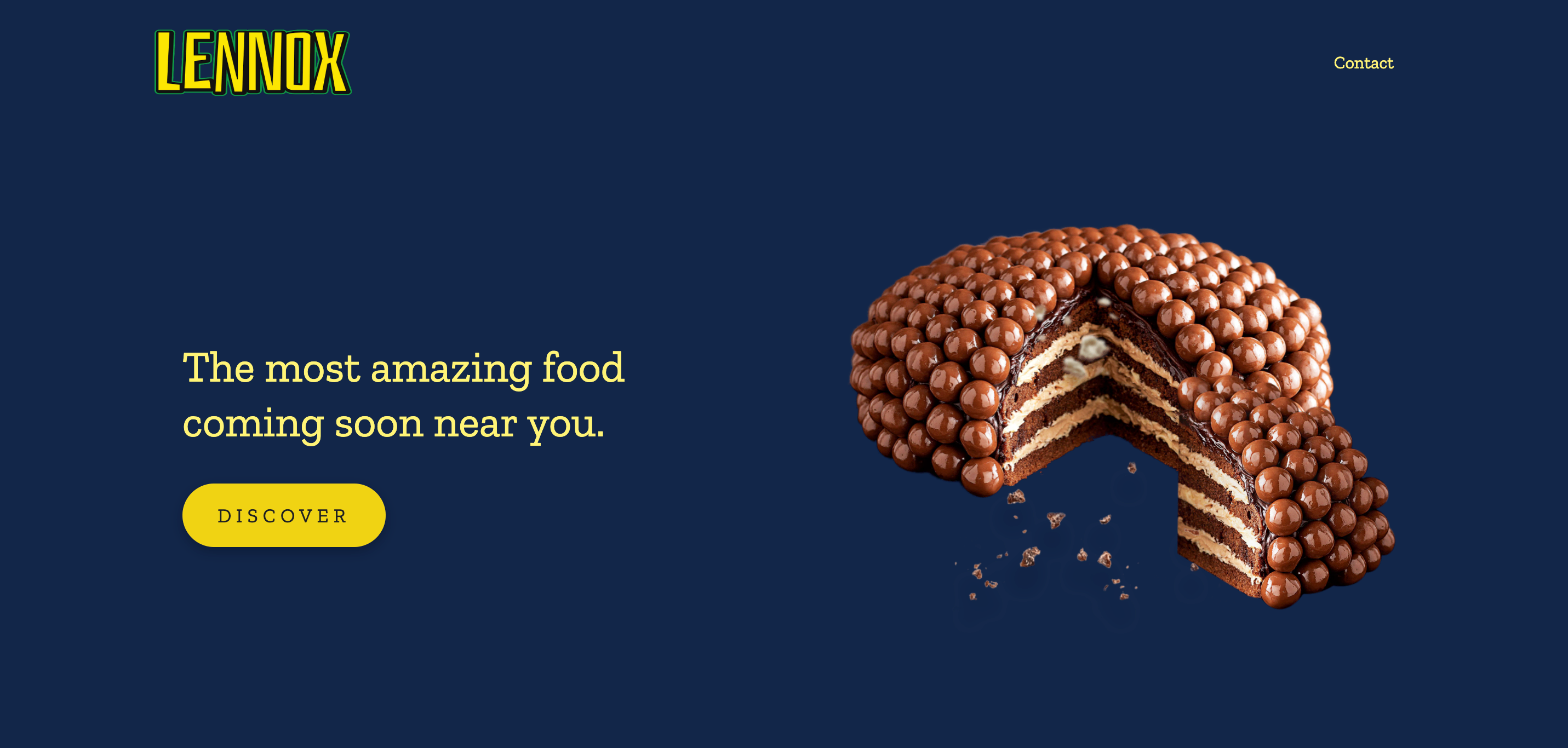
Lennox’s Bakery’s landing page, designed by Truly Custom, has a minimalist aesthetic with all the essentials of a strong bakery website. The landing page banner has a concise message — “The most amazing food coming soon near you.” — with a yellow CTA button, a hero image of a cake, a contact button in the top right corner, and the Lennox logo in the other.
The cake image is interactive, with slices and crumbs subtly floating in response to cursor movements to capture attention and engage visitors. The solid, flat background and static elements contrast the cake, making it pop off the page, highlighting the product and drawing the visitor's focus.
Scrolling reveals a transition: The background changes from blue to teal to red, then back to blue, keeping people visually engaged as they navigate. The text and CTA buttons remain yellow, serving as a consistent design element that reinforces the company’s brand identity, ensuring brand recognition and recall. There are also images throughout to showcase the bakery’s products.
The bottom of the page provides essential information for any business website: operating hours, an embedded Google map of the shop location, social media links, and a contact button.
2. Firebrand Artisan Breads

Firebrand Artisan Breads’ website, made by Majorminor, contrasts Lennox’s minimalist approach. This site contains videos throughout the page with bold text driving the brand’s mission: providing good jobs for those with barriers to employment through the craft of artisanal baking.
While the “People First” page details Firebrand’s mission and vision in great depth, all other pages focus on engaging visuals that capture attention. For instance, the homepage’s banner is a looping video with a mild black gradient that enhances the white text’s readability. This creates variation between content to break monotony while maintaining interest.
As you browse the site, you’ll find more videos and another common theme: Firebrand’s green and yellow visual identity. Components like the menu page and contact forms use this color combination to create a rustic aesthetic that reflects Firebrand’s identity.
3. Back Door Donuts
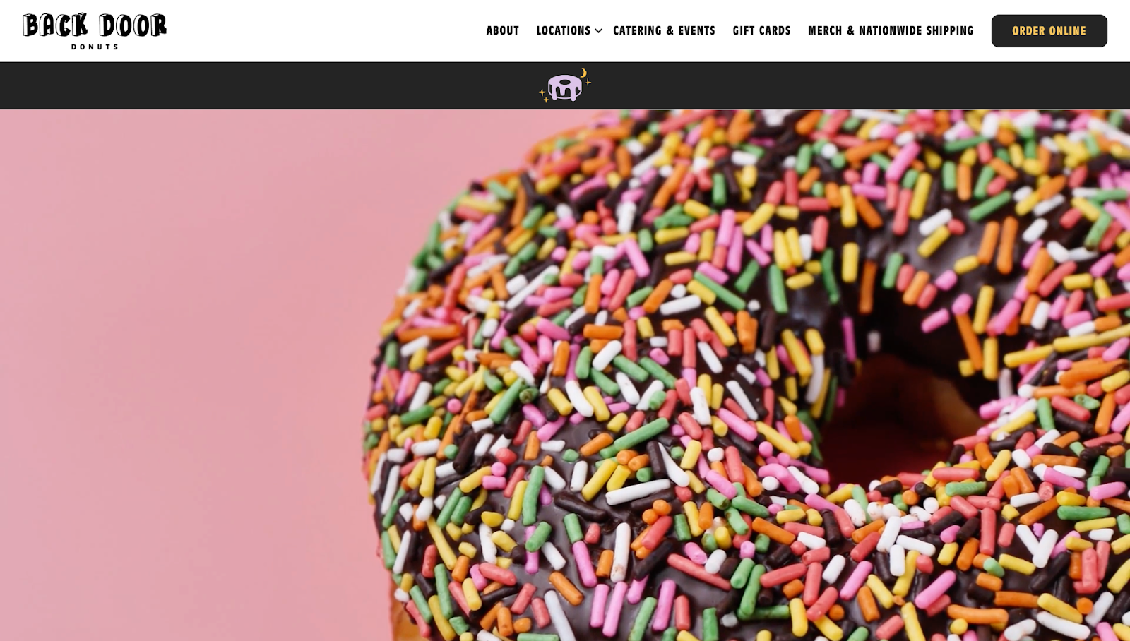
Like Firebrand, Back Door Donuts’ website has a prominent, edge-to-edge video of the company’s products and donut-making process. You can stop the video any time using a handy play/pause button at the bottom of the banner.
The website is split into multiple sections and web pages, each with a white and purple color palette to reinforce the website’s style guide. Despite the bold lettering and vibrant imagery, there’s ample whitespace to avoid overwhelming visitors. The negative spacing keeps the surroundings clear and removes potential distractions from headings, CTAs, and buttons. These design elements encourage desired actions and show important information, so placing them front and center turns interest into conversions.
At the top of the screen, there’s a sticky menu that doesn’t move, regardless of your whereabouts on the page. This menu lets you quickly navigate from any location without scrolling back to the top. At the bottom, a black-and-gold strip separates the main content from the social media and contact details, highlighting this critical information and encouraging potential customers to get in touch.


Ultimate web design
From 101 to advanced, learn how to build sites in Webflow with over 100 lessons — including the basics of HTML and CSS.
4. Nutmeg & Ginger

Nutmeg & Ginger’s website, created by Nkenna Amadi, takes a different approach to homepage multimedia — instead of a large banner or a looping video, a rolling carousel moves from right to left, with high-quality food images zooming in and out for emphasis. The dynamism in these visuals captures attention and allows you to see multiple products at once. At the same time, it encourages you to explore more of what the bakery offers by providing a sneak peek of their products.
A blend of different fonts above the carousel creates variation in the typography with the words “with love” appearing in what looks like handwritten script. The personalized style helps create an emotional connection with visitors, making the site feel warm and inviting, like you’re entering a bakery.
The rest of the website is minimal, with olive green, off-white, and an occasional dash of pink. This earthy color palette aligns with the bakery's brand identity and appeals to customers looking for authentic, handcrafted products. The minimal design ensures the focus remains on the baked goods without overwhelming visitors with excessive information.
A little cookie icon in the bottom-left corner is a witty reference to website cookies — clicking it allows you to customize your preferences. It's a playful yet functional element that adds personality to the site while giving you control over your browsing experience and privacy.
5. Cannella Bakery
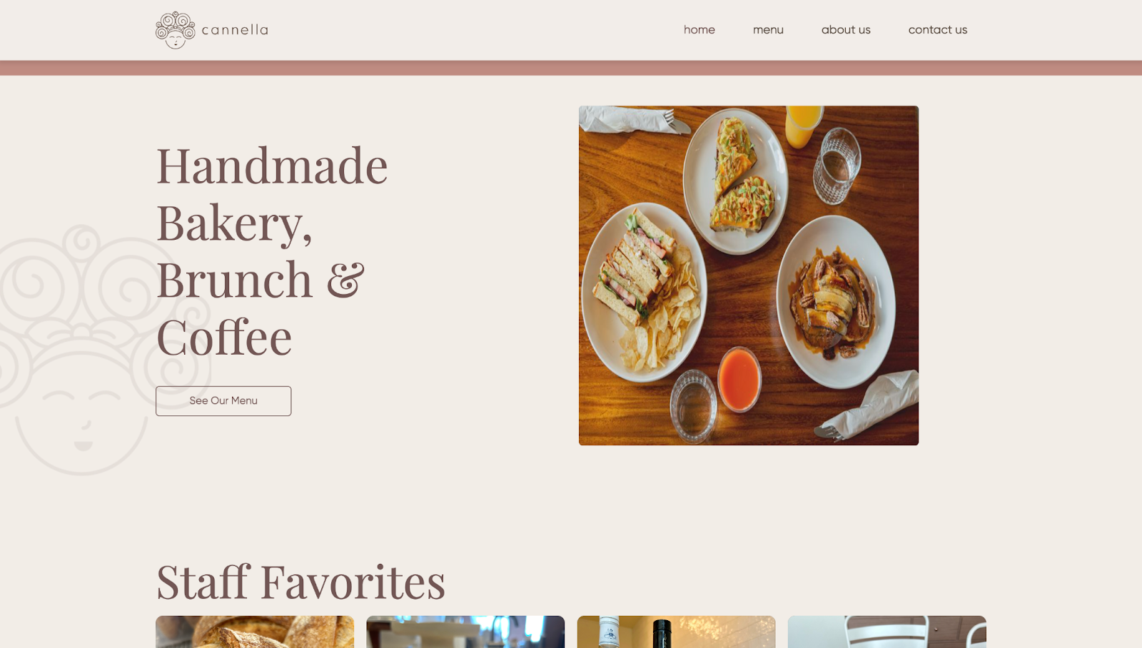
Cannella Bakery’s site is comparable to Nutmeg & Ginger’s with its earthy color tones and negative spacing, but has a more stripped-down appearance. These style choices are more fitting for a small business or a home bakery website.
The headings are all in large serif fonts that capture attention, while the buttons, navigation bars, and body content text are in simpler sans serif for readability. Similarly, the menu section displays dish names with neatly spaced-out descriptions and prices for better legibility.
The about page includes a detailed story of Desiree Passaro, the owner and chef of Cannella Bakery. It outlines her journey, providing a personal touch while highlighting her expertise. The contact page includes a form for potential customers or collaborators to reach out and a reCAPTCHA feature to prevent spam on Cannella’s end.
6. The Good Honest Baker
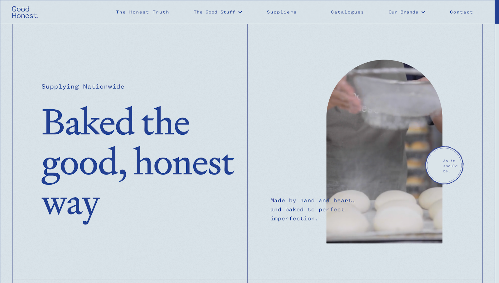
While most of the sites on this list feature neutral color palettes with earthy tones, The Good Honest Bakery stands out with a blue theme, distinguishing the brand’s visual identity from the competition.
Designed by Webflow Professional Partner Melia Marketing & Design, this online bakery site combines minimalism, animations, and other multimedia to create an engaging browsing experience. Each section has various shapes and proportions, but generous whitespace prevents elements from spilling into others.
Together, the typography and imagery weave a tale that encourages you to scroll, interact, and learn more about the company’s story and values.
7. TTM Bakery

TTM Bakery’s website template infuses ecommerce elements with bakery-related branding. This layout streamlines the buying process by removing unnecessary steps and allows people to complete their purchases with minimal hassle.
In addition to bold typography and imagery, this website has icons highlighting nutrition-rich, freshly baked, and safely packed products. The transparency builds trust and helps health-conscious customers make informed purchasing decisions.
The team section shows portraits of the bakery's chefs and bakers. Featuring the faces behind the products adds a personal touch to the website, making the website feel more approachable and relatable.
Below, two sections highlight customer testimonials and articles related to company news. Customer testimonials build credibility by showing other buyers' positive experiences, while the articles keep customers informed about the bakery's latest updates, promotions, and events.
Discover the recipe for website success
An aesthetically appealing and functional bakery website is essential for attracting and retaining customers. Your client’s bakery website will stand out with eye-catching visuals, user-friendly navigation, and consistent branding.
With Webflow, you can create stunning websites without relying on developers. Along with visually-driven features and flexibility to help bring your clients’ visions to life, you can use the content management system to update these sites when necessary.
Start designing an outstanding bakery website with Webflow today.
Get started for free
Create custom, scalable websites — without writing code. Start building in Webflow.