


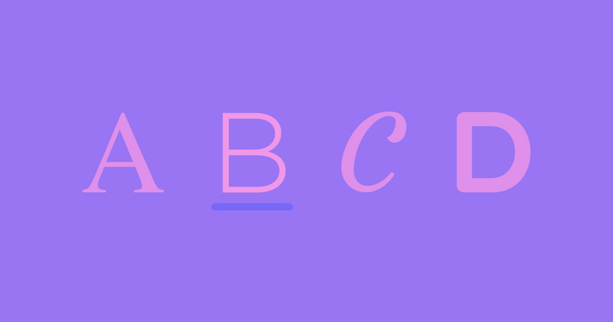
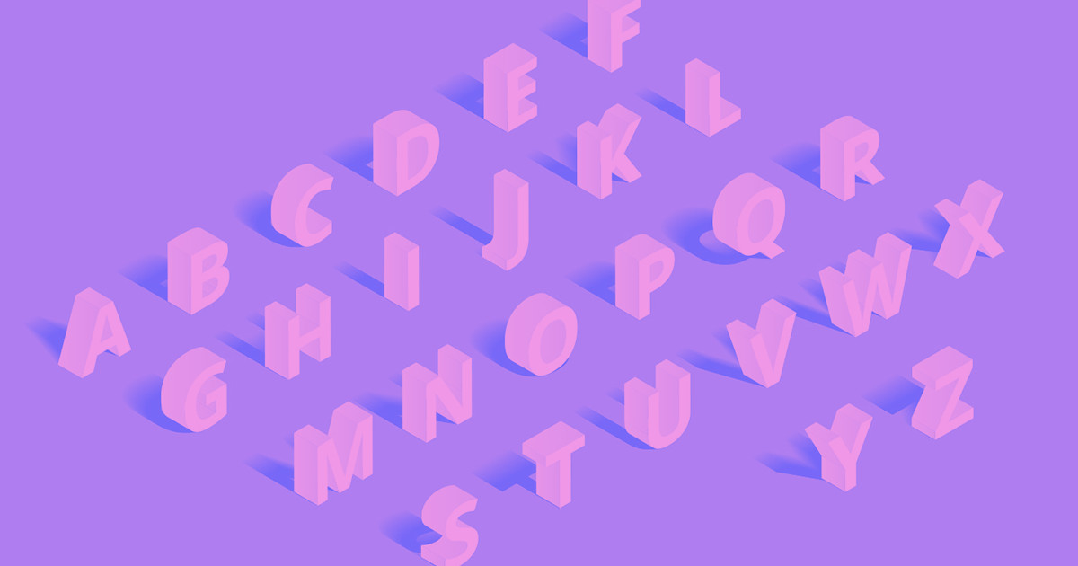
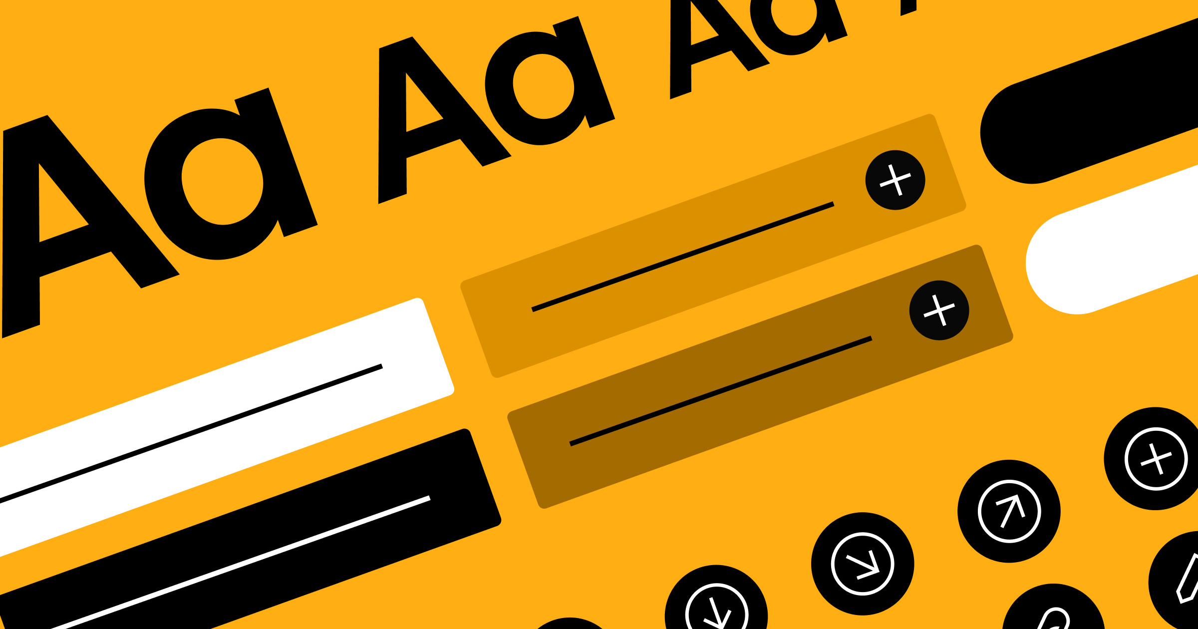
Every great website starts with two fundamental design decisions: what colors to use and how to present the text.
But these choices aren't independent. The most effective websites strategically pair colors and typography to create a cohesive experience that guides users toward specific feelings, perceptions, and actions.
The psychology behind these pairings runs deeper than aesthetics. Colors trigger emotional responses within milliseconds, while typography sets expectations about your brand's personality and trustworthiness. When you nail the combination, they work together to reduce cognitive load, improve readability, and set the tone for your brand experience.
Consider the difference between a finance website using bright neon colors with playful script fonts versus one that pairs deep blues with clean, professional typography. Each communicates entirely different messages about reliability and expertise — before the visitor reads a single word.
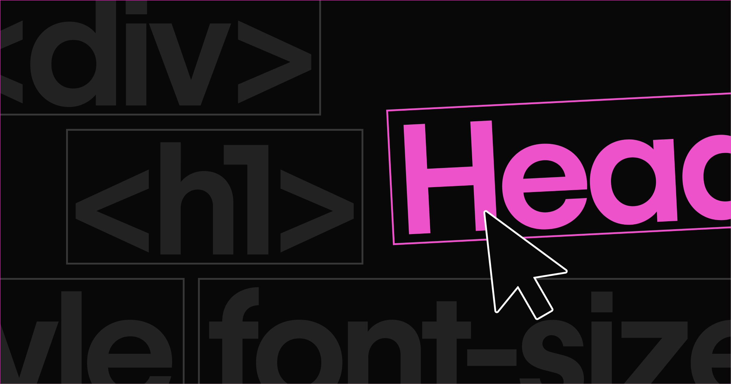
How color and typography work together
Color theory and typography are complementary systems that influence how users perceive and interact with content. Colors can enhance or diminish text readability, while font choices can either support or conflict with the emotional tone colors establish.

Accessibility makes these pairings even more critical. Poor color contrast can make text unreadable for users with visual impairments, while certain font and color combinations can be particularly challenging for people with dyslexia or other reading difficulties.
Industry norms also play a role. For example, healthcare websites typically pair calming blues with highly legible sans-serif fonts to convey trust and clarity, while creative agencies might combine bold, saturated colors with distinctive display fonts to showcase their artistic capabilities.
Examples of color and typography combinations
You can choose to play to these industry norms to meet customers’ expectations, or set your website apart by breaking the rules. Here are a few specific examples of each.
Proven combinations that meet user expectations
These predictable pairings work because they align with user psychology and industry expectations, creating immediate credibility and trust.
Professional standard: blue + gray + clean sans-serif
This combination appears across countless corporate websites because it works. Deep navies or calming blues convey trust and stability, while grays provide neutral flexibility. Paired with no-nonsense fonts like Inter, Roboto, or Open Sans, it creates instantly recognizable professional credibility.
When to use: Corporate websites, financial services, consulting firms, B2B platforms
Psychology: Trustworthy, stable, competent, approachable
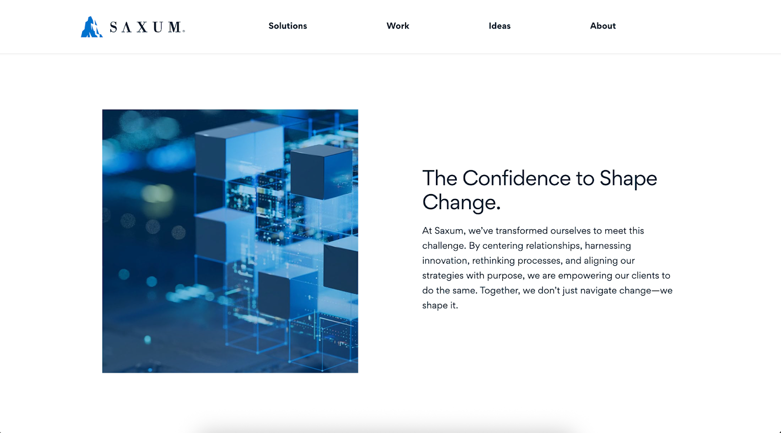
Example: Saxum, a communications and digital solutions agency
What they use: Saxum employs the Gordita font family across their site, pairing it with a palette anchored by a deep navy, complementary grays, and clean white backgrounds. Headlines use Gordita Bold while body text uses Gordita Regular, creating a clear hierarchy without introducing additional typefaces.
Why it works: The deep navy and soft gray palette creates a trustworthy, stable feel while the Gordita sans-serif gives a clean, modern appearance. This combination signals competence and reliability — exactly what B2B clients seek when evaluating communications partners. The consistent use of one font family with varied weights maintains sophistication without visual complexity.
Creative minimalist: vibrant accent + neutral base + display font
Brands wanting to stand out while maintaining readability often use this approach. One or more vibrant colors (like electric blue, bright orange, or magenta) are used sparingly — but intentionally — against neutral grays and whites. These pops of color draw the eye and add energy, while a distinctive but legible display type anchors the message.
When to use: Creative agencies, startups, design portfolios, innovative tech companies
Psychology: Creative, confident, forward-thinking, energetic
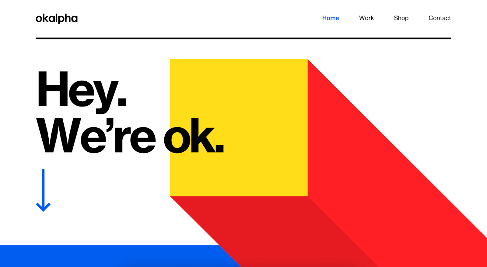
Example: Okalpha, a motion design studio
What they use: The home page uses a white base with a large block composed of primary colors (bright yellow, red and cobalt blue) and Neue Haas Grotesk, a bold, sans‑serif display type, for the headline. Menu links and other accents appear in the same bright blue, creating visual consistency.
Why it works: The neutral white background keeps the layout readable while the oversized geometric shapes in primary colors act as a vibrant accent. The bold display typography and playful color choices communicate energy and creativity.
Friendly and accessible: warm colors + rounded fonts
Soft, warm colors combined with rounded, approachable fonts create welcoming, inclusive experiences. This combination is perfect for consumer-facing brands seeking to build trust through approachability rather than authority.
When to use: Healthcare, education, family services, community organizations
Psychology: Approachable, caring, inclusive, trustworthy
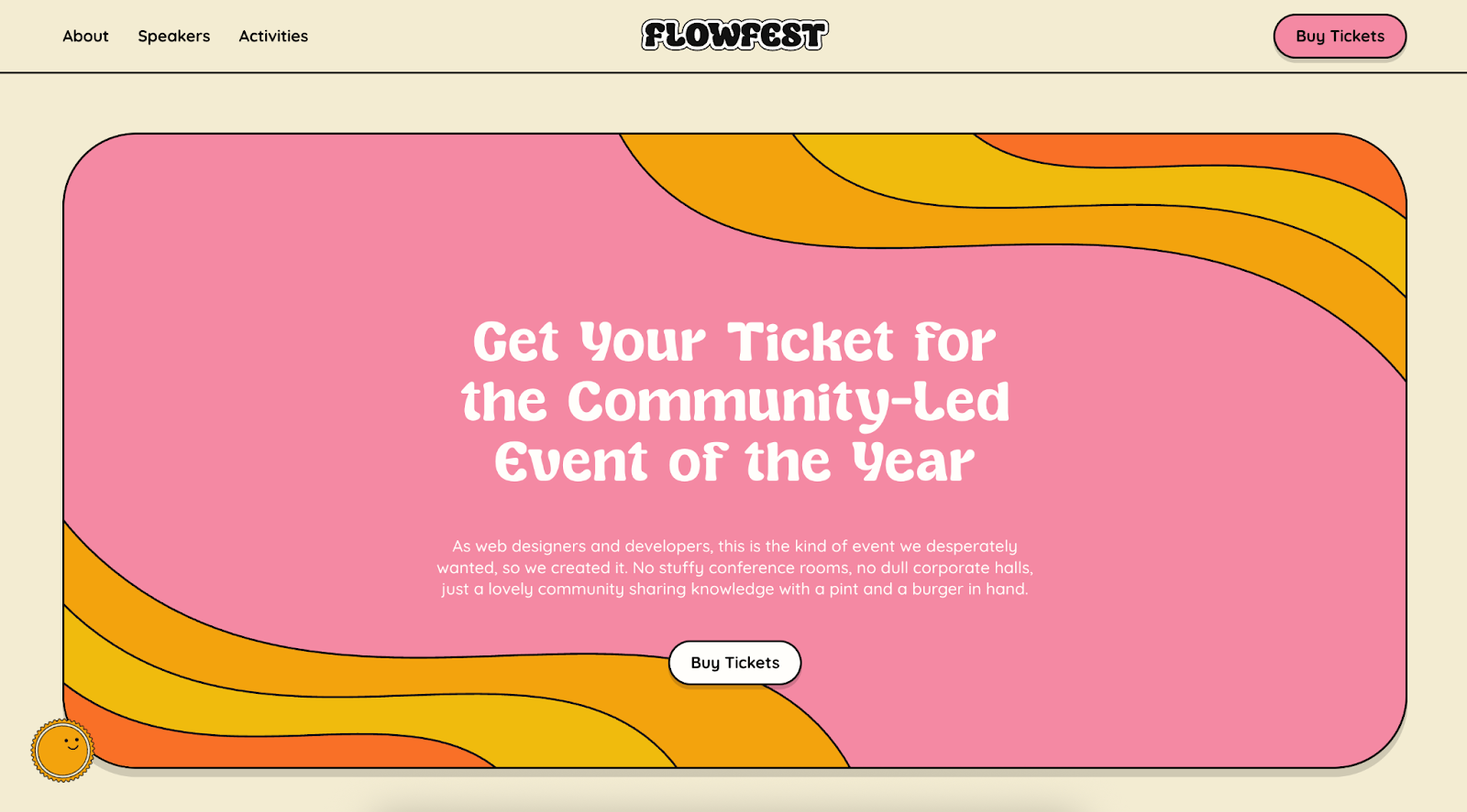
Example: Flowfest, a community-hosted conference for Webflow users
What they use: Flowfest combines a warm cream background with curved accent stripes in peach, coral, mustard, and honey. Typography pairs Sugar Peachy (a bubbly display font with thick outlines) for main headlines with Quicksand (a friendly rounded sans-serif) for navigation and body copy. The palette avoids harsh contrast, instead feeling sun-faded and inviting.
Why it works: The combination of warm, muted colors and rounded display typefaces immediately signals approachability and inclusivity — essential qualities for a community event. Because the palette is soft and fonts are friendly, the approach works equally well for education or family services while still feeling energetic.
Vibrant & bold: warm colors with strong display fonts
This approach uses high-saturation warm colors paired with large, assertive sans-serif fonts to create immediate visual impact. Perfect for brands that want to communicate energy, appetite, and confidence without subtlety.
When to use: Food and beverage brands, consumer products, lifestyle ventures that thrive on personality
Psychology: Assertive, confident, authentic, visceral
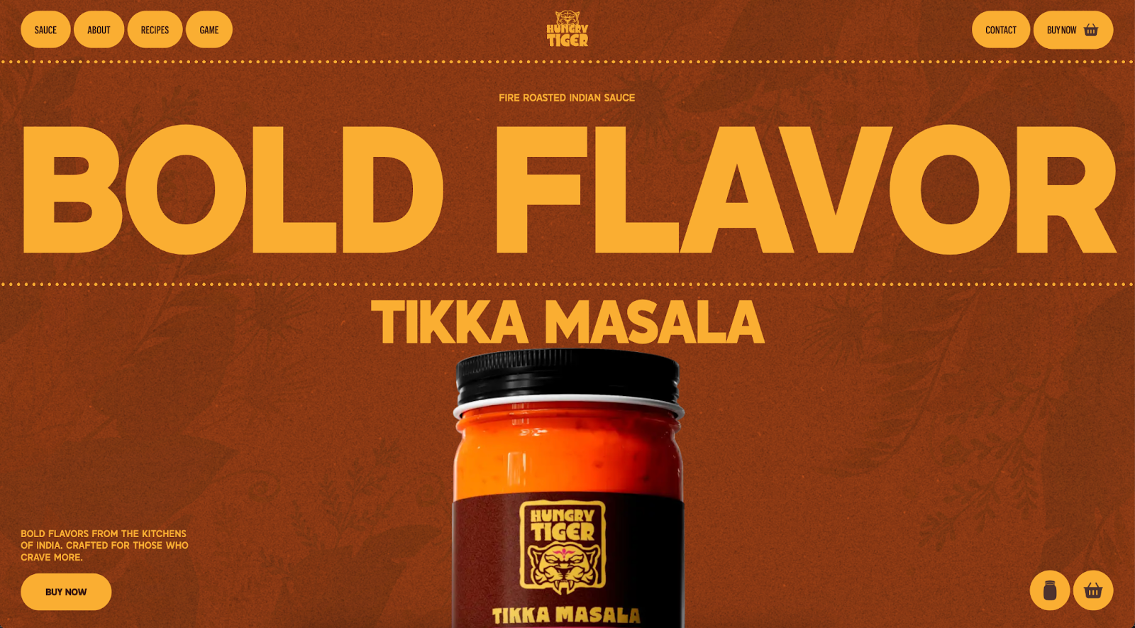
Example: Hungry Tiger — bold, Indian-inspired sauces
What they use: The homepage immerses visitors in saturated orange backdrops with headlines and call-to-action buttons in vivid mustard yellow. Primary headlines use Salmond Bold (a heavy, all-caps, slightly condensed sans-serif) while body text uses GraphikX Medium (a modern sans‑serif). The warm palette dominates every element, with no cool neutrals or pastel accents.
Why it works: This pairing of high-saturation warm colors with large all-caps typography perfectly matches brands focused on "big flavor" and bold experiences. The absence of cool tones or delicate fonts gives an immediate punch: visitors are drawn in by warmth and intensity while oversized typography makes the message impossible to miss. The approach stimulates appetite and conveys richness while the muscular typography suggests strength and authenticity.
Unexpected pairings that actually work
The most memorable websites often break conventional rules with color and typography combinations that shouldn't work — but somehow do.
“As a brand designer, I often think about color and typography less as a formula to follow and more as a key way to differentiate and illustrate a brand's personality,” says Meghan Murray, Senior Brand Designer here at Webflow. “While there’s value in aligning with certain expectations, I think it’s also worth highlighting how strategic deviation from norms can make a brand more memorable and distinct.”
Industry norms are inherently shaped by legacy brands, so newcomers often have to stand out to cut through the competition. Think of how Linear’s dark background with gradient purples broke every rule of enterprise software design — and launched its own eponymous design trend. Or consider Drunk Elephant’s embrace of eye-popping neon against the soft pastels of skincare.
When color and typography pairings go against the expected flow, users can’t help but pay attention.
Serif headlines with pastel colors: Wispr Flow
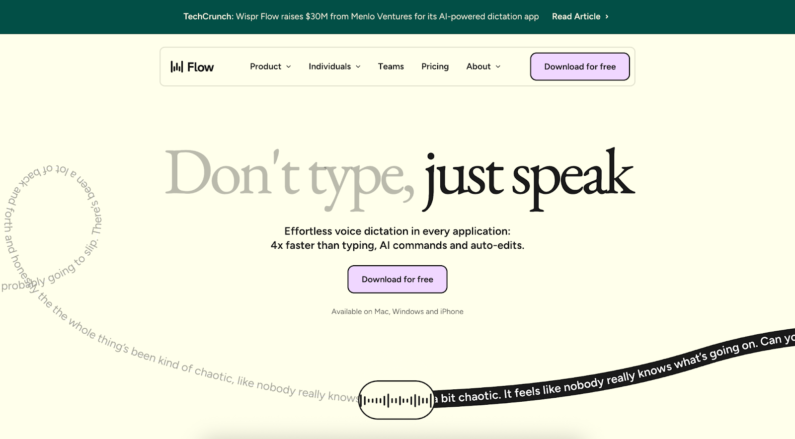
What they use: AI dictation app Wispr Flow's website shows that you don’t always need dark blues or neon highlights to feel trustworthy or modern. It pairs EB Garamond, a classic, elegant serif, with Figtree, a modern sans‑serif used for the supporting copy. Rather than placing this typography on a traditional dark or corporate backdrop, the designers set it against a soft cream background with accents of lavender and sage.
Why it works: The refined serif headline stands out more when surrounded by gentle pastels, creating contrast without clash. Serif fonts signal tradition and reliability — important for a voice-dictation app — while pastels soften that formality, suggesting friendliness and ease of use. In a space where productivity tools tend to rely on dark neutrals, this light palette feels fresh while the serif/sans pairing maintains credibility.
Luxury trappings with a twist: Cigarette Racing MME
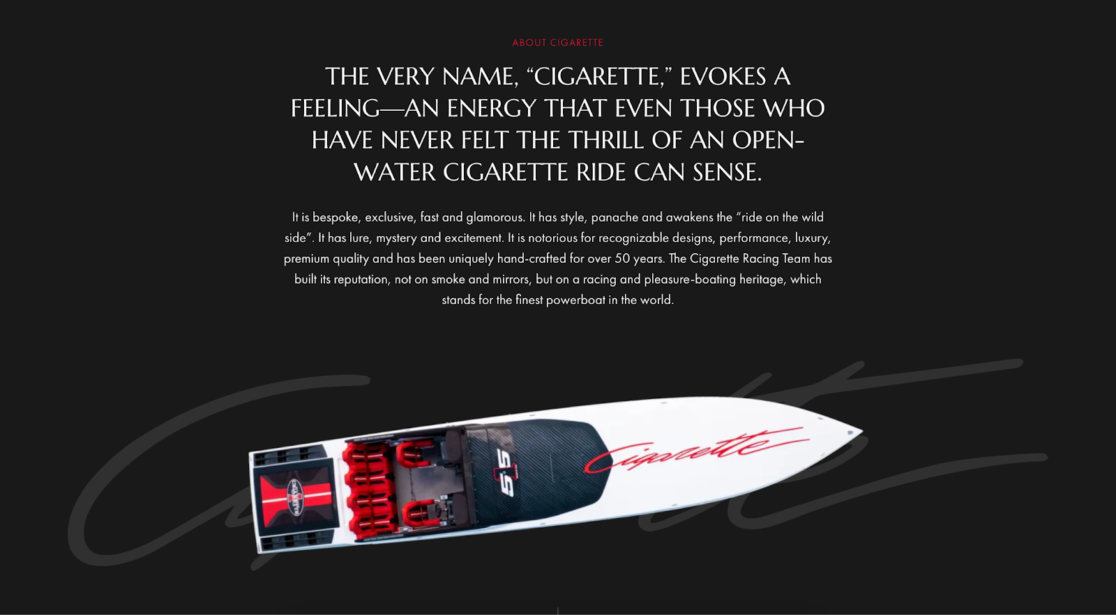
Cigarette Racing MME is the official distributor of Cigarette Racing boats in Monaco and the Middle East. This site exemplifies "luxury with a twist" by using traditional luxury design language — dark and neutral colors with refined fonts — with an unexpected color accent.
What they use: Dark, almost black hero backgrounds paired with Marcellus SC (refined serif) for headlines and Futura PT (geometric sans-serif) for body text. Instead of predictable gold or jewel tone accents, the design uses bold, vibrant red for primary call-to-action buttons and subtle highlights.
Why it works: The dark background and serif headings convey prestige and craftsmanship fitting for a heritage brand — but by introducing bold red, the design signals the speed and excitement of high-performance boating. The unexpected color accent maintains luxury credibility while injecting adrenaline-fueled energy.
Quick-start guide for color and typography pairing
Ready to find your site’s perfect color and typography pairing? Here’s how to make choices that actually work for your users.
Start with purpose, not preference
Before choosing colors or fonts, clearly define what you want users to feel and do. A meditation app requires different emotional triggers than a stock trading platform.
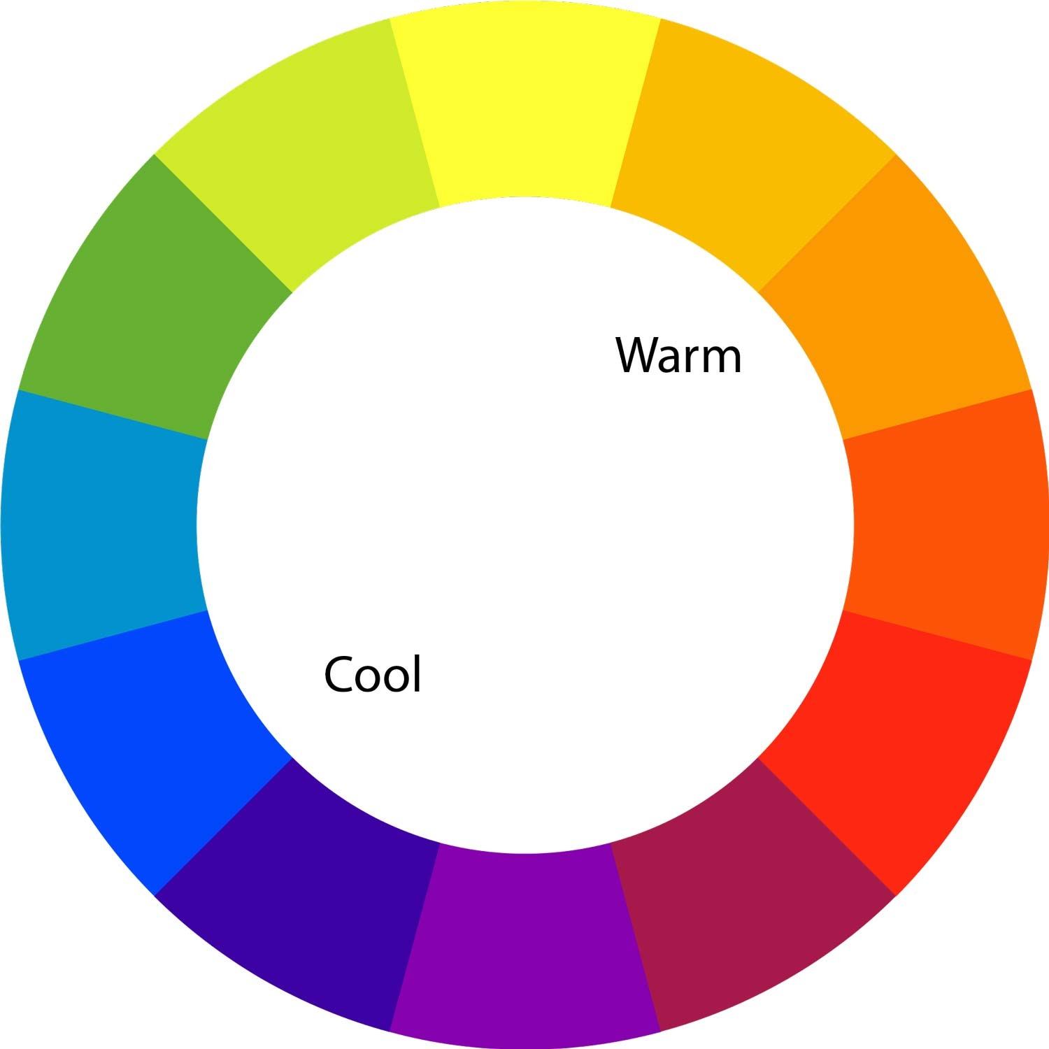
Consider warm vs. cool typography combinations
The temperature of your color palette should align with your typography choices to create emotional coherence.
Warm palettes (reds, oranges, yellows) pair naturally with:
- Round, friendly fonts like Nunito or Poppins
- Script fonts for creative industries
- Bold, confident display fonts
Cool palettes (blues, greens, purples) work well with:
- Clean, geometric fonts like Roboto or Lato
- Professional serif fonts like Times New Roman or Playfair Display
- Minimalist, modern typefaces
Leverage color psychology with typography personality
Match the emotional tone of your colors with complementary font personalities:
- Blue + geometric sans-serif = trustworthy and modern
- Green + rounded fonts = natural and approachable
- Orange + bold display fonts = energetic and confident
- Purple + elegant serif = creative and sophisticated
Use the 60-30-10 rule
This classic rule keeps your designs balanced without overthinking it:
- 60% dominant neutral color for backgrounds and primary text
- 30% secondary color for sections and supporting elements
- 10% accent color for CTAs and key highlights
Test typography hierarchy with color
Your color choices should enhance, not compete with, your typographic hierarchy:
- H1 headings: Can handle bold colors and distinctive fonts
- H2-H4 headings: Use color variations of your primary palette
- Body text: Keep neutral and highly readable
- CTAs: Use your strongest accent color with bold, clear fonts
Consider mobile-first color contrast
Small screens and varying lighting conditions make contrast even more critical on mobile devices. Test your pairings across different devices and lighting scenarios.
Tools and resources for perfect pairings
Need to test and implement your ideas? These tools will save you time.
Color and typography testing tools
These tools help you create, test, and refine your pairings:
- Webflow font generator: Copy and paste hundreds of unique fonts with your personal text
- Adobe Color Wheel: Generate color schemes and test accessibility
- Google Fonts: Preview font combinations with custom colors
- WebAIM Contrast Checker: Ensure accessibility compliance
How Webflow supports color and typography
If you're using Webflow, here's how to streamline your workflow:
Global styles: Create consistent color palettes, variables, and typography systems across your entire site
Style guide: Preview all your pairings in one organized view
Responsive typography: Test how your pairings work across device sizes
Accessibility tools: Built-in contrast checking and an accessibility checklist
Whether you're building in Webflow or any other platform, the key is consistency, testing, and always prioritizing readability and accessibility over purely aesthetic choices. The most beautiful design in the world won't convert if users can't read it or understand what action to take next.
Ready to put these principles into practice? Start with one strong pairing that aligns with your brand personality, test it thoroughly, then expand your palette and typography system from that solid foundation. Or keep learning in Webflow University’s advanced typography lesson and our guide to creating a color palettte for your website.


Explore typography best practices, including font pairing, hierarchy, and accessibility considerations, to improve readability and create more inclusive designs.
Evolving design systems
In our ebook, learn why experts are investing in scalable design systems and how they are thinking about the future of design systems.