

An excellent portfolio draws people into your world. Great content keeps them there.
Steer interested individuals to your work with a striking digital portfolio that lets your personality (and talent) shine. Here are five of the best writer websites we’ve seen.
5 writer websites worth checking out
Building and maintaining an online writer portfolio is a great way to showcase your experience. Instead of sending individual pieces to each potential client, you can send everyone to a central location — a great portfolio website that highlights your writing style and skills. Plus, you can link to it from your social media accounts and even include a QR code on your business cards and resume. You can also optimize your site to improve visibility in search engines.
Great portfolios express your work’s tone and style.. A technical writer website might prioritize more formal language than a typical essay writer website, while copywriters might display work from previous ad campaigns.
Here are five of great examples of freelance writer websites to use as a starting point when creating your portfolio:
1. Carrieann Narumon Cahall
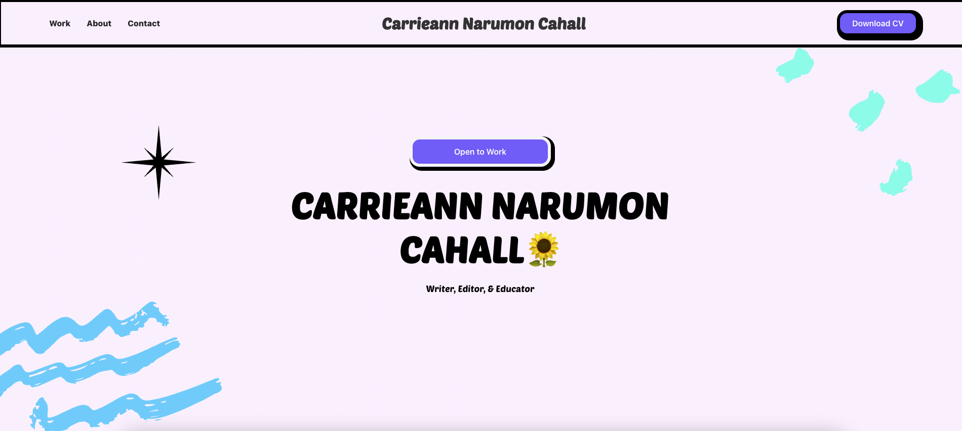
Carrieann Narumon Cahall is a writer, editor, and educator. With degrees in English and creative writing, her website’s bright colors match her enthusiasm.
The site is a single page showcasing a wonderful blend of pastels and stand-out calls-to-action (CTAs). What’s so effective about the layout is the use of color in the button design. Carrieann’s CTAs are a deep purple that’s more saturated than the other site elements, making them stand out from the rest of the content.
The main CTA is the “Open to Work” button, which turns a vibrant shade of green and tilts and expands when users hover over it. Other buttons, from “View Work” to “Download CV,” share this animation — but only this central button changes color. If potential clients hover over the button while considering hiring Carrieann, this CTA gives them an encouraging green light.
2. Bella Shing
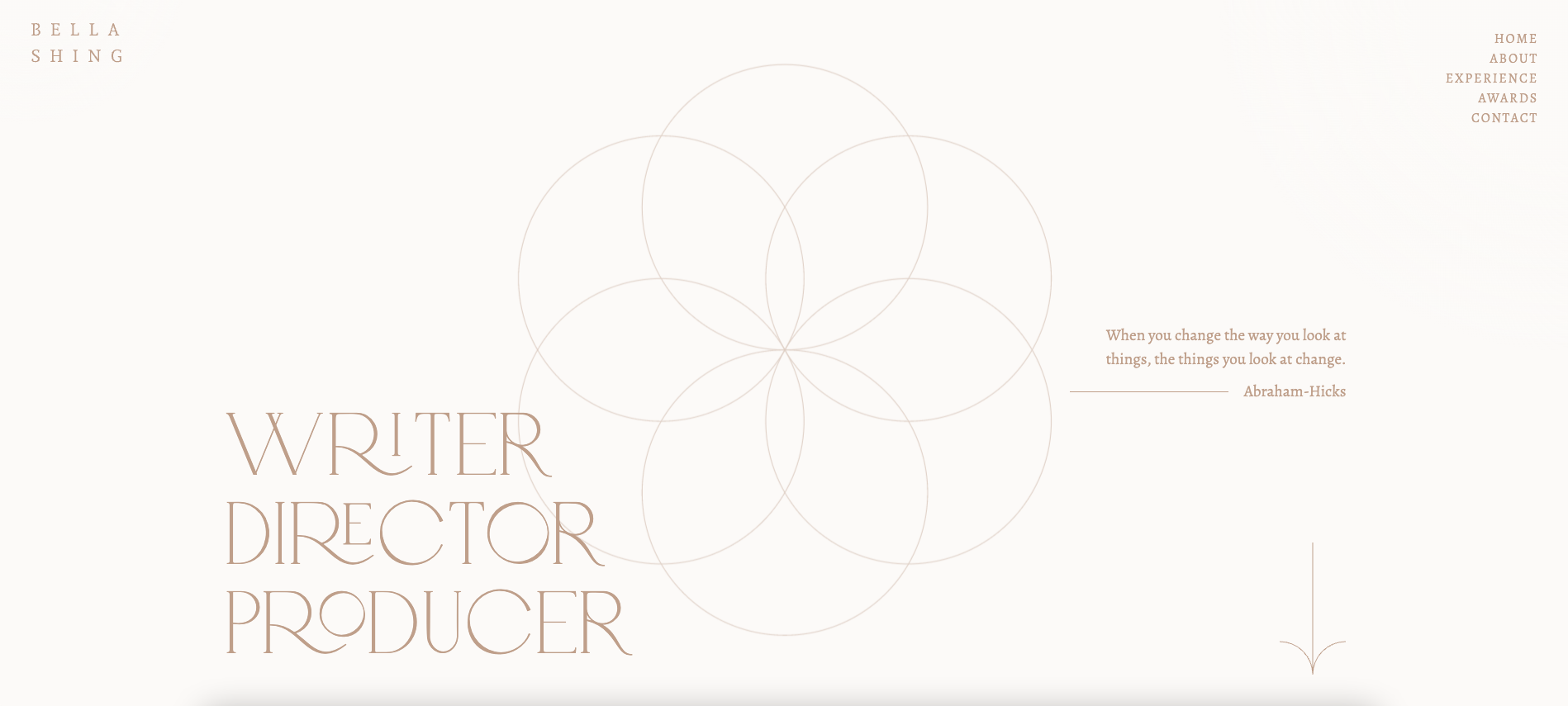
Bella Shing is a writer, director, and producer. Her portfolio is simple and elegant, featuring clever eye-catching animations, delicate lines, and oversized typography.
A large graphic made of overlapping circles sits in the center of the site’s homepage. As you scroll, the drawing shrinks and smaller circles appear within it. The smaller version of the drawing follows you down the page, creating a sense of cohesion. The ongoing animation encourages you to scroll to the “Get in touch” section at the bottom of the page.
The navigation menu sticks to the top right corner of this one-page website, so users can jump to other sections at any time. The menu indicates what section you’re currently exploring by underlining the name.


Show off your work.
Choose from fully customizable portfolio templates built for creatives. With Webflow, you can design, refine, and publish a standout portfolio — without writing a single line of code.
3. Clare Azzopardi
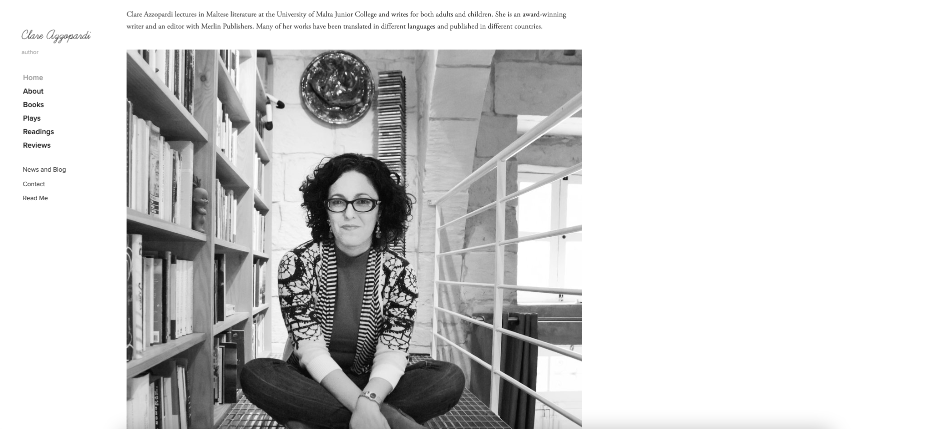
Clare Azzopardi’s website is straightforward and focused on brand identity. The homepage features a black-and-white headshot under a succinct three-sentence biography that summarizes her experience, notes her awards, and highlights a global and multilingual audience. These few elements introduce Clare and define her credibility as a writer from the get-go to encourage visitors to explore the site.
The classic and modest design is also comforting. Everything is monochromatic, and the old-fashioned serif typeface reminds us of a freshly printed novel. This timeless design has a high-quality feel, presenting Clare as a seasoned novelist that delivers.
4. Molly Stubbs

Molly Stubbs is a freelancer whose content writer website covers copywriting, content marketing, social media posts, and more. Her site uses vibrant colors and icons to showcase her personality.
The first thing we see in the portfolio is bubbly text that introduces Molly and states precisely what she’s great at: telling compelling brand stories. The vibrant color palette suggests she writes content as attention-grabbing as this design.
One feature that stands out is the purple news-ticker style banner at the bottom of the screen with the words “HIRE ME.” The banner separates the About and Contact sections.
Our favorite part is the brief message at the bottom of the page and next to the copyright information: “This is all there is. Were you expecting more? It's okay, me too.” Molly’s lighthearted and humorous personality gives the viewer a peek into her work’s tone of voice.
5. Travis Brown
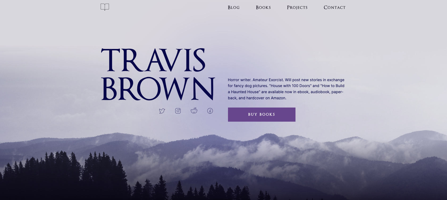
Travis Brown is a horror writer with a website that perfectly suits his niche with a haunting design. The site has an eerie ambiance with a background image of a foggy forest and a black and purple color scheme. A translucent cloud follows the cursor to add interactivity to the spooky atmosphere.
Travis’ CTAs and links constantly remind you of his writing to market his work. Each section has a brightly colored button saying “Buy Books” or “View Projects,” with a dedicated webpage redirecting to relevant online stores. A “Get in Touch” form at the end of every page encourages potential clients to inquire about his writing services. This cohesive design hints at Travis’ specialty and instills confidence that he understands the genre and delivers successful horror-focused content.
Elevate your career as a professional writer
A digital portfolio is a shareable resource that showcases who you are and what you offer. Demonstrating your experience and personal style with a well-designed site increases your chance of winning over not just new clients, but ones you’d be excited to work with.
No matter what type of writing you do, using a professional website builder like Webflow to create a portfolio is a great way to get your work in front of more people.


.jpeg)