

The number of internet users is constantly increasing, as are the various devices used to access it.
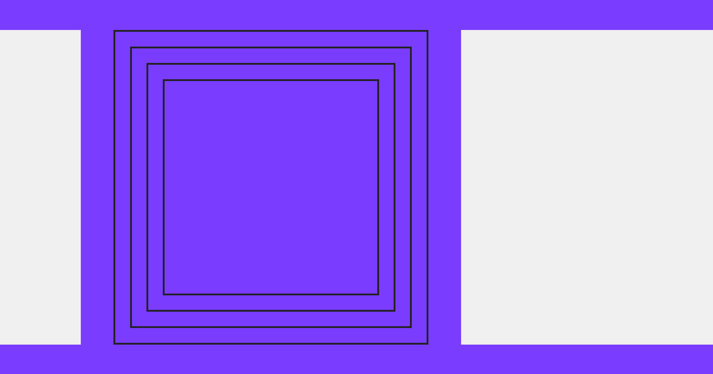
Breakpoints are predefined points in a website’s code where the design and layout change to accommodate different screen sizes and orientations.
Use breakpoints to create responsive designs, so that your website looks consistent and functions evenly across devices, from small smartphone screens to big desktop monitors. Strategically setting breakpoints ensures your site is both accessible and visually appealing while allowing people with any device to enjoy the intended user experience.
In web design, you can manage breakpoints through CSS and media queries. CSS breakpoints use CSS properties to define how a layout should adjust to specific screen widths. For instance, you can specify that a two-column layout should switch to a single-column layout at a width of 768 pixels.
Media query breakpoints are even more specific, allowing you to apply CSS rules based on the conditions set within a query, like the screen's width, height, resolution, and orientation, for more granular control. For example, a website’s standard breakpoint value might be 1024 pixels. When a device’s screen width is less than 1024 pixels, the website automatically shifts from a three-column layout to a two-column one to maintain readability.
You can use media queries to apply CSS rules conditionally and define this transition, ensuring the content adapts fluidly to various screen sizes and orientations for highly responsive designs.
Common responsive breakpoints
Understanding the most common breakpoints lets you create responsive designs that meet any use case. Here are the most-used breakpoints across today’s devices and screen sizes.
Extra-small breakpoints
- 320 pixels. A 320-pixel density is typically used for smaller mobile device screens like older smartphones. This breakpoint ensures that content remains accessible and legible, even on the smallest screens. Key adjustments include adding breakpoints that enlarge buttons and load content vertically to improve usability.
- 480 pixels. At this breakpoint, the design adjusts to suit slightly larger mobile screens. Font sizes, images, padding, and margins increase to take advantage of the available space for better readability.
Small breakpoints
- 768 pixels. This is typically used for large smartphones and tablets. Layout changes include switching from a single-column layout to a two-column layout to use the additional screen space without compromising readability and navigation.
- 1024 pixels. At 1024 pixels, this breakpoint bridges the gap between handheld devices and smaller desktop screens. The design maximizes the increased real estate, often transitioning to a multicolumn layout that spreads content horizontally across the screen.
Medium breakpoints
- 1280 pixels. This breakpoint is on the most common laptop and desktop screen sizes. A 1280-pixel design can include a more complex layout, like multiple columns, sidebars, and navigation bars. These larger screens provide content-rich, feature-packed user experiences and make full use of every pixel.
- 1440 pixels. This is optimal for large desktop monitors and high-resolution displays. Because it’s increasingly roomy, you can include more white space on the page and add elements like extra sidebars, larger images, and more detailed navigation.
Large breakpoints
- 1920 pixels and above. Breakpoints of 1920 pixels and higher are for wide screens and state-of-the-art setups with ultra-high-definition resolutions. Designs have highly detailed, expansive layouts that provide a visually stunning and immersive browsing experience. You can include extensive grids, full-size images, and multiple content sections side by side.


Evolving design systems
In our ebook, learn why experts are investing in scalable design systems and how they are thinking about the future of design systems.
How to choose the right breakpoints
There are two types of breakpoints to consider when creating websites: device-based and content-based. Depending on your content and audience, combining both might yield the best results.
Device-based breakpoints
Device-based breakpoints adapt to the screen sizes of common devices like smartphones, tablets, and computers. This approach optimizes your website for the most widely used devices to provide a consistent experience for most people.
A common device-based breakpoint might be 768, 1024, and 1280 pixels to accommodate large smartphones, tablets, laptops, and desktops, respectively. For example, a smartphone’s 768-pixel layout can switch from a single panel to a two-column format to maximize the available screen space on tablets. You need to customize breakpoints for different devices.
When to use: Opt for device-based breakpoints to ensure compatibility and a consistent viewing experience across multiple devices, especially if your site has a large audience using a specific range of phone or computer dimensions.
Content-based breakpoints
Instead of focusing on specific device sizes, content-based breakpoints consider your website’s layout and content requirements. These breakpoints are set where the content or visual structure naturally requires adjustment to maintain usability and aesthetics based on the space available.
Suppose your website has a multicolumn layout that appears cramped in certain areas on a desktop monitor. A content-based breakpoint at 1024 pixels allows the site to transition smoothly from three to two columns, ensuring text and images remain clear and visually appealing.
When to use: Choose content-based breakpoints to maintain your content’s readability and appearance, regardless of device. This approach is ideal for content-heavy websites with custom brand elements where preserving the user experience is essential.
5 best practices for responsive breakpoints
Implementing responsive breakpoints improves website performance across devices. Follow these best practices to ease the implementation process.
1. Set your breakpoints
Use data visualization tools to identify the most common screen sizes accessing your site. You can also track activity with heatmaps to gauge your audience’s engagement levels and specific behavior patterns on each page. Then, tailor breakpoints to these quantifiable metrics and optimize your site for the devices your audience uses most.
For example, if the analytics reveal that a large percentage of your audience uses devices with screen widths between 768 and 1024 pixels, set breakpoints at these widths to ensure optimal functionality for this segment.
2. Create mobile-first designs
Start by designing breakpoints for the smallest screen size and work your way up. This means creating layouts for mobile phones first. By prioritizing essential features for smaller screens, you’ll create a strong foundation for the content and find the transition to larger screens smoother without sacrificing performance.
For instance, you might design a single-column layout for smartphone screens. Progress to a two-column layout for tablets and add more content with extra features like sidebars and navigation menus as the screen size increases and more space becomes available.
3. Optimize layouts to reduce friction
A streamlined design includes fast loading times, smooth interactions, and quick responses to user input. Faster pages lead to better PageSpeed Insights speed scores and search engine optimization (SEO) rankings, which drive traffic to your website.
Use fewer large images, complex animations, and other heavy content that can slow down your site. When optimizing images, convert them into a WebP format to maintain high resolutions with smaller file sizes. You can also implement lazy loading for multimedia below the fold to reduce initial load times, meaning visuals only appear once visitors scroll to them.
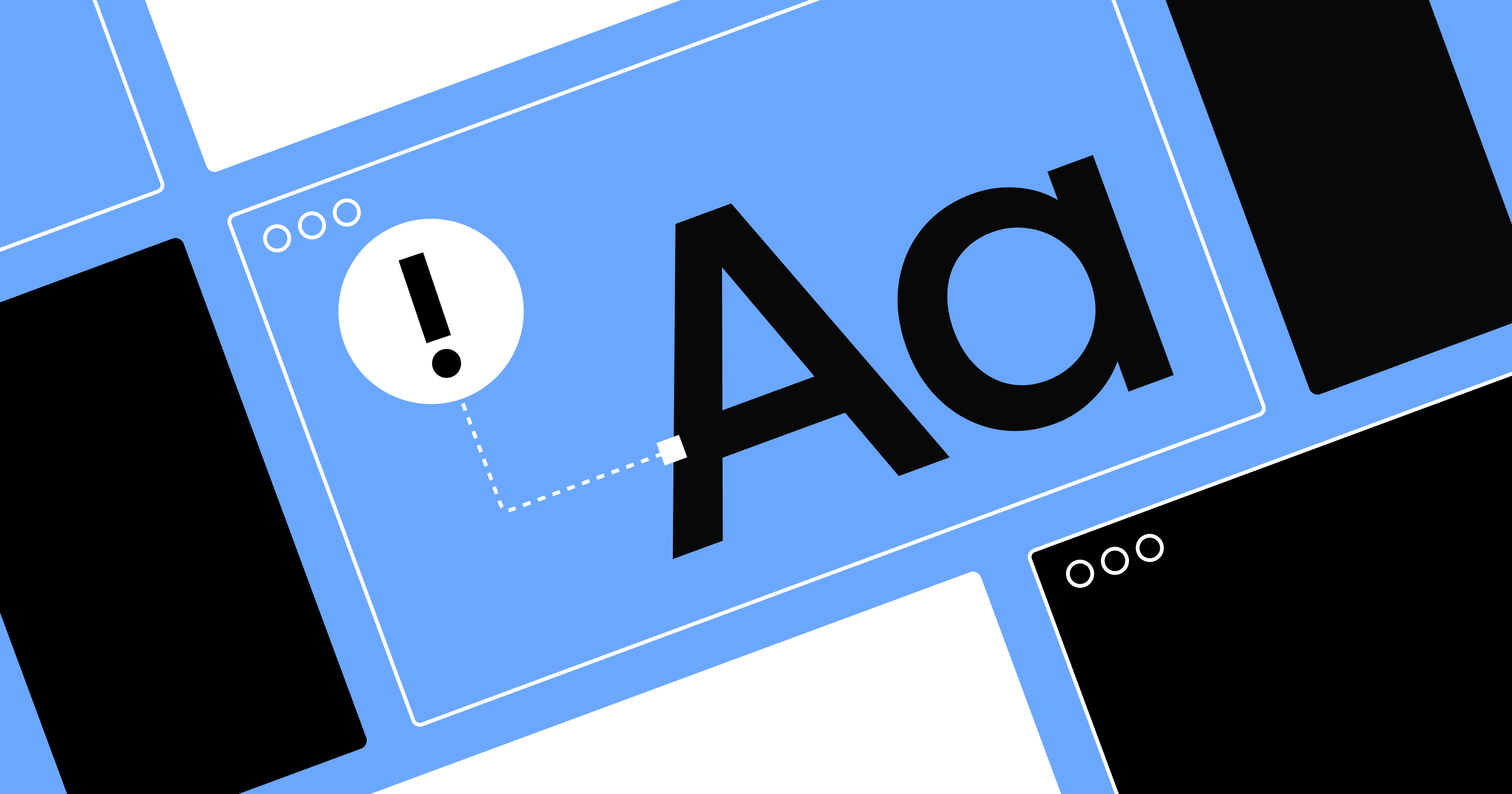
4. Use responsive typography
Responsive typography ensures your website’s text appears legible and aesthetically pleasing across devices. It also involves leaving ample white space so the layout looks spacious. Use web design-friendly fonts that adjust the size based on screen width and balance readability with visual impact.
5. Test across real devices
Test your breakpoint-enabled designs on real devices rather than solely relying on browser resizing tools. This way, you can identify and address issues that might not be evident in a simulated environment. It also ensures your site performs well in the real-world scenarios your target audience experiences daily.
Check breakpoint functionality on a variety of devices, including smartphones, tablets, laptops, and different desktop monitors. This hands-on approach can reveal response issues on touch-enabled devices, text readability problems, and transition smoothness.
Build responsive designs with Webflow
By understanding what breakpoints are and best practices for implementing them, you can provide a cohesive user experience for your site across all devices.
With Webflow, you don’t need to rely on web development languages like HTML and CSS to code breakpoints into your design. Instead, Webflow’s visual design environment allows you to customize your site for different screen sizes using built-in responsive breakpoints. Deliver a consistent browsing experience, regardless of content or device, and boost your reach today.

Get started for free
Create custom, scalable websites — without writing code. Start building in Webflow.